How to Conduct a Screen Reader Audit for Presentations
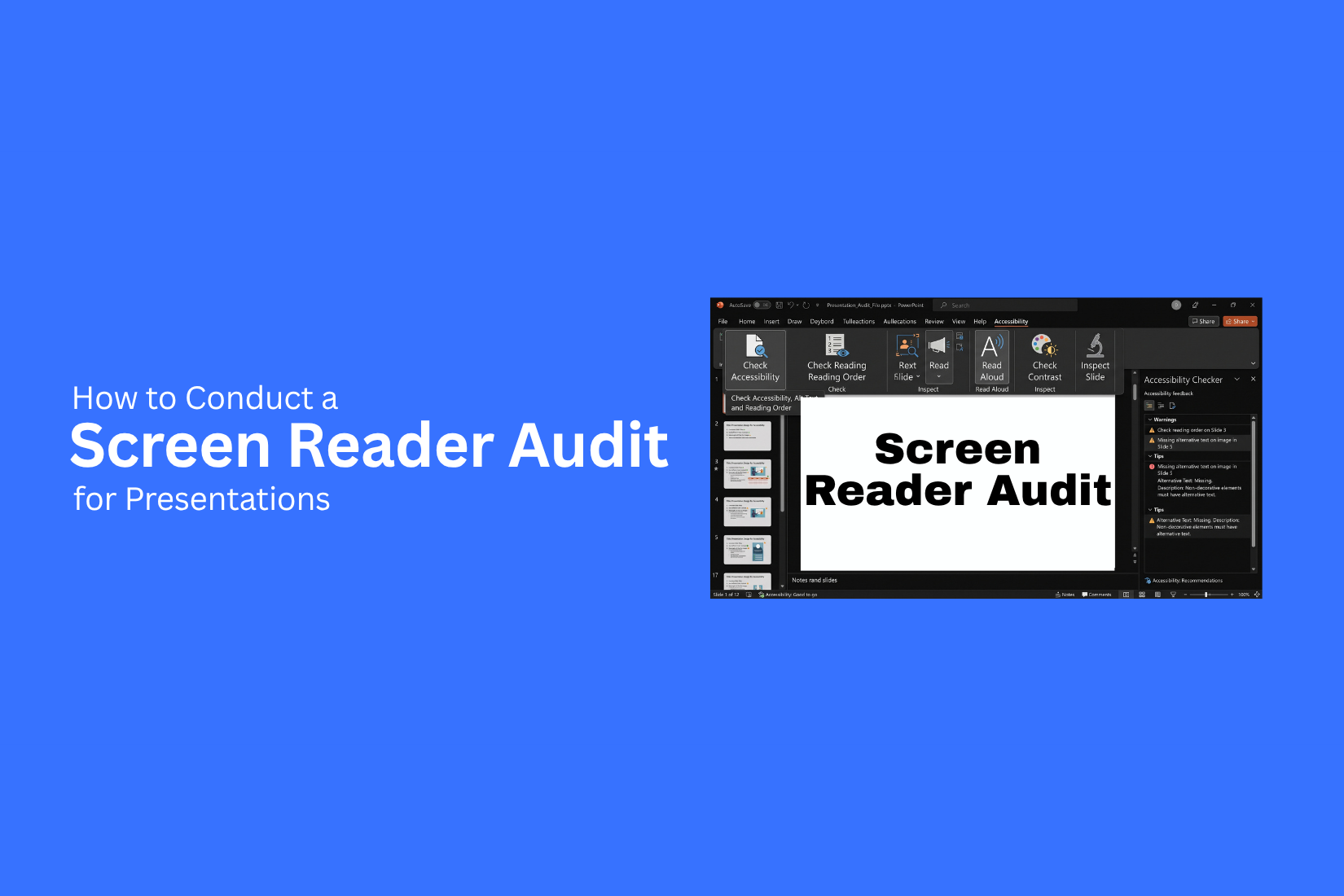
Every presentation may look clear on screen, but not everyone experiences it in the same way. A viewer may quickly understand a chart, diagram, or graphic. A person using a screen reader depends on the structure and order of the slide content. A screen reader audit helps find issues that may affect how users access your presentation. PowerPoint includes an Accessibility Checker that can find many common issues. However, an automated check cannot find every accessibility problem.
This guide explains what a screen reader audit involves, how screen readers read PowerPoint slides, and what PowerPoint’s Accessibility Checker can and cannot find. You’ll also learn how to manually test presentations with screen readers, review key slide elements, fix common issues, and run the audit again.
Why Screen Reader Accessibility Matters
Accessibility helps more people use and understand a presentation. A slide can look clear to a sighted viewer and still create barriers for someone using assistive technology. Automated accessibility checks can find some problems, but they do not catch every issue. Manual testing is also needed to review how a presentation works for real users.
Screen readers are tools that read digital content aloud or present it through Braille. They read slide content based on the presentation’s accessibility structure. This can be very different from how a sighted person scans a slide. A screen reader may move through text, images, links, and other objects in a set order.
Small PowerPoint issues can affect this experience. An incorrect reading order can make the content hard to follow. Missing or poor alternative text can leave users without useful details about an image. Raw URLs can be difficult to understand when read aloud. Missing slide titles can make navigation harder, while duplicate titles can make slides hard to tell apart. Decorative graphics may also be announced even though they add no useful information. These problems show why visual checks alone are not enough. A well-designed slide needs a clear accessibility structure too. Manual testing with a screen reader can reveal issues that are easy to miss during normal slide review.
Understanding How Screen Readers Read PowerPoint Slides
One common mistake in PowerPoint accessibility is assuming that screen readers read slides exactly as they appear visually. In reality, screen readers use PowerPoint’s accessibility tree to access slide elements. The order of these elements affects how the content is presented to the user.
Understanding Screen Reader Accessibility Tree
The accessibility tree shows slide elements to assistive technologies. A screen reader may encounter the slide title, placeholder content, text boxes, images, charts, tables, and other objects. The exact sequence depends on the reading order set for each object.
Why Screen Readers May Read Content Out of Sequence
A chart may appear first on a slide, followed by an annotation that explains it. If the reading order places the annotation before the chart, a screen reader user may hear the explanation before knowing what it refers to. This can make the slide harder to follow. It also shows why a clear visual layout alone does not make a PowerPoint slide accessible.
What Is a PowerPoint Accessibility Audit
A PowerPoint accessibility audit checks whether people who use assistive technology can access and understand a presentation. It looks at both the slide content and the way that content works with tools such as screen readers and keyboards. PowerPoint includes built-in accessibility checks. These checks can find some common issues, but they do not cover every problem. A proper audit also needs a manual review of the slides and their content.
A PowerPoint accessibility audit should review:
• Alternative text: Check that images, charts, and other visual elements have useful descriptions.
• Reading order: Make sure screen readers read slide content in a clear order.
• Slide titles: Give each slide a clear and unique title.
• Color contrast: Make sure text and key visual elements are easy to see.
• Tables: Check that tables have a clear structure and readable content.
• Hyperlinks: Use link text that tells users where the link leads.
• Keyboard navigation: Test whether users can move through the presentation without a mouse.
• Slide layouts: Use layouts that support clear content structure and assistive technology.
• Screen reader testing: Test the presentation with a screen reader to find issues that automated checks may miss.
The goal is simple: a person using a screen reader or other assistive technology should be able to move through the presentation and understand its content without help. An accessibility audit helps find barriers before the presentation reaches its audience.
How to Conduct a Screen Reader Audit for Presentations
For a PowerPoint screen reader audit, start with the built-in Accessibility Checker. Review the errors, warnings, tips, and suggested fixes it provides. Then check the reading order, slide titles, alt text, charts, tables, links, and other slide elements. Finish with a manual screen reader test to catch issues that automated tools cannot judge.
Step 1: Run PowerPoint’s Accessibility Checker
Microsoft recommends starting with the built-in Accessibility Checker. In PowerPoint, go to Review > Check Accessibility. The Accessibility pane opens on the right side of the screen and shows issues found in the presentation.
Check Accessibility: This option scans the presentation for accessibility issues. It also provides suggestions and quick fixes for some problems.
The Accessibility pane groups findings into different categories. Errors point to issues that may create access problems. Warnings point to issues that may need review. Tips suggest ways to improve usability. Each finding includes an explanation, so you can understand the problem before making a change.
Step 2: Review the Accessibility Checker Results
Review each finding instead of fixing issues without checking the details. Look at the affected slide and read PowerPoint’s explanation. Apply a quick fix when it fits the content.
Check for repeated issues across the presentation. Missing titles, poor alt text, and incorrect object settings may appear on several slides. Fixing the same issue across all affected slides can make the audit more consistent. The Accessibility Checker can find many structural problems. It cannot judge the meaning or quality of every piece of content.
Step 3: Check the Reading Order
Open the Reading Order Pane to review the order of objects on each slide. This shows the sequence a screen reader may use to read the slide content. Check that the order makes sense from a listener’s point of view. A common sequence may start with the slide title, followed by the main text, supporting content, and important visuals. Look for objects that are read too early, too late, or not at all. Also check decorative objects that do not need to be announced. A slide may look well organized on screen but sound confusing if its objects are read in the wrong order.
Step 4: Test Slide Titles
Check every slide for a clear and useful title. Slide titles help screen reader users understand what each slide is about. Make sure the title describes the main point of the slide. Avoid vague titles such as Data, Results, or Information if a more specific title gives better context. Also check that the title is set as an actual slide title. A text box placed at the top of a slide may look like a title but may not provide the same structure for assistive technology.
Step 5: Review Alternative Text
Open the Alt Text pane to review the descriptions for images, icons, charts, and other visual elements.
Check whether each description gives useful information. Alt text should explain the purpose or key message of a visual. It does not need to describe every visible detail.
PowerPoint may provide AI-generated alt text for some visuals. Review these descriptions for accuracy before using them. An automatically created description may identify an object but miss the information that matters to the presentation. Also check decorative images. A decorative visual may not need a description. Adding unnecessary alt text can create extra content for screen reader users.
Step 6: Test Tables, Charts, and Graphics
Review tables, charts, SmartArt, and other graphics manually. These elements can contain important information that is easy to understand visually but harder to follow through a screen reader.
For tables, check that the row and column structure is clear. Make sure the data can be understood without relying only on visual placement. For charts, check that the main message is available through text or useful alt text. A description such as Sales chart may not explain what the chart shows.
For SmartArt and other complex graphics, review the reading order and available descriptions. Make sure the key information remains clear when the visual is not visible.
Step 7: Check Links and Interactive Elements
Review all links, buttons, videos, and other interactive elements. Make sure each one has a clear purpose. Use descriptive link text instead of vague labels such as Click here. A screen reader user should be able to understand the destination from the link text. Also check linked shapes and buttons. Their purpose should be clear without relying only on their position, color, or appearance on the slide.
Test each link to make sure it works correctly. Review interactive content as part of the full slide experience, not as isolated objects.
Step 8: Perform a Manual Screen Reader Test
After the automated check, test the presentation with a screen reader. Listen to each slide and follow the content as it is read aloud. Pay close attention to the reading order, slide titles, alt text, tables, charts, links, and other important objects. Ask whether the slide still makes sense without seeing it.
Check questions such as:
• Does the slide title explain the topic?
• Is the reading order logical?
• Does the alt text explain useful information?
• Are important charts and graphics explained?
• Can tables be understood?
• Are links clear?
• Are decorative objects skipped?
• Does the spoken content make sense?
Manual testing matters because automated tools cannot fully judge meaning. PowerPoint can detect that an image has alt text. It cannot always tell whether the description is useful. It also cannot reliably decide whether an image should be decorative or whether the reading order makes sense to a person listening to the slide.
Step 9: Document and Fix Accessibility Issues
Keep a record of the issues found during the audit. Note the slide number, the problem, and the fix needed. For example, a slide may have a missing title, unclear alt text, or an incorrect reading order. Record each issue so you can track the fixes across the presentation. Start with issues that affect access to important content. Then work through smaller usability problems. Review each change after making it. A fix to one object can sometimes affect the layout or reading order of other objects.
Step 10: Run the Audit Again
Run Review > Check Accessibility again after making the fixes. Review the new results and confirm that the earlier issues have been addressed. Then perform another manual screen reader test. Listen to the presentation from start to finish and check the updated slides. A second review helps catch issues that appeared after editing. It also confirms that the presentation works as expected after the fixes.
The full process should follow this order: Accessibility Checker → Review findings → Check reading order and content → Manual screen reader test → Fix issues → Run the audit again.
Technical Checklist: What Every Accessibility Audit for a Presentation Should Review
A technical accessibility audit checks how a presentation works with assistive technology. The review should cover slide structure, alternative text, reading order, titles, links, tables, color contrast, and keyboard access. A manual screen reader test should follow the automated review.
Alternative Text for Images and Graphics
Alternative text helps screen reader users understand informative visuals. The text should explain the purpose or key message of the image or graphic. A short description of appearance alone may not give the user enough information. For charts and diagrams, describe the main information the visual communicates. Mark decorative objects as decorative so the screen reader can skip them.
Reading Order Determination
Reading order controls the sequence in which assistive technology announces slide elements. PowerPoint’s Reading Order Pane lets reviewers inspect and rearrange objects. The order should follow the natural flow of the information. A title may come first, followed by the main text, supporting graphics, and other content. Overlapping text boxes can create a confusing sequence, even if the slide looks correct visually. Review the Reading Order Pane on slides with many objects. Check that decorative items do not interrupt the main content.
Use of Unique Slide Titles
Every slide should have a meaningful title. Titles help screen reader users understand the purpose of each slide and move through a presentation more easily. Avoid giving several slides the same title without a clear reason. Titles such as “Overview,” “Results,” or “Summary” may not give enough context on their own. A title can also remain available to assistive technology without appearing on the slide. This is useful for designs that do not need a visible title.
Color Contrast Management
Text needs enough contrast against its background to remain readable. Under WCAG 2.1 Level AA, normal text needs a minimum contrast ratio of 4.5:1. Large text needs at least 3:1. PowerPoint may flag some contrast problems. Complex gradients, transparent overlays, background images, and custom graphics may need manual testing. Review the text against the actual background used on the slide.
Table Structure Design
Tables should contain real tabular information. They should not be used only to position text or create a visual layout. Use clear header rows so screen readers can keep track of the information as users move through cells. Keep tables simple and easy to follow. Complex comparison tables may work better as several smaller tables.
Hyperlink Text
Screen readers can allow users to review links without reading all nearby text. Link text should therefore explain the destination or action. Avoid vague labels such as “Click here” or “Read more.” A label such as “Download the Annual Report” gives the user a clearer idea of what the link does. Check that links can also be reached with keyboard navigation and that their purpose is clear when read by a screen reader.
Reviewing Built-in Slide Layouts vs. Freeform Text Boxes
Manually positioned text boxes can create accessibility problems. Slides made mostly from freeform text boxes may have a less clear structure for assistive technology. PowerPoint’s built-in layouts provide a more structured starting point. Use the title and content placeholders where they fit the slide. Review the Reading Order Pane after making manual changes. A freeform text box is not automatically inaccessible. The main concern is whether the final slide has a clear structure and logical reading order.
Manual Screen Reader Testing
An accessibility audit should include testing with an actual screen reader. Automated tools can find many structural issues, but they cannot fully show how a person experiences the presentation through assistive technology.
During the test, check:
• Slide titles are announced clearly.
• The reading order follows the intended sequence.
• Informative images have useful alternative text.
• Decorative objects are skipped.
• Hyperlinks describe their destinations.
• Tables provide enough context.
• Slide objects can be reached through keyboard navigation.
Two common screen readers can be used for this type of manual review.
Narrator (Windows)
Narrator is built into Windows. It provides a practical way to test a PowerPoint presentation with a screen reader. Move through the slides with the keyboard and listen to how the content is announced. Pay attention to:
• Whether the slide title is announced first.
• Whether the reading order follows the intended flow.
• Whether images have useful alternative text.
• Whether decorative objects are skipped.
• Whether hyperlink text explains the destination.
Use keyboard navigation rather than the mouse during the test where possible. This gives a better view of how the presentation works with assistive technology.
VoiceOver (Mac)
VoiceOver is the built-in screen reader on macOS. It can also be used to review PowerPoint presentations. The interface may differ from Windows, but the main audit points remain the same. Check whether:
• Slide objects are announced in a logical order.
• Slide titles are announced correctly.
• The reading order follows the intended flow.
• Alternative text gives useful information about images and graphics.
• Tables provide headers and useful context during navigation.
• Links clearly communicate their purpose.
Use keyboard navigation throughout the test where possible. Test slides with different layouts, object types, and content structures. This helps identify problems that may not appear in an automated accessibility report.
Common Screen Reader Accessibility Mistakes
PowerPoint accessibility problems often come from normal design habits. A slide may look clear on screen but still create barriers for people who use screen readers or other assistive technologies. Small issues with text, titles, images, charts, and layout can affect how slide content is read. The good news is that most of these issues are easy to spot and fix. A careful accessibility review can make the reading order clearer and help users get the same key information from the presentation.
Text Embedded in Images
Text inside an image may not be available as readable text to a screen reader. This can hide headings, instructions, labels, or key facts from users who cannot view the image clearly.
Accessibility impact: Screen reader users may miss important information. Users with low vision may also have trouble reading small text inside an image.
Recommended practice: Add important text as editable PowerPoint text. Keep the image as a visual element rather than using it as the only source of written information.
Using Screenshots Instead of Native Content
Screenshots can place useful content inside a single image. This includes tables, charts, website text, instructions, and other details that users may need to read.
Accessibility impact: A screen reader may not be able to read the information inside the screenshot. Users also cannot select, resize, or interact with the text in the same way as native PowerPoint content.
Recommended practice: Recreate key information with editable text, tables, charts, or shapes. Add useful alternative text or a nearby text explanation for screenshots that carry important meaning.
Charts Without Text Alternatives
Charts can show data clearly to sighted users, but the visual itself may not explain its main message to a screen reader user.
Accessibility impact: A user may hear that a chart exists without learning what the data means. Important trends, comparisons, or changes can be missed.
Recommended practice: Add a short text explanation that states the main point of the chart. Use clear data labels where useful. Make sure the surrounding slide text gives enough context.
Relying Only on Color
Color alone should not communicate meaning. A red line and a green line may look different to many users, but the difference may not be clear to everyone.
Accessibility impact: People with color vision deficiencies may not be able to tell the difference. Screen reader users also need text or another method to understand the meaning.
Recommended practice: Pair color with labels, icons, patterns, symbols, or data labels. For example, use “Increase” and “Decrease” along with different colors instead of relying on red and green alone.
Repeating or Missing Slide Titles
Slide titles help users understand the purpose of each slide. Repeated titles can make slides hard to identify, while missing titles can make the presentation harder to follow.
Accessibility impact: Screen reader users may hear the same title several times and struggle to know which slide they are on. A missing title can also make the reading sequence less clear.
Recommended practice: Give every slide a unique and descriptive title. Make the title match the main purpose of the slide. A clear title can also help users move through the presentation more easily.
Leaving Placeholder Content
Unused placeholders can remain in a slide layout even after visible content has been removed. These objects may still appear in the reading order.
Accessibility impact: A screen reader may read empty or unnecessary objects. This can add noise and make the slide harder to follow.
Recommended practice: Review each slide for unused placeholders. Use PowerPoint's Selection Pane to find hidden or extra objects. Remove objects that are not needed.
Using Too Many Floating Text Boxes
Floating text boxes can make a slide look flexible, but they may create a confusing reading sequence. Their visual position does not always match the order in which assistive technology reads them.
Accessibility impact: Screen reader users may hear content in an order that does not make sense. This can make instructions, lists, and related ideas harder to understand.
Recommended practice: Use built-in PowerPoint layouts and placeholders for main content. Review the reading order and adjust object placement as needed. Keep related content grouped in a clear structure.
Poor Alternative Text
Alternative text should tell users why an image matters. A label such as “Image” or “Chart” gives very little useful information.
Accessibility impact: Screen reader users may not understand the purpose or message of an image. Repeating all visible text can also make the reading experience longer without adding value.
Recommended practice: Write short, useful alternative text. Describe the key information or purpose of the image. Mark purely decorative images as decorative so assistive technology can skip them.
Excessive Animations and Transitions
Animations can change the order or timing of information on a slide. Too many effects can make content harder to follow.
Accessibility impact: Users may miss information that appears only during an animation. Motion can also create problems for some users of assistive technologies.
Recommended practice: Keep animations limited and purposeful. Make sure essential information remains available without relying on motion. Use simple transitions that do not interfere with reading or understanding the slide.
Poor Font and Contrast Choices
Small text, decorative fonts, and weak contrast can make slide content difficult to read. A slide may look fine on a large monitor but become hard to read on a laptop, projector, or mobile device.
Accessibility impact: People with low vision may struggle to read the content. Poor contrast can also make text difficult to see in bright rooms, dim rooms, or low-quality displays.
Recommended practice: Use clear fonts and readable text sizes. Choose strong contrast between text and its background. Test slides on different screen sizes and viewing conditions. Keep visual readability in mind alongside screen reader access.
How to Fix Common Screen Reader Issues
A screen reader audit can reveal problems that are easy to miss during a visual review. The slide may look clear, but a screen reader may read the content in the wrong order or miss key details. Fixing these issues helps users access the same information through assistive technology.
Fix the Reading Order
Screen readers follow the order set for objects on a slide. A poor order can make the content hard to follow. Open the reading order pane and review each object. Place the slide title first. Follow it with headings, text, images, charts, tables, and other content in a logical order. Remove decorative objects from the reading order when they do not add meaning. Read the slide with a screen reader after making changes. The spoken order should match the way a user needs to understand the slide.
Improve Alternative Text
Alternative text gives screen reader users a short description of an image or graphic. It should explain the main point of the visual. Write clear and useful alt text. State what the image shows and why it matters. Avoid descriptions that only list colors or shapes. Decorative images can be marked as decorative so the screen reader can skip them. Charts and diagrams need alt text that explains the key message. The user should not need to see the visual to understand its main purpose.
Structure Tables and Charts Properly
Tables need a clear structure, so screen readers can identify the information in each cell. Use clear column and row headings. Keep tables simple and avoid merging cells when it can make the reading order unclear.
Charts also need a clear text alternative. Add a useful title and alt text that states the main finding. Do not rely on color, position, or visual patterns alone to communicate key information. A screen reader audit should check both the visual structure and the information available through assistive technology.
Use Clear Slide Titles
Each slide should have a clear and unique title. The title helps screen reader users understand where they are in the presentation. Place the title in the correct reading order. Make it describe the main topic of the slide instead of using vague labels such as "Overview" or "Details." A clear title also makes it easier to move through a long presentation.
Replace Inaccessible Visual Content
Some visual content does not work well with screen readers. This can include text inside images, screenshots with important text, decorative graphics that are read as content, and visuals that use color as the only way to show meaning.
Replace these elements with accessible text, shapes, tables, or other slide objects. Add alt text to meaningful visuals. Mark decorative elements as decorative. The goal is simple: every key piece of information should be available in a form that a screen reader can access and read clearly.
Screen Reader Accessibility and WCAG Requirements
Screen readers need clear slide content and a logical reading order. A screen reader reads the objects placed on a slide. It may not follow the visual layout that a person sees. WCAG provides guidance for making digital content accessible. For presentations, key areas include clear text, meaningful image descriptions, proper structure, keyboard access, and good color contrast.
A screen reader audit should check both the content and the way assistive technology reads it. A slide may look clear but still cause problems for screen reader users. Text boxes may be read in the wrong order. Images may have no useful description. Decorative items may also add noise to the reading experience.
Keep these points in mind during an audit:
• Use clear and meaningful slide titles.
• Set a logical reading order for slide objects.
• Add useful alt text to meaningful images.
• Mark decorative images as decorative.
• Keep text readable and easy to follow.
• Use strong color contrast between text and its background.
• Avoid using color as the only way to share meaning.
• Make charts and diagrams understandable without visual cues alone.
• Check that important content is available to screen reader users.
• Test the presentation with a screen reader after making changes.
A WCAG-focused audit should look beyond visual design. The goal is to make the slide content understandable through assistive technology.
Screen Reader Audit Checklist for Presentations
Use a checklist to review each slide in a consistent way. Start with the slide title and reading order. Then check images, charts, text, color, and keyboard access.
• Slide titles: Check that every slide has a clear title. Make sure the title describes the main topic of the slide. Check for missing, repeated, or hidden titles.
• Reading order: Check the order in which the screen reader reads each object. The title should come before the main content. Supporting content should follow a logical sequence. Decorative objects should not add unnecessary information.
• Images and alt text: Check that meaningful images have useful alt text. The text should explain the image's purpose or key message. Decorative images should not have extra descriptions that add noise.
• Charts and diagrams: Check that important chart data is available to screen reader users. Review chart titles, labels, values, and supporting text. Add a short explanation of the main point if the visual alone does not provide enough information.
• Text content: Check that text is clear and easy to follow. Look for empty text boxes, repeated text, unclear labels, and important information placed only inside images.
• Color and contrast: Check the contrast between text and its background. Make sure important information does not rely only on color. Users should be able to understand the message without seeing color differences.
• Keyboard access: Test the presentation with a keyboard. Check that users can reach links, controls, and other interactive elements. The focus order should follow a logical path.
• Full presentation test: Read the entire presentation with a screen reader. Listen to each slide in order. Check whether the title, text, images, charts, and other content make sense. Note any missing or repeated information.
A screen reader audit should test the actual user experience, not just the slide's visual appearance. Listening to the full presentation can reveal issues that are easy to miss during a visual check.
Final Notes
A screen reader audit checks more than how a presentation looks. It checks how people using assistive technology access and understand each slide. A strong audit reviews slide titles, reading order, alternative text, tables, charts, links, color contrast, and keyboard access. PowerPoint’s Accessibility Checker is a useful starting point. It can find many common issues and suggest fixes. It cannot judge every part of the user experience. Manual testing with a screen reader is also needed.
Start by running the Accessibility Checker. Review each finding and fix the issues that affect access to key content. Next, review the Reading Order Pane. Make sure slide objects follow a clear sequence. Check that every slide has a clear and unique title. Review alt text for images, charts, and graphics. Mark decorative objects so they can be skipped. Give extra attention to charts, tables, screenshots, and text inside images. These elements may look clear on screen but may not provide the same information through a screen reader. Add text explanations or rebuild important content with accessible PowerPoint elements.
Links and interactive elements also need review. Use clear link text that explains the destination or action. Test links and controls with keyboard navigation. Finish the audit with a manual screen reader test. Use Narrator on Windows or VoiceOver on Mac. Listen to each slide from start to finish. Check the title, reading order, alt text, tables, charts, links, and decorative objects. Ask whether the slide still makes sense without seeing it. After making fixes, run the Accessibility Checker again. Then repeat the manual screen reader test. This second review helps confirm that the fixes worked and did not create new problems.
A reliable screen reader audit follows a clear process:
- Run PowerPoint’s Accessibility Checker.
- Review and fix the reported issues.
- Check the reading order.
- Review slide titles and alt text.
- Test tables, charts, graphics, and links.
- Check color contrast and keyboard access.
- Perform a manual screen reader test.
- Record and fix remaining issues.
- Run the audit again.
- Test the full presentation once more.
The main goal is simple. Every key piece of information should be available to people who use screen readers and other assistive technology. A presentation should remain clear through both visual review and actual screen reader testing.
FAQs
What is a screen reader audit for a presentation?
A screen reader audit checks how well a presentation works with screen readers and other assistive technology. It reviews slide titles, reading order, alt text, charts, tables, links, keyboard access, and other accessibility features.
Can PowerPoint’s Accessibility Checker find all screen reader issues?
No. The Accessibility Checker can find many common accessibility issues, but it cannot judge every part of the user experience. Manual testing with a screen reader is also needed.
How do you start a screen reader audit in PowerPoint?
Start by opening the presentation and going to Review > Check Accessibility. Review the errors, warnings, tips, and suggested fixes. Then check the reading order and test the presentation with a screen reader.
Why is reading order important for screen readers?
Reading order controls the sequence in which slide objects are announced. A poor order can make a slide hard to follow, even if the slide looks clear on screen.
How do you check reading order in PowerPoint?
Open the Reading Order Pane and review the order of the slide objects. Make sure the title comes first, followed by the main content and supporting elements in a clear sequence.
What should alt text include?
Alt text should explain the purpose or main message of an informative image or graphic. It should give useful information without listing every visible detail. Decorative images can be marked as decorative.
Do charts need alt text?
Yes. Charts should have useful alternative text or supporting text that explains the main message. A label such as “Sales chart” does not give enough information about the data.
Should every PowerPoint slide have a title?
Yes. Each slide should have a clear and unique title. The title helps screen reader users understand the topic and move through the presentation more easily.
How do you test a PowerPoint presentation with a screen reader?
Use a screen reader such as Narrator on Windows or VoiceOver on Mac. Move through the presentation with the keyboard and listen to how the slide title, text, images, charts, tables, and links are announced.
Why should decorative images be marked as decorative?
Decorative images do not add useful information. Marking them as decorative lets the screen reader skip them. This keeps the spoken content focused on information that matters.
How should links be written for screen reader users?
Use descriptive link text that explains the destination or action. Avoid vague labels such as “Click here” or “Read more.”
What common PowerPoint issues affect screen reader users?
Common issues include missing slide titles, poor reading order, unclear alt text, text inside images, screenshots with important information, charts without text alternatives, unused placeholders, excessive floating text boxes, and decorative objects that are read as content.
How often should you run a screen reader audit?
Run an audit after major accessibility changes and before sharing an important presentation. A final manual screen reader test helps confirm that the full presentation works as expected.


You may also be interested in ...

Tips To Create A Great Infographic
Infographics Have been around for a while, but not many people know about them or are their preferred presentation choice. If...
08 Jun, 2024

3 Steps To Create The Best Presentation...
Presentations are something wonderful when well done, you can captivate an audience or be super interested in what another pe...
23 Jun, 2024

3 Tips For Your Next Presentation You MU...
PowerPoint presentations are perfect for explaining a topic and communicating your ideas with a visual aid. But most people s...
08 Jun, 2024