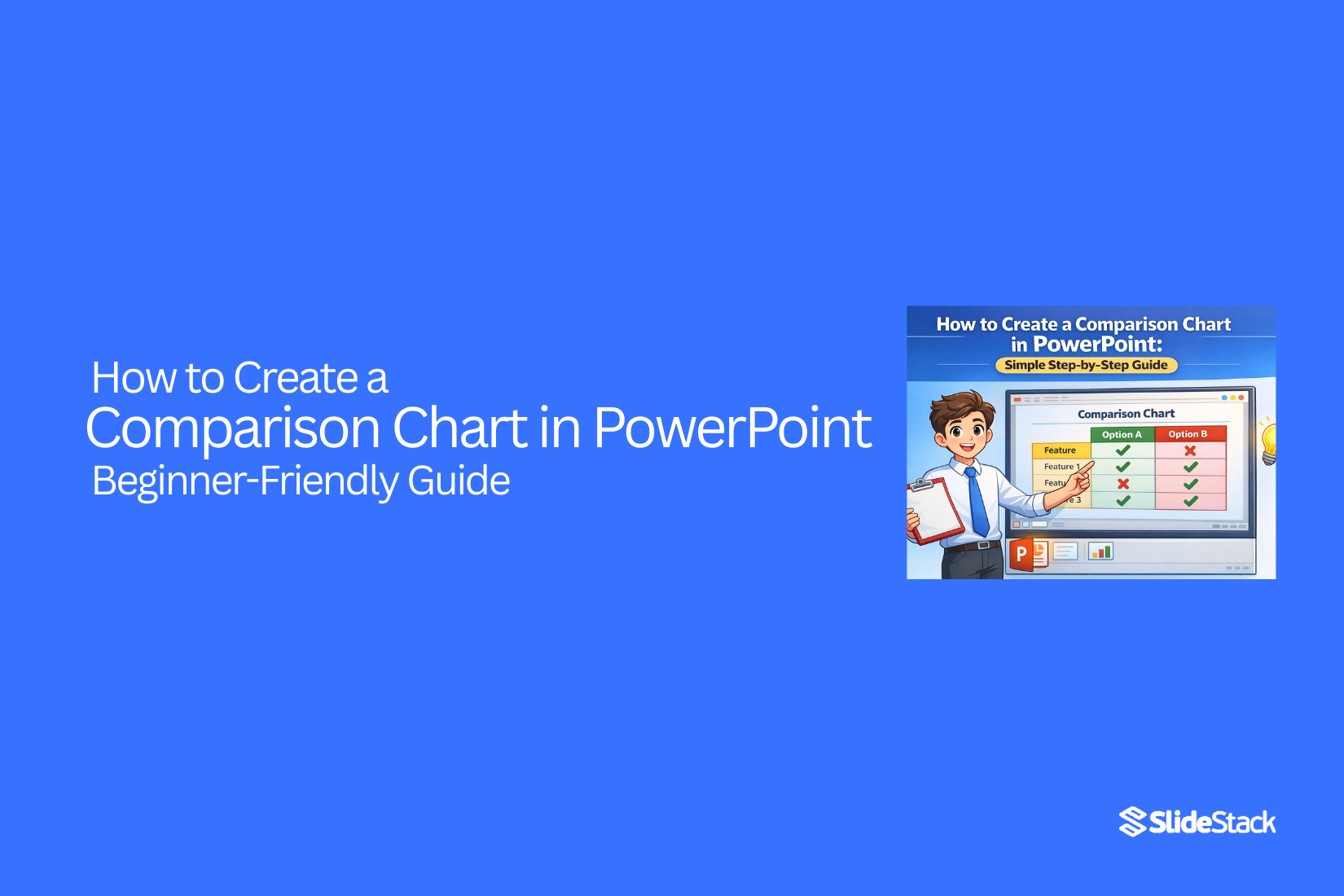
How to Create a Comparison Chart in PowerPoint – Beginner-Friendly Guide
Many people struggle to show comparisons clearly in PowerPoint. Slides often end up crowded, and audiences can miss key differences. This makes it hard to present ideas in a way that is easy to follow.
Creating a comparison chart solves this problem. It organizes information side by side, making differences clear at a glance. With simple steps, even beginners can build charts that look clean and professional.
By using these charts, your slides become easier to read and more persuasive. Readers can quickly understand important points, making presentations smoother and more effective.
What is a Comparison Chart?
A comparison chart is a tool used to display differences and similarities between items in a clear, organized format. These charts help viewers quickly understand complex information by presenting it visually. They are commonly used in research to analyze data, in business to evaluate products or performance, in education to compare concepts, and in decision-making to weigh options effectively. Visual formats, such as tables, bar charts, or line graphs, improve comprehension by highlighting patterns and relationships that may be difficult to identify in text alone. For example, a company might use a comparison chart to show actual sales versus projected sales across different regions, making it easier to identify areas that need attention or adjustment.
Types of Comparison Charts
Comparison charts come in different forms. A bar chart uses bars to show differences between items. Taller bars mean higher values. A column chart is similar but stands vertically. A line chart shows trends over time. Points are connected with lines to show changes. A table lists items side by side with numbers or features. It is easy to read and compare quickly. Each type helps show data in a clear way, depending on what you want to highlight.
Key Elements of a Good Comparison Chart
A good chart is easy to read. Labels should be clear so viewers know what each item means. Colors can help separate items, but should not be too bright or distracting. Numbers and scales must be accurate and consistent. The chart should show only the necessary data. Extra information can confuse the audience. A clear title at the top tells what the chart is about. Simple visuals help people see patterns and differences fast.
How to Create a Comparison Chart in PowerPoint
PowerPoint is more than slides with text and images. It can turn data into visuals that make your points easy to understand. Comparison charts are one of the simplest ways to show differences between items. This guide will walk you through creating one, step by step.
Step 1: Open PowerPoint and Prepare Your Slide
Start by opening PowerPoint. Choose a blank slide or a slide layout that has space for a chart. Make sure your slide is clear of clutter so the chart stands out. A clean slide helps viewers focus on the information.
Step 2: Insert a Chart
Go to the Insert tab at the top. Click Chart. You will see different chart types. For comparison, bar charts or column charts usually work best. Select the type you want and click OK. A chart will appear on your slide along with a small spreadsheet.
Step 3: Enter Your Data
The chart comes with example data. Replace it with your own. Type your labels in the first column and your numbers in the second. PowerPoint updates the chart automatically as you type. Keep the data simple to make the chart easy to read.
Step 4: Format the Chart
Once your data is in, you can adjust the look. Use the Chart Tools tab to change colors, fonts, or chart styles. Make sure colors are distinct for each item you are comparing. Avoid overcrowding the chart with too many items.
Step 5: Adjust for 2D Charts
For 2D charts, check the alignment and spacing of bars or columns. Ensure labels are readable and the chart isn’t stretched or compressed. This makes your comparison clear at a glance.
Step 6: Embed Existing Content
You can also copy data from Excel or another source. Highlight the data, copy it, and paste it into the chart’s spreadsheet. PowerPoint will adjust the chart automatically. This is useful if your numbers are already organized elsewhere.
Step 7: Final Review
Look over your slide. Check that labels, numbers, and colors are correct. Make sure the chart is easy to understand. Adjust anything that seems off. By keeping it simple, the comparison becomes clear and effective.
Creating a comparison chart in PowerPoint is straightforward. With these steps, anyone can turn numbers into a visual that is easy to follow. Once you practice, adding charts will feel quick and natural.
How to Create Comparison Tables in PowerPoint
Comparison tables help organize information clearly. Unlike charts, tables show details in rows and columns, making it easy to compare features, costs, or options side by side. They work well when numbers, text, or small visuals need clear alignment.
Step 1: Open PowerPoint and Choose a Slide
Start with a blank or content slide. A clean background keeps the table easy to read. Avoid cluttered slides, as too many elements can distract from the table.
Step 2: Insert a Table
Go to the Insert tab and select Table. Choose the number of rows and columns that fit your comparison. It’s better to start with a simple grid and expand if needed.
Step 3: Enter Your Data
Click inside each cell to type your information. Keep text short and clear. Avoid long sentences; use key points for easy scanning.
Step 4: Adjust Layout and Orientation
Decide whether to list items in rows or columns. Items across the top row work well for categories. Features down the side let readers scan quickly. Use consistent alignment to make the table tidy.
Step 5: Apply Styles and Formatting
Use PowerPoint’s Table Design tools to add shading, borders, and alternate row colors. Light shading behind rows or columns helps guide the reader’s eye. Stick to a simple color scheme for clarity.
Step 6: Add Visual Enhancements
Icons, small images, or check marks make comparisons more engaging. Place visuals in separate cells or next to text. Avoid overcrowding; each addition should clarify the table, not distract.
Step 7: Review for Clarity
Check that all text is readable and spacing is even. Make sure the table fits well on the slide and aligns with other slide elements. A well-structured table keeps your audience focused and understanding your points quickly.
How to Create a Comparison Slide in PowerPoint
Creating a comparison slide can make your ideas clear and easy to follow. A well-designed slide shows differences side by side. It helps your audience quickly understand key points.
Start with Ready-Made Templates
The easiest way is to use a ready-made template. Templates save time and keep your slide neat. You can find free templates online. Some let you download directly into PowerPoint. Once you open a template, you just replace the text and adjust colors.
Use Optional Tools for More Features
If you want more options, tools like iSpring Suite can help. These tools allow animations, interactive buttons, and extra visual effects. They can make your slide more engaging without needing design skills.
Create Your Own Comparison Slide
For more control, you can make a slide from scratch. Use shapes, tables, or icons to show your points. You can place pros on one side and cons on the other. This method gives full creative control. The trade-off is it takes more time to align and design elements neatly.
Keep It Professional with Templates
Templates are not just fast; they look polished. You don’t need to be a design expert to make a slide that looks clean and professional. Even simple edits, like swapping colors or icons, can make your slide ready to present.
Templates and tools give you choices. You can pick what fits your style and schedule. Either way, your comparison slide will be easy to read and visually balanced.
Tips for Making Your Chart Visually Appealing
Use clear colors to separate each item. Keep the background simple so the chart stands out. Label each section with short, readable text. Add icons or shapes if they help explain the points. Space the items evenly to avoid clutter. Make sure the font size is easy to read from a distance.
Common Mistakes to Avoid
Don’t overload the chart with too many items. Avoid using similar colors that confuse the reader. Keep text short and simple. Don’t add unnecessary decorations that distract from the data. Check that the chart matches the information correctly.
Examples of Effective Comparison Charts
A chart that lists features side by side with clear headers works well. Charts with simple bars or columns make differences easy to see. Adding small visuals, like check marks or symbols, can highlight key points. Using a clean layout with enough space helps the audience read quickly.
Final Summary:
Creating a comparison chart in PowerPoint helps make information easy to understand. Charts let viewers see differences and similarities at a glance. They turn numbers and details into visuals that are simple to follow.
Comparison charts come in many types, including bar charts, column charts, line charts, and tables. Each type shows data in a way that highlights what matters most. A good chart uses clear labels, simple colors, and only the needed information. This keeps the audience focused and avoids confusion.
PowerPoint makes creating charts straightforward. Start with a blank slide, insert a chart or table, and enter your data. Format colors and labels to keep everything readable. Templates and optional tools like iSpring Suite can save time and make slides look polished. You can also build charts from scratch for more control.
Keeping charts clear is key. Use simple layouts, readable fonts, and enough space between items. Avoid too many items, similar colors, or extra decorations. Small visuals like icons or symbols can help emphasize points without crowding the slide.
With practice, making comparison charts becomes quick and natural. Clear visuals make presentations easier to follow and help the audience understand key points fast. Well-designed charts and slides turn complex information into something simple, organized, and effective.
FAQs:
1: What is a comparison chart?
A comparison chart shows differences and similarities between items. It makes it easier to see patterns or results at a glance.
2: Which type of chart is best for comparisons?
Bar charts and column charts work well for simple comparisons. Tables are good when you need to list details side by side. Line charts show changes over time.
3: Can I use data from Excel in PowerPoint charts?
Yes. You can copy data from Excel and paste it into PowerPoint. The chart updates automatically with your data.
4: How do I make my chart easy to read?
Use clear labels, simple colors, and only the needed information. Space items evenly and avoid clutter. Small icons or symbols can help highlight points.
5: Are templates useful for creating comparison slides?
Yes. Templates save time and keep slides looking clean. You can edit colors, text, and icons without starting from scratch.
6: Can I make a chart from scratch?
Yes. You can create a slide using shapes, tables, or icons. This gives full control, but it may take more time to align everything neatly.
7: How many items should I include in a chart?
Keep it simple. Too many items make the chart hard to read. Only show what is necessary for the audience to understand.
8: Can I add visuals to comparison tables?
Yes. Icons, small images, or check marks make tables more engaging. Just avoid overcrowding the table.
9: Do I need special tools to create comparison charts?
No. PowerPoint alone is enough. Optional tools like iSpring Suite can add extra features, but they are not required.
10: Why are comparison charts useful in presentations?
They make information easy to understand, highlight key points, and help the audience see differences quickly.


You may also be interested in ...

How To Create An Eye-Catching Portfolio
If you’re looking to create an eye-catching portfolio, this post will come in handy. In this article, you can find the easies...
23 Jun, 2024

How To Easily Create An Infographic
Infographics are the perfect way to make a presentation that will impact an audience, but their design and composition might...
08 Jun, 2024

PowerPoint Template Tips & Tricks You Ne...
PowerPoint seems to be an unknown world for many people, especially those who have been assigned to create a presentation out...
08 Jun, 2024