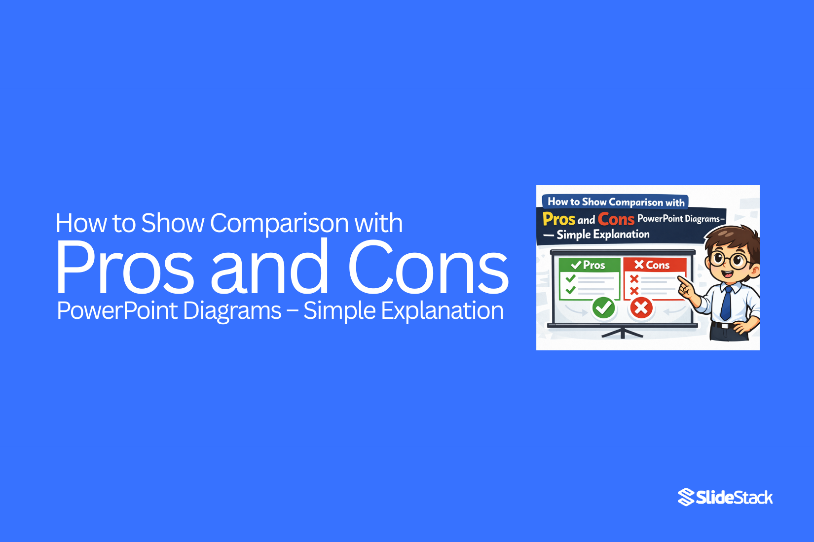
How to Show Comparison with Pros and Cons PowerPoint Diagrams – Simple Explanation
Creating clear comparisons in PowerPoint can take time. Slides often have too much text, making it hard for audiences to see key points.
Pros and cons diagrams show differences side by side in a simple way. They make information easy to read and decisions easier to follow.
Using this approach, your slides stay organized, your message is clear, and your audience can quickly understand the main points. This article will guide you through creating pros and cons diagrams in PowerPoint, step by step.
Why Use Pros and Cons Diagrams
Pros and cons diagrams help you see both sides of a topic clearly. They make it easier to compare options. By showing positives and negatives together, you can make better decisions. These diagrams also help your audience follow your ideas. They are useful in meetings, lessons, and presentations.
Understanding the Structure of a Pros and Cons Diagram
A pros and cons diagram usually has two main parts: pros and cons. Pros are the advantages or benefits of a choice. Cons are the disadvantages or risks. Each point is short and easy to read. You can use bullets, boxes, or lists to keep it organized. A clear structure makes the slide easier to understand quickly.
Step-by-Step Guide to Creating a Pros and Cons Slide in PowerPoint
Creating a pros and cons slide in PowerPoint is simple when you follow clear steps. Start with a clear topic and divide the slide into two sections: pros and cons. List the main points in short, easy-to-read phrases. Use colors or small icons to make the slide clear and organized. Check that the slide is balanced and easy to read.
Pick Your Topic: Start by choosing the idea, decision, or option you want to show. Be clear about what you are comparing. A clear topic helps your audience understand the points quickly.
Add a Slide: Open PowerPoint and add a new blank slide. Keep the layout simple so the focus stays on the pros and cons.
Draw Two Sections: Divide the slide into two sections. Label the left side “Pros” and the right side “Cons.” You can use a line, boxes, or shapes to separate them.
List the Pros: Under the “Pros” section, write the main advantages. Use short phrases or bullet points. Keep each point clear and easy to read. Avoid long sentences.
List the Cons: Under the “Cons” section, write the main disadvantages. Like the pros, use short, clear phrases. Keep the tone neutral.
Use Colors or Icons: Colors and icons can make the slide easier to read. For example, green for pros and red for cons. Small icons like checkmarks or crosses can highlight each point.
Check Balance: Try to have a similar number of points in both sections. A balanced slide looks neat and fair.
Keep It Readable: Use a font size that is easy to read from a distance. Avoid clutter or too much text. White space helps the slide feel clean.
Review and Edit: Go through each point. Make sure they are clear, relevant, and accurate. Remove extra words or repeated ideas.
Optional Enhancements: You can add subtle animations to show each point one by one. Keep it simple so it does not distract the audience.
Tips for Designing Effective Comparison Slides
Start by keeping your slides clear. Use short bullet points instead of long paragraphs. Make sure each point is easy to read at a glance.
Organize the information logically. Place similar items together so the audience can see differences quickly. Use simple visuals like icons, arrows, or colors to highlight contrasts.
Limit the number of points per slide. Too many items can overwhelm viewers. Aim for a balance between enough detail and clear readability.
Choose fonts and colors that are easy on the eyes. Avoid bright or clashing colors. Keep the style consistent across slides.
Common Mistakes to Avoid
Avoid cluttering slides with too much text. Large blocks of words make it hard to compare information.
Do not use confusing visuals. Complex charts or excessive graphics can distract from the main points.
Watch out for bias. Present pros and cons fairly without emphasizing one side too much.
Never ignore alignment and spacing. Uneven layouts make slides look unprofessional.
Final Thoughts
Pros and cons diagrams make comparisons easy to understand. They let your audience see both sides at a glance. Using these slides keeps your message clear and organized.
A well-made pros and cons slide helps your audience make sense of information quickly. Short points, clear sections, and simple visuals improve readability. Colors, icons, and balanced layouts guide the viewer without distraction.
Remember to keep your slides neat. Avoid clutter, bias, and confusing visuals. Focus on clarity, consistency, and fairness. When done right, pros and cons diagrams make your presentation stronger and your ideas easier to follow.
FAQs:
How many points should I list on a pros and cons slide?
Aim for 3 to 5 points per section. Too many points can make the slide crowded.
Should I show pros or cons first?
Either order works. Choose the order that fits your message.
Can I use colors or icons?
Yes. Use simple colors and small icons to highlight points. Keep it consistent.
Is it okay to have multiple pros and cons slides?
Yes. Use multiple slides if the topic has many points, but keep each slide clear and focused.
Can I add animations?
Yes. Show points one at a time to guide the audience. Avoid complex animations that distract.
How do I avoid bias in a pros and cons slide?
Present both sides equally. Use neutral language and balance the number of points in each section.
When should I use a pros and cons slide?
Use it for decisions, comparisons, lessons, or meetings. It helps your audience understand options quickly.


You may also be interested in ...

How To Create An Eye-Catching Portfolio
If you’re looking to create an eye-catching portfolio, this post will come in handy. In this article, you can find the easies...
23 Jun, 2024

How To Easily Create An Infographic
Infographics are the perfect way to make a presentation that will impact an audience, but their design and composition might...
08 Jun, 2024

PowerPoint Template Tips & Tricks You Ne...
PowerPoint seems to be an unknown world for many people, especially those who have been assigned to create a presentation out...
08 Jun, 2024