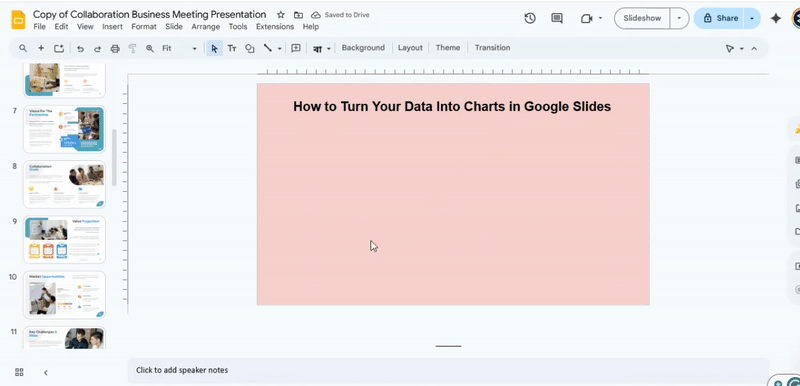
How to Make and Customize Charts in Google Slides
Numbers alone do not always tell the story, and slides filled with tables can be hard to follow. This can make presentations less clear and take longer to prepare.
With the right steps, you can turn your data into charts that are easy to read and understand. Charts help your audience see trends and patterns quickly, making your points stronger and your slides look more polished.
In this article, you will learn how to create charts in Google Slides, edit them, and use the charts included in our templates to save time and improve your presentation.
Why Use Charts in Google Slides
Charts help show data clearly. They turn numbers into pictures. This makes it easier for your audience to see trends and patterns. Instead of reading long tables, viewers can grasp information at a glance.
Charts also make presentations more engaging. A visual element keeps the audience focused and interested. They provide context and help explain complex ideas simply.
Using charts can save time. Instead of explaining every number, a chart tells the story quickly. It also adds a professional touch, showing that you organized your information carefully.
Overall, charts make data easier to understand, more interesting, and faster to share.
How to Create a Chart
Charts help show data clearly in a presentation. Google Slides can create charts directly or link them from Google Sheets. Linking allows changes in Sheets to update automatically in Slides.
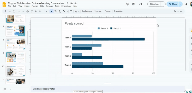
To add a chart, open your Google Slides presentation. Select the slide where you want the chart. Click Insert and then Chart. Pick a chart type: Bar, Column, Line, or Pie. The chart appears on the slide with sample data.
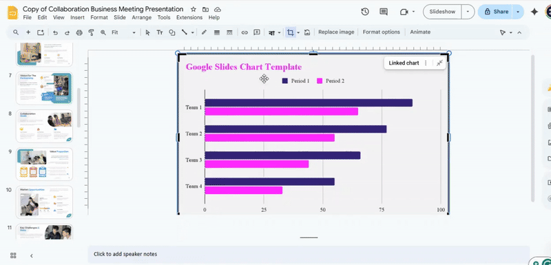
To edit the chart, click the chart and select Link to spreadsheet. This opens the chart in Google Sheets.
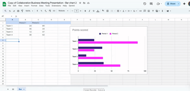
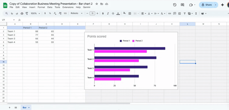
Change the data in Sheets, then return to Slides. Click Update to refresh the chart with new values.
Alternatively, you can copy a chart from Sheets. Go to the chart in Sheets, right-click, and select Copy chart. In Slides, right-click and choose Paste. You can choose to link it to the original spreadsheet or keep it as a static image.
This process allows quick adjustments to charts while keeping the presentation current and clear.
Editing a Chart
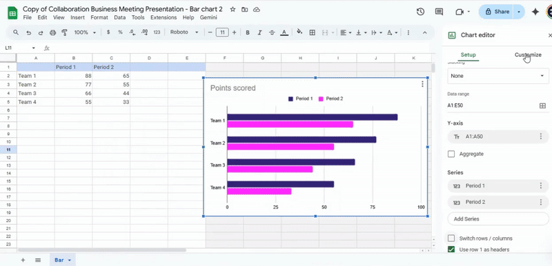
To edit a chart in Google Slides, first select the chart you want to change. Click on it to highlight it. Then, choose the option to open the chart in Google Sheets. This opens the chart in a separate window, where you can make changes to both the data and appearance. Google Sheets gives you full control over the chart’s content, including numbers, labels, and colors.
Start by updating the chart data. Click on the cells in the spreadsheet and type new values or adjust existing ones. Any changes here will automatically affect the chart. You can add new rows or columns if needed. This allows you to expand the chart or include additional information.
Next, focus on the visual elements. You can change the chart’s color scheme to match your slides. Click on the chart elements, such as bars, lines, or data points, and select the desired colors.
Adjust fonts for titles, labels, and legends. These simple changes make the chart easier to read and more consistent with your presentation style.
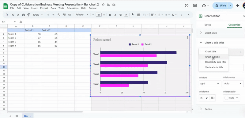
The Chart editor panel is your main tool for advanced customization. It has two main tabs: Setup and Customize. In the Setup tab, check the chart type. Switch between bar, line, or other chart types depending on the data you want to show. The Customize tab has several sections for more detailed editing. In Chart & axis titles, enter or modify the chart title, axis titles, and labels. This ensures the chart communicates the data clearly.
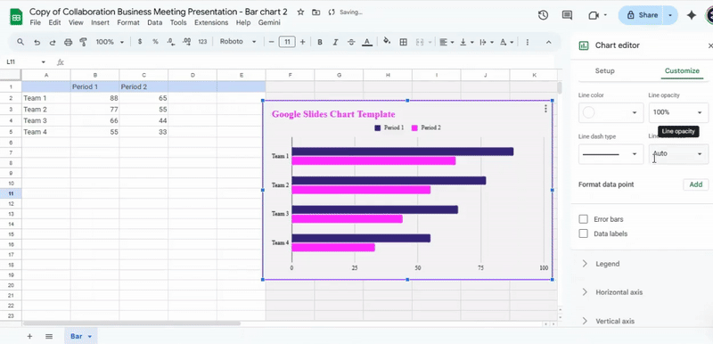
The Chart style section lets you adjust the chart background, font style, and borders. In the Legend section, set the legend position, font, and size. The Series section allows you to modify individual data series. You can change line thickness, bar width, or marker style. Use the Axes section to adjust the scale, minimum and maximum values, or gridline display. Finally, the Gridlines section allows you to add or remove horizontal or vertical lines for easier reading.
Once you finish editing, go back to Google Slides. If the chart was linked from Sheets, click the Update button to apply all changes. Alternatively, copy the chart from Sheets and paste it into Slides if you want a static version. Check that the chart appears correctly and matches your intended design. Repeat any adjustments as needed.
By following these steps, you can fully control the look and data of your charts. Editing in Sheets gives more flexibility than Slides alone, and using the Chart editor panel ensures each element is clear, accurate, and visually consistent.
Working with the Charts Included in Our Templates
Make a copy of the template in your Google Drive. Open the copied file to start editing.

Select the slide that contains the chart you want to use. Click on the chart to highlight it.
Link the chart to Google Sheets by selecting “Link to spreadsheet.” Open the spreadsheet and copy the data you need.
Edit the values directly in Google Sheets. After making changes, return to your Google Slides presentation.
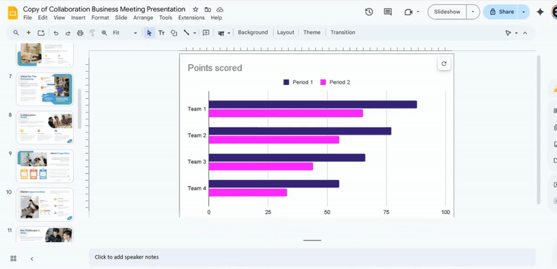
Paste the updated chart into your slide. Choose whether to link or unlink the chart to the spreadsheet.
Common Chart Customization Mistakes to Avoid
Charts can make data easy to understand, but small mistakes can confuse viewers. One common error is using too many colors. This can distract from the main point. Another mistake is choosing the wrong chart type. For example, using a pie chart for trends over time can mislead the audience.
Labels and legends are also important. Missing or unclear labels make it hard to read the data. Some people overload charts with too much information. Keep it simple. Focus on the key numbers.
Axis scales are another area to watch. Skipping steps or using inconsistent intervals can distort the data. Finally, avoid excessive effects like 3D shapes or shadows. They may look attractive, but they make charts harder to interpret.
Small changes in chart design can improve clarity and help viewers grasp the message quickly.
Advanced Chart Techniques
Charts help show data in a clear way. Using them well makes information easier to understand. You can do more than just basic bar or line charts. Try adding labels, colors, and shapes to highlight key points.
Look for patterns in your data. Use combination charts to compare different types of information. Small tweaks, like adjusting axes or adding data markers, can make charts easier to read.
Interactive features can also help. In some programs, you can let viewers hover over a chart to see exact numbers. This makes complex data more digestible
Conclusion:
Turning your data into charts makes your slides clearer and easier to follow. By creating charts directly in Google Slides or linking them from Google Sheets, you can quickly show trends and key points. Editing charts in Sheets gives you control over both the numbers and the visuals, while the Chart editor lets you adjust every detail to match your presentation. Using charts from templates can save time and ensure consistency. Following these steps helps you present data in a way your audience can understand at a glance.
FAQs:
What is the first step for creating a chart in Google Slides?
Open your presentation and go to the slide where you want the chart. Click on “Insert” in the top menu, then select “Chart” and choose the type of chart you want.
What is the final step for creating a chart in Google Slides?
Once the chart appears, adjust its data, colors, and labels as needed. Make sure it looks clear and fits well on the slide.
How to make a pie chart in Google Slides?
Go to “Insert” > “Chart” > “Pie.” The chart will appear with default data. Click on the linked Google Sheets icon to edit the numbers, and the chart will update automatically.
How to make a line graph in Google Slides?
Select “Insert” > “Chart” > “Line.” Use the Google Sheets link to enter your data. The line graph will reflect your numbers and update in real time.
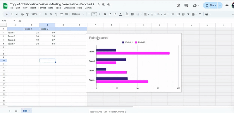
How to make a bar graph in Google Slides?
Click “Insert” > “Chart” > “Bar.” Edit the data through the linked Google Sheets sheet. You can change labels and colors to match your slide.
How to make a hierarchy chart in Google Slides?
Go to “Insert” > “Diagram” > “Hierarchy.” Pick a style and the number of levels. Fill in your text for each level to complete the chart.


You may also be interested in ...

How To Create An Eye-Catching Portfolio
If you’re looking to create an eye-catching portfolio, this post will come in handy. In this article, you can find the easies...
23 Jun, 2024

How To Easily Create An Infographic
Infographics are the perfect way to make a presentation that will impact an audience, but their design and composition might...
08 Jun, 2024

PowerPoint Template Tips & Tricks You Ne...
PowerPoint seems to be an unknown world for many people, especially those who have been assigned to create a presentation out...
08 Jun, 2024