How to Design a Stunning Radial Chart (Step-by-Step + Design Secrets

Radial charts can look incredibly clean and professional if done right. But most people end up creating charts that look cluttered, confusing, or just plain boring.
This guide goes beyond basic steps. You’ll learn not only how to create a radial chart in Google Slides, but how to design one that actually looks polished and presentation-ready.
What is a Radial Chart?
A radial chart is a circular data visualization that displays values around a central point. It’s often used to show progress, comparisons, or proportions in a visually engaging way.
Unlike standard charts, radial charts focus more on visual storytelling than raw data density.
When Should You Use a Radial Chart?
Use radial charts when you want to:
• Show progress (e.g., 75% completion)
• Highlight key metrics in a dashboard
• Present comparisons in a visually appealing way
• Simplify complex data into a single visual
Avoid using them when you need precise data comparisons—bar charts work better there.
How to Make a Radial Chart in Google Slides
A radial chart is a cool way to show two sets of proportions in one visually striking format. It looks like a mix between a pie chart and a donut chart. You can use it to compare parts of a whole in a clear, eye-catching way. Follow these steps to make your own radial chart in Google Slides.
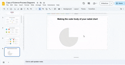
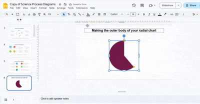
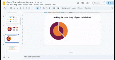
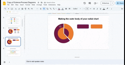
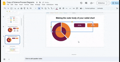
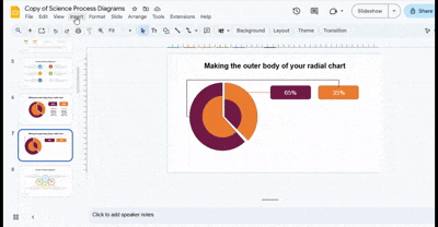
Making the Outer Body of Your Radial Chart
Start on the slide where the radial chart will sit. Open the Insert menu and choose Shapes. Pick the pie shape and place it on the slide with one click. This first shape acts as the base of the outer body. Keep it near the center so later steps stay clean.
Add a Pie Chart
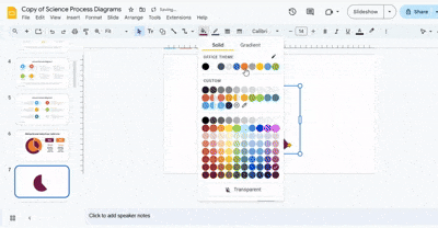
Start by selecting the slide where you want your radial chart. Go to the Insert tab, then choose Shape > Pie. Click on the slide to place the pie shape.
To adjust its appearance, select the shape and pick a Fill Color. For a clean, minimal look, set the border to Transparent.
Resize the Pie Chart
Click the pie shape to select it. Handles will appear around the edges. Drag any corner handle to change the size while keeping the shape circular. Adjust it until the pie forms a suitable outer frame.
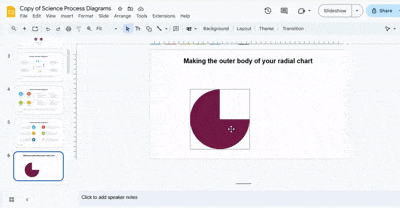
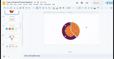
Duplicate the Pie Chart
Once the first pie is resized, copy it and paste it onto the same slide. Position the new shape directly over the original. Use alignment guides to make sure both shapes are centered.
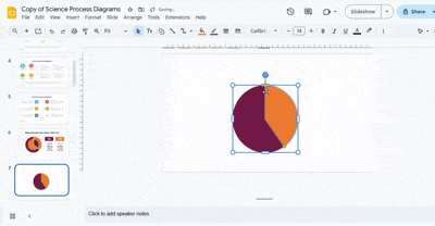
Change the Color and Position of the Duplicate Chart
Select the duplicate pie and change its fill color to make it distinct from the base shape. Then, click and rotate the duplicate slightly so it lines up well with the outer layer.
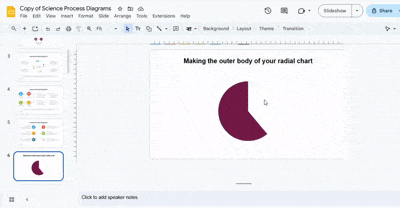
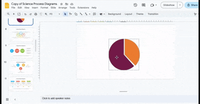
Resize the Duplicate Chart
Move the duplicate slightly away from the original. Drag the corner handles to adjust its size, creating some spacing between layers. Keep the radial lines parallel and ensure both charts share the same center.
Creating and styling the inner body
Creating the First Inner Circle
- Duplicate the first pie chart by selecting it and pressing Ctrl + D (or Cmd + D on Mac) so you have an exact copy to work with.
- Change the color of the duplicated circle by going to Format → Fill Color and selecting a color that complements your chart design.
- Resize the circle by dragging the corner handles while holding Shift to maintain the proportions, making sure it fits neatly over the original chart.
- Move the circle carefully into place so it is perfectly centered on the original chart, checking that it looks visually balanced.
Creating the Second Inner Circle
- Duplicate the second pie chart using Ctrl + D or Cmd + D to create a new circle for layering.
- Adjust the fill color of the duplicated circle to match your design theme and make it visually distinct from the first inner circle.
- Resize the circle smaller than the first inner circle so it sits neatly inside, maintaining a clear, layered effect.
- Position the second circle over the first inner circle and align it carefully to ensure it looks clean and well-proportioned.
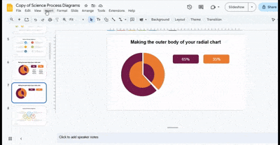
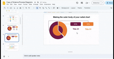
Inserting Data Labels
- Insert a rounded rectangle shape by going to Insert → Shapes → Rounded Rectangle and draw it close to your chart.
- Apply a fill color to the rectangle that stands out against the chart background and adjust the border for a clean look.
- Click inside the rectangle and type the label text that corresponds to the data point you are highlighting.
- Copy the label using Ctrl + C and paste (Ctrl + V) as many times as needed for all data points, placing them neatly around the chart.
- Adjust the position of each label so it is easy to read and does not overlap other elements.
Connecting Labels to the Radial Chart
- Use the Line or Elbow Connector tool from Insert → Shapes to draw lines from each label to its corresponding section of the chart.
- Adjust each line carefully so it is straight and clear, connecting the label precisely to the right data point.
- Make sure all lines are tidy and visually balanced to avoid cluttering the chart.
Styling the Lines

- Select each connecting line and change its color using Format → Line Color to match your brand or chart theme.
- Adjust the thickness using Line Weight so the lines are visible but do not overpower other elements of the chart.
- Review all lines and labels to ensure the overall chart is polished, consistent, and visually appealing.
Adding Text
Insert titles
Go to the Insert tab. Next, click the Text Box option. Draw a text box under each label and start typing. When you select the text box, you will see more options to align the text on the top right bar.
Include descriptive text
Go to the Insert tab, click the Text Box option, and drag a text box below each title. Then, start typing. Apply styling and confirm everything looks correct. You can add information to the inner sections to give your explanation more context. Display details such as category names, numbers, campaign titles, your target audience, and more.
Design Secrets That Make Your Chart Look Professional
Here’s where most tutorials fail—and where you win.
Use Color Hierarchy
• Highlight the main data with a bold color
• Use muted tones for secondary elements
• Stick to 2–3 colors max
Maintain Consistent Spacing
Uneven spacing destroys visual quality. Keep gaps uniform between segments.
Focus on One Key Metric
Don’t overload your chart. One clear message is more powerful than five weak ones.
Before vs After: What a Good Chart Looks Like
Bad Chart:
• Too many colors
• Misaligned segments
• Hard-to-read labels
Good Chart:
• Clean color palette
• Perfect alignment
• Clear focal point
Common Mistakes to Avoid
Misalignment Issues: Even slight misalignment makes your chart look unprofessional.
Too Many Colors: More colors = more confusion. Simplicity wins.
Poor Label Placement: Labels should never overlap or feel cramped.
Overcomplicating the Design: If it takes effort to understand, it’s already failing.
Advanced Tips
Use Layering for Depth: Stack shapes with slight size differences to create a modern layered effect.
Add Subtle Shadows: Shadows can add depth—but keep them minimal.
Combine with Icons: Icons can help explain data faster than text alone.
Use Transparency Strategically: Transparency helps create focus and hierarchy.
Real Use Cases
• Marketing performance dashboards
• Sales progress tracking
• Project completion visuals
• Presentation highlights
Limitations of Radial Charts in Google Slides
• No built-in radial chart tool
• Manual design required
• Limited data automation
Create Stunning Radial Charts with SlideStack
Make your data clear and visually appealing using SlideStack. Our free Google Slides radial chart templates let you build professional charts in minutes. Change colors, text, and shapes easily to match your style. Save time and make every slide look polished with SlideStack.
FAQs:
What is a radial chart?
A radial chart is a circular graph that shows data as parts of a whole. Each section represents a portion, and all sections together make 100%. It helps viewers see proportions quickly.
What types of radial charts can I use in Google Slides?
You can use donut charts, sunburst charts, and radial bar charts. Donut charts highlight percentages. Sunburst charts show layers of data. Radial bar charts use bars extending from the center to show values.
How do I start creating a radial chart?
First, insert a pie chart using Insert → Chart → Pie chart. Resize it, then duplicate it to create layered effects. Adjust colors and positions to make the chart visually clear.
How do I add inner circles to a radial chart?
Duplicate your outer chart to make the first inner circle. Resize and recolor it to fit inside the original. Repeat for a second inner circle if needed, keeping alignment balanced.
How can I label my radial chart?
Use rounded rectangle shapes for labels. Type the data text inside each label and place them around the chart. Connect labels to chart sections using lines or elbow connectors.
Can I customize the chart colors and text?
Yes. You can change colors, adjust line thickness, and edit all text boxes. This helps match your chart to your presentation style or brand.
Are there ready-made radial chart templates available?
Yes. SlideStack offers free, fully editable radial chart templates. You can change colors, text, and shapes to save time and create polished slides quickly.
Why should I use a radial chart instead of a standard chart?
Radial charts make complex data easier to read. They show proportions and comparisons clearly, making your presentation look professional and engaging.


You may also be interested in ...

How To Create An Eye-Catching Portfolio
If you’re looking to create an eye-catching portfolio, this post will come in handy. In this article, you can find the easies...
23 Jun, 2024

How To Easily Create An Infographic
Infographics are the perfect way to make a presentation that will impact an audience, but their design and composition might...
08 Jun, 2024

PowerPoint Template Tips & Tricks You Ne...
PowerPoint seems to be an unknown world for many people, especially those who have been assigned to create a presentation out...
08 Jun, 2024