How to Easily Create Radar Charts in PowerPoint
Radar charts often get overlooked in PowerPoint, even though they are great for showing patterns and comparisons in data. They let you display multiple data points clearly, which other charts might not handle well.
At first, I found them tricky to make. The menus felt confusing, and setting up the data took longer than expected. After some practice, I discovered a simple way to create radar charts without the hassle.
In this guide, I’ll walk you through everything, from building a basic radar chart to creating professional-looking versions. You’ll also learn how to customize, format, and even use Excel to speed up the process. Let’s dive in and make your data easy to read.
What Is a Radar Chart?
A radar chart is a type of data visualization used to display multivariate data in a two-dimensional chart. It is also called a spider chart or web chart. Each variable is represented on its own axis, which starts from the same point at the center.
The chart forms a shape by connecting data points across the axes. Each point’s distance from the center reflects its value. This makes it easy to compare multiple variables at once.
Radar charts are useful for showing strengths and weaknesses. For example, a company might use a radar chart to compare product features such as price, quality, durability, and popularity. Sports analysts might use it to compare athletes’ performance across speed, strength, and accuracy.
By visually linking the data points, radar charts make patterns and outliers easy to spot. They are most effective when comparing multiple items with the same variables.
When to Use a Radar Chart
Radar charts show how different items compare across multiple categories. They work best when you want to display strengths and weaknesses clearly. You can use them to compare teams, products, or skills.
These charts are helpful when you need to spot patterns quickly. For example, a team’s performance in several areas can be shown at once. You can see which areas are strong and which need improvement.
Radar charts also make it easy to compare more than one item. By plotting multiple items on the same chart, differences become clear. This helps in presentations or reports where comparisons matter.
How to Make a Basic Radar Chart in PowerPoint
A radar chart shows multiple variables on axes that start from the same point. It helps you compare data side by side. You can use it for work or personal projects. PowerPoint makes it simple to create one using its built-in radar chart feature. Follow these steps to make a basic radar chart.
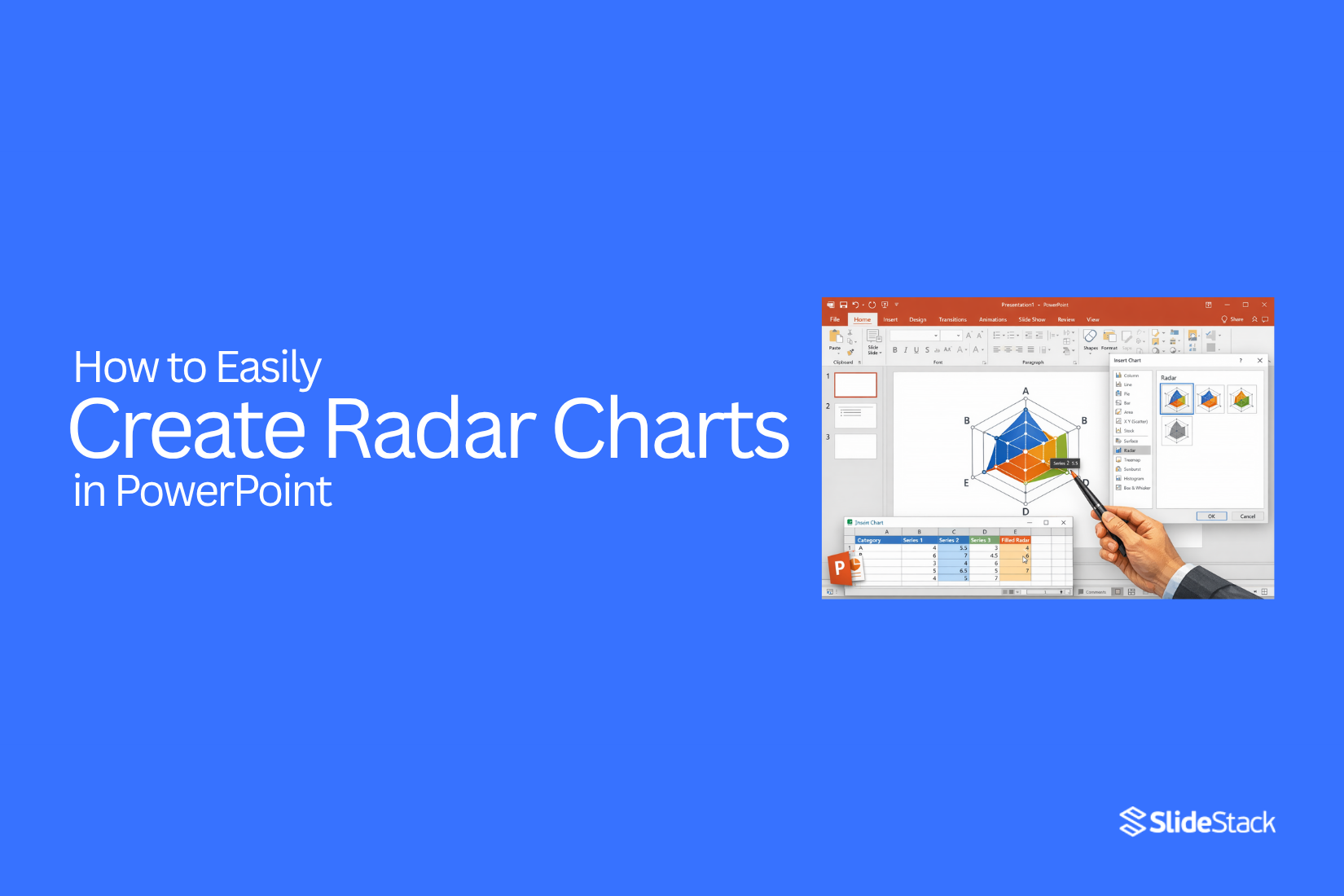
Step 1: Insert Radar Chart
Open PowerPoint and create a new slide. Go to the Insert tab in the ribbon and click Chart.
From the Insert Chart dialog box, select Radar. You’ll see three types: Radar, Radar with Markers, and Filled Radar. Pick the basic Radar and click OK to add it to your slide.
Tip: You can resize the chart by dragging the corners. Make it large enough so all points are visible
Step 2: Enter Your Data
After inserting the chart, a spreadsheet window will open. This is where you enter your data. PowerPoint shows sample numbers that you can replace.
- List the categories in the first column. For example, Communication, Teamwork, Creativity, and Technical Skills.
- Enter the values for each category in the second column. You can use any scale that fits your data.
- Close the spreadsheet when done.
Visual hint: The chart updates instantly as you type. This helps you see the pattern clearly.
Step 3: Start Customizing
Click the chart to select it. You can drag it to the center or any spot on the slide. Resize it using the corners.
The Chart Tools appear in the ribbon, with Design and Format tabs.
- In Design, click Chart Styles to pick a style that matches your presentation theme.
- In Format, click Shape Fill to change the colors of the radar areas. Adjust outlines and effects if needed.
Example: Use a bold color for the main series and softer colors for other lines. This helps viewers focus on key data.
Step 4: Add Data Labels and Personalize
Data labels show what each point represents.
- Click the chart.
- Click the Chart Elements button (the + sign).
- Check Data Labels to display values next to each axis.
You can change the font size, color, and style from the Home tab. Use contrasting colors for labels and chart areas to make them easy to read.
Tip: Right-click any chart element to see more customization options.
Step 5: Final Polishing
Check the chart before finishing.
- Make sure colors are clear and readable.
- Align the chart with other elements on the slide.
- Add a descriptive title if needed.
Once everything looks good, save your presentation. Your radar chart is ready to show patterns and comparisons clearly.
How to Create a Professional Radar Chart in Microsoft PowerPoint
Radar charts let you compare multiple variables on one visual. They are useful for showing strengths, weaknesses, or patterns across categories. Follow these steps to build a professional, presentation-ready radar chart in PowerPoint.
Step 1: Insert a Radar Chart
Go to the Insert tab. Click Chart and select Radar. PowerPoint will place a default chart on your slide. This is the base for your customization.
Step 2: Enter Your Data
Open the spreadsheet that appears with the chart. Replace the placeholder data with your own values. Ensure each category and series is clearly labeled. Accurate data makes the chart meaningful and readable.
Step 3: Resize and Position the Chart
Click the chart and drag its corners to adjust the size. Move it on the slide so it is centered and balanced with other content. Proper placement improves the visual flow.
Step 4: Customize the Chart Design
Use the Chart Design tab to choose a style that suits your presentation. Pick colors that match your branding. Avoid excessive colors that distract from the data.
Step 5: Reformat Chart Elements
Click individual elements like gridlines, spokes, or the radar fill. Adjust line thickness, color, and transparency to make the chart cleaner. Subtle refinements enhance readability.
Step 6: Modify the Axis Options
Right-click the axis and select Format Axis. Adjust the minimum and maximum values for better scale representation. Fine-tuning axes ensures data differences are visible.
Step 7: Add Data Labels
Select the series and choose Add Data Labels. Labels help viewers identify values without guessing. Place them clearly so they don’t overlap with chart lines.
Step 8: Insert a Chart Title
Click the chart title area and type a descriptive heading. A clear title helps viewers understand the chart at a glance.
Step 9: Incorporate Visuals
Add icons, shapes, or images if relevant. Visual elements support comprehension, but keep them subtle. Avoid cluttering the chart.
Step 10: Change the Font Style and Size
Select text elements and pick fonts that match the presentation. Adjust sizes for headings, labels, and legends. Consistent typography gives a professional appearance.
Step 11: Edit the Legend
Move or resize the legend to a non-distracting location. Rename series if needed for clarity. A well-placed legend helps viewers interpret the data quickly.
Step 12: Customize Slide Background
Adjust the slide background to complement the chart. Light or neutral backgrounds keep focus on the radar chart. Avoid patterns that reduce readability.
Step 13: Review and Tweak the Layout
Step back and assess the chart in the slide context. Ensure spacing, alignment, and colors work together. Make small adjustments to balance visual appeal and clarity.
Step 14: Save as a Template
Once satisfied, save the chart as a template. Reusing the layout speeds up future presentations and maintains consistency.
How to Customize a Radar Chart
Radar charts show data in a way that makes patterns easy to see. You can make them clearer by adjusting colors, lines, labels, and gridlines. Small changes can help your chart tell the story better.
Change Colors and Styles
You can change the color of each data line or area. Pick colors that stand out from each other. You can also adjust line thickness or fill patterns. This makes your chart easier to read.
Modify Axis and Gridlines
The axis shows the range of values. You can set the minimum and maximum numbers to focus on key points. Gridlines can be light or bold. Adjust them so they support the data without distracting from it.
Edit Labels and Legends
Labels show what each point means. Make them clear and easy to read. Legends explain the colors or lines in the chart. A clear legend helps viewers understand your chart without extra explanation.
Best Practices for Radar Charts
Radar charts show multiple variables in a single view. They help compare different items or track changes over time. Use them only when you have a few categories. Too many points make the chart hard to read.
Keep the scales consistent. This makes comparisons accurate. Label each axis clearly so viewers understand what each line means. Colors can help separate data sets, but avoid too many shades.
Highlight the most important data. Focus on trends or differences instead of every single point. Simple, clean charts are easier to read and more effective.
How to Edit a Radar Chart in PowerPoint
Radar charts are useful when you want to compare multiple variables at once. You might need to edit a radar chart to update data, adjust labels, or change its appearance to make your points clearer. Here’s how to do it correctly.
Steps to Edit a Radar Chart
- Select the chart: Click on the radar chart you want to edit. A border appears around it, showing it’s selected.
- Open the Chart Data: Right-click the chart and choose Edit Data. A small spreadsheet pops up. This is where your chart gets its numbers.
- Update your values: Change the numbers in the spreadsheet to reflect your new data. The chart updates automatically as you type.
- Adjust labels if needed: Click on any axis label to rename it. This keeps your chart clear and easy to read.
- Change the style or colors: Use the Chart Design or Format tabs. You can pick new colors, line styles, or marker shapes to highlight differences.
- Resize the chart: Drag the edges or corners to fit your slide without stretching the data.
Pro Tip: Check your numbers carefully after editing. A small mistake in the spreadsheet can make the chart misleading. Always compare the chart with your source data before presenting.
Formatting Your Radar Chart for Clarity
With radar charts, small formatting changes can make your data much easier to read. Here are practical tips to format your radar charts effectively.
- Add a Radar Chart Title: Give your chart a clear title, such as “Radar Chart – Skill Assessments” or “Radar Chart – Product Feature Comparison.”
- Change the Chart Colors: Use distinct colors for each series. Select the chart, go to the Format tab, and adjust fill, outline, and other color settings.
- Add Markers for Emphasis: To make data points stand out, use Radar with Markers or manually turn on markers under Chart Design → Change Chart Type.
- Adjust Axis Labels: Pick a readable font size and make sure category names do not overlap.
- Use Filled Radar for Impact: Filled radar charts highlight differences clearly when comparing multiple data sets. For faster results, use pre-designed templates like the Radar Chart Template for PowerPoint. These templates save time and provide clean, ready-to-use designs.
Common Mistakes to Avoid
One common mistake is adding too many animations. Too many moving elements can distract your audience and make slides look messy. Keep it simple and only use animations that add value.
Another mistake is using inconsistent timing. If some animations are too fast and others too slow, your slides will feel off. Make sure the pace flows naturally and feels even.
A third mistake is forgetting to check your slides after removing animations. Some text or images may shift or overlap. Always review your slides carefully to make sure everything looks right.
Finally, avoid relying on animations to explain your points. Slides should be clear on their own. Use animations only to support your message, not carry it.
Best Practices for Making a Perfect Radar Chart Diagram
When you make diagrams in PowerPoint, focus on clarity and effective communication. Here are some key tips to improve your radar charts:
Simplify Complexity: Keep your data clear. Remove any unnecessary elements and leave enough white space around the chart to avoid clutter.
Use Consistent Color Schemes: Stick to a palette of three main colors. Assign one color to each category and use lighter or darker shades for variety. This makes comparisons easier.
Align Text and Visuals: Make sure labels, titles, and legends are properly lined up. It avoids confusion and gives your chart a clean look.
Keep Fonts Simple: Choose easy-to-read fonts like Arial or Calibri. Use the same font size for titles and labels to stay consistent.
Prioritize Clarity Over Decoration: Skip flashy effects like 3D designs. Focus on a simple style that highlights the data.
Highlight Key Data: Make important information stand out with bolder colors or slightly larger fonts. Be selective so the chart remains clear.
Test for Accessibility: Ensure your chart is readable for everyone. Use color-blind-friendly palettes and clear fonts. PowerPoint’s accessibility checker can help.
These are just a few tips; keep practicing, and soon you'll create radar charts and diagrams that are clear, professional, and easy to understand.
Using Excel to Create Radar Charts for PowerPoint
Radar charts are a great way to show strengths and weaknesses across different categories. Start by opening Excel and entering your data in a simple table. Put the categories in the first column and the values in the next column.
Next, select your data and go to the “Insert” tab. Choose the radar chart icon and pick the style you like. Excel will generate the chart automatically. You can adjust colors, add labels, and change the line style to make it clearer.
Once your chart looks right, copy it from Excel. Open your PowerPoint slide and paste the chart. You can resize it, move it, and even apply PowerPoint’s design themes. Now your slide has a clear radar chart that makes the data easy to understand at a glance.
Final Thoughts:
Radar charts are simple to use and easy to read. They help you compare multiple variables at a glance. You can spot trends, strengths, and weaknesses quickly. These charts work well for business reports, school projects, and personal tracking. For more tips on creating clear and effective charts, check out our full guide on data visualization.
FAQs:
1. What is a radar chart?
A radar chart is a chart that shows multiple variables on separate axes. Each axis starts from the center, and the data points connect to form a shape. It helps compare strengths, weaknesses, or patterns.
2. What is PowerPoint radar?
PowerPoint radar is the radar chart feature in Microsoft PowerPoint. It lets you create a radar chart directly on a slide to display data clearly.
3. How do I read a radar chart?
Look at each axis to see the values for each category. The shape shows patterns, strengths, and weaknesses. Points further from the center mean higher values, and closer points mean lower values.
4. What are radar charts best used for?
Radar charts are best for comparing multiple items across several categories. They help show differences, trends, and areas that need improvement.
5. What are the disadvantages of a radar chart?
Radar charts can get hard to read if there are too many categories or data series. They may also make small differences look bigger or smaller than they really are.
6. What are the features of a radar chart?
A radar chart has axes for each category, a central starting point, data points connected by lines, and optional markers or filled areas. Labels and legends help explain the chart.
7. When should I use a radar chart?
Use radar charts to compare multiple items across several categories. They are helpful when you want to show differences or spot trends clearly.
8. How do I insert a radar chart in PowerPoint?
Go to the Insert tab, click Chart, and choose Radar. Pick the style you want and click OK. The chart will appear on your slide.
9. How do I add my data to a radar chart?
After inserting the chart, a spreadsheet opens. Replace the sample numbers with your own values. Each row is a category, and each column is a data series.
10. Can I customize the colors and design?
Yes. Click the chart, then use the Chart Design and Format tabs. You can change line colors, fill areas, fonts, and markers to make the chart easier to read.
11. How do I add data labels?
Click the chart, then click the Chart Elements button (+). Check Data Labels. You can move them and change the font size or color to make them clear.
12. How can I make a radar chart more professional?
Resize the chart, choose a simple color scheme, adjust axis scales, add a clear title, and keep labels readable. Avoid too many colors or effects that distract from the data.
13. Can I edit an existing radar chart?
Yes. Select the chart and right-click to choose Edit Data. You can update numbers, rename axes, change colors, or resize the chart.
14. Should I use radar charts for many categories?
No. Too many categories make the chart hard to read. Stick to a few categories for clear comparisons.
15. Can I create radar charts in Excel and use them in PowerPoint?
Yes. Enter your data in Excel, insert a radar chart, customize it, then copy and paste it into PowerPoint. You can resize and adjust it on your slide.
16. What are common mistakes to avoid?
Avoid using too many animations, inconsistent colors, or unclear labels. Check the chart after edits to make sure data matches the source.
17. How can I make my radar chart easy to read?
Keep the chart simple, use clear colors, label axes clearly, highlight key data, and avoid clutter. Simple charts help viewers understand the data quickly.


You may also be interested in ...

How To Create An Eye-Catching Portfolio
If you’re looking to create an eye-catching portfolio, this post will come in handy. In this article, you can find the easies...
23 Jun, 2024

How To Easily Create An Infographic
Infographics are the perfect way to make a presentation that will impact an audience, but their design and composition might...
08 Jun, 2024

PowerPoint Template Tips & Tricks You Ne...
PowerPoint seems to be an unknown world for many people, especially those who have been assigned to create a presentation out...
08 Jun, 2024