How to Create an Organizational Chart in Google Slides Step by Step

An organizational chart shows the structure of a company using simple visuals. It helps people see roles, reporting lines, and how teams connect. It is useful in business plans, company presentations, and pitch decks where a clear structure matters.
Creating an org chart in Google Slides can be done in two ways. One way is to use a built-in diagram template and adjust it to match your structure. The other way is to build the chart from scratch for more control over layout and design. Both methods are simple once you follow the right steps. This guide explains how to do each method in Google Slides in a clear and practical way.
What Is An Org Chart?
An org chart is a diagram that shows how an organization is structured. It uses simple shapes like rectangles to represent people or roles. It also shows how authority flows within the organization. Each box in the chart connects to others through lines. These lines show reporting relationships and levels of responsibility.
An org chart clearly presents the chain of command. It helps explain who reports to whom. It also outlines each person’s role in the organization. Businesses, schools, and government groups all use org charts to show structure in a simple way.
Org charts can be used in different ways. Some teams use them as a staff directory. Others use them for planning or management. They are also helpful during onboarding. New employees can quickly understand how the organization works. They can see where they fit in the structure and who they report to.
Suppose a company hires new team members. The manager needs to explain roles and reporting lines. An org chart makes this process clear and simple. It helps new staff understand the team without confusion.
An org chart supports better organization and communication. It gives teams a clear view of structure and roles. It also helps leaders manage people and plan work more effectively.
Where To Use Org Charts?
Org charts show how roles and people are arranged in a group. They make the structure clear and easy to follow. Different settings use them to show responsibility and connection.
Business structure: Companies use org charts to show departments and reporting lines. They make roles easy to understand across teams like sales, finance, and operations.
Project teams: Project groups use org charts to show who works on each task. Each role is clear, from team leads to support staff.
Human resources onboarding: New staff see org charts to learn who they report to. It helps them understand who handles each area of work.
Communication planning: Teams use org charts to show how messages move across a group. This helps reduce confusion in daily work.
Events and campaigns: Organizers use org charts to assign duties. Each person can see their role in planning, setup, and delivery.
Schools and training groups: Schools and training centers use org charts to show staff roles. Students and staff can see how the system is arranged.
Nonprofit groups: Nonprofits use org charts to show volunteers, leaders, and staff roles. It keeps duties clear across small and large teams.
Which Org Chart Template In Google Slides Fits Your Needs?
An org chart in Google Slides shows how a group is structured. It shows roles and reporting lines. Different templates serve different needs. The right choice depends on team size and structure.
Below is a clear comparison of common org chart styles.
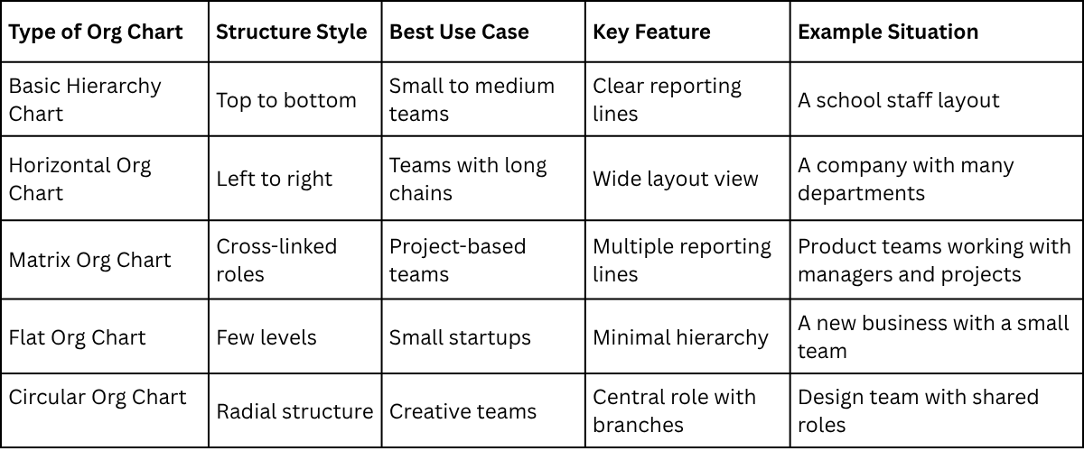
Each type gives a different way to show structure. A simple team often fits a basic or flat layout. A larger company often needs a hierarchy or horizontal layout. A matrix setup works better for teams that share responsibilities across projects. A clear org chart helps viewers see roles without confusion.
Key Elements of an Effective Organizational Chart
An organizational chart shows how a company is structured. It makes roles and reporting lines easy to see. Clear role labels are the first key element. Each box should show a job title and a name if needed. This helps people know who does what.
A clear structure is also important. The chart should show who reports to whom. Lines must stay simple so the flow is easy to follow. Consistency in shapes and layout matters too. Using the same style for all boxes keeps the chart easy to read. Mixed styles can confuse the viewer.
Good spacing improves clarity. Each level should have enough room so names and roles do not overlap. A clean design supports quick understanding. A cluttered chart makes it harder to follow relationships.
Preparing Your Information Before You Start
Start with a list of all roles in the organization. Include current job titles and the people in those roles. Next, sort the roles by level. Place top leadership first, then management, then team members.
Check reporting lines for each role. Each person should have a clear manager listed where possible. Collect the correct spelling of names and titles. Small errors can reduce clarity and trust in the chart. Group similar roles together. This helps in placing them later in a logical order. A simple plan on paper or a note app can help organize everything before building the chart.
Using an organizational chart template
1. Open Google Slides on your computer or device and either start a new blank presentation or select an existing one where you want to insert your organizational chart. Make sure you have the slide ready for editing before proceeding.
2. Click on the slide where you want the organizational chart to appear. This will ensure that the chart is added to the correct location in your presentation and does not overlap with other elements on different slides.
3. Navigate to the top menu bar and select Insert, then choose Diagram from the dropdown list. The diagram panel will appear on the right side of your screen, providing different types of diagrams you can use.
4. In the diagram panel, select Hierarchy to access organizational chart layouts. This category is specifically designed for structures that show relationships between positions or roles in a clear, top-down manner.
5. Browse the layout options within the Hierarchy category and choose one that best suits your organization’s structure. The available layouts may vary in style, number of branches, and visual arrangement of the boxes.
6. Adjust the number of levels in your chart using the controls at the top of the diagram panel. This lets you add more layers for subordinates or remove unnecessary layers for simplicity, depending on your organization’s size.
7. Click on each shape in the diagram to enter the text for names, positions, or titles. Make sure each box accurately reflects the person or role it represents so that the chart correctly represents your organizational structure.
8. Use the formatting options in the toolbar to customize the appearance of the chart. You can change font styles, text sizes, box colors, and shapes to match your presentation’s design and improve readability.
9. Move or resize boxes by clicking and dragging them as needed. This helps ensure that the chart fits well on the slide and maintains a clean, organized look without overlapping elements.
10. Review the chart carefully to make sure all connections between roles are displayed correctly. Verify that reporting lines are clear and that the structure reflects the organization accurately.
Pro tip: You can duplicate boxes or levels by selecting a shape and pressing Ctrl + D (Windows) or Cmd + D (Mac). This is useful if multiple roles share the same structure or you want to quickly expand your chart without manually adding each new box.
Creating an Organizational Chart from Scratch
An organizational chart helps you show the structure of a team or company. Google Slides makes it simple to build one from scratch. Follow these steps carefully, and you will create a clean, professional chart.
Step 1: Define Your Chart Structure
Start by planning the layout. Decide how many levels your chart needs. Typically, you have a top level for leadership, a middle level for managers, and a bottom level for team members. Draw a rough sketch on paper or in a simple drawing app. This will guide your slide creation.
Pro tip: Keep the structure simple. Too many layers can make the chart hard to read.
Step 2: Create Shapes for Each Layer
Open Google Slides and select a blank slide. Go to the menu and click Insert → Shape → Shapes. Choose a rectangle or a rounded rectangle for each position. Click and drag on the slide to place the shape. Repeat for all positions in the top layer.
Use the Shift key while dragging to keep shapes perfectly proportional.
Step 3: Style Your Shapes
Once shapes are in place, style them for clarity. Click on a shape, then go to the toolbar. Use Fill color to assign a color to each layer. Use Border color for outlines. Keep colors consistent across similar roles to make the chart visually clear.
Pro tip: Use subtle shades to avoid overwhelming viewers. Too many bright colors can distract from the information.
Step 4: Add Connectors Between Shapes
Connectors show reporting lines. Click Insert → Line → Elbow Connector or Straight Connector. Click one shape’s edge, drag to the edge of the next shape, and release. The line will attach automatically. Repeat for all reporting connections.
Pro tip: Hold the Shift key while drawing a line to keep it perfectly vertical or horizontal. This creates a neat, aligned look.
Step 5: Adjust Connector Styles
Select a connector and click Line color to match the chart’s style. Use Line weight to make connections thicker or thinner. Avoid overly thick lines; thin lines look cleaner.
Pro tip: Use dashed lines for dotted reporting relationships. This gives extra clarity without adding clutter.
Step 6: Insert Text into Shapes
Click a shape and type the name or title. Press Enter to add multiple lines if needed. Adjust the font size using the toolbar. Keep text centered and readable.
Pro tip: Use Ctrl + B (Windows) or Cmd + B (Mac) to bold names. Use consistent fonts for all shapes to maintain uniformity.
Step 7: Refine Alignment and Spacing
Select multiple shapes and use Arrange → Align to line them up. Use Distribute → Horizontally/Vertically to space shapes evenly. Proper alignment makes the chart easy to scan and visually balanced.
Pro tip: Zoom in while adjusting spacing. Small gaps or misalignment can make the chart look messy.
Step 8: Review and Test
Check all names, titles, and connections. Make sure every reporting line is correct. Adjust any shapes or connectors that look crowded.
Pro tip: Ask a colleague to review the chart. A fresh set of eyes can spot mistakes you might have missed.
Step 9: Explore Templates for Efficiency
Once you are comfortable creating charts from scratch, explore Google Slides templates. Templates save time and often include pre-styled shapes and connectors. You can still customize colors, text, and layout for your team’s needs.
Pro tip: Duplicate your completed chart before experimenting with templates. This ensures you keep a backup of your original work.
Following these steps, you can confidently create a detailed organizational chart in Google Slides. Each layer, shape, connector, and text entry builds toward a clear and professional representation of your team. Start experimenting with shapes, colors, and connectors today, and refine your skills with practice.
How To Make An Org Chart In Google Slides Using Diagrams
An org chart shows how a team is set up. It displays roles and reporting lines in a simple visual format. Google Slides has built-in diagram tools that help build this chart without extra software.
1. Open Google Slides
Start by opening Google Slides in a browser. Create a blank presentation. A clean slide gives more space for the org chart.
2. Go to the Diagram Tool
Look at the top menu. Click on Insert. A menu appears. Select Diagram from the list. A side panel opens on the right.
3. Choose the Org Chart Layout
Inside the diagram panel, find the Hierarchy section. Pick the org chart style. A basic structure appears on the slide. It usually starts with one top box.
4. Add Roles and Names
Click each box in the chart. Type a name or job title. Add more levels by using the add button next to each box. This builds the structure step by step.
Keep roles clear and short. One title per box works best.
5. Adjust Layout and Design
Select the chart. Use the toolbar to change colors and lines. Adjust spacing so each level is easy to read. Move boxes if the layout feels crowded.
Use consistent colors for each level. This helps separate teams or departments.
6. Fine-Tune the Chart
Check alignment across all boxes. Make sure text fits inside each shape. Resize boxes if needed. Keep the structure balanced, so it is easy to follow.
7. Final Check on the Slide
Review the full chart on the slide. Look for missing roles or uneven spacing. A clean layout helps viewers understand the structure quickly.
How to make an organizational chart in Venngage
Creating an organizational chart in Venngage is simple and intuitive. Start by signing up for a free account. Once logged in, you gain access to hundreds of ready-made templates designed for businesses of all sizes.
Choose a template:
Browse the library and pick a chart that fits your team structure. Templates are fully editable, so you can adjust layouts to match your needs.
Add your team details:
Click on any text box to enter names, titles, and roles. You can drag boxes to rearrange positions, making your chart visually clear and accurate.
Customize icons and colors:
Venngage offers a wide selection of icons and a color palette that can be applied in one click. Change icons for departments, highlight key roles, or adjust colors to match your company branding.
Edit shapes and lines:
Easily modify shapes or connectors by selecting them and choosing new styles. This ensures your chart is not only functional but also visually appealing.
Share and download:
Venngage allows you to share your chart online, embed it in presentations, or download it in high resolution.
Venngage’s platform makes chart creation accessible to everyone, even beginners. Its tools are designed to save time while keeping your design professional. Creating clear organizational charts has never been this effortless.
How to Make an Organizational Chart in SmartDraw
Create a clear organizational chart in SmartDraw by adding positions, connecting them, and customizing the layout.
Log in or create an account
Go to SmartDraw and sign in. If you don’t have an account, click Create Account and follow the instructions.
Open a new organizational chart
After logging in, select Templates. Then choose Organizational Chart to start a new project.
Add shapes for positions
Click on the chart area and use the Add Shape button to insert positions. You can add boxes for managers, team leads, and employees.
Enter names and roles
Click on each shape to type the person’s name and job title. Keep it short and clear.
Connect positions
Use SmartDraw’s lines or connectors to show reporting relationships. Drag a line from one box to another to create a link.
Customize the design
Change colors, fonts, or layout to make the chart easy to read. SmartDraw lets you adjust spacing and style with a few clicks.
Save or export
Click File and select Save to keep your chart in SmartDraw. To use it in Google Slides, choose Export, then Image or PDF.
Add the chart to Google Slides
Open your Google Slides presentation. Go to Insert > Image > Upload from computer. Select your saved chart, and it will appear in the slide.
How To Insert an Org Chart In Google Slides With SlideStack Templates?
An org chart shows roles in a simple structure. Google Slides can display it using SlideStack templates. The process is quick and clear. Open Google Slides and start a blank presentation. Remove any default text on the slide for a clean space.
Open the SlideStack templates panel: Find the org chart template option inside the panel.
Select an org chart layout: Pick a structure that fits your team size.
Add names and job roles: Click each box and type the details.
Adjust the chart layout: Move boxes so the structure looks clear and balanced.
Review the slide: Check spacing, names, and order for accuracy.
Save the presentation: Keep your work ready for sharing or editing later.
Best Google Slides Org Chart Templates
Organizational charts help show how a team is set up. They show who reports to whom. They also show roles in a clear way. Google Slides gives simple ways to build these charts using ready-made templates.
These templates help teams save time. They remove the need to build everything from scratch. Users can focus on adding names, roles, and structure instead of design work. This makes the process easier for both small teams and large companies.
A good org chart template keeps things clear. It uses boxes, lines, and simple layouts. Each part connects in a way that is easy to follow. This helps viewers understand team structure at a glance. It also supports better communication inside a business.
Google Slides templates also support quick changes. Teams can update roles or add new members without rebuilding the chart. The layout adjusts in a simple way. This keeps the chart updated as teams grow or shift.
Different templates fit different needs. Some work better for small teams with simple roles. Others fit larger companies with many departments. Some layouts focus on a top-down structure. Others spread out roles in a wider format.
Below are templates that work well in Google Slides for building org charts:
• Simple hierarchy chart templates for small teams
• Department-based chart layouts for medium companies
• Flat structure templates for startups
• Detailed corporate structure templates for large organizations
• Creative diagram-style templates for presentations
Each option gives a clear way to show team structure. The choice depends on how the organization is built and how much detail needs to be shown.
Common Mistakes to Avoid
Many people rush while building an organizational chart in Google Slides. This leads to errors that make the chart hard to read.
Placing too many names in one box is a common issue. It creates confusion and reduces clarity. Each box should hold one role or one person.
Another mistake is ignoring hierarchy. The chart should clearly show who reports to whom. Random placement breaks the structure.
Some users also use uneven spacing. This makes the chart look messy and unbalanced. Keep spacing consistent across all levels.
Using different fonts and colors without a plan can also hurt readability. Stick to one font style and a simple color set.
Tips for Making a Professional Organizational Chart
A clear organizational chart helps people understand roles and structure quickly. Good design keeps it easy to read and follow. Small choices in layout and style make a big difference.
Keep the structure simple and direct: Use a clear top-to-bottom flow. Avoid adding extra layers that are not needed.
Use clear role titles: Write job titles in plain words. Avoid long descriptions inside boxes.
Keep hierarchy easy to follow: Place leaders at the top. Place teams below in clear order.
Use consistent shapes: Stick to one shape style for all boxes. This keeps the chart clean and steady.
Limit colors: Use a small set of colors. Use them to separate levels, not to decorate.
Leave enough space: Keep a distance between boxes. Crowded layouts are hard to read.
Align everything neatly: Make sure all lines and boxes line up. Small misalignment can look messy.
Check readability: Step back and read it like a new viewer. Adjust anything that feels unclear.
Use Cases of Organizational Charts in Presentations
Organizational charts help show how a group is set up. They make roles and connections easy to follow during a presentation. Different situations use them in different ways.
• Business structure overview: An org chart shows how a company is arranged. It shows who reports to whom. This helps people understand the chain of responsibility.
• Team introductions: Teams use org charts to show members and their roles. This helps new people learn who does what.
• Project planning: Project groups use org charts to assign tasks. Each person’s role becomes clear in one view.
• Investor meetings: Investors see how a company is managed. The chart shows leadership and decision flow in a simple format.
• Education and training: Teachers and students use org charts for group projects. It helps explain how group roles are divided.
• Company growth tracking: Companies use org charts to show changes in structure over time. It helps track new teams and roles.
What Are Some Tips For Presenting An Org Chart Effectively Using Google Slides?
An org chart shows how a team is structured. A clear presentation helps people understand roles and reporting lines without confusion.
• Keep the layout simple: Use a clean structure with clear spacing. Avoid crowding the slide. Each role should have room to stand out.
• Use clear job titles: Write short and direct titles. Long descriptions make the chart harder to read.
• Group related teams together: Place departments in clear sections. This helps viewers see how teams connect.
• Keep shapes consistent: Use the same shape style for all roles. This keeps the chart visually stable and easy to follow.
• Limit text on each box: Each box should show only key details. Name and role are usually enough.
• Use color with purpose: Assign one color per team or department. This helps separate groups without adding confusion.
• Show reporting lines clearly: Connect roles with straight lines. Keep lines neat and avoid overlap.
• Check readability on screen: View the slide at full screen size. Small text or tight spacing can be hard to read from a distance.
What Are The Limitations Of Creating Org Charts In Google Slides Compared To Other Software?
Google Slides can be used to build org charts. It works for simple structures. It is often used for presentations and basic visuals. The tool was not built mainly for deep chart design. This creates clear limits when charts become larger or more complex.
Limited structural control
Google Slides relies on manual layout work. Each box and line needs to be placed by hand. This takes time. Alignment is not always precise. Spacing between roles can become uneven. There is no strong system that automatically builds hierarchy layouts.
Other diagram-focused tools handle structure in a more guided way. They adjust spacing and alignment with less manual effort. This reduces design errors and saves time.
Difficulty handling large charts
Small org charts are manageable in Slides. Bigger charts become harder to control. The screen can feel crowded. Moving one element can affect many others.
Dedicated diagram software handles large structures better. It keeps complex hierarchies easier to read. It also supports better zooming and layout control for large teams.
Weak data connection and updates
Google Slides does not connect org charts to live data sources. Each update must be done by hand. Staff changes or role updates require manual edits across slides.
Other software options often support data linking. Updates flow into the chart with less manual work. This helps reduce mistakes and keeps information current.
Limited smart design features
Slides have basic shapes and connectors. It does not offer advanced automatic styling for org charts. Visual hierarchy must be built manually.
Other tools often include auto-formatting features. They can adjust colors, spacing, and layout based on structure. This improves clarity without extra design work.
Ongoing maintenance effort
Org charts in Slides need regular manual adjustments. Even small changes can require repositioning multiple elements. This creates extra workload for teams.
More specialized tools reduce this effort. They are designed for frequent updates and structured editing.
Comparison with dedicated diagram tools
Dedicated diagram tools are built for structured mapping. They focus on hierarchy, flow, and automation. They reduce manual alignment work. They also support larger and more complex organizational designs.
Google Slides stays stronger as a presentation tool. It is useful for sharing simple visuals during meetings. It is less effective for managing detailed or frequently changing org structures.
Key insight
Google Slides works best for simple and static org charts. As complexity grows, limitations become clear. Tools built for diagram design handle structure, updates, and scale with more control and less manual effort.
Final Notes
The main points of this guide show a clear path to building strong and structured presentations. A good design keeps information easy to read. A clear layout helps the audience follow ideas without confusion. Each section of the content plays a role in building that clarity.
Strong structure brings real value to any presentation. It saves time during creation and during delivery. It also helps teams share information in a way that feels organized and simple. Clean visuals and proper flow support better communication across all levels of a business or project.
SlideStack templates give a ready base for this kind of work. They come with simple layouts that reduce setup time. Users can place their own data into ready sections without extra steps. This makes presentation building more direct and consistent.
Better structure leads to better understanding. Clear slides help ideas stay sharp and focused. This supports stronger meetings, better planning, and more confident sharing of information.
FAQs:
1. What is an organizational chart?
An organizational chart shows how a team is arranged. It displays who reports to whom and clarifies roles and responsibilities.
2. Can I make an organizational chart in Google Slides?
Yes. Google Slides allows you to create a chart using templates or from scratch. You can add shapes, text, and connectors to build a clear structure.
3. Do I need design skills to create a chart in Google Slides?
No. The steps are simple. You can customize shapes, colors, and text without advanced design knowledge.
4. How do I use a template in Google Slides?
Open a slide, go to Insert → Diagram → Hierarchy, and select a layout. Adjust the number of levels and fill in names and titles.
5. How can I create a chart from scratch in Google Slides?
Insert shapes for each role, style them with colors, add connectors to show reporting lines, and enter names and titles. Align and space shapes evenly for clarity.
6. What are connectors, and why are they important?
Connectors are lines that show reporting relationships. They help readers understand who reports to whom and keep the chart organized.
7. Can I customize the colors and text in the chart?
Yes. You can change fill colors, borders, text size, and fonts. Use consistent styling for similar roles to make the chart easy to read.
8. Is it possible to duplicate boxes or levels in Google Slides?
Yes. Select a shape and press Ctrl + D (Windows) or Cmd + D (Mac) to duplicate it. This saves time when adding similar roles.
9. Can I create organizational charts using Venngage?
Yes. Venngage offers templates that are easy to edit. You can add team details, adjust colors, change icons, and share or download your chart.
10. Which tool should I use, Google Slides or Venngage?
Both work well. Google Slides is free and simple, while Venngage has ready-made templates and more design options. Choose based on your needs and comfort level.


You may also be interested in ...

How To Create An Eye-Catching Portfolio
If you’re looking to create an eye-catching portfolio, this post will come in handy. In this article, you can find the easies...
23 Jun, 2024

How To Easily Create An Infographic
Infographics are the perfect way to make a presentation that will impact an audience, but their design and composition might...
08 Jun, 2024

PowerPoint Template Tips & Tricks You Ne...
PowerPoint seems to be an unknown world for many people, especially those who have been assigned to create a presentation out...
08 Jun, 2024