How to Use SmartArt in PowerPoint: A Complete Guide
PowerPoint SmartArt helps turn plain text into clear visual diagrams using built-in layout options. It lets you structure ideas into easy formats like lists, processes, cycles, hierarchies, and relationships without building designs from scratch. This makes slides easier to read and more organized for any audience.
In this guide, you will learn how SmartArt works in PowerPoint and how to use it step by step. You will see how to insert and edit SmartArt, customize layouts, and adjust shapes to match your content. You will also understand when to use SmartArt instead of shapes or icons, and how to convert SmartArt into editable elements for more control over your design.
What Is SmartArt in PowerPoint?
SmartArt is a built-in PowerPoint feature that converts plain text into ready-made visual diagrams. It helps users present ideas in a structured and clear format without manually drawing shapes. Instead of long text blocks, information can be shown using visual layouts like processes, hierarchies, and cycles. Each SmartArt layout can be adjusted to fit different presentation needs, making it useful for business reports, education slides, and training materials.
SmartArt Categories
SmartArt is grouped into different categories. Each category supports a specific way of organizing information.
Lists: These layouts show items in a simple structure. They are useful for showing points that do not follow a strict order.
Processes: These layouts show steps in a sequence. They are used for workflows, instructions, or step-by-step actions.
Cycles: These layouts show repeating stages in a circular format. They are used for ongoing processes with no fixed start or end.
Hierarchies: These layouts show structure and levels. They are used for organizational charts and reporting systems.
Relationships: These layouts show links between ideas. They are used to compare items or explain connections.
Matrices: These layouts place information in a grid. They are used to compare categories or show how items relate.
Pyramids: These layouts show levels stacked in order. They are used for ranking or showing proportions.
Picture Diagrams: These layouts combine images and text. They are used for timelines, roadmaps, and visual explanations that need visuals alongside words.
Why Use SmartArt in Presentations
SmartArt helps improve the way information appears on slides. It turns plain text into structured visuals that are easier to read and follow.
Improve Visual Communication: SmartArt helps turn written ideas into visuals. This makes the slides clearer and easier to understand.
Simplify Complex Information: Large amounts of text can be hard to follow. SmartArt breaks information into smaller visual parts.
Save Design Time: SmartArt offers ready-made layouts. This reduces the need to design diagrams from scratch.
Increase Audience Engagement: Visual content holds attention better than plain text. SmartArt helps keep viewers focused on key points.
Types of SmartArt Graphics in PowerPoint
SmartArt includes different graphic styles. Each style supports a different type of message.
List SmartArt: List SmartArt shows grouped information. It works well for notes and bullet points.
Process SmartArt: Process SmartArt shows steps in order. It is used for workflows and timelines.
Cycle SmartArt: Cycle SmartArt shows repeating actions. It is used for continuous processes.
Hierarchy SmartArt: Hierarchy SmartArt shows structure levels. It is used for teams and reporting systems.
Relationship SmartArt: Relationship SmartArt shows connections between ideas. It is used for comparisons and link-based data.
Matrix SmartArt: Matrix SmartArt shows information in a grid format. It is used for category comparisons.
Pyramid SmartArt: Pyramid SmartArt shows a layered structure. It is used for ranking and proportional data.
Picture SmartArt: Picture SmartArt combines visuals with text. It is used for storytelling, roadmaps, and visual timelines.
Step-by-Step Guide: How to Use SmartArt in PowerPoint
SmartArt helps you turn plain text into clear visuals. You can build diagrams, lists, and simple flows. The tools sit inside the PowerPoint ribbon and are easy to reach. Follow these steps to work through SmartArt from start to finish.
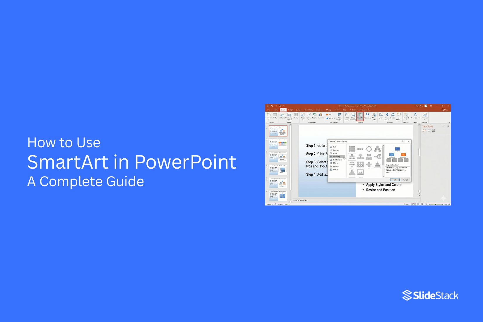
How to Insert SmartArt in PowerPoint
Start by placing SmartArt on your slide. This is the first action in your design flow.
Step 1: Open PowerPoint and choose the slide where you want the graphic.
Step 2: Go to the Insert tab on the top menu.
Step 3: Select SmartArt from the Illustrations section.
Step 4: A window opens with layout options. Pick a layout that fits your content.
Step 5: Click OK to place it on your slide.
A SmartArt graphic now appears on your slide, ready for content.
Pro Tip: Choose a simple layout first. Complex layouts can slow down your editing process later.
How to Add and Edit Text in SmartArt
After inserting SmartArt, the next task is adding content. The text panel makes this simple.
Step 1: Click the SmartArt graphic on your slide.
Step 2: Find the text pane on the left side of the graphic.
Step 3: Click inside a text box and type your content.
Step 4: Press Enter to add more points or shapes.
You can also edit text directly inside each shape by clicking on it.
Pro Tip: Keep each line short. Short text improves clarity inside SmartArt shapes.
How to Customize SmartArt Graphics
PowerPoint gives you tools to change the look of your SmartArt. You can adjust colors, styles, and layout.
Step 1: Select your SmartArt graphic.
Step 2: Open the SmartArt Design tab in the ribbon.
Step 3: Choose Change Colors to adjust the color style.
Step 4: Use the SmartArt styles gallery to pick a design style.
Step 5: Review how the design looks on your slide.
Small design changes can shift how the message feels on screen.
Pro Tip: Stick to one color theme across your slides for a cleaner look.
How to Add or Remove Shapes in SmartArt
SmartArt allows you to adjust the structure as your content changes. You can add or remove shapes easily.
Step 1: Click on the SmartArt graphic.
Step 2: Select a shape inside the graphic.
Step 3: Go to the SmartArt Design tab.
Step 4: Choose Add Shape to insert a new element.
Step 5: Use the Delete key to remove any unwanted shapes.
The layout adjusts itself after each change.
Pro Tip: Keep the structure balanced. Too many shapes can reduce clarity on the slide.
When to Use SmartArt vs. Shapes or Icons
PowerPoint offers three common ways to build visuals: SmartArt, Shapes, and Icons. Each one works in a different way. The choice affects speed, control, and how easy it is to update your slides later. The decision often comes down to three factors. How much structure do you need? How your content is organized. How often will your slide change? These factors shape the best tool for the job.
Structure and Automatic Alignment
SmartArt works with a built-in structure. It keeps elements aligned without extra effort. Text and shapes adjust together inside a fixed layout. This reduces manual formatting work. Shapes give full control. Each element is placed and adjusted by hand. This allows custom layouts, but it also takes more time to keep everything aligned. Icons work as visual elements. They need to be placed and sized manually. They do not manage layout or spacing.
In corporate reporting, structured layouts matter. A process chart or team structure stays clean with SmartArt because alignment is handled automatically. In education, a teacher can build a simple diagram without spending time fixing spacing. In consulting decks, structured visuals help keep focus on the message instead of design details. Manual tools like Shapes work better for unique layouts that do not follow a pattern. Icons fit well for simple visual support rather than structured diagrams.
Your Content Fits Predefined Categories
SmartArt is built around categories like Process, Cycle, Hierarchy, and List. Each category follows a preset structure. This makes it easier to match content to a clear visual format. Shapes do not follow categories. Every layout must be built from scratch. This gives freedom, but it also requires design decisions at every step. Icons also do not follow structured categories. They act more like visual accents.
Business content often fits preset patterns. A workflow fits a Process layout. A team chart fits a Hierarchy layout. A repeating sequence fits a Cycle layout. SmartArt supports these patterns directly, which reduces setup time and keeps the structure consistent.
Education materials often use lists and cycles. Smart layouts help keep ideas grouped in a clear order. Project management updates also rely on repeatable structures. Status flows and task stages match preset formats well. Consulting presentations often benefit from clean category-based diagrams that support fast reading. Shapes work better for experimental layouts where content does not follow a fixed pattern. Icons work best when the goal is visual emphasis rather than structure.
You Plan to Make Frequent Content Updates
SmartArt adjusts automatically. Adding or removing text shifts the layout. The structure stays intact without manual fixes. This helps when content changes often. Shapes require manual updates. Moving one element can affect spacing across the slide. Each change needs adjustment. Icons also need manual repositioning when content shifts. In corporate decks that update monthly or weekly, SmartArt reduces maintenance time. Financial summaries, project updates, and reporting slides change often. Structured layouts keep those updates simple.
In education, lesson slides may evolve over time. Adding new points or removing sections is easier with automatic alignment. In consulting work, client presentations often change during feedback rounds. A layout that adjusts itself saves time during revisions. Shapes are better for static slides that do not change often. Icons are best for decorative use or simple visual support where layout stability is not a concern. Choosing between SmartArt, Shapes, and Icons depends on the structure needs, content type, and update frequency. SmartArt fits structured, repeatable, and changing content. Shapes support full design control. Icons add visual clarity without building structure.
When to Use Shapes or Icons instead of SmartArt
PowerPoint gives you SmartArt, Shapes, and Icons. Each one works in a different way. SmartArt is structured. It keeps elements grouped. Shapes and Icons give more freedom. Some slides need more control. Some need more movement. Some need strict layout rules. That is where Shapes and Icons often fit better than SmartArt.
When You Need Full Creative Control
SmartArt follows fixed layouts. It limits how far you can move or change parts. Shapes and Icons do not have that limit. You can place them anywhere. You can change size, angle, and style without restriction.
This matters in design-heavy slides. Marketing teams often build campaign visuals with unique layouts. A standard SmartArt layout may feel too rigid for that work. Shapes let you build your own structure from scratch. Icons help add meaning without forcing a preset design. A common use case is a product roadmap slide. Each step may need a different size or position. Shapes allow that flexibility without breaking the layout.
Pro Tip: Start with SmartArt for structure, then switch to Shapes to rebuild the layout with more control.
To Animate Individual Elements Separately
SmartArt groups elements together. That makes animation harder to control. You often animate the whole group instead of parts of it. Shapes and Icons work differently. Each item can move on its own. This gives more control over timing and flow.
Training slides often use this approach. A presenter may want one point to appear at a time. Shapes make that simple. Each item can appear, move, or fade without affecting the rest. Dashboard-style slides also benefit from this setup. Numbers, labels, and icons can appear in sequence. That helps guide attention step by step.
Pro Tip: Build grouped ideas in SmartArt first, then convert them into Shapes before adding animation.
You’re Adapting to Strict Brand Guidelines
Some brands have strict rules for layout, spacing, and style. SmartArt does not always match those rules. Its preset designs may not fit brand fonts, spacing, or color systems. Shapes and Icons give full control over branding details. You can match exact colors. You can adjust spacing to fit design systems. You can also avoid preset styling that may conflict with brand rules.
Corporate reports often use this approach. Slides must match brand guidelines exactly. Shapes make that easier because every element is editable. Another example is client presentations. Agencies often need full control to match client identity. Shapes and Icons help meet those requirements without layout limits.
Pro Tip: Use SmartArt only for early structure. Move to Shapes and Icons for final brand alignment and precision.
How to Convert SmartArt to Shapes (Advanced Customization)
PowerPoint lets you turn SmartArt into separate shapes for deeper editing control. Select the SmartArt on the slide. Right-click it. Choose Convert to Shapes.
PowerPoint breaks the SmartArt into individual elements. Each element becomes its own shape. Text, color, size, and position can now change on each part.
Why do this?
Each shape can move on its own. This helps with detailed slide layouts. Colors can change beyond SmartArt presets. Borders and effects can be applied to single parts. Each element can support custom animation. This helps build clearer motion in presentations. These shapes can also fit into infographic layouts. They can be placed into custom slide systems with more control.
Warning
SmartArt structure does not stay active after conversion. Auto layout features stop working. All edits become manual. Editing takes more time after conversion. A copy of the original SmartArt helps keep a backup version of the design.
When to Move Beyond SmartArt Entirely
Some slide designs need more control than SmartArt allows. Complex visuals often require full layout freedom.
Template-based slide systems support this need. Each element follows a fixed design structure. Slides stay consistent across full presentations. Executive dashboards often use this approach. Roadmaps also use structured layouts. Strategy frameworks rely on clear spacing and alignment rules. SmartArt presets can feel limited in these cases. Layout options stay fixed and predictable.
A template system gives more room for a custom structure. Slides can be reused across many projects without rebuilding the design each time. A clear example is a 4 Step Hub Spoke Diagram Template for PowerPoint. This type of layout offers stronger control over spacing and design flow compared to SmartArt.
Everyday Use Cases for SmartArt
SmartArt helps you turn plain content into clear visuals. You use it in business work to show structure, flow, and relationships. It fits many daily tasks across teams, reports, and planning work.
1. Project Workflows
SmartArt shows how work moves step by step. It breaks a project into clear phases. A project manager uses it to show stages like planning, design, building, and delivery. Each stage stays visible in one simple view. This helps teams follow progress without confusion. It also keeps tasks connected in order. Process diagrams in PowerPoint give a quick way to build these visuals.
2. Organizational Charts
SmartArt shows how a company is structured. It displays roles and reporting lines. An HR manager uses it to show departments and leaders. New staff can see who reports to whom. This helps reduce questions during onboarding. It also keeps team structure clear in meetings. Hierarchy layouts in PowerPoint or Visio can be used for larger company maps.
3. Timelines and Milestones
SmartArt shows events in order over time. It helps display key dates and stages. A project lead uses it to show product launch steps like research, design, testing, and release. Each stage is easy to track on one line. Teams stay aware of deadlines and progress. Timeline templates in presentation tools can add more detail for long projects.
4. Comparisons
SmartArt helps place ideas side by side. It shows differences in a clear layout. A product manager uses it to compare two app versions. Features, cost, and performance sit in separate blocks. This makes decisions easier during reviews. Teams can see both options at once. Comparison tables in Excel or slide tools can handle larger data sets.
5. Cause and Effect Relationships
SmartArt shows how one factor leads to another result. It links reasons and outcomes.
A business analyst uses it to show how pricing changes affect sales. Each cause connects to a final result. This helps teams see the impact of decisions. It supports planning before action. Diagram tools outside PowerPoint can give a deeper analysis of complex systems.
6. Cycles and Loops
SmartArt shows repeating steps in a process. It works well for ongoing systems. A quality team uses it to show review cycles like plan, do, check, and act. Each step connects back to the next. This shows that the process never stops. It keeps the improvement work clear. Cycle diagrams in design tools can add more layers when needed.
7. Matrices and Grids
SmartArt organizes information into blocks. It helps compare groups across two or more factors. A strategy analyst uses it to map risks and opportunities. Each box shows a different condition. This helps spot patterns in data. It supports planning and review work. Spreadsheets offer stronger control for detailed matrix data.
8. Hierarchies and Decision Trees
SmartArt shows decision paths and layered structures. It breaks complex choices into steps. A compliance officer uses it to show reporting steps from staff to managers. This helps employees follow the correct process. It also reduces mistakes in escalation. Decision tree software can support deeper rule-based logic.
9. Training and Onboarding Sequences
SmartArt turns training steps into simple visuals. It shows learning in clear order. A trainer uses it to guide new staff through setup, orientation, and first tasks. Each step is easy to follow on screen. It helps reduce confusion during onboarding. Learning platforms can add tests and tracking for deeper training needs.
10. Marketing Funnels and Sales Pipelines
SmartArt shows how leads move toward a sale. It breaks the process into clear stages. A sales manager uses it to show the steps from lead to customer. Each stage shows progress in the pipeline. This helps teams see where leads drop off. It supports better planning for growth. CRM systems give more advanced tracking for full sales management.
Alternatives to SmartArt
SmartArt works for a simple structure. It helps arrange ideas quickly. Still, it has limits. Some slides need more control. Some need clearer data. Some need a stronger visual impact. Other PowerPoint tools handle these needs better.
Below are options that fit different slide goals.
Use PowerPoint Tables for Data-Heavy Visuals
Tables work well for structured information. They keep data aligned in rows and columns. This makes details easy to scan. Tables outperform SmartArt in accuracy. SmartArt focuses on layout and flow. Tables focus on precision.
Finance reports often rely on tables. Budget breakdowns also fit this format. Marketing teams use them for campaign comparisons. Consulting decks use them for KPI summaries. Tables also help when numbers must stay exact. No visual rearranging gets in the way. The message stays direct and clear.
Use PowerPoint Chart Tools for Data Visualization
Charts turn numbers into visual patterns. They show change, share, and direction. SmartArt cannot show real data movement. Charts connect directly to Excel data. This keeps updates consistent and fast.
Line charts work well for trends over time. Bar charts show comparisons across groups. Pie charts display proportions in a simple form. Sales teams rely on charts for performance reviews. Analysts use them for reporting dashboards. Startups use them in investor updates to show growth. Charts make patterns easier to spot. That clarity helps support decisions during presentations.
Use SlideStack Infographic Templates or Pre-Designed Diagrams for Advanced Visuals
Some slides need a stronger visual design. SmartArt offers limited styling control. Pre-designed infographic templates fill that gap. These templates support more complex layouts. They often include icons, layered shapes, and branded structures. They also allow deeper customization. Pitch decks often use these designs.
Marketing teams use them for campaign storytelling. Consulting presentations use them to simplify complex frameworks. SlideStack templates also help maintain visual consistency across slides. This keeps presentations aligned with brand style and structure. This approach also scales better for large decks. Reusable designs reduce repeated manual formatting inside PowerPoint.
Common SmartArt Mistakes to Avoid
Using the Wrong Graphic Type
SmartArt has many layouts. Each one fits a different purpose. Some show steps. Some show lists. Some show structure. Picking the wrong one makes the message unclear. The audience may miss the point of the slide.
Overloading Shapes with Text
Too much text in one shape hurts readability. Small screens make this harder to follow. Each shape should hold a short idea. Breaking long text into smaller parts helps keep the slide clean and easy to read.
Excessive Colors and Effects
Bright colors and heavy effects take attention away from the message. Too many styles on one slide create confusion. Simple colors help the content stand out. A clean look makes the information easier to follow.
Ignoring Slide Layout Balance
A crowded slide feels hard to read. Empty space helps guide the eye. SmartArt should sit in a clear position on the slide. Keeping a balance between text and space makes the slide more stable and easier to understand.
SmartArt Use Cases for Different Presentation Types
SmartArt fits different slide needs. It helps organize ideas in a clear way. Each presentation type uses it in a different form.
Business Presentations
SmartArt works well for showing structure in a business setting. Teams use it for org charts. It also works for showing steps in a workflow. Sales processes can be broken into simple stages. This keeps slides clean and easy to follow.
Academic Presentations
Students use SmartArt to show ideas in a simple layout. It helps present theories and key points. Research topics can be broken into sections. Complex subjects become easier to read on slides. Class presentations feel more organized with this layout.
Project Reports
Project updates often need clear step tracking. SmartArt shows progress in a visual way. Tasks can be shown in order from start to finish. Milestones can be placed in a clear flow. This makes project status easier to understand in meetings.
Training and Educational Slides
Training content often needs a step-by-step structure. SmartArt helps break lessons into small parts. Each step can sit in its own section. Learners follow the flow without confusion. Educational slides stay neat and structured with this method.
SmartArt vs Traditional Diagrams
SmartArt in PowerPoint gives ready-made layouts. It places shapes and text in a fixed structure. It keeps everything lined up without much effort. Traditional diagrams work in a different way. They are built using shapes one by one. Each line, box, and arrow is placed by hand.
SmartArt focuses on speed. You pick a layout, then add text. The design stays consistent across the slide. Traditional diagrams focus on control. You decide every position and size. You can adjust each detail freely. SmartArt limits big changes. The structure stays mostly the same after selection.
This keeps things simple, but it also reduces flexibility. Traditional diagrams take more time to build. Each element needs manual setup. The process allows more custom layouts and unique designs. Both styles serve different needs. SmartArt fits a simple structure for work. Traditional diagrams fit detailed or custom visuals.
Troubleshooting Common SmartArt Issues
SmartArt in PowerPoint can run into a few problems during use. These problems often show up while editing slides, adding text, or changing layout styles. Simple fixes usually solve them.
SmartArt Not Displaying Properly
SmartArt may not show shapes or layouts correctly on the slide. Sometimes parts look missing or shifted. This can happen after resizing or changing slide layouts. Resetting the layout often helps restore the correct view. Choosing a different SmartArt style and switching back can also correct display problems. Keeping slide size consistent helps reduce this issue.
Text Overflow Problems
Text can go outside the shape or get cut off inside SmartArt boxes. This makes the content harder to read and breaks the visual structure. Shortening text helps keep everything inside the shapes. Using fewer words per point keeps the balance across the diagram. A smaller font size also helps fit content without breaking layout alignment.
Formatting Inconsistencies
Colors, fonts, and shapes may not match across all SmartArt elements. Some parts may look different from others on the same slide. Applying a single theme across the slide keeps styles aligned. Using the same font family across all shapes keeps text uniform. Manual formatting of each element helps fix mismatched styles.
Conversion Issues
SmartArt may lose structure after converting into shapes or other formats. Elements can separate or shift away from their original positions. Keeping a copy of the original SmartArt before conversion helps protect the design. Rebuilding small parts manually keeps layout control stable. Careful alignment of each element restores a clean visual flow.
Final Thoughts:
SmartArt in PowerPoint gives a simple way to turn text into clear visuals. It helps structure ideas so slides stay easy to read and follow. Each layout supports a different purpose, from lists to processes and hierarchies. The real strength of SmartArt shows in everyday work. It helps teams explain ideas faster and keeps information organized without extra design effort. At the same time, knowing when to step beyond SmartArt gives more control over layout, design, and detail. Strong presentations depend on clarity. SmartArt can support that goal when used with care. Simple choices in layout, text, and structure often lead to better slides and clearer messages.
FAQs
1. What is SmartArt in PowerPoint?
SmartArt is a PowerPoint tool. It turns text into visual diagrams like lists, processes, and charts.
2. How do I insert SmartArt?
Go to the Insert tab. Select SmartArt. Pick a layout. Click OK. The graphic will appear on your slide.
3. Can I edit SmartArt text?
Yes. Click the SmartArt. Use the text pane or type directly inside each shape.
4. What types of SmartArt are available?
You can use lists, processes, cycles, hierarchies, relationships, matrices, pyramids, and picture layouts.
5. Can SmartArt be converted to shapes?
Yes. Right-click the SmartArt. Choose Convert to Shapes. Each part becomes editable.
6. Why is SmartArt not showing correctly?
This can happen after resizing or layout changes. Resetting the layout or choosing a new style often fixes it.
7. Should I use SmartArt or shapes?
SmartArt works for structured layouts. Shapes work better for full control and custom designs.
8. Can I animate SmartArt?
Yes. You can apply animations to SmartArt. Converting to shapes gives more control over each element.


You may also be interested in ...

How To Create An Eye-Catching Portfolio
If you’re looking to create an eye-catching portfolio, this post will come in handy. In this article, you can find the easies...
23 Jun, 2024

How To Easily Create An Infographic
Infographics are the perfect way to make a presentation that will impact an audience, but their design and composition might...
08 Jun, 2024

PowerPoint Template Tips & Tricks You Ne...
PowerPoint seems to be an unknown world for many people, especially those who have been assigned to create a presentation out...
08 Jun, 2024