How to Work with Spaghetti Diagrams – Step-by-Step Guide
A spaghetti diagram shows the physical movement of people, materials, or information across a workspace. Lines are drawn to trace each step in a process. The final result often looks messy, like tangled pasta in a bowl. That messy look is the point. It exposes how much extra movement happens during normal work and where effort gets wasted.
In process improvement work, this diagram plays a practical role. It does not describe theory or ideal systems. It captures real movement in real environments such as factories, offices, or service areas. This makes hidden delays and inefficient routes easier to see than in written reports or spreadsheets.
What Is a Spaghetti Diagram?
A spaghetti diagram maps movement inside a workspace. It shows the path of people, materials, or equipment during a process. The name comes from the look of the final drawing. Lines overlap and twist across a floor plan. The result often looks tangled. This method comes from lean manufacturing. It was first used in production settings. The goal was to study movement inside factories. Managers wanted to see how work actually happened on the floor. The diagram helped reveal movement that was not efficient.
A spaghetti diagram is built from direct observation. The process does not rely on written procedures or assumptions. It records real movement as it happens. The creation process follows a clear sequence. Start with a layout of the space. This can be a floor plan, office map, or workshop drawing. Mark key points such as desks, machines, storage areas, or stations. Next, observe a person, material, or item moving through the space. Track each step of the movement. Draw a line from the starting point to each stop along the route.
Repeat the tracking over a set period. Each movement adds more lines to the same diagram. Over time, the pattern becomes visible. The final drawing shows all movement paths layered together. Each line represents a real action taken during the process. Interpretation focuses on how the lines behave across the space. Areas with heavy line overlap show frequent movement. These zones often indicate high activity or repeated travel. Long lines between points show the distance covered during tasks. These distances can signal wasted effort or poor layout design.
Crossing lines shows repeated back-and-forth movement. This often points to unclear workflow steps or poor placement of tools and materials. Clusters of movement in one area can show congestion. This may slow down work and create delays. The diagram also highlights empty or unused space. These areas may be poorly connected to the main workflow. A spaghetti diagram is not just a drawing. It is a tool for process review. It shows how work flows in reality, not how it is planned on paper.
Differences between planned workflows and real movement often become clear. A process may look simple on paper, but show many unnecessary steps in practice. These insights support workspace redesign. Layout changes can reduce travel distance. Equipment can be repositioned to reduce backtracking. Workstations can be arranged to support smoother flow. Small adjustments often lead to reduced movement. Less movement can improve speed and reduce effort. It can also improve safety and reduce fatigue in physical environments.
Spaghetti diagrams are used in offices, factories, hospitals, and warehouses. Any place with repeated movement patterns can benefit from this method. It helps teams see problems that are not obvious in standard process charts. The strength of the diagram lies in its simplicity. It turns movement into a visual pattern that is easy to study.
Where and How Spaghetti Diagrams Are Used
Spaghetti diagrams appear in many workplaces where movement or routing affects how work gets done. They are used to show how people, materials, or information travel through a process. The focus is on finding wasted movement and unclear paths.
Manufacturing and logistics settings use spaghetti diagrams to study movement on factory floors and warehouses. Workers may walk between stations many times during a shift. Products and parts may also travel long routes before completion. The diagram maps these paths on a layout. Crossing lines shows repeated travel and extra steps that slow work.
Healthcare settings use the same method to track movement inside hospitals and clinics. Nurses, doctors, and patients often move between rooms, storage areas, and treatment zones. The diagram places these movements on a floor plan. Long routes and repeated walking patterns become easy to see. This helps highlight areas where layout or flow slows care delivery.
Office environments apply spaghetti diagrams to track the movement of documents, people, and tasks. Staff may move between desks, printers, meeting rooms, and departments to complete simple work. The diagram shows how often work travels between locations before it is finished. This helps reveal delays caused by physical movement and handoffs.
Spaghetti diagrams are also used in presentations for process improvement work. A common approach is to show two side-by-side diagrams. One shows the current movement paths. The other shows the improved layout after changes. The difference between the two makes the impact clear without needing long explanations or heavy data tables.
Lean management programs also rely on spaghetti diagrams as part of process review work. They support value stream mapping by showing movement inside a system. Teams use them to align on where waste exists in a process. They also support discussions in methods like kata for lean management, where understanding current flow is a key step.
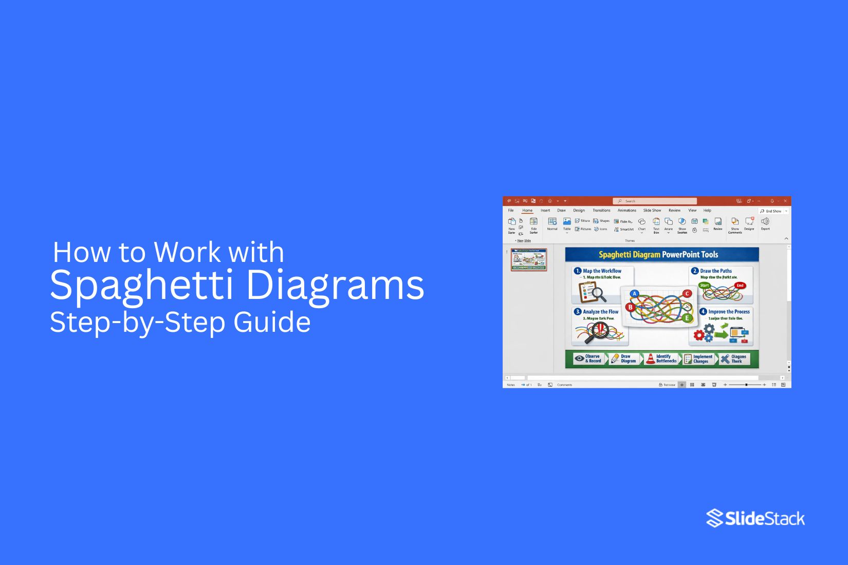
For slide decks and reporting, teams often start with simple templates. These usually include a floor plan image and space to draw movement paths. PowerPoint-based layouts are commonly used to present before-and-after comparisons. This format helps keep discussions clear during team reviews and leadership meetings.
Key Concepts Behind Spaghetti Diagrams
A spaghetti diagram shows how people, materials, or items move in a space. It starts with a simple floor plan or layout. Lines are drawn to track each movement. Over time, these lines overlap and form a web-like pattern. The main goal is to see movement clearly. Long paths often show wasted effort. Short, direct paths show better flow. The difference stands out once the map fills with lines.
Each line tells a small part of a process. One task may involve many steps across a room. That back and forth builds up quickly on the diagram. Patterns start to appear. Some areas get heavy traffic. Other areas stay unused. Distance matters. More walking or movement often means more time spent. That extra time can slow work down. A spaghetti diagram makes that visible without complex tools.
Flow direction also matters. Arrows or line direction show how work moves from one point to another. Crisscrossing lines can signal confusion in layout or process design. The diagram also reflects the layout design. Poor placement of tools, desks, or stations creates extra movement. Better placement reduces travel and keeps work smoother.
Small details stand out once the diagram is complete. A single bottleneck can create many repeated paths. That point often becomes a focus for improvement. The value comes from seeing what is usually missed in daily work. Movement that feels normal often becomes clear only after mapping it out.
Preparation Before Creating a Spaghetti Diagram
A clear layout of the workspace sets the foundation for useful results. A simple floor plan or process map works best, showing stations, equipment, and key activity points. Accuracy here shapes everything that follows.
A direct walkthrough of the area helps build understanding of how work actually moves. Short notes during this stage capture details that are easy to miss later, such as repeated travel routes or pauses between tasks.
Basic tools like printed layouts, colored pens, or a digital drawing tool are enough. The focus stays on clarity rather than complexity.
Step-by-Step Process to Create a Spaghetti Diagram
The process of building a spaghetti diagram follows a structured path that turns raw movement into a clear visual map. Each step reveals how work actually flows through a space, exposing patterns that are often missed in day-to-day operations.
Step 1: Observe the Process Flow
Work begins by watching the process from start to finish. Attention stays on how people, materials, or information move through each stage. Every movement matters, even the small or repeated ones.
The goal here is to capture reality without interruption. No adjustments, no assumptions, only the actual flow as it happens.
Step 2: Record Movement Paths
Each movement gets noted directly onto the layout. Lines or arrows trace where work travels between points.
Different colors can separate roles or types of movement, making patterns easier to follow later. Repeated trips between the same points stand out quickly during this stage.
Step 3: Plot Paths on Layout
All recorded movements are transferred onto a single layout. Each path connects the exact points visited during the process.
As more paths appear, overlapping routes start to form. These overlaps reveal areas where movement builds up across the workspace.
Step 4: Connect Movement Lines
Lines are refined to show continuous flow across the entire process. Every connection between points is drawn in sequence, showing how work progresses step by step.
The visual begins to reflect actual activity rather than planned structure. Inefficient travel becomes easier to spot as lines cross and repeat across the same areas.
Step 5: Review the Diagram
The completed diagram is studied closely to identify movement patterns. Long travel distances, unnecessary back-and-forth motion, and clustered traffic areas become visible.
Attention shifts to why these patterns exist. Small adjustments in layout or process design often reduce excess movement and improve flow across the workspace.
Practical Examples
A hospital pharmacy handling inpatient prescriptions offers a clear operational case. Orders arrive from nursing stations, pharmacists retrieve medication from storage, verify dosage, prepare packaging, and send it for delivery. A spaghetti diagram of this routine typically exposes repeated movement between the order desk and storage shelves. The pattern shows pharmacists walking the same path multiple times each hour due to frequently requested medicines being placed far from the processing point. That visual evidence leads to a direct operational change: repositioning high-demand medications closer to the order station, reducing unnecessary travel, and freeing time for clinical checks and quality control tasks.
In a financial services back office, loan application handling provides another strong example. Applications move from intake to compliance review, then return for missing details, move forward to credit assessment, and often loop back again for corrections. Mapping these movements across multiple cases often uncovers repeated rework cycles and hidden bottlenecks that are not visible in standard process documentation. Once displayed visually, the pattern creates a shared reference point for operations, compliance, and credit teams. That shared understanding supports redesign decisions such as introducing early-stage validation checks and reducing repeated transfers between the same processing stages.
Manufacturing environments show similar patterns at a physical level. A production line may appear efficient in layout diagrams, yet operators frequently walk long distances to collect tools, retrieve components, or consult supervisors. A spaghetti diagram of a full shift often reveals dense overlapping movement paths concentrated between workstations and centralized storage areas. The total travel distance accumulated over time highlights inefficiencies that are not obvious in standard workflow charts. That insight typically supports redesign decisions such as repositioning tools at point-of-use stations and reorganizing layout flow to match production sequence, reducing operator movement and improving line continuity.
Alternatives to Spaghetti Diagrams
Spaghetti diagrams map the physical movement of people, materials, or information across a process layout through traced paths. Their strength lies in exposing motion patterns inside clearly bounded environments such as factory floors, hospital wards, or service desks. Their usefulness declines once analysis shifts toward multi-variable systems, abstract relationships, or comparative method selection.
A different operational lens appears in Failure Mode and Effects Analysis (FMEA). This method shifts attention away from movement tracing and toward process reliability. Each step in a process is examined for possible failure points, with severity and likelihood assessed before prioritising action areas. The structure supports decision-making focused on risk exposure rather than spatial efficiency.
Another operational method is affinity diagramming. Instead of mapping physical flow, it organises qualitative inputs into grouped themes. Observations, ideas, or issues are sorted into clusters that share conceptual similarity. This approach suits early-stage analysis where clarity emerges from pattern formation rather than spatial representation.
Outside operations management, the term spaghetti plot appears in statistical visualization. Here, multiple trajectories are drawn on shared axes, often across time or repeated measurements. Dense overlaps between lines can reduce readability, particularly in datasets involving many subjects or long time sequences. The result can obscure individual patterns rather than clarify them.
A structured alternative known as lasagna plots addresses this limitation through layered encoding. This method appears in academic data visualization literature, where matrix-based representations replace overlapping lines with structured grids. Each row represents a subject or entity, each column represents time or an ordered condition, and values are encoded through colour intensity rather than continuous paths. The structure reduces visual congestion and supports clearer comparison across multiple entities.
Selection among these methods depends on the type of structure under investigation. Movement-based operational analysis aligns with spaghetti diagrams. Risk decomposition aligns with FMEA. Qualitative clustering aligns with affinity diagrams. Time-series or multi-entity statistical representation aligns more closely with lasagna plots.
How to Analyze a Spaghetti Diagram
Analysis starts by studying the movement lines drawn across the layout. Each line represents a physical path taken during a task. The main goal is to understand what the paths reveal about movement patterns inside the process. Line density offers an early signal. Areas with heavy overlapping lines often indicate repeated travel between the same points. Those clusters usually point to unnecessary movement or poorly arranged workstations.
Attention then shifts to distance. Long, stretched paths between related tasks suggest inefficiency in layout design. Shorter, direct connections between key points typically reflect smoother flow. Back-and-forth movement stands out clearly in most diagrams. Repeated travel between two or more stations often shows missing resources, unclear task sequencing, or poor placement of tools and materials. Direction changes also matter. Frequent turning or zig-zag patterns can indicate interruptions in workflow or poorly aligned stations that force extra motion.
Another focus is task grouping. Steps that belong together but appear far apart on the diagram often reveal opportunities to reorganize the workspace. Bringing related activities closer reduces unnecessary travel and reduces time spent moving instead of working. The final review centers on overall flow balance. A well-structured process shows cleaner, more direct paths with fewer overlaps. A cluttered pattern signals that movement is carrying more complexity than the task itself requires.
Improving Processes Based on Findings
Findings from a spaghetti diagram highlight where movement repeats, overlaps, or stretches across unnecessary distance. Those patterns point directly to delays, wasted effort, and uneven workload distribution inside a process.
Process improvement starts with adjusting the physical or digital layout that drives that movement. Workstations, tools, and information points can be placed closer to where they are needed most. Steps that cause backtracking or repeated travel can be grouped or reordered so the flow follows a clearer path from start to finish.
Changes often need testing on a small scale before wider use. A revised layout or sequence can be mapped again using the same method to see if movement lines become shorter and less tangled. If the paths remain dense, further adjustments to steps or placement help bring the process closer to a cleaner flow.
Applications of Spaghetti Diagrams
Spaghetti diagrams are used to make movement inside a workspace visible. Once the paths are drawn, patterns start to appear that are usually hard to notice during normal operations. These patterns help teams understand where effort is being spent in ways that do not add value. In manufacturing settings, they help track how materials, tools, or workers move between stations. Long or repeated routes often point to poor layout decisions, such as storage areas placed far from where items are actually used. Adjusting these layouts can reduce unnecessary travel and free up time for actual production work.
Healthcare environments also benefit from this method. Patient flow, staff movement, and equipment usage can be mapped to identify delays or overcrowded zones. A clear diagram can show how staff may need to cross the same areas repeatedly, creating avoidable congestion during busy periods. Warehousing and logistics operations use spaghetti diagrams to study picking routes. If workers travel long distances for commonly picked items, the diagram highlights those inefficiencies. This supports decisions about relocating inventory or reorganizing picking paths to shorten travel time.
Office environments are not exempt. Movement between desks, printers, meeting rooms, and storage areas can reveal how workspace layout affects daily tasks. Even small adjustments, such as repositioning shared equipment, can reduce repeated walking paths and improve workflow comfort. Retail spaces also apply this method to understand staff and customer movement. It can reveal bottlenecks near checkout areas or inefficient stocking routines that disrupt store flow. Across all these settings, the value lies in turning movement into something visible. Once the paths are mapped, decisions about layout and process changes become grounded in actual behaviour rather than assumptions.
Common Mistakes to Avoid
Spaghetti diagrams can reveal movement patterns clearly, but the value drops quickly when the setup or interpretation goes off track. Small errors in how the process is observed or mapped often lead to conclusions that look convincing but miss the real problem. One frequent issue is incomplete observation. Short tracking periods or selective recording tend to miss peak activity, which distorts the actual movement flow. A diagram built on partial data often looks simpler than reality, leading to decisions that do not address the real workload.
Another problem comes from unclear layout mapping. If the workspace diagram is outdated or not drawn to scale, movement lines become misleading. Even minor layout inaccuracies can make long paths appear short or hide repeated back-and-forth movement. There is also the risk of focusing on movement alone without context. Seeing heavy travel does not automatically point to inefficiency. Sometimes movement is required due to safety rules, task sequencing, or equipment constraints. Without understanding the process behind the movement, improvements can miss the mark or create new issues.
Overcomplicating the diagram itself can also reduce clarity. Too many colors, overlapping lines, or excessive detail make patterns harder to read. The goal is clarity of flow, not visual density. One more overlooked issue is skipping validation with the people involved in the process. Operators and staff often recognize reasons behind movement patterns that are not obvious on paper. Ignoring their input can lead to solutions that look good in analysis but fail in practice. A clean and accurate spaghetti diagram depends on careful observation, correct layout representation, and context-aware interpretation.
Tools for Creating Spaghetti Diagrams
Spaghetti diagrams start with something simple and often physical. A printed floor plan, a sheet of paper, and a pen or pencil are enough to map movement across a space. Coloured markers help separate different people, tasks, or time periods, making movement paths easier to read without confusion.
Many teams move toward digital options once the process becomes more detailed. Microsoft Visio supports structured layouts and clean path drawing. Lucidchart and Miro allow collaborative mapping, where multiple users can mark movement in real time. These tools suit remote teams or shared process reviews.
Excel can also support the work by tracking movement data before it is visualised. For spatially complex environments, AutoCAD provides accurate floor plan integration that aligns movement paths with real layouts. Sticky notes, clipboards, and printed layouts still appear in workshops because they encourage direct observation and quick adjustments during process walks.
Final Notes
Spaghetti diagrams translate movement inside a process into something visible and measurable. That shift matters because many operational problems remain hidden in day-to-day activity. Work often feels efficient on the surface, yet the actual flow tells a different story once movement is traced and documented. A common blind spot appears in repeated travel between workstations, unnecessary backtracking, and indirect routes that develop over time without formal review. These inefficiencies rarely appear in reports because they are not tracked as data points. They exist in motion, not in records, which makes them easy to overlook during routine evaluations.
Value emerges through converting that movement into structured evidence. Lines drawn across a layout replace assumptions with a clear visual record of how work is actually performed. Once those paths are visible, comparison becomes straightforward. Distances, repetition, and congestion patterns can be reviewed without interpretation bias. Decision-making improves as a result. Teams no longer rely only on verbal descriptions of workflow issues. The diagram provides a shared reference point that supports clearer discussions about layout changes, task allocation, and process redesign. Communication becomes more aligned because everyone is reviewing the same visual evidence rather than individual interpretations.
In presentation settings, the impact is even more direct. A before version of a process often shows scattered movement and overlapping paths, while the after version reflects streamlined flow and reduced travel. That contrast supports improvement proposals with clarity that written explanations rarely achieve. Stakeholders can see the difference rather than just hear about it. Spaghetti diagrams remain a practical tool in operations and process analysis because they turn physical movement into structured insight. That transformation supports stronger analysis, clearer communication, and more grounded decisions about how work environments should be organised.
FAQs:
What is a spaghetti diagram used for?
A spaghetti diagram is used to map physical movement inside a workspace. It shows how people, materials, or information travel during a process and helps reveal unnecessary movement patterns.
Where are spaghetti diagrams applied?
They are used in manufacturing, healthcare, offices, warehousing, and retail environments. Any setting with repeated movement between locations can benefit from this method.
What does a spaghetti diagram show in a process?
It shows the actual paths taken during work. Overlapping lines, long routes, and repeated travel between points reveal how work flows in practice.
How is a spaghetti diagram created?
A workspace layout is used as the base. Movement is observed and traced step by step onto the layout. Each path is recorded until a full picture of activity appears.
What tools are used to make a spaghetti diagram?
Paper layouts, pens, and markers are common for manual mapping. Digital tools such as Visio, Lucidchart, Miro, Excel, and AutoCAD are also used for more detailed work.
What mistakes should be avoided when using spaghetti diagrams?
Incomplete observation, outdated layouts, and unclear mapping reduce accuracy. Ignoring real process context can also lead to misleading conclusions.
How do spaghetti diagrams help improve processes?
They show where movement is excessive or repeated. That visibility supports layout changes, reduced travel distance, and smoother task flow across a workspace.


You may also be interested in ...

How To Create An Eye-Catching Portfolio
If you’re looking to create an eye-catching portfolio, this post will come in handy. In this article, you can find the easies...
23 Jun, 2024

How To Easily Create An Infographic
Infographics are the perfect way to make a presentation that will impact an audience, but their design and composition might...
08 Jun, 2024

PowerPoint Template Tips & Tricks You Ne...
PowerPoint seems to be an unknown world for many people, especially those who have been assigned to create a presentation out...
08 Jun, 2024