Hidden Presentation Techniques You Need to Know

Most presentations lose attention within minutes because slides rely on plain text and weak structure. There are simple techniques that change how information is delivered, making slides clearer and easier to follow. Most of these methods stay hidden in professional training sessions and workshops today.
That gap shows up in meetings where ideas fail to land, yet the right techniques make messages clear and memorable. These techniques guide how slides are structured, how visuals are used, and how audiences stay engaged from start to finish.
Keep reading to learn practical methods that can be applied in Google Slides, PowerPoint, and modern presentation tools. Each section breaks down clear steps for real use.
Why Presentation Techniques Matter
Most presentations fail before they even begin. The content might be strong, but the delivery weakens the message. People lose focus quickly if the structure feels unclear or dull.
A good presentation does more than share information. It guides attention. It helps the audience follow ideas step by step without confusion. Small changes in how content is shown can change how it is understood.
Many speakers focus only on slides. That leaves out timing, tone, and flow. These parts shape how the message lands. A clear structure keeps the audience with you from start to finish.
Strong presentation techniques also help reduce stress for the speaker. A clear plan makes it easier to stay on track. It lowers the chance of rushing or forgetting key points.
Every slide, pause, and transition plays a role. When these parts work together, the message becomes easier to follow and remember.
Key Trends Shaping Modern Presentations
Presentations are no longer just slides with text. They now focus on how people understand and stay with the message.
One clear shift is visual focus. Slides now use fewer words. Strong images and simple layouts carry more weight. This helps people follow ideas without effort.
Audience attention also shapes design choices. Short sections replace long blocks of content. Each slide carries one idea. This keeps the flow steady and easy to follow.
Story-based structure is another change. Information is not only listed. It moves in a clear path. Each point connects to the next in a natural way. This helps the message feel complete.
Interaction is also part of modern presentations. Polls, questions, and simple prompts help people take part. This keeps attention active instead of passive.
Design consistency matters more now. Fonts, colors, and spacing stay uniform across slides. This builds a clean and steady look from start to end.
These changes reflect how people process information today. Clear, simple, and focused delivery works better than heavy detail.
Summary of the 14 Best Presentation Techniques to Use in 2026
Audience-first framing: Open with the audience’s goal, constraint, or decision so relevance is established immediately and attention is captured early.
Outcome titles: Turn slide titles into clear conclusions rather than labels, so each slide communicates a takeaway instead of a topic.
Chunking and sequencing: Break complex information into smaller parts and reveal them in a controlled order to improve understanding and retention.
Signposting transitions: Use short verbal cues and structured bridges between sections so the audience always knows where the narrative is going.
Purposeful pausing: Insert deliberate pauses after key statements to allow meaning to settle and increase recall.
Data storytelling: Present data through context, comparison, and implication rather than raw charts, so insights become meaningful rather than descriptive.
Cognitive load control: Reduce unnecessary text, repetition, and visual clutter so attention is directed only toward what matters.
Structured Q&A handling: Respond using a consistent pattern, direct answer, supporting evidence, then business or practical impact.
Objection anticipation: Identify likely concerns in advance and address them within the flow of the presentation before they are raised.
Micro-interactions: Use brief audience engagement moments such as polls or targeted questions to reset attention and maintain involvement.
Consistent visual grammar: Maintain uniform rules for typography, spacing, alignment, and color usage to reduce cognitive friction across slides.
Rehearsal with timeboxing: Practice sections under strict time limits to ensure pacing remains controlled and content does not drift.
Hybrid delivery discipline: Balance attention between in-room and remote audiences to maintain equal engagement across both formats.
AI-supported coaching: Use AI to refine pacing, improve transitions, and rehearse delivery while keeping strategic interpretation and judgment with the presenter.
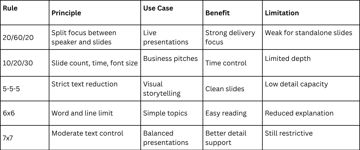
PowerPoint Rules of Presentations
Presentation design often follows fixed rules. These rules control how much text appears on slides. They also guide structure and clarity. Each rule serves a different communication need.
These systems support consistency in business communication. They also reduce overload on slides. Still, each rule has limits in modern presentation practice.
20/60/20 Rule
This rule divides attention across three parts. The presenter holds the focus during delivery. Slides support the message. The audience completes the final understanding.
This system supports live presentations. It reduces dependence on slide text. It also shifts control to the speaker.
A limitation appears in remote or self-reading decks. The message can lose clarity without a speaker.
10/20/30 Rule
This rule sets the structure for slides and delivery. Ten slides guide the full story. Twenty minutes set time control. Thirty-point font supports readability. This rule supports time discipline. It also improves slide clarity. The limitation comes from strict limits. Complex topics may need more space.
5-5-5 Rule
This rule limits text per slide. Five words per line. Five lines per slide. Five slides in a section. This system reduces text density. It supports visual communication. It keeps focus on spoken delivery. A weakness appears in the detailed content. Some ideas need more explanation.
6x6 Rule
This rule controls slide content size. Six words per line. Six lines per slide. This system supports simple reading. It keeps the slides clean. It improves audience focus. It also limits deep explanation. Some topics lose detail.
7x7 Rule
This rule sets a text cap. Seven words per line. Seven lines per slide. This system balances structure and content. It allows more detail than stricter rules. It still restricts complex ideas. Dense subjects can feel reduced.
Rule Comparison Table
Presentation Discipline and Delivery
Structured rules shape slide design. They control how information appears on screen. They also influence audience focus.
Strong presentation work depends on balance. Rules guide design. Delivery completes the meaning.
Foundational Presentation Techniques
Foundational presentation techniques sit at the base of how a presentation is built. They are not surface actions. They are structural choices that shape how information is arranged before any design or delivery begins. They guide how meaning is formed across the whole presentation.
These techniques connect directly to how an audience processes information. People do not take in everything at once. They follow a path through ideas. A clear structure helps the mind move step by step. Weak structure creates confusion and breaks focus.
Clarity depends on control of order and emphasis. Ideas placed in a clear sequence reduce mental strain. Key points stand out more easily. Unclear order forces the audience to search for meaning. That search slows understanding and weakens retention.
The result of strong foundational work is steady communication. Messages stay direct. The audience spends less effort decoding the structure. Attention stays on the meaning instead of trying to fix confusion in the flow of ideas.
These techniques sit below advanced presentation skills. Design choices and delivery style come after the structure is set. Without a strong base, visual polish, and speaking skills, the impact. They cannot fix unclear thinking at the core.
Many teams mix these layers. Slide rules get treated as strategy. Delivery habits get treated as structure. This creates gaps in how presentations are built. The result is work that looks polished but lacks clear direction.
Foundational techniques include structure design, sequence planning, and emphasis control. They also include how ideas are grouped and how one idea leads into the next. Visual layout choices belong in a separate layer. Speaking behavior belongs in another. Keeping these parts separate builds cleaner presentations.
Strong presentation work starts with a clear structure before anything else is added.
The Rule of Three
The Rule of Three organizes information into groups of three. It does not reduce meaning or limit depth. It structures ideas so they are easier to follow and remember. It reduces strain during listening by giving the mind a clear pattern to hold.
By dividing content into three parts, a presenter creates clear boundaries between ideas. Each group of three can hold a topic, a point of development, and a closing idea that links back to relevance. This structure does not need to be stated aloud. It works best as an internal guide that shapes how the message is delivered. The flow feels steady because each section connects to the next without sharp breaks.
In practice, the Rule of Three helps manage complex topics, long explanations, and structured arguments. It keeps content from spreading into unrelated directions. It also helps the audience follow progress through a predictable pattern. The presenter benefits as well. A three-part structure reduces mental pressure during speaking or writing and supports a clearer focus on the main message.
Signposting
Signposting is the practice of guiding audience attention by showing where a presentation is going and why each part matters. Many presentations fail because listeners cannot connect new points with what came before. Signposting fixes this by creating clear reference points during the talk.
It works through short spoken cues instead of long explanations. Phrases like “Now the focus shifts to the next point” or “This connects directly to the next idea” help the audience follow the structure. These cues reduce confusion. They show movement between ideas in a clear way. The listener stays aware of how each part fits together.
The strength of signposting comes from balance. Too much makes the speech feel repetitive. Too little removes structure and direction. It is most useful in technical presentations, financial discussions, and teaching sessions where ideas are built step by step. It also supports spoken delivery skills by keeping the audience oriented from start to finish.
The Pause Effect
A deliberate pause is one of the most overlooked tools in presentation delivery. Silence is not missing content. It is part of how content becomes clear. Many speakers avoid pauses because silence feels like hesitation. That assumption weakens delivery. A controlled pause shows calm control. It sets the rhythm of the room and signals that the speaker is steady.
Powerful pauses work in three clear ways. First, they support processing. A key point needs space to settle. A short silence after an important idea gives the audience time to understand it before new information arrives. Second, they shape emphasis. A pause placed before or after a critical statement makes that statement stand out. It creates weight without adding extra words. Third, they reset attention. When focus starts to fade, silence interrupts the drift and brings the audience back to the message.
This technique becomes especially useful in complex explanations. Dense information becomes easier to follow when it is broken with silence instead of continuous speech. It also helps during topic changes. A pause marks the end of one idea and prepares the mind for the next. During Q&A sessions, it plays a different role. A brief pause before responding creates space for thinking. It leads to clearer and more structured answers. The strength of this technique comes from control. It is not about how long the silence lasts. It is about using it at the right moment with clear intention.
Storytelling Structures
Storytelling in presentations is not about decoration. It is about arranging information in a clear order so meaning can be followed without effort. A strong structure helps the audience move through ideas step by step, even if they are not familiar with the subject.
The most reliable structure follows a simple sequence: a situation, a complication, and a resolution. The situation sets the context and defines the starting point. The complication introduces a problem, gap, or change. The resolution explains what was done and what changed as a result. This sequence creates direction and makes reasoning easier to follow.
In business communication, storytelling does not depend on expressive language. It depends on framing. A presenter sets the context by defining an issue or need. The discussion then moves through the factors that created pressure or limitation. It ends with a clear outcome that explains why the result matters. This approach works because it reflects how people naturally process cause and effect.
This structure also supports memory. People do not retain isolated details for long. They retain linked sequences. A number, chart, or insight becomes easier to remember when it is part of a clear flow of ideas that shows how one point leads to the next.
Chunking Technique
Chunking shapes how information is held in the mind during a presentation. It does not simplify ideas. It organizes them into clear units that the audience can process without strain.
Human attention has limits. Too much information at once creates mental overload. Chunking works with this limit. It breaks content into smaller groups of related ideas. Each group carries one clear focus.
A chunk is a set of connected points that belong together. It might be a concept, a step, or a single message. The key is internal connection. Each piece inside the chunk supports the same idea.
Many presentations fail at this point. Topics shift too quickly. A slide may start with a definition, then jump into an example, then move into a personal story. The audience has to reset each time. That reset slows understanding.
That kind of structure creates friction. The mind spends effort trying to reconnect ideas that were not grouped properly. Key meaning gets lost between transitions. Attention drops, even if the content is strong.
Chunking removes that issue. It keeps related ideas together before moving to the next group. One complete idea is finished before another begins. This gives the audience a stable path through the content. Comprehension becomes steady instead of broken.
Visual Presentation Techniques
Visuals do more than support spoken words. They carry meaning on their own. Each slide acts as a communication surface, not a background layer.
A common mistake is treating slides as decoration. Text is placed on top of visuals without structure. This creates noise. The audience does not know where to focus.
Strong visual design reduces confusion. It guides attention to one clear point at a time. Every element on the slide should serve a purpose tied to the message. Nothing should sit without a role.
Visuals also shape how information is processed. The brain reads structure before it reads detail. Layout, spacing, and contrast all influence understanding before a single word is read.
Poor design increases mental effort. The audience spends time decoding the slide instead of following the message. Good design removes that extra work. It allows ideas to land faster and with less resistance.
A presentation becomes clearer when visuals carry structure, not decoration. Each slide should reflect a single idea, supported by deliberate visual choices that reduce uncertainty and guide focus.
Minimalist Slide Design
Minimalism in slide design is not the removal of content but the removal of interference. A minimalist slide removes elements that do not support understanding. Decorative icons, heavy backgrounds, long labels, and repeated wording are replaced with spacing, contrast, and clear hierarchy. Each part of the slide serves a direct purpose. Nothing sits on the screen without contributing to meaning.
Minimalist slides work because the brain processes fewer signals with less strain. Dense layouts force the viewer to scan, pause, and decide what matters first. That small delay interrupts understanding and reduces focus. Simple layouts reduce that friction. The message becomes easier to read in a single pass. Attention stays on the meaning instead of the layout.
In settings like financial updates, technical reviews, and operational briefings, clarity matters more than decoration. These environments depend on fast comprehension. A crowded slide slows that process. A clean slide keeps the message direct and stable.
Minimalist design also changes how the presenter builds content. One idea per slide becomes the natural structure. The slide carries order and flow, while the speaker carries explanation and detail. Paragraph-heavy slides break this balance. They overload the screen and reduce clarity. Removing that habit strengthens both delivery and understanding.
Data Storytelling
Data storytelling transforms figures into structured interpretation by arranging visuals in a sequence that follows how reasoning develops. Instead of exposing full datasets, only selected elements are shown at each stage. This staged approach keeps attention focused on the point being made rather than scattered across unrelated values.
Clarity comes from removal rather than addition. Many presentations overload slides with complete tables or dense charts containing every available variable. This creates visual clutter and weakens meaning. Strong data storytelling avoids this by selecting trends, contrasts, or outliers that carry the message forward. Each slide acts as a controlled step in explanation, not a storage space for raw numbers.
Visual framing supports this structure. Charts are not treated as static displays of data points. They are used to show relationships between values. Consistent color usage helps separate categories without confusion. Stable scaling keeps comparisons accurate across slides. Repeated chart formats allow the audience to follow patterns without re-learning the visual structure each time. This discipline turns data presentation into interpretation, not reporting volume.
Consistent Visual Themes
A coherent visual theme brings a presentation together as one flow. It does not feel like separate slides. It uses the same colors, fonts, spacing, and chart styles from start to end. This steadiness reduces mental effort for the audience. Each slide feels familiar and easy to read.
Recommended lecture: Visual Communication for Presentations
Visual grammar guides the entire system. Once the rules are set, they stay stable. Blue represents outcomes. Gray represents baselines. These meanings stay the same across all slides. Title text stays in one fixed position. The layout structure does not shift between slides.
Changes in layout or style can feel small to the presenter. The audience experiences them differently. Each change forces a reset in focus. These resets build up across the presentation. The result is extra effort just to keep up with the structure.
Consistent visual design also supports trust. A steady system shows clear planning. It shows control over how information is delivered. The audience follows the content with less friction. A stable design supports clear thinking from start to finish.
Contrast for Emphasis
Contrast works as a control system for attention in slides. It sets what the viewer notices first. It also sets what gets noticed later. The eye follows differences in visual strength. That is how priority gets formed.
This is not decoration. It is not a style for effect. Strong contrast is about directing focus. Weak or random contrast breaks that direction. The viewer loses the main point.
Contrast is often mistaken for bold design choices. Large color shifts and heavy effects get used too often. That creates noise instead of focus. Real contrast is more controlled. It is based on clear visual differences that support meaning.
The main tools for contrast are weight, spacing, and tone. Weight refers to the thickness of text or visual elements. Spacing controls the distance between items. Tone controls light and dark levels. Each one shifts attention in a specific way. Used together, they shape a clear path for the eye.
Contrast does not replace structure. Structure sets the order of ideas. Contrast highlights that order. Without structure, contrast has no direction. It becomes random emphasis. That weakens communication.
A simple example shows this clearly. A bold number placed in the center draws instant focus. Supporting text sits in a lighter weight and lower tone. The eye goes to the bold number first. Then it moves to the supporting details. This sequence happens before reading starts.
This is how visual processing works. The brain reacts to differences before language. Stronger elements pull attention first. Weaker elements stay in the background. This creates a reading order without explanation.
Problems start when contrast is overused. Too many bold elements compete for attention. Nothing stands out anymore. The slide becomes flat in meaning. Every part feels equally important, which removes priority.
Another issue comes from random contrast choices. Changing colors or sizes without purpose confuses the viewer. The eye jumps around without direction. The message becomes harder to follow.
Good practice limits contrast to support one main focus point. That focus point matches the spoken message. Supporting elements stay visually quiet. They stay present but not dominant.
This discipline keeps attention stable. It reduces confusion. It also improves clarity during explanation. The viewer understands what matters without effort.
Contrast should always serve hierarchy. It should not fight against it. Every visual change must have a reason. That reason should connect to meaning, not decoration.
Strong slides feel simple. That simplicity comes from controlled contrast. Not from lack of content, but from clear visual order.
Transitions & Animations
Transitions and animations shape how information is paced across a slide. They control the order in which content appears and help guide attention step by step. This supports a clear link between what the presenter says and what the audience sees. A bullet list revealed that one line at a time prevents early reading and keeps understanding aligned with spoken explanation.
The purpose of animation is control, not decoration. It manages timing so each idea lands before the next appears. Simple fades or basic step reveals are usually enough. Complex movement can pull focus away from the message and create a distraction in formal settings. A slide should still work without animation. The structure must remain clear even in a static form. Animation only supports how information is received in sequence.
Transitions between slides work as attention markers. They signal a shift from one idea to another. This creates a clear separation between sections of a presentation. Without these shifts, content can feel continuous and unclear. Ideas begin to blend, and the structure becomes harder to follow. Proper use of transitions keeps each section distinct and easier to process.
Audience Engagement Techniques
We define audience engagement as the level of sustained cognitive connection between the audience and the material being presented. Engagement exists when ideas remain clear, relevant, and easy to follow from start to finish. The purpose is not to create artificial excitement. The purpose is to maintain alignment between what is said and what is understood. These techniques support alignment during delivery.
Interactive Elements
Interactive elements work when they support thinking rather than disrupt it. Their role is to maintain attention on the material and confirm that understanding is stable. Audience focus shifts naturally during longer explanations. Small pauses in the form of questions, short reflection moments, or brief prompts help bring attention back to the core idea.
Each interactive moment must connect directly to the content being discussed. Relevance controls effectiveness. A simple scenario linked to the current topic helps the audience connect new information with what they already know. This connection improves understanding because the mind has an existing reference point to attach the idea to. In structured or technical content, interaction can take the form of direct cognitive checks, such as asking which factor has the strongest effect in a given setup. The audience does not need to respond out loud for the interaction to be effective. The mental process is what matters.
Interactive elements also function as a feedback system for the presenter. Delayed responses, hesitation, or inconsistent answers indicate that clarity has dropped. This signals the need to restate or simplify before moving forward. Engagement in this sense becomes a method for checking understanding rather than a visual or stylistic addition to the presentation.
Call-and-Response Questions
Call-and-response questions are used to maintain momentum. They are not rhetorical. They are designed to trigger a short response, either spoken or internal. This keeps the audience actively engaged instead of passively receiving information. This method is known as The Question Hook.
The strongest call-and-response questions do not test knowledge. They guide interpretation. They often begin with a framing cue such as “Notice what happens when…” or “What shifts if…” These cues shape how the audience reads the next idea or slide. The question acts as a direction signal, not an open discussion prompt.
This technique works best when used with restraint. Repeated use reduces impact and makes the structure predictable. When placed at key points, before data is revealed, during decision framing, or when moving between contrasting ideas, it strengthens the flow and clarity of the presentation narrative.
Body Language Awareness
Body language in presentations shapes how audiences judge authority, confidence, and clarity. It works alongside speech but is processed on its own. A clear message can lose strength if posture looks unstable or movement feels uncontrolled.
Strong delivery starts with physical control. A steady stance, such as the Power Position, signals composure. Controlled gestures, as used in the Palm Up Principle, support explanation without distraction. Spatial awareness, as seen in the Lighthouse Method, helps organize ideas in visible space. Each method supports message clarity through physical structure.
Posture stability signals control of thought. It tells the audience the speaker is grounded. Excess movement, especially repeated pacing or shifting weight, breaks focus. It adds visual noise that competes with the message.
Gestures should carry purpose. When a hand movement matches a spoken idea, it creates a clear link between language and meaning. Pointing to a slide element with precision helps the audience connect words to visuals. Random or constant hand motion reduces clarity and weakens structure.
Facial expression also affects perception. A neutral and steady expression supports attention on content. Forced expressions can create a mismatch between tone and message. The audience reacts to that mismatch, often trusting what they see more than what they hear.
Coherence is the goal. Body language should reinforce speech, not compete with it.
Eye Contact Techniques
Eye contact is one of the most direct ways to control attention and connection. It signals presence and direction. It also shapes how the audience reads confidence and clarity. Eye contact must be intentional. Random scanning weakens the message. It creates uncertainty about focus. A structured pattern keeps attention stable across all audience sections.
A practical method is to divide the audience into clear zones. Left, center, and right work as a simple structure. Eye contact then rotates across these zones during delivery. This prevents overuse of one area and supports equal engagement. Each hold should be long enough for recognition but not extended to the point of discomfort. Short, controlled contact during key ideas strengthens importance and reinforces confidence. Another guiding structure is the 5-5-5 Rule of Public Speaking, which helps organize timing and presence across delivery moments.
In virtual settings, eye contact changes form. The speaker must look into the camera during key statements. This creates the effect of direct engagement with viewers. Looking away too often reduces connection and weakens attention. Hybrid environments require stricter control. The speaker must manage both in-room audience zones and the camera at the same time. Balanced attention across both spaces ensures no group feels excluded from the message.
Adaptation in Real Time
Adaptation is the highest form of engagement control. It means the presenter watches audience reactions and changes delivery during speaking. The message stays the same. Only the delivery shifts. Confusion in the room requires a slower pace. Attention dropping calls for a short recap. Limited time leads to a more condensed section with only key points.
Presenters who rely on fixed scripts often struggle with this skill. They focus on finishing lines instead of checking understanding. A better approach uses flexible frameworks instead of exact wording. Strong knowledge of each section makes adjustment easier. The presenter can shift pace or structure without breaking the flow of ideas.
High-Stakes Presentation Techniques
High-stakes presentations differ from routine meetings because the margin for ambiguity is small. Executives, investors, evaluators, and clients often decide quickly and expect clear direction from the start.
The presenter needs control of the message, early handling of objections, and a clear link between ideas and value within a limited time. Techniques in this section focus on precision, orientation, and tight information structure, helping reduce pressure without relying on performance style or scripted delivery. This is also where many sales presentations fail, since the issue often comes from weak structure rather than personal delivery style.
Elevator Storytelling
Elevator storytelling is the ability to shape a core message into a short and clear narrative that fits a brief time window, such as an elevator pitch. It is not a slogan. It is not a sales line. It is a structure that forces focus on what the message is really about. It strips away extra detail that does not support meaning. The result is a clear version of the main idea that still holds full intent.
In fast decision settings, people form early judgments on direction and clarity. They look for three things. The problem being addressed. The current situation. The intended outcome. These points guide how the message is understood. A strong structure helps the speaker stay steady under pressure. If time is cut or the flow is interrupted, the core message still holds. The structure stays intact even when the delivery changes.
Handling Objections Live
Handling objections in real time is a structured process. It is not improvisation. In high-stakes settings, objections act as tests of reasoning. They check clarity, assumptions, and depth of understanding. The goal is not to argue. The goal is to show stable thinking under pressure.
Objections fall into three groups: clarification questions, challenge questions, and strategic questions.
Clarification questions show interest in the message but point to a missing detail. These responses should stay short and direct. Add only what is needed to remove confusion. Do not expand beyond the question.
Challenge questions test the strength of logic or evidence. These require factual responses. Explain the reasoning in a simple way. Keep tone neutral and steady. Avoid defensive language. Composure signals control more than volume or emphasis.
Strategic questions focus on impact and direction. They look at outcomes such as risk, cost, or feasibility. The response should return to the main message. Keep alignment with the central idea. If the scenario has not been covered, state it clearly. Then explain how it would be assessed in a structured way. This shows control, not weakness.
Consistency across all responses builds credibility. Clear structure reduces tension in the conversation. Stable reasoning becomes the main signal of authority in the room.
Executive Summaries
An executive summary in presentations serves a different function than in written reports. It is not a shortened version of the content. It works as a guide that directs attention to the core message. Decision makers use it to quickly understand relevance and direction before engaging with detail. A strong executive summary sets context, presents the key insight, and defines what the content supports in terms of decisions or interpretation.
Effective summaries follow a clear structure built on three elements: situation, insight, and implication. The situation defines the environment or topic area. The insight identifies the main finding or shift in understanding. The implication explains what the audience should take from it or how it should influence thinking. This structure reduces the risk of information overload without meaning.
Many summaries fail by focusing on details instead of meaning. Data is presented without a clear interpretation. This weakens clarity and slows decision-making. A structured approach ensures that each part of the summary serves a specific role in guiding understanding.
Persuasive Closings
Closings in presentations serve as the final point of clarity. They bring structure to the message before the session ends. The purpose is to reinforce the main argument and ensure alignment with what has been established. This section avoids emotional language and focuses on logical resolution.
A strong closing follows a controlled sequence. It restates the core message. It highlights the key insight. It clarifies the consequence or the next logical step. This sequence helps the audience retain the central idea without confusion.
Weak closings often introduce new points or repeat earlier details without structure. This reduces impact and creates uncertainty. A clear closing strengthens credibility by showing that the argument is complete, coherent, and logically resolved.
Psychological Techniques
Psychological techniques describe how cognitive systems process information during communication. Human attention and memory follow consistent patterns. These patterns shape how information is stored, prioritized, and later recalled.
Effective presentation design aligns with these cognitive limits. It reduces unnecessary mental effort for the audience. It also improves clarity by matching message structure to natural processing behavior. The result is a more stable understanding and stronger retention of key points.
Primacy & Recency
Primacy and recency describe two positions in a presentation sequence that naturally receive stronger attention. The beginning of a segment carries higher focus because the mind is orienting to new information. The end carries higher recall because recent input remains active in short-term memory.
This pattern appears across communication settings. It reflects how sequential information is organized in memory systems. Middle sections often receive less retention strength because attention disperses after initial engagement and before closure.
Presenters who ignore this structure often place important content in lower-impact positions. This reduces clarity and weakens message retention, even when the content itself is strong.
Primacy is applied by placing the main framing idea at the start of a segment. This establishes the reference point for all following information. The audience uses this early structure to interpret later details. This improves consistency in understanding because all supporting content is anchored to a defined starting concept.
Recency functions through reinforcement at the end of a segment. The closing position shapes what remains in active memory after the presentation moves forward. A focused restatement of the central idea strengthens retention. This final reinforcement supports stable recall without introducing new complexity that could dilute attention.
Together, these two positions define how meaning is anchored and retained. Proper use of primacy and recency ensures that key ideas remain accessible beyond the immediate delivery of information.
Social Proof
Social proof shapes how audiences assess credibility. Listeners evaluate whether a claim or insight aligns with established patterns, verified outcomes, or shared expectations. This does not rely on authority alone. It reflects whether the reasoning fits within familiar and accepted reference points.
The presenter applies social proof by referencing patterns, precedent, or validated practices. A recommendation becomes stronger when similar cases are shown alongside it. In organizational settings, this may include reference to comparable decisions made under similar constraints. In technical environments, it often appears through established models or widely used methods. The goal is to position the message within a known system of practice rather than presenting it in isolation.
Social proof must remain controlled. Heavy dependence on external validation weakens the message and shifts attention away from the core argument. The strongest use occurs when it supports the presenter’s reasoning rather than replacing it. It reinforces credibility while keeping the explanation as the main driver of trust.
Cognitive Load Management
Cognitive load management directs attention toward understanding rather than processing unnecessary complexity. Audience disengagement often begins when information exceeds the brain’s capacity to process it in real time. Dense visuals, long verbal explanations, or stacked ideas create friction in comprehension.
The presenter manages cognitive load through the structured separation of information. Content is divided into clear sections that allow one idea to settle before the next is introduced. Slides avoid competing elements that demand simultaneous attention. A visual receives space to be processed before verbal explanation continues, ensuring both channels support rather than compete with each other.
This approach turns presentation design into a controlled system of attention management. Information flow becomes deliberate rather than continuous. The result is clearer comprehension, reduced strain on the audience, and improved retention of the central message.
Anchoring Effect
Anchoring occurs when the audience forms an initial reference point that shapes how they interpret all later information. That first input becomes the standard for comparison, and it influences judgment throughout the presentation.
A strong anchor helps the audience understand scale and meaning. A starting figure sets expectations for what follows. In financial slides, the first cost or baseline value frames how later increases or reductions are understood. In performance reporting, the initial metric defines how progress is judged across the remaining data.
Anchoring also affects how comparisons are read. A proposal that begins with a higher or lower reference point changes how improvement is perceived. In risk discussions, an early mention of the original limitation helps the audience understand why a solution matters and how much change has occurred.
Digital & Hybrid Presentation Techniques
Digital and hybrid presentations create constraints that do not exist in physical rooms. The presenter does not rely on natural eye contact, body language, or shared space. Connection depends on structure, pacing, and control of visual output. Each part of the setup shapes how the message is received across remote and mixed audiences.
Camera Framing & Lighting
Camera framing defines how presence is received on screen. A centered and stable frame supports focus and builds trust. The eyes should sit near the upper third of the frame. This placement supports direct engagement with viewers.
Camera height changes perception. A low angle shifts attention in an unintended direction. A high angle reduces presence and reduces impact. Eye-level positioning keeps communication balanced and direct.
Lighting controls how clearly the face is read. Strong backlight removes detail from facial expression. Soft front lighting keeps features visible and steady. Clear visibility supports reading of tone, focus, and emphasis. These visual signals guide how the audience interprets confidence and intent.
Virtual Engagement Tools
Virtual tools support the structure in digital sessions. They replace some of the natural feedback found in physical rooms. Their role is to organize attention and maintain participation.
Polling helps guide attention toward decision points. Short questions that require selection support active thinking. The response data gives the presenter insight into audience understanding without breaking the flow.
Chat input works best in planned intervals. Controlled moments for questions reduce scattered attention. Continuous messaging during complex explanation reduces focus and weakens message clarity.
Screen annotation tools support visual explanation. Highlighting key areas of a chart or diagram reduces interpretation load. The audience follows the explanation with less effort and more accuracy.
Hybrid Delivery Flow
Hybrid delivery connects in-room participants with remote viewers. Both groups receive the same message under different conditions. Structure keeps both sides aligned with the same progression of ideas.
Session flow begins with a clear setup of interaction rules. The audience understands how questions are handled and how responses are shared. This removes confusion during the session and supports smoother interaction.
Attention shifts between the camera and the room in planned movement. Direct address to the camera keeps remote participants included in key points. Engagement with the room supports live discussion and physical presence. Balanced rotation prevents one group from losing focus during delivery.
Niche Angles for Different Audiences
Presenters encounter different audience groups that do not interpret information in the same way. Each group applies its own logic, expectations, and level of scrutiny. A structure that works in one setting can fail in another. This section focuses on how presentation design changes based on audience type, with attention to structure, framing, and communication behavior.
Educators
Educators work in environments centered on learning transfer. The audience is not only receiving information but building long-term understanding. Presentation design must support memory formation, not just short-term attention.


You may also be interested in ...

Tips To Create A Great Infographic
Infographics Have been around for a while, but not many people know about them or are their preferred presentation choice. If...
08 Jun, 2024

3 Steps To Create The Best Presentation...
Presentations are something wonderful when well done, you can captivate an audience or be super interested in what another pe...
23 Jun, 2024

3 Tips For Your Next Presentation You MU...
PowerPoint presentations are perfect for explaining a topic and communicating your ideas with a visual aid. But most people s...
08 Jun, 2024