How to Make a Line Chart in PowerPoint (Step-by-Step Guide)
Line charts in PowerPoint often look simple at first, but many users still end up with cluttered or unclear visuals. Data can feel hard to place correctly, and small design choices can quickly make the chart confusing for viewers.
Small mistakes in layout or formatting can also reduce the impact of the message. A clean chart should show trends clearly without distraction.
This guide walks through each step of building a line chart in PowerPoint, from inserting the chart to adjusting design and fixing common issues, so the final result looks clear and easy to understand.
What Is a Line Chart
A line chart shows data using points on a graph. These points are connected with straight lines. It helps show how something changes over time.
Each point on the chart stands for a value. The line between points shows the movement from one value to the next. This makes patterns easy to see.
Line charts are often used to track changes like sales, temperature, or growth. They help compare data across different times in a clear way.
Why Use a Line Chart in PowerPoint
Line charts help show how data changes over time. They turn numbers into a simple visual path. This makes patterns easier to read during a presentation.
Show Data Over Time: Line charts work well for time-based data. Monthly revenue, quarterly performance, yearly sales, and weekly results all fit this format. The line shows how values move from one point to another.
Spot Patterns Quickly: A line makes trends easy to see. Growth, decline, steady movement, and sudden shifts stand out clearly. Raw tables hide these patterns behind numbers.
Compare Different Data Sets: Multiple lines can appear on one chart. This helps compare regions, products, or time periods. Differences become clear without extra effort.
Simple and Easy to Read: Line charts keep focus on movement. The design stays clean with less visual noise. This helps viewers understand the message faster.
Works Well in Slides: PowerPoint offers tools to style line charts. Colors, labels, markers, and animations help guide attention. The chart stays clear even in large presentations.
Types of Line Charts in PowerPoint
Line charts come in a few simple styles. Each one shows data in a different way. Picking the right type helps the message stay clear.
A basic line chart shows one set of data over time. It uses a single line. It is easy to read and works well for simple trends.
A line chart with markers adds dots on each data point. These dots make it easier to see exact values. It helps when numbers matter more than smooth lines.
A multiple-line chart shows more than one line in the same chart. Each line represents a different group. It helps compare trends side by side.
A stacked line chart combines values from different groups. The lines build on each other. It shows how parts add up over time.
A 100% stacked line chart shows proportions instead of raw values. Each line shows a share of the whole. It stays focused on percentage changes over time.
Step-by-Step: How to Create a Line Chart in PowerPoint
Below are simple steps to make a line chart in PowerPoint.
Step 1: Insert a Line Chart
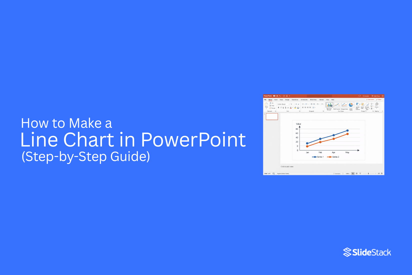
Open PowerPoint and go to the slide where the chart will appear. Go to the Insert tab.
Click Chart. A chart window opens. Select Line from the left menu.
Choose a line chart type from the list below:
• Line
• Stacked Line
• 100% Stacked Line
• Line with Markers
• Stacked Line with Markers
• 100% Stacked Line with Markers
• 3-D Line
• Click OK.
A default chart appears on the slide. An Excel sheet opens at the same time.
Step 2: Enter or Edit Data
The Excel sheet shows sample values. Click inside the cells and remove the sample text. Type your own data in its place. Use the first column for labels. These often show time periods like months or years.
Use the next columns for values. These represent your data points. Add more rows to include more labels. Add more columns to include more data series.
The chart updates right away as changes are made in Excel. Close the Excel sheet after finishing the data entry.
Step 3: Customize Chart Elements
Click the chart on the slide. The chart tools appear at the top. Open Chart Design. Change the chart title by selecting it and typing new text. Adjust the legend position so it matches the chart layout.
Edit axis labels for clearer reading of values and categories. Use formatting options to adjust line color and thickness. Turn gridlines on or off for a cleaner or more detailed view.
Step 4: Format the Chart for Clarity
Charts need clean visuals before they are shown on slides. Small changes make the data easier to read. The goal is simple. The chart should speak without effort.
Some people use ready chart templates to save setup time. These templates help keep spacing, colors, and layout consistent across slides.
Line thickness: Open the Format Data Series panel in PowerPoint. Set the line thickness between 2 and 3 points. Thin lines often get lost on a large screen. A slightly thicker line stays visible from a distance.
Color selection rules: Use one main color for the key data line. Keep background colors light. Avoid using many bright colors in one chart. Too many colors make the data harder to follow.
Marker usage: Use markers only for key data points. Keep them small and consistent. Large markers distract from the line pattern. Simple circles or dots work best.
Axis refinement: Remove extra grid lines that do not add value. Keep only the main reference lines. Set axis numbers in a simple format. Short labels help the eye move faster across the chart.
Title rewriting: Use a short and direct title. Place the main idea at the top. Avoid extra words in the title. A clear title helps the audience understand the chart in seconds.
Legend usage: Place the legend close to the chart area. Remove it if only one data series is shown. This gives more space to the visual itself.
A sales line chart with one strong line, light grid lines, a simple title, and minimal legend reads clearly on a slide.
How to Edit Data in an Existing Line Chart
Open the chart in your presentation file. Click on it once. A data sheet appears. This sheet controls the numbers behind the chart.
Change values in the table. Add new rows if needed. Remove anything that does not belong. The chart updates right away.
Check the axis after edits. Sometimes the scale shifts. Adjust it so the trend stays clear.
Look at the chart again on the slide. Make sure the message still reads clearly.
Line Chart Design Best Practices
Keep It Simple: A line chart works best with fewer lines and fewer data points. Too much data makes it hard to read. Focus only on what matters.
Use Meaningful Colors: Pick colors that separate each line clearly. Avoid colors that look too similar. Strong contrast helps the eye follow each trend.
Label Directly Instead of Using Legends: Place labels near the lines. This removes extra steps for the reader. It also saves space on the slide.
Avoid Chart Junk: Remove gridlines, effects, and extra shapes that do not add value. Clean space helps the data stand out more.
Tips on Which Line Chart to Use in PowerPoint
1. Standard Line Chart
A Standard Line Chart is the simplest and most widely used option. It shows trends over time using a single line or multiple lines. Each point connects smoothly, making changes easy to follow. This chart is best for clear and direct data display without extra layers.
It works well for:
• Sales or revenue tracking
• Growth trends over time
• Performance tracking across periods
• Any single or comparable time-based data
2. Stacked Line Chart
A Stacked Line Chart shows how different data groups build up into a total. Instead of separate lines, values are placed on top of each other. This helps show both the total and the parts that make it.
It is useful for:
• Showing total sales with category breakdowns
• Tracking combined performance across teams
• Understanding how parts contribute to a full result
• Visualizing cumulative changes over time
3. 100% Stacked Line Chart
A 100% Stacked Line Chart focuses on percentages instead of raw numbers. Each point always adds up to 100%. The goal is to show how each group changes in share over time.
It is commonly used for:
• Market share comparison
• Budget allocation over time
• Survey results shown as percentages
• Comparing relative contributions
4. Line Chart with Markers
A Line Chart with Markers places visible dots on each data point. These markers make it easier to read exact values and spot changes. It improves clarity when every point matters.
It is suitable for:
• Small or medium datasets
• Monthly or quarterly reporting
• Highlighting peaks and drops
• Data where precision is important
5. Stacked Line with Markers
A Stacked Line with Markers combines stacked values with visible data points. It shows both the total buildup and each individual contribution at every step. The markers help highlight exact values in a layered view.
It is useful for:
• Department-wise performance tracking
• Multi-product revenue analysis
• Financial breakdowns over time
• Situations where detail at each point is needed
6. 100% Stacked Line with Markers
A 100% Stacked Line with Markers shows percentage-based stacking with clear point markers. It keeps focus on proportional changes while still showing exact values at each stage.
It works well for:
• Market share movement tracking
• Product mix analysis
• KPI breakdowns by percentage
• Comparing category shares over time
7. 3-D Line Chart
A 3-D Line Chart adds depth to the standard line format. It changes the visual angle to create a three-dimensional effect. While it may look visually interesting, it can make the exact reading less clear.
It may be used for:
• Design-focused or visual presentations
• Slides where style matters more than precision
• Creative storytelling layouts
• Marketing visuals with light data focus
Common Mistakes to Avoid When Creating a Line Chart in PowerPoint
Line charts should make data easy to read. Many charts fail because of small design errors. These errors reduce clarity and can change how people understand the message. Good data can still look confusing when the chart is not built with care.
Below are common mistakes and how to avoid them.
1. Overloading the Chart
Adding too many lines creates confusion. The chart becomes crowded. It is hard to follow any single trend.
The impact is simple. The message gets lost. Viewers stop focusing on insights and start trying to separate lines.
Keep the chart simple. Use only the most important data series. Two to four lines often work best. Move extra details to another slide.
2. Mixing Inconsistent Data Intervals
Charts depend on equal spacing. Problems start when time periods are mixed, such as monthly data combined with yearly data. This creates false patterns. A steady change can look uneven or exaggerated. The audience may read the trend the wrong way. Use one time interval across the chart. Monthly data stays monthly. Yearly data stays yearly. Separate charts help keep each pattern clear.
3. Using Low-Contrast Colors
Colors that are too similar make lines hard to see. This becomes worse in large rooms or on projectors.
The result is weak readability. Lines blend together. Key differences disappear. Choose strong, clear colors. Each line needs a clear visual identity. Keep enough contrast between the background and the data.
4. Overuse of Markers
Markers can help highlight points. Too many markers create noise on the chart. The focus shifts away from the trend. The chart feels busy and harder to scan. Use markers only for key points. Milestones or important changes are good places for them. For long data sets, rely on the line itself.
5. Misleading Axes
Axis design can change how data is understood. A poorly set axis can exaggerate small changes or hide real movement. This affects trust. The audience may question the accuracy of the chart.
Keep axis scaling natural. Start from a logical baseline. Use equal spacing between values. The chart should reflect the real pattern in the data.
When to Use a Line Chart vs Other Charts
A line chart shows change over time. It helps track patterns across days, months, or years. The line connects data points, so trends are easy to see. A bar chart works better for comparing groups. Each bar shows a category. The height of the bar shows the value. This makes the differences clear at a glance.
A pie chart shows parts of a whole. It breaks data into slices. Each slice shows how much each part contributes to the total. Line charts focus on movement and direction. Bar charts focus on comparison. Pie charts focus on share and proportion.
Final Notes
Line charts in PowerPoint help you show data over time. They show trends, compare groups, and support KPI tracking. In business work, they make numbers easier to read. Reports become simpler to follow. Attention stays on the main changes in the data.
A good chart layout helps turn data into a clear visual story. It supports performance tracking, sales reporting, and project updates. Line charts also work well for regular business reporting. They keep information organized and easy to understand. You can also look at line chart examples and templates for PowerPoint to get ideas for layout and design.
FAQs:
1. What is a line chart in PowerPoint?
A line chart shows data points joined by a line. It displays change over time. Each point represents a value.
2. Why are line charts used in presentations?
They show trends in a clear way. They turn numbers into a visual form. This makes data easier to follow.
3. How is a line chart added in PowerPoint?
Open the Insert tab. Select Chart. Choose Line from the options. A chart appears with an Excel sheet for data.
4. How is data edited in a line chart?
Open the linked Excel sheet. Change the values in the cells. The chart updates right away on the slide.
5. Which line chart type works best for tracking sales?
A standard line chart fits sales tracking well. It shows change across time periods like months or years.
6. How many lines should a chart include?
A small number of lines keeps the chart readable. Two to four lines usually keep the view clear.
7. How can a line chart be made easier to read?
Use strong color contrast between lines. Remove extra gridlines. Keep labels short and direct. Avoid extra visual elements.
8. What mistakes affect line chart quality?
Too many lines create clutter. Mixed time intervals distort patterns. Weak color choices reduce visibility. Misaligned axes change the data story.


You may also be interested in ...

How To Create An Eye-Catching Portfolio
If you’re looking to create an eye-catching portfolio, this post will come in handy. In this article, you can find the easies...
23 Jun, 2024

How To Easily Create An Infographic
Infographics are the perfect way to make a presentation that will impact an audience, but their design and composition might...
08 Jun, 2024

PowerPoint Template Tips & Tricks You Ne...
PowerPoint seems to be an unknown world for many people, especially those who have been assigned to create a presentation out...
08 Jun, 2024