How to Make a Pie Chart in Google Slides (Step-by-Step)

Creating a pie chart in Google Slides can feel confusing if you’re not sure where to start. Many users struggle with getting their data to look right, adjusting colors, or adding labels correctly. This can make presentations look messy and leave your audience confused.
That’s why this guide will walk you through every step of the process. You’ll learn how to build a pie chart, customize its look, and even import charts from Google Sheets. By the end, you’ll be able to create clear, professional-looking pie charts that make your data easy to understand.
Make a pie chart on Google Slides step by step
This section shows how to make a pie chart in Google Slides, one step at a time. Each action is broken down so nothing feels confusing. Read the points below to follow the process from start to finish with ease.
Step 1: Building Your Pie Chart
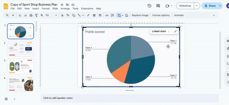
This step focuses on placing the chart correctly. Start by choosing the right slide. Then add the pie chart with clean placement and control.
Finding the Slide
- Open your presentation.
- Review the slide panel on the left side.
- Select the slide meant for visual data.
- Click once to activate the slide.
- Remove any text or objects that may distract from the chart.
The slide should feel balanced and clear. A clean layout helps the chart stand out and stay readable.
Inserting the Chart
- Open the top menu.
- Select the option to insert, then click chart.
- Choose the pie chart option.
- Place the chart at the center of the slide.
- Adjust the size to match the layout.
The chart now appears on the slide. It serves as a visual base. The next step focuses on adding and refining the data.
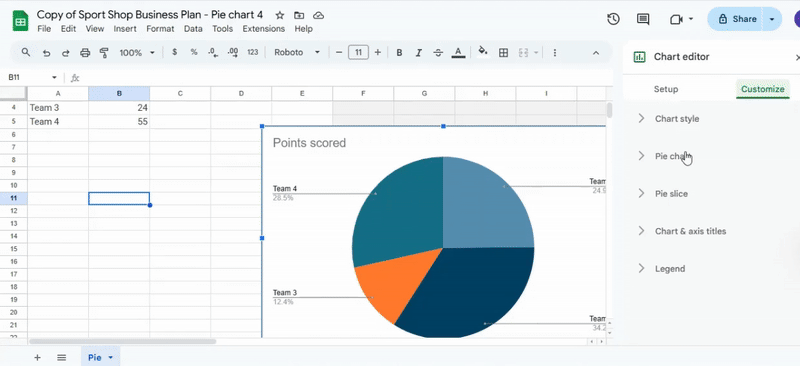
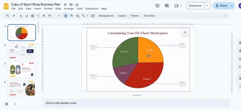
Step 2: Customizing Your Pie Chart Masterpiece
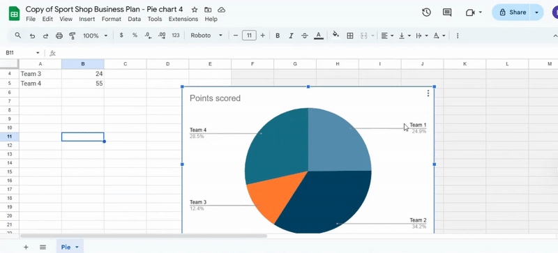
Start by opening the linked data source. Click the pie chart on your slide and select the link that appears. This will open the connected spreadsheet in a new tab. Take a moment to look at the rows and columns. These are the values that control each slice of your chart, and seeing them helps you understand how your data connects to the visual.
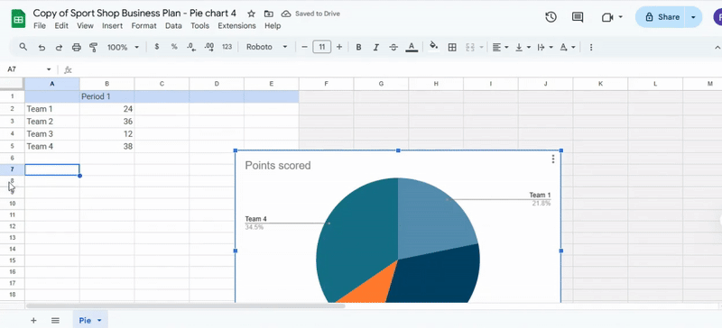
Next, focus on editing the chart values. Replace the numbers in the value column with your own data and add clear labels next to each entry. Short labels work best so the chart remains easy to read. As you type, the chart updates automatically, showing your changes in real time. Even small adjustments can change the look of the chart, and the automatic updates make it easy to experiment without worry.
Finally, close the spreadsheet once you have checked your changes. Review the chart one more time on the slide to make sure everything looks correct. Returning to your slide, you will see your updated pie chart ready to use. Every change remains linked and in sync, making it simple to refine your chart whenever needed.
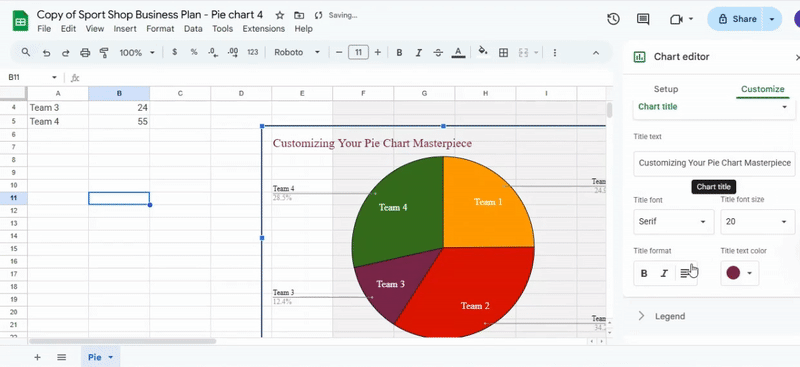
Formatting the Pie Chart Appearance
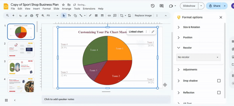
To format your pie chart, start by selecting it so the chart editor opens. This ensures any changes you make apply directly to the chart. Once the editor is visible, explore the tabs for setup, style, and colors. Each tab offers options to adjust how your chart looks, giving you control over its appearance.
Next, focus on colors. Click the color options and assign different shades to each slice. Use brighter colors for key sections to make them stand out. Adjusting slice labels is also important. You can change the text, font size, and position. Drag labels closer or farther from the slices to make the chart easier to read.
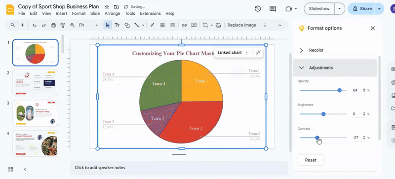
You can also change the chart’s size and shape. Drag the corners to resize the chart and adjust the angle of slices if the editor allows. These tweaks help the chart appear balanced and clear. Adding small visual touches, like borders or shadows, can also make a difference. Borders give definition to each slice, and shadows create a sense of depth. These subtle changes make the chart more visually appealing.
Finally, don’t hesitate to experiment. Try different color combinations and label positions until the chart feels clear and easy to understand. Even small adjustments can improve readability and make the chart more engaging. Treat each change as a way to guide the reader’s attention without overcrowding the visual. Customizing the chart is straightforward once you explore the editor and apply a few thoughtful tweaks.
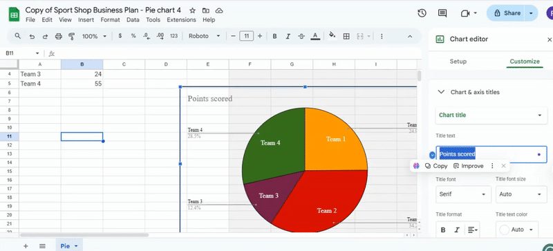
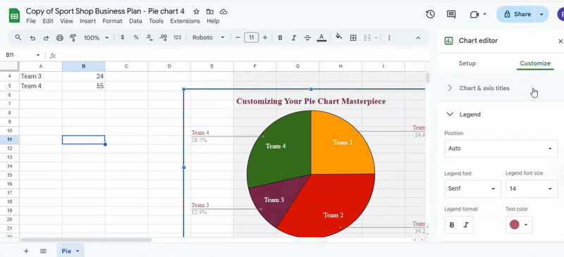
Adding Chart Titles and Labels
Adding titles and labels to your chart helps make the data easier to understand. Start by selecting the chart you want to label. A blue outline appears, showing that it is active. Next, click the chart title at the top. Type in a clear and descriptive title that matches the data, then press Enter to save the changes.
After updating the title, open the Chart Editor by clicking the three-dot menu in the top-right corner of the chart and selecting Edit chart. The Chart Editor panel appears on the right side. To add axis titles, go to the Customize tab and click Chart & axis titles. Choose either Horizontal axis title or Vertical axis title, then type the name for each axis and press Enter.

Adding data labels is the next step. In the Customize tab, click Series and check the Data labels box. Labels appear on each data point automatically. You can adjust their placement using the Label position dropdown. Options include Inside, Outside, or Center, so pick the one that keeps your chart clear and readable.
Finally, review your chart to make sure all titles and labels are visible and easy to read. Adjust the font size or label position if necessary. Clear titles and labels guide the reader through the data, making your chart informative and professional.
Importing Pie Chart from Google Sheets
Importing a pie chart from Google Sheets into Google Slides starts with opening the presentation and selecting the slide where you want the chart to appear. Make sure there is enough space on the slide for the chart to display clearly. Once the slide is ready, click Insert in the top menu, hover over Chart, and select From Sheets. This opens a window showing your recent Google Sheets files. Choose the spreadsheet that contains your pie chart and click Select to open it.
After opening the spreadsheet, you will see a list of charts it contains. Click the pie chart you want to import. You can select the option to Link to spreadsheet so that any future updates in Google Sheets will automatically appear in your slide. Then click Import to add the chart to your presentation. Once the chart is on your slide, click and drag it to position it correctly. Use the corner handles to resize the chart without distorting its proportions. Make sure the chart labels are easy to read and that the colors are clear for viewers.
You can also edit or update the chart after it has been imported. Click the chart and select the Link icon to open the linked spreadsheet. Changes made in Google Sheets will update automatically in your slide if the chart is linked. If you prefer the chart to stay static, you can click Unlink to prevent updates.
A helpful tip is to check the pie chart labels before presenting. Adjust the font size or colors in Google Sheets first to save time editing in Slides. This ensures the chart is clear and visually effective for your audience, avoiding last-minute adjustments during a presentation. Following these steps carefully makes the process of importing and managing charts straightforward and stress-free.
Conclusion:
Creating a pie chart in Google Slides does not have to be difficult. By following each step, you can build a chart, adjust its look, and add clear labels. Customizing colors and titles makes the data easy to read. Importing charts from Google Sheets keeps your work organized and up to date. With these skills, your slides can show information clearly and look professional every time.
FAQs:
How do I access the Chart Editor in Google Slides?
Select the chart you want to edit. Click the small link icon or the menu that appears, then choose Open in Sheets. The chart will open in Google Sheets, where you can make changes.
Can I change the colors of individual slices in my pie chart?
Yes. In Google Sheets, click the slice you want to change. Then pick a new color from the formatting options. Each slice can have a different color.
Can I animate my pie chart for a more engaging presentation?
Yes. Go back to Google Slides and select your chart. Click Animate, then choose how you want the chart to appear on the slide. You can control the speed and style of the animation.
How do I add data labels to my pie chart?
Select your chart, then open the Chart Editor. Go to the Series section and check the Data labels box. Labels will appear on each slice, and you can move them inside, outside, or at the center.
Can I resize or move my pie chart after adding it to a slide?
Yes. Click the chart, then drag it to a new position. Use the corner handles to adjust the size without changing its proportions.
Is it possible to import a pie chart from Google Sheets?
Yes. In Google Slides, click Insert → Chart → From Sheets. Select the chart you want, choose whether to link it, and then click Import to add it to your slide.
How do I add a title to my pie chart?
Click the chart title at the top. Type a clear title that describes your data, then press Enter. You can also edit axis titles in the Chart Editor under the Customize tab.


You may also be interested in ...

How To Create An Eye-Catching Portfolio
If you’re looking to create an eye-catching portfolio, this post will come in handy. In this article, you can find the easies...
23 Jun, 2024

How To Easily Create An Infographic
Infographics are the perfect way to make a presentation that will impact an audience, but their design and composition might...
08 Jun, 2024

PowerPoint Template Tips & Tricks You Ne...
PowerPoint seems to be an unknown world for many people, especially those who have been assigned to create a presentation out...
08 Jun, 2024