How to Make a Graph on Google Slides Without Hassle

You might spend more time adjusting colors, shapes, or labels than actually presenting your data. It’s frustrating when the slides don’t look clear or professional, and deadlines make the process even more stressful.
Luckily, there’s a simpler way. By following a few straightforward steps, you can create clean, polished graphs without wasting time. You’ll learn how to set up your data, choose the right chart type, and customize it quickly. This method saves effort and ensures your presentations look sharp and easy to understand.
Why Use Graphs in Presentations
Numbers alone can feel hard to follow. A graph turns those numbers into a clear picture. It helps people see what matters right away.
A graph shows trends with ease. You can spot growth, drops, or steady change in seconds. This saves time and keeps your message clear.
It also helps your audience stay focused. Long text can feel heavy. A simple chart gives the eyes a break and keeps attention on the key point.
Clarity matters in every slide. Graphs remove guesswork and reduce confusion. Your idea becomes easier to explain and easier to remember.
There is also a trust factor. Clean visuals make your data feel solid and easy to follow. This builds confidence in what you share.
In the end, a good graph supports your story. It keeps your slides simple, clear, and easy to understand.
Types of Graphs You Can Create in Google Slides
Google Slides lets you show data in clear ways. You can pick a graph that fits your message. Each type has a simple purpose.
Bar Graph: A bar graph uses bars to compare values. It works well for side-by-side data. You can show which item is bigger or smaller at a glance.
Column Graph: A column graph is like a bar graph, but it stands upright. It is good for showing changes over time. Each column represents a data point.
Line Graph: A line graph connects points with a line. It shows trends across time. This helps your audience see rises and drops.
Pie Chart: A pie chart shows parts of a whole. Each slice stands for a share. It is useful for showing percentages.
Scatter Plot: A scatter plot uses dots to show data points. It helps show how two sets of data relate. Patterns become easy to spot.
Area Chart: An area chart looks like a line graph, but the space under the line is filled. It shows totals over time and gives a sense of volume.
Each graph serves a clear role. Pick one that matches your data and your goal.
Methods to Add a Graph in Google Slides
Adding a graph helps present data in a clear way. It turns numbers into simple visuals. You have a few easy methods to do this in Google Slides. Each one fits a different need.
Using Built-in Chart Feature
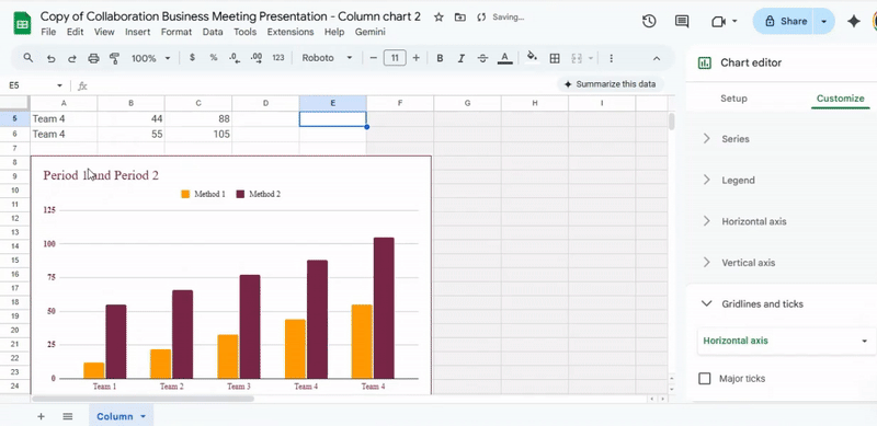
Start inside your slide. Go to the Insert tab and pick Chart. A small list will appear with options like bar, line, or pie. Choose one that fits your data.
A sample chart will show up on your slide. It comes with simple data. Click on the chart, then open the linked sheet. Now replace the sample values with your own numbers.
Once you finish, the chart updates on your slide. The design stays clean, and the data looks easy to read.
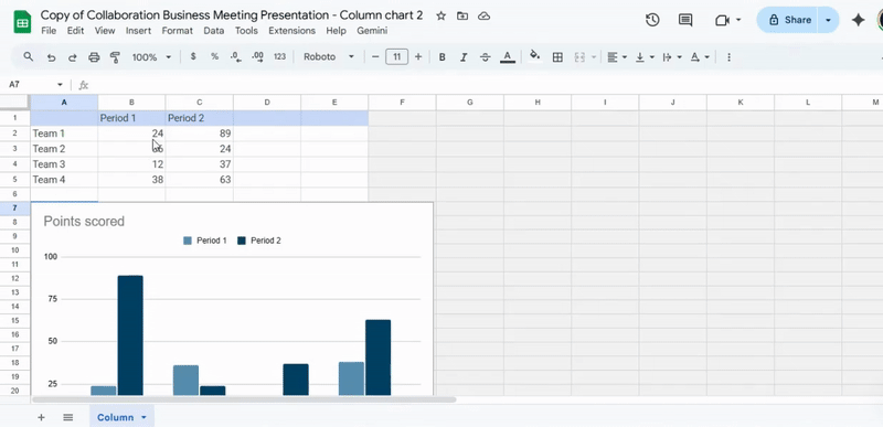
Importing a Graph from Google Sheets
Need more control over your data? This method works well.
Open your slide and go to Insert. Pick Chart, then choose From Sheets. A window will show your files. Select the sheet that holds your chart.
Next, pick the chart you want and insert it. The chart keeps a link to the sheet. Any change in the sheet updates the chart in your slide. This keeps your data accurate.
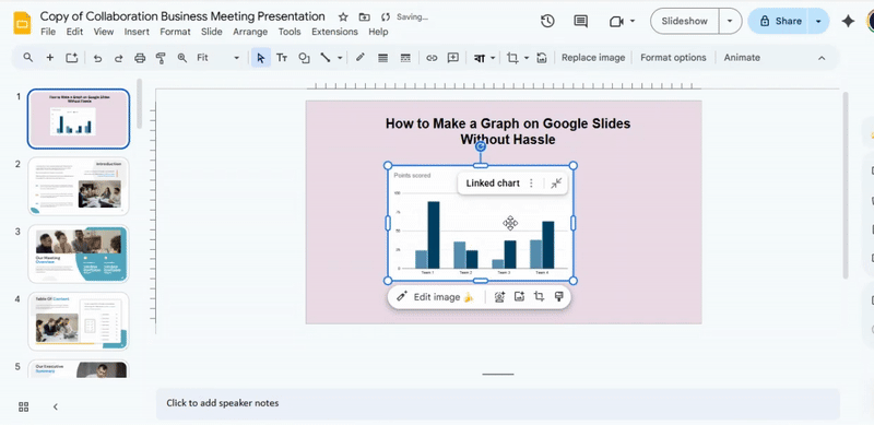
Copy-Pasting an Existing Chart
Already made a chart? You can move it in seconds.
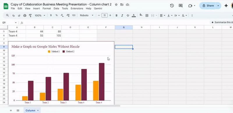
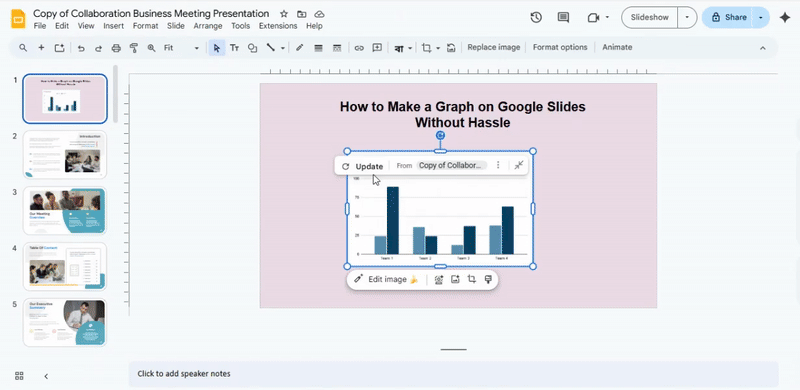
Go to your chart in Google Sheets or another slide. Copy it. Then paste it into your current slide.
After pasting, you may see a link option. You can keep the link or paste it as a simple image. A linked chart updates with new data. A static chart stays the same.
This method saves time and keeps your work simple.
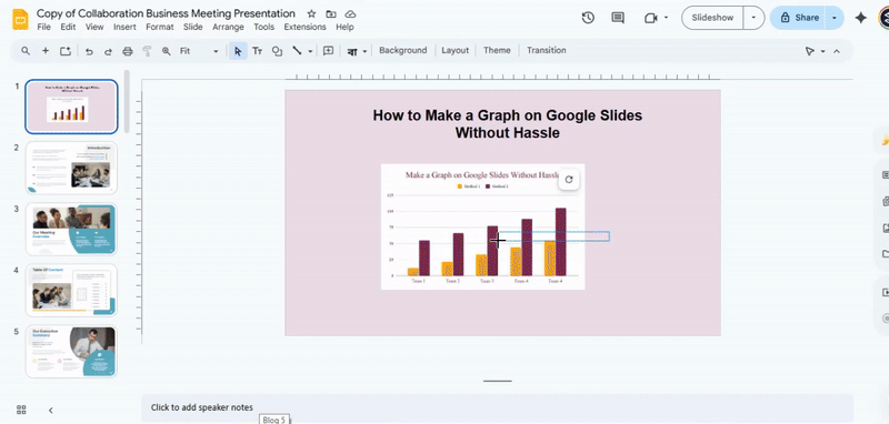
Step-by-step guide to creating a graph on Google Slides
Creating a graph on Google Slides is easier than you might expect. Follow the steps carefully, and you’ll have a clear, professional-looking graph in no time. Keep reading to see the step-by-step points that will guide you through the process.
Step 1: Open Google Slides
Begin by launching Google Slides. You can access it through your browser at slides.google.com. Open a new presentation or an existing one where you want to add your chart. Make sure you are signed in to your Google account to save changes automatically.
Step 2: Insert a Chart
- Click on the “Insert” menu at the top of your screen.
- Select “Chart” from the dropdown options.
- Choose the type of chart you want: bar, column, line, or pie. Each type shows data differently, so pick one that fits your information clearly.
Step 3: Access Google Sheets
After inserting the chart, a small link will appear to open it in Google Sheets.
- Click “Link to Spreadsheet.”
- This opens a new or existing Google Sheet connected to your chart. All changes made here update automatically in Slides.
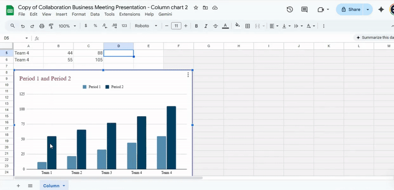
Step 4: Enter Your Data in Google Sheets
- Replace the sample data with your own numbers.
- Use clear labels for rows and columns so the chart reads correctly.
- Add extra rows or columns if needed. Charts will adjust to fit the data automatically.
Tip: Google Sheets can handle large data sets, but keep charts readable by focusing on key points.
Step 5: Customize the Graph
- Change the colors of bars, lines, or pie slices to match your presentation style.
- Adjust the gridlines, axis scale, or data points for clarity.
- Experiment with chart styles under the “Customize” tab to make the chart visually clear and easy to interpret.
Step 6: Add Titles and Labels
- Click on the chart title to edit it. Give it a clear, descriptive heading.
- Add axis titles for bar or line charts to show what each axis represents.
- Use labels for pie slices to show percentages or values.
Tip: Titles and labels help your audience understand the data at a glance.
Step 7: Final Adjustments
- Check the chart for readability and accuracy.
- Resize or move the chart on your slide to fit your layout.
- Ensure the font size and color are visible for all viewers.
Step 8: Save and Present Your Slides
- Google Slides saves automatically, but double-check before presenting.
- Review the chart on “Present” mode to see how it looks full-screen.
- Make adjustments if any elements look crowded or unclear.
How to Customize Graphs for Better Visual Impact
Graphs can look plain at first. A few small changes can make them clear and easy to read. Let’s go step by step and shape them into something that stands out.
Changing Colors and Styles
Color plays a big role. It helps people see key data fast. Start with simple color choices. Use one main color and one or two support colors. This keeps the graph clean.
Next, pick a style that fits your topic. A soft style works well for reports. A bold style fits strong data points. Avoid too many bright colors. That can confuse the viewer.
Also, keep colors consistent. The same color should always mean the same thing. This builds trust and makes your graph easier to follow.
Adjusting Labels and Legends
Labels guide the reader. Clear labels make your graph easy to scan. Use short words or short phrases. Keep the text large enough to read.
Now look at the legend. It should match the data on the graph. Place it where it does not block any part of the chart. A simple layout works best.
If the graph feels crowded, remove extra labels. Keep only what helps the reader. Clean space makes the data easier to see.
Modifying Axes and Data Ranges
Axes control how the data looks. Start by checking the scale. A good scale shows changes in a clear way. Avoid very large gaps that hide details.
Then adjust the range. Make sure the data fits well inside the graph. Too much empty space can make the graph look weak.
Also, name each axis clearly. This helps the reader know what the data shows right away. A small change here can make a big difference in how the graph feels.
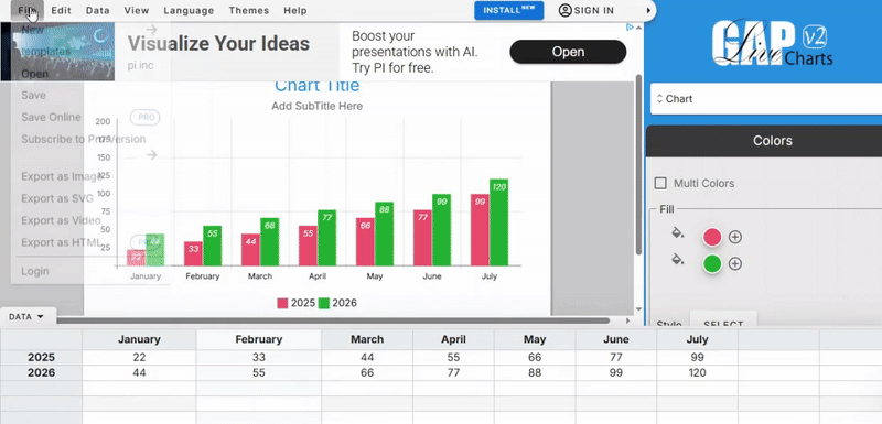
How to make a graph in LiveGap
Creating a graph in LiveGap is simple once you know the steps. Start by opening your LiveGap account and selecting the project where you want the graph.
You can pick the type of graph that fits your data, like a bar, line, or pie chart. Next, add your numbers or labels directly into the chart fields.
Watch as the graph updates in real time with each entry. Keep adjusting colors, labels, or sizes until it looks right.
After that, you can save or export your graph for use in presentations, reports, or projects. Follow the steps below to see it in action.
Add Your Graph to Google Slides:
After downloading your graph from LiveGap, open Google Slides. Go to the slide where you want to place the graph. Click Insert and then Image. Choose the graph file you downloaded and add it to the slide. You can move it, resize it, or adjust it to fit your presentation. This way, your data looks clear and professional right inside Google Slides.
How to Make a Graph in Graphy AI
Open Graphy AI and look at the main workspace. This area is where all chart work begins. Add your data by uploading a file or typing the numbers into the table. Keep each value in the right row and column. Add clear labels so the graph is easy to read.
Next, choose the graph type. Bar, line, and pie options appear on the screen. Pick the one that matches your data. A preview shows the graph right away. Update the title and labels using short words. Check spacing and colors so nothing feels crowded.
Once the graph looks right, save it. Use the export option to download the graph as an image. Pick a format like PNG or JPG. Store the file in a place that is easy to find.
Add Your Graph to Google Slides:
Open your Google Slides presentation and select the slide where the graph belongs. Use the Insert menu at the top of the screen. Choose Image, then Upload from computer. Select the graph image you saved earlier.
After the image appears, resize it using the corner handles. Keep the shape clean and balanced. Place it near related text so the message stays clear. Add a short caption if needed. The slide now shows data in a simple and clear way.
Tips to Make Your Graph Clear and Engaging
Start with a clear goal. Ask yourself what the graph should show. Keep that one idea in focus.
Next, choose the right chart type. Use a bar chart to compare values. Use a line chart to show change over time. A good match makes the data easy to read.
Keep labels short and direct. Use simple words. Place them close to the data so the reader does not search.
Color also plays a big role. Pick two or three colors. Too many colors can confuse the viewer. Use one color to highlight key data.
Spacing matters as well. Leave enough room between elements. Crowded graphs feel hard to read.
Then check your numbers. Make sure the scale is correct. Keep the steps even so the graph stays honest.
Finally, remove anything that does not help. Extra lines, shapes, or text can distract. A clean graph helps the message stand out.
Common Mistakes to Avoid
Many slides fail due to small errors. These mistakes can hurt the message and confuse the viewer. Let’s look at the most common ones.
Too much text is a big issue. Long blocks make slides hard to read. Keep text short and clear. Use key points only.
Poor alignment also causes problems. Items may look messy or out of place. Line up text and shapes to keep a clean layout.
Next, colors can create trouble. Bright or clashing colors hurt the eyes. Stick to a simple color set that is easy to read.
Another mistake is using too many fonts. This breaks the flow of the slide. Choose one or two fonts and stay consistent.
Overuse of animations can distract. Slides may feel busy and hard to follow. Use simple effects and keep them limited.
Low-quality images reduce the look of the slide. Blurry or stretched images look unprofessional. Always use clear and sharp visuals.
Finally, lack of spacing makes slides feel crowded. Give space between elements. This helps the viewer focus on each part.
Fixing these issues can make your slides cleaner and easier to understand.
Troubleshooting Graph Issues
Graphs do not always work as planned. Small errors can change how the data looks. Let’s fix the most common problems.
Start with missing data. A graph may look empty or broken. This often means the data range is wrong. Check the cells linked to the graph. Make sure all needed values are included.
Next, look at labels. Wrong labels can confuse the reader. The chart may show the right numbers but the wrong names. Go back to the data source and fix the text.
Now check the scale. A graph can look odd with the wrong axis range. Numbers may seem too small or too large. Adjust the axis settings so the data is easy to read.
Sometimes, the chart type causes the issue. A bar chart may not fit your data. A line chart may show trends better. Try a different chart style and compare the result.
Also, review formatting. Colors, fonts, and sizes can affect clarity. A busy design makes it hard to follow. Keep the layout clean and simple.
Finally, test the graph. Make a small change and see how it updates. This helps you spot errors early and keep the chart clear.
Conclusion:
When presenting statistics, creating reports, or even tracking your favorite team’s scores, charts, and graphs, they help make patterns in data easier to see and understand. You can choose from many online tools to create your graph, such as Google Slides, Microsoft PowerPoint, or a professional online graph maker.
When designing your graph, it is important to keep the layout clean and professional. This makes your graph easy to read and visually appealing. You can achieve this by adjusting colors, renaming the chart and axes, resizing and aligning the graph, choosing the right font, and more.
Alternatively, you can use one of SlideStack’s many convenient chart and graph templates to quickly create your next graph.
FAQs:
1. Why does my graph appear blurry or pixelated?
Graphs can look blurry if they are resized too much or if the image quality is low. To keep it sharp, try creating the graph directly in Google Slides or using high-resolution images. Avoid stretching images beyond their original size.
2. Will my graph stay intact if I download the presentation as a PowerPoint or PDF?
Yes, your graph usually stays the same when you download it as a PowerPoint or a PDF. Some small formatting changes might happen, so double-check after downloading. Using the “Download as PDF” option usually keeps the best quality.
3. Can I add animations to graphs in Google Slides?
Yes, you can animate graphs in Google Slides. Select the graph, then click “Animate” in the toolbar to choose effects like fade or appear. Animations make presentations more engaging without changing the data.
4. Is it possible to add more than one graph on a single slide?
Yes, you can add multiple graphs on a slide. Just insert each graph separately and arrange them so the slide looks organized. Make sure they are clear and easy to read.
5. How can I change the colors and labels of my graph?
Click on the graph and select “Edit chart.” From there, you can change colors, labels, and other settings. This lets you match your presentation style or highlight key data.


You may also be interested in ...

How To Create An Eye-Catching Portfolio
If you’re looking to create an eye-catching portfolio, this post will come in handy. In this article, you can find the easies...
23 Jun, 2024

How To Easily Create An Infographic
Infographics are the perfect way to make a presentation that will impact an audience, but their design and composition might...
08 Jun, 2024

PowerPoint Template Tips & Tricks You Ne...
PowerPoint seems to be an unknown world for many people, especially those who have been assigned to create a presentation out...
08 Jun, 2024