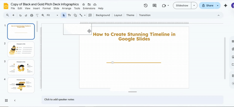
How to Create a Stunning Timeline in Google Slides
Creating a clear and visually appealing timeline in Google Slides can feel frustrating. Many presentations end up cluttered or confusing, making it hard for your audience to follow the sequence of events. This can leave your message lost and your hard work unnoticed.
Fortunately, you don’t have to settle for messy timelines. By following a few simple steps, you can build a timeline that is both organized and eye-catching. This guide will show you how to create the outline, add callouts, and insert text boxes, making your timeline easy to read and visually engaging.
When to Use a Timeline Slide
A timeline slide works best for showing a sequence of events in a clear order. It helps the audience follow how something developed over time without confusion or scattered details.
This type of slide fits well in situations like:
• Project planning from start to finish
• Product or service launch stages
• Company or brand history
• Roadmaps for future steps
• Event planning with key dates
Each point sits in order, making it easier to see progress and movement from one stage to the next. Instead of separate slides for each moment, everything stays in one continuous flow, which keeps the message easier to follow during presentations.
Types of Timelines You Can Create
Timelines help show events in order. Different styles fit different needs. Some are simple. Some show more detail. Each type has a clear purpose.
Horizontal Timeline
A horizontal timeline runs from left to right. Events appear in a straight line. It works well for simple stories or project steps. Each point is easy to follow. This style fits presentations with limited space.
Vertical Timeline
A vertical timeline runs from top to bottom. Events stack in order. It is easy to read on mobile screens. Long lists of events fit better here. This style is often used in reports and resumes.
Milestone-Based Timeline
A milestone-based timeline shows key points only. Each milestone marks a major step or goal. Small details are not included. This style helps track progress in projects. It keeps focus on results.
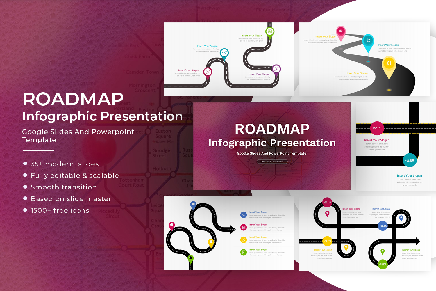
Roadmap Timeline
A roadmap timeline shows plans over time. It often includes stages and goals. It is used for projects and product planning. Each section shows what happens next. The layout helps with long-term direction.
Minimal vs Detailed Timelines
A minimal timeline uses few words and simple markers. It keeps only the main events. A detailed timeline includes extra notes and explanations. It shows more context for each step. The choice depends on how much information is needed.
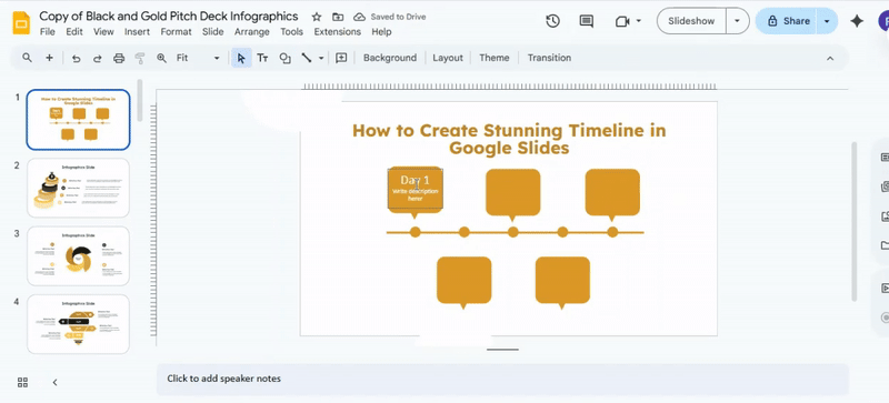
Creating the outline
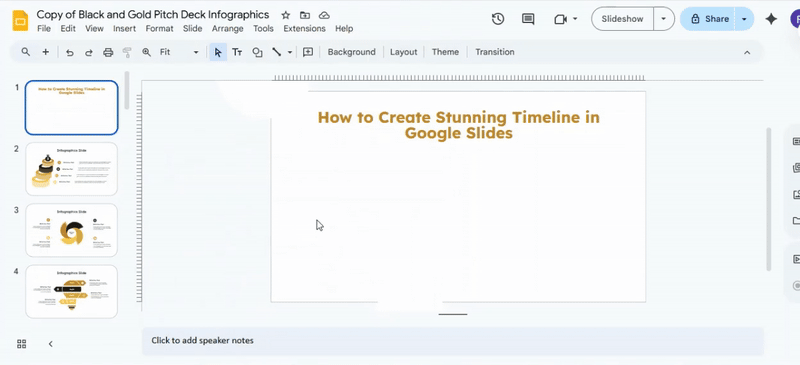
Open your Google Slides file.
Move to the slide where the timeline will appear.
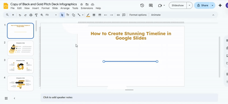
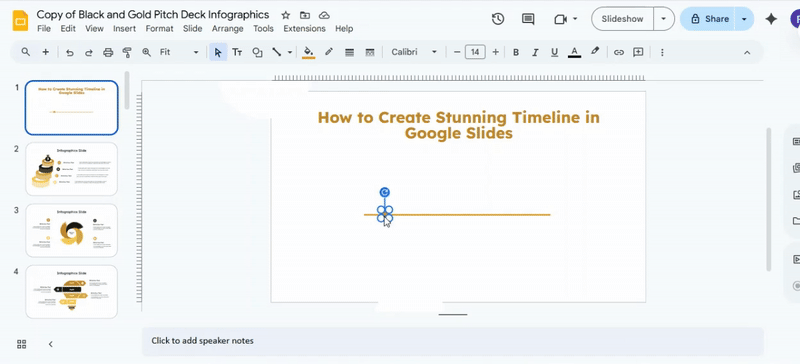
Go to the top toolbar.
Select Line, then choose Line.
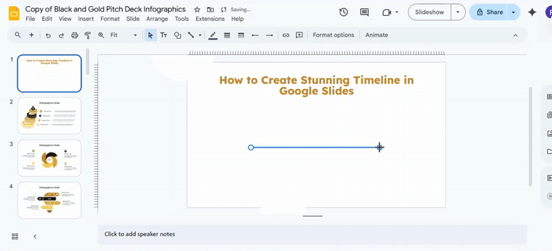
Use the Line color to adjust the color. Use Line weight to change the thickness. Keep the style consistent with the rest of the slides.
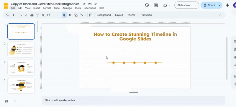
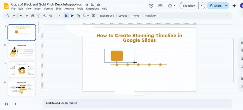
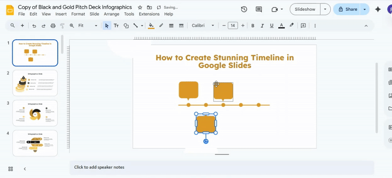
Next, return to the toolbar. Select Shape, then Shapes. Choose Oval to draw a circle. Each circle marks one milestone. This example uses five circles to show five days.
Pro tip: Hold the Shift key while dragging. This keeps the circle perfectly round.
Select the circle. Use Fill color to match the line color. Adjust the border using Border color, Border weight, and Border dash. For a clean look, remove the border. Choose Transparent for the border option.
This keeps the design smooth and simple.
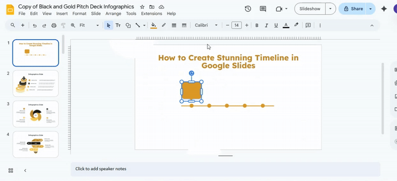
Duplicate the circle four times. This creates five milestones in total. Use Ctrl + C and Ctrl + V on Windows. Use Cmd + C and Cmd + V on Mac. Place the second circle along the line. Repeat for the third, fourth, and fifth circles. As you move each circle, alignment guides appear. Follow these guides to keep spacing even and neat.
Read also: How to Arrange and Align Objects in Google Slides: Tips and Tricks
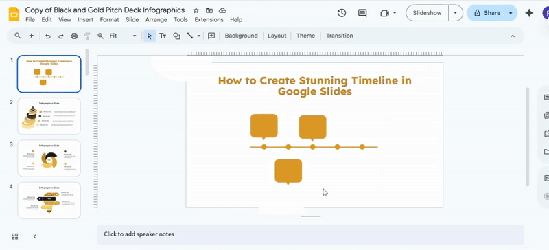
Creating Callouts for Your Text
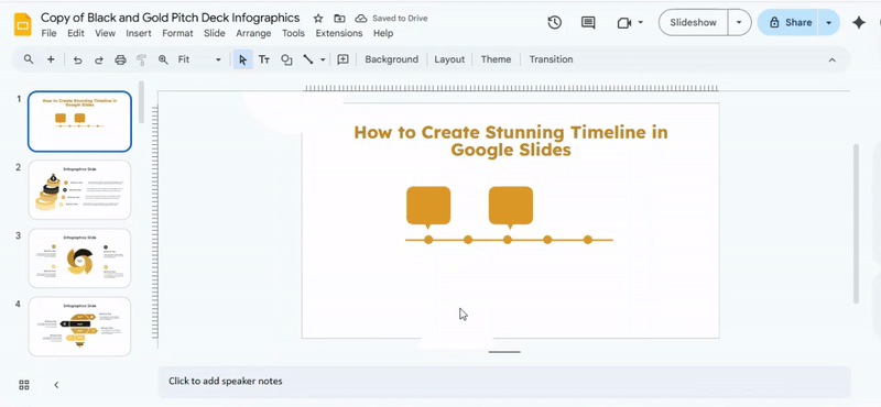
Start by opening the toolbar. Click Insert, Choose Shape, then Shapes, and then Callouts. Place a callout near each milestone. This step builds the basic structure of your timeline and shows where text will sit.
The default callouts in Google Slides point in one fixed direction. That works, but custom shapes give more control. For a custom look, insert a square shape and an upside-down triangle. Match the fill color and border style so they appear as one unit.
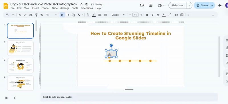
Once both shapes are in place, select them together. Drag your cursor over the full callout area so nothing is missed. Treating them as one object makes editing easier.
A quick tip helps here. Group the shapes so they move together. Select the shapes, open Arrange, then choose Group. This keeps spacing and alignment intact while you work.
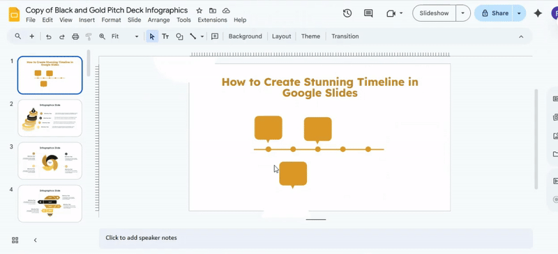
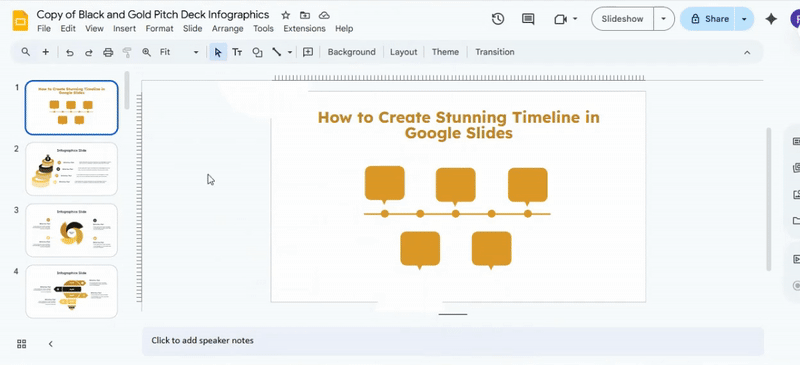
Next, copy the callout using Ctrl + C and Ctrl + V on Windows or Cmd + C and Cmd + V on Mac. Drag the copy above another milestone circle. Continue duplicating until each point on the timeline has a callout.
As the slide fills up, placement starts to matter more. Move some callouts above the line and others below it. This creates breathing room and keeps the layout easy to scan.
To make a callout point toward a circle below the line, select it.
Open Arrange, choose Rotate, then select Flip vertically. The tail will now face the milestone.
There is also a faster way to rotate shapes. Click the callout to show the blue handles. Grab the handle that sits farthest from the shape and drag it around. Hold Shift to rotate in clean steps.
Keep copying and placing callouts until the timeline is complete. Check that each callout sits the same distance from its circle. Make small adjustments so everything lines up and feels balanced on the slide.
Creating Text Boxes
Step 1: Insert a Text Box
Go to the Insert tab and click on Text Box. Choose either a simple rectangle or draw a custom shape. Place it where you want the text to appear.
Pro tip: Use gridlines to keep your box aligned with other elements on the slide.
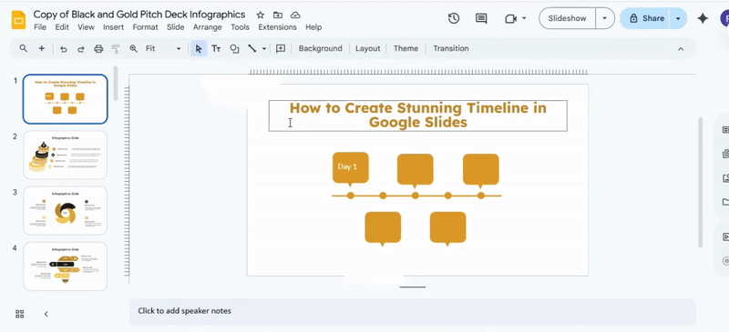
Step 2: Add Titles and Descriptions
Click inside the text box to type your title or description. Keep titles short and clear. Descriptions can be slightly longer, but aim for one or two lines.
Pro tip: Stick to one idea per box to keep slides easy to read.
Step 3: Style Your Text
Highlight your text and select a font that is easy to read. Adjust the size, weight, and color to create contrast. Avoid using too many font styles in the same slide.
Pro tip: Use bold or color sparingly to emphasize important points.
Step 4: Align the Text Box
Select the box and use the alignment options to center or line it up with other elements. Ensure spacing between boxes is even.
Pro tip: Hold Shift while moving boxes to keep them straight.
Step 5: Fill Out All Text Boxes
Repeat the process for all remaining boxes. Check for consistency in font, size, color, and spacing. Make adjustments as needed.
Pro tip: Review your slide as a whole to ensure balance and clarity.
Step 6: Final Check
Read through your slides to confirm every box is clear and visually balanced. Small tweaks make a big difference.
Great work! Your slides now have clean, readable text boxes. You can apply these steps to other templates for quick, consistent results.
Design Principles for a Stunning Timeline
A timeline works best with a clear order. Events should follow a simple path from start to end. This helps people follow the story without effort. Space matters in a timeline. Each point needs room to breathe. Crowded sections make it hard to read and understand.
A straight alignment keeps everything easy to scan. A clean line guides the eye from one event to the next. This removes confusion. Text size should show importance. Key events need larger text. Smaller details can stay lighter. This builds a clear visual order.
Colors should stay consistent. Too many colors can distract. A small set of matching colors keeps the design calm and clear. Icons can help explain points quickly. Simple shapes work best. Too many details in icons can slow down understanding.
Short text keeps the timeline sharp. Long sentences make it heavy. Clear and brief wording helps people move through each step with ease.
Pro Tips to Improve Your Timeline Design
Keep each point clear on the slide. A timeline works best with a simple structure. Too many details make it hard to read. Use equal spacing between steps. This keeps the flow steady and easy to follow. Uneven gaps break the visual rhythm.
Pick one direction for the timeline. A left-to-right layout or a top-to-bottom layout works well. Mixing directions creates confusion. Limit the number of colors. One main color and one accent color keep the design clean. Too many colors pull attention away from the content.
Use short text for each point. One line or a few words per step helps the viewer scan quickly. Align all elements carefully. Straight lines and even placement make the timeline look neat and organized.
Add icons only when needed. Simple icons can support meaning, but too many can distract from the message. Keep enough empty space around each section. This helps each step stand out without feeling crowded.
Common Mistakes to Avoid
Many slides look messy because of poor structure. People rush the design and skip planning. The message gets lost. Too much text is a frequent problem. Long paragraphs make slides hard to read. Viewers stop paying attention.
Font choices also cause issues. Mixing many styles creates confusion. Clean fonts keep things easy to follow. Colors can go wrong fast. Bright and random colors distract from the content. A simple palette keeps focus on the message.
Overloading slides with elements slows understanding. Every slide needs space to breathe. One idea per slide works better. Animations can become a problem, too. Too many effects make the flow feel noisy. Simple movement keeps attention on the content.
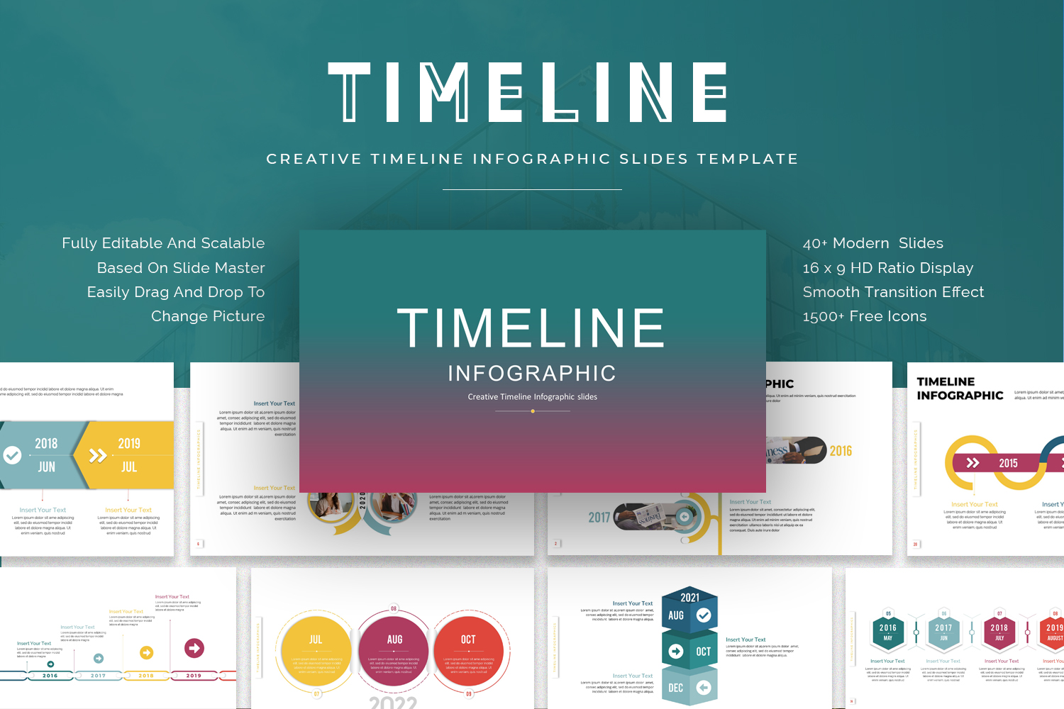
Using Google Slides Timeline Templates
Timeline templates in Google Slides save time. They give a ready layout for project steps. The structure is already set, so the focus stays on your content. Open Google Slides and go to the template gallery. Pick a timeline layout that fits your goal. Each template shows a different style of time flow.
Replace sample text with your own dates and events. Keep each entry short. Use clear words so each step is easy to follow. Adjust colors to match your topic. Stick to a small set of colors. This keeps the slide easy to read.
Add icons or simple shapes for key points. Space them out so nothing feels crowded. Each part of the timeline should stand on its own. Review the slide for spacing and order. Each step should guide the viewer from start to finish without confusion.
Timeline Examples for Inspiration
Business Roadmap: A business roadmap shows how a company grows over time. It breaks goals into clear stages. Each stage has a focus and a target date.
Start with a simple goal list. Add product plans, marketing steps, and hiring stages. Place them on a clear timeline from start to finish.
A roadmap can also show changes in direction. New products or services can be added as separate steps. This keeps the plan easy to follow.
Project Timeline: A project timeline helps track work from start to finish. It shows tasks in order. Each task has a start date and an end date.
Break the project into small parts. List design, planning, execution, and review. Each part sits on a clear point in time.
Deadlines help keep the work steady. Progress becomes easier to check. Teams can see what comes next without confusion.
Historical Timeline: A historical timeline shows events in order of time. It helps show how things have changed over the years or centuries.
Start with key events. Add dates next to each event. Place them from earliest to latest.
Each event connects to the next one. This helps show cause and effect. It also helps people understand long-term change in a simple way.
Exporting and Presenting Your Timeline
Your timeline is ready for use in other places. Save it in a format that fits your needs. A PDF works well for sharing and printing. An image file works well for slides and quick viewing.
A clear layout matters during a presentation. Keep spacing even. Keep text easy to read. Large screens need simple visuals so the audience can follow each step without strain.
Presentation mode helps during live sharing. Full-screen view keeps focus on the timeline only. Remove extra toolbars or side panels before showing it to others.
Sharing also matters. Email works for direct sharing. Cloud links help teams view the file without sending attachments. Choose a method that keeps access simple and stable.
Conclusion
Creating a stunning timeline in Google Slides doesn’t have to be complicated. By carefully building the outline, aligning shapes, adding clear callouts, and using well-styled text boxes, you can present information in a way that’s easy to follow and visually appealing. Keeping colors consistent, spacing balanced, and text readable helps your timeline look polished and professional. With these steps, your timelines will communicate ideas clearly and leave a strong impression on your audience.
FAQs:
Can I create a timeline in Google Slides without using shapes?
Yes, you can use text boxes and lines to create a simple timeline. However, shapes make timelines clearer and easier to align.
How many points should a timeline have on one slide?
It’s best to keep timelines simple. Five to seven points usually work well without making the slide feel crowded.
Can I animate timeline elements in Google Slides?
Yes, you can add animations to circles, text boxes, or callouts using the Animate option to reveal each step gradually.
What is the best font for timeline slides?
Clean, sans-serif fonts work best. Choose one that’s easy to read and keep it consistent across the slide.
Can I use templates to create timelines faster?
Yes, timeline templates can save time and help maintain a consistent design, especially for recurring presentations.


You may also be interested in ...

How To Create An Eye-Catching Portfolio
If you’re looking to create an eye-catching portfolio, this post will come in handy. In this article, you can find the easies...
23 Jun, 2024

How To Easily Create An Infographic
Infographics are the perfect way to make a presentation that will impact an audience, but their design and composition might...
08 Jun, 2024

PowerPoint Template Tips & Tricks You Ne...
PowerPoint seems to be an unknown world for many people, especially those who have been assigned to create a presentation out...
08 Jun, 2024