How to Add Bullet Points in Canva for Clean and Simple Designs
Bullet points in Canva often end up looking uneven, making designs feel cluttered and harder to read during presentations or shared content. This weak structure reduces clarity and pushes important ideas together, which makes the layout harder for viewers to scan quickly. This creates a challenge for anyone building clean visuals in Canva.
Canva offers simple ways to add and adjust bullet points across text boxes and designs. These options help organize content, keep spacing consistent, and guide attention across each section of your design. This guide explains clear methods to add bullet points in Canva so your layouts stay simple, readable, and visually structured from start to finish for better results.
Why Use Bullet Points in Canva
Bullet points in Canva help break information into small parts. Each point shows one idea. This makes text easier to read and follow. Viewers can scan content quickly without effort. The structure keeps focus on key messages and removes clutter from large text blocks.
Designers use bullet points to organize ideas in a clear way. The format separates thoughts so each message stands out on its own. This improves understanding, especially in slides with limited space. It also helps maintain a clean layout that does not feel crowded or heavy.
Beyond presentations, bullet points work well in posters, social media posts, and infographics. They support simple list building and step-by-step layouts. This makes information easier to share across different Canva designs while keeping the message direct and structured.
How to Insert Bullet Points in Canva
You can create bullet lists in Canva by using built-in tools, keyboard shortcuts, or symbols. Each method helps you format text into clear list points for designs like presentations, posters, and social posts.
Method 1: Use Canva’s Built-In Bullet List Option
Canva has a built-in feature for bullet lists. It helps keep spacing even and makes editing easier inside text boxes.
Step 1: Open your design
Open your Canva project and go to the page with your text.
Step 2: Select the text box
Click inside the text box that contains your content.
Step 3: Highlight the text
Select the lines you want to turn into a list.
Step 4: Turn on the bullet list
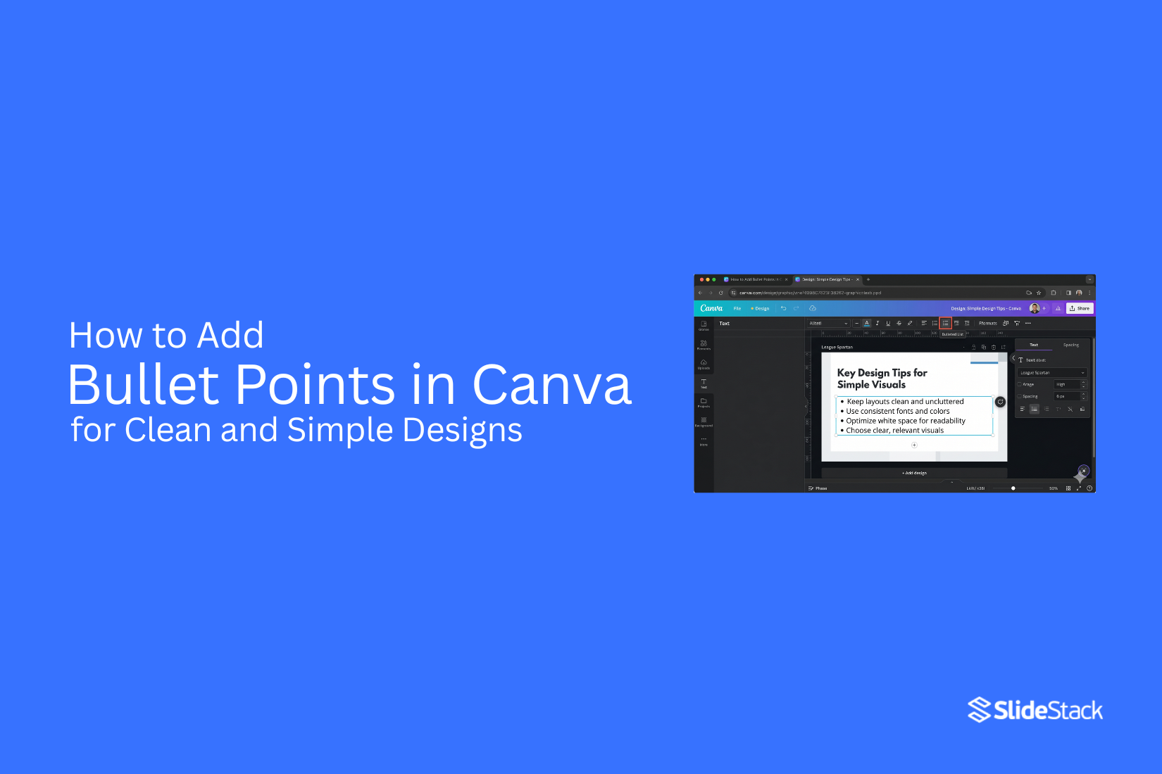
Click the list tool in the top text menu. The text changes into bullet points.
Step 5: Adjust spacing
Use spacing tools to change line height and indentation for better clarity.
Method 2: Use Keyboard Shortcuts in Canva
Keyboard shortcuts help you add bullet points while typing.
Step 1: Add a text box
Open Canva and place a new text box on your design.
Step 2: Start typing
Write your first line of text.
Step 3: Insert bullet symbol
Use the shortcut to add a bullet point.
Windows: Alt + 0149
Mac: Option + 8
Step 4: Create more lines
Press Enter after each line and repeat the shortcut for new bullet points.
Method 3: Use Symbols for Bullet Points
Symbols give more control over the look of your list.
Step 1: Open a text box
Add a text box to your Canva design.
Step 2: Add a bullet symbol
Copy a bullet symbol such as •, ○, ■, or →.
Step 3: Paste the symbol
Place it at the start of each line.
Step 4: Add your text
Type your content after each symbol and keep spacing even across all lines.
Method 4: Use Icons for Custom Bullet Lists
Icons help create styled lists for visual designs.
Step 1: Open the Elements panel
Go to Elements in Canva.
Step 2: Search for icons
Look for circles, dots, or arrow shapes.
Step 3: Place icons beside text
Drag one icon next to each line of text.
Step 4: Copy for other lines
Duplicate the icon and align it with each new line for a consistent look.
How to Change Bullet Point Color in Canva
Bullet point color helps control how your list looks on a design. Canva lets you adjust it in a few simple ways. You can match the text color or style bullets in a different color for contrast.
Method 1: Create Canva Bullet Lists with the Same Color as the Text
Step 1: Start by selecting the text box that has your list. Highlight the full list so all lines are active.
Step 2: Open the top text toolbar. Look for the text color option. Choose one color for the text.
Step 3: The bullet points will match the same color as the text. This keeps the list clean and uniform.
Step 4: You can adjust font size or spacing after this step. The bullet color stays tied to the text color.
Method 2: Create Canva Bullet Lists with Different Colors for Bullet and Text
Step 1: Select the text box that contains your bullet list. Keep the list highlighted.
Step 2: Open the toolbar and change the text color first. Pick the color you want for the words.
Step 3: Next, click into each bullet line. Highlight only the bullet symbol at the start of each line.
Step 4: Change the bullet symbol color using the text color option. Pick a different shade from the text color.
Step 5: Repeat this step for each bullet. This creates a mixed look with separate colors for bullets and words.
How to Animate Bullet Points in Canva
Bullet points help break ideas into small parts. Animation makes each point appear in motion during a presentation. Canva gives basic animation tools for this.
Step 1: Open your design
Go to your Canva project. Click the page that has your text.
Step 2: Select the text box
Click the text that has bullet points. A toolbar appears above the editor.
Step 3: Open animation options
Click the “Animate” button in the top menu. A side panel opens with effects.
Step 4: Choose an animation style
Pick an animation from the list. Common choices include Fade, Pan, and Rise. The whole text box will move with the effect.
Step 5: Preview the animation
Press the play button in Canva. Watch how the bullet points appear on screen. Adjust the effect if needed.
Note on Canva limitation
Canva does not animate each bullet point one by one inside a single text box. All bullet points move together as one block. This can feel limiting during presentations.
Workaround for better control
Break each bullet point into separate text boxes. Place them in order on the page. Apply animation to each text box one at a time. Set different timings for each one. This makes bullet points
Read also: How to Add Bullet Points in Google Slides for Better Readability
Customizing Bullet Points for a Clean Look
Bullet points help organize content in a simple way. They make text easier to read. They also help designs look neat on a slide or page. Canva gives options to change how bullet points look. Small changes can make a big difference in how clean your design feels. Start with spacing. Tight spacing can make text feel crowded. More space between lines helps each point stand out. This also makes reading easier for the viewer.
Next comes alignment. Left alignment keeps everything in order. It helps the eye move down the list without effort. A straight line of text feels balanced and clean. Font choice also matters. Simple fonts work best. Bold or fancy fonts can make bullet lists harder to read. A plain style keeps the focus on the message. Bullet style can also be changed. Some designs use dots. Others use squares or simple icons. A small icon can add structure without making the design heavy.
Color choice plays a role, too. Dark text on a light background is easy to read. Soft colors can also work if contrast stays clear. A clean bullet list does not need extra decoration. Each point should stand on its own. Short lines help keep attention on the message instead of the design. A quick look at the slide shows the effect. The text feels lighter. The message feels clearer. The design feels more organized without extra effort.
Best Practices for Bullet Points in Canva
Using bullet points in a clear way helps organize ideas on a slide. It makes content easier to read during a presentation. It also helps viewers focus on one idea at a time.
Keep Bullet Points Short and Focused
Bullet points work best with short text. Each point should carry one idea. Long sentences make slides harder to read. Short phrases keep attention on the main message. This also helps during speaking, since slides support what is being said.
Use Consistent Formatting Across Slides
Keep the same font style on every slide. Keep the same size and spacing as well. Mixed styles can break visual flow. A steady look across slides makes the presentation feel organized. Canva templates can support this structure.
Avoid Overloading Slides with Bullet Lists
Too many points on one slide reduce clarity. The main message gets lost. Keep only key ideas on each slide. Split content into new slides if needed. This keeps each slide easier to follow.
Use Visual Hierarchy to Improve Readability
Some points carry more weight than others. Place stronger ideas first in the list. Use spacing or size differences to separate main points from smaller ones. This structure guides the reading flow across the slide.
Match Bullet Styles to the Presentation Theme
Bullet style should match the slide design. Simple bullets work well in formal layouts. Icons or shapes can fit creative designs. A matching style keeps the design balanced and clean across all slides.
Use Spacing to Improve Slide Balance
Space between bullet points helps each idea stand out. Tight spacing makes text feel crowded. Extra space improves scanning during presentations. Balanced spacing also keeps slides visually steady.
Consider Mobile and Screen Viewing
Many presentations are viewed on smaller screens. Small screens reduce reading space. Use clear text size and short lines. Avoid dense bullet sections. This keeps content readable across different devices.
Professional Presentation Rules for Bullet Points
Bullet points shape how people read a slide. Clean structure helps the message land faster. Strong design keeps attention on the main idea, not the layout.
The 6x6 rule (keeping text minimal)
The 6x6 rule keeps slides light. Each slide stays within six bullet points. Each bullet stays within six words. This keeps the screen from feeling crowded. Short lines help the viewer read without effort. The message stays sharp and direct. Long sentences often hide the key point. Simple lines make each idea stand out on its own.
One idea per bullet principle
Each bullet should carry one clear idea. Mixing ideas in one line creates confusion. The reader loses focus quickly. A single idea keeps the structure clean. It also helps the speaker stay on track during delivery. Each point becomes easier to explain and remember. Splitting ideas into separate bullets builds stronger flow across the slide.
Slide density control for clarity
Slides work best with balanced spacing. Too much text makes the slide heavy. Too little content makes the message weak. A good slide keeps enough space around each bullet. The eye moves smoothly from one point to the next. Empty space is not wasted space. It helps each point stand out and breathe on the screen.
Consistency across multiple slides
A presentation feels stronger with a steady style. Bullet size, spacing, and alignment should stay the same across slides. This creates a smooth reading path from start to finish. The audience does not need to adjust to new layouts each time. Matching structure across slides builds a steady rhythm. It supports focus and keeps attention on the message.
Common Issues and Fixes
Even though bullet points look simple, they can still cause design and alignment problems in Canva presentations. Small issues in spacing, styling, or animation can affect how clean a slide looks. Below are common problems and practical fixes for bullet lists in Canva.
Bullet Points Not Aligning Properly
Misaligned bullet points often appear when spacing is uneven or indentation is inconsistent. This usually happens when bullet points are added manually instead of using Canva’s built-in list tool. The result is a list that looks uneven and harder to follow.
Fix: Adjust indentation and line spacing for the full list. Keep all bullets inside one text box. Use alignment tools to line everything up. Check spacing after each edit to keep the layout stable.
Inconsistent Bullet Styles Across Slides
Using different bullet styles like dots, arrows, or icons in the same presentation can break visual consistency. Even small changes in style can make slides feel less structured.
Fix: Stick to one bullet style across all slides. Keep size, spacing, and color the same. If icons are used, apply the same design rules everywhere.
Bullet Colors Not Changing Separately
Default bullet points usually take the same color as the text. This limits control when you want different colors for bullets and text.
Fix: Use symbols or icons instead of default bullets. This gives more control over color and style. Keep text formatting separate from the bullet element.
Animations Not Working as Expected
Bullet points often appear all at once during a presentation. This happens because Canva applies animation to the full text box instead of each line.
Fix: Split each bullet point into its own text line or text box. Apply animation to each one separately. Preview the slide to check the order and timing.
Spacing Looks Uneven After Resizing Slides
Changing slide size or layout can break spacing and alignment. Text boxes may shift slightly after resizing.
Fix: Review spacing after resizing. Adjust text boxes manually if needed. Keep layouts simple to reduce shifting across formats.
Custom Icons Shift Out of Position
Icons used as bullet points may move when text is edited or resized. This creates uneven spacing in the list.
Fix: Group icons with their matching text. Keep each bullet line locked together. Avoid the separate movement of icons and text elements.
Text Appears Too Dense
Long bullet lists with tight spacing can feel crowded. This makes it harder to read during presentations.
Fix: Increase line spacing. Reduce text per bullet. Break long lists into multiple slides for better clarity.
Bullet Lists Look Different on Other Devices
Fonts and spacing may shift when viewed on other screens or exported files. This can affect layout consistency.
Fix: Use widely supported fonts. Preview the design before sharing. Export as PDF to preserve formatting. Recheck layouts after transferring files between tools.
Tips for Keeping Designs Minimal and Professional
Clean design helps your message stand out. Bullet points play a big role in that. They guide the eye and break content into clear parts. Start with fewer words in each point. Short lines are easier to read. Long sentences crowd the space and make the design feel heavy. Stick to one font style across your slide or page. Mixing fonts can make the layout look messy. A single font keeps everything steady and easy on the eyes. Spacing matters more than most people notice. Give each bullet room to breathe. Tight spacing makes content feel cramped and harder to scan.
Color choice also shapes the look. Use one main text color and one accent color. Too many colors can distract from the message. Alignment should stay consistent. Left alignment often works best for bullet points. It keeps the structure neat and predictable. Bullet symbols should stay simple. Small dots or basic shapes work better than decorative icons. Simple symbols keep focus on the text, not the style. Step back and look at the whole design. If something feels crowded, remove extra words or elements. Less content often creates a stronger layout.
Final Words
Bullet lists help create cleaner, more organized, and easier-to-read presentations and designs in Canva. Whether you use keyboard shortcuts, Canva’s built-in list tools, custom symbols, or animated text boxes, there are several ways to structure presentation content with lists.
Beyond simply adding bullets, understanding how to customize colors, spacing, and animations allows you to create presentations that feel more polished and engaging. While Canva’s bullet-point features are not as advanced as PowerPoint’s, the platform still offers enough options to design professional presentation slides and other designs, with handy tools to create lists.
FAQs
How do you add bullet points in Canva?
Click a text box. Highlight your text. Select the bullet list option in the top menu.
Can you change bullet point style in Canva?
Yes. You can use dots, squares, arrows, or icons to change the look of your list.
How do you change bullet point color?
Select the text box. Change the text color. The bullets will match the same color. You can also use symbols for different colors.
Why are my bullet points not lining up?
Uneven spacing or manual formatting can cause this. Use one text box and adjust spacing and indentation.
Can each bullet point animate separately in Canva?
No. Canva animates the full text box. Each bullet needs its own text box for separate animation.
What is the best number of bullet points per slide?
Keep a small number. Too many points make the slide crowded and harder to read.
Can you use icons instead of bullet points?
Yes. Icons like circles, arrows, or shapes can be placed next to each line for a custom look.
Why do bullet points look different on other devices?
Fonts and spacing can shift on different screens. Using standard fonts and PDF export helps keep the layout steady.



You may also be interested in ...

How To Create An Eye-Catching Portfolio
If you’re looking to create an eye-catching portfolio, this post will come in handy. In this article, you can find the easies...
23 Jun, 2024

How To Easily Create An Infographic
Infographics are the perfect way to make a presentation that will impact an audience, but their design and composition might...
08 Jun, 2024

PowerPoint Template Tips & Tricks You Ne...
PowerPoint seems to be an unknown world for many people, especially those who have been assigned to create a presentation out...
08 Jun, 2024