Chart Types in Presentations: How to Choose the Right One
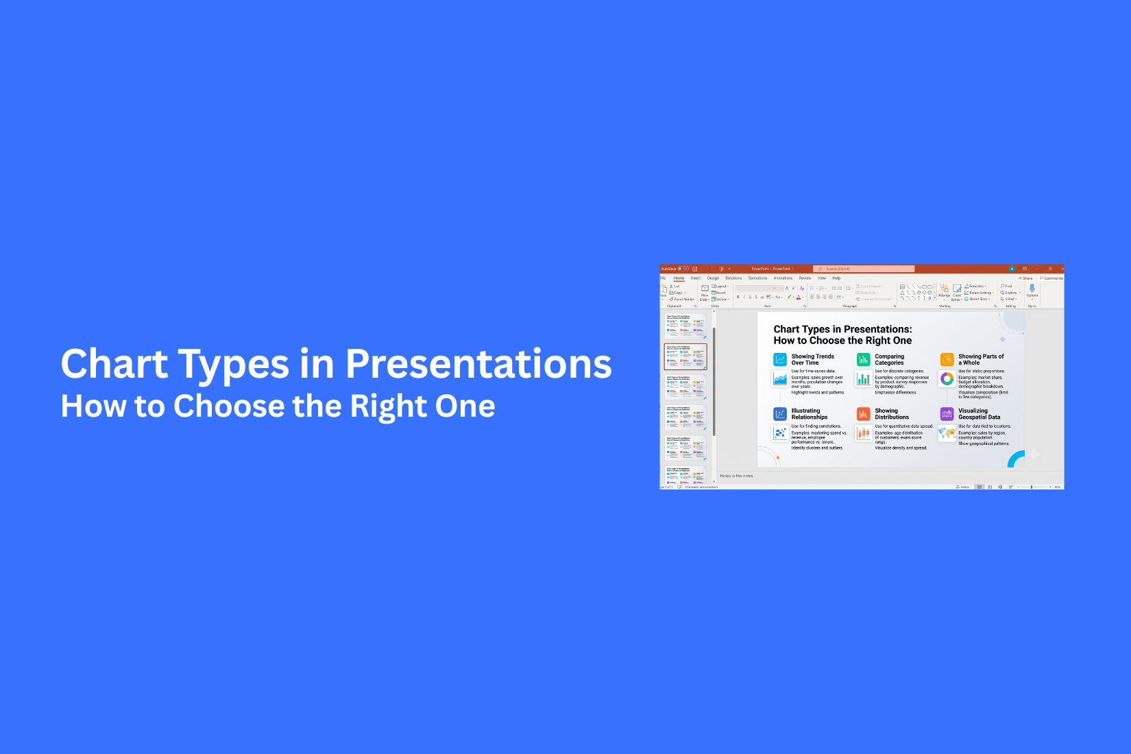
Choosing the right chart for a presentation is not always easy. Many chart types look similar, yet each one serves a different purpose. A poor choice can make your data harder to read and leave your audience confused. Good data deserves a clear visual. This guide explains the most common chart types used in presentations and shows where each one works best. You will also learn how to match charts with your data, avoid common design mistakes, and create charts that support your message. By the end, you will know how to choose the right chart with confidence.
What Are Charts in Presentations?
Charts in presentations are visual tools that turn numbers into easy-to-read graphics. They help people understand data without reading long tables or large blocks of text. A good chart can show patterns, compare values, or explain changes in a clear way.
Instead of listing many numbers on a slide, a chart gives the audience a quick view of the main point. This makes presentations easier to follow and helps people remember the information. Different charts serve different purposes. Some compare categories. Others show trends over time. Some display parts of a whole, while others reveal relationships between data points. Choosing the right chart depends on the message you want to share.
Charts also make slides look more organized. They break up text and draw attention to key data. A simple chart often explains an idea better than a paragraph full of numbers. Before choosing a chart, make sure your data matches your goal. A chart should support your message, not distract from it. The right chart helps your audience understand your data with less effort.
Why Choosing the Right Chart Type Matters
The chart you pick can change how people understand your message. A good chart makes data clear. A poor chart can confuse your audience, even if the numbers are correct. Every chart has a different job. Some compare values. Some show changes over time. Others display parts of a whole or the link between two sets of data. Using the wrong chart makes it harder for people to see the main point.
The right chart also helps your audience read information faster. Instead of sorting through rows of numbers, they can spot patterns, compare results, and notice key changes with a quick glance. Clear charts also keep your presentation organized. They remove extra details and put the focus on the data that matters most. This makes each slide easier to follow.
Good chart selection also helps you avoid common mistakes, such as:
• Using a pie chart for too many categories
• Using a line chart for data with no time order
• Using a bar chart for showing parts of a whole
• Adding too many colors or labels that distract from the data
Every slide should answer a simple question. What do you want your audience to notice first? Once you know that answer, picking the right chart becomes much easier. A well-chosen chart does more than display numbers. It helps people understand your message quickly and remember your main points after the presentation ends.
Common Chart Types Used in Presentations
Each chart tells a story in a different way. The right one depends on the data you want to show. Some charts compare values. Others show changes, parts of a whole, or relationships between numbers. Here are some of the most common chart types used in presentations.
Bar Charts
Bar charts compare values across different groups or categories. They use horizontal bars, which makes them easy to read, especially with long category names.
Use a bar chart to:
• Compare sales across regions
• Rank products by revenue
• Show survey results
• Compare team performance
Keep the bars in a logical order. Use clear labels so the audience can read the chart quickly.
Column Charts
Column charts also compare values, but they use vertical bars. They work well for showing differences across categories or short periods.
A column chart is a good choice for:
• Monthly sales
• Quarterly revenue
• Yearly growth
• Product comparisons
Avoid adding too many columns. A crowded chart can make the data harder to read.
Line Charts
Line charts show how values change over time. They connect data points with lines, making trends easy to spot.
A line chart works well for:
• Website traffic
• Monthly expenses
• Stock prices
• Customer growth
Keep the number of lines low. Too many lines can make the chart confusing.
Pie Charts
Pie charts show how each part contributes to a whole. Each slice represents a share of the total.
Use a pie chart for:
• Budget distribution
• Market share
• Survey responses
• Expense categories
Limit the number of slices. Too many sections make it hard to compare values.
Area Charts
Area charts show changes over time while also highlighting the size of the values. The space below the line is filled with color.
Area charts are useful for:
• Revenue growth
• Population changes
• Website visits
• Production totals
Simple data works best. Too many overlapping areas can hide important details.
Scatter Charts
Scatter charts show the relationship between two sets of numbers. Each point represents one data value.
Use a scatter chart to:
• Compare advertising costs and sales
• Study customer behavior
• Find patterns in data
• Spot unusual values
This chart is a good option for finding trends that may not appear in other chart types.
Bubble Charts
Bubble charts build on scatter charts by adding a third value. The size of each bubble represents extra data.
A bubble chart can show:
• Sales, profit, and market size
• Product price, demand, and revenue
• Population, income, and growth
Use bubble sizes that are easy to compare. Clear labels also help readers understand the data.
Radar Charts
Radar charts compare several values for one or more items. The data spreads out from a center point.
This chart is useful for:
• Skill ratings
• Product feature comparisons
• Team performance reviews
• Customer feedback scores
Limit the number of categories. A simple radar chart is much easier to read.
Funnel Charts
Funnel charts show how values move through a series of stages. Each step usually becomes smaller than the one before it.
Common uses include:
• Sales pipelines
• Hiring stages
• Marketing leads
• Customer sign-up steps
Keep the stages in order so the audience can follow the process without effort.
Waterfall Charts
Waterfall charts show how positive and negative values change a starting number until it reaches a final result.
This chart is helpful for:
• Profit and loss reports
• Budget changes
• Revenue adjustments
• Financial summaries
Use different colors for increases and decreases. That makes each change easier to identify at a glance.
How to Choose the Right Chart Type for Your Presentation
The best chart is not always the most colorful one. It is the one that helps people understand your message with little effort. A chart should support your point, not distract from it. Start by asking a few simple questions. What do you want to show? What kind of data do you have? Who will see the presentation? The answers will guide you to the right chart.
Identify Your Presentation Goal
Every presentation has a purpose. Your chart should match that purpose. Need to compare values? A bar or column chart works well. Want to show changes over time? A line chart is a better fit. Showing how each part adds to a whole? A pie chart can help if you have only a few categories. Pick the chart that supports your main message. Your audience should understand the point in just a few seconds.
Understand Your Data Type
The type of data also affects your chart choice. Time-based data works best with line charts. Category data often fits bar or column charts. Percentage data may work with a pie chart if the total equals 100%. Data with two number values can be shown with a scatter chart. Always match the chart to the data instead of forcing the data into a chart that does not fit.
Consider Your Audience
Your audience plays a big role in chart selection. A business team may expect detailed numbers. A general audience usually prefers simple visuals with only the key points. Students may need charts with clear labels and easy-to-read values. Use language, colors, and labels that fit the people in the room. The easier the chart is to read, the easier it is to follow your message.
Keep Your Charts Simple
Simple charts are easier to understand. Remove anything that does not help explain the data. Avoid too many colors, labels, or gridlines. Keep the text large enough to read from a distance. Highlight only the values that matter most. A clean chart helps your audience focus on the message instead of trying to figure out the design.
Chart Selection Guide Based on Data Goals
Picking a chart starts with one question: What do you want your audience to learn? Every chart has a job. Some compare values. Others show change, parts of a whole, or links between data points. Matching the chart to your goal makes your message easier to follow.
Charts for Comparing Data
Use comparison charts to show differences between values. These charts help people see which item is bigger, smaller, higher, or lower. Bar charts and column charts work well for this goal. They are easy to read and make side-by-side comparisons clear. They also work well for sales numbers, survey results, product features, or team performance.
Choose a comparison chart if your audience needs to answer questions such as:
• Which category has the highest value?
• Which option performs better?
• How do different groups compare?
Charts for Showing Trends Over Time
Some data tells a story across days, months, or years. Trend charts help people spot growth, drops, or steady patterns. Line charts are the best choice for this type of data. Area charts also work well if you want to show the total value as it changes over time.
These charts are useful for:
• Monthly sales
• Website traffic
• Business growth
• Project progress
Keep the time order clear so readers can follow the changes from start to finish.
Charts for Showing Data Proportions
Part-to-whole charts show how each section adds to the total. They help readers see the share of every category. Pie charts are a common choice for a small number of data points. Keep the number of slices low so each section stays easy to read.
Use these charts for:
• Budget breakdowns
• Market share
• Survey responses
• Department expenses
If your data has many categories, a bar chart often gives a clearer view.
Charts for Showing Relationships
Some presentations need to show how one value connects to another. Relationship charts help readers spot patterns between two sets of data. Scatter charts are a strong choice for this goal. Bubble charts can also work if you want to add a third value by changing the size of each bubble.
These charts can help answer questions such as:
• Do higher costs lead to higher sales?
• Is there a link between study time and test scores?
• Do two values move in the same direction?
A clear relationship chart makes patterns easier to notice.
Charts for Showing Processes and Changes
Some information follows a path or moves through several stages. Other data explains how values increase or decrease over time. These situations need charts that show movement instead of simple comparisons. Funnel charts are useful for stages such as a sales pipeline or customer journey. Waterfall charts show how positive and negative values change a starting total until you reach the final result.
These charts work well for:
• Sales funnels
• Hiring stages
• Budget changes
• Profit and loss breakdowns
Pick the chart that matches your process. Your audience will understand each step with less effort.
Common Chart Design Mistakes to Avoid
A good chart can make your message clear. A poor chart can confuse your audience. Many presentation problems come from simple design mistakes. The good news is that they are easy to fix. Here are four common mistakes and how to avoid them.
Using the Wrong Chart Type
Every chart has a purpose. A chart that works well for one type of data may not work for another. Picking the wrong chart makes your data harder to understand. For example, a line chart works well for showing changes over time. A bar chart is better for comparing different groups. A pie chart fits small sets of data that show parts of a whole. Start by asking what you want your audience to learn. Then choose the chart that matches that goal.
Adding Too Much Data
Too much data can make a chart look crowded. Small labels, extra numbers, and too many categories make it hard to find the main point. Keep only the data that supports your message. Break large data sets into more than one chart if needed. A few clear charts work better than one chart filled with details. Simple charts help people understand your ideas faster.
Making Charts Difficult to Read
A chart should be easy to read from the back of the room or on a small screen. Tiny text, poor color choices, and crowded labels make reading difficult. Use clear fonts and readable text sizes. Leave enough space between chart elements. Pick colors that have good contrast. Label important values clearly. Your audience should understand the chart without extra effort.
Using Unnecessary Visual Elements
Extra effects can distract from your data. Heavy shadows, 3D styles, bright backgrounds, and too many colors often make charts look busy. Keep the design clean. Use only the colors and shapes that help explain the data. Remove anything that does not add value. A simple chart keeps the focus on the information instead of the design.
Tips for Creating Effective Presentation Charts
A good chart does more than display numbers. It helps people spot patterns and understand your message without extra effort. Small design choices can make a big difference. These tips will help you create charts that are clear, simple, and easy to follow.
Highlight Key Insights
Your audience should notice the main point right away. A chart filled with too many details can hide the message you want to share. Use color, bold labels, or data markers to draw attention to the most important value. Keep the focus on one main idea instead of trying to explain everything in a single chart. If one result matters more than the rest, make it stand out. This helps your audience remember the information after your presentation ends.
Use Clear Labels and Titles
Every chart needs a title that explains what the data shows. Labels should also be easy to read and easy to understand. Use simple words instead of technical terms. Label each axis clearly, and include units if needed. If your chart uses colors, add a simple legend so readers know what each color means. Clear titles and labels remove confusion and help people understand the data faster.
Maintain Consistent Design
A consistent design makes your presentation look organized. It also helps your audience stay focused on the information instead of the layout. Use the same fonts, colors, and chart styles throughout your slides. Keep titles in the same position and use matching color choices for similar data. A uniform design creates a smooth reading experience from the first slide to the last.
Improve Chart Readability
Charts should be easy to read from any seat in the room. Small text or crowded data can make important details hard to see. Use large fonts and leave enough space between chart elements. Remove extra gridlines, heavy borders, and decorations that do not support the data. Choose colors with strong contrast so labels and values remain easy to read. Before you present, view your slides on a larger screen. If the chart is clear from a distance, your audience will have a much better experience.
Final Notes
Choosing the right chart helps your audience understand your message faster. Each chart has a different purpose, so matching the chart to your data is the first step. A clear chart can show trends, compare values, explain parts of a whole, or display relationships without making the slide feel crowded. Keep your charts simple and easy to read. Use clear titles, readable labels, and a consistent design across your presentation. Remove anything that does not support your message. Small design choices often make a big difference in how people understand your data.
Before you finish your presentation, review every chart. Ask one simple question: Does this chart make the main point clear? If the answer is yes, your audience will spend less time reading the chart and more time understanding your message. The right chart turns data into a story that people can follow and remember.
FAQs
What is the best chart type for a presentation?
The best chart depends on your data and your goal. Bar charts work well for comparisons, line charts show changes over time, and pie charts show parts of a whole.
How do I choose the right chart for my data?
Start with the message you want to share. Then match your data to a chart that shows that message clearly. Use simple charts that are easy to read.
What is the difference between a bar chart and a column chart?
A bar chart uses horizontal bars. A column chart uses vertical bars. Both compare values, but bar charts work better for long category names, while column charts fit short labels and time-based comparisons.
Which chart is best for showing trends over time?
A line chart is the best choice for showing trends over time. It makes it easy to see growth, drops, or steady changes across days, months, or years.
Are pie charts good for all types of data?
No. Pie charts work best for showing parts of a whole with only a few categories. Too many slices make the chart hard to read.
How can I make my presentation charts easier to read?
Use clear titles, simple labels, readable font sizes, and strong color contrast. Remove extra design elements that do not support the data.
What are the most common chart mistakes in presentations?
Common mistakes include using the wrong chart type, adding too much data, using small text, and adding too many colors or visual effects that distract from the message.
Should every slide include a chart?
No. Use a chart only if it helps explain your data better than text or a table. Every chart should support your main message and make the information easier to understand.


You may also be interested in ...

How To Create An Eye-Catching Portfolio
If you’re looking to create an eye-catching portfolio, this post will come in handy. In this article, you can find the easies...
23 Jun, 2024

How To Easily Create An Infographic
Infographics are the perfect way to make a presentation that will impact an audience, but their design and composition might...
08 Jun, 2024

PowerPoint Template Tips & Tricks You Ne...
PowerPoint seems to be an unknown world for many people, especially those who have been assigned to create a presentation out...
08 Jun, 2024