How to Make a Strip Chart in PowerPoint: A Step-by-Step Guide
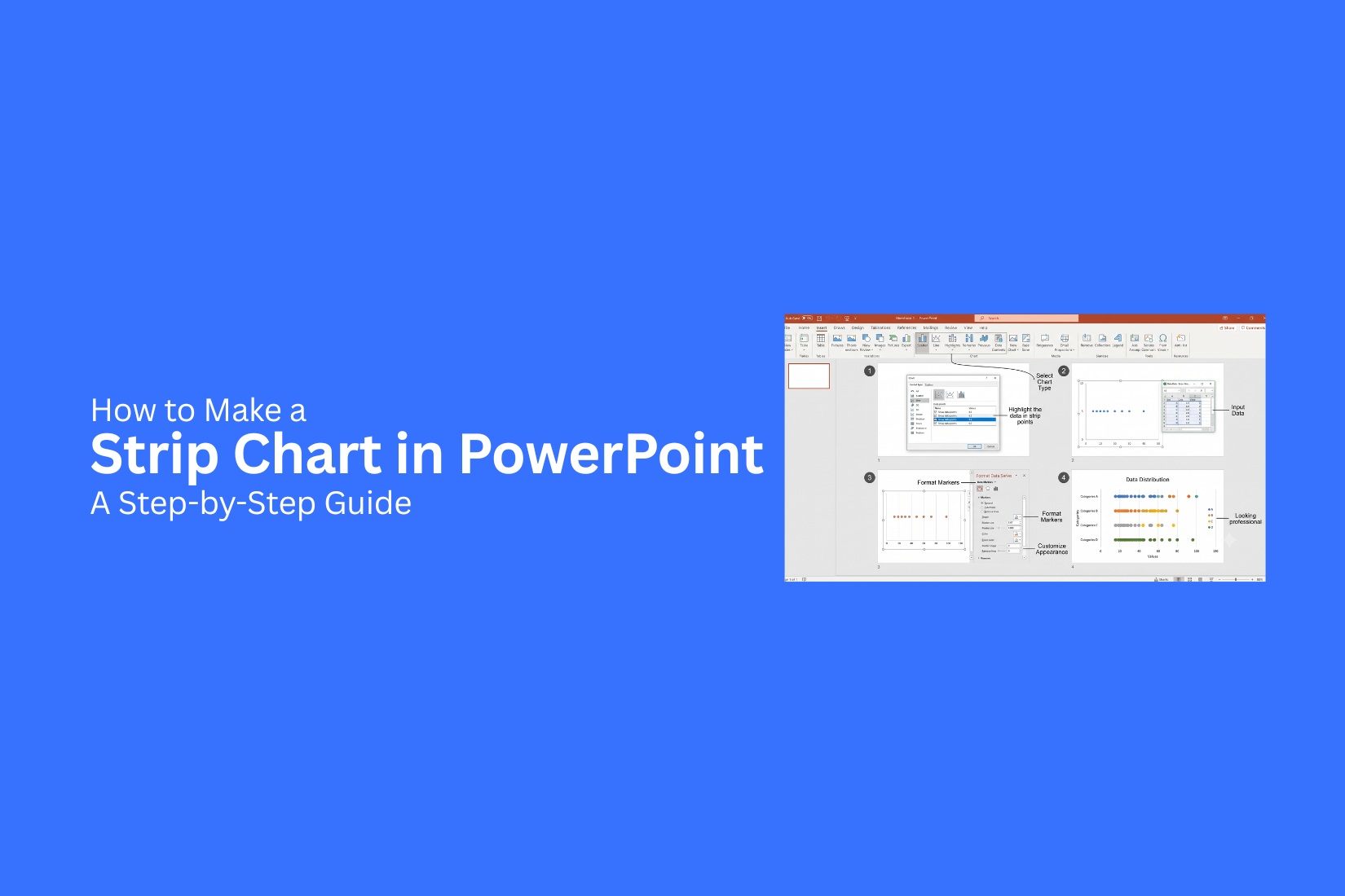
Creating a data chart in PowerPoint can be challenging for people who need to show values in a simple way. Many charts may make data harder to read and may hide details that matter. A strip chart helps display individual data points in an easy-to-follow format. This guide shows how to make a strip chart in PowerPoint step by step. You will learn how to prepare data, create the chart, and adjust its design for better viewing. The process covers chart setup, formatting, labels, and common mistakes to avoid. By the end, you will know how to use strip charts in presentations to share data in a clearer and more organized way.
What Is a Strip Chart in PowerPoint?
A strip chart is a simple chart that shows data points along a single line. It helps readers see patterns, groups, and differences in data. Each value appears as a mark on the chart, making it easy to compare multiple data points. In PowerPoint, a strip chart can be used to present numbers in a clean and visual way. It works well for showing survey results, ratings, scores, or other sets of data. The chart keeps the design simple while helping the audience understand the information.
A strip chart is similar to a scatter chart because both use points to display data. The main difference is that a strip chart places values along one main line instead of spreading them across two number ranges. Creating a strip chart in PowerPoint helps turn raw numbers into a slide that is easier to read. With the right formatting, the chart can fit into reports, presentations, and data-focused slides.
Why Use a Strip Chart in Presentations?
A strip chart helps turn data into a simple visual format. It shows values along a single line, making patterns easier to see. This can help your audience understand differences, groups, or changes without reading through large tables. Strip charts also make slides cleaner. A long list of numbers can feel hard to follow. A chart gives each value a clear place, so viewers can focus on the main points. Presenters use strip charts to share research results, survey answers, project updates, and other data. The format works well for slides because it keeps information organized and easy to read. A well-made strip chart can also support your message. It guides the audience through the data and helps them notice key details during your presentation.
How to Prepare Data for a Strip Chart
A strip chart works best with clean and organized data. Before creating the chart in PowerPoint, prepare your data in a simple format. This step helps you place each data point correctly. Start by collecting the values you want to show. Strip charts usually display individual data points instead of grouped values. Each point should represent one item, result, or measurement. Create a table with clear labels. Add one column for categories and another for values. Keep the format simple so you can transfer the data into PowerPoint without extra edits. Remove any unnecessary details from your data. Check for missing values, duplicate entries, or incorrect numbers. Clean data helps your strip chart show accurate results.
You can also sort your data before adding it to the chart. Arrange values from low to high or group them by category. This makes patterns easier to see. Once your data is ready, you can start building the strip chart in PowerPoint. A well-prepared dataset makes the chart creation process smoother and helps your audience understand the information.
How to Make a Strip Chart in PowerPoint: A Step-by-Step Guide
A strip chart helps show individual data points across a single line or scale. It makes it easier to see data patterns, differences, and groups. PowerPoint does not have a direct strip chart option, but you can create one using a scatter chart.
Follow these steps to build a clear strip chart in PowerPoint.
Create a Scatter Chart for the Strip Chart
Start by opening PowerPoint and adding a blank slide. Go to the Insert tab and select Chart. Choose Scatter from the chart options. A scatter chart works well for a strip chart because it lets you place each value as a separate point. After selecting the chart, PowerPoint will add a sample chart and open an Excel sheet for editing data. Remove the sample values. Keep the chart area ready for your own data.
Enter and Arrange Your Data
A strip chart needs data that controls the position of each point. Add your values in the Excel sheet linked to the chart. Use one column for the horizontal values. These values show where each point sits on the scale. Use another column for the vertical position. A small range of repeated numbers works well for this part. For example, you can use the same vertical value for all points to create a straight strip. You can also add small changes to the vertical values to spread points that are close together. After entering the data, close the Excel sheet. Your scatter chart will update with the new points.
Format Data Points for Better Visibility
Clear data points help viewers read the strip chart easily. Click on any point in the chart to select the data series. Open the Format Data Series menu. Change the marker size to make points easier to see. You can also adjust the marker shape based on your design needs. Use a simple marker style for a clean look. Make sure the points have enough space so they do not overlap.
Customize the Chart Axes
The default chart axes may not match your data. Adjust them to fit your strip chart. Click the horizontal or vertical axis and open the Format Axis panel. Change the minimum and maximum values to create the right scale. You can remove the vertical axis if it does not add value. A simple horizontal line often works better for a strip chart. Adjust the gridlines as needed. Removing extra lines can make the chart easier to read.
Add Titles and Labels
Titles and labels help explain your strip chart. Click the chart and select Chart Elements to add a chart title. Add a clear title that explains the data. Use axis labels to show what each value represents.
You can also add text boxes near the chart to highlight key points or explain groups. Keep labels short and easy to read. A well-labeled strip chart helps your audience understand the data without extra explanation.
How to Customize a Strip Chart in PowerPoint
A basic strip chart gives you a clear way to show data points. PowerPoint also lets you adjust the chart style to match your presentation. You can change colors, markers, labels, and other settings to make the chart easier to read. Start by selecting your strip chart. The Chart Design and Format tabs will appear on the PowerPoint ribbon. These tools help you edit the look and layout of your chart.
Change the Chart Colors
PowerPoint offers different color options for charts. You can pick a color style that fits your slide design.
To change the colors:
- Click the strip chart.
- Open the Chart Design tab.
- Select Change Colors.
- Choose a color set from the options.
Use colors that create clear differences between data groups. Avoid using too many colors because they can make the chart harder to follow.
Adjust Data Markers
Data markers show each value on a strip chart. You can change their size, shape, and appearance.
To edit markers:
- Click a data point on the chart.
- Right-click and choose Format Data Series.
- Open the Marker section.
- Select a new marker shape or size.
Small markers work well for large data sets. Larger markers help highlight key values.
Add or Edit Chart Labels
Labels help viewers understand the information shown in the chart. You can add data labels to display exact values.
Follow these steps:
- Select the chart.
- Click the Chart Elements button.
- Check the Data Labels box.
- Choose a label position.
Keep labels simple. Too many numbers can make the chart look crowded.
Format the Chart Area
The chart area controls the overall appearance of your strip chart. You can adjust the background, border, and spacing.
To format the chart area:
- Click the chart background.
- Open Format Chart Area.
- Change the fill, border, or size settings.
A clean chart area helps the main data stand out. Remove extra design elements that do not add value.
Adjust the Axis Settings
The axis settings control how data is displayed. You can change the scale, number format, and spacing.
To edit the axes:
- Select an axis on the chart.
- Right-click and choose Format Axis.
- Adjust the settings based on your data.
A proper axis scale makes the strip chart easier to understand. It also helps viewers compare values quickly. Customizing your strip chart gives you more control over how your data appears. Simple edit
Common Mistakes to Avoid When Creating a Strip Chart
Creating a strip chart in PowerPoint can be simple, but small mistakes can affect how people read the data. A clear chart helps your audience understand the values without confusion. Avoid these common issues to make your strip chart easier to follow.
Using Too Many Data Points
Adding too many points can make the chart look crowded. The main patterns may become hard to see. Use only the data that supports your message. A clean chart helps viewers focus on the key details.
Choosing the Wrong Scale
A poor scale can make data look misleading. Make sure the axis range matches the values in your data. A balanced scale helps people compare points more accurately.
Adding Too Many Colors
Too many colors can distract from the data. Use a simple color style that keeps attention on the chart. Use different colors only when they help separate groups or show differences.
Ignoring Labels and Titles
A strip chart needs clear labels. Missing titles or unclear labels can leave viewers unsure about what the chart shows. Add a useful title and label each section properly.
Overloading the Chart With Extra Details
Extra elements can make the chart harder to read. Avoid adding unnecessary shapes, effects, or text. Keep the design simple so the data stays easy to understand.
Not Checking Data Accuracy
Small data errors can change the meaning of a chart. Review your values before adding them to PowerPoint. Check that every point appears in the correct place. A well-made strip chart does more than display numbers. It helps your audience see patterns and compare data with less effort. Avoiding these mistakes can help you create a cleaner and more useful PowerPoint chart.
Best Practices for Designing a Strip Chart in PowerPoint
A good strip chart does more than show data points. It helps your audience understand patterns quickly. A clean design makes the chart easier to read and keeps the focus on the information.
Keep the Chart Simple
Avoid adding too many details to your strip chart. Extra lines, colors, or effects can make the data harder to follow. Use a clean layout with enough space between data points. Choose a clear title that explains the chart topic. Add labels that help readers understand each part of the chart. Remove any elements that do not support the main message.
Use Colors With Purpose
Colors can help separate groups or highlight key data points. Use a small number of colors to keep the chart neat. Too many colors can distract viewers. Pick colors that are easy to see on the slide. Make sure the text and data points stand out from the background. Keep the same color style across your presentation.
Make Data Points Easy to Read
The main purpose of a strip chart is to show individual values. Make sure each data point is visible. Use proper spacing so points do not overlap. Adjust the size of markers based on your slide needs. Large markers work well for presentations with fewer values. Smaller markers fit better with larger data sets.
Add Clear Labels and Notes
Labels help your audience understand what each value means. Use short text that explains important points. Avoid filling the chart with too much information. Add notes for unusual values or key findings. A short explanation can help viewers understand the reason behind certain data points.
Keep Text Easy to Read
Use a font size that works well on a presentation screen. Avoid using long sentences inside the chart. Short labels make the chart cleaner. Place text near the related data point. This helps viewers connect the label with the information quickly.
Test the Chart Before Presenting
Review your strip chart before sharing your presentation. Check if the data points are clear and easy to follow. Look for areas that feel crowded or confusing. View the slide from a distance. A chart that looks clear on your computer screen may need changes for a larger display.
Strip Chart vs Other PowerPoint Charts
A strip chart is useful for showing individual data points across a simple scale. It helps viewers see patterns, clusters, and differences between values. Other PowerPoint charts may look similar, but each one serves a different purpose. Choosing the right chart depends on the type of data you want to show. A strip chart works best for small to medium data sets where each value needs to stay visible.
Strip Chart vs Scatter Chart
A strip chart and a scatter chart both display individual data points. The main difference is how the points are placed. A strip chart places values along one main line or category. It focuses on showing the spread of data in a simple way. This makes it easier to view small groups of numbers. A scatter chart uses two number axes. It shows the connection between two sets of values. This makes it a better choice for finding relationships between variables. Use a strip chart for showing the range of values in one group. Use a scatter chart for comparing two data sets and spotting trends.
Strip Chart vs Box Plot
A strip chart shows every single data point. A box plot groups data into sections and shows key details like the middle range, average spread, and unusual values. The biggest difference is the level of detail. A strip chart lets viewers see each value. A box plot gives a quick view of the overall data pattern. A strip chart works well for smaller data sets where each point matters. A box plot is better for larger data sets where a summary view is needed.
Strip Chart vs Bar Chart
A strip chart and a bar chart show data in different ways. A strip chart uses dots or markers to show exact values. A bar chart uses bars to show totals or comparisons. Bar charts are common for comparing categories. They make differences between groups easy to spot. Strip charts focus more on the details inside each group. Use a strip chart to show individual results. Use a bar chart to compare amounts across categories. The right choice depends on whether the exact values or the overall comparison matters more.
When to Use a Strip Chart in a Presentation
A strip chart works well for showing individual data points across a range. It helps the audience see patterns, gaps, and groups without hiding the details behind large bars or shapes. Use a strip chart for data sets where each value matters. It is a good choice for showing survey results, test scores, customer ratings, sales numbers, or measurement records.
A strip chart can help you show:
• Data distribution: See how values are spread across a scale.
• Individual results: Display each data point instead of only showing an average.
• Small data sets: Present limited data clearly without making the slide crowded.
• Group comparisons: Compare results from different categories or teams.
This chart type fits presentations that need a closer look at data. It helps viewers spot clusters, unusual values, and common ranges quickly. A strip chart may not be the best option for large amounts of data. Too many points can make the slide harder to read. For large data sets, a different chart type may present the information more clearly. The best use of a strip chart depends on the message of the slide. If the goal is to show every value and its position, a strip chart can make the data easier to understand.
Final Notes
A strip chart is a useful way to show individual data points in a PowerPoint presentation. It keeps the data visible and helps viewers compare values with ease. Creating a strip chart does not require a separate chart tool. A scatter chart can be adjusted to build a strip chart that fits your slide needs. Good data preparation, proper labels, and clean formatting help create a chart that is easy to follow. Keep your design simple and focus on the message behind the data. Use clear markers, readable text, and a suitable scale to help your audience understand the information. A well-designed strip chart can make data slides more organized and easier to read. Use it for presentations where showing each value matters.
FAQs
What is a strip chart in PowerPoint?
A strip chart is a chart that shows individual data points along a single line or scale. It helps display data values clearly and makes it easier to see patterns, groups, and differences.
Does PowerPoint have a built-in strip chart option?
No, PowerPoint does not have a direct strip chart option. You can create one by using a scatter chart and adjusting the data points, markers, and axis settings.
What type of data works best for a strip chart?
A strip chart works best for small to medium data sets where each value needs to be visible. It is useful for survey results, ratings, scores, measurements, and other individual results.
How do I create a strip chart in PowerPoint?
Start by inserting a scatter chart. Add your data values, adjust the vertical positions of the points, and format the markers and axes to create a strip chart layout.
Can I change the appearance of a strip chart in PowerPoint?
Yes. You can change marker size, marker shape, colors, labels, axis settings, and chart area design to match your presentation style.
What is the difference between a strip chart and a scatter chart?
A strip chart places values along one main line to show the spread of data. A scatter chart uses two number axes to show the relationship between two sets of values.
What is the difference between a strip chart and a bar chart?
A strip chart shows each individual value using points. A bar chart shows totals or comparisons between categories using bars.
Can a strip chart show large amounts of data?
A strip chart is better for smaller data sets. Too many points can make the chart crowded and harder to read. Larger data sets may need another chart type.
How can I make a strip chart easier to read?
Use clear labels, simple colors, proper spacing, and readable markers. Remove extra design elements that do not help explain the data.
Why should I use a strip chart in a presentation?
A strip chart helps show exact values while keeping the slide clean. It allows viewers to see data patterns without looking through long tables or complex charts.




You may also be interested in ...

How To Create An Eye-Catching Portfolio
If you’re looking to create an eye-catching portfolio, this post will come in handy. In this article, you can find the easies...
23 Jun, 2024

How To Easily Create An Infographic
Infographics are the perfect way to make a presentation that will impact an audience, but their design and composition might...
08 Jun, 2024

PowerPoint Template Tips & Tricks You Ne...
PowerPoint seems to be an unknown world for many people, especially those who have been assigned to create a presentation out...
08 Jun, 2024