How to Simplify Data and Ideas Without Losing Meaning in Presentations
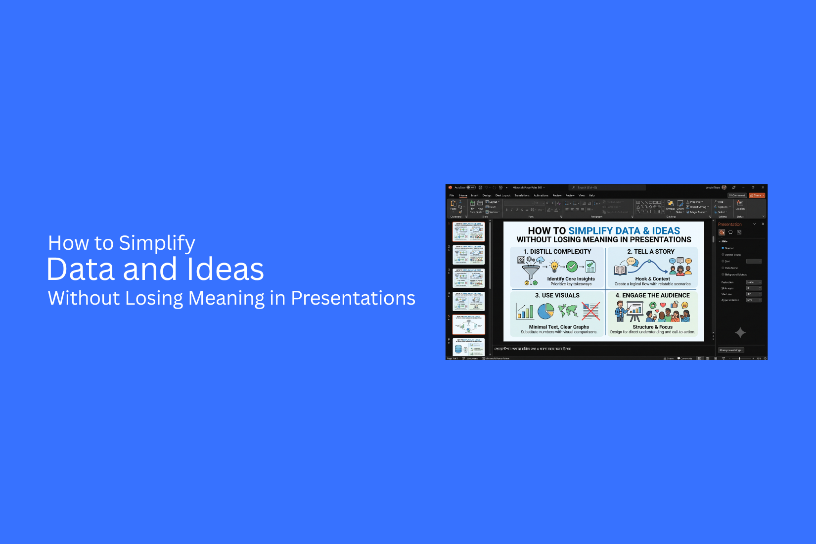
Presentations often include large amounts of data and detailed ideas, but too much information can make slides hard to follow. A crowded slide may hide the main message and leave the audience unsure about what matters most.
Clearer slides start with a focused message. This helps presenters remove extra details while keeping the value of the information. The goal is not to reduce ideas but to present them in a way that feels simple and easy to understand.
This guide explains how to simplify data and ideas without losing meaning in presentations. It covers ways to organize information, improve slide clarity, and help audiences understand key points faster and better.
What is a Complex Concept?
A complex concept is an idea that has many parts, connections, or layers that need deeper understanding. It often includes different elements that work together, making the idea harder to explain in a simple way. Complex concepts can include relationships between ideas, step-by-step processes, large amounts of data, comparisons, or technical details. Each part adds more information that the audience needs to understand before seeing the full picture.
For example, a simple concept is saying, “Sales increased last year.” This gives one clear fact. A complex concept explains why sales increased, which products performed better, what customer groups changed, and how different factors affected the results. The difference is not only the amount of information. It is also about how different pieces connect with each other. A complex concept often requires more context to help people follow the message.
Presenting these ideas on a slide can be difficult. Too much information can make the main message harder to find. A good presentation breaks down complex concepts into clear parts so the audience can understand the idea without confusion.
Why Complex Information Becomes Difficult to Present
Presenting complex ideas is not only about adding more details. The challenge is making each piece of information easy to follow. A slide needs a clear purpose, a simple structure, and the right amount of detail. Without these elements, even useful information can become hard for the audience to understand.
Too Much Information on One Slide
A slide with too much content creates a heavy reading load. Large blocks of text, many charts, and too many points compete for attention. The audience may spend more time reading than listening. The main message can get lost among extra details. A better approach is to focus on one key idea per slide. Remove details that do not support the main point. Use short text, clear headings, and visuals that help explain the message.
Lack of Clear Message and Direction
A presentation needs a clear path. Each slide should answer one main question or share one important idea. A slide without a clear message can leave the audience unsure about what they should learn from it. Random facts and unclear points make the presentation feel disconnected. Start each slide with a clear purpose. A strong title can guide the audience and show why the information matters.
Complex Data Without Proper Context
Numbers and data do not always explain themselves. A chart or table may show results, but the audience still needs to know what those numbers mean. Without context, data can feel confusing. People may miss key trends, comparisons, or reasons behind the results. Add short explanations to support data. Highlight the main takeaway and explain how the information connects to the larger idea.
Poor Visual Organization
A slide’s layout affects how people read and understand information. A crowded design, unclear sections, or poor spacing can make ideas harder to follow. Good visual organization creates a clear order. Titles, images, charts, and text should work together to guide the audience through the message. Use spacing, alignment, and visual grouping to create a cleaner slide. A well-organized design helps people understand the content without extra effort.
When Does a Slide Become ‘Too Complex’?
A slide becomes too complex when the audience needs to process too many ideas, details, or visual elements at the same time. A good slide helps people understand one clear message. A complex slide forces them to search for meaning.
The problem often appears through a few common warning signs:
• Too many tasks compete for attention.
• Too much data appears without a clear purpose.
• Multiple elements fight for focus.
• The slide lacks a clear order of information.
Each issue can make a presentation harder to follow. Understanding these signs helps you create slides that guide the audience instead of creating confusion.
The Multitasking Trap
A slide can become difficult to follow when it asks the audience to do too much at once. They may need to read a paragraph, study a chart, look at an image, and listen to the speaker all at the same time. This happens because presenters often try to include every detail on one slide. They want to make sure nothing is missed. The result is a slide with too many jobs.
The audience may not know where to look first. Their attention moves between different areas, and the main message becomes less clear. A better approach is to give each slide one main purpose. Decide what the audience should notice first, then remove elements that do not support that message.
The Data Dump
A data-heavy slide contains more information than the audience can process during a presentation. Large tables, long lists, and crowded charts can make useful information harder to understand. This problem often happens because the presenter shares the full data instead of the key points. More details do not always create better understanding.
The audience may spend time reading numbers and miss the explanation behind them. They may remember small details but miss the main idea. A better design choice is to show only the data that supports the message. Use clear labels, simple charts, and short explanations to help the audience understand the meaning behind the numbers.
Competing Focal Points
A slide loses direction when several elements try to attract attention at the same time. Large titles, bold text, bright images, and multiple charts can compete with each other. This happens because every element feels important to the presenter. However, the audience needs a clear path through the slide. Too many focal points create visual confusion. People may look at different areas and take away different messages. A strong slide design creates one main focal point. Size, placement, spacing, and contrast can help guide the audience toward the message that matters most.
Lack of Hierarchy
Visual hierarchy helps people understand the order of information on a slide. Without it, the audience has to figure out what to read first, what details support the idea, and what information can be ignored. This issue appears when text, images, and data have the same visual weight. A small detail may look as significant as the main message. Poor hierarchy slows understanding because the slide does not provide a clear structure. A better slide creates a simple order. The main idea should stand out first. Supporting details should appear below it in a way that feels organized and easy to follow.
How to Identify What Information Matters Most
A presentation becomes easier to understand once you know which information deserves attention. Not every detail has the same value. Some points help explain the main idea, while others only add extra context. Before creating slides, take time to review your information. Ask what your audience needs to learn, remember, or act on. This step helps you remove unnecessary details and create a clearer message.
Define the Main Goal of Your Presentation
Every presentation needs a clear purpose. Start by asking what you want your audience to take away from your slides. A presentation goal guides your choices. It helps you decide which data, examples, and ideas belong on the slide. Without a clear goal, slides can become filled with information that does not support the main point.
For example, a sales report may have many numbers about revenue, customers, and expenses. The main goal may be to show why sales increased. In that case, focus on the data that explains the growth instead of showing every available number. A clear goal keeps your presentation focused and easier to follow.
Find the Key Message Behind the Data
Data alone does not tell a story. Your audience needs to understand why the information matters. Look at your data and ask what it shows. Is there a trend? A problem? A change? A result? The answer can become the main message of your slide. For example, a chart may show monthly website visits. The key message may not be the exact number of visitors each month. It may be that traffic increased after a new campaign started. Finding the message behind the data helps you create slides that explain ideas instead of only showing numbers.
Separate Essential Information from Supporting Details
A common mistake is adding every detail to one slide. This makes the main idea harder to find. Start by separating your information into two groups. Essential information supports your main message. Supporting details provide extra explanation but are not required to understand the idea. Keep the essential points visible. Move extra details to speaker notes, backup slides, or another section of the presentation. For example, a project update slide may need the current status, key results, and next steps. A full list of small tasks may not belong on the main slide. This approach keeps slides clean while still allowing you to share more details if needed.
Understand What Your Audience Needs to Know
A good presentation focuses on the audience, not just the information you have collected. Ask what your audience already knows and what they need to understand. A group of experts may need different details than a group of beginners. Too much information can distract people from the main idea. Too little information can leave questions unanswered. The best slides provide the right amount of information for the people viewing them. They guide attention toward the message that matters most.
How to Simplify Complex Information for Slides Without Losing the Point
Simplifying a slide starts before choosing colors, layouts, or visuals. The first step is finding the main idea the audience should remember. A slide becomes easier to follow when every element supports that one message. Many presenters try to simplify by cutting text or removing details. That approach can create another problem. Important information may disappear, leaving the audience with an incomplete picture. Good slide design keeps the meaning while making the message easier to understand. A simple slide does not mean an empty slide. It means the audience can quickly see what matters and understand why it matters.
Start with the Core Message
Every slide needs a clear purpose. Before adding charts, images, or bullet points, define the main takeaway. Ask yourself, “What should the audience remember after seeing this slide?” The answer should guide the entire design. A strong headline can often communicate the main point better than a general title.
For example, a title like “Quarterly Sales Report” only tells the audience what the slide contains. A title like “Online Sales Increased by 35% After the New Campaign” gives the audience the key message right away. The second example helps people understand the meaning before they read the details. The chart, numbers, and notes then support the message instead of forcing the audience to search for it. A clear core message creates direction. It helps you decide what belongs on the slide and what can be removed.
Use Visuals to Reduce Cognitive Load
Complex information often becomes difficult because the audience must process too much text at once. Visual elements can help explain ideas faster and make connections easier to see. A chart can replace a long explanation of numbers. A timeline can show steps in a process. A diagram can explain how different parts connect.
For example, a slide about a customer journey may include several paragraphs describing each stage. A simple flow diagram can show the same information in a way that is easier to follow. Visuals should support the message, not act as decoration. Every image, chart, or shape should help explain an idea or guide attention. The goal is not to add more visuals. The goal is to use the right visual to make the information clearer.
Remove Noise, Not Substance
Simplifying a slide does not mean deleting useful information. It means removing elements that distract from the main message. Extra text, repeated points, unnecessary icons, and confusing layouts can make a slide harder to understand. These elements take attention away from the information that matters most.
For example, a data slide may include ten labels, multiple colors, and several notes. The data itself may be valuable, but the extra elements make the key finding harder to notice. A better approach is to highlight the main insight and keep supporting details available for explanation. Good simplification protects important information. It removes distractions so the audience can focus on the message.
Test for Understanding, Not Brevity
A common mistake is judging a slide only by its word count. A short slide is not always a clear slide. A slide with fewer words can still confuse the audience if the message is unclear. The real test is understanding. Show the slide to someone who does not know the topic and ask what they think the main point is. Their answer can reveal whether the design works.
For example, a slide with three short bullet points may look clean, but the audience may still miss the connection between them. A well-designed slide with more information may work better if it presents the idea in a clear order. The goal is not to make slides shorter. The goal is to make them easier to understand. A strong presentation keeps important details while making the message simple to follow. The best slides guide the audience toward the right idea without making them work harder to find it.
How to Simplify Ideas for Clearer Presentation Slides
Complex ideas often become hard to follow because too much information appears at once. A clear slide does not remove meaning. It presents the message in a way that helps the audience understand each point. A simple structure, clear wording, and helpful visuals can make difficult topics easier to follow. The goal is to guide the audience from one idea to the next without creating confusion.
Break Complex Ideas into Smaller Parts
Large ideas can feel overwhelming on a single slide. Breaking them into smaller parts makes the information easier to understand. Start by finding the main points inside the larger topic. Each slide should focus on one key idea instead of covering every detail at once. For example, a slide about a business strategy can be divided into separate slides for goals, steps, challenges, and results. This gives each part enough space and keeps the message clear. Smaller sections also help the audience remember important details. They can follow the message without trying to understand everything at the same time.
Use Simple Words and Clear Explanations
Complex language can make a simple idea feel difficult. Use words that your audience already understands. Replace long explanations with short and direct sentences. Avoid technical terms unless they are needed and explain them clearly if they appear. For example, instead of writing “increase operational efficiency through process optimization,” a slide can say “improve work by making processes easier.” Clear language helps the audience focus on the message instead of trying to understand difficult wording.
Create a Logical Flow Between Ideas
A presentation works best when each slide connects naturally with the next one. A clear order helps the audience understand how ideas relate to each other. Start with the basic information before moving into details. Show the problem first, explain the cause, and then present the solution. Slide titles can also guide the audience. A title that shows the main message helps people understand the purpose of each slide before reading the details. A strong flow turns separate slides into one connected story.
Use Examples to Explain Difficult Concepts
Examples make unfamiliar ideas easier to understand. They give the audience something practical to connect with. A presentation about data analysis can include a real situation instead of only showing numbers and terms. A presentation about a new process can show how the process works in a daily task. Good examples answer questions the audience may have. They show how an idea works outside the slide.
Turn Abstract Ideas into Visual Stories
Some ideas are hard to explain with words alone. Visuals can help turn these ideas into something easier to understand. Charts, diagrams, icons, and simple illustrations can show relationships between different points. A timeline can explain changes over time. A process diagram can show steps in order. A visual story gives the audience a clear path to follow. It helps them understand the message without reading large blocks of text. The best slides combine simple ideas, clear structure, and useful visuals. This approach helps the audience understand complex information while keeping the original meaning.
Design Techniques to Make Complex Slides Easier to Understand
A complex slide does not always need less information. It needs better organization. Good slide design helps the audience understand the message without spending too much effort. The goal is to present ideas in a clear way while keeping the important details. Simple design choices can change how people read and remember a slide. The right layout, visuals, and spacing help the audience follow the main point.
Use One Main Idea Per Slide
Each slide should focus on one clear message. A slide with many ideas often makes the audience unsure about what matters most. Start by finding the key point you want people to remember. Use that message as the center of the slide. Add only the information that supports it. For example, a slide about sales growth should not also explain customer feedback, team updates, and future plans. Those topics need separate slides. Each slide gets a clear purpose. This approach creates a smoother flow throughout the presentation. The audience can follow each idea without sorting through too much information.
Create Strong Visual Hierarchy
Visual hierarchy shows the audience where to look first, second, and third. It helps important details stand out from supporting information. Use different text sizes, bold headings, and placement to show importance. The main message should be easy to find. Supporting details should stay smaller and less noticeable. Charts, icons, and images can also guide attention. A large number or key finding can become the focus point of a slide. A clear hierarchy helps people understand the relationship between different parts of your content.
Reduce Text and Increase Visual Clarity
Large blocks of text make slides harder to read. A presentation slide should support your explanation, not replace it. Remove words that do not add value. Turn long sentences into short points. Use charts, diagrams, or simple visuals to explain ideas that are hard to describe with text. For example, a process with five steps is often easier to understand as a flow diagram than as a paragraph. The goal is not to remove all details. The goal is to present details in a way that feels clear and organized.
Use White Space Effectively
White space is the empty area around text, images, and other slide elements. It gives each part of the slide room to stand out. A crowded slide can make even useful information feel confusing. Adding space between sections helps the audience focus on one part at a time. Avoid filling every corner of the slide. Empty areas can improve readability and create a cleaner structure. A balanced slide feels easier to follow because the audience can quickly identify the main sections.
Guide Audience Attention with Layout
The layout of a slide controls how people move through the information. A good layout creates a natural path from one element to another. Place the most important information where people are likely to look first. Use alignment, spacing, and visual connections to create order. For example, a timeline should guide the viewer from the first event to the last. A comparison slide should make differences easy to see. A thoughtful layout helps the audience understand the message without extra effort. It turns complex information into a clear visual story.
Best Visual Methods for Simplifying Complex Information
Complex information becomes easier to understand with the right visual format. A slide filled with text can make key ideas harder to follow. Visual elements help organize details and show how different pieces connect. The right visual method depends on the type of information you need to present. A process needs a different format than a comparison or a set of data points. Choosing the right visual structure helps your audience understand the message without removing important details.
Use Diagrams for Processes and Relationships
Diagrams help explain how different parts connect. They are useful for showing steps, systems, workflows, or relationships between ideas. A process diagram can turn a long explanation into a clear path. Each step appears in order, so the audience can follow the movement from one point to another. For example, a slide about a product development process may show research, design, testing, and launch as connected stages. The audience sees the full process without reading a large block of text.
Use Timelines for Sequential Information
Timelines work well for information that follows a specific order. They help show events, project stages, historical changes, or future plans. A timeline gives the audience a clear sense of progression. Instead of listing dates and details separately, the information appears as one connected story. For example, a company growth presentation can use a timeline to show major milestones from the first launch to the current stage. Each point gets a clear place, making the information easier to follow.
Use Comparison Charts for Differences
Comparison charts help audiences see differences between options, ideas, or results. They place related information side by side, which makes key points easier to spot. A comparison chart works well for product features, research findings, pricing plans, or strategy choices. It prevents the audience from searching through separate sections to find differences. Keep the chart simple. Focus on the points that matter most. Too many rows or details can make the slide harder to read.
Use Icons to Support Key Points
Icons add visual support to important information. They can replace repeated text and help guide attention to specific ideas. For example, a presentation about business goals may use simple icons for growth, customers, costs, and results. The audience can quickly identify each topic before reading the details. Icons should support the message, not take over the slide. Use clear and familiar symbols that match the information being shared.
Use Infographics for Multiple Data Points
Infographics combine text, visuals, and data into one organized layout. They work well for presenting several related facts on a single slide. A good infographic can show statistics, trends, steps, or categories in a simple format. It helps the audience understand the main message without sorting through separate numbers. For example, a marketing report may use an infographic to show audience groups, sales numbers, and campaign results together. The data becomes easier to compare and remember. Visual methods do more than make slides look better. They create structure and help audiences understand complex ideas. The right visual choice allows you to share more information while keeping the main message clear.
Common Mistakes When Simplifying Presentation Content
Simplifying a presentation does not mean removing everything until only a few words remain. A good slide keeps the main message clear while giving the audience enough information to understand the topic. Some mistakes can make a presentation look simple but reduce its value.
Removing Important Context
Context helps the audience understand why the information matters. Removing too much background can leave people confused about the meaning behind the data or idea. For example, a chart showing sales growth may look clear with only numbers. The audience still needs details about the time period, goals, or factors behind the change. A small amount of context can make the information easier to understand. Keep the details that explain the purpose of the slide. Remove extra information that does not help the audience follow the message.
Making Slides Too Generic
A simple slide should still provide a clear point. Some presentations remove so much detail that the message becomes too broad. A headline like “Market Results” does not tell the audience what they should learn. A more specific message explains the key idea, such as “Customer Growth Increased After the New Pricing Plan.” Clear details help the audience understand the purpose of each slide. Simplicity works best with a strong message.
Replacing Text with Meaningless Visuals
Visuals can make ideas easier to understand, but they need a clear purpose. Adding random images or icons can distract the audience instead of helping them. A chart, diagram, or icon should support the message on the slide. A picture that only fills empty space does not add value. Choose visuals that explain a point, show a relationship, or make information easier to remember.
Adding Too Many Design Elements
A clean design helps people focus on the main idea. Too many colors, shapes, icons, or effects can make a slide harder to read. Each design element should have a reason for being there. A title, image, chart, or text box should guide attention toward the main message. A simple layout with enough empty space often works better than a slide filled with decorations.
Simplifying Content Without Considering the Audience
A presentation should match the knowledge and needs of the audience. Information that feels simple to one group may feel unclear to another. A technical team may understand industry terms, while new customers may need more explanation. Removing details without knowing the audience can create confusion. Focus on what the audience needs to understand. Keep useful details and remove parts that do not support their learning or decisions.
How to Check If Your Slide Is Simple and Clear
A slide may look clean, yet it can still confuse people. That is why it helps to review your work before you present it. A few simple checks can show whether your message is easy to follow or needs more work. The goal is not to make the slide shorter. The goal is to make the main idea easy to see and understand.
Apply the 5-Second Understanding Test
Show your slide for five seconds. Then hide it and ask one question: What was the main point? A clear slide leaves one strong idea in the viewer's mind. If people cannot explain that idea after a quick look, the slide may have too much text, too many visuals, or no clear focus. You can also test yourself. Look away from the slide for a moment. Then try to say the main message in one sentence. If that feels hard, the slide likely needs a few changes.
Ask Someone Unfamiliar with the Topic to Review It
A fresh set of eyes can spot problems that you no longer notice. Ask a person who does not know the topic to review your slide. Watch how they react. Do they understand the message right away? Do they ask questions about basic points? Their feedback can show where the slide creates confusion. Pay close attention to the parts that slow them down. Those areas often need simpler wording, better layout, or fewer details.
Check If the Main Message Is Obvious
Every slide should answer one simple question: What do I want the audience to remember? Read the title first. Then scan the rest of the slide. The text, visuals, and data should all point to the same message. If several ideas compete for attention, the audience may miss the point. Give the main message the most space and the strongest visual focus.
Remove Anything That Does Not Support the Goal
The final review is often the most helpful. Look at every item on the slide and ask whether it helps explain the main idea. Extra icons, long text blocks, repeated facts, or unrelated images can pull attention away from the message. Removing them gives the important content more room to stand out. A simple slide does not leave out useful information. It keeps only the details that help the audience understand the point.
Tools That Help Simplify Complex Presentation Content
The right tools can make complex ideas easier to organize and present. They help turn large amounts of information into clear slides that are easier for audiences to follow. Each tool type supports a different part of the presentation process, from planning ideas to showing data clearly.
AI Presentation Tools
AI presentation tools help create slide structures, suggest layouts, and organize content. They can help turn rough ideas into a clearer presentation plan. These tools are useful for creating a starting point. They can suggest slide titles, arrange key points, and reduce the time spent on basic formatting. A strong presentation still needs human input. Review each suggestion and adjust the content to match the main message and audience needs.
Data Visualization Tools
Data visualization tools help present numbers, trends, and patterns in a simple way. Charts, graphs, and diagrams can replace long blocks of data and make key points easier to understand. A good visual does more than display information. It helps the audience see the connection between data points and the message behind them. Choose visuals that match the information. A timeline works well for events in order. A comparison chart helps show differences. A simple graph can highlight changes over time.
Design Templates and Presentation Frameworks
Design templates and presentation frameworks provide a clear structure for building slides. They help keep layouts consistent and guide the placement of text, images, and other elements. Templates can reduce design work and give presentations a clean appearance. They also help maintain a logical flow across multiple slides. Use templates as a starting point, not a replacement for thoughtful design. Adjust colors, layouts, and content placement to fit the topic and make each slide support the main idea.
Best Practices for Simplifying Presentations Without Losing Value
A simple presentation does not mean removing useful information. It means making ideas easier to follow. The goal is to keep the message clear while giving the audience enough detail to understand the topic.
Keep the Audience at the Center
A presentation should match the needs of the people viewing it. Start by asking what the audience needs to learn, understand, or remember. Too much information can make a slide harder to follow. Focus on the points that help the audience reach the main goal. Remove details that do not support the message. A clear audience focus helps every slide feel more useful and easier to understand.
Prioritize Clarity Over Information Volume
More content does not always create a better presentation. A slide filled with text, numbers, and details can hide the main idea. Choose the most useful information and present it in a simple way. Use clear headlines, short sentences, and organized layouts. A strong slide helps the audience understand the message without extra effort. Each element should have a clear purpose.
Use Visuals That Explain, Not Decorate
Visuals should help explain an idea. They should not only make a slide look attractive. A chart can show changes over time. A diagram can explain a process. An icon can highlight a key point. The right visual can replace long explanations and make ideas easier to understand. Every image, shape, or graphic should support the message. Remove visuals that add no meaning.
Maintain the Balance Between Simplicity and Detail
Simple slides still need enough information to explain the topic. Removing too much detail can leave the audience confused. Keep the main ideas visible and move extra details to speaker notes or supporting slides. This keeps the presentation clean while protecting the information that matters. The best slides create a clear path for the audience. They provide enough detail to explain the idea without creating confusion.
Final Notes
Creating a clear presentation does not mean removing every detail. It means organizing information so the audience can understand the main message with less effort. Start with the purpose of the presentation. Identify the key idea, remove distractions, and keep details that support the message. Use simple wording, clear layouts, and visuals that explain the information.
A strong slide helps people see what matters first. It gives each idea enough space and creates a clear path from one point to the next. Review each slide from the audience’s view and remove anything that does not support the goal. The best presentations balance simplicity and detail. They keep valuable information while making ideas easier to understand, remember, and use.
FAQs
How can I simplify complex data in a presentation?
Start by finding the main message behind the data. Remove numbers and details that do not support that message. Use charts, diagrams, or simple visuals to show important patterns and connections.
Does simplifying a presentation mean removing important information?
No. Simplifying means removing distractions while keeping the details that help explain the main idea. Extra information can move to speaker notes or supporting slides.
How many ideas should be included on one slide?
A slide should focus on one main idea. Adding too many topics can make the message harder to follow. Separate different ideas into different slides to create a clearer structure.
How do visuals help simplify presentation content?
Visuals help explain information in a way that is easier to understand. Charts can show data changes, diagrams can explain processes, and icons can support key points.
What makes a slide too complex?
A slide becomes too complex when it has too many details, visuals, or messages competing for attention. A lack of clear structure can also make the main point harder to find.
How can I check if my slide is clear?
Use the 5-second test. Show the slide briefly and ask someone to explain the main message. If they cannot identify the key point, the slide may need fewer details or a clearer structure.
Should I use AI tools to simplify presentation content?
AI presentation tools can help organize ideas, suggest layouts, and create a starting structure. Review and adjust the content to make sure it matches the presentation goal and audience needs.
How do I simplify a presentation without making it too basic?
Keep the important information and remove only the parts that distract from the message. Use clear wording, helpful visuals, and organized layouts to maintain meaning.



You may also be interested in ...

How To Create An Eye-Catching Portfolio
If you’re looking to create an eye-catching portfolio, this post will come in handy. In this article, you can find the easies...
23 Jun, 2024

How To Easily Create An Infographic
Infographics are the perfect way to make a presentation that will impact an audience, but their design and composition might...
08 Jun, 2024

PowerPoint Template Tips & Tricks You Ne...
PowerPoint seems to be an unknown world for many people, especially those who have been assigned to create a presentation out...
08 Jun, 2024