How to Insert and Use Icons in PowerPoint
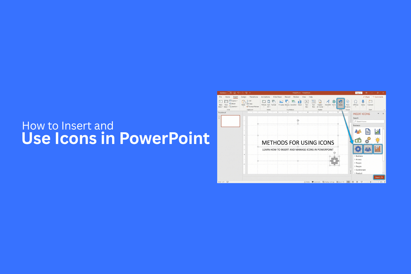
If you want to add useful visuals to your slides, learning how to insert icons in PowerPoint can help. Icons can convey ideas with fewer words and make key information easier to scan. They can also support infographics, flowcharts, diagrams, and other slide elements. Used with the right layout, icons can help your audience follow the main points more easily.
This guide covers several ways to insert icons in PowerPoint, including the built-in icon library, ready-made PowerPoint icon templates, and third-party SVG or PNG files. You will also learn how to customize icons, pair them with text, choose the right style, and avoid common mistakes.
What Are Icons in PowerPoint?
Icons are small graphic symbols that represent an idea, object, action, or topic. PowerPoint has a built-in icon library with many designs. You can find icons for business, people, technology, communication, education, files, and other common topics.
Unlike photos, icons use simple shapes and lines. This makes them easy to place on slides without taking up much space. They also work well with short text, numbers, charts, and diagrams.
PowerPoint lets you edit most icons after you add them to a slide. You can change the icon size, color, outline, and position. You can also group icons with other objects to create custom slide layouts.
Icons can serve different roles on a presentation slide. A single icon can show the topic of a section. A row of icons can show several features or steps. A set of matching icons can also help separate different points on the same slide.
For example, a phone icon can represent communication. A chart icon can represent data. A folder icon can represent files or documents. The right icon gives the audience a quick visual clue about the content.
Why Use Icons in PowerPoint?
Icons can make PowerPoint slides easier to read and scan. They give the audience a visual way to understand key ideas. This can help reduce the amount of text on a slide. Here are several ways icons can improve a PowerPoint presentation:
Show Ideas With Less Text
A clear icon can represent an idea without a long explanation. This gives you more space for the main message on the slide. For example, a calendar icon can represent a schedule. A dollar sign icon can represent money or cost. The icon gives the audience a quick clue before they read the supporting text.
Break Up Large Blocks of Text
Slides with too much text can be hard to scan. Icons can add small visual breaks between sections. You can place an icon beside each key point. This creates clear visual groups and makes the slide easier to follow.
Highlight Key Points
Icons can draw attention to important parts of a slide. Place an icon beside a number, heading, or short statement to make that item stand out. For example, a warning icon can mark a risk. A check mark can show a completed task. A target icon can represent a goal.
Make Slides More Visual
A slide does not need a photo for every topic. Icons give you another way to add visuals. They work well on title slides, process slides, comparison slides, feature lists, and summary slides. Their simple design also keeps the layout clean.
Create a Consistent Design
Using icons with a similar style can make your slides look more organized. You can use matching icons across several slides to represent related topics. Keep the icon size, placement, and color style consistent. This creates a clear visual pattern that the audience can follow.
Improve Navigation
Icons can also help guide people through a presentation. You can use different icons for sections such as goals, data, plans, results, and next steps. This gives each section its own visual marker. The audience can quickly recognize the type of content on the slide.
Support Charts and Diagrams
Icons can work with charts, timelines, and diagrams. They can show what each part of a visual means without adding long labels. For example, use a people icon for team data and a money icon for financial data. This can make the visual easier to scan.
Customize Icons for Your Brand
PowerPoint gives you control over the look of an icon. You can adjust its color and size to match your presentation theme. You can also place icons inside circles, squares, or other shapes. This gives you more control over the slide layout while keeping the icon easy to recognize.
How to Insert PowerPoint Presentation Icons
There are several ways to insert icons into PowerPoint. Common icon file types include SVG, PNG, and JPG. SVG is often a good choice for presentation icons because it keeps its quality after resizing. It also gives you more control over color and other design changes.
Method 1: Inserting Icons Using PowerPoint’s Built-In Library
PowerPoint includes a built-in icon library that lets you search for icons and add them directly to your slides. You can search by keyword or browse different categories to find an icon that fits your content.
Step 1: Go to the Insert tab and select Icons. Use the search bar to find an icon or browse the available categories.
Step 2: Select one or more icons that you want to add to your slide. Click Insert.
Step 3: Resize, move, or recolor the icon using the options under the Graphics Format tab.
The built-in icons are available as SVG files. This means you can resize them without making the image look blurry. You can also change the color to match your presentation design.
Method 2: Using Pre-Made PowerPoint Icon Templates
Pre-made PowerPoint icon templates give you a set of ready-to-use icons in one file. These templates can be useful for presentations that need many icons with a consistent visual style.
Step 1: Open the PowerPoint icon template that contains the icons you need.
Step 2: Select an icon, copy it using Ctrl+C on Windows or Command+C on Mac, then open your presentation and paste it using Ctrl+V or Command+V.
Step 3: Resize the icon and change its color or position to fit your slide layout.
Pre-made icon templates can include different categories and styles. You can pick an icon that matches your topic and use it across several slides. Keeping a similar icon style can also make the presentation look more consistent.
Method 3: Importing Third-Party SVG or PNG Icons into PowerPoint
You can also use SVG or PNG icons saved on your computer. This method gives you more choices for icon styles and designs.
Step 1: Go to Insert → Pictures → This Device.
Step 2: Find the SVG or PNG icon file on your computer and click Insert.
Step 3: Select the icon and use PowerPoint's formatting tools to resize, reposition, or change its appearance.
SVG icons work well for editable presentation graphics. You can resize them without losing image quality and, in many cases, change their color directly in PowerPoint. PNG icons are useful for ready-to-use graphics, especially if the file has a transparent background. Unlike SVG files, PNG images have a fixed pixel structure, so making them much larger can reduce image quality.
How to Find the Right Icons in PowerPoint
PowerPoint includes a built-in icon library that you can use for many types of slides. You can find icons for people, places, objects, actions, business topics, technology, education, and more. The search tool makes it easier to find a useful icon without checking every option in the library.
Start by opening your presentation and follow these steps:
- Open the Insert tab.
- Find the Icons option in the Illustrations section.
- Click Icons to open the icon library.
- Type a keyword in the search box.
- Review the available icons.
- Select the icon you want to use.
- Click Insert.
Use Clear Search Terms
The search term affects the icons PowerPoint shows. Use a simple word that describes the idea you need.
For example:
• Search phone for a phone icon.
• Search mail for an email icon.
• Search people for team or user icons.
• Search chart for data-related icons.
• Search calendar for dates or schedules.
• Search location for maps and places.
• Search computer for technology topics.
A broad search can give you many options. A more specific search can make the list easier to review.
Match the Icon to the Message
An icon should support the point on the slide. It should not confuse the reader. A chart icon can support sales data. A clock icon can support time or deadlines. A folder icon can support files or documents. Use the meaning of the icon as a guide. The visual should make sense beside the text.
Keep Icon Styles Consistent
Look at the shape and style of the icons across your slide. Try to use icons with a similar visual style. For example, avoid placing a thin line icon beside a large filled icon unless there is a clear reason. Consistent icons can make the slide look more organized. The same rule works across a full presentation. Use a similar icon style on related slides to create a consistent visual system.
Check the Icon Size
The icon should be large enough to see. Small icons may get lost beside text or other objects. Large icons can work well as visual markers or section graphics. Smaller icons work better beside short labels or list items. Leave enough space around each icon. Crowded icons can make the slide harder to scan.
How to Customize Icons in PowerPoint
PowerPoint gives you several ways to change an icon after you insert it. You can adjust its color, size, position, and rotation. Select the icon on your slide. The Graphics Format tab will appear in the PowerPoint ribbon. Use the tools in this tab to adjust the icon to fit your slide.
Change the Color of an Icon
Select the icon and open the Graphics Format tab. Find Graphics Fill and choose a color. The color should work with the slide background and nearby text. A dark icon can work well on a light background. A light icon may work better on a dark background. You can also use a theme color to keep the icon aligned with the rest of your presentation.
Change the Icon Size
Select the icon and drag a corner handle to resize it. You can also set the height and width from the Graphics Format tab. This gives you more control over the size. Use the same size for icons that serve the same purpose. For example, four icons used for four key points should have similar dimensions.
Move an Icon
Click the icon and drag it to a new location. PowerPoint shows alignment guides as you move objects. Use these guides to line up icons with headings, text boxes, images, or other objects. Good spacing gives each icon enough room. It also helps the slide feel less crowded.
Rotate an Icon
Select the icon and use the rotation handle above it. Drag the handle to rotate the icon. You can also use the Rotate options from the ribbon to set rotation angles. Rotation can work well for arrows, directional icons, and other shapes that support movement or flow.
Change the Position of Multiple Icons
A slide may contain several icons. Moving each one by hand can lead to uneven spacing. Select multiple icons and use PowerPoint's Align options. You can align them to the left, center, or right. You can also distribute them across the slide. This helps create a cleaner layout.
Group Icons With Other Objects
An icon can be grouped with a text box, shape, or other object. Select the objects you want to combine. Right-click and choose Group. The grouped objects can then be moved or resized as one unit. This is useful for cards, labels, and small content blocks.
Keep Customization Simple
Icons work best as supporting visuals. Too many changes can make them harder to understand.
Start with the basic changes:
• Size
• Color
• Position
• Rotation
• Alignment
These options are enough for most presentation slides.
How to Use Icons With Text in PowerPoint
Icons can support text by giving each point a clear visual marker. This works well for lists, feature slides, process steps, timelines, and other layouts. The key is to make the icon and text work as one content group.
Place an Icon Beside a Heading
Add a small icon beside each heading. Place a short explanation under the heading.
For example:
Calendar: Project schedule and key dates
Chart: Monthly sales results
People: Team members and roles
This layout gives each topic a visual marker. It also makes the content easier to scan.
Use Icons for Bullet Points
Icons can replace standard bullet points. A slide about project tasks could use a checkmark icon beside each task. A travel slide could use a plane, hotel, and map icon beside related details. Keep the icons the same size. Align them with the first line of each text item.
Create Icon and Text Cards
Cards can organize several related points on one slide.
Each card can include:
- An icon
- A short heading
- One or two lines of supporting text
For example, a project overview could use four cards:
• Goal: Main project target
• Team: People working on the project
• Time: Project schedule
• Budget: Planned spending
Keep each card similar in size. Use the same icon size across all cards.
Use Icons in Process Slides
Icons can show each stage of a process.
For example:
Research → Plan → Create → Review
Add one icon to each stage. Place the stage name below the icon. Add a short description under the name. This gives the audience a clear visual path through the process.
Use Icons With Short Text
Icons work best with short text blocks. Long paragraphs can reduce the value of the icon. Keep headings short. Use one or two lines for supporting details. This gives the visual and text enough space to work together.
Keep Text and Icons Aligned
Alignment affects how the slide feels. Place icons at the same height across a row. Keep the text boxes aligned below or beside them. Use equal spacing between each group. PowerPoint's guides and Align tools can help with this task.
Use the Same Icon Style Across a Slide
A group of icons should look like it belongs together. Use similar line weight, shape style, and visual size. This creates a clear pattern across the slide. A consistent icon set also helps the audience focus on the text instead of noticing differences between visuals.
Avoid Using Too Many Icons
More icons do not always make a slide better. A slide with too many visuals can become difficult to scan. Use icons only for the main points. Remove icons that do not add meaning. A simple slide with four clear icons can work better than a slide filled with small graphics.
Balance Icons With Text
Give both elements enough space. A large icon beside a tiny heading can create an uneven layout. A tiny icon beside a large text block may not have much visual value. Match the size of the icon to the amount of text and the role it plays on the slide. Keep the main message easy to find.
How to Use Icons in PowerPoint Presentations
Icons can help make PowerPoint slides easier to read and understand. They can show ideas, actions, topics, or steps with a simple visual. A well-placed icon can also break up large blocks of text and give each section a clear visual cue.
PowerPoint lets you use icons in many parts of a presentation. You can add them to title slides, content slides, charts, diagrams, timelines, and process slides. The key is to use icons that match the topic and support the text.
Add Icons to Highlight Key Points
Icons can sit beside important points on a slide. Use one icon for each main idea. This gives the audience a quick visual clue before they read the text. For example, a presentation about project planning could use a calendar icon for deadlines, a checklist icon for tasks, and a clock icon for time.
Keep the icons close to the text they support. Use a similar size and style for all icons on the same slide.
Use Icons in Lists and Bullet Points
Icons can replace standard bullet points. This works well for short lists with clear topics.
For example, a business presentation may use:
• A people icon for team details
• A chart icon for sales data
• A target icon for goals
• A folder icon for project files
This format can make a list easier to scan. Keep the text short so the icon does not become the main focus.
Use Icons in Process Slides
Icons work well for slides that show a process. Each step can have its own icon. For example, a four-step workflow could use a document icon for planning, a pencil icon for editing, a check icon for review, and a presentation icon for delivery. Place the icons in the same order as the steps. Use arrows or lines to show the path from one step to the next.
Use Icons in Charts and Diagrams
Icons can add meaning to charts and diagrams. They can help explain what each section represents.
For example, a pie chart about customer groups could use simple user icons beside the labels. A sales process diagram could use icons for leads, calls, meetings, and deals. Use icons as support elements. The chart or diagram should still be easy to read without them.
Use Icons in Title and Section Slides
A single icon can add visual interest to a title or section slide. Pick an icon that matches the subject of the section. For example, a finance section could use a money or chart icon. A marketing section could use a megaphone icon. A planning section could use a calendar icon. Keep the icon large enough to see but small enough to keep the title clear.
Keep Icon Styles Consistent
Use icons with a similar visual style across your presentation. Mixing many different styles can make slides look uneven.
Check the following details:
• Use similar line or filled icon styles.
• Keep icon sizes consistent.
• Use the same color rules across slides.
• Align icons with the text.
• Leave enough space around each icon.
A consistent icon style helps the presentation feel organized and easier to follow.
How to Change the Style of PowerPoint Icons
PowerPoint gives you several ways to change the look of an icon after you add it to a slide. You can change its color, size, fill, and outline to match your presentation design. Select the icon on your slide to open the Graphics Format tab. From there, use the available formatting options to adjust its appearance. You can change the icon color to match your slide theme. A simple color change can also help the icon stand out from the background.
You can also resize the icon by dragging its corner handles. Keep the icon large enough to see clearly, but do not let it take attention away from the main slide content. PowerPoint also lets you adjust the icon's fill and outline. Try different settings to create a style that fits the rest of your presentation. Keep icon styles consistent across your slides. Using similar colors, sizes, and formatting helps create a clean and organized presentation.
Common Mistakes to Avoid With PowerPoint Icons
PowerPoint icons can make slides easier to scan and understand. Poor icon use can also make a slide look crowded or unclear. A few simple checks can help keep your icons useful and easy to read.
Using Too Many Icons
Adding too many icons can make a slide feel crowded. Each icon should have a clear purpose. Remove icons that do not add meaning to the slide.
Mixing Different Icon Styles
Icons should have a similar visual style across the presentation. Mixing filled icons with thin line icons can make the slide look uneven. Use a consistent style for related content.
Choosing Icons That Do Not Match the Text
An icon should support the idea next to it. A confusing icon can make the message harder to understand. Pick an icon that has a clear link to the text.
Using Low-Quality Image Icons
Low-quality icons can look blurry after resizing. This is more common with raster image files. SVG icons are a better choice for resizing because they keep their quality at different sizes.
Making Icons Too Large or Too Small
Icon size affects how the slide is read. Very large icons can take attention away from the main content. Very small icons may be hard to see. Keep the size balanced with the text and other slide elements.
Using Too Many Colors
Too many icon colors can distract from the main message. Use a small set of colors that fits the slide design. Keep related icons in the same color where possible.
Placing Icons Without Proper Alignment
Icons that are not aligned can make a slide look messy. Use PowerPoint's alignment tools to keep icons in line. Keep similar spacing between icons and their related text.
Stretching Icons Out of Shape
Changing the width or height of an icon separately can distort its shape. Keep the original proportions while resizing the icon. This helps the icon keep its intended look.
Using Icons as Decoration Only
An icon should have a reason to be on the slide. Adding icons only to fill empty space can make the design less clear. Use them to support key points, labels, or visual groups.
Ignoring the Slide's Main Message
Icons should support the main point of the slide. They should not become the main focus unless the icon itself is part of the message. Check the slide after adding icons and make sure the text remains easy to follow.
Tips for Using Icons Effectively in PowerPoint
Icons can make PowerPoint slides easier to scan. They can also help show ideas without adding too much text. Good icon use depends on size, color, spacing, and placement. A simple set of rules can help keep your slides clean and easy to follow.
Keep Icon Sizes Consistent
Use icons with similar sizes across the same slide. Large and small icons placed together can make the layout look uneven. Set a clear size for icons used in the same group. Keep the size consistent for related points, labels, or steps. This creates a cleaner visual structure.
Use a Limited Color Palette
Too many icon colors can make a slide look busy. Pick a small set of colors that match the slide design. Use the same color for icons that have a similar role. A different color can highlight a specific point. Keep the color choices simple so the icons do not take focus away from the main message.
Maintain Equal Spacing
Leave similar amounts of space between icons. Uneven gaps can make a slide look disorganized. Check the space between each icon and its text. Also check the space between icon groups. PowerPoint alignment and spacing tools can help keep these areas even.
Use Icons to Support the Message
Each icon should have a clear purpose. Use an icon to help explain or reinforce the text near it. Pick an icon that matches the idea it represents. Avoid adding icons only to fill empty space. A useful icon should help the reader understand the slide faster.
Keep the Design Simple
Too many icons can distract from the main content. Use only the icons needed to support the slide. Keep the same visual style across related icons. Avoid mixing too many different styles on one slide. A simple layout with clear icons can make the content easier to read and understand.
PowerPoint Icons vs. Images: Which Should You Use?
PowerPoint icons and images can both improve a slide. The right choice depends on the type of content you want to show. Icons work well for simple ideas, labels, steps, and key points. Images work better for real objects, people, places, products, or detailed scenes. Icons are simple graphic symbols that help explain an idea with little visual detail. For example, a phone icon can represent a mobile app. A calendar icon can represent a schedule. This makes icons useful for slides with short text and several key points. Images show more detail. A photo can help explain a product, person, event, or location. Images can also give the audience a clear view of a real subject.
Choose icons for simple concepts, lists, process steps, categories, features, and short labels. They also take up less space, which helps keep a slide clean. Choose images for products, people, places, events, real examples, and subjects that need more detail. A product slide, for example, may need a clear product photo rather than an icon. The slide message should guide your choice. Use an icon for a simple idea and an image for a subject that needs more detail. You can also use both on the same slide. An icon can label a section, while an image shows the main subject. The goal is to make the visual support the message. Avoid adding an icon or image only to fill empty space. Each visual should have a clear purpose.
Final Notes
PowerPoint icons are useful for showing ideas, steps, topics, and key points with less text. PowerPoint offers several ways to add icons, including its built-in library, pre-made icon templates, and SVG or PNG files. Choose icons that match the message on the slide. Keep their size, color, spacing, and style consistent. Use alignment tools to keep icons and text in the right position. SVG icons are useful for presentation graphics because they can be resized without losing image quality. PNG files can also work well, especially with transparent backgrounds, but they may lose quality after large size changes.
Keep icon use simple. Too many icons, colors, or mixed styles can make a slide harder to read. Each icon should have a clear purpose and support the main message. Icons and images serve different needs. Icons work well for simple ideas, lists, labels, steps, and categories. Images work better for real people, products, places, events, and subjects that need more detail. A good icon should make the slide easier to understand, not add extra noise. Use each visual with a clear purpose and keep the main message easy to find.
FAQs
Can I insert icons directly into PowerPoint?
Yes. PowerPoint has a built-in icon library. Go to the Insert tab and select Icons. You can search for an icon, select it, and add it to your slide.
What file types can I use for icons in PowerPoint?
Common file types include SVG, PNG, and JPG. SVG files work well for presentation icons because you can resize them without losing image quality.
Can I change the color of an icon in PowerPoint?
Yes. Select the icon and open the Graphics Format tab. Use the Graphics Fill option to change its color. You can also use theme colors to match the slide design.
Can I resize PowerPoint icons?
Yes. Select the icon and drag a corner handle to change its size. You can also set the height and width from the Graphics Format tab.
Can I use icons with text in PowerPoint?
Yes. Icons can sit beside headings, bullet points, labels, or short text blocks. Keep the icon and text aligned. Use similar icon sizes across the same group.
How many icons should I use on one PowerPoint slide?
There is no fixed number. Use enough icons to support the main points. Remove icons that do not add meaning. Too many icons can make the slide harder to scan.
Should I use icons or images in PowerPoint?
Use icons for simple ideas, categories, steps, labels, and key points. Use images for people, products, places, events, and subjects that need more detail. You can also use both on one slide.
Why do my PowerPoint icons look blurry?
Blurry icons are often linked to low-quality image files. SVG icons are a good choice for resizing because they keep their quality at different sizes. PNG files can lose quality after large size changes.
Can I group icons with other PowerPoint objects?
Yes. You can group an icon with text boxes, shapes, or other objects. Select the objects, right-click, and choose Group. You can then move or resize them as one unit.
How can I keep PowerPoint icons consistent?
Use icons with similar styles, sizes, colors, and line or fill designs. Keep their spacing and alignment consistent. This helps related content look organized across the presentation.


You may also be interested in ...

How To Create An Eye-Catching Portfolio
If you’re looking to create an eye-catching portfolio, this post will come in handy. In this article, you can find the easies...
23 Jun, 2024

How To Easily Create An Infographic
Infographics are the perfect way to make a presentation that will impact an audience, but their design and composition might...
08 Jun, 2024

PowerPoint Template Tips & Tricks You Ne...
PowerPoint seems to be an unknown world for many people, especially those who have been assigned to create a presentation out...
08 Jun, 2024