How to Add a Map to PowerPoint in Easy Steps
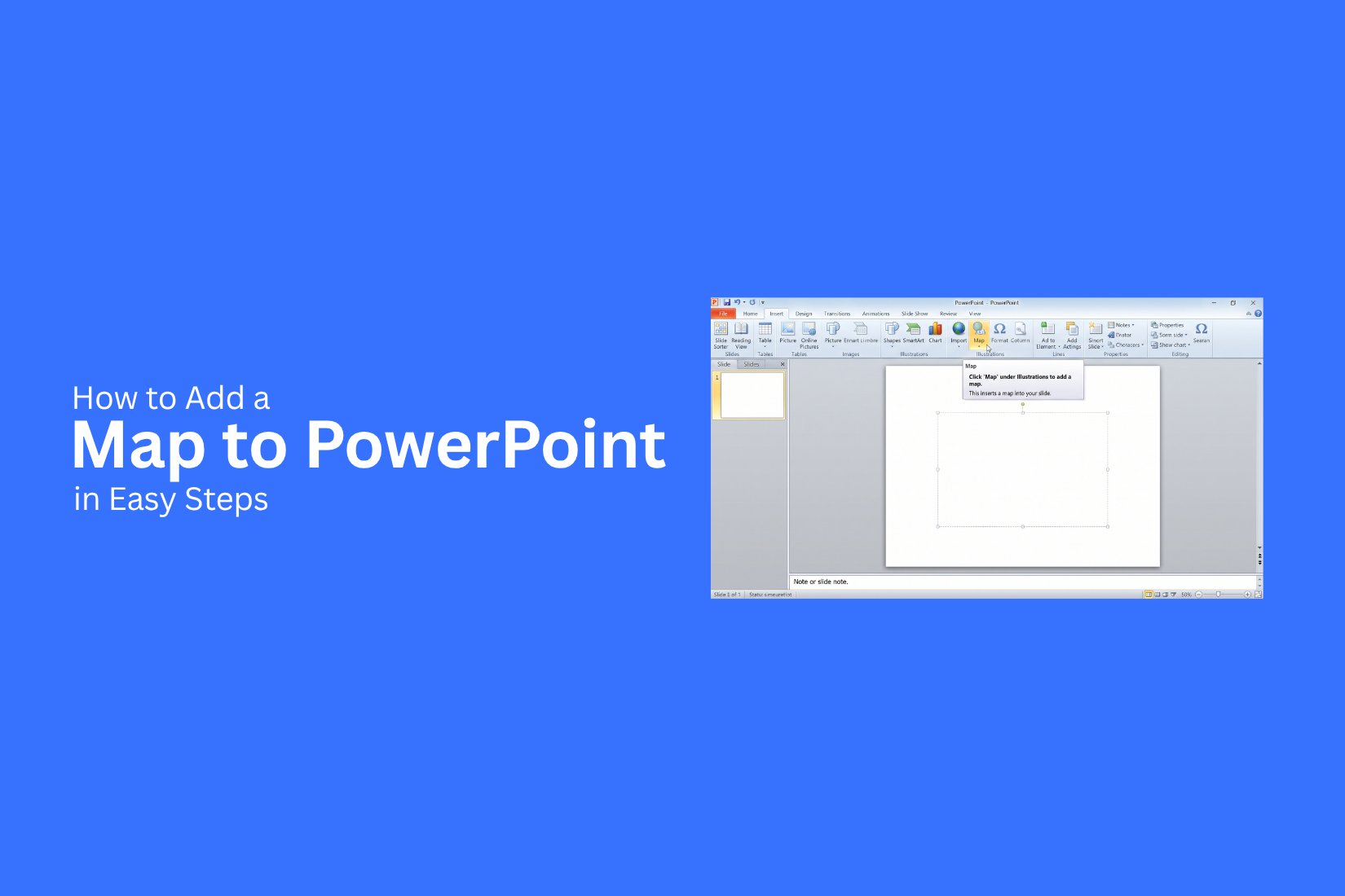
Adding a map to PowerPoint can make location-based information easier to understand. Yet, many users may not know which map option to use or how to place it on a slide. A map that is too small, crowded, or poorly placed can also make key details hard to see.
A few simple steps can help you create a cleaner map slide. You can add a map, resize it, adjust its position, add labels, and mark key locations. PowerPoint also offers options for map images and map charts.
This guide explains how to add a map to PowerPoint in easy steps. You will also learn how to add map images, create map charts, add location pins, customize maps, and avoid common map problems.
What Is a Map in PowerPoint?
A map in PowerPoint is a visual that shows places, regions, or countries on a slide. It can help your audience understand location-based information more clearly. You can use maps to show sales by country, office locations, travel routes, customer locations, or market areas. A map can also help explain data that is tied to specific places. PowerPoint supports different ways to add a map. You can insert a map image, use a map graphic, or create a chart that displays data by region. The best choice depends on the type of information you want to show.
A simple map can also make a slide easier to read. Instead of listing many locations in text, you can show them on one visual. This gives your audience a quick way to see where each location fits. The key is to match the map with your message. Use only the areas and labels your audience needs. Too many details can make the slide harder to follow.
Why Add a Map to a PowerPoint Presentation?
A map can make location-based information easier to understand. It gives your audience a clear view of places, regions, routes, or areas. A well-placed map can also support the main point of a slide without adding too much text.
Make Location Data Easier to Understand
Maps turn location details into a visual format. Your audience can quickly see where a city, country, state, or region is located. For example, a business presentation can use a map to show office locations. A travel presentation can show places on an itinerary. A school presentation can use a map to explain geography.
Show Geographic Relationships
A map helps show how different places relate to each other. You can show nearby cities, borders, regions, or travel routes on one slide. This works well for topics that depend on distance or location. A map can help your audience see the connection between two or more places without reading a long list of names.
Make Slides More Visual
Large blocks of text can make a slide hard to follow. A map gives the slide a clear visual element. You can add labels, shapes, icons, or colors to point out key locations. Keep these details limited so the map stays easy to read.
Support Data With Location
Some data makes more sense with a geographic view. Sales by region, population by state, store locations, and survey results are a few examples. A map can place the data directly on the areas it relates to. This helps your audience connect numbers with specific locations.
Keep the Audience Focused
A map can guide attention to the places that matter most to your topic. Highlight only the areas linked to your main message. The goal is not to fill the slide with geographic details. Use the map to make one clear point and support the information around it.
How to Add a Map to PowerPoint in Easy Steps
Adding a map can help your audience understand a location, route, or region. PowerPoint gives you several ways to place map visuals on a slide. The basic process is simple. Start with the right slide, add your map, then adjust its look and position.
Step 1: Open Your PowerPoint Presentation
Open the PowerPoint file you want to edit. Find the presentation that needs the map. Check the slide size and layout before adding the map. A clear layout gives the map enough space on the slide. Save your file before making changes.
Step 2: Choose the Slide for Your Map
Select the slide where you want the map to appear. A blank or simple layout often works well for a map. Make sure the slide has enough open space for the map and its labels. Move or remove other objects if they make the slide feel crowded.
Step 3: Insert a Map
Go to the Insert tab in PowerPoint. Look for the option that lets you add a map or map-based visual. Choose the map type that fits your presentation. Add the selected map to the slide. The map will appear as an object that you can edit. Your exact options may vary based on your PowerPoint version and the type of map you use.
Step 4: Adjust the Map Size and Position
Select the map on your slide. Drag a corner handle to change its size. Place the map in a clear area of the slide. Keep enough space around it for the title, labels, or other slide content. Avoid stretching the map from only one side. Use the corner handles to keep its shape balanced.
Step 5: Customize the Map
Adjust the map to match the purpose of your slide. You may change its style, colors, borders, or other available settings. Keep the map easy to read. A simple design often works better than a map with too many visual details. Make sure the map style also fits the rest of your presentation.
Step 6: Add Labels or Markers
Add labels to show key places on the map. Markers can also help point out cities, offices, destinations, or other locations. Keep each label short and clear. Place labels close to the correct location without covering important parts of the map. Use a consistent text style for all labels. This makes the map easier to scan.
Step 7: Review the Map on the Slide
Look at the full slide after making your changes. Check the map size, position, labels, and overall layout. Make sure every location is easy to identify. Check for text that is too small or objects that overlap. Run the slideshow to see how the map looks at full size. Make any final changes before presenting the slide.
How to Add a Map Image to PowerPoint
A map image can make a PowerPoint slide easier to understand. It can show a location, route, region, or travel area in a clear way. PowerPoint lets you add a map image and adjust it to fit your slide.
Find or Create a Map Image
Start by finding a map image that fits your slide. Pick an image that shows the area you need. Make sure the labels are easy to read. You can also create your own map image. Mark the key locations, routes, or areas you want to show. Keep the map simple. Too many details can make the slide hard to follow. Choose an image with good quality. A blurry map can look poor after you resize it on the slide.
Save the Map Image to Your Computer
Save the map image to a folder on your computer. Use a file format that PowerPoint supports, such as PNG or JPG. Give the file a clear name. This makes it easier to find later. Keep the original image too. You may need it again if you make changes to the map or use it on another slide.
Insert the Image Into PowerPoint
Open your PowerPoint presentation and go to the slide where you want the map.
- Select the Insert tab.
- Click Pictures.
- Choose the option to add a picture from your computer.
- Find your saved map image.
- Select the image and click Insert.
The map will appear on the slide. Drag it to the right spot. Keep enough space for the slide title and other content.
Crop and Resize the Map
Select the map image to adjust its size and shape. Drag a corner handle to make the map larger or smaller. Use Crop to remove parts of the image you do not need. Keep the main location or route visible. Avoid stretching the map from one side. This can change its shape and make locations look out of place. Use the corner handles to keep the map's proportions. Place the map where it supports the slide content. Leave enough space around it so the slide does not feel crowded.
How to Create a Map Chart in PowerPoint
A map chart can show location-based data in a clear visual format. You can use it to compare values across countries, states, or other areas. PowerPoint lets you add a map chart and adjust it to fit your presentation.
Open the Insert Tab
Start by opening your PowerPoint presentation. Go to the slide where you want to add the map. Select the Insert tab from the top menu. This tab contains tools for adding different types of content to your slide. Look through the options for the chart tools. The map chart option is available through the chart menu.
Select the Map Chart
Open the chart menu and select the Map option. PowerPoint will add a map chart to your slide. A data table may also appear beside or below the chart. The chart uses the geographic information in your data to create the map. You can replace the sample data with your own information.
Enter Your Geographic Data
Add your location names and related values to the data table. For example, your data can include a list of countries with a value for each country. Keep the location names clear and consistent. Enter the data in the correct rows and columns. The map will use this information to show the related areas.
Customize the Map Chart
Select the map chart to access its chart options. You can adjust the chart layout to match your slide. You can also change the chart size and position. Keep the map large enough to read. Remove extra elements that do not help explain the data. A simple layout makes the location data easier to follow.
Update the Map Data
Map data may change as your project develops. You can update the values in the chart's data table. Select the chart and open its data options. Edit the location names or values as needed. The map will update based on the new data. Check the chart after each update to make sure the locations and values appear correctly. A clean map chart can make geographic data much easier to present. Keep the data simple and give the map enough space on the slide so your audience can read it easily.
How to Customize a Map in PowerPoint
A map can do more than show places. You can change its look, move it on the slide, and add details to make the map easier to read. PowerPoint gives you several tools for making these changes.
Change Map Colors
Map colors can help separate countries, states, or regions. They can also match the colors used in the rest of your presentation. Select the map on your slide. Open the Graphics Format tab. Look for Graphics Fill and choose a color that fits your slide design.
You can also use different colors for different areas. A simple color system can make key regions easier to spot. Keep the color count low. Too many colors can make the map hard to read.
Resize and Reposition the Map
The map size should fit the space on your slide. Select the map and drag a corner handle to make it larger or smaller. Use the corner handles to keep the map shape in place. Avoid pulling from the side unless you want to change its proportions.
You can also move the map to a new spot. Click and drag the map across the slide. Place it near the text or other content that explains the map. Leave enough space around the map. This keeps the slide clean and easy to scan.
Add Text Labels
Text labels can help readers understand key areas on the map. You can add the name of a city, country, state, region, or other location. Go to Insert > Text Box. Click near the location you want to label. Type the name and adjust the font size.
Keep labels short. Use a clear font that is easy to read from a distance. Place each label close to its location. A short line or connector can also link the label to a specific point.
Add Shapes and Icons
Shapes and icons can add extra information to your map. A circle can mark a city. A star can show an office. A simple arrow can show a route. Go to Insert > Shapes to add a shape. You can also use Insert > Icons to add an icon to the slide.
Resize each shape or icon so it does not cover important map details. Use a small number of visual elements to keep the map clear. You can also place shapes over the map to create custom markers for key points.
Highlight Specific Locations
Some maps need to draw attention to one or two places. A highlight can make those locations easy to find. Use a circle, pin, icon, or other shape to mark the location. You can also use a different fill color for a selected region.
Add a short label beside the marker. This gives readers the location name without adding too much text. Keep the main focus clear. The highlighted area should stand out from the rest of the map without making other areas hard to see.
How to Add Location Pins to a PowerPoint Map
Location pins help you mark cities, offices, stores, events, or other places on a PowerPoint map. A clear pin also helps your audience find each place quickly. You can create one with a simple icon or shape.
Insert an Icon or Shape
Start by adding a pin icon or shape to your slide.
- Open the Insert tab in PowerPoint.
- Select Icons or Shapes.
- Search for a location pin icon, or choose a shape that looks like a pin.
- Add it to your slide.
- Adjust the size so it is easy to see on the map.
A simple pin shape works well for most maps. You can also change its fill and outline to match your slide design.
Place the Pin on the Map
Move the pin to the exact location you want to mark. Zoom in on the map if you need more control. Keep the pin close to the correct city, state, country, or other place. Use the same pin size for all locations. This keeps the map neat and easy to read. For several locations, place each pin carefully. Leave enough space between pins and labels to prevent overlap.
Add a Location Label
A label tells your audience what each pin represents.
- Go to Insert > Text Box.
- Draw a text box near the pin.
- Type the location name.
- Adjust the font size and style.
- Place the label next to the pin.
Keep labels short. A city name or short place name is often enough. Use the same font style for every label on the map.
Group the Pin and Label
Grouping keeps the pin and its label together. This makes it easier to move or resize them later.
- Select the pin and its label.
- Hold Ctrl and click both objects.
- Right-click the selected objects.
- Choose Group > Group.
Now you can move the pin and label as one object. Repeat the same steps for other locations on the map. This helps keep your map organized as you make changes to the slide.
Tips for Using Maps in PowerPoint
A map can help your audience understand locations and routes faster. Good map design keeps the main point clear. Use these tips to make your PowerPoint map simple and easy to follow.
Keep the Map Easy to Read
Use a clear map with enough space around key areas. Avoid tiny text, thin lines, or hard-to-see symbols. Your audience should understand the map from a normal viewing distance. Use a font size that matches the rest of your slides. Keep labels short and easy to read. A clean map also works better on large screens during a presentation.
Highlight Only Important Locations
Show only the locations that support your main point. Too many markers can make the map hard to follow. Use markers, circles, or simple shapes to point out key places. Keep the focus on the locations your audience needs to see. Remove markers that do not add useful information.
Use Consistent Labels
Keep the same style for all map labels. Use one font, size, and format across the slide. This makes the map easier to scan. Place labels close to the locations they describe. Keep the spacing clear so labels do not overlap. Short names often work better than long descriptions.
Choose a Suitable Map Size
Give the map enough space on the slide. A map that is too small can make locations and labels hard to see. Match the map size to the amount of information it contains. A simple location map may need less space. A map with several locations may need a larger area.
Keep Extra Details to a Minimum
Remove map details that do not support your message. Too many roads, names, icons, and borders can distract from the main point. Keep only the details your audience needs. A simple map helps viewers focus on the location, route, or area you want to explain.
Common Problems With Maps in PowerPoint
Maps can make a PowerPoint slide easier to understand. Yet, a few problems can affect how the map looks or works. A blurry image can reduce clarity. Small labels can be hard to read. Wrong location data can also confuse your audience. Here are some common map problems and simple ways to fix them.
Map Looks Blurry
A blurry map can make roads, borders, names, and other details hard to see. This often happens after adding a low-quality image to PowerPoint. Use a high-resolution map image for better results. Avoid stretching a small image across the slide. A larger source image keeps more detail after you resize it. PowerPoint also lets you crop the map to show only the area you need. This gives key details more space on the slide.
Labels Are Too Small
Map labels can become difficult to read, especially on slides with many locations. Small text may look fine while editing but become hard to read during a presentation. Use fewer labels when possible. Keep the names of key cities, regions, or places. Remove labels that do not support your main point. You can also add your own text boxes for important locations. Use a clear font and a readable size. Keep labels away from other slide elements so they stay easy to spot.
Map Does Not Fit the Slide
A map may be too wide, too tall, or too large for your slide. This can leave little room for a title, text, or other content. Resize the map from a corner to keep its shape. Then place it in an area that gives the map enough space. Cropping is another useful option. Remove parts of the map that do not support your topic. This helps you use the available slide space more effectively.
Geographic Data Is Incorrect
A map loses value if the locations or data are wrong. An incorrect city, country, border, or data point can lead to confusion. Check the location names and data before adding the map to your presentation. Compare the information with the source you used. For data-based maps, check the values linked to each location. A wrong number can change the meaning of the whole map.
Map Elements Become Misaligned
Map elements can shift after you resize or move them. This can affect labels, icons, shapes, lines, and other objects placed over the map. Select related objects and use PowerPoint's alignment tools to keep them in place. Group elements that need to move together. This makes it easier to resize or move them as one object. Leave enough space between map elements. A clean layout makes each part easier to read and reduces the chance of objects covering each other.
Best Ways to Use Maps in Presentations
Maps can make location-based information easier to understand. A clear map gives the audience a visual reference for places, routes, regions, and other geographic details. The best use depends on the goal of your presentation.
Business and Sales Presentations
Maps can show where a company operates, where customers are located, or where a new market is planned. A sales presentation can use a map to show customer regions, sales territories, store locations, or service areas. For example, a map can highlight the states or cities covered by a sales team. You can also add labels to show key offices, stores, or customer groups. Keep the map focused on the locations that support your main point.
Travel Presentations
Travel presentations can use maps to show destinations, routes, and places to visit. A simple map can help the audience follow a trip from one location to another. You can mark airports, hotels, cities, attractions, or stops along a route. Add short labels near each location. This helps the audience understand the trip without reading a large block of text.
Marketing Presentations
Maps can help show where a product, service, or campaign reaches customers. They can also show regional sales, target markets, or campaign coverage. For example, a marketing team can use a map to highlight areas with strong customer interest. Different markers or labels can separate regions and make the data easier to read. Use only the locations that support the campaign message.
Educational Presentations
Maps are useful for teaching geography, history, social studies, and other subjects that involve places. A map can help students connect facts with real locations. You can use maps to show countries, borders, rivers, historical events, migration routes, or climate regions. Add labels and simple notes to explain the key areas. A clean map keeps the lesson easier to follow.
Data and Research Presentations
Maps can present geographic data in a visual format. They can show population data, survey results, research locations, sales numbers, or other information tied to specific areas. Use markers, labels, or different map sections to point out key findings. Keep the number of visual elements under control. The audience should be able to see the main finding without studying the map for too long.
Final Notes
Adding a map to PowerPoint is a simple way to show locations, regions, routes, and geographic data. You can use a map image, map chart, icons, shapes, or labels based on your slide goal.
Keep the map large enough to read and use only the details that support your main point. Check the labels, location data, image quality, and object alignment before presenting. A clean map helps your audience understand location-based information without adding extra text to the slide. With the right map type and a simple layout, you can create a clear PowerPoint slide that supports your message and keeps key locations easy to find.
FAQs
Can I add a map directly to PowerPoint?
Yes. PowerPoint supports several ways to add maps. You can use a map image, map chart, graphic, icon, or shape based on the type of information you want to show.
How do I add a map image to PowerPoint?
Go to Insert > Pictures and choose the map image from your computer. Add the image to your slide, then resize and position it as needed. Use a clear, high-quality image for better results.
Can I create a map chart in PowerPoint?
Yes. You can add a map chart through the Insert tab and Chart menu. Add geographic names and related values to the chart data. PowerPoint uses the data to display the related areas on the map.
How do I add location pins to a PowerPoint map?
Use Insert > Icons or Insert > Shapes to add a location pin. Place the pin over the correct location on the map. You can also add a text box beside the pin to show the location name.
How do I resize a map in PowerPoint?
Select the map and drag a corner handle to change its size. Using a corner handle helps keep the map's shape balanced. Avoid stretching the map from one side.
How can I make a PowerPoint map easier to read?
Keep the map large enough for the audience to see. Use short labels and clear text. Remove details that do not support the main point. Leave enough space between pins, labels, and other slide elements.
Can I change the colors of a PowerPoint map?
Yes. Depending on the map type, you can change colors through the available formatting tools. Use a simple color system that matches the slide and makes key areas easy to spot.
Why does my PowerPoint map look blurry?
A map may look blurry because the original image has low quality or has been stretched too much. Use a higher-quality map image and avoid making a small image much larger than its original size.
How do I add labels to a map in PowerPoint?
Go to Insert > Text Box and add a text box near the location you want to label. Use short names and place them close to the correct location. Keep the same text style across the map.
What can I use PowerPoint maps for?
You can use maps for business, sales, marketing, travel, education, data, and research presentations. Maps can show office locations, sales regions, travel routes, customer areas, research sites, and other location-based information.


You may also be interested in ...

How To Create An Eye-Catching Portfolio
If you’re looking to create an eye-catching portfolio, this post will come in handy. In this article, you can find the easies...
23 Jun, 2024

How To Easily Create An Infographic
Infographics are the perfect way to make a presentation that will impact an audience, but their design and composition might...
08 Jun, 2024

PowerPoint Template Tips & Tricks You Ne...
PowerPoint seems to be an unknown world for many people, especially those who have been assigned to create a presentation out...
08 Jun, 2024