How to Create a Butterfly Chart in PowerPoint Step by Step
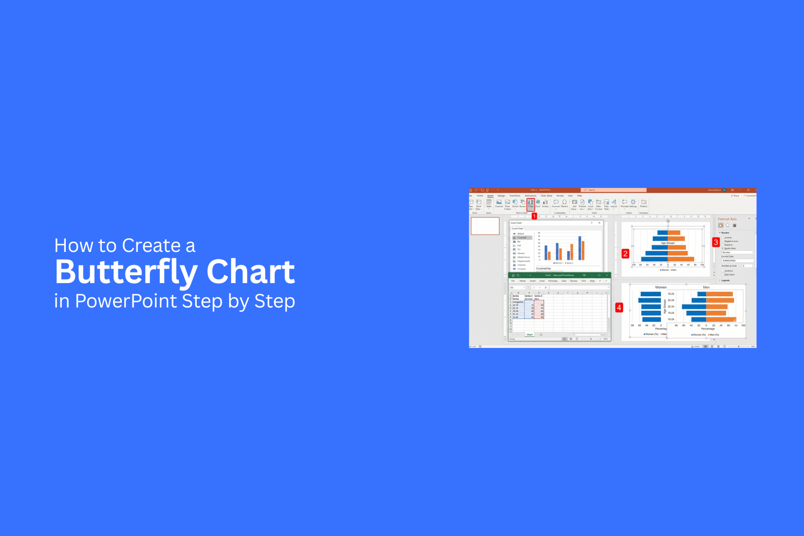
Creating a clear comparison chart in PowerPoint can be difficult, especially with two sets of data that need to be viewed side by side. Standard charts may not always show the differences in a simple way. As a result, readers may struggle to understand the data, and your presentation can lose clarity. A butterfly chart helps solve this issue by showing two related data groups around a central category list. This guide explains how to create a butterfly chart in PowerPoint step by step. You will learn the setup process, formatting steps, and design tips to make your chart ready for presentations with a clean and professional visual style for all audiences.
What Is a Butterfly Chart?
A butterfly chart is a type of comparison chart that shows two sets of data side by side. It uses two horizontal bar charts that meet at a center line. The shape looks similar to butterfly wings, which gives the chart its name. This chart helps readers compare two groups quickly. One group appears on the left side, and the other group appears on the right side. Each side uses bars to show values, making differences easier to see.
Butterfly charts work well for data comparisons such as survey results, sales reports, age groups, market data, or before-and-after results. They help show how two categories relate without using separate charts. A clear butterfly chart needs simple labels, balanced spacing, and easy-to-read numbers. A well-designed chart allows the audience to spot key differences with less effort.
Benefits of Using a Butterfly Chart in PowerPoint
A butterfly chart helps you compare two sets of data in one visual. It uses two horizontal bar charts that meet at the center. Each side shows a different category or group. This layout makes differences easier to see.
Makes Data Comparison Easier
A butterfly chart places related data side by side. This helps viewers spot gaps between two groups quickly. For example, you can compare sales numbers from two years or show differences between two teams.
Saves Space on Slides
PowerPoint slides often have limited space. A butterfly chart combines two charts into one design. This keeps your slide clean and leaves more room for other details.
Shows Differences Clearly
The mirrored layout draws attention to changes between two groups. Viewers can compare values without moving between separate charts. This makes the data easier to follow during a presentation.
Improves Audience Understanding
Large data tables can be hard to read. A butterfly chart turns numbers into a simple visual format. The clear structure helps your audience understand the main points faster.
Works Well for Many Data Types
Butterfly charts can show different types of comparisons. They are useful for age group comparisons, survey results, market data, budget changes, and other two-sided data sets.
Creates More Engaging Presentations
A well-designed butterfly chart adds visual variety to PowerPoint slides. It helps break up text-heavy content and gives your audience a clearer way to view information.
How to Create a Butterfly Chart in PowerPoint Step by Step
A butterfly chart is a useful way to compare two sets of data in one visual. It places two horizontal bar groups on opposite sides of a center line. One group appears on the left, and the other appears on the right. This chart style works well for showing differences between two categories. You can use it to compare survey results, budget changes, product performance, age groups, market data, or other comparison-based information.
PowerPoint does not have a built-in butterfly chart option. You can create one by editing a stacked bar chart. The process involves adding data, changing one side to negative values, and adjusting the chart format. Follow these steps to create a clear butterfly chart in PowerPoint.
Step 1: Insert a Stacked Bar Chart
Open your PowerPoint presentation and select the slide where you want to add the chart. Go to the Insert tab from the top menu. Click Chart to open the chart selection window. Choose Bar from the chart options. Then select Stacked Bar and click OK. PowerPoint will add a sample chart to your slide. An Excel worksheet will appear beside it. This worksheet stores the chart data.
The stacked bar chart creates the base for your butterfly chart. You will change its data and settings in the next steps to create the final design. Before adding your own information, check the chart layout. Make sure the category names and data series are arranged correctly.
Step 2: Enter Your Comparison Data
The next step is adding your own comparison data. In the Excel worksheet, replace the sample values with your data. Keep the categories in the first column. Add the two groups you want to compare in separate columns.
For example, a chart comparing two groups may include:
• Category names.
• Group A values.
• Group B values.
Each row should represent one item being compared. A simple data structure helps PowerPoint create a clean chart. Avoid adding extra categories that do not support your main message.
You can use a butterfly chart for many types of comparisons, such as:
• Before and after results.
• Two customer groups.
• Two product options.
• Different survey responses.
• Regional comparisons.
After entering the data, close the Excel worksheet. PowerPoint will update the chart automatically.
Step 3: Convert One Data Series to Negative Values
A butterfly chart needs one data group on the left side and another on the right side. To create this effect, one data series must use negative values. Open the Excel data sheet again. Select the values for the group you want on the left side.
Add a minus sign before each number.
Example:
• 30 becomes -30.
• 45 becomes -45.
• 60 becomes -60.
These negative numbers move the bars to the left side of the chart. The positive numbers stay on the right side. The values do not represent a loss or decrease. They only control the position of the bars. After changing the values, check the chart preview. Both sides should extend away from the center line.
Step 4: Format the Horizontal Axis
The horizontal axis controls the scale and spacing of your butterfly chart. Right-click the horizontal axis and choose Format Axis. Adjust the axis options to improve the chart appearance.
You can change:
• Minimum and maximum values.
• Major unit spacing.
• Number format.
• Axis position.
The center area should give both sides enough room. A small range may cut off your bars. A very large range may create too much empty space. You can also remove negative signs from the axis labels. This makes the chart easier to understand because viewers only need to compare the bar lengths.
To hide negative signs:
- Open Format Axis.
- Go to Number settings.
- Create a custom number format.
This keeps the left-side values looking clean while keeping the butterfly structure.
Read also: How to Make a Professional Pyramid Chart in PowerPoint
Step 5: Adjust Gap Width and Series Overlap
The default chart settings may not create the right butterfly shape. Adjusting the bar spacing can improve the layout. Click any bar in the chart. Open the Format Data Series menu.
Change the following settings:
Gap Width
• Lower values make bars thicker.
• Higher values create more space between bars.
Series Overlap
• Adjust this setting to control how the chart elements align.
A balanced gap width helps the chart look neat. The bars should be large enough to read but still leave enough space between categories. Take time to check the spacing between each row. Crowded bars can make the comparison harder to follow.
Step 6: Add Data Labels
Data labels show exact numbers on the chart. They help viewers understand the comparison without reading the axis. Select the chart and click the Chart Elements icon. Turn on Data Labels. You can adjust the label position based on your design.
Common options include:
• Inside end.
• Outside end.
• Center.
For butterfly charts, outside labels often work well because they keep the numbers away from the center area. Remove negative signs from the left-side labels. The chart position already shows which side the values belong to. Make sure the font size is large enough for your audience to read during a presentation.
Step 7: Customize Colors, Fonts, and Chart Elements
The default PowerPoint chart style may not match your presentation design. Customize the visual elements to create a cleaner look. Start by changing the bar colors. Use different colors for each group so viewers can separate both sides quickly.
You can also adjust:
• Chart title.
• Category label fonts.
• Data label style.
• Background.
• Gridlines.
Remove unnecessary chart elements that create distractions. A simple design keeps attention on the comparison. Use the same font style used throughout your presentation. This creates a consistent look across your slides.
Step 8: Finalize the Butterfly Chart for Presentation
The final step is reviewing your chart before presenting it. Check the chart carefully and make small adjustments.
Review these areas:
• Data accuracy.
• Label placement.
• Bar alignment.
• Font size.
• Color contrast.
• Slide spacing.
Make sure the chart title explains what the audience is comparing. A clear title helps viewers understand the purpose of the chart quickly. Resize the chart so it fits well on the slide. Leave enough space around the chart so it does not feel crowded. A finished butterfly chart should make comparisons simple. With the right data and formatting, it becomes a useful visual tool for explaining differences in a PowerPoint presentation.
Read also: How to Make a Strip Chart in PowerPoint: A Step-by-Step Guide
Tips for Designing an Effective Butterfly Chart
A butterfly chart works best when the data is easy to compare. A clean design helps viewers understand the differences between two groups without confusion. Small design choices can make the chart easier to read and follow.
Use Clear Category Labels
Clear labels help readers understand what each bar represents. Place category names near the center of the chart so they connect with both sides. Use short labels that explain the data clearly. Avoid long text that makes the chart look crowded. A viewer should understand each category at a glance.
Keep Both Sides Balanced
A butterfly chart compares two sets of data side by side. Both sides should have the same scale and spacing. This keeps the comparison fair. Avoid making one side larger or more detailed than the other. A balanced layout helps readers focus on the differences between the groups.
Choose Contrasting Colors
Colors help separate the two sides of the chart. Use two different colors that are easy to tell apart. Avoid using too many colors. A simple color pair keeps the chart clean and helps the main data stand out.
Remove Unnecessary Chart Elements
Extra elements can distract readers from the main message. Remove heavy grid lines, extra labels, and decorative shapes that do not add value. Keep only the parts needed to explain the data. A simple chart looks cleaner and makes comparisons easier.
Common Butterfly Chart Mistakes to Avoid
A butterfly chart works best when the data is easy to compare. Small design mistakes can make the chart harder to read. A clean layout helps viewers understand the differences between two groups without confusion. Here are some common mistakes to avoid while creating a butterfly chart in PowerPoint.
Using Too Many Categories
Adding too many categories can make a butterfly chart look crowded. The main purpose of this chart is to compare two sets of data side by side. Too many rows can make it hard for viewers to find key details. Try to keep the number of categories limited. Focus on the data points that matter most. A shorter list makes the comparison clearer and keeps the chart easy to follow.
Choosing Similar Colors
Colors help separate the two data series in a butterfly chart. Using similar colors can make both sides look almost the same. This makes it harder for viewers to know which side represents each group. Pick two colors with a clear difference. Use the same color style across the entire chart. Add a simple legend or label to explain each side.
Forgetting to Reverse One Data Series
A butterfly chart needs one data series to face left and the other to face right. This setup creates the butterfly shape and makes comparison easier. A common mistake is leaving both series in the same direction. The chart may look like a regular bar chart instead. Check the data settings in PowerPoint and reverse one series before finalizing the design.
Overloading the Chart with Labels
Too many labels can distract viewers from the main comparison. Adding values, descriptions, and extra notes to every bar can make the chart feel busy. Use labels only where they add value. Keep text short and place numbers in a clear position. A simple chart helps viewers focus on the difference between the two groups.
Butterfly Chart vs Other Comparison Charts
Comparison charts help present differences between two or more groups. Each chart type has a specific purpose. A butterfly chart is useful for showing two sets of data side by side. Other charts may work better for different types of comparisons. Choosing the right chart depends on the message you want to share. A clear chart makes data easier to read and helps viewers spot differences quickly.
Butterfly Chart vs Bar Chart
A butterfly chart and a bar chart both show comparisons, but they present data in different ways. A butterfly chart uses two horizontal bars that face opposite directions from a center point. It works well for comparing two groups, such as male and female results, two time periods, or before-and-after values. A bar chart uses bars that usually move in the same direction from a starting point. It is better for comparing several categories or showing differences between individual values. Use a butterfly chart for direct side-by-side comparisons. Use a bar chart for simple category comparisons with one data group.
Butterfly Chart vs Tornado Chart
A butterfly chart and a tornado chart have a similar look. Both use two sides that extend from a center line. The main difference is how they are used. A butterfly chart focuses on comparing two related groups. Each side usually represents a different category or group. It helps viewers compare values at a glance. A tornado chart is often used to show the impact of different factors. It is common in risk analysis and sensitivity studies. The chart shape shows which factors have the biggest effect. A butterfly chart is a good choice for balanced comparisons. A tornado chart works better for showing changes caused by different factors.
Which Chart Should You Choose?
Choose a butterfly chart for clear comparisons between two groups. It works well for surveys, reports, demographic data, and before-and-after comparisons. Choose a bar chart for comparing many separate categories. It keeps the layout simple and easy to scan. Choose a tornado chart for showing how different factors affect a result. It helps highlight the size of changes. The best chart is the one that matches your data and your message. A simple design helps your audience understand the comparison without extra effort.
How to Edit and Update a Butterfly Chart
A butterfly chart may need updates as your data changes. PowerPoint makes it easy to adjust the chart without creating a new one from scratch. You can replace old numbers, add new data groups, and change the chart style to match your presentation. Keeping your chart updated helps your audience see the latest information. Small edits can also improve how clearly the data is shown.
Replace Existing Data
Old data can make a chart less useful. Updating the numbers keeps your butterfly chart accurate.
To replace existing data in PowerPoint:
- Click the butterfly chart.
- Open the Chart Design tab.
- Select Edit Data.
- Change the values in the Excel sheet that appears.
- Close the sheet to apply the updates.
The chart will adjust automatically based on the new numbers. Check both sides of the chart to make sure the values match your message.
Add New Categories
Your chart may need more groups as your data grows. Adding new categories helps you compare more information in one view.
Follow these steps to add new categories:
- Open the chart data table.
- Add a new row for the category name.
- Enter the values for both sides of the chart.
- Close the data window.
PowerPoint will add the new category to the butterfly chart. Keep the number of categories reasonable so the chart stays easy to read.
Update Colors and Labels
Colors and labels help readers understand the chart faster. You can change them to match your presentation style or improve clarity.
To update chart colors:
- Select the chart.
- Go to the Chart Design tab.
- Choose a new color style or change individual data series colors.
To edit labels:
- Click the chart labels.
- Select the text you want to change.
- Add clear names or values.
Use simple labels that explain the data. Avoid adding too much text around the chart. A clean design helps your audience focus on the key comparisons.
Best Practices for Presenting Butterfly Charts
A butterfly chart helps compare two sets of data side by side. The chart works best when the audience can quickly see the main differences. Good design choices make the data easier to follow and understand. A clear presentation needs more than just adding a chart to a slide. The way you introduce and explain the chart also affects how well your audience understands the message. Use these practices to create a cleaner and more effective butterfly chart presentation.
Focus on Key Comparisons
A butterfly chart is made for comparing two groups. Use it to highlight the most important differences between categories. Avoid adding too much data that can distract your audience. Start by choosing the data points that support your main message. Keep the number of categories limited so each comparison stays easy to read. Large data sets may make the chart crowded and harder to explain. Use clear labels for both sides of the chart. Your audience should know what each color, bar, and category represents without extra effort. Add short notes or callouts to point out major differences if needed.
Use Animation Carefully
Animations can help guide attention during a presentation. They can show data step by step and make the chart easier to explain. Use simple effects like fade or appear. Avoid adding too many movements because they can take attention away from the data. The chart should remain the main focus. A good approach is to reveal one side of the comparison first, then show the second side. This helps the audience follow the story behind the numbers. Keep the timing smooth and avoid long delays between animations.
Match the Chart Style to Your Presentation Theme
The butterfly chart should fit the overall look of your presentation. Use colors, fonts, and design elements that match your slides. Choose colors that create a clear difference between the two data groups. Make sure text is easy to read, and labels stand out from the background. A simple design helps the audience focus on the comparison. Keep the chart style consistent with other slides. Use the same font family, color style, and spacing rules throughout your presentation. A matching design creates a more organized and professional look.
Final Notes
A butterfly chart is a simple way to compare two groups of data in PowerPoint. It places two sets of values on opposite sides of a center line, making differences easier to see. This chart type works well for surveys, reports, sales comparisons, demographic data, and before-and-after results.
Creating a butterfly chart requires a few formatting steps because PowerPoint does not include a ready-made option. You can build one by using a stacked bar chart, adjusting the data, and customizing the design. Proper labels, balanced spacing, and clear colors help the chart stay easy to read.
A good butterfly chart does more than display numbers. It helps your audience understand the relationship between two data groups. Avoid adding too many categories, extra labels, or confusing colors. A clean layout keeps attention on the main comparison. With the right setup and design choices, a butterfly chart can become a useful tool for PowerPoint presentations. It helps turn complex comparisons into a clear visual that your audience can understand quickly.
FAQs
What is a butterfly chart in PowerPoint?
A butterfly chart is a comparison chart that shows two sets of data side by side. It uses two horizontal bar charts that extend from a center line. One group appears on the left, and the other appears on the right.
Can I create a butterfly chart directly in PowerPoint?
PowerPoint does not have a built-in butterfly chart option. You can create one by using a stacked bar chart and changing the data settings. One data series needs negative values to create the left-side bars.
What type of data works best for a butterfly chart?
A butterfly chart works best for comparing two related groups. It can be used for survey results, sales comparisons, age groups, market data, budget changes, and before-and-after results.
Why do I need negative values for a butterfly chart?
Negative values help move one data series to the left side of the center line. They only control the bar position. They do not mean the data represents a loss or decrease.
How many categories should I add to a butterfly chart?
A butterfly chart works best with a limited number of categories. Too many rows can make the chart crowded and harder to read. Focus on the categories that support your main message.
How can I make a butterfly chart easier to read?
Use clear labels, different colors for each data group, balanced spacing, and simple formatting. Remove extra chart elements that distract from the comparison.
Can I update a butterfly chart after creating it?
Yes. You can edit the chart data, add new categories, change colors, and update labels through PowerPoint’s chart tools. The chart will adjust based on the new information.
What is the difference between a butterfly chart and a bar chart?
A butterfly chart compares two related groups using bars that face opposite directions. A bar chart usually compares values from one starting point and works better for separate categories.
What is the difference between a butterfly chart and a tornado chart?
A butterfly chart focuses on comparing two groups side by side. A tornado chart is often used to show how different factors affect a result, such as changes in risk or sensitivity analysis.
Can I use animations with a butterfly chart in PowerPoint?
Yes. Simple animations can help explain the chart during a presentation. Use basic effects and avoid too many movements that distract from the data.


You may also be interested in ...

How To Create An Eye-Catching Portfolio
If you’re looking to create an eye-catching portfolio, this post will come in handy. In this article, you can find the easies...
23 Jun, 2024

How To Easily Create An Infographic
Infographics are the perfect way to make a presentation that will impact an audience, but their design and composition might...
08 Jun, 2024

PowerPoint Template Tips & Tricks You Ne...
PowerPoint seems to be an unknown world for many people, especially those who have been assigned to create a presentation out...
08 Jun, 2024