How to Create a Control Chart in PowerPoint Step by Step
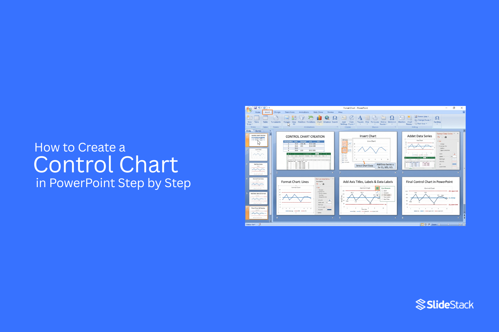
Creating a control chart in PowerPoint can be confusing for users who need to show process changes and data trends clearly. Many people struggle with choosing the right chart type, setting control limits, and formatting the slide correctly. A chart with unclear details can make data harder to follow and reduce the value of a presentation. To make the process easier, this guide explains how to create a control chart in PowerPoint step by step. You will learn different methods to build the chart, improve readability, apply formatting tips, and avoid common mistakes. The steps help you create a clear chart that fits your presentation needs and communicates data better.
What Is a Control Chart?
A control chart is a visual tool used to track changes in a process over time. It shows recorded data points on a graph and helps identify whether a process is working within an expected range. Businesses and teams use control charts to monitor quality, find unusual changes, and keep processes consistent. A control chart has several key parts. The data points show the values collected from a process at different times. These points help users see patterns and changes in performance. The CL, or Center Line, shows the average value of the process. It provides a reference point to compare each data point.
The UCL, or Upper Control Limit, marks the highest expected value for normal process variation. The LCL, or Lower Control Limit, marks the lowest expected value for normal variation. These lines help users check process stability. Data points that stay between the UCL and LCL usually show that the process is operating within the expected limits. Points outside these limits may show a problem that needs attention. A control chart helps teams review these changes and find possible causes. Control charts are used in areas such as manufacturing, healthcare, and service operations. They help teams track quality, reduce errors, and make better decisions based on process data.
When Should You Use a Control Chart?
A control chart helps track changes in a process over time. It shows if the changes are normal or if something needs attention. Businesses use control charts to check quality, reduce errors, and keep work consistent. A control chart is useful for projects that collect data regularly. For example, a factory can use it to check product quality each day. A service team can use it to track customer response times.
Use a control chart in these situations:
• Tracking process stability: A control chart shows if a process stays within a normal range.
• Finding unusual changes: It helps spot sudden increases, drops, or patterns in data.
• Improving quality control: Teams can find areas that need changes and make better decisions.
• Checking long-term performance: Regular tracking helps teams see if improvements are working.
Control charts are not only for large companies. Any team that collects repeated data can use them to understand performance and find problems early.
How to Create a Control Chart in PowerPoint
A control chart can be created in PowerPoint using different methods. The best method depends on how much control you need over the chart design. PowerPoint’s chart tools work well for data-based charts, while shapes offer more design freedom. A ready-made template can also help you create a professional slide with less manual work.
Method 1: Create a Control Chart Using PowerPoint Charts
PowerPoint’s built-in chart feature is a simple way to create a control chart. This method works well for users who already have data values and want a clear visual display.
Follow these steps:
Insert a line chart: Open your PowerPoint slide and go to Insert > Chart. Select the Line Chart option and click OK. PowerPoint will add a chart and open an Excel sheet for entering data.
Add your data values: Enter your measurement values in the Excel sheet. Add categories such as time periods, sample numbers, or test groups in the first column. Add the related data points in the next column.
Create control limit lines: Add extra data series for the upper control limit and lower control limit. Enter the same limit value across all points so the lines stay flat on the chart.
Adjust the chart design: Return to PowerPoint and customize the chart. Change the colors, line styles, labels, and chart title to make the information easier to read.
Add final details: Include labels for the center line, upper control limit, and lower control limit. Check that each part of the chart is clear before presenting it.
This method creates a chart that updates easily if the data changes. It is a useful choice for reports and presentations that need regular updates.
Method 2: Create a Control Chart Using Shapes
Shapes give you more freedom to design a control chart from scratch. This option works well for simple charts or slides that need a custom layout.
Follow these steps:
Create the chart area: Go to Insert > Shapes and select lines or rectangles to create the basic chart structure. Draw the horizontal and vertical axes on your slide.
Add the control lines: Use line shapes to create the center line, upper control limit, and lower control limit. Place each line at the correct level based on your data.
Add data points: Use circles or other small shapes to mark each measurement point. Connect the points with lines to show changes across the chart.
Add labels and text: Insert text boxes to label the chart title, data points, and control limits. Keep the text short so the chart remains easy to follow.
Format the design: Adjust the size, spacing, and alignment of each element. Use the Align and Distribute tools in PowerPoint to create a clean layout.
Creating a control chart with shapes takes more time, but it gives full control over the appearance of each element.
Method 3: Use a Control Chart Presentation Template
A control chart presentation template provides a ready-made layout that you can edit with your own information. This method saves time and helps you start with an organized design.
Follow these steps:
Choose a control chart template: Select a PowerPoint template that includes a control chart layout. Open the file and review the slide structure.
Replace the sample data: Update the existing chart values with your own data. Change the labels, numbers, and notes to match your project.
Customize the slide design: Modify the colors, fonts, icons, and chart elements to fit your presentation style. Remove any parts that are not needed.
Add supporting information: Include short explanations, key findings, or notes beside the chart. This helps viewers understand what the chart shows.
Review the final slide: Check the chart labels, data points, and layout. Make sure the information is accurate and easy to read.
For example, an existing control chart template can be customized by replacing the sample values with production data, updating the control limit lines, changing the title, and adjusting the slide colors to match a company presentation. This creates a finished control chart slide without building every element from the beginning.
Read also: How to Easily Create Radar Charts in PowerPoint
How to Make Your Control Chart Easier to Read
A clear control chart helps viewers understand data changes without extra effort. Good formatting makes each part of the chart easier to follow. Small design choices, such as line colors and labels, can improve how the chart looks and works.
Use Different Colors for Each Line
A control chart often includes multiple lines, such as the data line, center line, upper control limit, and lower control limit. Use a different color for each line so viewers can tell them apart quickly. Choose colors that are easy to see. Avoid using too many bright colors because they can make the chart look crowded. Keep the same color style across all slides in the presentation.
Keep Labels Short
Long labels can make a control chart harder to read. Use short names that explain the purpose of each line. For example, use “Average,” “Upper Limit,” and “Lower Limit” instead of longer descriptions. Place labels close to the related lines so viewers can match them easily.
Highlight Out-of-Control Points
Out-of-control points show data values that move outside the expected range. Mark these points with a different color, shape, or size to make them stand out. A clear marker helps the audience find areas that need attention. It also makes the chart easier to explain during a presentation.
Reduce Visual Clutter
Too many design elements can distract from the data. Remove extra gridlines, unnecessary shapes, and heavy backgrounds. Keep only the details that help explain the chart. A simple layout allows viewers to focus on the changes in the data.
Use Consistent Fonts
Use the same font style throughout the control chart and presentation. Consistent fonts make the slide look organized and professional. Choose a readable font size for titles, labels, and data points. Small text can make key details harder to notice, especially during a presentation.
Control Chart Formatting Best Practices
A clear control chart helps viewers understand data changes without confusion. Good formatting makes each line, marker, and label easier to read. PowerPoint offers many editing tools, but a few design choices help create a clean and useful chart.
Choose Simple Line Styles
Use simple line styles to separate data points and control limits. A solid line works well for the main data line. Dashed lines can show upper and lower control limits. Avoid using too many line types or heavy effects. Extra styles can make the chart harder to read. Keep the focus on the data pattern and important changes.
Use Clear Marker Shapes
Markers help viewers identify each data point on the chart. Use simple shapes like circles, squares, or dots. Make sure the marker size is large enough to see but does not cover the line. Use the same marker style throughout the chart. Different shapes should only be used to show different data groups or reference points.
Maintain Equal Spacing
Keep equal spacing between data points along the chart axis. Proper spacing helps viewers compare values and spot changes more easily. Check the distance between labels, gridlines, and chart elements. Uneven spacing can make the chart look confusing and affect how people read the data.
Keep the Background Clean
A clean background keeps attention on the chart details. Use a plain background color and remove extra design elements that do not support the data. Limit the use of strong colors, shadows, and decorative effects. A simple chart layout looks more professional and works better in presentations.
Make the Chart Presentation Ready
A control chart in PowerPoint should be easy to understand on any screen. Add a clear title, label the axes, and include a short explanation if needed. Check the chart size, font readability, and line visibility before presenting it. A well-formatted chart helps the audience follow the data and understand the message quickly.
Common Mistakes to Avoid
Creating a control chart in PowerPoint is simple, but small mistakes can affect how the data is shown. A clear chart helps viewers understand process changes and trends. Avoid these common errors to create a more accurate presentation.
Using Incorrect Data
A control chart depends on accurate data. Wrong values can make the chart show false patterns. Check the data source before adding numbers to PowerPoint. Make sure each value matches the correct time period or measurement.
Missing Control Limits
Control limits help show whether a process stays within an expected range. A chart without upper and lower control limits does not give a complete view of process performance. Add these lines clearly so viewers can compare the data points with the set limits.
Adding Too Many Data Points
A control chart with too many points can become hard to read. Large amounts of data may hide important changes. Use a suitable time range and keep the chart focused on the information that matters.
Using the Wrong Chart Type
A line chart is commonly used to create a control chart in PowerPoint. Other chart types may not show changes over time clearly. Choose a chart format that makes data movement easy to follow.
Poor Chart Formatting
A control chart should be easy to read. Small labels, unclear colors, or crowded elements can make the chart confusing. Adjust the font size, axis labels, and line styles to improve readability.
Ignoring Data Updates
Control charts are often used to track changes over time. An outdated chart may not show the current process status. Update the data regularly to keep the presentation accurate.
Not Explaining the Chart
A control chart should include enough context for the audience. Add a clear title, labels, and a short explanation of what the chart shows. This helps viewers understand the purpose of the data without extra details.
Design Tips and Best Practices for Control Charts in PowerPoint
A well-designed control chart helps the audience understand data patterns and process changes with less effort. Clear formatting, accurate data, and simple visuals make the chart easier to read during a presentation. Good design choices also help viewers focus on the information that matters most.
Keep the Design Simple
A control chart should focus on the data, not extra design elements. Avoid adding too many shapes, effects, or decorative items that distract from the chart. A clean layout helps the audience follow the trend line and control limits without confusion. Use enough space around the chart elements. Keep the focus on the main data points, center line, and control limits. A simple design makes the information easier to understand.
Use Clear Labels and Legends
Labels help viewers understand what each line or value represents. Add clear names for the data series, control limits, and measurement points. Avoid using short forms or unclear terms that may confuse the audience. Place legends in a location that does not block important chart details. A clear legend allows viewers to identify each part of the chart quickly.
Use Colors Strategically
Colors can help separate different parts of a control chart. Use a small number of colors to show key elements such as the data line, average line, and control limits. Choose colors that are easy to read on a projector or screen. Avoid using too many bright colors because they can make the chart harder to understand. Keep the main focus on the data instead of the visual styling.
Maintain Design Consistency Across Slides
A control chart should match the style of the rest of the presentation. Use the same fonts, text sizes, and layout style across slides. Consistent formatting creates a smoother viewing experience. Keep chart titles, labels, and spacing similar across multiple slides. This helps the audience understand each chart without adjusting to a new design each time.
Ensure Accurate Control Limits
Control limits are a key part of the chart. Make sure these values are calculated correctly and displayed clearly. Incorrect limits can lead to wrong conclusions about the process. Check the placement of upper and lower control limits before presenting the chart. Accurate data helps the audience trust the information shown.
Avoid Overloading the Chart
Adding too much data can make a control chart difficult to read. Use only the information needed to explain the process or highlight a trend. Remove unnecessary gridlines, extra labels, and unrelated details. A focused chart helps viewers find the main message faster.
Ensure Clean Formatting
Proper formatting improves the overall readability of a control chart. Align chart elements, keep spacing balanced, and use readable font sizes. Check the chart size before presenting. A chart that is too small may hide important details, while a chart that is too large may take attention away from other slide content.
Highlight Outliers and Key Insights
Important data points should stand out from the rest of the chart. Use markers, labels, or simple notes to point out unusual values or major changes. Highlighting outliers helps the audience notice areas that may need further review. Clear visual signals guide attention to the most useful parts of the chart.
Final Notes
Creating a control chart in PowerPoint becomes easier with the right method and clear data. You can use PowerPoint charts, shapes, or a ready-made template based on your design needs and the amount of control you want over the layout. A good control chart should show data points, center line, upper control limit, and lower control limit clearly. Simple formatting, readable labels, and proper spacing help the audience understand the chart without confusion. Before sharing the presentation, check the data values, chart labels, control limits, and overall design. A well-prepared control chart helps explain process changes, track performance, and present data in a clear way.
FAQs
What is a control chart in PowerPoint?
A control chart in PowerPoint is a visual chart that shows process data over time. It uses data points, a center line, and control limit lines to help track changes and check process performance.
Can I create a control chart directly in PowerPoint?
Yes, you can create a control chart directly in PowerPoint using the built-in chart tools. You can also create one manually with shapes or edit a ready-made template.
Which PowerPoint chart type is best for a control chart?
A line chart is commonly used for creating a control chart in PowerPoint. It helps show data changes over time and makes it easier to compare values with control limits.
What are the main parts of a control chart?
A control chart includes data points, a center line (CL), an upper control limit (UCL), and a lower control limit (LCL). These parts help show the normal range of process changes.
Why are control limits needed in a control chart?
Control limits show the expected range of process variation. They help users check if data points stay within normal limits or if a change needs attention.
Can I customize a control chart in PowerPoint?
Yes, you can customize a control chart by changing line styles, colors, labels, fonts, markers, and other design elements. These changes help make the chart easier to read.
How can I make a control chart easier to understand?
Use clear labels, simple line styles, readable fonts, and a clean layout. Highlight important data points and remove extra design elements that distract from the chart.
What mistakes should I avoid while creating a control chart?
Avoid using incorrect data, missing control limits, adding too many data points, choosing the wrong chart type, and using unclear formatting. These issues can make the chart harder to understand.
Can I use a control chart template in PowerPoint?
Yes, a control chart template can help you create a slide faster. You can replace sample data, update labels, and adjust the design to match your presentation.


You may also be interested in ...

How To Create An Eye-Catching Portfolio
If you’re looking to create an eye-catching portfolio, this post will come in handy. In this article, you can find the easies...
23 Jun, 2024

How To Easily Create An Infographic
Infographics are the perfect way to make a presentation that will impact an audience, but their design and composition might...
08 Jun, 2024

PowerPoint Template Tips & Tricks You Ne...
PowerPoint seems to be an unknown world for many people, especially those who have been assigned to create a presentation out...
08 Jun, 2024