How to Make a Professional Pyramid Chart in PowerPoint
In this guide, you will learn how to make a Pyramid Chart in PowerPoint. This chart helps show data in clear layers. It improves slide clarity and makes information easier to follow.
Many presentations look confusing when the data has no clear order. A pyramid chart fixes this by placing ideas in a simple structure from top to bottom. It helps viewers read information quickly.
The next sections show the full process step by step. You will learn how to choose the right layout, insert SmartArt, build layers, and adjust design. Keep PowerPoint open while you follow along to complete your chart faster. Start with the basics before moving into advanced design options.
What is a Pyramid Chart?
A pyramid chart is a type of visual chart that shows information in a triangular form. It is used to display data that is organized by size or level. The widest part is at the bottom. The sections get smaller as they move toward the top. A pyramid chart is also called a pyramid graph or pyramid diagram. These names describe the same structure and purpose.
The shape is made of stacked horizontal sections. Each section represents a part of the data. The lower sections show larger values or groups. The upper sections show smaller values or narrower categories. This structure helps show how parts relate to a whole. Pyramid charts are used in infographics, presentations, and reports. They help present ranked data in a simple visual form. They also appear in education materials for basic data understanding.
Why Pyramid Charts Are Used in Presentations
Pyramid charts help organize information in a clear visual shape. The structure moves from a wide base to a narrow top. This makes the order of ideas easy to see. People use pyramid charts to show levels. Each level connects to the one above it. This helps break complex ideas into simple parts. One common use is hierarchy. Teams, roles, or systems can be shown from bottom to top. The base shows the starting point. The top shows the final stage or main point.
Another use is process flow. Steps can be arranged in order. Each step builds toward the next one. The shape helps show progress without extra explanation. Pyramid charts also help with priority. The lower levels show larger or general items. The higher levels show smaller or more focused items. This makes key points stand out faster. Clarity matters in presentations. A pyramid chart reduces confusion. It replaces long text with a simple structure that the eye can follow quickly.
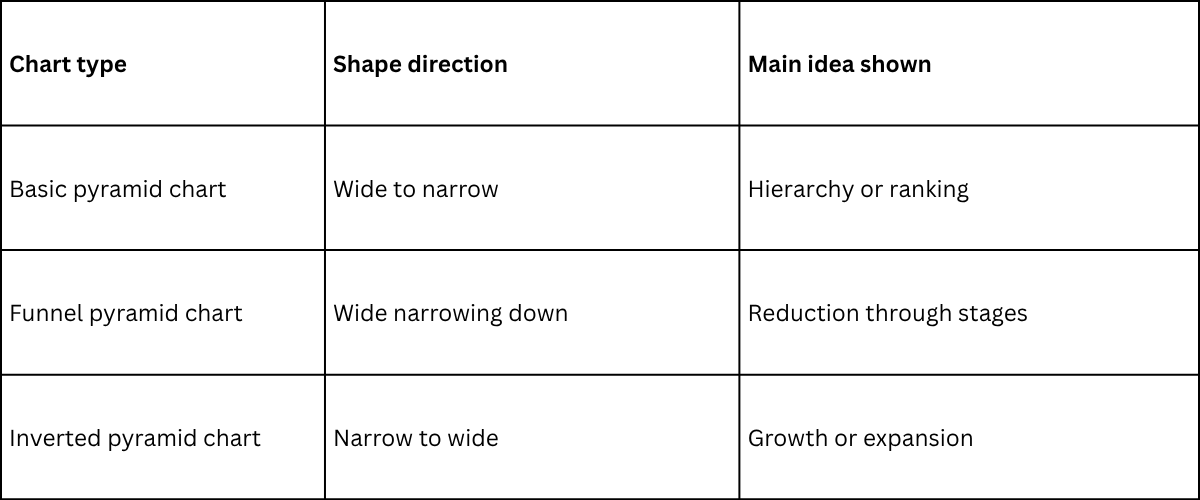
Types of pyramid charts
Ancient pyramids in Egypt stand on wide bases and rise to a narrow top. Data charts can follow a similar shape. The structure helps show flow, levels, and ranking in a simple way. You can read the size of each part at a glance.
Basic pyramid chart
A basic pyramid chart uses a straight triangle shape. The bottom section is wide. Each level above becomes smaller. The flow moves from large to small or from small to large, depending on the design choice. The shape stays balanced and steady. This chart works well for showing hierarchy. It also fits topics like team structure, learning stages, or product levels.
Funnel pyramid chart
A funnel pyramid chart looks like a wide top that narrows down into layers below. It can also appear as a flipped structure depending on design style.
The flow often shows movement through stages. Each step gets smaller as items move forward.
This chart is often used for sales processes, lead tracking, or user journeys. It helps show how a large group reduces into a smaller group over time.
Funnel pyramid chart example note: commonly used in marketing and sales tracking dashboards.
Inverted pyramid chart
An inverted pyramid chart flips the structure. The top starts narrow. It expands as it moves down.
The flow shows growth or expansion through stages. Each level becomes wider as data progresses.
This chart fits well for topics like audience growth, resource distribution, or expanding systems.
Simple comparison
How to Make a Simple Pyramid Chart in PowerPoint
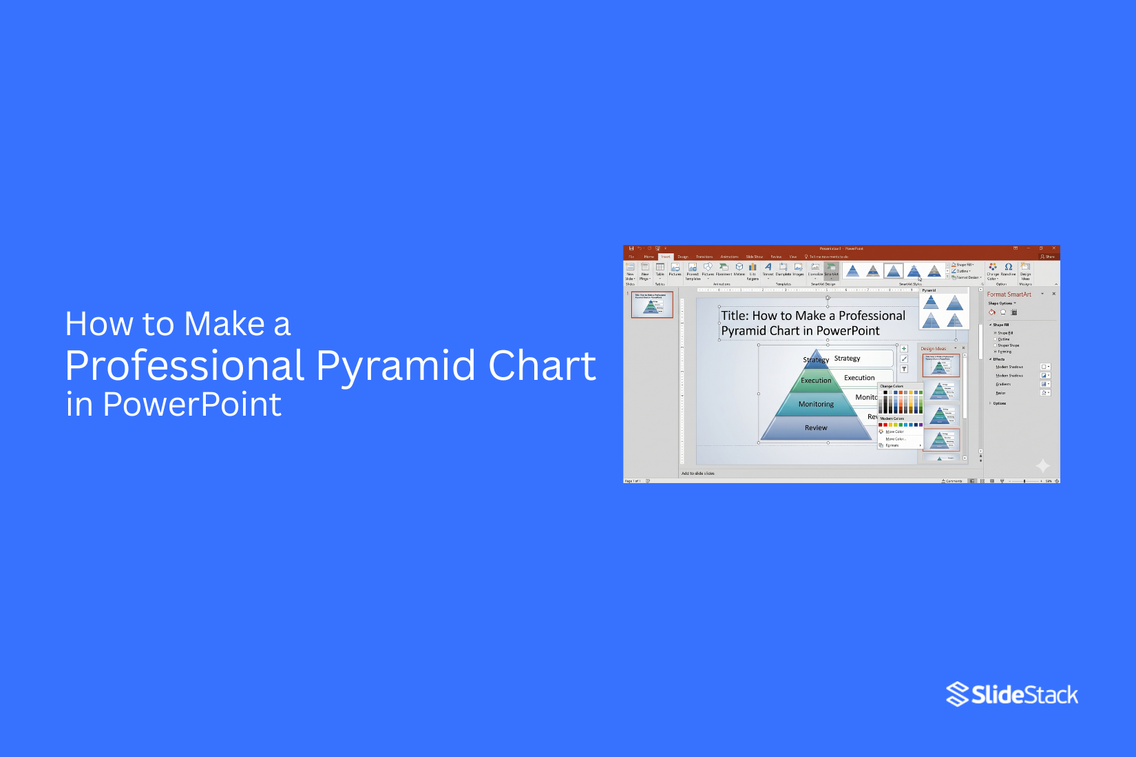
SmartArt in PowerPoint gives a quick way to build pyramid charts. It helps turn simple data into a clear visual structure. The pyramid shape is often used to show levels that move from wide to narrow.
Choose the right slide layout
Start with a blank slide. This gives space for the chart. A clean slide helps the pyramid stand out. It also makes editing easier later.
Insert SmartArt or a pyramid shape
Go to the Insert tab in PowerPoint. Select SmartArt. A list of graphic options appears on the screen. This tool is where pyramid charts are created.
Select pyramid structure type
Inside SmartArt, open the Pyramid section. Different pyramid styles are shown. Some are stacked. Some are segmented. Pick the one that matches your data layout.
Add layers to the pyramid
Each pyramid level represents a layer of information. Add more layers to increase detail. Keep the structure balanced so each level stays clear and readable.
Input and arrange content
Click each layer and type your content. Keep text short. Each section should carry one idea. Move content around until the order makes sense from top to bottom.
Adjust design and formatting
Change colors to improve clarity. Use simple color contrast between layers. Adjust font size so text is easy to read. Small design changes can make the pyramid easier to follow.
How to Make a Segmented Pyramid Chart in PowerPoint?
A segmented pyramid chart is a visual structure that divides each level of a pyramid into smaller parts so you can show more detailed information inside each section while still keeping a clear layered shape that is easy for viewers to understand at a glance. SmartArt in PowerPoint gives you a simple way to build this type of chart without needing any drawing skills or advanced design tools.
Open Insert Tab
Go to the top menu in PowerPoint and open the Insert tab, where all visual tools are located, so you can start building your chart from the correct place in the software.
Access SmartArt
Click SmartArt from the Insert tab to open a full library of diagram layouts where you can choose structured visuals that fit your data.
Select Pyramid Category
Inside the SmartArt window, scroll until you find the Pyramid category, which contains different pyramid-based layouts designed for hierarchical or layered information.
Choose Fourth Pyramid Model
Select the fourth pyramid model from the available options because this version supports segmented layers that allow each level of the pyramid to be broken into smaller, structured sections for better detail display.
Customize Colors
Click on the pyramid chart, then open SmartArt Design tools and use the Change Colors option to select a color style that separates each segment clearly so every layer and section remains easy to distinguish during presentation.
Add Content
Click inside each segment and type your information in a clear and simple way while making sure each section contains only one focused idea so the pyramid stays clean, readable, and visually balanced.
Final Result
Your segmented pyramid chart now appears on the slide with clearly divided layers and structured sections that help present information in an organized visual flow that is easy for any audience to follow.
Design Notes
A segmented pyramid chart differs from a standard pyramid because it divides each level into smaller visible parts instead of showing one solid block, and this structure can vary slightly depending on the PowerPoint version you are using, while still following the same basic concept of layered information display. Color selection plays an important role in improving clarity since using simple and well-separated tones helps each segment stand out without distracting from the overall structure of the pyramid.
Read also: How to Create a Pareto Chart in PowerPoint – Step-by-Step Guide
How to Make a 3D Pyramid Chart in PowerPoint
A 3D pyramid chart helps show layers of information in a clear visual form. It stacks data in steps from bottom to top. This makes the structure and ranking easy to read. It also adds depth to your slide design, which helps your message stand out in presentations.
Two ways can be used in PowerPoint. One is quick and built-in. The other gives full control over design.
Method 1: SmartArt Approach
SmartArt gives a fast way to build a pyramid without drawing shapes one by one. Start by opening PowerPoint. Go to the Insert tab on the top menu. Select SmartArt. A window will appear with different layouts. Choose the Pyramid category. Pick a basic pyramid style. After adding it to the slide, open the SmartArt Design tab. This tab controls layout and structure.
Select a 3D style from the SmartArt styles section. The shape now gains depth and shadow. Each level becomes clearer. Next, enter your content in each section. Bottom levels usually hold broad ideas. Upper levels hold smaller or more focused points. At this stage, the pyramid is ready for use in a simple presentation. It works well for quick slides and clean layouts.
Method 2: Build a Pyramid from Scratch
This method gives full control over shape, depth, and design. Start with a blank slide. Go to Insert. Select Shapes. Choose a rectangle. Draw the rectangle at the bottom of the slide. This forms the base layer. Remove the outline using Shape Format. Set the fill color to match your design style. The next step uses shape adjustment. Right-click the shape and select Edit Points. Adjust the corners so the shape becomes slightly angled. This begins the pyramid structure. Duplicate the shape using copy and paste. Resize the new shape to be smaller. Place it above the first layer.
Repeat this step to build multiple layers. Each layer should get smaller as it moves upward. To create depth, use the Format Shape panel. Add shadow effects and soft edges. This gives a 3D feel. For a stronger structure, use the Merge Shapes tool. Combine parts where needed so layers look connected. At the top, insert a triangle shape. Position it as the peak of the pyramid. Group all shapes together. This keeps the full structure locked in place. Now the pyramid can be reused or moved as a single object.
Method Flow Difference
SmartArt works best for speed and simple slides. It is limited in design control. Manual construction takes more time. It allows full control over shape, depth, and style. It also supports more creative layouts and unique visuals.
Both methods serve different needs. One focuses on speed. The other focuses on design control. A 3D pyramid chart in PowerPoint turns basic data into a structured visual story. It helps slide content feel more organized and easier to follow.
Read also: How to Create an Effective Mekko Chart Presentation
Advanced Pyramid Chart Customization and Design Techniques in PowerPoint
Pyramid charts in PowerPoint can be adjusted in many ways using SmartArt tools, and these adjustments allow you to change both the visual style and the structure of the chart so that it better fits the message you want to show on the slide.
Color customization
Color plays a major role in how a pyramid chart is understood because it helps guide the viewer’s attention across different levels, and even small changes in shade or contrast can change how each section is perceived in relation to the others.
Option 1: Use default SmartArt color palettes
Start by selecting the pyramid chart on your slide, then move to the SmartArt Design tab where all the main visual controls are located, and from there click on Change Colors, which opens a set of preset color combinations that are already designed to work well together, and once you select one of these palettes the entire pyramid updates instantly so each level receives a coordinated color style without needing any manual adjustments.
These built-in palettes are useful because they keep the design visually balanced while also saving time, and they make sure that each level remains clearly separated from the others without creating visual confusion.
Option 2: Manual customization
Select a single section of the pyramid that you want to change, then right-click on it and open the Format Shape panel where deeper design controls are available, and inside this panel you can choose different fill types such as solid fill, gradient fill, texture fill, or pattern fill depending on the look you want to create, and each level can be adjusted one at a time so that you have full control over how the chart appears.
Manual customization becomes useful when different levels need different levels of emphasis or when a presentation requires specific brand colors that are not included in the default SmartArt palettes, and by adjusting each section individually, you can create a more detailed and structured visual hierarchy. Color choices directly affect readability because stronger contrasts help separate each layer more clearly, while softer tones create a smoother and more uniform appearance across the entire pyramid, which changes how quickly the audience can scan and understand the information.
Level customization
The structure of a pyramid chart is not fixed and can be changed depending on how much detail you want to include, and this flexibility allows you to add new levels, remove existing ones, or modify the content inside each section to better match the message you are trying to present. Select any level in the pyramid, then right-click and choose Add Shape Before or Add Shape After, which inserts a new level into the existing structure and immediately updates the layout so that the pyramid adjusts itself to include the new section without breaking the overall format. Each added level can be filled with new information, and the text inside each section can be edited directly by clicking on it, which makes it easy to refine messages without rebuilding the chart from scratch.
For deeper structure expansion, the Add Shape Below option can be used, which creates additional layers under a selected section and helps build a more detailed pyramid that can represent more complex information in a clear vertical flow. Text boxes can also be placed beside each level to provide extra explanation or supporting details without overcrowding the main pyramid shape, and this approach helps keep the core chart clean while still giving space for extra context. Right-clicking and opening Format Shape also allows you to adjust spacing, alignment, and positioning, and these small adjustments help maintain a clean layout where each level remains easy to read and visually separated from the others.
Design use notes
Default SmartArt color styles are often used in situations where speed and simplicity are more important than detailed customization, since they provide a ready-made structure that already looks balanced and professional without requiring extra design work. Manual styling becomes more valuable in presentations where specific levels need stronger visual emphasis or where branding requires exact color matching, and in these cases, individual adjustments help create a more intentional and structured visual message.
Keeping spacing consistent and avoiding overcrowding across levels improves readability, since a pyramid chart works best when each section is easy to distinguish at a glance and the overall structure flows smoothly from top to bottom without visual distraction.
Best Practices for Pyramid Chart Content
A pyramid chart works best with a clear structure. Each level should show a step in order. The meaning must stay easy to read at a glance. Start with a simple idea for the chart. Each layer should carry one message. Too many ideas on one level make the chart harder to follow. Keep the number of levels small. Three to five levels usually work well. More levels make the pyramid crowded and harder to read. Labels should stay short and direct. Long text makes the chart look heavy. A few clear words per section keep it clean.
Data should follow a clear order from top to bottom or bottom to top. The flow should feel natural without confusion. Color choice should stay consistent. One color family with light changes between levels helps each section stand out without distraction. Each level should connect to the main message of the chart. Random or unrelated data breaks the structure and weakens understanding. Spacing between sections should stay balanced. Tight spacing reduces clarity. Extra spacing helps the shape stand out more clearly.
Common Mistakes to Avoid
Many pyramid charts fail because of simple errors. These mistakes make the chart hard to read or unclear. Too many layers can confuse the message. A pyramid works best with a small number of levels. More levels reduce clarity. Colors that do not match can distract the viewer. Each level should look distinct, but still feel balanced.
Small text causes reading problems. Labels need to be clear and easy to read on every slide. Uneven spacing breaks the structure. Each section should stay aligned to keep the pyramid shape clean. Crowded data lowers impact. Each level should carry only the key point, not long details. Misplaced labels can break understanding. Text should stay close to the correct section of the pyramid.
Final Notes
A pyramid chart helps turn complex data into a simple visual form. The layered shape guides attention from one level to another without effort. Each section supports the main idea in a clear way. PowerPoint offers different methods to build this chart. SmartArt works well for quick setup. Manual shape building gives more control over design and structure. Both methods can produce strong results if the layout stays clean.
Clarity depends on how the content is arranged. Each layer should carry one clear message. Short text works better than long explanations. Too many levels make the chart harder to read. A simple structure keeps the slide focused. Design choices also affect how the chart performs. Color should support separation between levels without creating visual noise.
Spacing should stay even so the pyramid shape remains balanced. Small adjustments in alignment can improve overall readability. A pyramid chart works best in presentations that need clear order. It helps show hierarchy, steps, or levels in a way that viewers can understand quickly. Strong structure always leads to stronger communication on slides.
FAQs
What is a pyramid chart used for?
A pyramid chart shows information in layers. It helps present hierarchy, steps, or levels in a clear order.
Can I make a pyramid chart in PowerPoint without SmartArt?
Yes. You can build it using Shapes. You stack and resize rectangles or triangles to form a pyramid structure.
How many levels should a pyramid chart have?
Three to five levels work best. Fewer levels keep the chart clear. More levels can make it crowded.
What type of data fits a pyramid chart?
It fits data that has ranking or structure. Examples include team roles, process steps, or priority levels.
Why does my pyramid chart look unclear?
Too much text, too many levels, or poor spacing can reduce clarity. Simple labels and balanced spacing fix this.
Can I change colors in a pyramid chart?
Yes. You can use SmartArt color options or edit each shape manually for full control.
Is a 3D pyramid chart better than a flat one?
It depends on the goal. A 3D chart adds depth. A flat chart is easier to read and often looks cleaner in reports.


You may also be interested in ...

How To Create An Eye-Catching Portfolio
If you’re looking to create an eye-catching portfolio, this post will come in handy. In this article, you can find the easies...
23 Jun, 2024

How To Easily Create An Infographic
Infographics are the perfect way to make a presentation that will impact an audience, but their design and composition might...
08 Jun, 2024

PowerPoint Template Tips & Tricks You Ne...
PowerPoint seems to be an unknown world for many people, especially those who have been assigned to create a presentation out...
08 Jun, 2024