How to Create a Pareto Chart in PowerPoint – Step-by-Step Guide
Sorting priorities in data can feel unclear when everything looks equally important. PowerPoint does not give a direct, simple path for building a Pareto chart, which often leaves users unsure about where to start or how to structure the data correctly.
Small setup errors can also affect the final result and make the chart harder to read. A clear method helps remove that confusion and keeps the process steady. This guide breaks down each step in PowerPoint, so the chart becomes easy to build, format, and use for clear decision-making.
What Is a Pareto Chart?
A Pareto chart is a type of chart that helps show problems in order of importance. It combines bars and a line on the same graph. The bars show different causes or categories. Each bar is sorted from the largest to the smallest. This makes it easy to see which issues happen most often.
The line shows the total percentage as you move across the chart. It helps show how much each group adds to the overall problem. People use a Pareto chart to find the main causes of a problem. It helps focus attention on the few things that create most of the results.
Why Pareto Analysis Matters
Not every problem has the same weight. Some issues cause most of the damage, while others create only small effects. Pareto analysis helps separate the major problems from the minor ones. It is based on a simple idea. A small number of causes often lead to most of the results. This helps you stop guessing and start focusing on what truly matters.
Teams use this method to spot key issues in data. It helps in quality control, business planning, and project work. Instead of spreading effort across many areas, attention goes to the few areas that drive the biggest change.
Picture a business dealing with customer complaints. One or two problems may be responsible for most of them. Fixing those first can reduce complaints quickly and improve customer satisfaction.
This approach also saves time. Resources go where they create the most impact. Less time is wasted on low-impact problems. Decisions become clearer. Data shows what matters most, and action follows that pattern.
When to Use a Pareto Chart in Presentations
A Pareto chart helps you see what matters most in your data. It shows which problems or causes take up most of the impact. Use it when you have many issues, but only a few cause most of the results. This helps you focus on what needs attention first.
It works well in business reports. For example, customer complaints, sales problems, or production errors. It also fits project updates. You can show which tasks slow progress the most.
In team meetings, it helps people stop guessing. The chart shows clear priorities using real numbers. If you want to explain data in a simple way, this chart does the job. It turns long lists into a clear picture that is easy to understand.
Understanding the Components of a Pareto Chart
A Pareto chart has two main parts. One part shows bars. The other part shows a line. The bars show categories. Each bar represents a problem or cause. The height of each bar shows how big the problem is. Bigger bars mean bigger issues.
The bars are placed from left to right. The biggest bar comes first. The smallest bar comes last. This order helps you see the most important problems right away. The line runs across the top of the bars. This line shows the total percentage. It moves upward as each bar is added.
The line helps show how much each category adds to the whole. It helps you see how quickly the total builds up. Together, the bars and the line give a clear picture. You can see which issues matter most. You can also see how they add up over time.
Preparing Your Data for a Pareto Chart
Good data makes a Pareto chart work well. PowerPoint needs clear numbers and clear categories. Messy data leads to a weak chart. Start with a list of problems or categories. These could be product issues, customer complaints, or sales errors. Keep each item short and clear.
Next, count how often each item happens. Write the total next to each category. Do not mix different types of data in one row.
Place your data in a simple table. Use two columns:
- Category name
- Number of occurrences
Sort the numbers from highest to lowest. The biggest value goes at the top. The smallest value goes at the bottom. This order shows which problems matter most. Check your data for mistakes. Make sure every number is correct. Make sure no category is missing. Clean data helps the chart show clear patterns. It also makes the next steps in PowerPoint easier to follow.
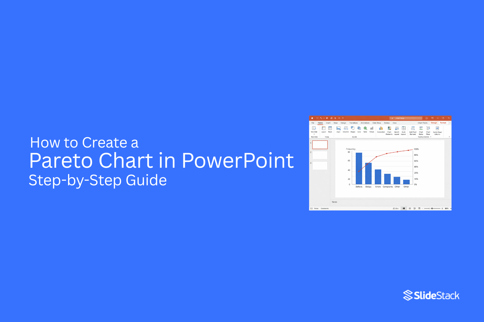
How to Create a Pareto Chart in PowerPoint (Step-by-Step)
A Pareto chart helps show which problems matter most. It combines bars and a line to highlight the biggest causes first. PowerPoint can build it with a few clear steps.
Step 1: Insert a Chart in PowerPoint
Open PowerPoint and go to the slide where the chart is needed. Click Insert, then choose Chart. A list of chart types will appear. Pick a Column chart and press OK. A small Excel sheet will open with sample data.
Step 2: Input or Import Data from Excel
Replace the sample data with real information. List categories in one column and values in the next. This can also be copied from Excel and pasted directly into the sheet.
Step 3: Sort Data in Descending Order
Arrange the data so the largest value sits at the top. Keep moving down to the smallest value. This step helps the chart show priority clearly.
Step 4: Add a Cumulative Percentage Column
Go back to Excel view inside PowerPoint. Add a new column next to the values. This column shows running totals as a percentage. Each row builds on the one above until it reaches 100%.
Step 5: Change Chart Type to Combo Chart
Click on the chart, then open Chart Design. Select Change Chart Type. Choose Combo Chart. Set bars for values and a line for the cumulative percentage.
Step 6: Assign Secondary Axis to Percentage Line
Select the cumulative percentage line. Move it to the secondary axis. This keeps values and percentages easy to read on one chart.
Step 7: Format the Chart for Clarity
Adjust colors, labels, and spacing. Make sure bars are easy to compare. Add axis titles if needed. Keep the design clean, so the main message stands out.
Formatting Tips for a Professional Pareto Chart
A clean chart makes data easier to read. Keep the layout simple so viewers focus on the message. Start with clear labels. Each bar needs a short and direct name. Long labels make the chart hard to read.
Use a consistent font. Pick one style and keep it the same across the chart. Avoid mixing font types or sizes. Set a clear color contrast. Use one color for bars and another for the line. Keep colors steady across all slides.
Adjust axis settings. Make sure numbers are easy to follow. Avoid crowded tick marks. Keep gridlines light. Strong gridlines can distract from the data. Soft lines work better. Check spacing between bars. Even spacing helps the chart look organized and balanced.
Place the chart title at the top. Use a simple title that tells what the chart shows. Avoid extra graphics. Too many visuals can take attention away from the data. A well-formatted chart helps the audience understand results without effort.
Common Mistakes to Avoid
A Pareto chart looks simple, but small errors can change the result. These mistakes often lead to wrong conclusions or messy slides. One common issue is using unclean data. Missing values, duplicate entries, or mixed categories can distort the chart. The data needs to be checked first. Each category should be clear and consistent.
Another mistake is wrong sorting. A Pareto chart depends on ranking values from highest to lowest. If the order is random, the pattern becomes unclear and loses meaning. Some people also forget the cumulative line. This line shows the running total and helps explain the 80/20 pattern. Without it, the chart loses its main purpose. Too many categories can also cause trouble. A crowded chart becomes hard to read. It is better to group smaller items into “Other” so the focus stays clear.
Color choices matter as well. Using too many colors or similar shades makes it hard to separate bars. Simple and consistent colors keep the chart easy to read. Another issue appears during PowerPoint formatting. Resizing the chart too much can stretch labels or compress data. The layout should stay balanced so numbers remain readable. A clean setup, correct sorting, and clear structure help avoid these problems.
Advanced Customization Techniques
A basic Pareto chart gets the job done. It shows the main causes clearly. But sometimes you need more control over how it looks and feels. That is where customization helps. Start with the chart colors. Use one strong color for the bars. This helps the main values stand out. Keep the cumulative line in a different color. A simple contrast works best. Avoid too many colors. That makes the chart harder to read.
Next, adjust the axis labels. Make sure the text is easy to read. Increase the font size if needed. Short labels work better than long ones. Long text can crowd the chart and reduce clarity. Gridlines also matter. Light gridlines can help guide the eye. But heavy lines can distract. Keep them faint so the data stays in focus.
Now look at the data labels. These show exact values on the bars. Place them above or inside the bars, depending on space. Make sure they do not overlap. Clean spacing improves clarity. You can also refine the cumulative line. Make it smooth and clear. Add markers at each point if needed. This helps the viewer follow the trend easily.
Some charts need a threshold line. This is often set at 80 percent. It helps highlight the key contributors. Add a simple horizontal line for this. Keep it subtle so it does not overpower the data. Finally, align everything neatly. Check spacing, margins, and balance. A well-aligned chart feels easier to read and more professional. These small adjustments turn a basic chart into a clear visual tool.
Use Cases of Pareto Charts in Business Presentations
Teams use Pareto charts to show which problems matter most. The chart helps sort issues from biggest to smallest. This makes it easier to focus on key areas during a presentation. Sales teams use it to show the top reasons for lost deals. It helps point out which issues happen most often. This keeps discussions clear and focused.
Quality teams use it to track defects in products or services. The chart shows which defects appear the most. This helps teams fix the main problems first. Customer service teams use Pareto charts to study complaints. They can see which complaint types repeat the most. This supports better planning for support improvements. Project teams also use it to review delays or errors. It shows what causes most of the slowdowns. This helps leaders make better decisions during updates.
Alternative Methods to Create Pareto Charts
Pareto charts are not limited to PowerPoint only. Other tools can also do the job well. Excel is a common choice. It offers built-in chart tools. You can sort data, add bars, and include a line for the total percentage. The setup is simple for most users.
Another option is PowerPoint with manual steps. This method uses basic bar charts and line charts. Data is added directly into slides. It takes more time but gives full control over the layout.
Some people use spreadsheet tools like Google Sheets. It works in a similar way to Excel. Data entry and chart building stay easy to manage. Each method gives a clear way to show data patterns. The best choice depends on the tool you already use and the time you have.
Final Notes
A Pareto chart shows which issues matter most. It brings focus to the top causes instead of every detail at once. Good data sits at the center of a clear chart. Each category needs a correct count. Sorting from highest to lowest keeps the structure clear and easy to follow.
PowerPoint can build the chart step by step. The process stays smooth once the data is set in the right order and the cumulative line is added. Small mistakes can change the result. Wrong sorting, missing percentage lines, or messy categories can make the chart harder to read.
Simple design works best. Clear labels, steady colors, and even spacing help the chart stay readable during presentations. This method supports better decisions by showing where most of the impact comes from.


You may also be interested in ...

How To Create An Eye-Catching Portfolio
If you’re looking to create an eye-catching portfolio, this post will come in handy. In this article, you can find the easies...
23 Jun, 2024

How To Easily Create An Infographic
Infographics are the perfect way to make a presentation that will impact an audience, but their design and composition might...
08 Jun, 2024

PowerPoint Template Tips & Tricks You Ne...
PowerPoint seems to be an unknown world for many people, especially those who have been assigned to create a presentation out...
08 Jun, 2024