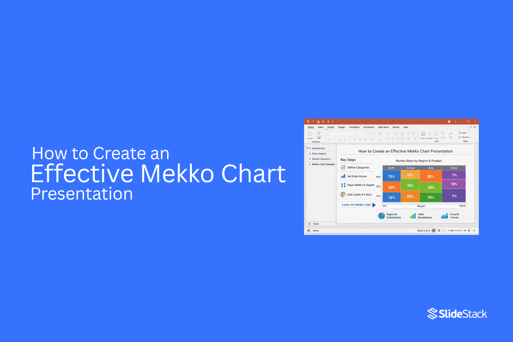
How to Create an Effective Mekko Chart Presentation
Presenting complex data often becomes difficult because standard charts fail to show both proportions and relationships in a single view. This creates gaps in understanding, where important comparisons are either hidden or oversimplified, leading to weaker communication in business discussions. Mekko charts address this by combining category size and composition in one structure, but they also demand careful setup because interpretation depends heavily on layout and scale.
In presentation settings, this means every part of the chart must support clear reasoning rather than visual decoration. A poorly structured Mekko chart can confuse an audience just as easily as it can inform them. This article explains how to create a Mekko chart presentation that supports clear interpretation, strengthens data storytelling, and turns complex distributions into insights that can be discussed with confidence.
What Is a Mekko Chart and What Does It Communicate?
A Mekko chart, also called a Marimekko chart, is a data visualization that shows both category size and category structure in a single view. It combines two measures at once. One is width, which represents the total size, such as market value or volume. The other is height, which shows how that total is split into parts. Because both dimensions matter, the area of each block becomes the key signal of meaning.
From a communication standpoint, this makes the chart more than a simple comparison tool. It answers two linked questions at the same time. How large is each category, and what does each category contain? That dual structure is why it is often used in market analysis, portfolio reviews, and revenue breakdowns. In executive settings, it can show market segments side by side while also showing how each segment is divided internally. The result is a compact view of structure and scale. At the same time, it demands attention. The viewer must read width and height together, not in isolation.
Compared with other chart types, the Mekko chart serves a distinct role. A stacked bar chart keeps all categories the same width, which removes size differences between groups. A treemap focuses on area alone, but it does not preserve a clear shared axis for comparison. The Mekko chart sits between these approaches. It keeps category separation clear while still showing proportional size differences.
Because of this balance, it often appears in strategy work, investment analysis, and executive reporting. It is not a general-purpose chart. It is a structured tool for specific questions about scale and composition. Choosing it requires clarity on what needs to be communicated, not just what needs to be shown.
Why Mekko Charts Matter in Business Presentations
Mekko charts help people see more than one thing at a time. They show both size and structure in one view. This makes them useful in business meetings where time is short. A normal chart shows one main idea. A Mekko chart goes further. It shows how each part fits into the whole. It also shows how big each part is compared to the others.
This matters in real decisions. Leaders often need to compare markets, products, or regions. A Mekko chart makes these comparisons clear at a glance. It also helps reduce confusion. Numbers alone can feel heavy. A visual layout turns those numbers into something easier to follow.
Another benefit is clarity in complex data. Some data sets have many parts. A Mekko chart organizes them in a simple structure. This helps the audience stay focused on the main message. Business presentations often fail when the message is unclear. A Mekko chart supports better storytelling with data. It gives structure to information that would otherwise feel scattered.
Understanding the Anatomy of a Mekko Chart
A Mekko chart shows both size and parts in one view. It looks like a mix of a bar chart and a stacked chart. Each column has a width and a height. Both parts carry meaning. The width of each column shows the total size of a group. A wider column means a larger share. A narrow column means a smaller share.
Inside each column, you see stacked sections. These sections show how the total breaks down. Each section has its own value. The full column is the sum of all parts. This structure helps you compare groups and parts at the same time. You can see which group is larger. You can also see what makes up each group.
Colors play a key role. Each color stands for a category. Keeping colors consistent helps the reader follow the chart without confusion. Labels matter too. Clear labels show what each section represents. Without clear labels, the chart becomes hard to read.
Spacing between columns also adds clarity. It helps separate groups so the eye can move easily across the chart. A Mekko chart works best with a clean structure. Too many sections can make it crowded. Simple layouts help the message stand out. This chart is strong for showing market share and category mix in one view.
Preparing Your Data Before Building a Mekko Chart
Start by collecting all the data you want to show. Keep it in one place so nothing gets missed. Next, split your data into clear groups. Each group should represent a category in your chart. Keep the groups simple and easy to read. Then, check the values inside each group. Make sure they are correct and match your source. Small errors can change the full chart.
After that, organize your numbers so they can be compared. Mekko charts depend on clear size differences, so consistency matters. Next, make sure your totals make sense. Each section should add up correctly so the full picture stays accurate. Then, clean your labels. Use short and clear names. Long labels can make the chart harder to read.
Keep all units the same across your data. Mixing units can confuse the results and distort the chart. Finish by reviewing everything once more. The structure should feel simple, clear, and ready for chart building.
Choosing the Right Data Structure Before You Touch a Slide
Most Mekko charts fail long before they reach a presentation slide. The issue is rarely the tool. It is almost always the data structure. A Mekko chart does not tolerate unclear categories or loosely defined breakdowns. Every category must have a defined total. Every subcategory must align perfectly with that total. If definitions are inconsistent, the visual becomes misleading rather than informative.
The first structural decision is the variable that controls width. This choice sets the foundation of the entire chart. In most business cases, width represents revenue, users, market size, or volume. The key requirement is consistency. All categories must use the same unit and the same aggregation logic. Mixing different measurement systems creates false comparisons. A chart that combines revenue-based categories with unit-based categories loses analytical meaning even if it looks visually complete.
The second decision is how each category is segmented. These internal segments must follow a single shared logic across the dataset. Common examples include product lines, customer groups, regions, or cost components. The structure must remain stable across all categories. If one category is split by geography and another by product type, the chart loses comparability. The MECE principle helps here. Each segment should be mutually exclusive, and together they must represent the full category without overlap or gaps.
Normalization is another important step in Mekko preparation. In most presentation settings, category heights are expressed as percentages. This allows the viewer to focus on composition rather than absolute scale. Raw values can still be used, but only when both width and height carry clear meaning, and the audience is trained to interpret them. Otherwise, the chart becomes harder to read and slows down understanding.
Ordering also plays a critical role in clarity. Categories are usually arranged from largest to smallest based on width. This creates a natural hierarchy that the eye can follow without effort. Inside each category, segments should follow a consistent order as well. A common approach is to sort by size or strategic importance. In financial analysis, ordering segments by contribution margin often reveals patterns that would otherwise remain hidden.
A Mekko chart is not just a visualization step. It is a structural decision. If the data is poorly designed, the chart will fail no matter how well it is built. If the structure is disciplined, the chart becomes a clear analytical tool rather than a visual decoration.
Tools You Can Use to Create Mekko Charts
Mekko charts need the right tools. Some tools make the process simple. Others give more control. Microsoft Excel is a common choice. Many users build Mekko charts with add-ins. These add-ins help create stacked and variable-width charts.
Tableau is another option. It handles complex data well. It also helps build clear visuals from large datasets. Power BI also supports similar chart styles. It works well for business reports. Data updates in real time. R is used for deeper data work. It allows full control over chart design. Packages like ggplot help build custom visuals.
Python is another strong option. Libraries like Matplotlib and Plotly support flexible chart building. It suits users who work with code. Each tool works in a different way. The right choice depends on the data and the goal of the presentation.
Choosing the Right Data Structure Before You Touch a Slide
Start with your data. Not the slide. A Mekko chart depends on a clean structure. Without it, the chart loses meaning fast. Think of your data like building blocks. Each block must fit a clear role. You need categories. You need subgroups. You need values that match both. Keep the structure simple. One column for main groups. One column for subgroups. One column for numbers. This setup keeps everything clear when you build the chart later. Messy data leads to confusion. Mixed labels make the chart hard to read. Missing categories break the visual flow. Clean structure removes these problems early.
A good habit helps here. Scan your data before anything else. Look for patterns. Group similar items together. Remove anything that does not support the message. Now the chart starts to take shape in your mind. You can see how each part will sit inside the Mekko layout. The size and width will start to make sense. This step saves time later. It also reduces mistakes during design. A strong structure makes the slide easier to build and easier to understand. Everything starts here. Not in PowerPoint. Not in design. In the data itself.
How to Build a Mekko Chart in Excel and Transfer It to PowerPoint
Excel does not include a native Mekko chart type, so creating one requires a structured workaround. The method below is a practical approach for business users who need Mekko-style visuals without add-ins. The process has two stages. First, you build the chart logic in Excel. Then you move it into PowerPoint for presentation use.
Setting Up Your Data in Excel
Start by accepting one key limitation. Excel cannot change the bar width directly. So the workaround is to simulate width using repeated columns. Each category gets a different number of columns based on its share of the total value. Begin with a simple planning row. List all categories and their total values. These values define width. Decide on a fixed total unit count for the chart. Ten or twenty units work well for most cases because it keeps scaling simple and readable.
Now convert percentages into units. A category with 40 percent becomes 4 units if your total is 10. A category with 25 percent becomes 2 or 3 units, depending on how precise you want the chart to be. Keep rounding consistent across all categories so the structure stays balanced.
Building the Table Structure
Next, build your Excel table. Each unit becomes a column. So a category with 4 units will take up 4 separate columns. These columns are duplicates in structure but represent width visually. Inside each category block, you enter the same stacked segment data. Each column repeats the same percentage breakdown. This is what creates the illusion of a single wide bar when charted.
Label each column clearly. Use a pattern like Category name plus unit number. For example, Asia 1, Asia 2, Asia 3. This helps you track each section without confusion when scaling or adjusting later. Your rows represent the segments of the stacked bar. Your columns represent the width units. Each cell holds the percentage value for that segment. Keep totals consistent so each column always sums to 100 percent within its category block.
Final Dataset Shape
At this stage, your sheet becomes a grid. Rows show product or market segments. Columns show category width units. Every category has repeated columns, and every column contains an identical segment structure. This structure is what allows Excel’s standard stacked bar chart to behave like a Mekko chart. The width is not drawn directly. It is implied through repetition.
Moving the Chart into PowerPoint
Once the chart is created in Excel, insert a stacked bar chart using your dataset. Format it cleanly with consistent colors per segment. Remove unnecessary gridlines and reduce chart clutter. Copy the chart and paste it into PowerPoint. Use Paste Special and select “Keep Source Formatting” if you want it to remain linked to Excel styling. If the chart needs to stay editable inside PowerPoint, use an embedded Excel chart object.
After transfer, adjust sizing and alignment inside the slide. Keep labels readable and avoid stretching the chart disproportionately. The final result is not a native Mekko chart. It is a structured approximation built from stacked bars and controlled data repetition. Still, it delivers the same insight. It shows both market size and internal composition in one view.
Creating the Chart Step by Step
With the data table ready, the process moves into Excel to build the Mekko-style chart using a structured workaround. Select the entire data table, including all segment rows and all category columns. This ensures Excel captures the full structure needed for proportional stacking.
Go to Insert > Chart and choose Stacked Bar Chart. Select the 100% stacked bar variant. This forms the base layout for the Mekko-style visual. Once the chart appears, right-click any bar and open Format Data Series. Set the Gap Width to 0%. This removes spacing between bars and allows the columns to sit tightly together, forming wider visual blocks.
Move to the horizontal axis next. Right-click the axis and choose Format Axis. Adjust the label interval so each category is clearly represented. In some cases, removing the axis and placing manual text labels below each group creates a cleaner layout. Apply consistent fill colors to each segment type across all columns. Each segment must keep the same color so patterns remain easy to read across the full chart. Use Format Painter to keep formatting consistent.
Remove gridlines to reduce visual noise. Lighten or simplify axis lines. Add a clear chart title and a minimal legend. Keep the legend focused on segment types only. Review the full chart against the original data structure. Proportions must match the planned values. Any uneven visual distribution signals a need to revisit the unit breakdown in the dataset. Complete a final visual pass. The chart should now show clear category blocks, consistent segment colors, and an accurate proportional structure that reflects the intended market layout.
Transferring the Chart to PowerPoint
To move the chart, select it in Excel and copy it using Ctrl+C on Windows or Command+C on Mac. Open PowerPoint and go to the slide where the chart will appear. Open Paste Special from the Home tab or by right-clicking on the slide. Choose the option that fits your output goal. Pasting as a Microsoft Excel Chart Object keeps the chart connected to Excel. The chart stays editable inside PowerPoint. Double-clicking it opens Excel inside the slide. This works well for reports that need updates or review checks.
Pasting as an image creates a fixed visual. The chart no longer connects to Excel. This keeps the file simple and stable during sharing. It also avoids broken links between files. Enhanced Metafile format keeps lines and text sharp. It scales well on slides without losing clarity. PNG format works like a standard image. It is useful for simple visuals, but can reduce sharpness when resized.
Linked charts work best for ongoing reports. They allow changes in Excel to appear in PowerPoint without rebuilding slides. Static images work better for final delivery decks that stay unchanged. After pasting, adjust the chart size to match the slide layout. Keep the proportions the same to avoid distortion. Place it so labels and values stay easy to read from a distance.
Clear visuals depend on format choice. EMF or Excel Chart Object keeps sharp detail. Standard image paste can lower clarity, especially with text-heavy charts. Slide titles should carry the main message of the chart. A title like “Sales Growth Led by Asia Region” gives meaning before the audience studies the data. A basic label like “Sales by Region” adds less value. Strong presentation design connects data with insight. Each formatting choice shapes how clearly the message reaches the audience.
Designing the Mekko Chart for Readability at Presentation Scale
Because Mekko charts carry high information density, every visual choice must earn its place. Extra elements do not automatically improve understanding. They often do the opposite. The most common failure is over-labeling every segment. That leads to cluttered blocks, overlapping text, and a chart that no longer communicates structure. Strong Mekko design depends on control over scale, color, axes, and labels working together to support fast reading at a distance.
Scale and Spacing
Scale sets the foundation for readability. If a segment cannot be read clearly from a distance, it has already failed its role in a presentation setting. Small blocks should not be forced into detail. They either belong in grouped categories or should be explained outside the chart.
Spacing matters just as much. Each column needs enough room to breathe. Tight spacing compresses meaning and reduces visual separation between categories. The chart should feel open, not crowded.
Slide usage also plays a direct role in clarity. The Mekko chart should take most of the slide area. Large empty areas weaken focus because they pull attention away from the structure. A clean slide border helps the eye stay on the data rather than scanning unused space.
Wide-screen layouts offer an advantage here. Horizontal space allows columns to expand naturally. That improves separation between segments and makes comparisons easier. Narrow layouts create compression and reduce clarity, especially when categories increase.
A frequent layout error appears when a Mekko chart shares space with dense text or another chart. That split forces the chart to shrink. Once that happens, column widths lose clarity. If context is required, use a single short callout instead of a full text block. That keeps the chart dominant while still guiding interpretation.
Color
Color must carry meaning, not decoration. Each category should follow a consistent color rule. If colors shift without logic, the viewer loses trust in the structure of the chart.
Strong contrast between segments helps separation, but high saturation weakens focus. Muted tones often perform better in presentation settings because they reduce visual strain while preserving distinction.
A single accent color should guide attention. That accent highlights the most important segment or insight. It becomes a visual anchor during explanation. The rest of the chart should stay neutral so that the accent stands out without competition.
Limiting the palette is critical. Five to six colors is usually the upper limit for clarity. Beyond that point, recognition slows down. The viewer starts relying on the legend instead of reading the chart directly. That shift increases effort and reduces insight speed.
When data requires more categories than the palette allows, grouping becomes necessary. Expanding color variety is not a solution. It only creates confusion.
Axes
Axes should support structure, not dominate it. Heavy gridlines create noise. They rarely improve understanding in a Mekko chart. Instead, light reference lines at key intervals such as 25%, 50%, and 75% are usually enough to guide interpretation.
Vertical axes often display percentages, but full axis detail is not always needed. In many presentation settings, removing the axis entirely improves clarity. The proportional widths already communicate distribution.
Horizontal axes carry category labels. These should remain simple and readable. Long category names should be shortened where possible to reduce visual weight.
A common issue appears after moving charts from Excel into PowerPoint. Default formatting often includes small fonts and dense tick marks. These elements do not scale well in presentation environments. Every axis element should be reviewed at full slide size before final use. If the text feels small at viewing distance, it is too small.
Audience type also influences axis design. Technical audiences benefit from more reference detail. General audiences do not. They read structure first, not numbers. In mixed settings, removing the axis and adding only key percentage annotations directly on segments often creates the cleanest result.
Labels
Labels must be selective. Not every segment needs direct labeling. Over-labeling creates visual friction and reduces clarity.
Category labels should stay consistent in placement. They typically sit below the chart and align with the column structure. This helps the viewer map labels to segments without confusion.
Segment labels require judgment. Only the most important or largest segments should be labeled directly. Smaller segments should rely on a legend or grouping strategy. This avoids overcrowding the chart surface.
Consistency matters more than completeness. If one segment is labeled directly, similar segments should follow the same rule. Mixed labeling creates false importance signals and distorts interpretation.
Presentation context also changes the labeling strategy. In live slides, legends are acceptable because the presenter can guide attention. In printed formats, viewers must interpret independently. Direct labeling on larger segments becomes more useful in that case. Two versions of the chart often solve this better than one compromised design.
Percentage labels should be used with restraint. Only larger segments should carry numeric values. Thin segments should stay clean. A practical threshold is labeling only segments large enough to hold text without distortion. Anything smaller should remain unlabelled and interpreted through structure or narration.
Closing Principle
Mekko chart design is not about adding more detail. It is about removing anything that slows understanding. Every reduction improves clarity. Every extra element increases cognitive load. Strong design decisions come from disciplined exclusion, not expansion.
Framing the Mekko Chart for Your Audience
A Mekko chart does not explain itself. The viewer must be guided through it. Without direction, people try to read everything at once. Width and height can get mixed up. That leads to confusion, even when the data is correct. Mixed audiences make this problem stronger. Some understand the chart type. Others see it for the first time.
Start the framing before the chart appears. Use simple words to set the meaning. Say what width shows. Say what height shows. This prepares the audience to read the chart in the right way. A clear line, such as “Width shows total size and height shows the share inside that size,” sets the base for understanding. Executive groups move quickly through visuals. Their first view often shapes their full opinion. Confusion at the start weakens the message.
Once the chart is on screen, keep explanations focused. Begin with the full shape of the data. Point out which groups take the most space. Then shift to how each group is divided inside. This step-by-step path matches how people scan visuals in real time. It keeps attention steady and reduces overload.
Comparisons need to be direct. Name the groups being compared. Explain what is different between them. Do not assume differences are obvious. Area charts can be read the wrong way without guidance. Benchmarks or past values can give extra meaning. The chart works best when structure and message move together in a clear line of understanding.
Integrating the Mekko Chart Into a Larger Presentation Narrative
A Mekko chart is not a starting point in a presentation. It is part of a wider story. It works best inside a clear flow of slides. The chart gains meaning from what comes before it and what comes after it. On its own, it can feel heavy and unclear. Within a structure, it becomes easier to read and understand.
The strongest position for a Mekko chart is after the main problem has been explained. The audience already knows the question being asked. At that stage, the chart adds detail and depth. It sits before final decisions or conclusions. This keeps the presentation moving in a clear direction.
Simple charts should come first. A bar chart sets the base view of size or comparison. A stacked bar chart shows how parts are divided. The Mekko chart comes later and combines both views. This step-by-step flow helps the audience stay aligned with the data.
A clear sequence improves understanding. The bar chart shows a basic comparison. The stacked bar chart shows structure within those totals. The Mekko chart brings both ideas together in one view. This order reduces confusion and builds understanding in layers. Each slide prepares the viewer for the next level of detail.
Transitions between slides need a clear purpose. The slide before the Mekko chart should explain what is coming next and why it matters. The slide after should take the insight and move it forward into action or decision. The chart should not sit in isolation. It should connect to the message that follows.
Mekko charts should not appear too often in one presentation. They require focus and attention to read well. One or two strong examples are usually enough. Too many create strain and reduce clarity. Limited use keeps the chart impactful and easy to remember.
Extra detail does not need to sit in the main flow. Supporting slides can hold deeper numbers or alternative views. The main deck stays focused on the core message. The Mekko chart remains a highlight within that structure. This separation keeps the narrative clean and direct.
The Mekko chart works best as a key moment in the story. It should support the message, not replace it. Its value comes from placement, flow, and focus. Within a structured narrative, it becomes a clear point of insight rather than a standalone visual.
How to Build a Mekko Chart Directly in PowerPoint
A Mekko chart helps show parts of a whole across different groups. It also shows size differences in one view. PowerPoint does not have a built-in Mekko chart button. A stacked column chart can act as a base.
Start inside PowerPoint and open a blank slide. Go to the Insert tab and choose Chart. Pick a stacked column chart. A small Excel sheet opens with sample data.
Set up your data: Replace the sample values with your own. Each row stands for a category. Each column stands for a segment inside that category. Keep the structure clean, so the chart reads clearly.
Adjust the widths: Mekko charts depend on width differences. Change the total values in each category. Larger totals create wider bars. Smaller totals create narrow bars.
Format the chart: Click on the chart area. Remove extra gridlines. Clean up background colors. This keeps the focus on the data.
Work on colors: Use clear colors for each segment. Keep the same color for the same type of data across all categories. This helps the eye track patterns.
Refine labels: Add data labels for clarity. Keep text short. Place labels where they do not overlap.
A simple stacked column chart can now act like a Mekko-style layout. The structure shows comparison across groups without clutter.
Best Practices for Designing an Effective Mekko Chart
A Mekko chart shows data in a clear visual form. Good design keeps it easy to read and understand. Small choices affect how well the message comes through. Use a clear category structure. Each group needs a simple label. Too many groups make the chart hard to follow.
Keep the number of segments low. A crowded chart slows down understanding. Only show data that supports the main point. Use consistent color coding. Each category should have a clear visual identity. Repeated colors across different meanings create confusion. Balance the width and height of blocks. The size of each block should match the data it represents. Uneven scaling can mislead the viewer.
Avoid long labels inside the chart. Short text works better. Extra details can sit outside the chart area. Keep spacing clean. Tight layouts reduce clarity. Open space helps the eye move across the chart. Check alignment across all sections. Misaligned blocks break the structure. A clean grid improves reading flow. Focus on one message per chart. Too many ideas weaken the impact. One clear story works better for the audience.
Common Mistakes When Designing a Mekko Chart Presentation
Over-segmentation
One of the most frequent issues in Mekko chart design is too many segments. The chart fills with thin slices. Nothing stands out. The message gets lost.
The fix starts with selection. Only keep segments that support the main point. Combine the rest into an “Other” category. A smaller number of clear segments always reads better than a crowded structure.
This is also a data decision, not just a visual one. The way data is grouped changes the story. A Mekko chart is not meant to show every detail. It is meant to show structure and meaning. Each segment shown should have a reason to exist.
If a segment cannot explain its purpose, it does not belong on the chart. This decision should happen before building the visual, not after.
Inconsistent segmentation
Another common problem is mismatched category logic. One part of the chart follows one structure, while another part follows a different one. The comparison stops being valid.
This often happens when data comes from multiple systems. Each system defines categories in its own way. The result looks organized, but does not actually measure the same thing.
Before building the chart, category rules need alignment. Every segment should follow one shared definition. Without that, the chart creates visual order but weak analytical value.
Sometimes teams try to force mixed systems into one chart. That leads to false confidence. The design looks clean, but the comparison is not reliable. Fixing this at the data level is the only stable solution.
Not giving enough explanation
Many Mekko charts fail during presentation because no one explains them. The audience is expected to understand structure, width, and meaning without guidance.
That slows down interpretation. People start decoding instead of listening to the message.
Different audiences also have different experience levels with Mekko charts. Some see them often. Others rarely do. That gap matters.
A short explanation at the start changes how the chart is received. A simple title line can also set direction. Small labels on the chart can point out what each dimension represents.
This is not extra decoration. It removes confusion before it starts.
Closing principle
A Mekko chart works only when the structure is clear, the data is aligned, and the audience is guided. The chart itself is not enough. Meaning comes from a disciplined setup and controlled simplification.
How to Present Mekko Charts Clearly
A Mekko chart can show a lot of data at once. That is also where problems start. Too much detail can confuse the viewer. The goal is to make the message easy to follow in a few seconds. Start with one clear idea. The chart should answer one main question. If it tries to show too many things, the message gets weak. Pick the most important comparison and build around it.
Keep labels simple. Long text slows down reading. Short labels help the eye move across the chart without effort. Use only what is needed to understand the data. Color should guide, not distract. Use a small set of colors. Each color should mean something clear. Too many colors make the chart harder to read. Space matters. Blocks should not feel cramped. Give each section room so the structure is easy to see. A crowded chart hides meaning.
Numbers should support the story. Place them where they add clarity. Avoid repeating the same values in many places. That creates noise. Step back and check the view. Ask a simple question. Can someone understand the chart in a few seconds without help? If not, reduce details and simplify again.
Real-World Examples of Mekko Chart Applications
A Mekko chart shows data with both height and width. It helps compare parts of a whole across groups. This makes patterns easier to see in one view. Different industries use it to make complex data clearer. Below are common uses that show its value in real work.
Product mix in a company
Companies often sell many products. A Mekko chart can show how each product contributes to total revenue. The width shows the size of each product line. The height shows its share of performance.
This helps teams see which products carry more weight and which ones are smaller.
Market share by region
Businesses operate in different regions. A Mekko chart can display market share across those areas. Each region takes a different width based on size or sales volume. Inside each region, competitors are shown as stacked sections. This makes it easier to compare competition across locations.
Marketing channel performance
Marketing teams use multiple channels like email, social media, and search ads. A Mekko chart can show how each channel contributes to total leads or sales. One view can show both channel size and performance strength. This helps teams see which channels bring the most value.
Budget allocation
Finance teams track how money is split across departments. A Mekko chart can display the full budget and its breakdown. Large departments take more space. Smaller ones take less. Inside each section, spending categories can also be shown.
Customer survey results
Survey data often includes multiple answer groups. A Mekko chart can show response patterns across customer segments. Each segment can represent a group like age or location. The internal bars show how each group responded. These examples show how a Mekko chart brings structure to layered data. It turns multiple comparisons into one clear view.
Mekko Chart vs Other Business Charts
Different charts show data in different ways. Some focus on simple comparison. Others show change over time. The Mekko chart adds another layer by showing both size and breakdown in one view. This makes it useful for deeper analysis.
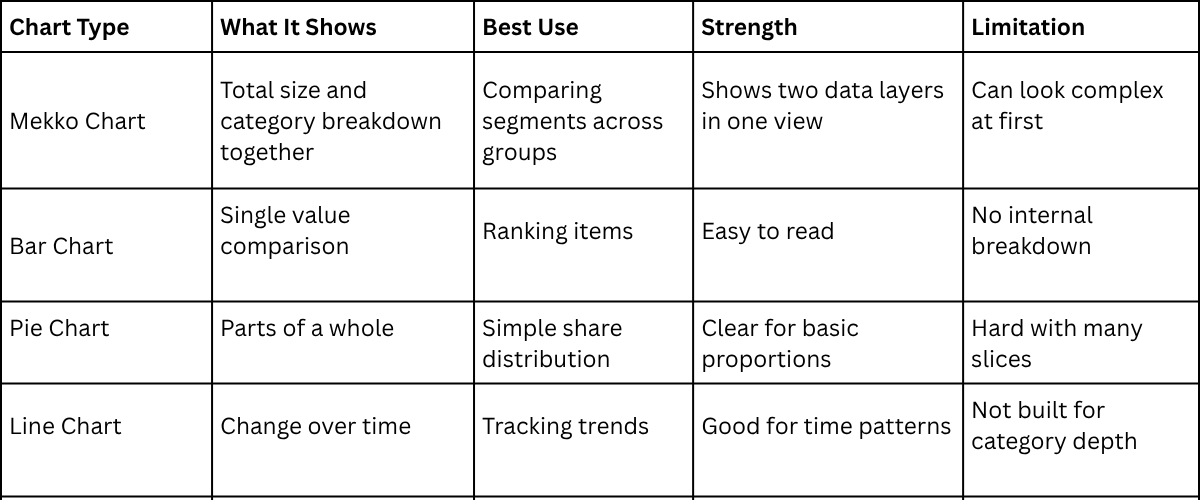
Each chart has a clear purpose. Bar charts work well for quick ranking. Pie charts help with simple share views. Line charts focus on movement over time. The Mekko chart brings more detail into one space, which helps when data has both categories and size differences.
Advanced Tips for Professional Mekko Chart Presentations
A Mekko chart carries dense information. Clear design choices make it easier to read at scale. Every element needs a clear role on the slide. Start with structure. Keep categories simple. Limit each section to the most relevant data. This reduces visual noise and keeps attention on meaning.
Next comes spacing. Leave room between blocks. Tight layouts make patterns harder to see. Clean spacing helps the eye move across the chart without strain. Color needs control. Use a small set of colors. Each color should represent one idea only. Repeated colors across different meanings create confusion. Labels should stay short. Long text slows reading. Place labels close to the data they describe. This helps the viewer connect details quickly.
Scale also shapes clarity. Keep proportions consistent. Uneven scaling distorts comparison. Balanced scaling supports accurate reading of values. Legends need clear placement. Place them near the chart area. Far placement forces extra scanning and breaks focus. Grid lines should stay light. Heavy lines compete with data. Subtle lines guide the eye without distraction. Final layout check matters. Look for crowded areas. Remove anything that does not support the main message. Each part of the chart should earn its place.
Final Notes
A Mekko chart shows both size and structure in one view. It supports comparison across groups and inside each group. Strong results start with clean data. Each category needs a clear role. Each value must match its group without overlap. Mixed definitions reduce meaning.
Design choices shape reading speed. Simple colors help the eye follow patterns. Consistent labels reduce confusion. Small labels often work better than long text. Spacing supports structure. Open space between blocks helps separation. Crowded layouts make reading harder.
The chart should stay focused on one message. Extra details reduce attention on the main point. Only the most relevant segments belong in the view. Order also affects reading. Large groups first create a natural path for the eye. Smaller groups follow in a steady flow.
A Mekko chart works best in a full story. Earlier slides set the context. Later slides explain the meaning and action. Each part of the chart must serve a purpose. Clean structure and steady flow create a stronger understanding across the audience.
FAQs
What is a Mekko chart used for?
It shows group size and breakdown in one view. It helps compare categories and parts at the same time.
How is a Mekko chart different from a bar chart?
A bar chart shows only size. A Mekko chart shows size and structure together.
Why do businesses use Mekko charts?
They help explain complex data in a simple visual form. This supports faster understanding in meetings.
What data works best for a Mekko chart?
Data with clear groups and subgroups works best. Each group should have a total and clear set of parts inside it.
Can Excel create a Mekko chart directly?
Excel does not have a built-in Mekko chart. It can be built using stacked charts and structured data.
Why is data structure important for Mekko charts?
Clear structure keeps the chart accurate. Poor structure leads to confusion in the final visual.
How many categories should a Mekko chart have?
A small number works better. Too many categories make the chart hard to read.
What makes a Mekko chart hard to read?
Too many segments, mixed colors, and unclear labels reduce clarity.


You may also be interested in ...

How To Create An Eye-Catching Portfolio
If you’re looking to create an eye-catching portfolio, this post will come in handy. In this article, you can find the easies...
23 Jun, 2024

How To Easily Create An Infographic
Infographics are the perfect way to make a presentation that will impact an audience, but their design and composition might...
08 Jun, 2024

PowerPoint Template Tips & Tricks You Ne...
PowerPoint seems to be an unknown world for many people, especially those who have been assigned to create a presentation out...
08 Jun, 2024