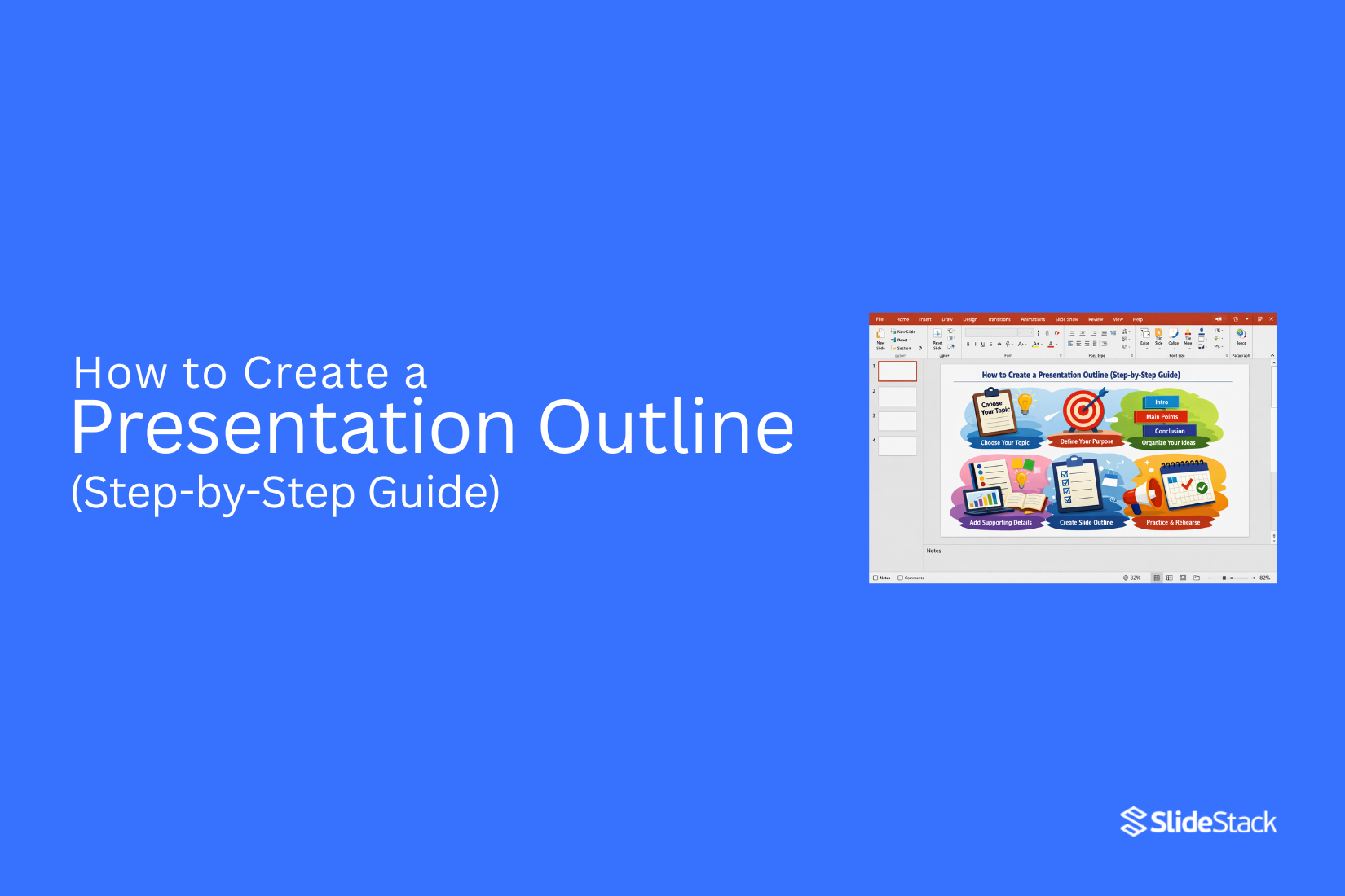
How to Create a Presentation Outline (Step-by-Step Guide)
A presentation outline is the structure that shapes how a message is delivered. Without it, ideas become scattered, and slides lose direction. Presenters often add too many points and miss the main goal. This often leads to confusion and weak flow. A simple outline method brings order to content and sets a clear path from start to finish. As a result, each section has a clear purpose and supports the main idea.
Creating a presentation outline defines objectives, audience needs, and the order of ideas. It removes repetition and improves clarity. Each section connects to the next, helping the message stay focused and easy to follow from start to finish.
What Is a Presentation Outline?
A presentation outline is a simple plan. It shows what you will say in your presentation. It keeps your ideas in order. It usually starts with the main topic. Then it breaks into key points. Each point supports your message.
You can think of it as a guide. It helps you stay focused while speaking. It also helps your audience follow your ideas without confusion.
Why Should You Create a Presentation Outline?
An outline is not a preparatory task done before “real work” begins. It is the structural foundation that shapes how information is organized, interpreted, and retained. Without it, ideas tend to appear disconnected. With it, content gains order and clarity that supports understanding.
A presentation outline defines the flow of a presentation from the opening point through to the final message. It determines what content is included and what is left out. Many presentations fail at this stage because slide creation starts too early. That often produces repetition, weak transitions, and scattered focus. An outline prevents this by forcing clarity on purpose and structure before design choices begin.
At a cognitive level, information is processed in sequence. Audiences expect a clear direction from the introduction to development and then resolution. A structured outline aligns with this expectation. It reduces the mental effort required to follow ideas. Attention stays on meaning rather than on figuring out how ideas connect.
An outline also acts as a constraint system. It limits unnecessary expansion of content and keeps the message within defined boundaries. In professional environments where time is limited, this control becomes critical. Key arguments remain central, while supporting details are positioned with intention rather than placed randomly across slides.
Defining the Objective Before Structuring Content
A presentation outline starts with a clear objective. Without it, structure loses direction. The key question shifts away from what content to include. It focuses on what the audience must understand or decide by the end.
Objectives usually fall into clear groups. Some presentations inform. Some persuade. Others report progress, propose action, or guide discussion. Each group shapes structure in a different way. A report often follows data and sequence. A proposal centers on the problem and solution logic. A training flow moves step by step from basic ideas to advanced understanding.
A strong objective also reduces scope. Broad intent creates weak structure. A goal like “explain our strategy” is too open. A sharper outcome, such as “gain approval for the updated pricing model” or “align leadership on Q3 priorities,” gives direction. Structure becomes easier to control once the outcome is specific.
The audience's needs also guide the structure. Leadership expects clarity and impact. Technical teams look for detail and process. Mixed groups need a balance between insight and explanation. The same content can fail if it does not match audience expectations.
A useful step at this point is writing one core message in a single sentence. This sentence holds the entire outline together. Each section should support it. Any part that does not connect to that message weakens the structure and needs reconsideration.
Mapping the Core Narrative: From Opening to Conclusion
A presentation follows a planned path. The message moves in a clear order from start to finish. Each part has a defined role. The flow supports understanding and reduces confusion.
Crafting a Clear Introduction
The introduction sets context and direction. It explains the topic in simple terms. It shows why the topic matters. It also prepares the audience for what comes next.
The opening can include background information. It can include a clear problem statement. It can also show a short view of the agenda. The content stays limited and focused.
This section does not carry deep detail. Its purpose is orientation. It helps the audience settle into the topic. A clear start improves attention for the rest of the presentation.
Structuring the Body Around Logical Progression
The body carries the main content. It builds the message in steps. Each section supports the main idea in a direct way.
The structure follows a clear order. One idea leads into the next without gaps. Each section stays focused on a single function.
Common structures include problem, analysis, and solution. Another structure follows time order. A theme-based structure groups ideas by topic.
Each section should be labeled by purpose. A label should explain the role of the section. This keeps the outline clear and aligned with the goal.
Subsections must stay distinct. Each one should add something new. Repeated ideas reduce clarity and should be removed or merged.
Flow between sections matters. Each part connects to the next in a smooth line. This keeps the message stable from start to end.
Designing a Conclusion That Reinforces the Objective
The conclusion closes the presentation. It brings focus back to the main point. It does not introduce new ideas.
Key points are repeated in a short form. The main message is made clear again. The audience should leave with a strong understanding of the goal.
The closing aligns with the purpose of the presentation. It brings the structure to a complete end. The message stays clear after the presentation finishes.
Organizing Key Points and Supporting Material
An outline separates main arguments from supporting details. This structure keeps ideas clear and easy to follow. Without it, content turns into a loose collection of points with no clear direction.
Establishing a Clear Hierarchy
The outline starts with three to five main sections. Each section connects directly to the main objective. Each one covers a different part of the topic. Too many main sections reduce focus and weaken the structure.
Each main section contains supporting points. These points explain the main idea. They also give proof or simple examples. At this stage, short notes work best. Full paragraphs are not needed in an outline.
Hierarchy also shapes slide planning. Main sections often become multiple slides. Supporting points may fit into one slide or move to backup slides. This separation keeps the presentation balanced and controlled.
Prioritizing Relevance and Eliminating Redundancy
Every point in the outline needs a clear purpose. A point that does not support understanding or decision-making does not belong in the structure. Removal of such points keeps the outline clean.
Overlap often appears across sections. Similar ideas can repeat in different places. A full review of the outline helps spot this issue. Merging repeated ideas creates a tighter structure and reduces confusion.
Supporting material like data, examples, or case notes must sit close to the related main idea. Each piece of evidence connects to one argument only. Random placement weakens clarity and reduces the strength of the message.
Integrating Data and Visuals Into the Presentation Outline
A presentation outline does more than arrange topics. It sets rules for how information and visuals will work together. The outline becomes a planning system. It guides what is shown and why it matters. This reduces random slide building later.
Strong outlines connect content with proof and visual form from the start. Each section carries intent. Each point has a clear role. The structure prevents decoration without purpose.
The information design consultant views this stage as control, not decoration. Every element earns its place before slides are created.
Determining the Role of Data
Each section of the outline assigns a job to supporting evidence. The role is defined early, not left for later slides.
Some sections need proof of scale. Some need proof of change over time. Others need a comparison between groups or outcomes. Each purpose must be stated clearly in the outline.
Weak outlines use vague notes like “add numbers.” Strong outlines define purpose in plain terms. For example, a section may state revenue growth over a set period to confirm the direction of performance. Another may focus on usage levels to show adoption strength.
This approach removes guessing during slide creation. The outline tells the presenter what the information must achieve. It also keeps the message focused on meaning, not raw figures.
Selecting Appropriate Visual Formats
Visual structure follows communication intent. The outline assigns the format, not the slide builder.
Trends over time connect to line charts. Comparisons across groups connect to bar charts. Composition or breakdown fits well with tables or segmented visuals. Step-based processes fit diagrams that show sequence.
Each visual choice matches the purpose already set in the outline. This prevents mismatched slides where the format does not support the message.
The outline acts as the guide for visual planning. It decides how the information will appear before any design work begins. This keeps structure and presentation aligned from the start.
Alignment Control Principle
The outline holds both message and visual direction in one system. It links narrative flow with representation choices. Nothing is added later without a reason already defined in the structure.
This method keeps presentations consistent. It removes last-minute design decisions. It also strengthens clarity because every visual has a defined job tied to the outline.
Step-by-Step Guide to Creating a Presentation Outline
A presentation outline turns scattered ideas into a clear structure. It helps shape what comes first, what follows, and how each point connects. This makes the final presentation easier to build and easier to understand.
Below is a simple step-by-step process to create a strong outline.
Step 1 - Define Your Goal
Start by setting one clear goal for the presentation. Decide what message must come through by the end. This goal will guide every section you build later.
Step 2 - Identify Your Audience
Know who the presentation is for. Their background and expectations shape how deep or simple your content should be. This step helps keep your message relevant.
Step 3 - Brainstorm Ideas
Write down all possible points related to your topic. Do not filter ideas at this stage. The aim is to gather as much material as possible before organizing it.
Step 4 - Group Key Points
Sort similar ideas into groups. This creates structure and reduces clutter. Repeated or weak points can be removed during this step.
Step 5 - Organize Flow
Place the groups in a logical order. Move from basic ideas to more detailed ones. Each section should connect in a smooth and clear path.
Step 6 - Add Supporting Details
Add short notes under each main point. These notes guide what will be said in each section. Keep them brief and focused.
Step 7 - Refine and Simplify
Review the full outline from start to end. Remove anything unclear or unnecessary. Adjust the balance so each section supports the main goal evenly.
Common Presentation Outline Structures
Presentation outlines do not all follow the same path. Different goals need different setups. The structure you pick shapes how your message lands with the audience.
Problem-Solution Structure
This structure starts with a problem. It explains what is going wrong. Then it moves to a clear solution. It works well in business settings. It also helps when you need quick decisions. The message stays focused on fixing one main issue.
Chronological Structure
This structure follows time order. It starts from the beginning and moves step by step. Each point leads into the next in sequence. It fits topics like project updates or process explanations. The flow feels natural because events are shown in order.
Compare-and-Contrast Structure
This structure looks at two or more ideas side by side. It shows how they are similar and how they are different. It helps people make choices. It is often used for product or strategy comparisons. The clarity comes from direct comparison.
Storytelling Structure
This structure follows a narrative path. It has a beginning, middle, and end. It builds interest through a simple story flow. It keeps attention by linking ideas through events or experiences. It works well when you want people to connect with the message on a human level.
Example of a Presentation Outline
A presentation outline gives structure before building slides. It helps organize ideas in a clear order.
Title of the presentation: State the topic clearly. Keep it specific.
Introduction: Present the purpose of the presentation. Add a brief background so the audience understands the context.
Main Point 1: Introduce the first key idea. Focus on one clear message.
Supporting details for Point 1: Add facts, examples, or explanations that support the first idea.
Main Point 2: Present the second key idea. Keep it distinct from the first.
Supporting details for Point 2: Include relevant information that strengthens this point.
Main Point 3: Share the third key idea. Maintain a logical flow from the previous sections.
Supporting details for Point 3: Provide evidence, steps, or clarification for better understanding.
Closing section: Summarize the main ideas. Restate the core message in a brief and direct way.
Mistakes to Avoid When Creating a Presentation Outline
A presentation outline sets the path for your message. It shapes how ideas connect. Small mistakes here can make the whole presentation unclear or hard to follow. A strong outline needs focus and structure from the start.
Starting with Slides First
Many people open PowerPoint first. They start adding text and images right away. This often leads to scattered ideas. The message becomes unclear.
A better way starts with planning on paper or a simple document. First, decide the main idea. Then build the structure. Slides come later. This keeps the message clear from the beginning.
Too Many Main Points
Too many main points make the message heavy. The audience loses focus. Nothing feels important.
A strong outline keeps a small number of main sections. Each one should support the main idea. Extra points can sit under these sections as support. This keeps the flow clean and easy to follow.
Ignoring Audience Needs
Some outlines focus only on content. They forget the people watching. This creates a gap between the message and understanding.
A better outline speaks to the audience's level. What do they already know? What do they need explained in simple terms? Answering these questions shapes a better structure and better clarity.
Weak Logical Flow
A presentation can have good content but still fail. The problem often sits in the order of ideas. Random structure confuses the audience.
Each section should lead to the next. One idea should build into the next step. A clear path helps the audience stay connected from start to finish.
Tips to Improve Your Presentation Outline
A strong outline makes your presentation easier to follow. It keeps your ideas in order and helps your message stay clear.
Start with one main idea. Every section should connect back to it. If a point does not support it, remove it. This keeps your focus sharp.
Keep sections short. Long lists of ideas can confuse the flow. Break them into smaller groups so each part has a clear purpose.
Order matters. Place your strongest points where attention is highest. The opening and middle often carry the most weight.
Check the flow between sections. One idea should lead into the next without sudden jumps. Read it out loud. It should feel smooth and natural.
Cut extra details that do not add value. A clean outline is easier to turn into slides later.
Ask yourself one question after each section. Does this help the audience understand the main idea? If not, adjust it.
Tools for Creating Presentation Outlines
A good outline starts with a clear structure. It helps turn ideas into a simple plan. It also keeps the message focused from the start to the end.
Many people begin with a blank page. That can slow progress. Tools help remove that block. They give a place to sort ideas and build order.
Some tools use bullet layouts. Others use cards or sections. Each idea can sit in its own space. This makes it easier to move parts around.
Digital note-taking apps also help. They let you write quickly and edit without effort. You can split topics into headings and subpoints in seconds.
Slide software can also act as a planning space. Each slide can hold one key point. Rearranging slides changes the flow of the outline.
Paper still works for many writers. A simple list or mind map can show how ideas connect. It keeps thinking clearly without distraction.
The best tool is the one that feels easy to use. If the tool feels heavy, the outline slows down. If it feels simple, ideas move faster and stay organized.
Final Notes
A presentation outline gives shape to a message before slides take form. It keeps ideas in order and removes confusion that often comes from random planning. Each section in the outline has a clear role. That role supports one main idea from start to finish.
Strong outlines begin with a clear goal. That goal guides what stays in and what stays out. It also shapes how detailed each section becomes. Without this focus, content often drifts and loses direction.
The audience needs to sit at the center of the structure. Different groups need different levels of detail. A clear outline adjusts to that. It avoids overload and keeps information easy to follow.
Flow matters as much as content. One idea should lead into the next without breaks in understanding. This steady path helps the audience stay connected throughout the presentation.
Visuals and data gain meaning only when placed with purpose. Each chart, number, or diagram should support a defined point. Random placement weakens the message. Planned placement strengthens it.
Common mistakes often come from rushing into slides too early, adding too many points, or ignoring structure. These issues create scattered messages and weak delivery.
A simple outline process keeps work clear. Define the goal. Know the audience. Collect ideas. Group them. Arrange them. Add support. Then refine. This sequence builds control over content.
Different structures serve different needs. Some focus on problems and solutions. Some follow the time order. Others compare ideas or tell a story. The choice depends on the message.
A well-built outline reduces effort during slide creation. It keeps thinking clearly and supports stronger communication from start to finish.
FAQs
What is the main purpose of a presentation outline?
A presentation outline sets the structure of your content before you create slides. It organizes your ideas in a clear order. This helps your message stay focused from start to finish.
When should I create the outline? Before or after designing the slides?
The outline is created before designing slides. It gives direction for what each slide will cover. This reduces confusion during the design stage.
How detailed should a presentation outline be?
The outline should include key points only. Full sentences are not needed. It should guide slide content without adding too much detail.
How many main sections should a presentation outline contain?
Most outlines work well with 3 to 5 main sections. This depends on the topic size and depth. Too many sections can make the flow harder to follow.
Should the outline of a presentation include the introduction and conclusion explicitly?
Yes, both the introduction and ending should be included. They shape the opening and closing flow of the message. This keeps the structure complete and balanced.
How do I prevent redundancy in my outline?
Group similar ideas together under one section. Remove repeated points that say the same thing. This keeps the outline clean and direct.
Can I adapt the presentation outline during slide creation?
Yes, changes can be made during slide creation. New ideas may appear while building slides. The structure should still stay organized.
What is the biggest mistake when creating a presentation outline?
A common mistake is adding too much detail too early. This can make the outline messy and hard to follow. Keeping it simple helps maintain a clear structure.


You may also be interested in ...

How To Create An Eye-Catching Portfolio
If you’re looking to create an eye-catching portfolio, this post will come in handy. In this article, you can find the easies...
23 Jun, 2024

How To Easily Create An Infographic
Infographics are the perfect way to make a presentation that will impact an audience, but their design and composition might...
08 Jun, 2024

PowerPoint Template Tips & Tricks You Ne...
PowerPoint seems to be an unknown world for many people, especially those who have been assigned to create a presentation out...
08 Jun, 2024