How to Change Slide Dimensions in Canva Like a Professional Designer
Slide dimensions affect how your Canva presentation looks on different screens. Wrong sizes can stretch text, cut images, and make layouts look uneven. Many users notice these issues when switching between widescreen, mobile, or print formats. Canva handles resizing in a different way compared to tools like PowerPoint, so the steps are not always clear at first.
This guide shows simple ways to change slide dimensions in Canva. You will see how to use preset sizes, enter custom values, and adjust your design after resizing. Each step helps you keep layouts clean and readable. By the end, you will know how to set the right size for any project clearly.
What Are Slide Dimensions in Canva?
Slide dimensions are the size of your slide. They set the width and height of your design. This size controls how your content fits on the screen. In Canva, slide dimensions affect how your presentation looks on different devices. A common size is 16:9. This size fits most laptops and projectors. Another size is 4:3. This one looks more square and older style.
You can also set a custom size in Canva. This lets you choose the exact width and height for your slides. It helps when a project needs a special format. Inside Canva, the slide size works in the background while you design. Every element you add fits inside that space. Text, images, and shapes all adjust to the slide boundaries. Clear slide dimensions help your design stay neat. They also keep your content aligned and easy to view on different screens.
Why Slide Dimensions Matter in Canva
Before changing slide size, it helps to understand why it matters. Slide dimensions control how content fits on the screen. They affect spacing, layout, and overall balance. The wrong size can make text look tight or push elements out of place. Images may also stretch or get cut off. Using the correct dimensions keeps slides aligned. Text boxes, shapes, and visuals stay in their intended positions. This creates a clean and structured look that is easier to read. It also reduces the chance of distortion when the slide is viewed on different screens.
Slide size also affects how content appears across devices. A design made for a widescreen display may not fit well on a projector or laptop with a different ratio. Choosing the right dimensions helps the slide adjust better to the screen it is shown on.
Different uses also call for different sizes. Slides often get reused for social media posts, where square or vertical formats work better than widescreen. Printing also needs proper sizing so the content fits on paper without being cut off. Orientation plays a role as well. Horizontal layouts suit presentations. Vertical layouts work better for mobile viewing or video content. Changing dimensions allows slides to match these different formats without losing clarity.
Common Page Dimensions in Canva
Different formats serve different purposes. To understand how to change page dimensions in Canva, below is an explanation of common formats available for end users:
Presentations: For presentations, you will see the following orientations:
Widescreen (16:9): This is a widely used aspect ratio for presentations and modern displays. This option allows you to resize your canvas to 1920×1080.
Standard (4:3): This orientation is suitable for a traditional presentation format or for displaying your slides on a legacy device. This option provides an orientation of 1024×768.
Custom Sizes: This orientation option lets you set a custom size for your slides.
Social Media
In addition to the Standard and Widescreen dimensions, you can also design your content for a Pinterest pin or for an Instagram, LinkedIn, Twitter, or Facebook post. This may be useful if you need to export images for social media later or if you want to give your slides a social-media-style orientation. For example, you can choose between 1080×1350 for an Instagram post and 1080×1920 for an Instagram Story.
There are also other Instagram orientations for videos, ads, and animations. There are also orientations for LinkedIn posts (1200×1200), LinkedIn Background (1584×396), LinkedIn Single Image (1200×627), Facebook Post (1940×788), Facebook Cover (815×315), Facebook Story (1080×1920), Twitter Post (1600×900), and Pinterest Pin (1000×1500).
Videos
Canva also provides other options to optimize your canvas, such as for videos. This menu has orientations suitable for TikTok, Instagram, Facebook reels, LinkedIn videos, YouTube videos, and video collages. These options help when working with video content that needs standard layouts for different platforms.
Website
This option is meant to provide orientations for a website-style layout. Once selected, Canva automatically resizes the canvas to fit web-based designs such as banners and page sections.
Whiteboard
The Whiteboard option in Canva resizes the canvas to a layout suitable for whiteboards. This helps turn your canvas into a structured board with the right orientation for planning and mapping ideas.
Other Dimensions
Since Canva is not limited to presentations, videos, or social media designs, you can choose other orientations for posters, magazine covers, virtual backgrounds, desktop wallpapers, and many other formats through the More option. This section is useful for finding document dimensions in Canva or layouts that do not appear in the main categories.
How to Change Dimensions in Canva
There are several ways to change slide dimensions in Canva. You can use the Resize tool, start with a custom size, or adjust everything manually. Each method works in a different situation depending on your setup.
Method 1: Resize Slides Using Canva’s Resize Tool
The Resize tool is the fastest way to change slide size in Canva. This feature is available in Canva Pro. It works best if you have already built your design and need to switch formats or match a specific screen size.
Step 1: Open the design you want to change.
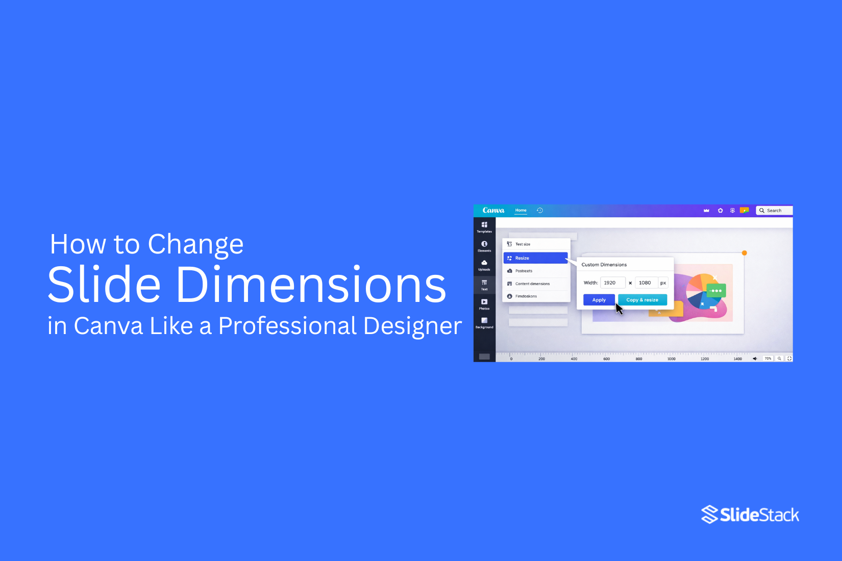
Step 2: Click the Resize button in the top menu.
Step 3: Select a preset size or enter a custom width and height. You can pick common formats like 16:9 or 4:3.
Step 4: Choose one of the two options:
• Copy & Resize: Creates a new version with the updated size
• Resize This Design: Changes the current file directly
Step 5: Review your slides after resizing. Move elements around if spacing looks off or items shift out of place.
Method 2: Change Dimensions When Creating a New Design
Setting dimensions before you start gives you full control over layout from the beginning. This works for both free and Pro users.
Step 1: Go to the Canva homepage.
Step 2: Click Create a design.
Step 3: Select Custom Size from the menu.
Step 4: Enter the width and height values. Choose units like pixels, inches, cm, or mm.
Step 5: Click Create New Design. Canva will open a blank canvas with your selected size.
Step 6: Add your content or rebuild your presentation inside the new layout.
Method 3: Manually Adjust Layout After Resizing
Manual adjustment is used when you do not have access to the Resize tool. It also works if you need full control over each element. This method takes more time, especially for large presentations.
Step 1: Create a new design using your required dimensions.
Step 2: Open your original presentation in another tab or window.
Step 3: Copy elements from the original slides and paste them into the new design.
Step 4: Adjust each element by hand. Move text, images, and shapes into the correct position.
Step 5: Check each slide for spacing, alignment, and readability.
Read also: How to Easily Change Slide Size in Google Slides
Best Slide Dimensions for Different Use Cases
Slide size changes how your content fits on screen. The right choice keeps text clear and visuals balanced.
Business Presentations
Most business decks use a wide layout. A 16:9 format works well for projectors and large screens. It gives space for titles, charts, and images without feeling crowded. Text stays readable from a distance, which helps during meetings and pitches.
Online Meetings and Webinars
Video calls need clear slides that load well on shared screens. A 16:9 layout still works best here. Keep spacing clean so key points stand out even in small video windows. Simple backgrounds help reduce distraction during live sessions.
Social Media Slides
Social platforms favor vertical or square formats. A 1:1 or 4:5 size fits better on feeds. These dimensions keep the content centered and easy to scroll. Short text blocks and bold visuals perform better in this format.
Mobile-Friendly Presentations
Phones change how slides appear. A vertical layout, such as 9:16, fits full screen on mobile devices. Large fonts and clear spacing help readers follow along without zooming. Avoid dense layouts since small screens limit visibility.
Print and PDF Layouts
Printed slides need a different approach. A 4:3 layout often works better for handouts and PDFs. It matches paper proportions more closely. This reduces empty space and keeps content aligned on each page. High-resolution images also matter here to avoid blur when printed.
How to Keep Your Design Professional After Resizing
Resizing a design can change how everything looks. Elements may shift. Text may feel tight. Images can lose balance. A clean result still depends on small fixes after resizing.
Fix Alignment Problems
Start by checking alignment across the whole design. Items often move out of place after resizing. Line up text boxes and images again. Keep edges straight. Use guides if available in your tool. Focus on the balance between the left and right sides. A tidy layout helps the design feel stable and easy to read.
Resize Images Correctly
Images can stretch or shrink in the wrong way after resizing. Adjust each image so it keeps its original shape. Avoid distortion. Crop where needed instead of forcing a stretch. Keep important parts of the image centered. This keeps visuals clear and sharp.
Maintain Font Readability
Text size may no longer fit the new layout. Check each heading and paragraph. Increase or decrease font size so words stay easy to read. Keep enough space between lines. Avoid text that feels cramped. Clear text helps the message stand out.
Adjust Spacing and Layout
Spacing controls how the whole design feels. Add space between sections so nothing feels crowded. Keep equal gaps where possible. Move elements until the layout feels even. A balanced structure makes the design easier to scan and understand.
Canva Pro vs Free Resize Options
Changing slide size works differently in Canva Free and Canva Pro. Both tools can get the job done, but the process and effort level are not the same. The main difference comes down to speed and control over
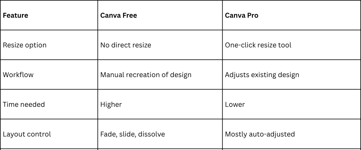
Canva Free asks for more manual work. Each element often needs to be moved and adjusted after creating a new design size. This can slow down the process, especially with detailed slides.
Canva Pro handles resizing in a smoother way. The layout adapts faster, and less time goes into fixing spacing and alignment. This makes it easier to reuse the same design across different slide sizes.
Common Slide Resizing Mistakes to Avoid
Changing slide size sounds simple. Still, small errors can hurt your design. One common issue is starting with the wrong size. This can stretch images and shift text out of place. Slides may look fine on one screen but break on another. Another mistake is ignoring spacing after resizing. Elements often move closer together or spread too far apart. That makes the slide feel messy and uneven.
Many people also forget to check image quality. Some images lose sharpness after resizing. Blurry visuals can weaken the overall look of the presentation. Text alignment can also go off. Titles may no longer sit where they should. Body text may feel off balance. A quick review after resizing helps catch these issues early. Small fixes here make the final design feel clean and steady.
Tips to Maintain Design Quality After Resizing
When you change dimensions, design tools try to adjust elements automatically. This adjustment is not always accurate. Text boxes may shift from their original place. Images can stretch or get cropped. Spacing between elements may change. Alignment can also become uneven. Because of this, every design needs a careful review after resizing.
Keep Layouts Simple
Simple layouts adjust more cleanly across different sizes. Fewer elements reduce movement during resizing. This helps keep the structure stable and easier to fix if changes happen.
Group Elements
Grouped elements move together during resizing. This helps keep related items aligned. It also reduces the chance of parts separating and needing manual correction.
Use Grids and Guides
Grids and guides give a clear structure for placement. They help keep alignment consistent after resizing. This makes it easier to reposition elements that shift.
Avoid Heavy Edges
Content placed near edges can get cut or pushed out of view after resizing. Keeping space around the edges helps protect important elements and improves visibility.
Check Design
Every resized design needs a final review. Small shifts can affect spacing, alignment, and clarity. A quick check helps catch issues before the design is used or shared.
How to Export Resized Canva Slides
Your design is ready after resizing. Now the next step is saving it in the right format. This keeps your work clean and usable across different platforms. Start by checking your layout one more time. Small shifts can happen after resizing. Text alignment, spacing, and image placement should all look balanced on every slide.
Move to the download panel in Canva. Pick the file type based on where the slides will be used. PDF works well for sharing and printing. PNG gives high quality images for slides with strong visuals. MP4 works if the design includes animation. Quality settings matter here. Higher resolution keeps text sharp and images clear. A lower setting reduces file size, which helps with quick sharing.
File naming also helps later. A clear name makes it easier to find your slides in a folder with other projects. After export, open the file and review it. Check each slide for spacing issues or missing elements. This quick review helps avoid problems before sharing with others.
Final Notes
Changing slide dimensions in Canva supports clear control over layout and visual structure. The process stays simple and follows a few direct steps. The Resize tool changes the slide size in a quick way. Custom dimensions set the exact width and height for specific needs. Manual adjustments fix spacing, alignment, and text placement after resizing.
Canva also works with many formats beyond presentation slides. Social media posts, documents, and print layouts follow the same design system, allowing content to shift across uses without starting again. Strong results come from choosing the right format before building the design. Early alignment between purpose and layout reduces extra adjustment work and keeps the structure steady across different outputs.
FAQs:
What are slide dimensions in Canva?
Slide dimensions are the width and height of a design. They decide how content fits on the screen.
Which slide size works best for presentations?
A 16:9 size works well for most presentations. It fits laptops, projectors, and modern screens.
Can I change slide size after creating a design?
Yes. Canva allows size changes after a design is made. The layout may need adjustments after the change.
What happens to my design after resizing?
Some elements may move. Text, images, and spacing can shift. A quick check helps fix layout issues.
Do free Canva users have resize options?
Free users do not have direct resize tools. They often need to rebuild the design in a new size.
Why do images look stretched after resizing?
Images may lose their original ratio. Adjusting or cropping the image keeps it in proper shape.
Which format works best for mobile slides?
A vertical 9:16 format fits mobile screens better. It uses the full screen space on phones.
What file type should I use after downloading?
PDF works well for sharing and printing. PNG works well for high quality image slides.



You may also be interested in ...

How To Create An Eye-Catching Portfolio
If you’re looking to create an eye-catching portfolio, this post will come in handy. In this article, you can find the easies...
23 Jun, 2024

How To Easily Create An Infographic
Infographics are the perfect way to make a presentation that will impact an audience, but their design and composition might...
08 Jun, 2024

PowerPoint Template Tips & Tricks You Ne...
PowerPoint seems to be an unknown world for many people, especially those who have been assigned to create a presentation out...
08 Jun, 2024