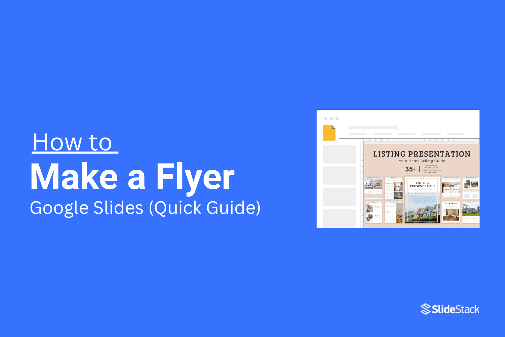
How to Make a Flyer with Google Slides (Quick Guide)
Creating an eye-catching flyer can feel overwhelming. Many people struggle with complex design software or spend hours trying to get layouts just right. The result is often a flyer that looks messy or unprofessional, leaving you frustrated and pressed for time.
Fortunately, Google Slides offers a simple solution. With its easy-to-use tools, you can design a polished flyer quickly, without needing prior design experience. Its flexibility allows you to adjust layouts, add images, and customize text with ease. By following this guide, you’ll be able to create a professional-looking flyer step by step, ready to download and share in no time.
Why Use Google Slides for Flyer Design?
Google Slides is not just for presentations. It can also be a practical tool for creating flyers. One major benefit is easy access, since you can work from any device without installing extra software. The tools are simple, with shapes, text boxes, and images that make designing straightforward. Collaboration is also smooth, allowing multiple people to edit the flyer in real time. Google Slides offers pre-made templates, which save time and help achieve a polished look. You can export your flyer as a PDF or image, making it ready for print or online sharing. Finally, the design is flexible, letting you adjust colors, fonts, and layouts quickly to fit your style.
Step-by-Step Guide to Creating a Flyer in Google Slides
Creating a flyer in Google Slides is easier than it seems. You can design a clear, eye-catching layout without extra software. Keep reading to follow the step-by-step points below and make your own flyer quickly.
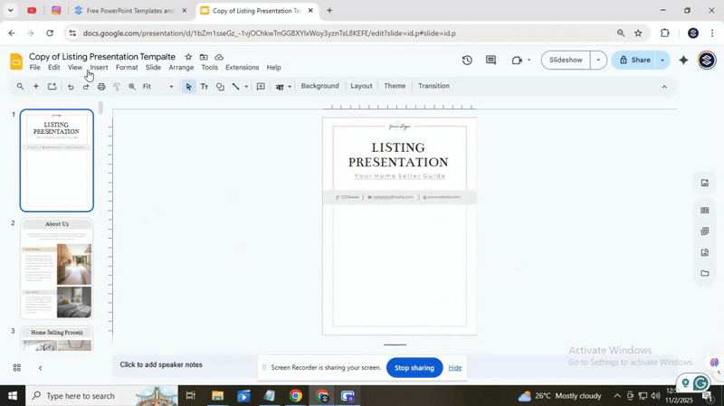
Choose the flyer size
To start, go to File > Page Setup and select “Custom” from the drop-down menu. Enter your desired flyer dimensions, like a vertical A4 at 8.3 x 11.7 inches, then click Apply. You can also save time by using a Google Slides template. Templates come with preset sizes and layouts, making it easier to design your flyer quickly. This way, you get the right size without manually adjusting dimensions, and you can focus on adding content and images.
Define the design style
When you start designing, Google Slides offers a set of predefined styles. These include simple color schemes, basic fonts, and standard layouts. They are easy to use, but they can feel limited if you want a unique or polished look. You might notice that some layouts do not fit your content perfectly, and adjusting them can take extra time.
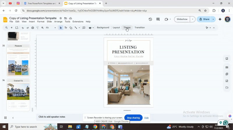
To find a style that works, browse through the available options in Google Slides. Click on the “Theme” button to see the full range. Scroll through them and choose one that matches your topic or mood. Look at the colors, fonts, and slide layouts to make sure they fit your needs. Selecting a style this way gives you a starting point, even if you need to make adjustments later.
For a more professional result with less effort, consider using Slidestack templates. These are designed to save time and give your slides a refined look. They include ready-made layouts, cohesive color palettes, and balanced fonts. Using a template lets you focus on your content instead of formatting every slide from scratch.
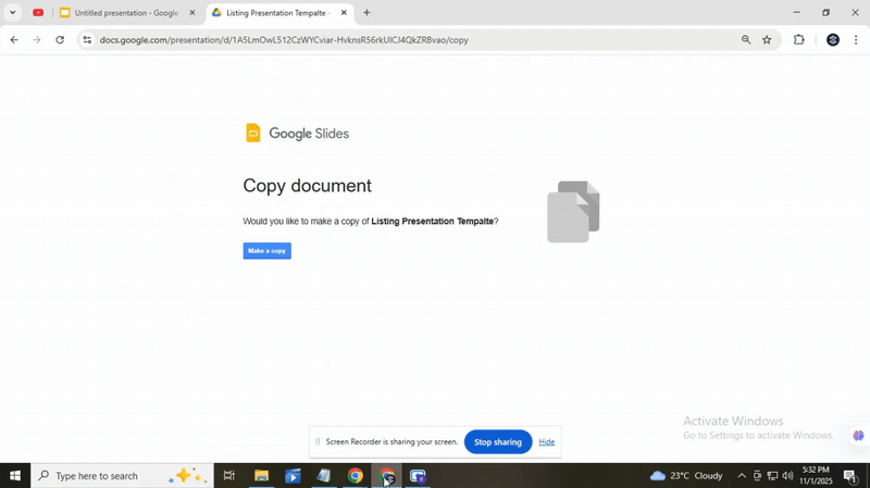
After choosing your style or template, the next step is to download it and begin editing. Replace the placeholder text with your own information, add images, and adjust any elements to fit your message. This approach ensures your slides are both visually appealing and ready for presentation quickly.
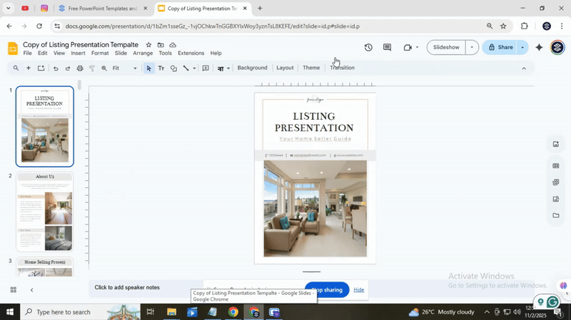
Add images and content in Google Slides
Adding images and content in Google Slides opens up many ways to make your flyer or poster visually appealing. You can start by choosing a background color or image that fits your message. Solid colors work well for clarity, while subtle patterns or light photos can give depth without making text hard to read. Keep the overall look simple so the focus stays on the main content.
Image quality is key, especially if you plan to print your slides. Low-resolution images can look blurry or pixelated when printed. To avoid this, use pictures that are at least 300 dpi for print. You can check resolution by right-clicking the image and viewing its properties, or by using high-quality stock photos. Using clear, sharp images ensures your flyer appears professional and readable.
Templates can save time and offer ideas if you are unsure about layout or design. Google Slides has several pre-made templates for posters, flyers, and presentations. These templates can give you inspiration for colors, fonts, and placement of images and text. Even if you change colors or fonts, templates provide a solid starting point.
To use a template, go to the top menu and select “File,” then “New,” and “From template.” Pick one that matches your style and start replacing placeholder elements with your own images and text. Use “Insert” from the menu to add photos, shapes, or icons. Drag and resize elements so they balance well on the slide. Group items if you want to move multiple pieces together. This step-by-step approach helps your flyer stay neat and organized.
Finally, make sure to include important content that tells viewers what to do next. Add contact information, a website link, or a short call to action so readers know how to follow up. Position this text where it is easy to see but does not block key visuals. Clear, well-placed information increases the effectiveness of your flyer and ensures it achieves its purpose.
Download your flyer in PDF
After you finish editing your flyer, it is time to save it for printing or sharing. Start by removing any slides you don’t need. Click on the slide you want to keep and move it to the beginning. Then, select all other slides and press the Delete key. This leaves only your final design ready for export.
Next, go to the top menu and click File, then choose Download. Select a PDF Document to get a high-quality file that works well for printing. PDFs preserve your layout and make sure text and images stay sharp.
For extra tips, you can check tutorials from Slidestack. They show more ways to handle slides and export options.
Remember, starting with a template can save time and keep your design clean. You can also explore professional templates if you plan to create more flyers in the future.
Conclusion:
Creating a flyer with Google Slides is simpler than it seems. You can mix colors, images, and text to make your ideas stand out. Don’t forget that even small changes can make your flyer look professional.
There are plenty of templates and tutorials that can give you new ideas and keep your designs fresh. Try different layouts and styles to see what fits your message best.
Start experimenting today. The more you play with the tools, the easier it becomes to create flyers that catch attention. Happy designing, and have fun bringing your ideas to life!


You may also be interested in ...

How To Create An Eye-Catching Portfolio
If you’re looking to create an eye-catching portfolio, this post will come in handy. In this article, you can find the easies...
23 Jun, 2024

How To Easily Create An Infographic
Infographics are the perfect way to make a presentation that will impact an audience, but their design and composition might...
08 Jun, 2024

PowerPoint Template Tips & Tricks You Ne...
PowerPoint seems to be an unknown world for many people, especially those who have been assigned to create a presentation out...
08 Jun, 2024