How to Make Google Slides Look More Attractive
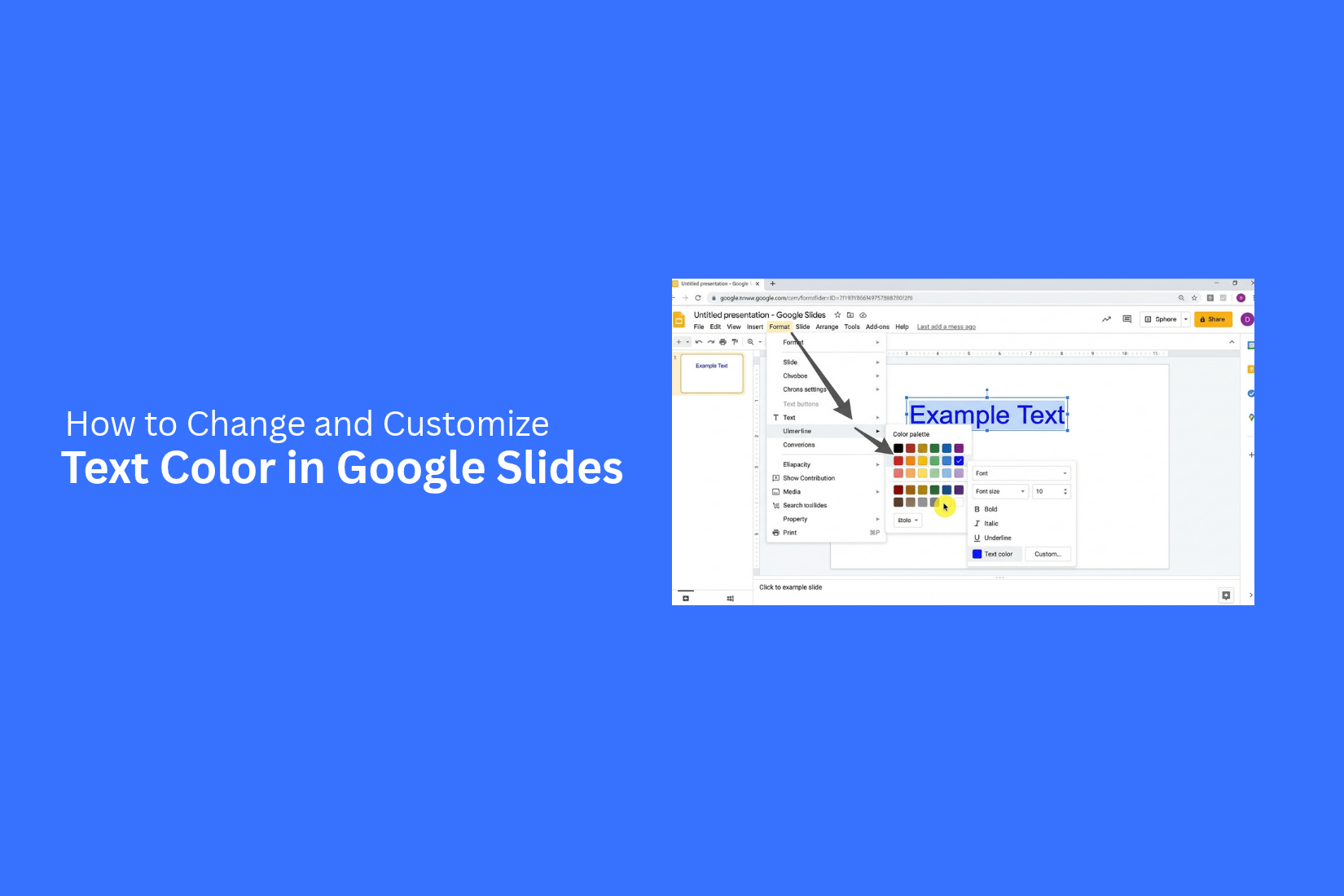
A plain Google Slides presentation can make your content look dull. Basic layouts, poor color choices, and low-quality images can also make your message harder to follow. As a result, your audience may lose interest before you finish presenting.
Google Slides now offers AI-powered tools that can help improve slide designs. Features like Beautify This Slide, Help Me Visualize, and built-in photo editing can save time on design tasks. But AI alone cannot make every slide look professional.
This guide shows you how to make Google Slides look more attractive. You'll learn how to use its new AI features, customize themes, choose better fonts and colors, and apply simple design rules to create clean, engaging presentations.
What’s Actually New Inside Google Slides
Google Slides has offered basic design suggestions for years. However, its newer AI tools offer more ways to improve slide visuals. The main addition is a feature called Help me visualize. You can find it in the Insert menu. There is also an Edit image option that appears after you select an existing photo or graphic.
These tools can help with four main tasks:
- Generate a new image from a text prompt.
- Turn your existing slide content into a slide image.
- Create an infographic based on your prompt or slide content.
- Edit or extend an image already in your presentation.
Google also introduced a new tool called Beautify this slide. It works differently from Help me visualize. Instead of creating a new visual, it redesigns a slide that already contains content.
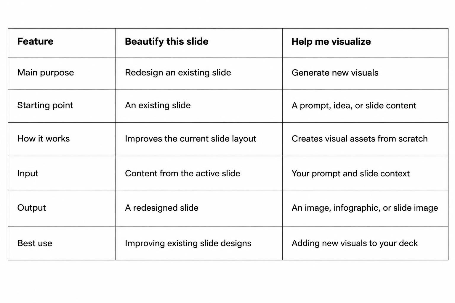
These features use Nano Banana Pro, Google's Gemini 3 Pro image model. Google rolled it out across Slides, Vids, the Gemini app, and NotebookLM in November 2025.
The biggest benefit is less manual design work. You can create visuals, improve existing images, and give your slides a fresh look with AI assistance. However, these tools do not replace good design choices. You still need to pay attention to text size, spacing, colors, and layout.
Beautify This Slide: How It Works
A well-designed slide helps people follow your message. Google Slides now offers AI tools that can help improve slide layouts. One of these features is Beautify This Slide. It helps adjust the look of a slide with less manual work.
The tool can review your slide and suggest a cleaner layout. It can help organize text, images, and other elements. This makes it easier to create slides that look neat and balanced.
Here is how the feature works:
1. Open your Google Slides presentation: Go to the slide you want to improve. Make sure the text and images are in place.
2. Select Beautify This Slide: Find the Beautify option in the available AI tools. Select it to start the design process.
3. Review the suggested layout: Google Slides may suggest changes to the placement and size of slide elements. These changes can help make the content easier to read.
4. Apply the design: Choose a layout that fits your content. Apply the suggested changes to your slide.
5. Make final edits: Check the text, images, colors, and spacing. Adjust any element that does not fit your needs.
A quick tip: AI suggestions can save time, but they may not match your presentation style. Review each change before using it. Keep the layout simple and make sure the main message stands out.
Note: The exact steps and availability of Beautify This Slide may vary by Google Slides account and feature access.
Generating New Visuals with Help Me Visualize
A good slide needs more than text. Visuals can help explain ideas and make key points easier to follow. Google Slides offers a Gemini feature called Help me visualize. It lets you create images from text prompts without leaving your presentation.
To use this feature, follow these steps:
- Open your presentation in Google Slides.
- Click Insert in the top menu.
- Select Help me visualize.
- Enter a text prompt that describes the image you want.
- Choose an image style that fits your slide.
- Click Create to generate the image.
- Review the results and select the image you like.
- Add it to your slide and adjust its size and position.
Your prompt plays a key role in the result. Use clear details about the subject, setting, colors, and style. For example, a prompt like "A modern office with a team working around a table, flat illustration style, blue and white color palette" gives the tool a clear direction.
You can use this feature to create custom illustrations, backgrounds, diagrams, and other visuals. Match the image style and colors with the rest of your presentation. This helps your slides look neat and consistent.
Editing Photos and Removing Backgrounds Without Leaving the Deck
Photos can make your Google Slides presentation look more attractive. But a poorly cropped image or a busy background can take attention away from your message. Google Slides now offers image editing tools that help you make quick changes without opening another app.
You can use these tools to adjust images and make them fit your slides better. For example, you can crop a photo to focus on the main subject. You can also change its size and position to match the layout.
Background removal is another useful option. It helps separate a person or object from the original photo background. This can make the subject easier to place over a new background. It also helps create cleaner slides.
These tools can save time during slide design. You can make basic image changes in Google Slides and keep your presentation work in one place.
How to Customize Google Slides for a Professional Look
A clean design can make your Google Slides presentation look more professional. Small changes to the background, colors, and fonts can improve the look of your slides. Google Slides has built-in tools for these tasks. You can use them to create a consistent style across your entire presentation.
Change Slide Backgrounds
The slide background affects the look of your entire presentation. A plain white background works well for many topics. However, other colors can help your content stand out.
To change a slide background:
- Open your presentation in Google Slides.
- Select the slide you want to edit.
- Click Slide in the top menu.
- Select Change background.
- Choose a color from the available options.
- Click Done to apply the change.
You can also use an image as a background. Select Choose image in the background panel. Upload an image or select one from the available sources.
Keep the background simple. Avoid bright colors and busy images behind text. Your audience should be able to read the content without effort.
Customize Theme Colors and Fonts
Colors and fonts help give your presentation a consistent look. Google Slides lets you edit theme settings to match your preferred style.
Start by opening the Theme panel from the toolbar. Select a theme that fits your presentation. You can also change the colors and fonts to match your design needs.
Here are a few ways to customize your theme:
- Choose a color palette: Use two or three main colors across your slides. Pick colors that work well together.
- Set heading fonts: Choose a clear font for slide titles. Make sure it stands out from the body text.
- Set body fonts: Use a simple font that is easy to read. Keep the same font style across your slides.
- Keep text sizes consistent: Use similar sizes for titles, subtitles, and body text.
Avoid using too many colors or font styles. A simple color palette and a small font selection can make your slides look more organized.
Use the Theme Builder
The Theme Builder in Google Slides helps you control the design of multiple slides from one place. You can set common layouts, backgrounds, fonts, and other design elements. Changes made to a theme layout can also apply to slides that use that layout.
To open the Theme Builder:
- Open your Google Slides presentation.
- Click Slide in the top menu.
- Select Edit theme.
- Choose a master slide or a layout from the left panel.
- Make changes to the background, text styles, or other design elements.
- Close the Theme Builder to return to your presentation.
The Theme Builder is useful for presentations with many slides. You can set a common title style, logo position, and background design. This saves time and helps keep the slides consistent.
Use the master slide for elements that should appear across the presentation. For example, you can add a logo or footer to a shared layout. This way, you do not need to add the same element to each slide by hand.
How This Compares to Copilot in PowerPoint
Google Slides and Microsoft PowerPoint both offer AI tools to help users create better presentations. However, their features work in different ways.
Google Slides uses Gemini to help users create visuals, edit images, and improve slide layouts. It can save time during the design process. Users can also make changes without leaving their presentation.
PowerPoint uses Microsoft Copilot to help create and edit slides. It can generate presentation content, suggest layouts, and help users improve existing slides. It also works with other Microsoft 365 apps.
Both tools can make slide design easier. However, AI cannot make every design choice for you. You still need to check the layout, colors, fonts, and images. A good presentation needs a clear visual style. It should also match your message and audience.
Design Fundamentals the AI Still Leaves to You
AI tools can help improve your slides. However, they do not replace basic design skills. A slide may look polished but still be hard to read. Poor color choices, crowded layouts, and weak images can affect the final result.
A few simple design rules can help you create more attractive Google Slides presentations.
Choose a Consistent Color Palette
Colors help set the tone of your presentation. Too many colors can make slides look messy. A consistent color palette gives your deck a clean and organized look.
Choose two or three main colors for your presentation. Use one color for headings and another for key details. Keep a neutral color, such as white or light gray, for backgrounds.
You can also use a single accent color to highlight important points. Apply the same color choices across all slides. This creates a clear visual style and helps your audience follow the content.
Select Readable Fonts
Font choice affects how people read your slides. Decorative fonts may look attractive, but they can make text hard to read. Simple fonts work better for most presentations.
Choose one font for headings and another for body text. Keep both fonts easy to read. Use a larger size for titles and smaller text for supporting details.
Avoid using too many font styles in one deck. Bold text can highlight key points. Italic text can add emphasis, but use it in small amounts.
Maintain Proper Spacing and Alignment
Spacing gives your slides room to breathe. Text, images, and shapes need enough space around them. Crowded slides can make your message harder to follow.
Use the alignment tools in Google Slides to keep objects in place. Line up text boxes, images, and other elements. Keep equal gaps between related items. You can also use guides and rulers to maintain a consistent layout. Leave enough space around the edges of each slide. This helps create a neat and balanced design.
Use High-Quality Images
Images can make your presentation more engaging. They also help explain ideas that may be hard to describe with text alone. However, low-quality images can make a slide look unprofessional.
Choose clear images that match your topic. Avoid blurry photos and stretched graphics. Keep image sizes consistent across related slides. Pay attention to how images fit into the layout. Use them to support your message, not to fill empty space. A relevant image can often explain more than a long block of text.
Keep Slides Simple and Balanced
A good slide focuses on one main idea. Too much text or too many visual elements can distract your audience. Keep each slide focused on the point you want to share. Use short text blocks, clear headings, and a few key visuals. Break long lists into smaller groups. Use charts or diagrams to present data in a clear way.
Balance is also important. Avoid placing all the text on one side and leaving the other side empty. Give each element enough space. Keep a similar layout style across the deck. A simple slide is easier to read and follow. It also gives your main message more room to stand out.
Creative Ways to Make Google Slides More Attractive
A good presentation needs more than plain text and basic layouts. Small design changes can make your slides look better and help people follow your message. You can use colors, images, shapes, and visual elements to give each slide a clear purpose. Here are three simple ways to improve the look of your Google Slides presentation.
Create Eye-Catching Title Slides
The title slide sets the tone for your presentation. A clean design can make a strong first impression. Start with a clear title that tells people what the presentation is about. Keep the text short and easy to read.
Use a large font for the main title. Add a smaller subtitle to provide extra details. You can also add a relevant photo, illustration, or simple graphic to make the slide more appealing.
Choose a background that matches your topic. Use two or three colors that work well together. Avoid adding too many design elements. Leave enough empty space around the text and images. This keeps the title slide neat and easy to read.
Use Infographics and Visual Elements
Large blocks of text can make slides look crowded. Infographics offer a better way to share facts, steps, and other details. They turn information into visual content that people can understand at a glance.
Google Slides has several tools that can help you build simple infographics. You can use shapes, lines, arrows, icons, and diagrams to present your ideas.
Here are some ways to use visual elements:
• Use icons: Add simple icons to represent ideas, services, or key points.
• Create process diagrams: Use arrows and shapes to show steps in a process.
• Add charts: Present numbers and data through bar charts, pie charts, or line charts.
• Use timelines: Show events, project stages, or milestones in the right order.
• Add images: Use relevant photos to support your message and break up text-heavy slides.
Keep your visuals consistent across the presentation. Use similar colors, shapes, and icon styles. Each visual should support the message rather than distract from it.
Highlight Important Information
Some details deserve more attention than others. A key statistic, main idea, or important message should stand out from the rest of the content. You can use simple design choices to guide the audience toward these details.
Start by using bold text for key words or short phrases. Add a different text color to highlight important points. You can also place key information inside a colored box or shape.
Here are a few ways to make key details stand out:
• Use contrasting colors: Choose text and background colors that are easy to read.
• Increase font size: Make important numbers, headings, or short statements larger.
• Add callout boxes: Place key facts or quotes inside a separate shape.
• Use bold text: Highlight important words without making the whole paragraph bold.
• Add visual markers: Use arrows, circles, or simple icons to draw attention to specific details.
Avoid highlighting too much content on one slide. Too many colors, bold words, and shapes can make the design look messy. Focus on the most useful details. This helps your audience understand the main message without extra effort.
A Practical Workflow and Where the Limits Show Up
Making Google Slides look more attractive takes more than adding colors and images. A clear workflow can help you build slides that look neat and easy to follow. Start with your content, use design tools to improve the layout, and make a few changes to match your needs. Google Slides also has some limits. Its design suggestions may not always match your message or preferred style. You may need to adjust the slides by hand.
Organize Your Presentation Content
Start by arranging your ideas before working on the design. Each slide should focus on one main point. This makes your presentation easier to read and follow.
Use a simple structure to organize your content:
Introduction: Present the topic and explain its purpose.
Main points: Divide the key ideas into separate slides.
Supporting details: Add short text, data, or examples.
Conclusion: End with the main message or key takeaways.
Avoid adding too much text to one slide. Long paragraphs can make the layout look crowded. Use short sentences and clear headings instead. This gives you more room for images, charts, and other visual elements.
Apply AI-Powered Design Suggestions
Google Slides offers AI-powered tools that can help improve your slide design. These tools can suggest layouts and create visual elements based on your content. They can save time during the design process.
Start by reviewing the design options available in Google Slides. Look for layouts that fit your content. You can also use the AI features to create visuals for your slides. This can help make simple slides more engaging.
However, AI suggestions may not always match your presentation style. Some layouts may place too much focus on visuals or leave important details out. Review each suggestion before using it. Keep the options that support your message and ignore the ones that do not.
Customize and Refine Slide Layouts
AI suggestions can give your presentation a starting point. Your own edits help make the slides look more polished. Adjust the layout to create a clear visual order.
Focus on these design elements:
• Fonts: Use readable fonts and keep heading styles consistent.
• Colors: Choose a small color palette that works across the slides.
• Images: Use clear images that support the main topic.
• Spacing: Leave enough space between text and visual elements.
• Alignment: Keep text boxes, images, and charts properly aligned.
You can also resize or move elements to improve the balance of each slide. Keep the same design style throughout the presentation. This helps the slides feel like parts of one complete deck.
Review the Final Presentation
A final review helps you catch design problems before sharing your presentation. Read through each slide and check how the content looks as a complete set.
Pay attention to text size, image quality, spacing, and alignment. Make sure charts and visuals are easy to understand. Check that no text or image is cut off. Also, look for slides that feel too crowded or have too much empty space.
Review the presentation in slideshow mode. This gives you a better idea of how the slides will appear to your audience. Check the flow from one slide to the next. Remove any details that do not support your main message.
Google Slides can help you improve your presentation with AI-powered design tools. Still, these tools cannot make every design decision for you. Your own review and edits play an important role in creating attractive slides.
Final Notes
Making Google Slides look more attractive does not require advanced design skills. Simple changes to colors, fonts, spacing, and images can make a big difference. Google Slides also offers AI-powered tools like Beautify This Slide and Help Me Visualize. These features can help you improve layouts and create new visuals with less manual work.
However, AI suggestions are only a starting point. Review each slide and make changes that fit your content. Keep your layouts clean, use readable fonts, and maintain a consistent color palette. Most importantly, make sure every visual supports your message. A well-designed presentation is not just about appearance. It should help your audience understand your ideas and follow your message from start to finish.
Frequently Asked Questions
1. How can I make Google Slides look more attractive?
Use a consistent color palette, readable fonts, high-quality images, and proper spacing. Keep each slide simple and focus on one main idea. You can also use AI tools like Beautify This Slide and Help Me Visualize to improve your designs.
2. Does Google Slides have an AI design tool?
Yes. Google Slides offers AI-powered features through Gemini. Tools like Beautify This Slide and Help Me Visualize can help improve slide layouts and create new visuals.
3. How do I use Beautify This Slide in Google Slides?
Open your presentation and select the slide you want to improve. Find the Beautify This Slide option in the available AI tools. Review the suggested layout and apply the changes that fit your content. You can make further edits to adjust the design.
4. How can I change the theme of a Google Slides presentation?
Open your presentation and click the Theme option in the toolbar. Choose a theme from the available options. You can also customize theme colors, fonts, and layouts to match your presentation style.
5. How do I make Google Slides look professional?
Use simple layouts, consistent fonts, and a limited color palette. Add relevant images and keep enough space between elements. Make sure headings are clear and text is easy to read. Review every slide before presenting.
6. Can I remove the background of an image in Google Slides?
Yes. Google Slides offers image editing options that can help remove image backgrounds. Select an image and check the available editing tools. Feature availability may vary by account.
7. How can I make Google Slides more engaging without adding too much text?
Use infographics, charts, icons, diagrams, and relevant images to share information. Break long paragraphs into short points. Highlight important numbers and key messages with simple visual elements.
8. Is Google Slides better than PowerPoint for presentation design?
Both tools offer useful design features. Google Slides uses Gemini to help create visuals and improve slide layouts. PowerPoint uses Copilot to help create and edit presentations. The better choice depends on your workflow, preferred tools, and design needs.




You may also be interested in ...

How To Create An Eye-Catching Portfolio
If you’re looking to create an eye-catching portfolio, this post will come in handy. In this article, you can find the easies...
23 Jun, 2024

How To Easily Create An Infographic
Infographics are the perfect way to make a presentation that will impact an audience, but their design and composition might...
08 Jun, 2024

PowerPoint Template Tips & Tricks You Ne...
PowerPoint seems to be an unknown world for many people, especially those who have been assigned to create a presentation out...
08 Jun, 2024