How to Design a Business Card in PowerPoint
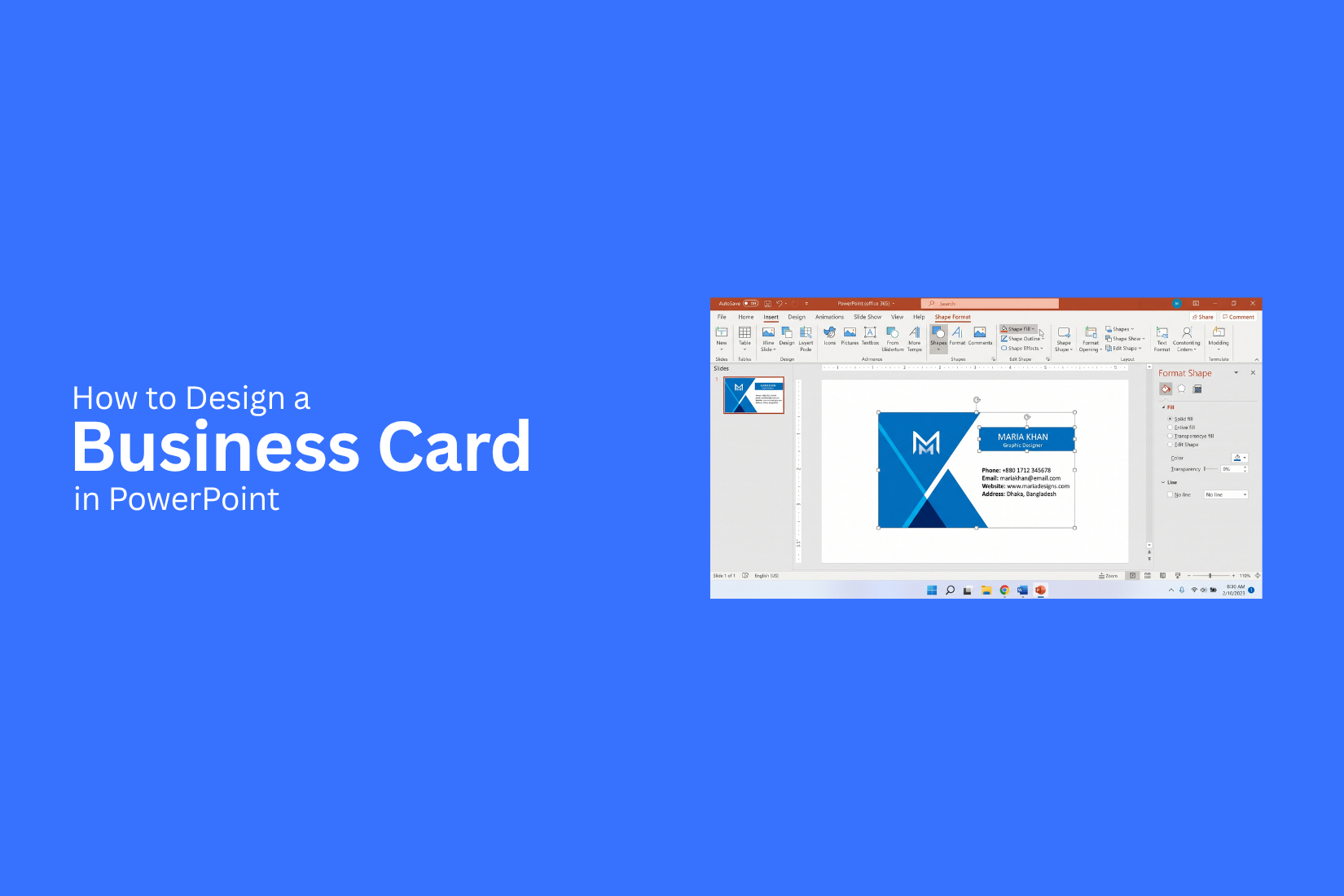
Creating a business card can be difficult if you do not have design software. A card needs the right size, clear contact details, readable text, and a balanced layout. PowerPoint offers familiar tools that can help you build these elements in one file.
A poorly planned card can look crowded or make key details hard to find. Small text, weak spacing, too many colors, and low-quality images can also affect the printed result. These issues can make a simple business card less useful.
PowerPoint gives you tools to set the card size, add guides, place your logo, arrange contact details, and create both sides. You can also add a QR code and prepare the design for printing. This guide explains each step from setup to final PDF.
What Is a Business Card?
A business card is a small card that shares key contact details about a person or business. It usually includes a name, job title, company name, phone number, email address, website, and other useful details. A good business card makes contact details easy to find. It also gives people a quick view of what you do and who you represent.
A typical business card may include:
• Name and job title
• Company name or logo
• Phone number
• Email address
• Website
• Business address
• Social media details
The design should keep the most useful information easy to read. A clear layout, readable font, and balanced use of space can help the card look clean and professional.
What You Need Before Designing a Business Card
A good business card starts with the right details and design assets. Prepare these items before opening PowerPoint. This makes the design process easier and helps you create a clean card.
Choose the Business Card Size
Start by choosing the size of your business card. A common US business card size is 3.5 × 2 inches. This size fits most standard card holders and wallets. Set the PowerPoint slide to match the card size. Go to Design > Slide Size > Custom Slide Size. Enter the width and height for your card. Leave some space around the edges for printing. Keep text, logos, and other key details away from the edge. This helps prevent important content from being cut off.
Prepare Your Business Information
Gather all the details you want to place on the card. This may include:
• Full name
• Job title
• Company name
• Phone number
• Email address
• Website
• Office address
• Social media handles
Keep the list short. A business card has limited space. Include the details people need to contact you or learn more about your business. Check every detail before adding it to the design. A wrong phone number or email address can make the card less useful.
Gather Your Logo and Brand Assets
Prepare your company logo before you start designing. Use a high-quality version that looks clear at the card size. You may also need other brand assets, such as icons, patterns, or brand graphics. Keep these files in one folder so they are easy to find. Use the same logo version across your business materials. This helps your card match your other branded content.
Choose Your Colors and Fonts
Pick your colors before building the card. Use colors that match your brand or company style. A simple color set usually works better than using many colors. Choose one or two fonts that are easy to read. Use a clear font for contact details and a stronger font for your name or company name. Keep the text large enough to read after printing. Test the font size on screen and review the final layout before printing.
How to Design a Business Card in PowerPoint
PowerPoint gives you the tools to create a simple business card from scratch. You can set the card size, add your brand elements, and arrange your contact details on one slide. Follow these steps to build the front and back of your card.
Set the Slide Size
Start with a blank PowerPoint presentation. Remove any text boxes or objects from the slide. Go to Design > Slide Size > Custom Slide Size. Enter the width and height you want for the business card. A common US business card size is 3.5 × 2 inches. Choose Ensure Fit if PowerPoint asks how to scale the content. A smaller slide gives you a better view of the card layout.
Add Guides and Margins
Guides help you place each item in the right spot. Go to View and turn on Guides and Gridlines. Keep a small empty area around the edges of the card. This space helps prevent text and logos from sitting too close to the edge. Use the guides to mark the main content area. Keep your logo, name, and contact details inside these guides.
Create the Card Background
Add a rectangle that covers the full slide. Use Insert > Shapes > Rectangle. Remove the outline and choose a fill color that fits your brand. A plain white background works well for a clean card. You can also use a solid brand color or a simple two-color design. Keep the background simple. Your contact details should remain easy to read.
Add Your Logo
Go to Insert > Pictures to add your logo. Place it in a clear spot on the card. Keep the logo large enough to see but small enough to leave room for your contact details. Use the corner handles to resize it so the logo keeps its original shape. Place the logo near the top or on one side of the card. The best position depends on the rest of your layout.
Add Your Name and Job Title
Insert a text box for your name. Use a larger font size so your name is easy to spot. Add your job title below your name using a smaller font. Keep the two text styles different enough to create a clear order.
For example:
Alex Morgan
Marketing Manager
Use one or two fonts across the card. Too many font styles can make the design look messy.
Add Your Contact Information
Add your main contact details in a separate text box. You may include:
• Phone number
• Email address
• Website
• Office address
Use a readable font size. Keep enough space between each line so the details are easy to scan. Only add details that people need to contact or identify your business. Extra information can make the card harder to read.
Add Social Media Details
Add your social media handles if they support your business or professional role. You can include platforms such as LinkedIn, Instagram, Facebook, or X. Use the platform name or a small icon beside each handle. Keep this section short. One or two useful social profiles may be enough for a simple business card.
Add Icons and Shapes
PowerPoint includes icons and shapes that can help separate different parts of the card. Use small icons for phone, email, website, or location details. Go to Insert > Icons to find suitable options. Shapes can also create lines, color blocks, or small design accents. Use them with a clear purpose so they do not distract from the main information.
Align and Arrange the Elements
A clean layout depends on proper spacing and alignment. Select related objects and use Shape Format > Align to line them up. Use Align Left, Align Center, or Align Middle based on your layout. The Distribute Vertically and Distribute Horizontally options can help create even spacing. Check the card from top to bottom. Make sure the logo, text, icons, and shapes have enough space around them.
Create the Back of the Card
Create a second slide for the back of the business card. Keep the same slide size as the front. The back can use a simple layout. You might place your logo in the center, add your website, or include a short brand message. Keep the colors and fonts consistent with the front. This makes both sides look like parts of the same card. Once both slides are ready, review the spacing and text size. Check that no important element sits too close to the edges before preparing the design for printing.
How to Add a QR Code to Your Business Card
A QR code can give people a quick way to reach your website, portfolio, contact page, or social profile. Adding one to a business card can save space and make key information easier to access. PowerPoint lets you place the code on your card and adjust its size and position.
Choose What the QR Code Should Link To
Start by choosing the page you want people to visit. A business website works well for general business information. A portfolio page fits cards for designers, writers, and other creative roles. You can also link to a contact page, booking page, or professional social profile. Keep the link focused on one goal. The person scanning the code should know what they will get from it. Use a page that works well on mobile devices since most scans happen on phones.
Add the QR Code to PowerPoint
Create the QR code using a QR code tool that lets you enter your chosen link and save the code as an image. PNG works well for most business card designs. Open your business card in PowerPoint. Go to Insert > Pictures and select the QR code image from your computer. PowerPoint will place the code on the slide. Place it near the contact details or another area where it is easy to spot. Leave enough empty space around the code so nearby text or graphics do not make it harder to scan.
Resize and Position the QR Code
Select the QR code and drag a corner handle to change its size. Avoid stretching it from the sides, as this can change its shape and make scanning harder. Keep the code large enough for a phone camera to read. A simple black-and-white QR code on a light background is often easier to scan. Use PowerPoint's alignment tools to place the code neatly. Keep it away from the card edges and leave some space around all four sides.
Test the QR Code Before Printing
Do not send the business card to print before testing the QR code. Scan it with a phone from the same size and distance people may use after receiving the card. Check that the code opens the correct page. Test it on more than one phone if possible. Also check the page after scanning to make sure it loads correctly on a mobile screen. Print a test copy of the card before ordering a large batch. Scan the printed code as well. A QR code may work on your screen but become harder to read after printing if it is too small or has poor contrast.
How to Customize Your Business Card Design
A business card should match your brand and make key details easy to find. PowerPoint gives you control over colors, fonts, spacing, and layout. Small design changes can make the card look cleaner and more professional.
Use Your Brand Colors
Use the colors that already represent your business. Start with your main brand color and add one or two supporting colors. Avoid using too many colors on one card. A simple color palette keeps the design clean. Use a strong color for headings or key details. Keep the background simple so the text stays clear.
Choose Readable Fonts
Pick fonts that are easy to read at a small size. Sans-serif fonts often work well for business cards because their letters are clear. Use one font for most of the card. You can use a second font for the name or title. Keep font sizes large enough to read without zooming in.
Create a Clear Visual Hierarchy
Give the most important details more visual weight. Your name and business name should stand out first. Contact details can have a smaller size. Use font size, weight, and placement to guide the reader. Keep related details close together. This helps people find the information they need quickly.
Use White Space Effectively
Leave enough empty space around text, logos, and other elements. White space gives each part of the card room to stand out. Avoid filling every area with text or graphics. A less crowded layout is easier to scan and gives the card a cleaner look.
Keep Contact Details Easy to Read
Your phone number, email address, website, and other contact details should be clear. Use short labels or icons to help separate each type of information. Check the text at the actual card size. Small text may look fine while editing in PowerPoint but becomes hard to read after printing.
Maintain Consistent Spacing and Alignment
Keep equal spacing between related elements. Align text, logos, and other objects along the same guides. PowerPoint's alignment and distribution tools can help keep the layout neat. Check the edges and gaps before exporting the final design. Consistent spacing gives the card a balanced appearance.
How to Make a Double-Sided Business Card in PowerPoint
A double-sided business card gives you more space for your contact details and brand information. PowerPoint lets you create both sides on separate slides. Keep the same size, fonts, colors, and spacing on both slides for a clean result.
Design the Front Side
Use the front side for the main details. Add your name, job title, company name, logo, phone number, email, and website. Keep the most useful details easy to spot. Place your logo near the top or center. Use a clear font for your name and contact details. Leave enough empty space around each item so the card does not look crowded.
Design the Back Side
Use the back side for extra brand details or a simple visual design. Add a short tagline, social media details, services, or a QR code. Keep the back side simple. Too many elements can make the card hard to read. A logo with a short message can work well for a clean design.
Match Both Sides
Both sides should look like they belong to the same card. Use the same colors, fonts, and design style. Keep key elements in similar positions when possible. For example, place the logo in the same area on both slides. Check the text size and spacing on each side as well.
Check the Layout Before Printing
Review both slides at 100% zoom. Check for text that sits too close to the edges. Make sure logos, icons, and other elements are aligned. Print a test copy on regular paper before using business card stock. Cut it to the card size and check how the front and back line up. This simple test can help you spot layout issues before the final print.
How to Prepare a PowerPoint Business Card for Printing
A good business card design needs more than a clean layout. The file must also be ready for print. A few checks can help prevent blurry images, cut-off text, and sizing problems.
Check the Card Dimensions
Start by checking the size of your business card. The size should match the printer's requirements. A common US business card size is 3.5 × 2 inches. In PowerPoint, open the Design tab and select Slide Size > Custom Slide Size. Enter the required width and height. Set the slide to landscape or portrait based on your design. Using the correct size from the start keeps the layout in the right shape.
Set Up Bleed and Safe Areas
Bleed gives the background or other design elements extra space beyond the final card size. This helps avoid white edges after cutting. PowerPoint does not have a built-in bleed setting. You can create extra space around the slide by extending the background and other edge elements past the trim area. Keep important text, logos, phone numbers, and email addresses away from the edges. This creates a safe area and reduces the chance of important details being cut off.
Check Image Quality
Images need enough resolution for print. A low-quality logo or photo may look clear on your screen but appear blurry on paper. Use high-resolution logos, photos, and graphics. Avoid enlarging small images too much. Check the images at 100% size in PowerPoint to spot soft edges or visible pixels. Vector graphics, such as SVG logos, can also help keep shapes and logos sharp.
Review Text and Contact Details
Read every piece of text before sending the file to print. Check names, job titles, phone numbers, email addresses, website URLs, and social media details. Look for spelling mistakes and missing information. Make sure the font is large enough to read on a small card. A final proofread can prevent simple errors from appearing on hundreds of printed cards.
Export the Business Card as a PDF
PDF is a common format for sending print-ready files. It helps keep the layout, fonts, images, and page size together. In PowerPoint, go to File > Save As or File > Export. Select PDF as the file format. Check the PDF after saving it to make sure the card looks correct. Open the PDF at full size and review the edges, text, images, colors, and spacing. Then send the file to your printer based on its file requirements.
Common Business Card Design Mistakes to Avoid
A business card should be easy to read and simple to scan. Small design mistakes can make the card look crowded or hard to use. Check these common issues before you print or share your design.
Adding Too Much Information
A business card has limited space. Adding too many details can make the design feel crowded. Keep the key details, such as your name, job title, company name, phone number, email, website, and social media handle. Remove details that do not help the reader contact you or understand your role.
Using Too Many Fonts
Too many fonts can make a business card look messy. Use one font for most of the text. A second font can work for a name or heading. Keep font styles consistent across the card. Use size and weight to create a clear text order.
Choosing Poor Color Combinations
Colors should make the text easy to read. Some color pairs have low contrast, which can make text hard to see. Use a simple color palette with two or three main colors. Check the text against the background before printing the card.
Making Text Too Small
Small text may look fine on your PowerPoint screen but become hard to read on a printed card. Use a readable font size for contact details. Keep the name larger than the supporting text. Leave enough space around each text area.
Ignoring Bleed and Safe Areas
Bleed gives the background or design extra space beyond the final trim line. The safe area keeps key text and logos away from the edge. Set these areas before finishing your PowerPoint design. Keep names, contact details, and logos inside the safe area. Extend background elements into the bleed area if needed.
Using Low-Quality Images
Low-quality logos, photos, or graphics can look blurry after printing. This can make the card look less polished. Use high-resolution images for your business card. Check the image at its final size in PowerPoint. Replace any graphic that looks pixelated or unclear.
Poor Alignment and Spacing
Misaligned text and uneven spacing can make the card look unorganized. Each element should have a clear position. Use PowerPoint's alignment tools to line up text, logos, icons, and other objects. Keep similar gaps between related items. Consistent spacing helps create a clean layout.
Business Card Design Tips for PowerPoint
A business card needs to be easy to read at a glance. PowerPoint gives you control over the layout, text, colors, shapes, and other design elements. A few simple design choices can help you create a card that looks clean and professional.
Keep the Layout Simple
Start with a clean layout that gives each piece of information enough space. Place your name, job title, contact details, and other key information in clear areas. Avoid filling every part of the card. Empty space helps separate different details and makes the card easier to read. And design elements aligned. A simple grid can help you place items in a neat order.
Make Your Name Stand Out
Your name should be one of the first things people notice. Use a larger font size or a stronger font weight for your name. Keep your name easy to read. A simple font works well for most business cards. Your job title can use a smaller size below your name. Avoid using too many font styles. Two fonts are usually enough for the whole card.
Use One Clear Focal Point
Give the card one main visual focus. This could be your name, logo, or a simple graphic related to your work. A clear focal point helps guide the reader's eye. Other details should support that main element instead of competing with it. For example, a designer may use a small logo as the main visual. A consultant may give more space to their name and job title.
Limit Decorative Elements
Shapes, icons, lines, and patterns can add style to a business card. Too many of them can make the card look crowded. Use decorative elements only when they support the design. A thin line, small icon, or simple shape may be enough. Keep the design focused on the information people need. Contact details should remain easy to find.
Match the Design to Your Industry
Your business card should fit the type of work you do. A creative professional may use bold colors or a unique layout. A lawyer, accountant, or financial advisor may need a more formal design. Choose colors, fonts, and graphics that fit your field. The design should also match your brand style across other business materials.
Check the Card at Actual Size
A design that looks good on a large PowerPoint slide may not work well as a printed business card. Check the card at its intended size before printing. Read every line of text. Check the font size, spacing, alignment, and contact details. Make sure small elements are still clear. Print a test copy if possible. Hold it in your hand and review it from a normal reading distance. This simple check can reveal issues that are easy to miss on your screen.
Business Card Design Tips for PowerPoint
A good business card should look clear and easy to read. PowerPoint gives you simple tools to set up text, shapes, colors, and images. Use these tips as you build your card.
• Keep the design clean and easy to scan.
• Use a clear name and job title.
• Add only the contact details people need.
• Keep text sizes easy to read.
• Use colors that work well together.
• Leave enough space between each part.
• Keep the same style across the full card.
• Check the card at full size before saving it.
Business Card Design Ideas
Different card styles can fit different needs. Pick a style that matches the person, job, or brand.
Minimal Business Card
A minimal business card uses a simple layout. It has little extra detail. Use plenty of empty space around the text. Add the name, job title, and key contact details. A small logo can also fit the layout.
Corporate Business Card
A corporate business card can use a clear and formal layout. Place the company name and logo where they are easy to see. Add the person's name, job title, phone number, email, and other key details. Keep the design neat and consistent.
Creative Business Card
A creative business card can use shapes, images, and bold text. Try a unique layout that still keeps the contact details easy to read. You can use a strong visual element to give the card a clear style.
Personal Brand Business Card
A personal brand business card should focus on the person. Use the person's name as a key part of the design. Add a job title or service name. A personal logo, photo, or brand mark can also be used. Keep the colors and text style consistent.
Modern Business Card
A modern business card can use clean lines, simple shapes, and a fresh layout. Use a limited color set and clear text. Place each detail with enough space around it. A simple visual element can add more character without making the card hard to read.
Final Notes
Designing a business card in PowerPoint is simple with the right setup. Start with the correct card size. Gather your business details, logo, colors, and fonts before you begin. Keep the layout clean and easy to read. Use clear fonts, enough space, and a small number of colors. Keep names, contact details, and logos away from the card edges. For double-sided cards, use two slides with the same size and design style. Test any QR code before printing. Check it on the screen and on a printed copy.
Review the card at its actual size before you send it to print. Check the text, images, spacing, alignment, and contact details. Use high-quality images and export the finished design as a PDF if your printer accepts that format. A well-planned PowerPoint business card can give you a clean and useful design without needing advanced design software. Keep the focus on clear information, simple design, and accurate details.
FAQs
Can I design a business card in PowerPoint?
Yes. PowerPoint lets you set a custom slide size, add text, images, shapes, logos, and QR codes. You can use these tools to create both sides of a business card.
What size should a business card be in PowerPoint?
A common US business card size is 3.5 × 2 inches. Set the slide to this size before you start designing. Check your printer's size requirements before printing.
Can I create a double-sided business card in PowerPoint?
Yes. Use one slide for the front and a second slide for the back. Keep the same slide size, fonts, colors, and design style on both slides.
Can I add a QR code to a PowerPoint business card?
Yes. Create the QR code as an image and add it to your PowerPoint slide. Place it where it is easy to see. Leave enough space around it so phones can scan it.
How do I make a business card print-ready in PowerPoint?
Check the card size, safe areas, images, text, and spacing. Keep key details away from the edges. Use high-quality images. Then export the card as a PDF if your printer accepts PDF files.
Can I use a logo on a PowerPoint business card?
Yes. Add your logo through Insert > Pictures. Use a high-quality logo that stays clear at the final card size.
How many fonts should I use on a business card?
One or two fonts are usually enough. Use a clear font for contact details. A second font can help make the name or company name stand out.
How can I make my business card easy to read?
Use clear fonts, readable text sizes, good contrast, and enough space between sections. Keep only the contact details people need.
Should I add social media accounts to my business card?
You can add social media details if they support your work or business. Keep the list short. One or two useful profiles may be enough.
How can I check my business card before printing?
Review the design at 100% zoom and at its actual size. Check the text, images, spacing, alignment, and card edges. Print a test copy if possible.


You may also be interested in ...

How To Create An Eye-Catching Portfolio
If you’re looking to create an eye-catching portfolio, this post will come in handy. In this article, you can find the easies...
23 Jun, 2024

How To Easily Create An Infographic
Infographics are the perfect way to make a presentation that will impact an audience, but their design and composition might...
08 Jun, 2024

PowerPoint Template Tips & Tricks You Ne...
PowerPoint seems to be an unknown world for many people, especially those who have been assigned to create a presentation out...
08 Jun, 2024