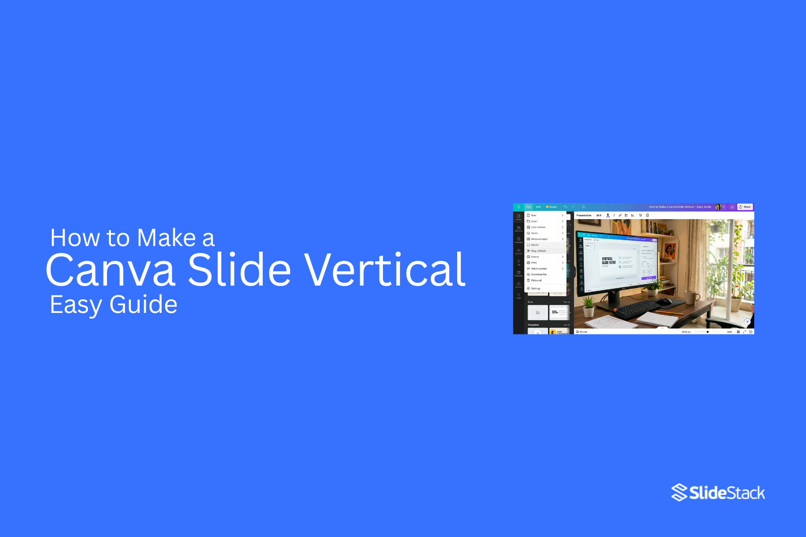
How to Make a Canva Slide Vertical – Easy Guide
Most presentations use a horizontal layout, but many people run into limits when trying to adapt Canva slides for mobile screens, social posts, or tall infographic designs where vertical space works better and improves how content is seen and shared across different viewing formats today.
Next, Canva provides tools that let users adjust layout settings or rebuild slides in a vertical format depending on the project's needs, which helps create content that fits better on taller screens and improves readability. This article shows how to make a Canva slide vertical using simple methods, including resizing, choosing portrait dimensions, and adjusting elements so the final design stays clean and easy to use for better results today.
What is a Vertical Canva Slide and When Should You Use it
A vertical slide uses a portrait orientation, meaning the height is greater than the width. It looks taller than a standard slide and follows a top-to-bottom layout. This format is used for mobile-first presentations, infographics, social media posts like Instagram and Pinterest, and also for reports and short summaries.
A standard widescreen slide (16:9 landscape) spreads content from left to right and works well on large screens. A vertical Canva slide is easier to view on phones because it matches the screen shape. It works well for social media sharing, scrollable presentations, and visual reports. It also fits situations where the audience mainly views content on smartphones rather than desktop screens.
Why Use Vertical Slides Instead of Horizontal Ones?
Most slides follow a wide layout. That works well for projectors and desktop screens. Still, that format does not always fit every need. Vertical slides feel more natural on phones. People scroll down more than they swipe sideways. This makes reading easier on mobile screens.
Social media also favors vertical content. Platforms like Instagram Stories and TikTok show tall layouts better. Content fills the screen without empty space on the sides. Vertical slides also help with focus. Each slide can hold one idea. This keeps the message clear and easy to follow.
Designs like infographics also work better in a vertical format. Information flows from top to bottom. Readers move through the content step by step. A tall layout also gives more control over pacing. Each section can guide attention in a simple order.
How to Create a Vertical Canva Presentation
This guide shows how to create a vertical Canva presentation using built-in presets, starting from scratch, or resizing an existing design, followed by simple steps to complete the setup.
Method 1: Create a Canva Slide Vertical on Desktop
Open Your Canva Presentation: Start by opening Canva on your desktop browser. Pick the presentation you want to change. The file will open in the editor.
Use the Resize Feature: Look at the top menu bar. Find the resize option. Click it to open size settings.
Select Portrait Dimensions: Choose a vertical size from the list. You can pick a preset like mobile or portrait layout. This changes the slide shape to a tall format.
Adjust Slide Elements: Text, images, and shapes may move after resizing. Drag each item into place. Make sure everything fits cleanly on the new layout.
Method 2: Create a Vertical Canva Slide from Scratch
The easiest way to create a vertical Canva presentation is to set the dimensions before you start designing. Use this method for new presentations, infographics, and content made for mobile screens or social media slides.
Step 1: Open Canva and click Create. Then select Custom Size or choose a blank template option.
Step 2: Set a vertical format size such as 1080 × 1920 px. You can also select a vertical preset if it is available.
Step 3: Add text, images, and design elements in the same way as a normal presentation. Arrange everything for vertical viewing so content flows from top to bottom.
Method 3: Resize an Existing Canva Presentation
If a horizontal presentation already exists, it can be changed into a vertical Canva slide using the Resize option. This tool is usually part of Canva Pro.
Step 1: Open your design and click Resize from the top menu.
Step 2: Enter vertical dimensions like 1080×1920 px or select a preset size.
Step 3: Choose Resize to update the current design or select Copy & Resize to keep the original file unchanged.
Note: After resizing, some elements may move, text may need fixing, and the layout may need reworking.
Method 4: Rebuild Slides in a Vertical Layout
If resizing does not give clean results, rebuilding is a better option. This works well for complex designs that do not convert properly or when you need full control over the layout.
Step 1: Create a new vertical design via Create -> Custom Size.
Step 2: Copy content from your original slides and paste it into the new slide deck.
Step 3: Rearrange elements for vertical flow and keep content easy to read from top to bottom.
Recommended Vertical Slide Sizes in Canva
Vertical slides in Canva work well for mobile screens and print layouts. Picking the right size helps your design fit the space without cropping or stretching. A common choice is 1080 x 1920 pixels. This size fits phone screens and social media stories. It gives a tall layout that feels natural on mobile devices.
A4 portrait size is another option. It works well for documents, reports, and printable slides. This size follows a standard paper format, so it prints cleanly. Some users also use 1080 x 1350 pixels. This size fits social media posts that need more height than a square layout. It shows more content without taking up too much space on a screen.
Choosing a size depends on where the slide will be used. Mobile viewing and printing need different proportions. A clear format at the start makes the design process smoother later.
Tips for Choosing Dimensions and Designing Vertical Canva Slides
Vertical slides fit well on phones and social feeds. They also work for simple reports and print-style layouts. The structure you use shapes how easy the content is to read. Clear planning at the start helps the slide stay clean and balanced.
Choosing the Right Dimensions
Start with the purpose of the slide. Different uses need different sizes.
A common choice for mobile screens is 1080 × 1920 px. This size fits full-screen viewing on phones. It works well for social posts and story-style content. For longer vertical layouts, 800 × 1200 px is a practical option.
It gives enough space for text and visuals without feeling too stretched. Print-focused designs often use A4 portrait size. This format suits handouts, guides, and formal documents. Picking the size early keeps spacing and alignment consistent. It also reduces layout problems later in the design process.
Designing for Vertical Flow
Vertical slides guide the eye from top to bottom. Most people scan in that direction without thinking about it. Your layout should support that path. Place the main idea near the top. This helps the reader understand the message right away. Support details can sit below the main point. Keep each part separated with clear spacing. Tight spacing makes content harder to follow, especially on smaller screens.
Text size matters more in vertical layouts. Smaller screens need larger fonts for easy reading. Simple font choices also improve clarity. Visual elements should follow the same flow. Place images or icons where they support the text, not where they distract from it.
Prioritizing Information
Not every detail carries the same weight. The most important message belongs at the top of the slide. That area gets the most attention during a quick scan. Headings help guide the reader through sections. Subheadings break the content into smaller parts. This structure reduces confusion and keeps ideas separated.
Spacing also supports clarity. Clear gaps between sections help each idea stand on its own. Crowded layouts make it harder to focus on key points. Strong vertical slides rely on order. Each piece of content should serve a clear role in the flow from top to bottom.
Common Problems When Resizing Canva Slides
Misaligned Elements: Design parts can shift after resizing. Buttons, icons, and shapes may move out of place. The layout starts to look uneven. Items that were once lined up can lose their structure. This creates a messy slide that feels hard to read. Fixing this takes time because each element needs to be adjusted by hand.
Cropped Images: Images can lose important parts after resizing. The edges may get cut off. Faces, text, or key details might disappear. This changes the meaning of the design. Some pictures may also stretch in a way that looks odd. Checking each image helps catch these problems early.
Text Overflow Issues: Text can spill outside its box after resizing. Words may overlap or drop to new lines in strange places. This makes the slide harder to follow. Some sentences may become broken or uneven. Adjusting font size or text boxes helps bring everything back into place.
How to Export Vertical Canva Slides
Exporting a vertical Canva slide is simple. The process stays the same across most file types. Each option works for a different need.
Export as PDF
Open the finished vertical design in Canva. Go to the share menu at the top. Select the download from the list. Choose PDF as the file type. This format keeps the layout sharp. It works well for presentations and sharing. Pick a standard PDF for general use. Pick print PDF for higher quality output. Then confirm the download.
Download as Image Files
Open the same download menu again. Choose PNG or JPG as the file type. PNG keeps higher quality for graphics and text. JPG creates smaller file sizes for easy sharing. Select the pages you want to save. Each slide becomes a separate image file. This works well for social posts or previews.
Export as Video
Open your Canva design with animations or moving elements. Go to the download section. Choose the MP4 video format. This keeps motion effects intact. Please set the quality level based on your needs. High-quality works better for presentations. Lower quality keeps the file size small. Download starts after selection. The video file saves each slide in sequence.
Canva Free vs Canva Pro for Vertical Slides
Canva Free gives you basic tools to create vertical slides. You can set a custom size like 1080×1920 px. You can also use free templates. Editing tools are simple and easy to use. Some design elements are locked behind Pro.
Canva Pro adds more control. The Resize tool helps change horizontal slides into vertical ones in seconds. You also get more templates, photos, and graphics. Brand tools are included for consistent design. Magic Resize saves time when you work with many slide sizes.
Free works well for simple projects. It suits basic presentations and small designs.
Pro fits better when you need speed and more design options. It also helps when you manage multiple slide formats or client work.
Use Cases for Vertical Canva Presentations
Vertical Canva slides fit screens that are tall. They work well on phones and social apps. They also help content feel easy to scroll.
Social media stories: These slides fit Instagram Stories and similar formats. Text stays clear on small screens. People can read without zooming.
Product promotions: Brands use vertical slides to show products one by one. Each slide can focus on one item. This keeps attention on details.
Step-by-step guides: Instructions work well in a vertical flow. Each step can sit on its own slide. Readers follow the order without confusion.
Event announcements: Dates, times, and details can be placed in clean sections. The layout helps important info stand out fast.
Mobile presentations: Many people view content on phones. Vertical slides match that screen shape. Content looks natural and fills the screen better.
Infographics: Charts, tips, and short facts fit in a tall format. Information stacks in a clear order. This helps readers move through content easily.
Common Mistakes to Avoid
When converting or designing vertical slides, a few common issues can reduce clarity and visual balance. These mistakes often come from adjusting existing layouts instead of designing for a vertical structure from the start.
Some Layouts Might Need to Be Redesigned
One of the most common issues is forcing a horizontal layout into a vertical format. This usually creates cluttered spacing and uneven alignment. Elements feel squeezed, and the design loses structure. A better approach is to rebuild the layout so it flows naturally from top to bottom.
Avoid Overloading Slides
Another mistake is placing too much content on a single slide. Vertical space may look large, but filling it with heavy text or too many visuals makes the slide harder to read. Keeping content short and spaced improves focus and helps the message stand out clearly.
Optimize for Small Screens
Mobile viewing changes how slides are experienced. Many users view vertical designs on phones, where spacing and readability matter more. Poor adjustments can lead to stretched or cropped images, which affect the overall look. Careful alignment and clean scaling help keep the design consistent across screen sizes.
Final Words
Understanding vertical slide design gives more flexibility in how content is built and shared. It helps you adapt your work for different platforms without extra effort later. Horizontal slides still work well for screens like projectors and laptops. They feel wide and structured. Vertical layouts fit better with mobile screens and social feeds. More people now view content on phones, so vertical design keeps things easier to read and follow.
There are a few ways to build vertical slides. You can start from a blank vertical canvas. You can resize an existing design. You can also rebuild your slides from scratch for better control over layout and spacing. Each method works depending on your goal and time. Good design always focuses on clarity. Keep content simple and easy to scan. Make sure each slide feels balanced on smaller screens. The goal stays the same across all formats. Help the viewer understand the message without effort.
FAQs:
What is a vertical Canva slide?
A vertical Canva slide is a design that is taller than it is wide. It follows a portrait layout. It is often used for mobile screens, social posts, and simple guides.
Can I change a normal Canva slide into a vertical one?
Yes. You can use the resize tool or set custom dimensions like 1080 × 1920 px. Some designs may need layout fixes after resizing.
What size works best for vertical Canva slides?
A common size is 1080 × 1920 px. A4 portrait also works for print use. Another option is 1080 × 1350 px for social media posts.
Do I need Canva Pro to make vertical slides?
No. Canva Free lets you create vertical slides using a custom size. Canva Pro adds tools like Resize, which saves time.
Why do elements move after resizing?
Changing slide size can shift text, images, and shapes. The layout adjusts to the new space, so manual fixes are often needed.
Can I use vertical slides for presentations?
Yes. They work well for mobile presentations, short reports, and social content. They are not ideal for large screens like projectors.
What is the easiest way to design vertical slides?
Starting with a vertical canvas from the beginning is the simplest method. It avoids layout issues later.
Can I export vertical Canva slides as images or a PDF?
Yes. You can download them as PDF, PNG, JPG, or MP4, depending on how you plan to use them.
Why do vertical slides work better on phones?
Phones are tall screens. Vertical slides match that shape, so content fills the screen and is easier to read.
What is the most common mistake in vertical slide design?
A common mistake is forcing a wide layout into a tall format. This often leads to cluttered design and poor spacing.


You may also be interested in ...

How To Create An Eye-Catching Portfolio
If you’re looking to create an eye-catching portfolio, this post will come in handy. In this article, you can find the easies...
23 Jun, 2024

How To Easily Create An Infographic
Infographics are the perfect way to make a presentation that will impact an audience, but their design and composition might...
08 Jun, 2024

PowerPoint Template Tips & Tricks You Ne...
PowerPoint seems to be an unknown world for many people, especially those who have been assigned to create a presentation out...
08 Jun, 2024