20 Must-Haves for a Professional Presentation: The Ultimate Checklist
A professional presentation can lose its impact because of small details. Slides may have too much text, weak visuals, poor spacing, or an unclear message. These issues can make the content harder to follow and may leave the audience unsure about the main point.
A presentation also needs more than good design. Missing data checks, weak speaker notes, poor slide flow, or no clear next step can affect the full presentation experience. A quick review can catch these issues before you present. This checklist covers 20 must-haves for a professional presentation. Use it to check your content, design, data, visuals, and delivery. It also helps you spot common mistakes and prepare your slides with greater confidence.
What Makes a Presentation Look Professional?
A professional presentation looks clear, organized, and easy to follow. Every slide should have a clear purpose. The design should also feel consistent from start to finish. Several details shape this look. A simple layout helps the audience focus on the main point. Readable fonts make the content easy to follow. A consistent color palette gives the slides a unified look. Strong visuals also matter. Use images, charts, icons, and diagrams that support the message. Avoid adding visuals just to fill empty space.
Good spacing can make slides easier to read. Give text, images, and other elements enough room. A crowded slide can make even good content hard to follow. The content needs the same level of care. Use clear headings, short text, and useful data. Keep each slide focused on one main idea. A professional presentation also follows a clear structure. The opening should set the topic. The main slides should build the message in a logical order. The final slide should leave the audience with a clear takeaway or next step. These basics form the foundation of a polished presentation. The checklist below covers the key details to review before you present.
The Ultimate Professional Presentation Checklist
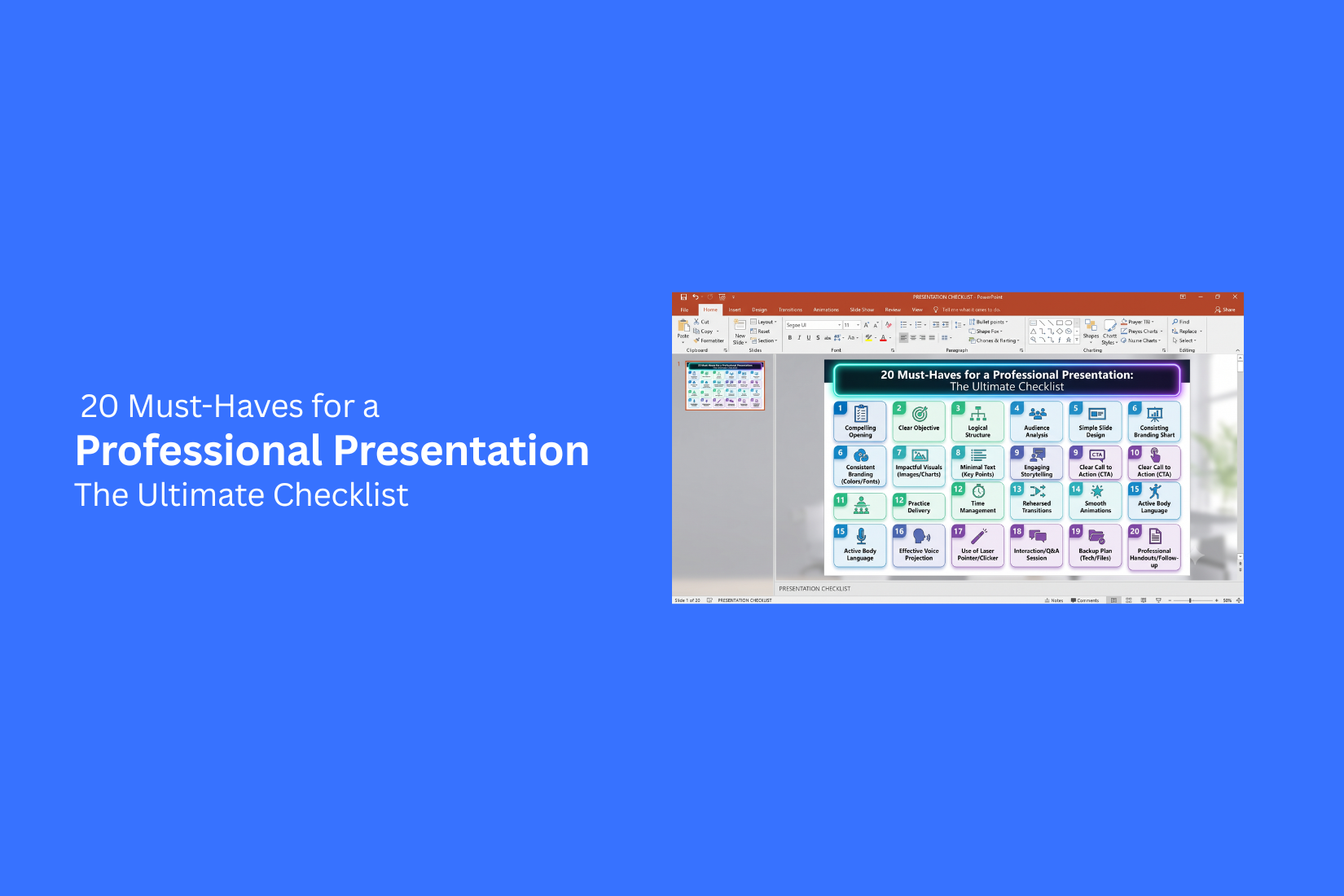
A professional presentation should be clear, useful, and easy to follow. This checklist covers the key parts of a strong presentation, from the first slide to the final review. Use it before you present to find gaps and improve the full deck.
1. Clear Presentation Goal
Every presentation needs a clear goal. Decide what you want the audience to know, understand, or do after the presentation. Your goal should guide the content. It also helps you decide which details to include and which ones to remove. A sales deck may aim to gain a new client. A business report may aim to explain results. A team presentation may aim to gain approval for a plan. Write the goal in one sentence before you start building slides. Use that sentence as a check throughout the process.
2. Defined Target Audience
Your audience affects the way you build the presentation. A presentation for company leaders will need different details than one for new employees or customers. Learn who will attend and what they already know about the topic. Note their roles, needs, questions, and goals. This helps you choose the right examples and level of detail. Avoid using terms that the audience may not know. Use simple language and explain technical terms if they are needed.
3. Strong Opening Slide
The opening slide gives the audience the first view of your presentation. It should tell them what they are about to see. Keep the design clean. Add the presentation title and only the details that help identify the presentation. These may include your name, company, role, or presentation date. A strong opening also sets the tone for the rest of the deck. Use a clear visual style that matches the topic and your brand.
4. Clear Presentation Title
Your title should tell the audience what the presentation is about. Avoid titles that are too broad or unclear. A good title can also show the main purpose of the presentation. For example, "Q2 Sales Results and Growth Plan" gives more information than "Sales Presentation." Keep the title short enough to read quickly. Use a large font and place it in a clear position on the slide.
5. Logical Slide Structure
A good presentation follows a clear path. The audience should know how each section connects to the main topic. Start with the purpose and key context. Follow with the main points, supporting details, and results. End with the main takeaway and next step. Group related slides into sections. Use section slides or clear headings to help the audience track progress. Review the slide order from start to finish and remove any slide that feels out of place.
6. Simple and Focused Content
Each slide should have one main idea. Too many ideas on one slide make the message harder to follow. Use short sentences, brief bullet points, and clear headings. Remove text that only repeats what you plan to say aloud. Ask yourself what the audience needs to see on each slide. Keep supporting details in speaker notes or an appendix if they are not needed during the main presentation.
7. Consistent Branding
Your presentation should match the company or brand it represents. Use the correct logo, fonts, colors, icons, and other brand elements. Place these elements in consistent locations. For example, keep the logo in the same area across the deck. Use the same heading style and font pair throughout the presentation. Avoid adding too many brand elements. The content should remain the main focus. A clean brand treatment makes the deck look more organized and professional.
8. Professional Color Palette
Choose colors that support the message and make the slides easy to read. A small color set is often enough for a full presentation. Use one main brand color and a few supporting colors. Keep text colors easy to read against the background. Use accent colors to highlight key numbers, words, or chart data. Check the colors on a real screen before presenting. Colors may look different on a laptop, projector, or large display.
9. Readable Typography
Your text should be easy to read from the back of the room. Use simple fonts with clear letter shapes. Create a clear difference between titles, headings, and body text. Keep font sizes and styles consistent across similar slides. Avoid using too many fonts. Two font families are usually enough. Also check line spacing, text alignment, and contrast. These small details can make a large difference in readability.
10. Consistent Slide Layouts
Similar slides should use similar layouts. This gives the presentation a clear visual pattern and helps the audience focus on the content. Keep titles in the same position. Use consistent margins, spacing, image sizes, and alignment. Follow the same layout rules for charts, tables, and text blocks. You can still vary layouts for different types of content. The key is to keep the overall design system consistent across the deck.
11. Effective Use of White Space
White space is the empty area around text, images, charts, and other slide elements. It gives each part of the slide room to breathe. Avoid filling every part of the slide. Too much content can make a slide feel crowded and hard to read. Use open space to separate groups of information. It can also help guide the eye toward the most important part of the slide.
12. High-Quality Images and Graphics
Images should support the message. Use clear visuals that relate directly to the topic. Avoid stretched, blurry, or low-resolution images. Check the size and quality of each visual before adding it to the deck. Graphics can also help explain ideas that are hard to show with text. Use icons, diagrams, screenshots, or simple illustrations when they make the point easier to understand.
13. Clear Charts and Data Visuals
Charts should help the audience understand data quickly. Pick a chart type that fits the information. Remove extra labels, effects, and details that do not help the reader. Use clear titles and labels so the audience knows what the chart shows. Highlight the most useful data point. For example, you can use a different style for the value that supports your main message. Keep the rest of the chart simple.
14. Accurate and Relevant Data
Every number in your presentation should be correct. Check percentages, totals, dates, names, labels, and other figures before presenting. Use data that supports the purpose of the presentation. Old or unrelated data can distract from the main message. Check the source of important numbers. Add source details to the slide or speaker notes when needed. This also makes it easier to answer questions from the audience.
15. Strong Supporting Evidence
Main claims should have support. Use research, company data, customer results, case studies, reports, or other reliable sources. Match the evidence to the point you are making. A large amount of data does not make a claim stronger if the data is not relevant. Keep sources clear and easy to find. Use short source labels on slides and add full details in notes or an appendix if the presentation needs more detail.
16. Clear Key Messages
Every presentation has a few points that matter most. Make these points easy to find. Use slide titles that state the main message instead of using generic labels. For example, "Revenue Increased 18% in Q2" gives the audience more information than "Q2 Revenue." Repeat the main message in the right places. The audience should be able to understand the key points even after a quick review of the deck.
17. Useful Speaker Notes
Speaker notes help you prepare for delivery. Use them for details that do not need to appear on the slide. Add talking points, examples, statistics, reminders, and answers to likely questions. You can also use notes to mark where you need to pause or change topics. Keep the notes short and useful. They should help you speak with confidence without forcing you to read from the screen.
18. Strong Closing Slide
The final slide should give the audience a clear takeaway. Do not end with a slide that adds a new topic or a large amount of information. Restate the main result, recommendation, or message. Use a short headline and a few supporting points. A strong closing also gives the presentation a clear ending. The audience should know what matters most after the final slide.
19. Clear Call to Action
Tell the audience what needs to happen next. The action should match the goal of the presentation. A call to action may ask the audience to approve a plan, contact your team, review a proposal, schedule a meeting, or start a project. Make the action specific. Avoid vague phrases that leave the next step unclear. Add a deadline or owner if the project requires one.
20. Final Proofreading and Quality Check
Give the full deck a final review before you present it. Check spelling, grammar, numbers, dates, names, charts, images, and links. Review the slides in presentation mode. Look for text that is too small, images that appear stretched, or elements that are not aligned. Also test the deck on the device you plan to use. Check videos, animations, fonts, audio, and other interactive elements. A final quality check can prevent small errors from affecting the presentation.
How to Use a Professional Presentation Checklist
A presentation checklist helps you review your work before you present. It gives you a clear way to check the content, slides, data, flow, and delivery. Use the checklist at the end of your preparation. A final review can help you catch small issues before they affect your presentation.
Start With the Content
Begin with the message of your presentation. Check that every slide supports the main goal. Remove details that do not add value. Make sure the key points are easy to find. Review the order of your ideas. Each slide should build on the one before it. Check titles, facts, examples, and key takeaways. A clear content structure makes the presentation easier to follow.
Review the Slide Design
Look at every slide as a whole. Check font size, colors, spacing, images, charts, and alignment. Make sure the text is easy to read from a distance. Use the same design rules across the deck. Check that headings, body text, and visual elements follow a clear pattern. Remove crowded layouts and extra elements that distract from the main point.
Check Data and Sources
Review every number, chart, quote, and claim. Check that the data is correct and that labels are clear. Make sure charts match the data they show. Add sources for research, statistics, and outside information. Check names, dates, percentages, and other key details. A careful data review helps prevent errors during the presentation.
Test the Presentation Flow
Run through the slides from start to finish. Check how each section connects to the next. Look for gaps, repeated points, or slides that feel out of place. Pay close attention to the opening and closing. The opening should tell the audience what to expect. The closing should reinforce the main message and make the next step clear.
Practice Your Delivery
Practice out loud instead of reading the slides silently. Check your timing and speaking pace. Make sure you can explain each slide without reading every word. Practice key points, examples, and transitions between sections. Prepare for likely questions. A few practice runs can help you speak with more control and keep the presentation on track.
Common Professional Presentation Mistakes
A professional presentation can lose its impact because of small design and content mistakes. These issues can make slides hard to read, weaken your message, and distract the audience. Use this checklist to spot common problems before you present.
Adding Too Much Text
Large blocks of text make slides hard to read. They also pull attention away from the speaker. Keep slide text short and focused. Use short phrases, key facts, and simple bullet points. Put extra details in speaker notes or an appendix.
Using Inconsistent Design
Different fonts, colors, layouts, and spacing can make a presentation look unplanned. Each slide should feel like part of the same deck. Use a small set of fonts and colors. Keep headings, body text, images, and other elements in the same style across the slides.
Choosing Poor-Quality Visuals
Blurry images, stretched graphics, and low-resolution icons can make a presentation look less professional. They can also make key ideas harder to understand. Use clear images that support the topic. Check image quality before adding visuals to the final deck.
Overloading Slides With Data
Too much data can make a slide difficult to scan. A large table or long list of numbers may hide the main point. Show only the data the audience needs. Group related figures and remove details that do not support the message. Place extra data in an appendix.
Using Unclear Charts
A chart should help the audience understand data quickly. Poor labels, too many categories, or complex layouts can create confusion. Choose a chart type that matches the data. Use clear labels and a simple title. Highlight the number or trend that matters most.
Ignoring the Audience
A presentation should match the needs and knowledge of the people in the room. A technical audience may need more detail. A senior team may need key results and decisions. Before building the slides, identify what the audience needs to know. Use examples, data, and language that fit their role.
Ending Without a Clear Next Step
A strong presentation should tell the audience what happens next. A closing slide with only “Thank You” may leave people unsure about what to do. End with a clear action. Ask for a decision, confirm the next task, share a deadline, or state who owns the follow-up. This gives the presentation a clear purpose from start to finish.
Professional Presentation Checklist Before You Present
A final check can help you catch small problems before you start speaking. Use this checklist before every professional presentation. It covers your content, design, data, equipment, and delivery.
Content Check
• Make sure the main message is clear.
• Check that each slide supports your main goal.
• Remove details that do not help the audience.
• Check that the slide order makes sense.
• Make sure the opening explains the topic quickly.
• Add a clear next step or takeaway at the end.
• Check all names, dates, facts, and key points.
Design Check
• Use the same fonts across the presentation.
• Keep font sizes large enough to read from a distance.
• Check that headings stand out from body text.
• Keep colors and layouts consistent.
• Leave enough empty space around text and visuals.
• Remove crowded slides.
• Check images, icons, charts, and shapes for alignment.
• Make sure every visual supports the slide message.
Data and Accuracy Check
• Check every number, percentage, and total.
• Confirm that charts match the source data.
• Check labels, units, and axis values.
• Make sure dates and time periods are correct.
• Review sources for key claims and statistics.
• Check that calculations are correct.
• Update old figures or information.
Technical Check
• Test the presentation on the device you will use.
• Check that videos and audio play correctly.
• Test links and buttons.
• Make sure fonts display correctly.
• Check animations and slide transitions.
• Keep a backup copy of the presentation.
• Save a PDF version for backup.
• Test any clicker, microphone, or display equipment.
Delivery Check
• Practice the full presentation from start to finish.
• Check your total speaking time.
• Practice the opening and closing more than once.
• Know the key point on every slide.
• Practice explaining charts and numbers in simple terms.
• Prepare answers for likely questions.
• Practice speaking at a steady pace.
• Check your posture, eye contact, and hand movements.
A strong final check does more than fix errors. It helps you start the presentation with a clear plan and fewer distractions. Run through the list shortly before presenting, then focus on your message and audience.
Final Notes
A professional presentation depends on more than good-looking slides. Clear content, readable design, accurate data, useful visuals, and strong delivery all play a role. Use this 20-point checklist before each presentation. Start with your goal and audience. Review the slide structure, design, data, and visuals. Then check your speaker notes, closing slide, and next step. Give yourself time for one final review. Fix small errors before you present. Test the deck on your presentation device. Practice the full presentation out loud. A simple checklist can help you catch problems early. It also gives you a clear process for preparing a presentation that is easy to follow and ready to deliver.
Frequently Asked Questions
What are the must-haves for a professional presentation?
A professional presentation should have a clear goal, defined audience, logical slide structure, readable text, consistent design, strong visuals, accurate data, useful speaker notes, and a clear next step. A final review also helps catch errors before you present.
How do I make my presentation look professional?
Use a simple and consistent design. Choose readable fonts, a small color palette, clear layouts, and high-quality visuals. Keep each slide focused on one main idea. Use enough white space to make the content easy to read.
How many slides should a professional presentation have?
The right slide count depends on the topic, audience, and presentation time. Focus on the amount of information the audience needs. Avoid adding slides just to reach a certain number.
What should I check before giving a presentation?
Check your content, slide order, design, data, charts, images, sources, and speaker notes. Test videos, links, fonts, audio, and animations. Practice the full presentation and check your speaking time.
What should be on the final slide of a presentation?
The final slide should show the main takeaway, recommendation, or result. It should also state the next step if action is needed. Avoid ending with a slide that adds a new topic.
How can I make presentation slides easier to read?
Use short text, clear headings, readable fonts, strong contrast, and enough white space. Keep layouts simple. Remove extra content that does not support the main message.
Why is data accuracy important in a presentation?
Incorrect numbers can weaken trust in the presentation. Check totals, percentages, dates, labels, and sources before presenting. Make sure charts match the data they display.
Should I use speaker notes in a professional presentation?
Yes. Speaker notes can hold talking points, examples, data, reminders, and answers to likely questions. They help you prepare without filling the slides with extra text.
What are common mistakes in professional presentations?
Common mistakes include using too much text, poor-quality visuals, inconsistent design, unclear charts, crowded slides, incorrect data, and weak slide flow. Ending without a clear next step is another common issue.
How can I use a presentation checklist effectively?
Start with the content and main goal. Then review the design, data, technical setup, and delivery. Run through the checklist again shortly before presenting. This helps you catch small issues before they affect the presentation.


You may also be interested in ...

Tips To Create A Great Infographic
Infographics Have been around for a while, but not many people know about them or are their preferred presentation choice. If...
08 Jun, 2024

3 Steps To Create The Best Presentation...
Presentations are something wonderful when well done, you can captivate an audience or be super interested in what another pe...
23 Jun, 2024

3 Tips For Your Next Presentation You MU...
PowerPoint presentations are perfect for explaining a topic and communicating your ideas with a visual aid. But most people s...
08 Jun, 2024