How to Present Research Findings: A Guide to Making Data More Impactful
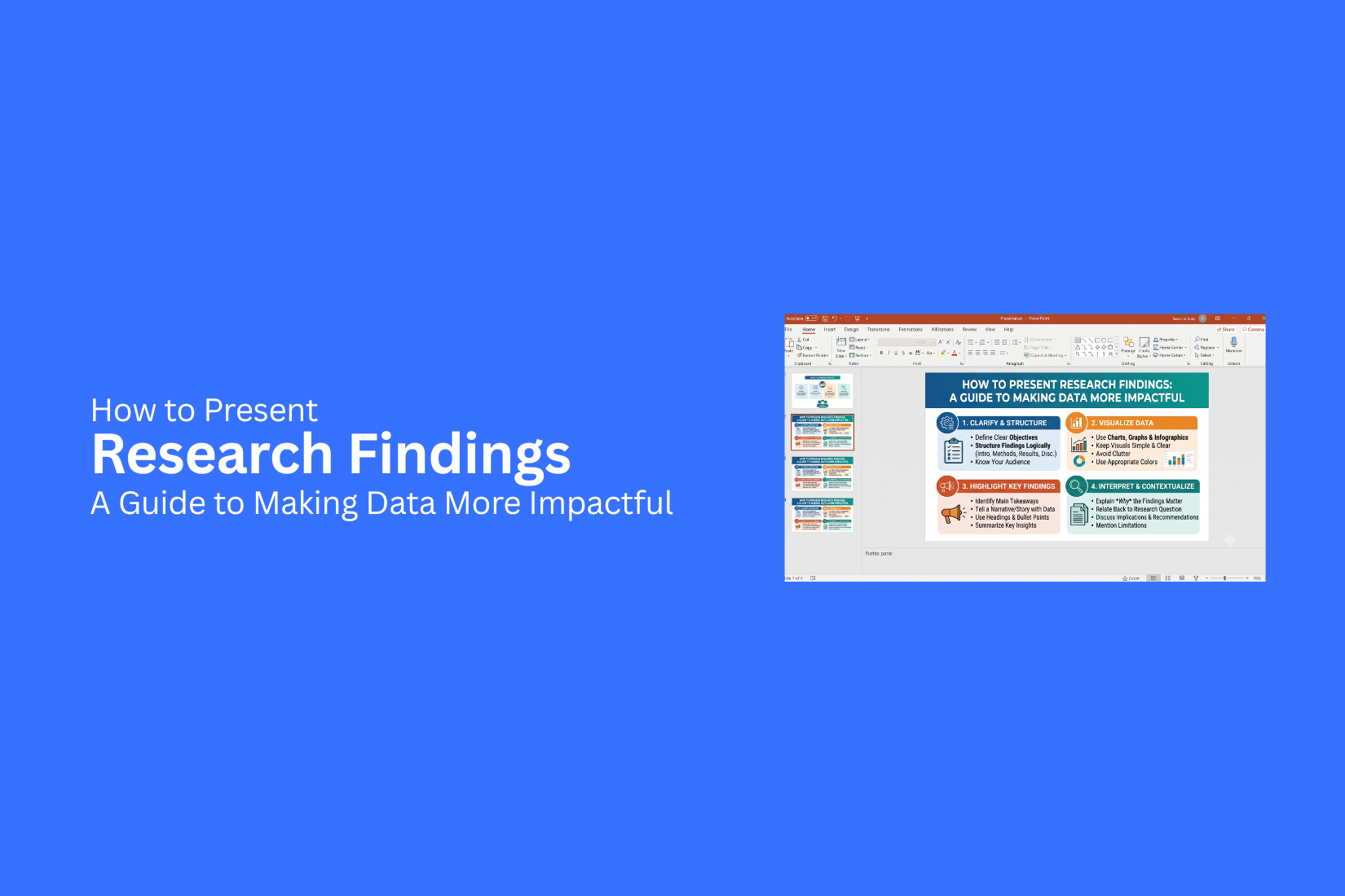
Research findings can hold useful answers, but sharing them clearly is often a challenge. Many presentations include too much data, making key points hard for the audience to follow. A strong research presentation needs more than numbers on slides. Poor presentation choices can hide valuable insights and leave viewers unsure about the meaning behind the results. Data without context may fail to show why the research matters or how the findings can guide decisions. This guide explains how to present research findings with clear structure and simple visuals. It covers ways to prepare data, build slides, share insights, and create a presentation that helps people understand the message behind the research.
What Are Research Findings?
Research findings are the results collected from a study or investigation. They show what the data reveals after researchers gather, review, and analyze information. These findings help explain patterns, answers, or changes related to a research question. They can come from surveys, interviews, experiments, observations, or other data sources. A research finding is more than a set of numbers or facts. It tells a story about what the data means. For example, a survey may show how people use a product, while an experiment may reveal which method works best. Clear research findings help readers understand the main points of a study. They also help researchers share their results with others in a simple and clear way. Presenting findings well requires more than showing data. The way information is organized, explained, and displayed helps people understand the message behind the research.
Why Is It Important to Present Research Findings Effectively?
Research findings often include numbers, patterns, and key details. A clear presentation helps people understand the message behind the data. It turns complex results into ideas that are easier to follow.
A strong presentation helps your audience see what the research shows and why the results matter. Good structure, simple visuals, and clear explanations make the information easier to remember.
Poorly presented findings can confuse people. Even valuable research may lose its effect if the main points are hidden in too many details. A well-planned presentation keeps the focus on the most useful insights. Effective research presentations also help people make better choices. They allow teams, leaders, or readers to use the findings with confidence. Clear communication gives the research a stronger purpose and helps the audience understand the next steps.
How to Prepare Research Findings for a Presentation
A strong research presentation starts with clear preparation. Raw data can feel confusing if it is not organized well. A good structure helps the audience follow your ideas and understand your results.
Start by reviewing your research goals. Know the main question your study answers. Pick the findings that best support your message. Avoid adding too many details that may distract from the key points.
Next, organize your data into simple sections. Group similar findings together. Use charts, graphs, or tables to show numbers in a clear way. Visuals help people understand patterns without reading long blocks of text.
Focus on the main points your audience needs to know. Each slide should share one clear idea. Add short explanations to help explain the data. Your goal is to make the findings easy to follow. Check your sources, numbers, and labels before presenting. Small errors can change how people view your research. A final review helps you share accurate information with confidence. Good preparation creates a smooth path from research notes to a clear presentation. Your audience can follow the story behind the data and understand why the findings matter.
How to Structure a Research Findings Presentation
A strong research findings presentation helps your audience follow your work from start to finish. A clear structure makes your data easier to understand. It also helps people see why your research matters.
A good presentation usually follows a simple path. Start with the reason behind the research. Move into how you collected the data. Then share the main results and explain what they mean. Finish with recommendations that connect your findings to future actions.
Start With the Research Background
Begin by explaining the purpose of your research. Give your audience the context they need before showing any data. Share the main problem, question, or goal behind the study. Explain why the research was needed and what you wanted to discover. Keep this section simple. Your audience should understand the reason for the research before they see the results. A clear background sets the stage for the rest of your presentation.
Explain the Research Methodology
The methodology section shows how you collected and analyzed your data. It helps your audience understand the process behind your findings. Explain the research methods you used. Mention details such as surveys, interviews, experiments, observations, or data sources. Keep the focus on the steps that matter most. A clear explanation builds trust in your results. It shows that your findings came from a planned and organized process.
Present the Key Findings
This section is the main part of your presentation. Share the most important results from your research.
Focus on the findings that answer your main research questions. Use charts, graphs, and visuals to make complex data easier to understand. Avoid showing every piece of information you collected. Too much data can distract your audience. Highlight the results that tell the strongest story.
Interpret the Meaning Behind the Results
Data alone does not explain its value. Your audience needs to know what the findings mean.
Explain the patterns, trends, or connections you discovered. Share why the results matter and how they relate to your original research goals. This part turns numbers into useful insights. It helps your audience understand the bigger message behind the data.
Share Recommendations Based on Findings
End your presentation with clear recommendations. Show how your research can guide decisions or future steps. Connect each recommendation to your findings. Explain the action you suggest and why it makes sense based on the results. A strong closing leaves your audience with a clear direction. It shows how your research can create value beyond the presentation itself.
Best Practices for Presenting Research Findings
Sharing research findings is more than showing numbers on a slide. A clear presentation helps people understand the results and see why they matter. Good slides guide the audience through the data without making them work too hard.
Keep Slides Simple and Focused
A slide should share one main idea at a time. Too much text, too many charts, or extra details can make the message hard to follow. Use short headlines that explain the key point. Add only the data that supports your message. Remove anything that does not help the audience understand the finding.
A clean slide gives people more time to listen to your explanation. The audience should focus on your message, not search through a crowded screen.
Use Data Storytelling Techniques
Research data becomes easier to understand with a clear story. Start with the question your research answers. Then show the findings and explain what the numbers reveal. Use charts, graphs, and visuals to help explain patterns. A good story connects each part of the research. It helps the audience follow the journey from the problem to the result. Keep your explanation simple. Focus on what the data shows and why the finding matters.
Highlight Important Numbers and Trends
Not every number needs the same level of attention. Focus on the results that support your main message. Use bold text, labels, or visual markers to point out key numbers. Show changes, growth, drops, or patterns that help explain the research. A strong presentation helps the audience quickly see the main results instead of searching through a list of data points.
Maintain Consistent Slide Design
A consistent design makes your research presentation easier to follow. Use the same fonts, colors, layouts, and chart styles across your slides. Keep titles, images, and data sections in similar positions. This creates a smooth viewing experience and keeps attention on the findings. A simple design also makes your work look organized and professional.
Practice Explaining Your Findings Clearly
Practice helps you explain your research with confidence. Read through your slides and check if each point is easy to understand. Use simple words to explain complex ideas. Avoid reading every word from the slide. Your slides should support your talk, not replace it. Practice answering questions about your research. This helps you prepare for discussions and explain your findings in a clear way.
Common Mistakes to Avoid When Presenting Research Findings
Research findings can lose their value if they are not shared in a clear way. A strong presentation does more than show facts. It helps the audience understand what the data means and why it matters. Avoiding common mistakes can make your research easier to follow and more useful.
Adding Too Much Data to Slides
A slide filled with too many numbers can make it hard for people to follow your message. Large data sets may hide the main points you want to share. Choose the most useful data for each slide. Use simple charts, short text, and key numbers to guide the audience. A clean slide gives people more time to understand your findings.
Using Confusing Charts and Visuals
Charts and visuals should make data easier to understand. A chart with too many details, colors, or labels can create confusion. Pick a visual style that matches your message. Use simple graphs that show the main pattern or change. Every chart should have a clear purpose and support your research story.
Presenting Results Without Context
Numbers alone do not tell the full story. Your audience needs to know what the results mean and why they matter. Add background details before showing key findings. Explain the goal of the research, the method used, and what the results show. This gives your audience a clearer view of the data.
Ignoring the Audience’s Knowledge Level
Every audience has a different level of understanding. A technical presentation may confuse people who are not familiar with the topic. Use words your audience can understand. Explain complex ideas with simple examples. A clear message helps more people connect with your research.
Focusing Only on Numbers Instead of Insights
Numbers are only one part of a research presentation. The real value comes from explaining the meaning behind those numbers. Share the lessons from your findings. Explain trends, patterns, and possible actions based on the data. This helps your audience see the value of your research beyond the figures.
How to Make Research Findings More Engaging
Research findings can feel hard to follow if they only show numbers and charts. A strong presentation helps people understand the message behind the data. Simple storytelling, clear examples, and audience involvement can make your findings easier to follow.
Turn Data Into a Clear Story
Numbers alone may not explain why your research matters. A clear story gives your data a purpose. Start with the main question your research answers. Then guide your audience through the key points.
Use a simple structure. Explain the problem, share the findings, and show what the results mean. This flow helps people follow your message without getting lost in details.
Use Real-World Examples
Examples help people connect with research findings. A real situation can show how your data relates to everyday experiences. Add short stories, case examples, or simple scenarios that match your research. These examples help explain complex ideas in a way that feels familiar.
Highlight Unexpected Insights
Some findings may reveal results that people did not expect. These points can create interest and encourage deeper thinking. Show why these results stand out. Explain what the data shows and why it matters. A surprising detail can help your audience remember your main message.
Add Audience Interaction
A presentation becomes more active when the audience can take part. Ask questions, run quick polls, or invite short discussions. Simple activities can help people connect with your research. They also give you a chance to understand how your audience views the findings.
Connect Findings With Practical Outcomes
Research becomes more useful when people see how they can apply it. Explain how your findings can support decisions, solve problems, or guide future actions. Focus on the next steps your audience can take. Clear outcomes help turn research from a set of results into a useful tool.
Tools for Presenting Research Findings
The right tools help turn research results into clear presentations. A good tool makes data easier to read, helps organize key points, and keeps the audience focused. Different projects need different features, so choose a tool that fits your research goals and presentation style.
PowerPoint for Research Presentations
PowerPoint is a common choice for research presentations. It offers many ways to organize data, add charts, and create structured slides. Researchers can use tables, graphs, images, and text boxes to explain their findings step by step. PowerPoint also works well for academic talks, business reports, and conference presentations. Its slide layouts help keep information organized. Speakers can highlight key results without adding too much text to each slide.
Google Slides for Collaborative Presentations
Google Slides makes it easier for teams to work on the same research presentation. Multiple people can edit slides, add comments, and share ideas from different locations. This tool is useful for group projects and research teams. It keeps updates in one place and helps team members review changes before the final presentation. Google Slides also includes simple charts, images, and design options for clear research slides.
Canva for Visual Research Slides
Canva helps users create clean and attractive research slides with ready-made templates. It offers design tools for adding icons, charts, images, and layouts. Researchers can use Canva to make complex information easier to understand. A well-designed slide can help the audience follow data points and key findings. Canva works well for reports that need a strong visual style.
Data Visualization Tools for Better Insights
Data visualization tools help turn numbers into charts, graphs, and visual reports. They make patterns and trends easier to spot. Tools that create interactive charts can help audiences understand large amounts of data. Bar charts, line graphs, and dashboards can show research results in a simple way. These visuals support the main message and help explain findings with less effort.
Final Notes
A research presentation is more than a collection of numbers and charts. The way you organize, explain, and display your findings helps people understand the message behind your work. Start with a clear goal. Share the research background, explain the method, present the key findings, and show what the results mean. This structure helps your audience follow your ideas from start to finish.
Keep your slides simple and focused. Use visuals that support your data instead of adding extra details. Charts, graphs, and examples can help explain your findings in a way that feels clear and easy to follow. A strong presentation also connects research with action. Show how your findings can guide decisions, solve problems, or support future steps. Clear communication helps your research create a stronger impact and gives your audience a better understanding of the results.
FAQs
What are research findings?
Research findings are the results collected from a study or investigation. They show what the data reveals after researchers gather, review, and analyze information. These findings help explain patterns, answers, or changes related to a research question.
Why should research findings be presented clearly?
A clear presentation helps people understand the meaning behind the data. It makes complex results easier to follow and helps the audience see why the findings matter.
What should a research findings presentation include?
A research findings presentation should include the research background, methodology, key findings, meaning behind the results, and recommendations. This structure helps guide the audience through the study.
How can I make research slides easier to understand?
Keep each slide focused on one main idea. Use short text, simple charts, and useful visuals. Remove extra details that may distract the audience from the main message.
How do charts help in a research presentation?
Charts help show patterns, changes, and key numbers in a simple way. They make data easier to understand and help the audience focus on the main results.
Should I include all research data in my presentation?
No. Include the data that supports your main message. Too much information can hide the most useful findings and make the presentation harder to follow.
How can I explain research findings better?
Explain what the data shows and why the results matter. Add context, share examples, and connect the findings to practical outcomes.
What are common mistakes in research presentations?
Common mistakes include adding too much data, using confusing visuals, presenting results without context, and focusing only on numbers instead of insights.
Which tools can I use to present research findings?
Tools such as PowerPoint, Google Slides, and Canva can help create research presentations. Data visualization tools can also help turn numbers into easy-to-read charts and reports.
How can I make a research presentation more engaging?
Use simple stories, real examples, and audience activities such as questions or quick polls. These methods help people connect with the research and understand the main message.



You may also be interested in ...

How To Create An Eye-Catching Portfolio
If you’re looking to create an eye-catching portfolio, this post will come in handy. In this article, you can find the easies...
23 Jun, 2024

How To Easily Create An Infographic
Infographics are the perfect way to make a presentation that will impact an audience, but their design and composition might...
08 Jun, 2024

PowerPoint Template Tips & Tricks You Ne...
PowerPoint seems to be an unknown world for many people, especially those who have been assigned to create a presentation out...
08 Jun, 2024