Tech Stack Icons for Your Software Architecture Slides
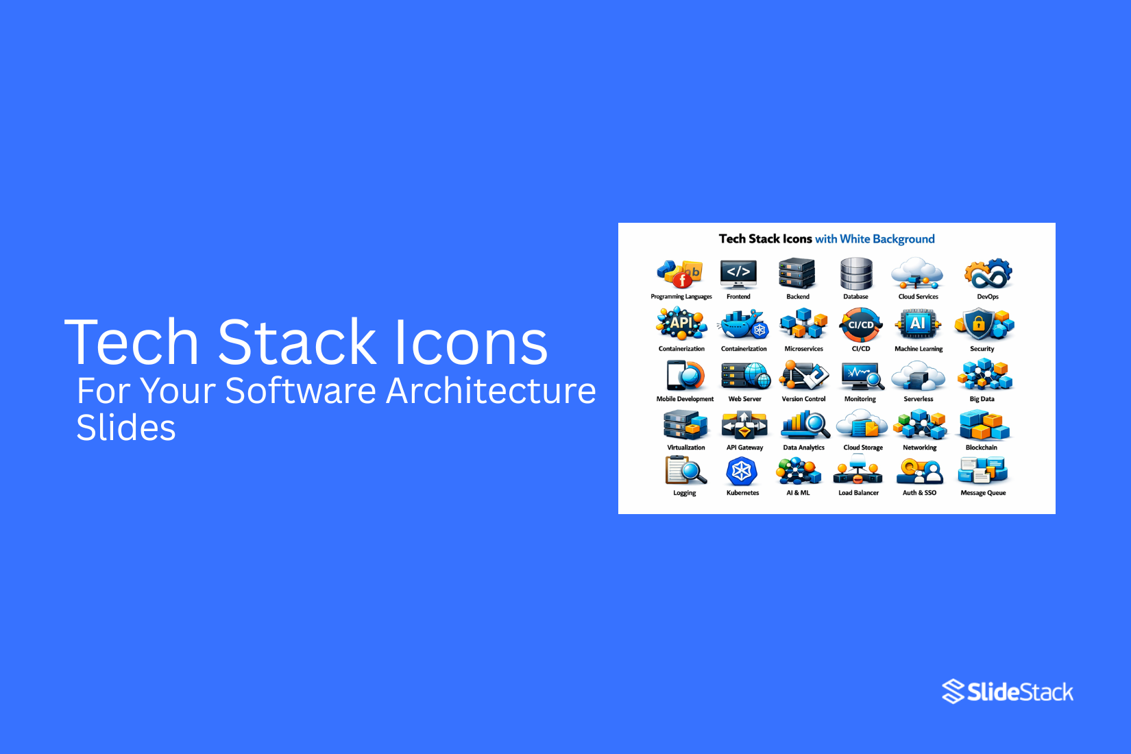
Software architecture slides often look crowded and hard to follow. Different tools, services, and systems sit together without a clear structure. This makes it hard for teams to explain how everything connects.
We use tech stack icons to fix this gap. These icons represent cloud services, databases, frameworks, and tools in a simple visual form. They create a shared way to read system design slides.
With clear icons, complex systems become easier to scan. Teams can understand structure faster during meetings and planning sessions. It also reduces confusion between technical and non-technical viewers. This guide explains icon types, where to find them, and how to build clean architecture slides step by step.
What Are Tech Stack Icons
Tech stack icons are small visual symbols. Each icon shows a specific tool or technology used in software systems. These icons represent things like databases, cloud services, programming languages, and frameworks. Each one has its own simple image. For example, a database icon shows where data is stored. A cloud icon shows services that run online.
Teams use these icons in software architecture slides. They help explain system parts without long text. A viewer can scan the slide and understand what tools are used. Each icon works like a label. It gives a quick visual clue about the role of a tool in the system. This keeps diagrams clear and easier to follow.
Why Visual Icons Matter in Software Architecture Presentations
In software architecture presentations, icons carry meaning that text alone struggles to deliver. A service icon like Azure Machine Learning or AWS Lambda is recognized instantly by technical teams. It signals function, ownership, and placement within a system without requiring extra explanation. Non-technical stakeholders also gain a quick reference point. The symbol anchors the discussion in something familiar, even if the underlying service is complex.
Text-heavy architecture slides create a different experience. Every service name must be read, parsed, and interpreted. That slows down communication and places extra demand on attention during discussions. A diagram filled with only labels and arrows forces the audience to switch between reading and listening at the same time. That split focus reduces clarity and weakens retention of key system relationships.
Official icons change the quality of that communication. Cloud provider icon sets from Microsoft Azure, Amazon Web Services, and Google Cloud are designed to represent exact services. They carry a level of precision that generic icons cannot match. A generic cloud or database symbol only suggests meaning. It does not confirm what service is actually in use. That gap can lead to misunderstanding in technical reviews.
Enterprise settings raise the stakes further. Architecture diagrams appear in procurement discussions, security audits, and executive presentations. In these contexts, visual accuracy is treated as part of technical correctness. Using official service icons signals discipline in system design documentation. It shows that the diagram reflects real infrastructure rather than a simplified interpretation. That level of precision supports trust during decision-making and reduces back-and-forth clarification across teams.
Types of Tech Stack Icons
Tech stack icons help show how a system is built. Each icon points to a part of the system. They make slides easier to read. They also help teams stay on the same page.
Frontend Icons
Frontend icons show what users see on the screen. They represent the visual layer of an app. This includes web pages and mobile screens. Common frontend tools include React, Angular, and Vue. Each one has its own icon. These icons help identify which framework powers the user interface. A slide becomes clearer when these icons sit near the user-facing layer. The audience can quickly link design with function.
Backend Icons
Backend icons represent the logic behind an app. This is where data is processed. It handles requests from the frontend. Icons for Node.js, Java, Python, and .NET are common here. Each one shows a different backend language or framework. These icons help explain how requests move through the system. They also show which tools run the core application logic.
Database Icons
Database icons show where data is stored. They represent systems that keep information safe and organized. MySQL, PostgreSQL, MongoDB, and Redis are often used. Each has a distinct icon that signals how data is managed. These icons help viewers understand storage choices. They also show if the system uses structured or flexible data models.
Cloud & Hosting Icons
Cloud and hosting icons show where the system lives. They point to platforms that run and scale applications. AWS, Microsoft Azure, and Google Cloud are common examples. Each icon marks a different hosting provider. These icons help explain deployment choices. They also show how the system handles traffic and availability.
DevOps & Tools Icons
DevOps and tools icons show how software is built and delivered. They represent automation, testing, and deployment steps. Docker, Kubernetes, GitHub, and Jenkins are widely used. Each icon shows a part of the delivery pipeline. These icons help explain how code moves from development to production. They also show how teams manage updates and system health.
Where to Find Official Tech Stack Icons
Cloud architecture diagrams rely on official icon sets. These icons help teams show systems in a clear way. Each cloud provider uses its own library. The access method, file format, and structure are not the same across platforms. Microsoft Azure, Amazon Web Services, and Google Cloud each publish official icon packs. These packs are built for architecture slides, system design docs, and engineering reviews.
Microsoft Azure Icons
Microsoft provides Azure icons through its official architecture icon library. The download is available from Microsoft’s Azure branding and architecture resources page. The files come in a ZIP folder. Inside the folder are SVG and PNG formats. The icons are sorted by service groups. These include compute, networking, storage, databases, identity, and AI services. Each group matches how Azure organizes its services in the platform. SVG files work best in PowerPoint. They stay sharp at any size. PNG files are useful for quick drag-and-drop use in slides. Most teams use SVG for final diagrams because it keeps layouts clean.
Azure icons follow a consistent visual style. This helps diagrams stay uniform even when mixing many services. Compute, data, and AI services still look like part of the same system. AI and machine learning diagrams often use Azure Machine Learning, Azure OpenAI Service, and Azure AI Foundry icons. These icons sit in the AI and machine learning section of the library. Many real systems combine these with storage and compute icons. That setup helps show full workflows from data input to model output in a clear flow.
Amazon Web Services Icons
Amazon Web Services provides a large official icon library for architecture work. The download is available through the AWS Architecture Center. The package includes SVG and PNG files. It also includes templates for common architecture layouts. The icons are grouped into resource icons and service icons. Resource icons show components like EC2 instances or S3 buckets. Service icons show broader tools like Lambda or DynamoDB. This structure helps when building system diagrams. Resource icons often show the parts inside a system. Service icons show the managed services that connect those parts.
AI and machine learning diagrams often use Amazon SageMaker, Amazon Bedrock, and AWS Trainium icons. SageMaker also includes sub-icons. These cover Studio, training jobs, and endpoints. Each one shows a different stage of the ML process. This level of detail helps explain full pipelines. One part shows data preparation. Another part shows training. Another part shows model serving. The icons help keep each step separate without adding extra text.
Google Cloud Platform Icons
Google Cloud provides official icons through its cloud documentation site. The download includes SVG and PNG formats. It also includes files ready for diagram tools like draw.io and Lucidchart. The icons are grouped by product area. These include compute, storage, networking, data, and AI services. Each icon matches a specific Google Cloud service. The visual style is simple and rounded. This makes diagrams feel less dense. It also keeps layouts easy to read on slides and reports.
AI and machine learning diagrams often use Vertex AI, Cloud TPU, and BigQuery icons. Vertex AI often acts as the main symbol for machine learning systems. It represents the full ML platform rather than a single step. Other icons support it. Cloud Storage shows data input. BigQuery shows data preparation. TPUs or GPUs show training work. This structure helps show the full pipeline in a clear way without needing extra labels. Google Cloud also treats its AI platform as a unified system. This means fewer separate icons for sub-services. The diagram design usually focuses on Vertex AI as the main anchor.
Where to Find Programming Language and Framework Icons
Cloud icons usually show the infrastructure layer of a system. That only tells part of the story. Most software also depends on programming languages and frameworks. Python runs data pipelines. JavaScript and React power user interfaces. Java, PHP, and Node.js support backend systems. SQL tools manage stored data. These parts also need clear visual icons in architecture slides. Cloud provider icons follow strict brand rules. Programming and framework icons come from open libraries. That difference affects how they are used in presentations, licensing, and distribution.
Devicon
Devicon is an open-source icon library on GitHub. It includes icons for more than 200 programming languages, frameworks, and tools. It covers Python, JavaScript, TypeScript, React, Node.js, Java, Go, Rust, PHP, Docker, Kubernetes, PostgreSQL, MySQL, and MongoDB.
The license is MIT. This allows use in slides, documents, and commercial work with no heavy limits. Each icon often comes in multiple styles. A colored version matches the official brand look. A plain version supports clean, minimal slides. A wordmark version includes both symbol and text. Colored icons work well in architecture diagrams. They help the viewer separate tools quickly. Devicon files are available through GitHub and also through CDN access for design tools.
Simple Icons
Simple Icons is an open-source library available at simpleicons.org. It focuses on brand logos for technology tools, frameworks, and programming languages. The style is uniform. Every icon uses a flat and single-color design. This creates visual balance across large diagrams.
The library includes database tools, development frameworks, cloud platforms, and version control systems. It also includes SQL-related technologies like SQLite and common database engines. Each icon includes an official brand color reference. This gives a guide for matching real-world branding while still keeping control over slide design choices. Simple Icons also connects with the Iconify system. That system brings multiple icon libraries into one search space. It helps keep asset sourcing in one place.
SlideStack Icons
SlideStack Icons is a presentation-focused icon library built for software architecture and slide design work. It includes programming language icons, framework symbols, and general diagram assets used in technical decks. The library is organized for direct search inside a navigation bar. A search for JavaScript brings up multiple icon styles. A search for React or Python follows the same structure. This setup reduces the time spent locating specific technologies during slide creation.
Icon sets are grouped by technology type. Frontend tools, backend frameworks, databases, and infrastructure visuals sit in separate collections. This helps keep architecture diagrams structured and easy to read. Each icon is designed for scaling across slide formats. Files can be reused across multiple presentations without quality loss. This supports consistent design across large slide decks that include repeated system diagrams.
Using Programming Language Icons in PowerPoint
PowerPoint supports SVG icons from libraries like Devicon and SlideStack. SVG files keep their quality at any size, which helps in architecture diagrams with zoomed sections. A structured folder system keeps icons easy to reuse. Each technology name matches a file name inside the library. JavaScript often appears as “js”. PostgreSQL often appears as “postgresql”.
Architecture diagrams often combine cloud icons with programming icons. A single style choice keeps the slide clean. Cloud icons use official brand colors. Programming icons can follow either colored or plain styles. Size consistency across all icons creates balance. Each layer of the system should use the same visual scale. Frontend tools, backend frameworks, and databases stay grouped in separate rows or sections. This structure keeps the reading flow clear for viewers.
Brand Guidelines and Permitted Use
Permitted use of cloud and technology icons sits within clear boundaries defined by each provider. Microsoft Azure, Amazon Web Services, and Google Cloud publish official brand rules that explain how their visual assets can be used. The core allowance is consistent across providers. Their icons can be used to represent services in technical documentation, system diagrams, and architecture slides. This use supports the explanation of infrastructure and system design. The restriction begins when those same assets move into marketing or promotional framing. Using cloud icons in a way that suggests partnership, certification, or official endorsement goes beyond permitted use. A diagram showing Azure services inside a system flow remains technical. A banner using Azure branding to promote a product or service creates an implied commercial relationship. That shift changes the meaning of the asset and introduces compliance risk.
For presentation work, this distinction becomes central. Architecture decks rely on icons to map services and data flows. The goal is clarity, not branding association. Consulting materials, internal documentation, and client delivery slides stay within this technical boundary when icons are used as system references. Template libraries and design platforms also operate within these rules. Redistribution of official cloud logos or icon sets inside downloadable templates is restricted because it moves beyond individual professional use. This is why many presentation marketplaces avoid including full provider icon libraries in their assets.
Design consistency still plays a role in presentation quality. Visual adjustments such as spacing, alignment, or subtle styling can be applied, provided the underlying meaning of the icon remains unchanged. The icon must continue to represent the service without suggesting alteration of the brand mark itself. A final review against provider guidelines is standard practice before external release. This step is particularly relevant in consulting environments and agency work where client-facing decks may be shared beyond internal teams.
How to Present a Tech Stack in PowerPoint
The structure of a tech stack presentation depends on the audience in the room. Executive groups focus on outcomes and business impact. Product teams look for how systems support features and delivery. Engineering teams focus on services, dependencies, and system flow. A single slide rarely works for all groups. A layered set of slides gives each group the level of detail they need without confusion.
A strong tech stack presentation follows a clear story path. Start with the problem the system is designed to solve. Move into the solution that shows the overall architecture at a high level. Then shift into the components that make up the system, including services, platforms, and connections. This sequence turns technical detail into structured meaning. A roadmap slide can sit alongside this flow to show how the system evolves over time and how current choices connect to future direction.
Slide design matters as much as content order. Group services by layer so the viewer can scan the system quickly. Frontend, backend, data storage, cloud infrastructure, and delivery tools should sit in clear visual zones. Data flow should be shown as movement through these layers rather than a static list of tools. Entity and service relationships help explain how parts of the system interact. A final separation between architecture slides and decision slides keeps structure and reasoning distinct, so technical detail stays clear while business justification remains easy to follow.
Presenting AI Workloads: Azure, AWS, and Google Cloud
Azure AI workloads sit on a clear set of services that map directly to Microsoft’s official icon library. AI agents use Azure AI Foundry, Azure OpenAI Service, and Azure Machine Learning as core components. Data moves through Azure Storage and Azure networking services that support the training and deployment flow. Each icon represents a real system part, not a concept. Architecture diagrams stay readable when compute, model services, and data layers use their correct Azure symbols. This keeps AI pipelines easy to trace from ingestion to deployment across enterprise systems.
AWS LLM training workloads map to a broad set of production services. Amazon SageMaker handles model training and deployment. Amazon Bedrock supports foundation model access. AWS Trainium supports high-performance training compute. Amazon S3 holds training data and model artifacts. AWS Glue manages data preparation before training begins. Architecture diagrams often pair these services with operational views that show training cost, throughput, and run duration. AWS icons help separate data flow, compute workload, and monitoring layers in a single pipeline view.
Google Cloud VLM training workloads center on Vertex AI as the main platform layer. Cloud TPUs provide training acceleration. Google Kubernetes Engine runs containerized training and serving workloads. Cloud Storage manages datasets and model outputs. BigQuery supports large-scale data preparation before training starts. Vertex AI connects these services into one pipeline that covers training, tuning, and deployment. The Vertex AI icon is used as a key reference point in architecture diagrams. It signals that the system is built on a managed ML platform rather than a generic AI setup.
Best Practices for Using Tech Stack Icons
Keep icon style the same across all slides. Do not mix different visual styles. Use icons from official icon libraries. Stick to one source for a clean look. Match icon sizes across every slide. Uneven sizes create distraction. Limit the number of icons on each slide. Too many icons make slides crowded. Keep space around each icon. This helps each element stand out clearly. Use simple backgrounds behind icons. Busy backgrounds reduce clarity. Use color with purpose. Do not use color for decoration only. Keep labels short under each icon. Short text is easier to read quickly. Group related tools in the same area. This helps viewers see connections fast.
How to Structure a Clean Architecture Slide
A clean architecture slide shows how a system is built. It presents parts of a system in a clear way. Each part has a clear role. The goal is easy reading and quick understanding. Most slides follow a layered structure. The top layer often shows the user interface. The middle layer shows services or logic. The bottom layer shows data storage and infrastructure. Each layer stays separate so the flow is easy to follow.
Icons help show each service in a simple way. A database icon marks storage. A cloud icon marks hosting. A code icon marks application logic. Small and consistent icons keep the slide clear. Space matters in the layout. Too many elements in one area make the slide hard to read. Clear gaps between layers help the eye move down the structure. Alignment keeps everything in order. Text should stay short. Each label should describe only the core function. Long sentences make the slide crowded. Simple words keep focus on structure rather than detail.
Common Mistakes to Avoid
Icons make a tech stack slide easier to read. Poor use of icons does the opposite. It creates confusion and slows down understanding. One common issue is mixing styles. Some slides use flat icons, while others use 3D or outlined versions. The result looks inconsistent. A clean slide needs one visual style across all icons. Another mistake is using too many icons in one place. A crowded slide makes it hard to follow the system flow. Each section of the architecture should stay simple. Only show what supports the message.
Some teams also pick icons that do not match real services. A generic database icon might replace a specific cloud database service. This removes clarity. Viewers lose track of what system is actually used. Color misuse also causes problems. Bright and random colors pull attention away from structure. Most tech stack slides work better with neutral tones and limited color accents. Size imbalance is another issue. Some icons appear too large, others too small. This breaks the visual hierarchy. Important components should stand out without overwhelming the slide.
Labeling is often missing or unclear. Without clear names, even good icons lose meaning. A short label next to each icon helps the audience follow the architecture quickly. Spacing matters as well. Tight grouping makes systems look tangled. Proper spacing keeps each layer readable and organized. A strong slide keeps focus on clarity. Simple choices in icon style, size, and labeling improve how the whole architecture is understood.
Where to Use Tech Stack Icon Packs
Tech stack icon packs help explain system design in a clear way. They turn complex setups into simple visuals. Architecture slides are one of the main places they are used. A slide can show how services connect. Each icon stands for a tool or service. This makes the structure easy to scan in seconds. They also work well in system diagrams for teams. Engineers use them to map backend services, databases, and APIs. Product teams use them to explain how features connect to services behind the app.
Client presentations benefit from them too. A clean diagram builds trust. It shows how the system is built without long explanations. Stakeholders can follow the flow from front end to backend with ease. Documentation is another common use. Internal wikis and onboarding guides often include architecture visuals. Icons help new team members understand the system faster. Training materials also rely on them. A visual layout helps learners see how each part of a system fits together.
Final Notes
Technical presentations often fail when clarity breaks down between technical teams and business stakeholders. The same architecture can look clear to one group and unclear to another. Strong design removes this gap through structure and visual consistency. Icon systems support this by giving each service a stable visual identity. Teams can scan a diagram and quickly recognize components without reading long labels. This reduces confusion in complex cloud setups.
Slide structure carries the message forward in layers. A high-level view sets the context. A deeper slide then shows service connections. A final layer can focus on specific components such as AI workloads or data flows. This step-by-step structure keeps attention steady across mixed audiences. AI workload framing needs extra clarity. Services like model hosting, data storage, and networking must stay visually separated. Clear boundaries help avoid mixing system roles. This improves understanding of how each part supports the wider solution.
Business alignment connects the technical map to outcomes. Each service should relate back to a clear function, such as performance, scale, or user delivery. This link helps non-technical stakeholders follow the value behind the architecture. Official icon libraries and brand rules keep visuals consistent across teams. Clear spacing and readable labels improve legibility on every slide. These details protect accuracy and reduce misinterpretation in large presentations. Strong technical storytelling depends on structure, visual order, and consistent rules across every layer of the design.
FAQs:
1. Where can I download official Azure icons for my presentations?
Official Azure icons are available in the icon library from Microsoft. The library includes service symbols used in system diagrams and slides. The files come in a downloadable package for design work.
2. Are AWS architecture icons free to use in technical presentations?
AWS architecture icons from Amazon Web Services are provided for technical presentations. They support system diagrams and learning materials. Usage follows the brand rules set by Amazon Web Services.
3. Where do I find Google Cloud icons for my slides?
Google Cloud icons are available in the official icon set from Google Cloud. The set includes product and service symbols used in diagrams and slides. The files are provided for design and documentation work.
4. Can I include cloud provider logos in a client-facing deck?
Cloud provider logos from Microsoft, Amazon Web Services, and Google Cloud can appear in client-facing decks. The logos represent services and system components in diagrams. Brand rules from each provider guide proper usage.
5. What file format should I use for cloud icons in PowerPoint?
PowerPoint slides often use PNG or SVG files for cloud icons. SVG keeps shapes sharp at any size. PNG works well for static slide images.
6. How do I structure a tech stack presentation for a non-technical audience?
Start with a simple system overview slide. Follow with grouped layers such as frontend, backend, and data. End with a clear diagram that shows how parts connect.
7. How often are the official cloud icon libraries updated?
Microsoft, Amazon Web Services, and Google Cloud update their icon libraries on a regular schedule. New services and changes appear in updated packages. Checking the official libraries keeps content current.
8. Can I apply visual effects such as shadows or color overlays to cloud service icons?
Cloud icons work best close to their original design. Heavy shadows or color overlays can reduce clarity. Simple spacing and light effects keep slides readable.
9. How many cloud service icons can one slide display before becoming unreadable?
A small number of cloud service icons per slide keeps content clear. Too many icons make details harder to read. Grouping services into sections helps maintain structure.
10. What is the difference between a tech stack slide and a tech stack deck?
A tech stack slide shows one part of a system. A tech stack deck covers the full system across multiple slides. A deck shows the complete structure step by step.
11. What is the recommended slide count for a tech stack presentation?
A tech stack presentation uses a number of slides based on system size. Smaller systems need fewer slides. Larger systems need more slides to show all components clearly.



You may also be interested in ...

How To Create An Eye-Catching Portfolio
If you’re looking to create an eye-catching portfolio, this post will come in handy. In this article, you can find the easies...
23 Jun, 2024

How To Easily Create An Infographic
Infographics are the perfect way to make a presentation that will impact an audience, but their design and composition might...
08 Jun, 2024

PowerPoint Template Tips & Tricks You Ne...
PowerPoint seems to be an unknown world for many people, especially those who have been assigned to create a presentation out...
08 Jun, 2024