How to Edit a Candlestick Chart PowerPoint Template
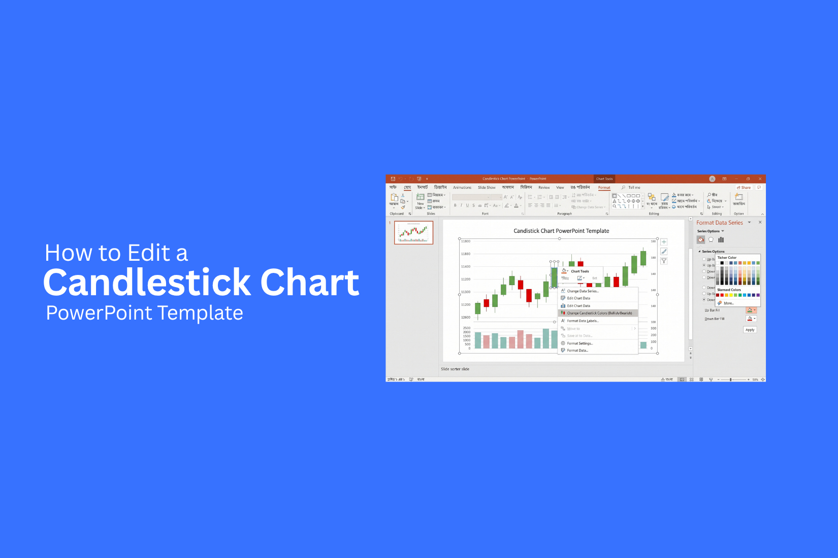
Editing a candlestick chart PowerPoint template can be hard, especially when the sample data does not match your market data. You may also need to change chart colors, labels, axes, and other details to fit your presentation.
An unedited chart can make price data harder to read. Too many candlesticks can crowd the slide. Small labels, unclear colors, or incorrect values can also distract your audience from the key price changes. A few simple edits can make the chart clearer and easier to follow.
This guide shows you how to edit a candlestick chart PowerPoint template step by step. You will learn how to replace sample data, change the chart design, add more data, edit multiple charts, and prepare the final file for sharing.
What Is a Candlestick Chart?
A candlestick chart shows how the price of an asset changes over a set period. Traders often use it to track stocks, currencies, or other financial assets.
Each candlestick shows four key price points:
• Open: The price at the start of the period.
• High: The highest price reached during the period.
• Low: The lowest price reached during the period.
• Close: The price at the end of the period.
The wide part of a candlestick is called the body. Thin lines above and below the body are called wicks or shadows. The body shows the opening and closing prices. The wicks show the highest and lowest prices.
Candlestick colors can also show price movement. A green candle often shows that the closing price was higher than the opening price. A red candle often shows that the closing price was lower. A PowerPoint candlestick chart can turn this price data into a clear visual. You can edit its colors, labels, fonts, and other design elements to match your presentation.
What You Need Before Editing the Template
Before you edit a candlestick chart PowerPoint template, prepare the basic content and tools you need. This helps you edit each slide with less effort and keeps the chart easy to read.
• PowerPoint: Use a version that lets you edit charts and slide elements.
• Your market data: Keep your stock or trading data ready. This may include open, high, low, and close prices.
• Chart details: Know the time range and data points you want to show.
• Brand assets: Have your logo, brand colors, and preferred fonts ready.
• Key numbers: Mark the prices or trends you want to highlight.
• Template file: Keep a copy of the original template before making changes.
Once these items are ready, you can start editing the candlestick chart and adjust the slide for your presentation.
How to Edit a Candlestick Chart PowerPoint Template
A candlestick chart template gives you a ready-made layout for showing price data. You can replace the sample numbers, change the chart style, and adjust the slide to match your presentation. PowerPoint also connects the chart to an Excel data sheet, so you can make detailed data changes without rebuilding the chart.
Step 1: Open the PowerPoint Template
Open the candlestick chart PowerPoint template in PowerPoint. Go to the slide that contains the chart you want to edit. Before making changes, save a separate copy of the presentation. This gives you a backup of the original template. Check the slide layout before editing the chart. Look at the chart size, title, colors, and other elements. This helps you plan the changes without affecting the overall slide design. You can also remove any sample text that you do not need. Keep the main chart area clear so your data remains easy to read.
Step 2: Select the Candlestick Chart
Click the candlestick chart once to select it. You should see a border around the chart. PowerPoint will show chart-related options in the ribbon. These tools let you edit the chart, change its design, and adjust its layout. Right-click the chart to see more editing options. You may see options such as Edit Data, Format Chart Area, and Select Data. Take a moment to identify the chart elements before making changes. The chart title, axes, legend, and plot area can each be edited separately.
Step 3: Replace the Sample Data
The sample data controls the candlesticks shown on the chart. Replace these values with the data you want to present. Select the chart and go to Chart Design > Edit Data. An Excel worksheet will open inside or beside PowerPoint.
Look at the existing rows and columns before entering new values. Match your data with the same structure used by the template. Replace the sample values with your own numbers. Keep the entries organized by date or time period. After entering the values, close the Excel sheet or return to PowerPoint. The chart should update with your new data. Check the chart after the update. Look for missing values, incorrect dates, or unusual candlestick shapes.
Step 4: Edit the Chart Data in Excel
PowerPoint uses an Excel data sheet to control the chart. This gives you more control over the values behind each candlestick. Select the chart and choose Chart Design > Edit Data. Excel will display the data connected to the chart. Review the column headings first. A typical candlestick chart uses values such as opening price, closing price, high price, and low price. Use the data structure provided by your template.
Edit each value carefully. A small number change can affect the size and direction of a candlestick. You can also add new rows for more dates or periods. Keep the same column structure throughout the data sheet. After editing the values, return to PowerPoint. Review the updated chart to make sure the data appears correctly.
Step 5: Update the Data Range
Adding new data does not always mean the chart will include it automatically. You may need to update the chart's data range. Select the chart and go to Chart Design > Select Data. The Select Data Source window will open. Look at the selected range in the data field. Make sure it covers every row and column you want to use.
For example, your template may contain data for 10 trading days. Your new data may cover 20 days. Expand the range to include the additional rows. Click OK after selecting the correct range. Check the chart again to make sure all the required candlesticks appear. This step also helps remove unwanted sample data from the chart. A correct range keeps the chart focused on your actual data.
Step 6: Change the Chart Colors
The template may use colors that do not match your presentation. PowerPoint lets you change the chart colors without rebuilding the chart. Select the chart and open the Chart Design tab. Choose Change Colors to view the available color sets. Pick colors that make the candlesticks easy to read. Use clear differences between upward and downward price movement.
You can also format individual chart elements. Right-click a chart element and use the formatting options to adjust its fill, line, or other settings. Keep the number of colors low. Too many colors can make financial data harder to read. Match the chart colors with the rest of your slide. This creates a more consistent presentation without changing the chart's main purpose.
Step 7: Edit the Chart Title and Labels
The chart title should tell the audience what the data represents. Replace the sample title with a short and specific title. Click the existing title and type your new text. A title such as ABC Stock Price Movement gives more context than a general title such as Candlestick Chart. You can also edit axis titles and other labels. Select the text you want to change and enter the new wording.
Check the date labels along the horizontal axis. Make sure they are easy to read and match the time period shown in your data. Remove labels that add little value. A chart with too much text can become hard to scan. Adjust the font size if needed. Make sure the title and labels are large enough to read from a distance.
Step 8: Adjust the Chart Axes
The chart axes control the scale and range of the displayed data. A poor scale can make price changes look larger or smaller than they are. Select the vertical or horizontal axis. Right-click it and choose Format Axis. The formatting panel gives you control over settings such as the minimum value, maximum value, major units, and number format.
Adjust the vertical axis to fit your price range. Avoid leaving a large amount of unused space above or below the data. You can also adjust the horizontal axis to control how dates are displayed. This helps keep the chart readable, especially with many data points. Review the chart after each change. The goal is to make the price movement clear without distorting the data.
Step 9: Resize and Reposition the Chart
The chart size affects how easily your audience can read the data. A chart that is too small may make the candles, labels, and axes hard to see. Click the chart to select it. Drag a corner handle to resize it while keeping its proportions. Move the chart by clicking and dragging it to a new position. Leave enough space for the title and any supporting content.
Use PowerPoint's alignment tools to line the chart up with other slide elements. This helps create a clean layout. Check the spacing around the chart as well. Avoid placing text, icons, or shapes too close to important chart elements. Preview the slide in presentation mode after resizing. The chart should remain readable from the audience's viewing distance.
Step 10: Add Supporting Text and Visuals
A candlestick chart may need a short explanation to help the audience understand the key point. Add a text box near the chart for important notes. You can highlight a major price change, a specific date, or a key trend. Keep each note short and focused. Simple shapes can also help point to a specific part of the chart.
For example, an arrow can direct attention to a sharp price movement. Icons can support the message of the slide, but they should not cover the chart. Keep supporting visuals away from the candles and axis labels. Use the same fonts and general style across the slide. This keeps the chart connected to the rest of the presentation. Finally, review the full slide. Make sure the chart is still the main source of information and the added elements help explain the data rather than distract from it.
How to Customize the Candlestick Chart Design
A candlestick chart should fit the rest of your presentation. PowerPoint gives you several ways to change its look. You can edit the colors, fonts, gridlines, borders, and background. Small design changes can also make the chart easier to read.
Change the Chart Colors
Start with the chart colors. Use colors that make the rising and falling values easy to spot. Select the chart and open the Chart Design tab. Click Change Colors to view the available color sets. Pick a style that fits your presentation.
You can also change individual colors. Select a candlestick or chart element, then use the Format options to choose a new fill or line color. Use strong contrast between positive and negative values. Keep the number of colors low. Too many colors can make the chart hard to read.
Update Fonts and Text Styles
The chart text should match the fonts used on your other slides. Click the chart title, axis labels, or other text. Use the Home tab to change the font, size, weight, or alignment.
Use a clear font for chart labels. Keep the chart title larger than the axis labels. Avoid very small text, especially for charts shown on a large screen. A simple text hierarchy helps the audience read the chart in the right order.
Adjust Gridlines and Borders
Gridlines help readers compare price levels and values. Too many lines can add visual noise. Select the chart and open the Chart Elements (+) button. Turn gridlines on or off based on your layout. You can also select the gridlines and adjust their line style or color.
Borders can also change the chart's look. Select the chart area and use Format Chart Area to edit the border. A thin border can define the chart area without taking attention away from the data.
Change the Chart Background
The chart background affects how well the data stands out. Select the chart area and open Format Chart Area. From there, you can change the fill color or remove the fill. A white or light background works well for most presentations. A darker background can also work with light chart elements and text. Keep enough contrast between the background, candlesticks, labels, and gridlines. This makes the chart easier to read from a distance.
Match the Chart With Your Presentation Theme
Your candlestick chart should look like part of the same presentation. Use the same main colors found in your slide theme. Match the chart font with your other slide text. Keep the title style and spacing consistent with your other charts.
You can also match the chart background to the slide background. This creates a cleaner look and helps the chart fit into the layout. The goal is simple. The chart should support the data without looking separate from the rest of the slide.
How to Add More Data to a Candlestick Chart
A candlestick chart becomes more useful as you add more trading data. You can add new dates, price values, or both. PowerPoint uses the chart's data sheet to build each candlestick.
Open the chart's data sheet and add the new values in the correct columns. Keep the same layout as the existing data. This helps the chart display each trading period correctly.
Add New Trading Dates
Add each new trading date in the date column. Enter one date per row. Keep the dates in the same order as the current chart.
For example, a data table may include:
• Date
• Opening price
• High price
• Low price
• Closing price
Add the next trading date below the last entry. The chart can then use that row as another trading period.
Add Opening and Closing Prices
Enter the opening price and closing price for each new date. These values form the main body of each candlestick. Use the same number format as the existing prices. Check that each price is placed in the right column. A misplaced value can change the way the candle appears. The opening price shows where trading started for that period. The closing price shows where it ended.
Add High and Low Prices
Add the highest and lowest prices for each new trading date. These values create the upper and lower parts of the candlestick. The high price should match the highest price reached during the trading period. The low price should match the lowest price. Keep each value in its matching column. The high and low prices should also fit the opening and closing prices for that row.
Update the Chart Data Range
Adding values to the data sheet does not always update the chart range by itself. Check the chart's data range after adding new rows. Select the chart and open the chart data options. Adjust the selected range so it includes the new rows. Check the chart after the range is updated. Each new trading date should appear as a new candlestick. The dates and price values should also match the data sheet.
How to Edit Multiple Candlestick Charts
A presentation may need several candlestick charts. Each chart can show data for a different stock, market, or time period. Editing each chart from scratch takes extra time. A better approach is to create one chart first. Then, use it as a base for the others. This keeps the charts aligned and gives the presentation a clean look.
Duplicate the Chart
Start with the candlestick chart you have already edited. Make sure its size, position, colors, fonts, and labels look right. Select the chart and copy it. Then paste the copy onto the same slide or another slide. Repeat this step for each chart you need. The duplicated chart keeps the original formatting. You only need to change the data for the new chart.
Replace the Data for Each Chart
Each chart can use its own set of data. Select the duplicated chart. Open the Chart Design tab and choose Edit Data. A spreadsheet will open with the chart data. Replace the old values with the new data for that chart. Keep the same data structure across all charts. Close the spreadsheet after updating the values. PowerPoint will update the chart based on the new data. Repeat these steps for each duplicated chart. This method saves time and keeps the chart layout intact.
Keep Chart Styles Consistent
Multiple charts should follow the same visual style. Use the same font, chart size, colors, line styles, and label settings across the set. Keep the charts aligned on the slide. Match their width and height as well. This makes the data easier to compare.
A consistent style also keeps the presentation organized. The data can change from chart to chart, but the visual structure should stay the same. Use one finished chart as your style guide. Duplicate it before adding new data. This simple step helps keep every candlestick chart consistent.
Tips for Making a Candlestick Chart Easy to Read
A candlestick chart should help readers understand price movement at a glance. A clean layout makes the chart easier to follow. Use these tips as you edit your PowerPoint template.
Show Only Important Data
Keep the chart focused on the price data that supports your message. Remove extra data that does not help explain the market trend. A smaller set of useful data also gives each candle more space on the slide.
Use Clear Labels
Use simple labels for dates, prices, and other key points. Keep the text large enough to read from a distance. Place labels close to the data they describe. Clear labels help readers understand the chart without guessing.
Keep Colors Consistent
Use the same colors for rising and falling prices across the chart. For example, use one color for bullish candles and another for bearish candles. Keep these colors the same across your slides. This creates a clear visual pattern for your audience.
Avoid Too Many Chart Elements
Remove extra lines, shapes, icons, and text that do not support the chart. A crowded slide can make price data harder to read. Keep the chart, key labels, and supporting details. Give each element enough space.
Highlight Important Price Changes
Use simple visual cues to draw attention to major price changes. A short label, shape, or callout can point to a key rise or drop. Keep the highlight clear and limited. This helps your audience spot the price movement you want to discuss.
Common Mistakes to Avoid
Editing a candlestick chart in PowerPoint takes more than changing the numbers. Small errors can affect how the chart looks and how readers understand the data. A quick review can help keep your chart clear and accurate.
Using Incorrect Data
Check every number before you edit the chart. Make sure the opening, closing, high, and low values match your source data. A single wrong value can change the shape of a candlestick. Also check the date or time labels. The chart should show the correct period for the data you are presenting.
Adding Too Many Candlesticks
Too many candlesticks can make the chart hard to read. The audience may have trouble seeing price changes or key trends. Use only the data needed for your message. A shorter time range can make the chart easier to follow. Keep the chart focused on the period that matters most.
Using Confusing Colors
Colors should help readers tell the candlesticks apart. Too many colors can make the chart harder to understand. Use a simple color system. Keep the same color meaning across the chart. For example, use one color for rising values and another for falling values. Add a clear legend if the colors need more explanation.
Making Text Too Small
Small text can be hard to read during a presentation. This includes chart labels, dates, values, and axis titles. Increase the font size so people can read the chart from a distance. Remove labels that do not add useful information. Keep the most useful details easy to see.
Skipping a Final Data Check
A final check can catch errors before you present the slides. Review the chart data, labels, colors, and scale. Check that the edited chart matches your source. Read the chart as an audience member would. The main message should be clear at a glance. A few minutes of review can prevent avoidable mistakes.
How to Save and Share Your Edited PowerPoint Template
Editing a candlestick chart template is only part of the work. You also need to save the file in the right format. This keeps your chart editable and makes sharing easier.
Save the Editable PowerPoint File
Save the edited presentation as a PowerPoint file so you can make changes later.
- Click File in PowerPoint.
- Select Save As.
- Choose a folder for the file.
- Enter a clear file name.
- Select PowerPoint Presentation (*.pptx).
- Click Save.
Keep the PPTX file as your main working copy. It lets you edit the chart, change text, and update data later.
Export the Presentation as a PDF
A PDF works well for sharing a finished presentation. It keeps the slide layout and chart design in place.
- Open the edited PowerPoint file.
- Click File.
- Select Export.
- Choose Create PDF/XPS.
- Pick a folder for the PDF.
- Click Publish.
Use the PDF for people who only need to view the presentation. Keep the PPTX file for future edits.
Check the Chart Before Presenting
Give the edited candlestick chart one final check before presenting it. Look at the chart data and labels. Make sure the values are correct. Check that the candlesticks are easy to read. Review the title, axis labels, legends, and other text.
Also check the chart in Slide Show mode. This helps you spot text that is too small, objects that are out of place, or chart details that are hard to see. A final check helps keep your edited PowerPoint template clear and ready to present.
Final Notes
Editing a candlestick chart PowerPoint template does not require rebuilding the chart from scratch. You can replace the sample data, update the data range, change the colors, adjust the axes, and resize the chart to fit your slide. Start with accurate market data. Check the open, high, low, and close values before updating the chart. Keep the data range correct so every needed trading period appears.
Good chart design also matters. Use clear colors, readable labels, simple fonts, and enough space around the chart. Remove extra elements that do not support the main message. Multiple charts should use the same visual style. A consistent layout makes it easier to compare different stocks, markets, or time periods.
Before sharing the file, review the data and the full slide. Check the chart in Slide Show mode as well. Save the editable PPTX file for future changes and export a PDF for easy sharing. A few careful edits can turn a basic candlestick chart template into a clear and useful part of your PowerPoint presentation.
FAQs
Can I edit a candlestick chart in PowerPoint?
Yes. You can edit the chart data, colors, labels, axes, fonts, and other chart elements directly in PowerPoint.
How do I replace the sample data in a candlestick chart?
Select the chart and go to Chart Design > Edit Data. Replace the sample values in the Excel data sheet with your own open, high, low, and close prices.
Can I add more trading dates to a candlestick chart?
Yes. Add new dates and price values to the chart's Excel data sheet. You may also need to update the chart data range so the new rows appear on the chart.
How do I change the colors of a candlestick chart?
Select the chart and open the Chart Design tab. Choose Change Colors. You can also format individual chart elements to use specific colors.
How do I change the title of a candlestick chart?
Click the chart title and replace the sample text with a short, specific title. You can also edit axis titles and other labels.
How do I make a candlestick chart easier to read?
Use clear colors, readable labels, a suitable chart size, and a simple layout. Remove extra data and chart elements that do not support the main message.
Can I edit multiple candlestick charts in one presentation?
Yes. Edit one chart first, then duplicate it. Replace the data in each copy while keeping the same fonts, colors, size, and layout.
How do I save an edited candlestick chart PowerPoint template?
Save the presentation as a PowerPoint Presentation (*.pptx) file. This keeps the chart editable for future updates. You can also export the presentation as a PDF for sharing.
What should I check before presenting a candlestick chart?
Check the data, dates, labels, colors, axes, and chart scale. View the slide in Slide Show mode to make sure the chart and text are easy to read.




You may also be interested in ...

How To Create An Eye-Catching Portfolio
If you’re looking to create an eye-catching portfolio, this post will come in handy. In this article, you can find the easies...
23 Jun, 2024

How To Easily Create An Infographic
Infographics are the perfect way to make a presentation that will impact an audience, but their design and composition might...
08 Jun, 2024

PowerPoint Template Tips & Tricks You Ne...
PowerPoint seems to be an unknown world for many people, especially those who have been assigned to create a presentation out...
08 Jun, 2024