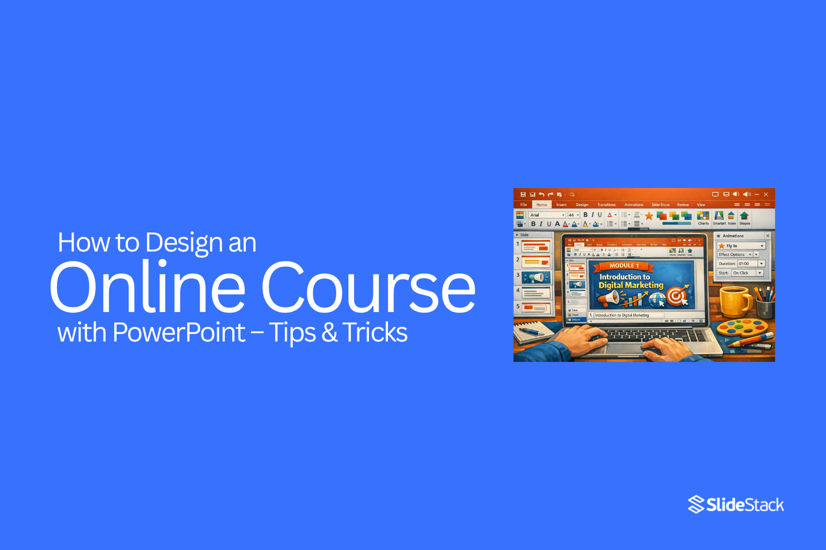
How to Design an Online Course with PowerPoint – Tips & Tricks
Online courses have become a major part of digital learning. The global e-learning market is expected to reach over $400 billion in the coming years. A large share of this growth comes from self-paced online courses that people can access anytime from anywhere. PowerPoint plays a key role in this shift because it is widely used and easy to start with. Many educators, trainers, and creators now use it to build structured lessons without advanced tools. The demand for flexible learning is also rising as new skills are needed across industries. Traditional classrooms often cannot keep up with this speed of change. That is why more learners now prefer online formats that are simple, focused, and practical. PowerPoint helps turn basic ideas into organized lessons that support a clear learning flow.
Why PowerPoint Alone Is Not Enough for Creating an Online Course
PowerPoint helps you build slides. It keeps ideas in order. It also makes content easy to present. That is a good start.
Online courses need more than slides. Learners expect movement, voice, and interaction. Static slides feel flat after a short time. Attention drops quickly.
PowerPoint does not handle the full course flow well. There is no built-in structure for lessons, quizzes, or progress tracking. A course needs clear steps that guide the learner from start to finish.
Audio and video also matter. Many courses rely on voice explanation. Some use screen recordings or face-to-camera teaching. PowerPoint alone does not manage these smoothly without extra tools.
Learners also expect a simple way to move through lessons. They want pause points, checks for understanding, and clear sections. PowerPoint slides stay linear. That limits how flexible the learning path can be.
A better setup often combines PowerPoint with other tools. This helps turn slides into a full learning experience.
Creating Online Courses: a Step-by-Step Guide
Most online courses follow a clear building process. Each stage has a simple purpose. The work moves in order from idea to final review. This structure helps keep the course organized and easy to follow.
Topic Ideation. A strong course starts with a focused topic. The topic usually solves one clear problem. It can teach a skill like social media marketing, basic coding, or design basics. Simple topics work better than broad ones because learners understand the goal faster.
Course Outline. The topic is shaped into a lesson plan. Each lesson is placed in a clear order. The outline shows what learners will study from start to finish. This stage takes time because each section must connect in a logical way.
Content Preparation and Gathering. All notes, examples, and reference material are reviewed. The lesson points are grouped into small learning sections. Each section focuses on one idea, so learners do not feel confused or overloaded.
Create Slides. Slides are built to support each lesson. One slide usually shows one main point. Short text works better than long paragraphs. Simple design keeps attention on the lesson content instead of decoration.
Work on Video. Each lesson is turned into spoken content. A script helps keep the flow steady. The recording follows the slide order, so the lesson stays clear. Audio clarity matters more than effects or visuals.
Refine Modules and Course Plan. The full course is checked again after the content and slides are ready. Each lesson is reviewed for gaps or missing points. Sections are adjusted so the learning path stays smooth from start to end.
Test. A small group reviews the course before release. Their feedback shows unclear parts or weak explanations. Changes are made based on their responses, so the final version is easier to follow.
How to Create an Online Course Outline
How to Create an Online Course Outline
Writing an online course outline can feel messy at the beginning. There are many ideas competing for space. Some feel important, others feel unclear. Without structure, everything blends together. The result becomes hard to organize. A clear outline brings order before content creation starts.
A strong course does not include every idea. It focuses on what the learner needs most. Short lessons help reduce confusion and improve completion. Most learners stay more engaged with small, focused sections. A good target is 3 to 10 minutes per lesson. This keeps learning simple and easy to follow.
Start with one core idea.
Before anything else, define the course problem.
• Who is this course for
• What problem are they trying to solve
A course becomes useful when it solves a clear problem instead of listing information. The goal is to guide learners from confusion to clarity through structured steps.
Next, focus on understanding the audience in detail. Strong course design starts with real learner insight. Without this step, the outline becomes guesswork. Instructional design depends on knowing who the learner is and what they need at each stage.
There are five good ways to learn what students want:
1. Be them
2. Hang out
3. Observe
4. Interview
5. Co-create
Bonus: empathy mapping helps organize learner thoughts and behavior patterns.
Understanding how learners talk is important. Real language reveals real problems. This helps shape course lessons that feel relevant and direct. Research should focus on places where learners already share struggles. That includes comments, forums, and discussions.
Pain points often appear in simple questions like:
• Why am I not getting results
• Where do I start first
• What step should I take next
These questions help form the base of the course structure. Each one points to a missing skill or missing clarity in the learner journey.
After collecting pain points, the next step is solution design. Each problem needs a clear response within the course.
• Step-by-step frameworks
• Templates and worksheets
• Video walkthroughs
• Checklists and guides
• Coaching or live sessions
• Slide-based learning material
Solutions should stay practical and focused on action. Each one connects directly to a learner's struggle.
Clarity comes when pain points and solutions are mapped together. This creates a structured foundation for the course outline.
The next step is turning this mapping into a course structure.
Pain Point
Solution
Outline
I do not know where to start learning
Step-by-step beginner framework
Module 1: Learning Basics and First Steps
I struggle to apply what I learn
Guided practice system with examples
Module 2: Application and Skill Building
I cannot get consistent results
Real-world exercises and a feedback system
Module 3: Execution and Improvement
This table helps turn scattered ideas into structured learning blocks. Each module now has a clear purpose.
Once the structure is ready, it becomes easier to shape the learning flow. Modules should move from simple understanding to practical use. Lessons should build on each other without gaps. Each step should feel connected to the next. This keeps the learner moving forward without confusion.
Merrill’s Principles of Instruction (MPI)
Developed by David Merrill in 2002, this model is built around five learning principles that focus on real task performance and structured skill building.
Task-centered: Learning starts with real-world problems or tasks. Students connect lessons directly to situations they are likely to face.
Activation: The course begins by bringing forward what learners already know. Prior knowledge becomes the base for new learning, making new ideas easier to understand.
Demonstration: Concepts are shown through clear examples. Visual explanation, storytelling, and step-by-step models help learners see how the task is done.
Application: Learners practice what they have learned through activities. Exercises, quizzes, and guided tasks help build confidence through repetition and correction.
Integration: Learners use new skills in real situations. Reflection, discussion, and sharing help transfer knowledge into daily use.
Gagne’s Nine Events of Instruction
Robert Gagné’s framework follows a structured learning process based on how people receive, process, and retain information. It outlines nine clear steps for course design.
Gain attention – Start with something that draws focus. A question, a short story, or a surprising idea can help capture interest at the beginning.
State objectives – Explain what the learner will achieve. Clear goals help set direction and expectations for the lesson.
Prior learning – Connect new content with what learners already know. This helps prepare the mind for new input.
Present content – Share information in small and clear parts. One idea at a time helps learners understand better.
Provide guidance – Support learning with examples, explanations, and step-by-step help. This reduces confusion during learning.
Practice – Give learners a chance to try tasks. Repetition and activity help strengthen understanding.
Provide feedback – Offer clear responses on performance. Learners understand what is correct and what needs improvement.
Assess performance – Check understanding against learning goals. This confirms whether the learner has achieved the expected outcome.
Enhance retention and transfer to the job – Support long-term use of knowledge through resources, practice materials, and real-life application.
How to Create Educational Slides for Your Online Course
Before you design your first slide in PowerPoint, your storyboard should be ready. A storyboard is a master document where you outline the course objectives and line up all the course content based on your lesson plan.
A storyboard helps you organize ideas before you start building slides. Each module is broken into small sections. Each section has a clear learning focus.
After you have a clear set of content for a module, you can start moving it into PowerPoint. Keep the structure simple and steady from planning to final delivery.
Your process should follow this order:
• Plan – build your course outline and complete your storyboard.
• Make your presentation – turn each part of your plan into slides.
• Record your slide deck with audio – add voice guidance for each slide.
• Delivery – upload the course to an LMS and adjust final details.
Each slide should focus on one main idea. Keep text short and clear. Visuals should support the message instead of adding extra noise.
Font choice should stay consistent across all slides. Headings should be easy to read. Body text should stay simple and spaced well for clarity.
Navigation should feel smooth for the learner. Each slide should move in a clear order without confusion.
Below you’ll find format and layout tips, advice on fonts and navigation, plus some educational PowerPoint templates you can use for your course.
Slide Format and Layout: General Tips
Start with the platform where the course will be hosted. Many LMS platforms work well with PowerPoint slides and do not need size changes. Animated PowerPoint lessons on YouTube work best with a 16-by-9 aspect ratio. Some LMS tools show slides in different ways. Slide format choice matters before building the full course.
Follow the Bullet Rule of 6. Do not add more than 6 bullets per slide. Do not go beyond 6 words per bullet. More text on one slide creates cognitive overload. Learners start reading instead of listening. Short bullets keep focus on the spoken lesson.
Keep each slide within 20 to 30 seconds. This timing supports a steady learning flow. One slide should deliver one clear idea. Long pauses on a single slide reduce attention. Fast movement across slides breaks understanding.
The Rule of Three helps slide structure. Each slide works well with three equal sections. One section holds the title. One section holds the main content. One section supports visuals or highlights. This layout keeps slides clean and easy to scan.
Use strong visual pointers. Charts help show numbers in a simple way. Icons replace long text blocks. Short labels under visuals explain the meaning clearly. This keeps slides simple and easy to follow.
Instructional Design Essentials for eLearning Presentations
Maintain a strong focus on learning goals. Every part of your eLearning presentation should support what the learner needs to achieve. Each slide should move the learner closer to a clear outcome.
• For every concept explained on a slide, check if the learner can:
• Recall and remember key information?
• Explain the idea in their own words?
• Use the information in a real situation?
• Differentiate between related concepts?
• Create something new based on what they learned?
Introduce non-linear navigation. Many presentations follow a fixed slide order, but eLearning often needs flexible movement and repetition for better understanding. PowerPoint supports content grouping and branched menus to improve interaction.
Start by breaking your content into sections. Each section should have a main menu slide. Use PowerPoint hyperlinks to connect buttons to different slides. Each button should lead to a specific topic area.
Now learners can move through the course in a flexible way. They are not forced into a single path. Some may go step by step. Others may focus only on selected sections and return later for review.
Add audio commentary to support learning. Voice narration can make complex ideas easier to understand and reduce reading effort for learners. Record audio and save it in formats like MP3, WAV, or WMA.
Insert the audio into PowerPoint using the insert media option. Click the sound icon and open the playback settings. Turn off “Play Across Slides” and “Loop Until Stopped” if continuous playback is not needed. Adjust timing so audio matches slide content and animations.
P.S. Avoid outdated visual styles that reduce learner engagement. Use modern layouts that keep focus on content and structure.
Add Easter eggs to increase engagement. Small hidden interactions can encourage learners to explore the course more actively. Wrong clicks can show short messages that guide learners back. Correct clicks can unlock extra content or practice tasks.
Add a slide rewind button so learners can repeat key information easily. Place a replay icon on each slide and link it back to the same slide or section start. Test all navigation links carefully so they do not conflict with other actions.
Create a glossary for key terms. Use a dedicated slide for definitions. Add extra explanations in the notes section of PowerPoint so the main slides stay clean and simple.
Develop SCORM-compatible courses for LMS tracking. SCORM helps structure content so learning systems can track progress, completion, and quiz results. You can convert PowerPoint files into SCORM packages using third-party tools, add-ins, or manual setup methods.
Fonts and Font Pairings
Use sans-serif or serif fonts for body text because they are clear on screens and support better reading flow across different devices and learning platforms. Clean typography helps learners focus on content instead of struggling with style or unclear letter shapes during long study sessions. Sans-serif fonts often work better for digital screens, while serif fonts can still support structured reading when spacing is handled properly. Consistency in font choice across slides improves visual stability and reduces distraction during navigation through course materials. Good font selection also supports accessibility by improving readability for learners with different visual needs and screen sizes.
Some modern fonts like Lydian, Euclid, Tiempos, and Supria Sans offer a fresh visual style for presentations. These fonts can improve visual identity when used carefully in headings or highlighted areas. They are not always available on all devices, which can affect how slides appear in shared environments.
If fonts are not installed on another device, the presentation layout may shift or appear broken.
This can reduce clarity and change the intended design of the course content.
• Always test fonts on different devices before final delivery
• Include font files when sharing offline presentations
• Prefer web-safe fonts for wide compatibility
• Use consistent font pairings across all slides
Sharing presentations works best when fonts are bundled in a zip file along with the project files.
Online hosting removes most font compatibility issues because the display environment stays controlled and consistent.
This approach keeps the design stable and ensures learners see the presentation exactly as intended.
Turning Slides into Engaging Lessons
Slides can feel flat without structure. A lesson needs clear steps. Each slide should carry one idea.
Start with a clear goal for the lesson. One topic per section keeps focus strong. Too many ideas on one slide can confuse learners.
Short text works better than long blocks. Use simple points. Keep each line easy to read. This helps the learner stay with you.
Visuals can support meaning. A diagram or image can explain faster than words. Place visuals close to the related point so the link is clear.
Add small pauses in the flow. A question on a slide can make the learner pause and think. This builds attention without extra content.
Slide order also matters. Begin with basic ideas. Move step by step into deeper points. This helps learning feel steady and clear.
Keep spacing clean. Crowded slides reduce focus. Empty space gives the eye rest and improves understanding.
Each slide should feel like part of one path. The learner should move forward without confusion.
Converting PowerPoint into a Video Course
PowerPoint slides can become a video course with a clear plan. Each slide turns into a lesson part. The goal is to guide learners step by step without confusion.
Start with your slide order. Each slide should follow a simple path. One idea per slide keeps the flow steady. Too many ideas on one slide can slow learning.
Next, add voice narration. Speak in short lines. Match your words with what appears on the screen. Keep a steady pace so learners can follow without strain.
Slide timing matters as well. Each slide should stay long enough for reading and understanding. Avoid rushing through content. Give space for key points to settle.
Transitions between slides should feel smooth. One idea leads into the next without sudden jumps. This helps learners stay focused from start to finish.
Audio and visuals should work together. Clear images and simple text make the lesson easier to follow. Background noise should stay out of the recording.
After recording, review the full video. Check if the message flows well. Fix any parts that feel unclear or too quick.
A well-built video course from PowerPoint feels simple, steady, and easy to learn from.
Branding Your Course Professionally
A course feels stronger when it has a clear identity. Students notice the look and feel right away. That first impression sets the tone for everything that follows.
Start with a consistent visual style. Pick a small set of colors and stick with them across all slides. This keeps the content clean and easy to follow. Too many colors can make the course feel messy.
Fonts also shape how your course is seen. Simple fonts work best. One font for titles and another for body text is enough. Keep sizes readable on all devices.
Your course logo or name should appear in a steady place on every slide. This builds recognition over time. It also helps students feel they are in a structured program.
Slide layouts should stay consistent. Use similar spacing and alignment throughout. This makes learning smoother and less distracting.
Small details matter here. Icons, shapes, and images should match the same style. A mixed style can break the flow and reduce trust in the content.
Strong branding helps students take the course seriously. It also makes your material easier to remember and share.
Advanced Tips to Improve Course Quality
A strong course keeps learners active from start to finish. Small changes in design and delivery can raise the overall experience.
Start with structure. Each lesson should have one clear focus. Avoid mixing too many ideas in one slide or video. This helps learners stay on track without confusion.
Use simple visuals that support the message. A clean diagram or a short chart works better than crowded slides. Too many elements on one screen can slow understanding.
Keep text light on slides. Slides are not for full explanations. They are reminders of what you say. Learners should listen more than read.
Add short checks after key lessons. A quick question or mini task helps learners remember what they just learned. It also shows where they need more support.
Keep language consistent across the course. Use the same tone and style in every lesson. This builds comfort for the learner as they move forward.
Record audio in a quiet space. Clear sound helps learners focus. Background noise can pull attention away from the lesson.
Break longer lessons into smaller parts. Short sections are easier to follow and review later. This also helps learners stay engaged across the full course.
Common Mistakes to Avoid
Many problems come from small writing habits. Long sentences often make ideas hard to follow. Short sentences keep the meaning clear. Some writers add extra words that do not add value. This weakens the message and hides the main point.
Another issue is unclear structure. Ideas feel scattered, and readers lose the flow. Weak transitions also create breaks in reading. Each idea needs a natural link to the next one. Spelling and grammar mistakes reduce trust. Careful review keeps the content clean and easy to read.
Final Workflow Checklist
A clear workflow starts with a single topic and a defined purpose for the course. From there, a simple outline is created to show each lesson in order. Notes, examples, and supporting material are collected in one place so nothing is missing later. A storyboard then shapes the full structure and shows how each lesson connects step by step.
After planning, slides are built with one main idea per slide. Text stays short so learners can follow easily. Voice recording is added to match each slide and guide the lesson flow. Audio is placed in the correct order across all sections. Navigation links and buttons are tested to make sure movement through the course feels smooth. Timing is reviewed so each slide gives enough space for understanding. The course is then exported into a video or LMS format. A full review comes next by watching the entire course from beginning to end. Feedback from learners is collected, and unclear parts are improved.
FAQs:
1. Can PowerPoint be used to create a full online course?
Yes. PowerPoint can be used to build structured lessons. It works best when combined with audio, video, and a clear course plan.
2. Do I need advanced tools to design an online course?
No. Many creators start with PowerPoint. Simple tools are enough if the content is clear and well-organized.
3. How long should each slide stay on screen?
Most slides work well within 20 to 30 seconds. This keeps attention steady and helps learners follow the lesson.
4. What makes a good online course outline?
A good outline follows a clear order. Each lesson focuses on one idea and moves from basic to advanced steps.
5. Should slides have a lot of text?
No. Slides should stay simple. Short points work better than long paragraphs. Learners should listen more than read.
6. Can I add voice to PowerPoint lessons?
Yes. You can record audio and match it with each slide. This helps explain ideas more clearly.
7. How do I keep learners engaged?
Use short lessons, simple visuals, and a clear structure. Add small questions or tasks to keep attention active.
8. What is a storyboard in course design?
A storyboard is a planning document. It shows each lesson and how the content will appear before building slides.
9. Can PowerPoint courses be used in LMS platforms?
Yes. PowerPoint files can be converted into video or SCORM format for LMS use with the right tools.
10. Why is consistent design important in a course?
Consistent design makes learning easier. It reduces distraction and helps learners focus on the content.
11. What is the biggest mistake in course design?
The biggest mistake is unclear structure. When lessons are scattered, learners lose focus and stop following the course.


You may also be interested in ...

Tips To Create A Great Infographic
Infographics Have been around for a while, but not many people know about them or are their preferred presentation choice. If...
08 Jun, 2024

3 Steps To Create The Best Presentation...
Presentations are something wonderful when well done, you can captivate an audience or be super interested in what another pe...
23 Jun, 2024

3 Tips For Your Next Presentation You MU...
PowerPoint presentations are perfect for explaining a topic and communicating your ideas with a visual aid. But most people s...
08 Jun, 2024