How to Create an App Prototype in PowerPoint
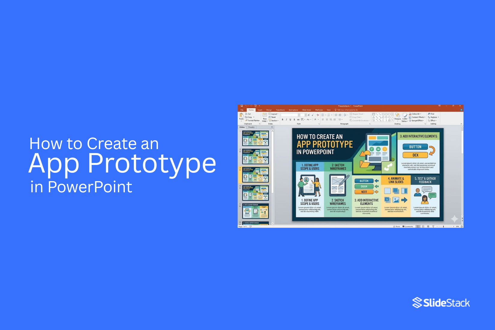
Creating an app always starts with a clear idea, but turning that idea into something visual is not always simple. Many struggle to show how screens connect or how users will move through the app. That gap often leads to confusion during planning, weak feedback, and unclear direction for development. A concept without structure can easily lose its purpose before it even reaches a design stage. PowerPoint offers a simple way to shape that idea into screens, links, and basic interactions without needing advanced design tools.
This guide explains how to create an app prototype in PowerPoint step by step, using its built-in features to design screens, build navigation, and simulate user flow. It also includes a practical example of a simple app layout, showing how slides can act like real app screens and help turn early ideas into something clear and testable.
What Is PowerPoint Prototyping?
PowerPoint prototyping is a method of building interactive models of apps or websites using PowerPoint slides. It turns a slide deck into a working flow of screens. Each slide acts like a screen in a digital product. Shapes, images, and text represent interface parts like buttons and menus. Interaction happens through links inside the slides. A button can move from one slide to another. This creates movement between screens. The structure starts to feel like a real app, even though it is still inside a presentation tool.
Navigation is built by connecting slides in a planned order. One slide can lead to different paths. This helps show how a user moves through a product step by step. The prototype can show menus, pages, and actions without writing code. Static wireframes only show layout and structure on a flat page. They do not move or respond to clicks. PowerPoint prototypes add movement between screens. This makes the design easier to test and understand before building the real product.
Why you should use PowerPoint
PowerPoint works as a simple tool for building early product ideas. It is not only for slides. It can act as a quick way to sketch digital screens and test how they connect. This helps turn ideas into something visible and usable.
The tool comes with basic shapes, solid and gradient fills, and a strong layout system. These parts help build clean interface mockups without extra software. You can place buttons, menus, and panels directly on a slide. Each element can look close to a real app screen.
Hyperlinks add another level of control. A button on one slide can link to another slide. That creates movement between screens. It starts to feel like a working product instead of static pages. This setup supports early testing of the user flow.
Tools and Features for App Prototyping in PowerPoint
PowerPoint has features that help turn slides into simple app screens. Each feature supports layout, structure, or basic navigation. Shapes and Icons: Rectangles, circles, and icons build buttons, menus, and input areas. They form the visual parts of each screen.
Slide Master: Sets a shared layout for slides. It keeps headers, spacing, and repeated elements consistent across screens.
Hyperlinks and Action Buttons: Connect objects to other slides. They build navigation between screens like moving through an app flow.
Transitions and Animations: Add motion between slides or elements. They help show screen changes and simple actions.
SmartArt and Charts: Present data in structured visuals. They support dashboards and simple information views.
Embedded Media: Add images, GIFs, or video. They represent content that appears inside app screens.
Export to PDF or Web: Share the prototype outside PowerPoint. It allows others to open and click through the screens.
These features work together to turn a slide deck into a clear and structured app screen flow with basic interaction paths.
Step-by-Step Guide to Creating an App Prototype in PowerPoint
Building an app prototype in PowerPoint starts with a clear plan and ends with a clickable flow. Each step shapes how the app feels and works. The goal is to turn simple slides into screen-like pages that users can move through. Each part adds structure and interaction.
Step 1: Plan Your App Structure
Start with the main idea of the app. Write down the main screens. Keep it simple. Focus on what the user sees first, second, and third. List the flow from start to end.
Step 2: Set Up the Slide Size
Open PowerPoint and choose a slide size that fits a phone screen. A vertical layout works best. This helps the design feel like a real app screen instead of a presentation.
Step 3: Design Your App Screens
Build each screen one by one. Use shapes for boxes, menus, and content areas. Keep spacing clean. Keep colors simple so the screen is easy to read.
Step 4: Add Buttons and Navigation
Place buttons where users will tap. Use simple shapes like rectangles or circles. Label each button clearly so its purpose is easy to understand.
Step 5: Link Slides for Interactivity
Connect each button to another slide. This creates movement between screens. Each link should match the app flow you planned earlier. This makes the prototype feel interactive.
Step 6: Add Transitions and Animations
Apply light slide transitions between screens. Use simple animations for buttons or elements. Keep movement smooth and not distracting.
Step 7: Test the Prototype
Run the slideshow mode. Click through every button. Check every link. Make sure each screen moves in the right order and nothing is broken.
Benefits of Prototyping an App with PowerPoint
Low setup effort → PowerPoint is already installed on many devices. No extra tools or complex setup steps are needed to start building screens.
Simple layout control → Shapes, text boxes, and images can be placed with basic drag and drop actions. This supports quick screen building.
Quick idea testing → Screen ideas can be built and adjusted in a short time. This helps check layout choices without long production cycles.
Easy editing process → Elements on slides can be changed at any point. Text, colors, and positions can be updated without rebuilding the full structure.
Cost-saving approach → No need for paid design software in early stages. PowerPoint supports early design work using existing resources.
Clear user flow structure → Slides can be linked using clickable buttons. This allows simple flow paths between screens for early app structure planning.
Simple sharing format → Files can be shared easily through email or cloud storage. Team members can view and review without special software.
Early issue spotting → Layout problems and missing steps become visible during slide review. This supports early correction before advanced development work begins.
Prototype the First Screen of a Fitness App in PowerPoint
To keep things concrete, a simple first screen is built for a fictional fitness app called PulseFit. The slide works as a welcome screen with a headline, a visual space, and a “Get Started” button that links to a second slide. Each element stays simple, so the layout feels like a real mobile app screen.
Step 1: Set Your Slide to Portrait
Go to Design > Slide Size > Custom Slide Size, select Portrait, and click OK. PowerPoint may suggest a size that matches a phone screen. Accept the default or set the width to 20 cm and height to 34 cm for a taller layout. Portrait mode creates the base shape of a mobile interface and sets the screen proportion.
Step 2: Build the Layout with Basic Shapes
Start with a blank slide and remove any default placeholders. Right-click the background and choose Format Background > Solid Fill. Pick a light color such as white or soft grey.
- Divide the slide into three clear zones using rectangles.
- Top section holds the app name.
- The middle section holds a visual or image area.
- Bottom section holds action elements.
Insert a text box at the top and write PulseFit in a bold font around 24–28pt. In the middle section, insert a large rectangle as a placeholder for an image or fitness visual. This space represents the core content area of the app. Below that, add a short headline such as Build strength each day in a larger font around 30–32pt. Under it, place a smaller line of text that supports the message in simple wording.
Step 3: Add a “Get Started” Button
Insert > Shapes > Rounded Rectangle and place it in the lower part of the slide. Stretch it horizontally while keeping margins on both sides. Fill the shape with a strong, solid color. Remove the outline. Type Get Started inside the button and center the text in white. Below the button, add a simple text label Log in. Keep it plain with no shape so the focus stays on the main action.
Step 4: Make the Button Clickable
Right-click the “Get Started” button and choose Link > Insert Link. Select Place in This Document and choose Slide 2. Make sure Slide 2 exists before linking. A blank slide with “Next Screen” text is enough to show movement between screens. Right-click the “Log in” text and apply the same linking method. Connect it to another slide that represents an alternate flow. Each clickable element now leads to a defined screen.
Step 5: Test the Flow
Press F5 to start the slideshow from the beginning. Click the “Get Started” button and confirm it moves to Slide 2. Use Shift + F5 to test the current slide without restarting the full deck. Check every clickable element. Confirm links work and alignment stays consistent. Adjust spacing if any element feels off balance or crowded.
Export the File
Go to File > Export > Create PDF/XPS. Save as PDF. This keeps clickable links active so the prototype can be shared and tested outside PowerPoint. That completes the setup. One slide becomes a working fitness app welcome screen with structure, clarity, and navigation flow that behaves like a real app interface.
Best Design Tips for App Prototypes
Keep each screen focused on one main idea. Too many elements on one slide create confusion. Clean layouts help the viewer understand the purpose faster. Use the same spacing across all slides. Equal gaps between buttons, text, and icons make the design feel stable. Misaligned elements make the prototype harder to follow. Buttons need clear shapes and labels. Rounded rectangles work well for most actions. Text inside buttons should stay short and direct, such as “Start” or “Next”.
Slide Master helps keep everything consistent. Set headers, footers, and layout styles once. Every new slide then follows the same structure without extra effort. Navigation flow should feel natural from one screen to another. A login page connects to a dashboard. A menu leads to settings or content pages. This structure helps users follow the path without confusion. Icons should match their function. A home icon returns to the main screen. A gear icon leads to settings. Simple visuals support faster understanding of the prototype. Colors should stay limited. Two or three main colors keep the design clean. Too many colors distract from the main flow of the app.
Common Mistakes to Avoid
Many people rush into building slides without a clear plan. This leads to confusion later. A simple layout plan saves time and keeps the prototype clean. Some users try to add too much detail on one slide. Buttons, text, and images get crowded. The slide then becomes hard to follow. Simple screens work better for app flow. Another common issue is ignoring consistency. Different button styles or colors on each slide make the app feel broken. A steady design helps users understand the structure faster.
Some forget to link slides properly. Buttons that do not lead anywhere break the experience. Every clickable element should have a clear path. A few people also skip testing the flow. They build all slides and never click through them. Small errors stay hidden this way. A quick review helps catch these problems early. Strong prototypes stay simple, connected, and easy to follow.
PowerPoint Features That Help with Prototyping
PowerPoint has tools that help turn simple slides into app screens. These tools support layout, design, and movement between screens. Each feature plays a clear role in building a working prototype.
Slide Master
Slide Master controls the main layout of your slides. It sets a shared structure across all screens. This keeps your prototype consistent. You can place headers, footers, and background elements here. Every slide then follows the same base design. This saves time during editing. Changes made in the Slide Master apply across the whole deck. That helps keep spacing, fonts, and alignment steady.
Icons and Shapes
Icons and shapes form the building blocks of app screens. Buttons, menus, and input fields often start as simple shapes. PowerPoint offers built-in icons for common actions like search, home, and settings. These icons help users understand each part of the screen quickly. Shapes can be resized and styled to match app layouts. Rounded rectangles often work well for buttons. Lines and boxes help form structure.
Morph Transition
Morph Transition creates movement between slides. It helps show how one screen changes into another. Elements placed on two slides can shift position smoothly. A button can move, grow, or change place across screens. This helps show user flow without coding. It gives a clearer sense of how the app behaves during use.
Final Notes
A prototype is not defined by the tool used to build it. The value comes from clear thinking and clear structure. Simple tools can still shape strong ideas. PowerPoint fits this approach well because it keeps focus on layout and flow.
PowerPoint prototypes help outline user journeys. They show how a person moves from one screen to the next. They also help test intent. Each screen shows a clear purpose. Flow testing becomes easier because gaps stand out early.
These prototypes also work in many settings. Investors can see how a product works without extra detail. Teams can use them to align on direction. Presentations become easier to follow because the structure is already visible. Strong prototypes do not need heavy detail. They need clear steps and steady logic. Start simple, iterate fast, clarity over perfection.
FAQs:
Is PowerPoint really suitable for prototyping compared to tools like Figma?
PowerPoint works well for early app ideas and simple prototypes. It helps show screen flow and basic layout. Figma is better for detailed design and teamwork.
Can PowerPoint simulate interactivity?
Yes, PowerPoint can simulate interactivity using links, buttons, and slide transitions. These features let you move between screens like an app. It still cannot fully act like a real software app.
Do I need design assets to start?
No, design assets are not required at the start. Simple shapes and text are enough to build your first screens. You can add icons or images later if needed.
Can prototypes be tested on mobile devices?
Yes, you can test PowerPoint prototypes on mobile devices. You can open them through mobile apps or shared files. The experience may feel simpler than on a computer.
How detailed should a PowerPoint prototype be?
Keep it simple and focused on structure and flow. Show how screens connect and what each screen does. Too much detail can make testing harder and slower.



You may also be interested in ...

How To Create An Eye-Catching Portfolio
If you’re looking to create an eye-catching portfolio, this post will come in handy. In this article, you can find the easies...
23 Jun, 2024

How To Easily Create An Infographic
Infographics are the perfect way to make a presentation that will impact an audience, but their design and composition might...
08 Jun, 2024

PowerPoint Template Tips & Tricks You Ne...
PowerPoint seems to be an unknown world for many people, especially those who have been assigned to create a presentation out...
08 Jun, 2024