How to Deal With Overcrowded Presentation Slides: The Power of Margins
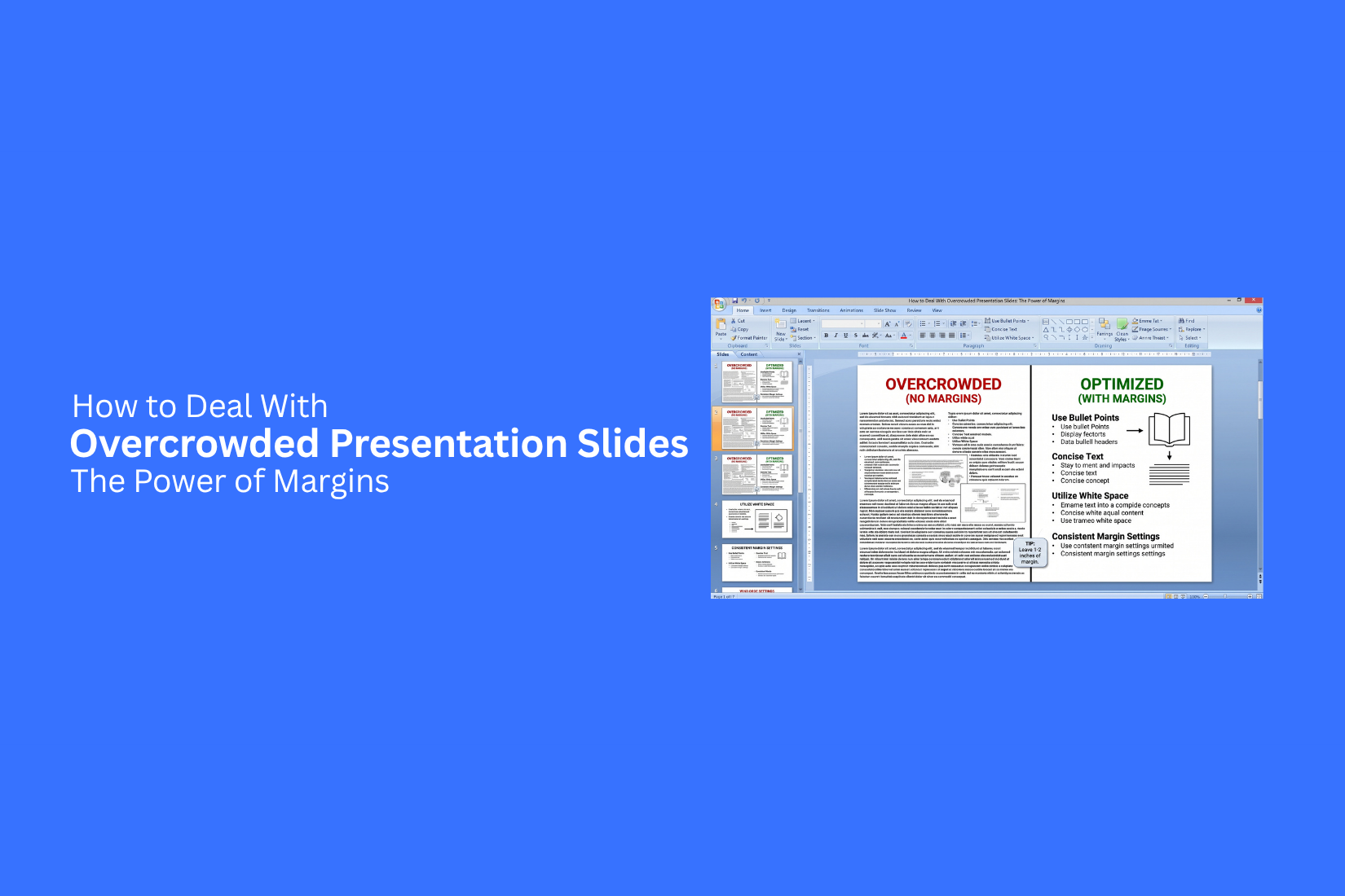
Overcrowded presentation slides can make your message hard to follow. Too much text, images, and other elements can fill every part of the slide. The result is a layout that feels tight and hard to read.
A crowded slide can also make key points harder to find. Small gaps between headings, text, images, and slide edges can make the layout feel even more packed. Your audience may spend more time reading than listening.
A simple fix is to use margins. Margins create space between your content and the slide edges. They also help you place text and visuals with more care. This guide shows how margins can help clean up crowded slides and create a more balanced layout.
What Makes a Presentation Slide Look Overcrowded?
A slide looks overcrowded when too many elements compete for space. Large blocks of text, extra images, charts, icons, and shapes can make the slide hard to read.
Here are some common signs of an overcrowded slide:
• Too much text: Long paragraphs make the main point hard to find.
• Small font size: Text gets smaller to fit more content on the slide.
• Too many visuals: Several images, icons, or charts can pull attention in different directions.
• Little empty space: Content sits close to the edges or other elements.
• Poor spacing: Text boxes and visuals have uneven gaps between them.
• Weak visual order: The audience cannot tell which part of the slide matters most.
A crowded slide does more than look messy. It can make your message harder to follow. Your audience may spend more time reading the slide than listening to you. The fix is not always to remove half the content. Better spacing can also make a slide easier to read. This is where margins become useful.
Why Margins Matter in Presentation Design
Margins give your slide content enough room to breathe. They create space between the slide edge and your text, images, charts, and other elements. A slide without enough margin can feel packed. Text may sit too close to the edge. Images may compete with nearby content. The whole slide can become harder to scan. Good margins create a clear visual boundary. They help guide the viewer from one part of the slide to another. They also make each element easier to see.
Margins can also improve balance. A title may have more space above it, while the main content stays within a clear area. This gives the slide a cleaner structure without removing useful information. The goal is not to leave large empty areas. The goal is to give each element enough space so the slide feels organized and easy to follow. Even small changes to the margins can make a crowded slide feel much more open.
How Margins Help Fix Overcrowded Slides
Margins give your slide content more breathing room. They create a clear gap between the edge of the slide and the text, images, charts, or shapes. This simple space can make a crowded slide feel much easier to read.
Create Clear Boundaries
Margins set a clear area for your content. Text and visuals stay away from the slide edges. This keeps the layout neat and gives each element a defined place. A slide with no clear margins can feel packed. The content may reach too close to the edges. Even a small increase in side or top margins can make the slide look cleaner.
Reduce Visual Clutter
Large margins reduce the amount of content that sits in one area. They give the eye more space to move between different elements. For example, a text-heavy slide may have several paragraphs, icons, and a chart. Moving these items away from the edges can reduce the crowded feel. You may also find that some content needs to be removed or shortened.
Improve Text Readability
Text needs enough space around it. Tight margins can make paragraphs look cramped. Wide margins create a cleaner text area. This works well for slides with headings, bullet points, or short blocks of text. Keep the text inside a consistent margin area. This creates a clear reading path for the audience.
Give Visuals More Space
Images, charts, and icons also need room around them. A visual placed too close to the edge can make the slide feel unbalanced. Margins create space around these elements. The extra room helps each visual stand out without adding more design elements.
Make the Layout Easier to Scan
Good margins help separate groups of content. A heading can have space above it. A chart can have room around its edges. Text blocks can sit apart from each other. This makes the slide easier to scan from one section to another. The audience can spot the main points without sorting through a wall of content.
How Margins Help Fix Overcrowded Slides
Margins give your slide content more breathing room. They create a clear gap between the edge of the slide and the text, images, charts, or shapes. This simple space can make a crowded slide feel much easier to read.
Create Clear Boundaries
Margins set a clear area for your content. Text and visuals stay away from the slide edges. This keeps the layout neat and gives each element a defined place. A slide with no clear margins can feel packed. The content may reach too close to the edges. Even a small increase in side or top margins can make the slide look cleaner.
Reduce Visual Clutter
Large margins reduce the amount of content that sits in one area. They give the eye more space to move between different elements. For example, a text-heavy slide may have several paragraphs, icons, and a chart. Moving these items away from the edges can reduce the crowded feel. You may also find that some content needs to be removed or shortened.
Improve Text Readability
Text needs enough space around it. Tight margins can make paragraphs look cramped. Wide margins create a cleaner text area. This works well for slides with headings, bullet points, or short blocks of text. Keep the text inside a consistent margin area. This creates a clear reading path for the audience.
Give Visuals More Space
Images, charts, and icons also need room around them. A visual placed too close to the edge can make the slide feel unbalanced. Margins create space around these elements. The extra room helps each visual stand out without adding more design elements.
Make the Layout Easier to Scan
Good margins help separate groups of content. A heading can have space above it. A chart can have room around its edges. Text blocks can sit apart from each other. This makes the slide easier to scan from one section to another. The audience can spot the main points without sorting through a wall of content.
How to Set Margins for Presentation Slides
Good margins give every slide a clear edge. They create space between your content and the slide border. A simple margin system also helps keep text, images, and graphics in the right place.
Choose a Consistent Margin Size
Pick one margin size and use it across your slides. This creates a steady visual structure. A wider margin gives the slide more open space. A smaller margin leaves more room for content. Pick a size that fits your layout and keep it consistent.
Use Guides for Accurate Placement
Guides help you place content at the same distance from the slide edges. Add vertical and horizontal guides to mark your margin lines. Use these guides as a visual frame for your content. Text boxes, images, and other elements can follow the same lines. This makes the slide look more organized.
Set Safe Areas Around the Slide
Keep a clear area between your content and the slide edges. This space acts as a safe area for your main content. Avoid placing key text or graphics too close to the edge. A clear safe area also gives each slide more breathing room.
Align Text Boxes With the Margins
Place text boxes along the margin lines. Start headings, body text, and other text blocks from the same left or right edge. Check the top and bottom spacing as well. Consistent text placement makes the slide easier to scan.
Keep Images and Graphics Inside the Margins
Images, charts, icons, and shapes should also follow the margin lines. Keep their edges inside the same content area as your text. This creates a clear boundary for the slide. It also stops visual elements from crowding the edges. A simple margin system can make a busy slide feel more balanced and easier to read.
How to Create Better Margins in PowerPoint
Good margins give your slide a clear edge. They create space between your content and the slide border. This makes text, images, and other elements easier to place. PowerPoint does not have a direct margin setting for slides. You can build your own margin system with guides, gridlines, and the Slide Master.
Turn on Guides and Gridlines
Guides and gridlines help you place objects with better spacing. Guides are lines that you can move across the slide. Gridlines form a larger layout that helps you place objects at even distances.
To turn them on:
- Open your PowerPoint presentation.
- Go to the View tab.
- Find the Show section.
- Turn on Guides and Gridlines.
Use the guides to mark the left, right, top, and bottom edges of your content area. Keep key text and graphics inside these lines. This creates a clean space around the slide content.
Create Custom Guides
Custom guides give you more control over your margins. You can move guides to set the exact space you want around your content. Right-click an existing guide and choose Add Vertical Guide or Add Horizontal Guide. Drag the new guide to the position you need. Create four main guides for the slide edges. Use the same positions across your slides. This gives each slide a shared layout and keeps content from getting too close to the edge.
Align Objects With Guides
Guides work best as fixed points for your slide layout. Place text boxes, images, charts, and shapes along the guide lines. Select an object and move it near a guide. PowerPoint can help you line up the object with nearby elements. You can also use the Align tools under the Shape Format or Picture Format tab.
Start with the main content area. Line up the left edges of text boxes and the right edges of key graphics. Keep similar objects at the same distance from the guides. This gives the slide a more organized structure.
Use Slide Master for Consistent Spacing
The Slide Master helps you keep the same spacing across many slides. It is useful for presentations that use the same layouts more than once. Go to View > Slide Master. Select the layout you use for your slides. Place guides and set the position of common elements, such as title boxes and content areas.
Make sure these elements stay inside your chosen margin area. Close the Slide Master after making your changes. Your layouts will now have a shared spacing system. This reduces the need to adjust the same elements on every slide.
How to Reduce Content Without Losing Meaning
A crowded slide often has more text than the audience needs at one time. Cutting text does not mean removing the main idea. The goal is to keep the message clear while giving each point enough space.
Remove Unnecessary Text
Read each line and ask what the audience needs to know. Remove words that do not add meaning. Cut repeated ideas, filler phrases, and extra descriptions.
For example:
Before:
“Our team was able to successfully complete the project ahead of the planned schedule.”
After:
“Our team completed the project early.”
The second version keeps the same message with fewer words.
Shorten Long Sentences
Long sentences can make slides hard to scan. Break them into short statements. Keep one main idea in each line.
Before:
“Our sales team increased revenue by 20% during the last quarter by focusing on new customer outreach and improving follow-up.”
After:
• Revenue grew by 20%.
• New customer outreach increased.
• Follow-up improved.
The shorter version is easier to read from a distance.
Combine Related Points
Some slides repeat the same idea across several bullets. Group related points into one clear statement.
For example, these points can be combined:
• Customer support response time improved.
• Support tickets were handled faster.
• Customers received quicker replies.
A shorter version is:
• Customer support response time improved.
This keeps the main message and removes repeated details.
Turn Paragraphs Into Bullet Points
Large blocks of text make a slide feel full. Break the content into short bullet points.
Before:
“Our new process helps teams manage tasks, track progress, share updates, and find project details in one place. It also gives managers a clear view of current work.”
After:
• Manage tasks
• Track progress
• Share updates
• Find project details
• View current work
Each bullet gives the audience one clear point. This also creates more open space on the slide.
Move Extra Details to Speaker Notes
Not every detail needs to appear on the slide. Keep the main facts on screen and place supporting details in speaker notes.
Speaker notes can hold:
• Extra examples
• Full explanations
• Data sources
• Talking points
• Background details
This lets you keep the slide clean while still having the information you need during the presentation. The audience sees the key message instead of a wall of text.
Best Practices for Using Margins on Presentation Slides
Margins help control the space around your slide content. A clear margin gives text, images, and other elements room to breathe. Use these simple practices to keep your slides clean and easy to read.
Keep Margins Consistent Across Slides
Use the same margin size across your presentation. This creates a steady layout from slide to slide. Text boxes, images, and other elements should follow the same basic spacing rules. A consistent margin also makes alignment easier. Your audience can follow the content without being distracted by shifting layouts.
Give Headings Enough Space
Headings need clear space around them. Avoid placing a heading too close to the slide edge or the content below it. Leave enough room above and below each heading. This separates the title from the main content. It also makes the slide easier to scan.
Leave Space Around Images
Images need room on all sides. Avoid pushing an image against text, another image, or the slide edge. Use margins to create a clear gap around visual elements. This helps each image stand on its own. It also reduces the crowded look that often appears on slides with many graphics.
Avoid Filling Every Empty Area
Empty space has a purpose. You do not need to fill every open spot with text, icons, shapes, or images. Open areas help separate groups of content. They also give the audience a place to rest their eyes. Remove extra elements instead of adding content just to fill space.
Check Margins at Different Screen Sizes
A slide may look different on a laptop, projector, monitor, or large display. Small spacing issues can become more noticeable on a larger screen. Review your slides at different sizes before presenting. Check the space near the edges, headings, images, and text boxes. Make sure key content stays inside the safe area and remains easy to read.
Common Margin Mistakes to Avoid
Good margins help a slide look clean and easy to read. Small spacing errors can make a slide feel crowded. They can also make key content harder to notice. A few simple checks can help you keep your slide layout clear and balanced.
Using Margins That Are Too Small
Very small margins leave little space around your content. Text can sit too close to the slide edge. Images and shapes may also feel cramped. Keep enough space around each element. A clear gap gives the content room to stand out. It also makes the slide easier to scan.
Creating Uneven Margins
Uneven margins can make a slide look off balance. A text box may sit close to one edge while another side has much more space. This can make the layout feel unplanned. Use guides to keep the left, right, top, and bottom spacing even. Check the distance between major elements as well. Small spacing changes can affect the whole slide.
Ignoring Visual Balance
Margins do more than create empty space. They help spread content across the slide. Poor spacing can make one side feel heavy while the other side feels empty. Look at the full slide before adding more content. Check where the text, images, charts, and shapes sit. Give each part enough room so the slide feels steady.
Placing Important Content Near the Edge
Important text should not sit too close to the slide edge. It may be harder to read on some screens. It can also look cut off during certain presentations. Keep titles, key points, and other important details inside a safe area. Extra space near the edge gives the content more protection and makes the layout easier to read.
Using Different Margins on Similar Slides
Similar slides should follow the same spacing rules. Different margins can make the presentation feel inconsistent. Titles may shift from slide to slide. Images may also appear at different distances from the edges. Set a clear margin size for related slides. Use the same guides and alignment points across the set. This creates a steady layout and helps the audience focus on the content.
Before and After: Turning a Crowded Slide Into a Clean Slide
A crowded slide can contain too much text, too many visuals, or poor spacing. A simple cleanup process can make the slide easier to read. Margins help create clear space around the content and give each element room to stand out.
Identify the Main Problem
Start by looking at the slide as a whole. Find the areas that feel packed or hard to read. Check for long text blocks, large groups of images, or elements placed too close to the slide edge. Focus on the main issue first. A slide with too much text needs a different fix than a slide with poor spacing.
Remove or Reduce Excess Content
Review every piece of text and ask if it needs to stay on the slide. Remove repeated points and extra details. Shorten long sentences into brief statements. Keep the information that supports the main message. Move supporting details to speaker notes or another slide. A smaller amount of content gives the remaining elements more space.
Apply Consistent Margins
Set a clear margin around the slide content. Keep a similar amount of space along the top, bottom, left, and right edges. Consistent margins create a clear boundary for your content. They also help prevent text and visuals from sitting too close to the edge. Use guides to keep the spacing accurate across the slide.
Reposition Text and Visuals
Place text boxes, images, charts, and other elements inside the margin area. Align related items so the slide feels organized. Give headings enough space from nearby content. Leave room around images and charts. A small shift can create a noticeable improvement in readability.
Review the Final Slide
Step back and review the updated slide. Check if the main message is easy to find. Look at the spacing between each element and the distance from the slide edges. Compare the new version with the original slide. The goal is not to fill every open area. The goal is to create enough space for the content to remain clear and easy to follow.
Final Notes
Overcrowded slides can make your message hard to follow. Too much text, too many visuals, and poor spacing can make a slide feel packed. Margins give your content more room and create a clear space between the slide edges and your main content. Start by checking what makes the slide feel crowded. Remove extra text, shorten long sentences, and group repeated points. Use speaker notes for details that do not need to appear on the slide.
Set clear margins and keep them consistent across similar slides. Use guides in PowerPoint to place text, images, charts, and shapes with better spacing. Keep key content inside a safe area. Give headings and visuals enough space around them.
Good margins do not mean leaving large empty areas. They help each part of the slide have enough space. A clean margin system can improve readability, make the layout easier to scan, and help the audience focus on the main message. Before presenting, review each slide from a distance. Check the space around the edges, text, images, and other elements. Small spacing changes can make a crowded slide much easier to read.
FAQs
What are margins in presentation slides?
Margins are the space between your slide content and the slide edges. They create a clear area for text, images, charts, and other elements. Good margins help keep the slide clean and easy to read.
How do margins help with overcrowded slides?
Margins create more space around your content. They stop text and visuals from sitting too close to the slide edges. This can make a crowded slide feel more open and easier to scan.
How much margin should I use on a presentation slide?
There is no single margin size for every slide. Pick a size that gives your content enough space. Use the same basic margin size across similar slides to keep the layout consistent.
How can I set margins in PowerPoint?
PowerPoint does not have a direct slide margin setting. You can create your own margin system with guides and gridlines. Add guides to mark the left, right, top, and bottom edges of your content area.
Should images stay inside the slide margins?
Yes. Keep images, charts, icons, and shapes inside the main margin area. This creates a clear edge around the content and helps prevent the slide from feeling crowded.
Can margins improve text readability?
Yes. Space around text can make paragraphs, headings, and bullet points easier to read. Consistent margins also create a clear path for reading the slide.
Should every slide use the same margins?
Similar slides should use the same basic margin rules. Consistent spacing helps the presentation feel organized. It also keeps titles, text, and visuals in similar positions across slides.
How can I reduce content on a crowded slide?
Remove repeated ideas and extra words. Shorten long sentences and turn paragraphs into bullet points. Move supporting details, examples, and background information to speaker notes.
What are common margin mistakes?
Common mistakes include using margins that are too small, creating uneven margins, placing key content near the slide edge, and using different margins on similar slides.
Do margins mean I should leave large empty spaces?
No. The goal is not to fill every open area or leave large empty areas. Margins give each element enough space so the slide stays clear and easy to follow.



You may also be interested in ...

Tips To Create A Great Infographic
Infographics Have been around for a while, but not many people know about them or are their preferred presentation choice. If...
08 Jun, 2024

3 Steps To Create The Best Presentation...
Presentations are something wonderful when well done, you can captivate an audience or be super interested in what another pe...
23 Jun, 2024

3 Tips For Your Next Presentation You MU...
PowerPoint presentations are perfect for explaining a topic and communicating your ideas with a visual aid. But most people s...
08 Jun, 2024