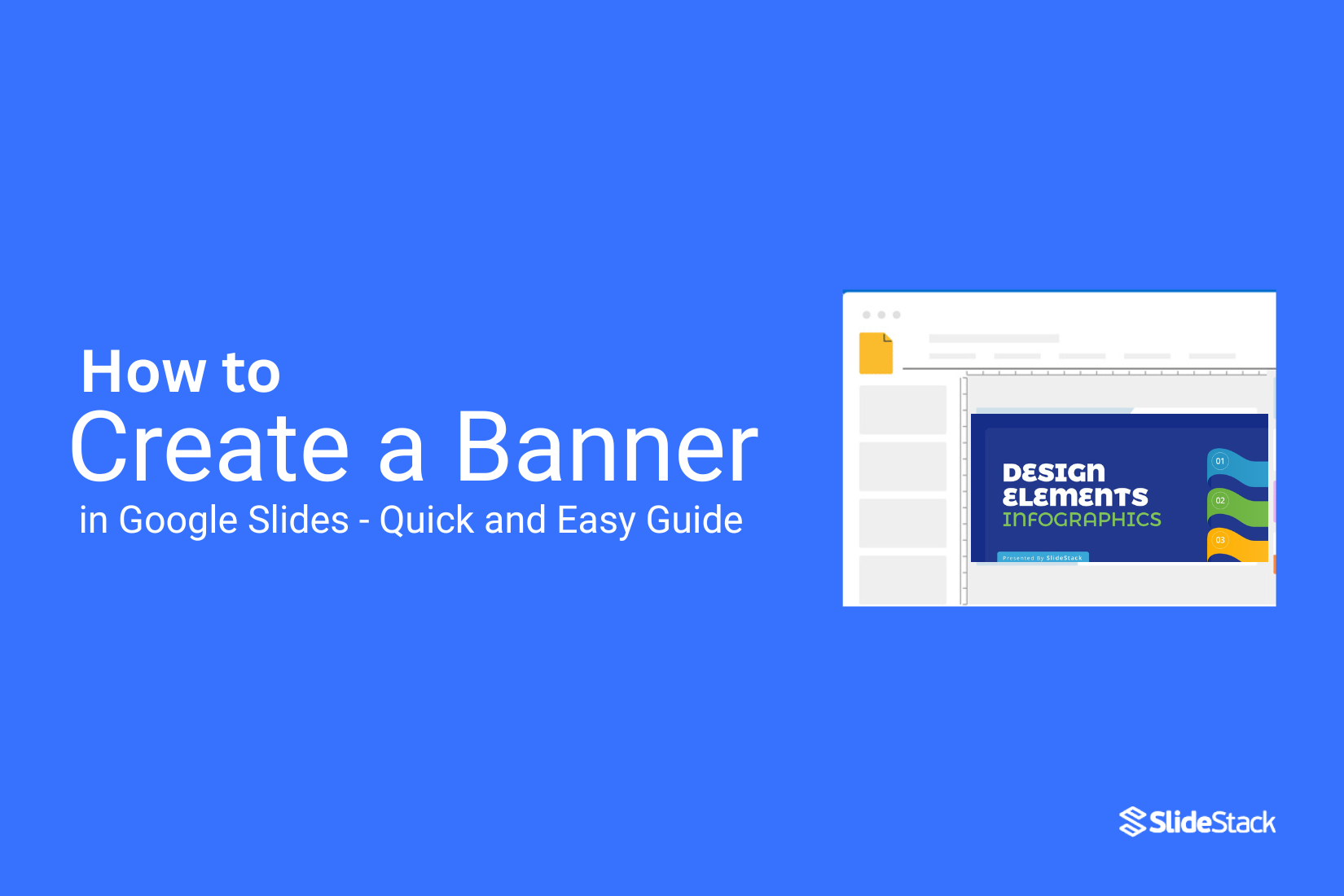
How to Create a Banner in Google Slides - Quick and Easy Guide
Creating a banner in Google Slides can feel confusing and time-consuming, especially if you want it to look professional. Many people waste hours trying to adjust elements, fonts, and colors without a clear plan. This can be frustrating and discouraging.
Fortunately, you don’t need to struggle. With a few simple steps, you can design a polished banner quickly and easily. Let’s walk through the process so you can create eye-catching banners without the headache.
What Is a Banner and Why Use Google Slides
A banner is a visual design that shares a message or promotes something. It can be used online or in print. Banners often include text, colors, and images. They grab attention and make information easy to understand.
Google Slides is a tool that helps you create banners quickly. It offers ready-made shapes, text boxes, and images. You can move and resize elements easily. Google Slides works in your browser, so you don’t need extra software. It also lets you save your banner in different formats. This makes sharing simple.
Using Google Slides for banners saves time. You can make updates anytime and see the changes immediately. Even beginners can create neat and clear designs without learning complex software.
Why Choose Google Slides for Banner Design
Google Slides makes banner design easy. Its interface is simple, so anyone can use it. You don’t need to learn complicated software.
The tools are flexible. You can add shapes, text, and images in just a few clicks. Everything can be moved or resized without hassle.
Collaboration is another benefit. Multiple people can work on the same banner at the same time. Changes are saved automatically, so you don’t lose your work.
You can also access your banners anywhere. All you need is a web browser. This makes it easy to work from home, school, or on the go.
Creating a Banner in Google Slides
Here’s a quick guide to designing a banner in Google Slides with clear, simple steps.
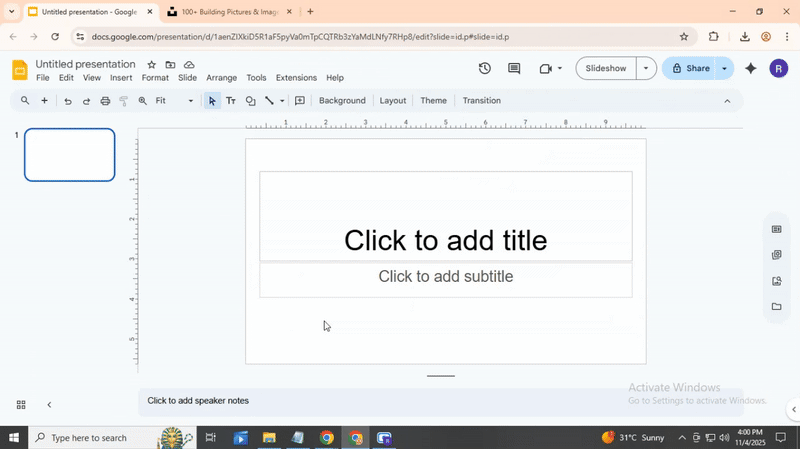
Step 1: Set Up Your Slide Size
Open Google Slides and start a new presentation. Go to the top menu and select File > Page setup. Choose Custom and enter the dimensions for your banner. For example, 20 inches wide and 5 inches tall works well for a website or event banner. Click Apply, and your slide will resize.
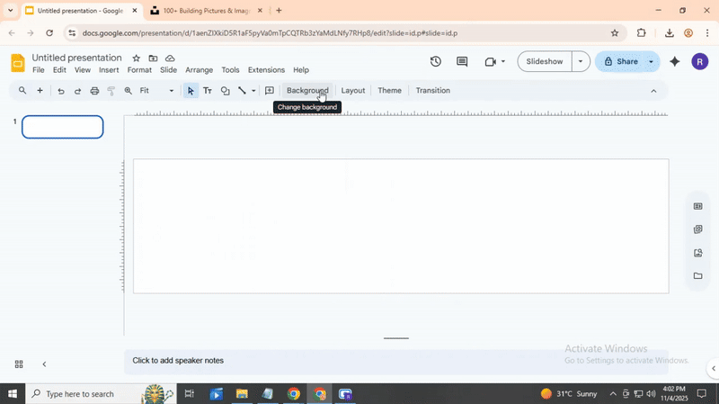
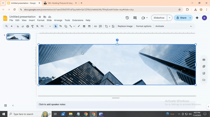
Step 2: Pick a Background
Next, decide on your background. Right-click the slide and choose Change background. You can select a color or add an image. If you use an image, you can stretch it to cover the whole slide. OK, now let’s add some text.
Step 3: Add Text
Click Insert > Text box and draw a box where you want your main message. Type your text and adjust the font, size, and color using the toolbar. Keep it simple so it stands out. You can add another text box for smaller details, like a date or website. Alright, spacing and alignment are important. Move the boxes around until they look balanced.

Step 4: Include Shapes or Icons (Optional)
You can add shapes or icons to make your banner more lively. Go to Insert > Shape or Insert > Image > Search the web to find free icons. Place them carefully so they support your text, not cover it.
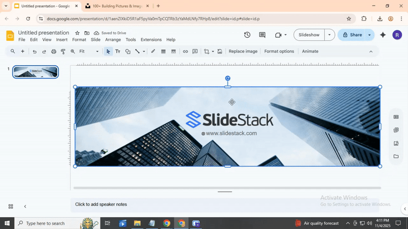
Step 5: Save Your Banner
When your design looks ready, it’s time to save. Go to File > Download, and select PNG or JPEG for image use. You can also save as a PDF if you plan to print.

Best Banner Size and Dimensions for Different Platforms
Banners need the right size to look good. Each platform has its own rules. Using the wrong size can make images stretch or cut off.
- Cover Photo: 820 x 312 pixels
- Event Banner: 1920 x 1080 pixels
- Header Image: 1500 x 500 pixels
- In-Stream Photo: 1200 x 675 pixels
- Story Banner: 1080 x 1920 pixels
- Feed Post Banner: 1080 x 1080 pixels
- Company Cover: 1128 x 191 pixels
- Shared Image: 1200 x 627 pixels
YouTube
- Channel Art: 2560 x 1440 pixels
- Video Thumbnail: 1280 x 720 pixels
Picking the right size keeps your banner clear and professional. It also makes sure all text and images appear correctly on each platform.
Creative Banner Design Ideas and Inspiration
Banners can grab attention when done well. Bright colors, bold shapes, and clear text help your message stand out. You can mix photos with graphics to make a banner lively.
Try using patterns or textures to add depth. Simple icons or illustrations can guide the viewer’s eye. You can also experiment with unusual layouts that break away from standard designs.
Think about the message first. Every design choice should support what you want to say. For example, a clean layout works well for professional banners, while playful fonts suit fun events.
Look at other banners for ideas. Notice what draws your attention. You can combine several small ideas into a unique design.
Colors, fonts, and spacing are powerful tools. They can create a mood and focus attention. Keep the design balanced, so it is easy to read from a distance.
Small details matter. Borders, shadows, or overlays can make the banner look polished. Even subtle effects can improve the overall impact.
Banners are not just decoration. They tell a story in a single glance. A well-designed banner can leave a lasting impression.
Tips for Creating Effective Banners
1. Keep It Simple. Focus on one main message. Avoid cluttering your banner with too many elements or text. Clear visuals help viewers understand your point quickly.
1. Use Readable Text. Make sure the font size and style are easy to read from a distance. Contrast the text color with the background so it stands out.
1. Choose Strong Visuals. Select images or graphics that support your message. A relevant visual draws attention and reinforces your point without overwhelming the viewer.
Test and Refine. Check your banner on different screens or in print. Adjust colors, spacing, or wording if needed. Small tweaks can make a big difference in clarity and impact.
Common Mistakes to Avoid
Many people make the same errors when using motion paths. One common mistake is adding too many animations. Too many moving objects can distract the audience. Another error is moving objects too fast. If an object moves too quickly, viewers may miss the point.
Some forget to align objects properly. Misaligned elements can make a slide look messy. Others use motion paths without purpose. Every animation should guide attention or show a process.
Lastly, not testing the animation can cause problems. Always preview slides to ensure everything moves smoothly and looks right.
Conclusion:
Using Google Slides to create banners makes designing simple and flexible. You can adjust layouts, add colors, and insert images without extra software. This makes your banners suitable for presentations, social media posts, or event promotions. The more you practice, the quicker you’ll become at designing clean and professional banners. For extra tips and examples, explore online resources to spark new ideas. Keep experimenting with each design and enjoy the process. Happy designing!
FAQs:
1. What is a banner and why should I make one in Google Slides?
A banner is a visual design used to share a message or promote something. It can include text, colors, and images. Google Slides makes it easy to create banners quickly, move elements, and save them in different formats.
2. Can beginners use Google Slides for banners?
Yes. The tools are simple and easy to use. You can add text, shapes, and images without learning complex software. Changes are saved automatically, so you don’t lose your work.
3. How do I set up the size of my banner?
Open Google Slides and start a new presentation. Go to File > Page setup, choose Custom, and enter your dimensions. For example, 20 inches wide by 5 inches tall works well for online or event banners. Click Apply to resize the slide.
4. How can I add a background to my banner?
Right-click your slide and select Change background. You can choose a color or add an image. If you use an image, stretch it to cover the whole slide.
5. How do I add text to my banner?
Click Insert > Text box and draw a box where you want your message. Type your text and adjust the font, size, and color. Add more boxes for extra details, like a date or website. Move the boxes until the layout looks balanced.
6. Should I add shapes or icons?
Shapes and icons can make a banner more lively. Go to Insert > Shape or Insert > Image > Search the web for free icons. Place them so they support your text without covering it.
7. What file types can I save my banner as?
You can save your banner as a PNG or JPEG for online use. If you plan to print it, choose PDF.
8. What sizes should I use for different platforms?
Each platform has recommended sizes:
- Facebook cover: 820 x 312 pixels
- Twitter header: 1500 x 500 pixels
- Instagram story: 1080 x 1920 pixels
- LinkedIn cover: 1128 x 191 pixels
- YouTube channel art: 2560 x 1440 pixels
- Using the right size keeps your banner clear and professional.
9. What are some tips for creating a good banner?
Keep it simple. Focus on one main message. Use readable text with high contrast. Choose visuals that match your message. Test your banner on different screens. Small adjustments can make it look much better.


You may also be interested in ...

How To Create An Eye-Catching Portfolio
If you’re looking to create an eye-catching portfolio, this post will come in handy. In this article, you can find the easies...
23 Jun, 2024

How To Easily Create An Infographic
Infographics are the perfect way to make a presentation that will impact an audience, but their design and composition might...
08 Jun, 2024

PowerPoint Template Tips & Tricks You Ne...
PowerPoint seems to be an unknown world for many people, especially those who have been assigned to create a presentation out...
08 Jun, 2024