EBITDA Slide in Presentations: A Simple Guide
An EBITDA slide can help an audience understand a company’s operating performance. Yet, financial data can become hard to follow if the slide shows too many numbers, charts, or details. A weak layout can also hide the main EBITDA figure and key changes.
A clear structure makes the data easier to read. The slide should show the main figures, EBITDA margin, changes over time, and key factors that affect EBITDA. Charts and short notes can add context without filling the slide with extra details.
This guide explains how to create an EBITDA slide for a business presentation. You will learn what to include, which slide formats to use, common mistakes to avoid, and how to present EBITDA data in a clear way.
What Is an EBITDA Slide in a Presentation?
An EBITDA slide shows a company’s earnings before interest, taxes, depreciation, and amortization. It gives the audience a clear view of operating earnings without some costs that affect net income. A well-made EBITDA slide can help explain business performance, compare results across periods, or support a financial discussion.
The slide may show EBITDA as a single number. It may also include revenue, EBITDA margin, and changes over time. The right format depends on the goal of the presentation.
What Does EBITDA Mean?
EBITDA stands for Earnings Before Interest, Taxes, Depreciation, and Amortization.
It starts with earnings and leaves out four items:
• Interest: The cost of borrowing money.
• Taxes: Taxes paid on business income.
• Depreciation: The expense linked to the use of physical assets over time.
• Amortization: The expense linked to certain non-physical assets over time.
EBITDA is often used to show earnings from core business operations before these items are included. It can give the audience a simple way to look at operating performance.
Why EBITDA Matters in Presentations
Financial slides can contain a lot of numbers. EBITDA helps focus attention on one key earnings measure.
A presentation may use EBITDA to show:
• Current operating earnings
• EBITDA growth over time
• EBITDA margin
• Changes from one period to another
• Differences between actual and planned results
• Business performance across different periods
For example, a company may show revenue and EBITDA for the last three years. A simple chart can make the change easier to follow than a table filled with numbers. An EBITDA slide also gives the speaker a clear point to discuss. The presenter can explain why EBITDA changed and what the change means for the business.
EBITDA vs. Net Income and Operating Profit
EBITDA, net income, and operating profit are different measures. Each one looks at business performance from a different angle. EBITDA focuses on earnings before interest, taxes, depreciation, and amortization.
Operating profit accounts for operating costs, including depreciation and amortization. It does not include interest or income tax. Net income goes further. It reflects income after operating costs, interest, taxes, and other applicable expenses.
A simple comparison can help:
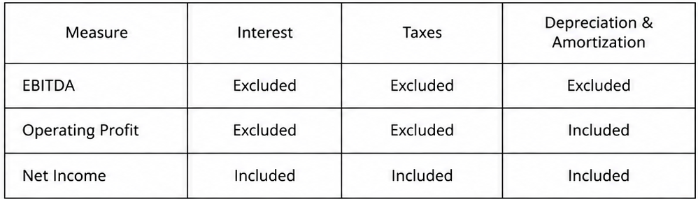
The three figures can tell different parts of the same financial story. An EBITDA slide works best when the audience needs to focus on operating earnings before interest, taxes, depreciation, and amortization.
What Should an EBITDA Slide Include?
An EBITDA slide should show the main numbers that help explain a company’s operating performance. Keep the slide focused. Use clear figures and short notes. The reader should understand the main point without reading a large block of text.
EBITDA and Revenue Figures
Start with revenue and EBITDA figures for the same period. Revenue shows the total income from business activities. EBITDA shows earnings before interest, taxes, depreciation, and amortization.
Show both figures side by side or in a simple chart. Add the period for each number. This makes the data easier to read and compare.
For example:
• Revenue: $10 million
• EBITDA: $2.5 million
• Period: FY 2025
You can also show the figures for two or more periods. This gives the audience a clear view of changes over time.
EBITDA Margin
EBITDA margin shows EBITDA as a share of revenue. It helps show how much EBITDA the company produces from its revenue.
The basic formula is:
EBITDA Margin = EBITDA ÷ Revenue × 100
For example, a company with $2.5 million in EBITDA and $10 million in revenue has an EBITDA margin of 25%. Add the margin next to the EBITDA figure. A simple percentage can make the slide easier to read. It also gives more context than EBITDA alone.
Year-over-Year EBITDA Changes
Show how EBITDA changed from one year to the next. This can be shown as a percentage or as a dollar change.
For example:
• 2024 EBITDA: $2 million
• 2025 EBITDA: $2.5 million
• YoY change: +25%
A small bar chart can show this change clearly. Use labels for each year. Keep the chart simple so the main figures stay easy to read.
Key Factors Affecting EBITDA
Numbers alone may not explain why EBITDA changed. Add a few short points that describe the main factors behind the change.
These factors may include:
• Higher or lower revenue
• Changes in operating costs
• Pricing changes
• Changes in sales volume
• Higher or lower staff costs
• Changes in other operating expenses
Keep each point short. Focus only on factors that had a clear effect on EBITDA. This gives the audience more context without filling the slide with text.
How to Create an EBITDA Slide
A good EBITDA slide should make the main financial result easy to see. Keep the layout clean and focus on the numbers that support your message. A clear structure also helps your audience understand the financial story faster.
Start With the Main EBITDA Figure
Start the slide with the main EBITDA figure. Make this number easy to find. Use a large font and place it in a clear position on the slide. You can also show the EBITDA margin beside the main figure. This gives your audience another useful measure of performance. Keep the focus on the most important number rather than filling the slide with too many figures.
Add Relevant Financial Data
Add financial data that helps explain the EBITDA figure. Revenue, operating costs, and EBITDA margin can provide useful context. Keep the data focused. Each number should help explain the main result. Too many figures can make the slide harder to read.
Use Charts to Show EBITDA Trends
A chart can show how EBITDA changes over time. A line chart works well for showing movement across several periods. A bar chart can also help compare EBITDA across different years, quarters, or business segments. Use clear labels for each period. Make sure the EBITDA values are easy to read. The chart should support the main figure rather than take attention away from it.
Highlight Important Changes
Point out major changes in EBITDA. A rise or drop can help explain what happened during the period. You can use short labels near the data points. For example, a note can explain that higher costs affected EBITDA. Another note can point to stronger revenue growth. Keep these highlights short. The audience should understand the key change without reading a large block of text.
Add Brief Supporting Notes
Use short notes to explain details that the numbers alone do not show. These notes can give context about major cost changes, revenue shifts, or other factors linked to EBITDA. Avoid long explanations. One or two short lines are often enough. The main figure and chart should carry most of the message. A strong EBITDA slide gives the audience a clear view of the result, the supporting numbers, and the changes behind them. The goal is to make the financial story easy to follow.
EBITDA Slide Formats for Presentations
An EBITDA slide can present financial data in several ways. The right format depends on the message you want to share. A summary works well for key figures. A chart helps show changes over time. A bridge can explain what caused EBITDA to move. Here are five useful formats.
EBITDA Summary Slide
An EBITDA summary slide puts the main numbers in one place. It can show EBITDA, revenue, operating costs, and EBITDA margin. Use large figures for the most important metrics. Keep supporting data smaller. This format works well for an overview. It helps the audience see the company’s financial position without reading a large table.
EBITDA Trend Chart
An EBITDA trend chart shows how EBITDA changes over time. You can use months, quarters, or years on the horizontal axis. EBITDA values appear on the vertical axis. A line chart can make the trend easy to follow. Add labels for key periods or major changes. Keep the chart simple so the main trend stays clear.
EBITDA Bridge or Waterfall Chart
An EBITDA bridge shows how one EBITDA figure changes into another. It can start with the previous period’s EBITDA. Each bar can then show an increase or decrease from factors such as revenue, costs, or other business changes. The final bar shows the new EBITDA figure. This format helps explain the reasons behind a change instead of showing only the final number.
EBITDA Margin Comparison
An EBITDA margin comparison shows how EBITDA relates to revenue. You can compare the margin across different periods, products, business units, or companies.
A simple bar chart can make these differences easy to see. Add the percentage value to each bar. This helps the audience focus on margin changes rather than only looking at EBITDA amounts.
Actual vs. Forecast EBITDA
An actual vs. forecast EBITDA slide compares planned results with actual results. It can show data for each quarter or year. Use two clear data series for the comparison. Add labels that show the difference between actual and forecast figures. This makes it easier to see where results were above or below the plan.
How to Design a Clear EBITDA Slide
A clear EBITDA slide helps the audience understand the main financial point quickly. The slide should show the most useful numbers first. Extra details should support the main message instead of taking attention away from it.
Keep the Data Focused
Start with the EBITDA figure and the data that helps explain it. Avoid adding every financial number to one slide. Too much data can make the slide hard to read. Use a small set of related figures. You may show EBITDA, revenue, EBITDA margin, and the change from the previous period. Each number should have a clear purpose.
Use Clear Labels and Numbers
Every number should have a simple label. The audience should know what each figure means without reading extra text. Use consistent number formats across the slide. Keep decimal places, percentages, and currency formats consistent. Show units such as $, %, or millions where needed. A clear label also helps prevent mistakes in reading the data. Place the label close to the number it describes.
Create a Simple Visual Hierarchy
Give the most important EBITDA figure the most visual weight. Make it larger or place it in a clear position on the slide. Supporting numbers can use smaller text. Charts and other visuals should also follow this order. The main figure should stand out first. The audience can then move to the supporting data. Keep enough space between each section. A clean layout makes the slide easier to scan.
Separate Key Metrics From Supporting Details
Keep the main metrics in one clear area. Place supporting details in a separate section. This creates a clear path through the information. For example, the top of the slide can show EBITDA and EBITDA margin. A chart below can show the EBITDA trend. Notes or extra financial details can sit in a smaller area. This structure helps the audience see the main point first. The supporting details remain available for a closer look.
Common EBITDA Slide Mistakes
An EBITDA slide should make financial information easy to follow. Some design and content choices can make the slide harder to understand. The goal is to show the key numbers, explain major changes, and give enough context for the audience.
Adding Too Many Financial Metrics
A slide can become crowded with too many numbers. Adding revenue, net income, margins, cash flow, costs, and other metrics can take attention away from EBITDA. Keep the slide focused on the main message. Add only the financial data that helps explain the EBITDA figure or its change. Extra metrics can make the main point harder to find.
Using Complicated Charts
Charts should help the audience understand EBITDA trends quickly. A chart with too many lines, labels, colors, or data points can make the slide hard to read. Use a simple chart that shows the most important trend. Label the data clearly. Remove details that do not support the main message.
Leaving Out Important Context
A single EBITDA number does not tell the full story. The audience may need more information to understand what the figure means. Add useful context, such as the reporting period, comparison period, or key business factor linked to the result. This gives the audience a clearer view of the financial picture.
Mixing Different Reporting Periods
Using numbers from different reporting periods can create a misleading comparison. For example, EBITDA from one quarter should not be compared with revenue from a different quarter without a clear reason. Keep the reporting periods consistent across the slide. Label each period clearly. This makes the data easier to compare and reduces the chance of misreading the numbers.
Not Explaining Major EBITDA Changes
A large increase or decrease in EBITDA needs some explanation. The audience may notice the change but not understand what caused it. Add a short note beside the chart or figure. Explain the main reason for the change. This could relate to revenue, costs, pricing, or another major business factor shown in the presentation.
EBITDA Slide Example for a Business Presentation
An EBITDA slide can give the audience a quick view of business performance. The slide should keep the main number easy to find. A small set of supporting data can then show what changed over time.
Example EBITDA Data
Suppose a business wants to show its EBITDA results for three years. The data could look like this:
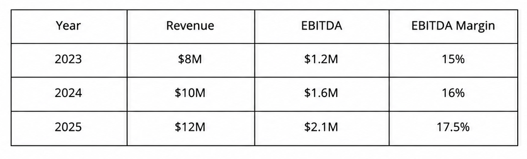
This data shows steady growth. Revenue increased each year. EBITDA also increased from $1.2 million to $2.1 million. The EBITDA margin rose from 15% to 17.5%.
Example Slide Structure
A simple EBITDA slide can use three main areas:
• Main figure: Show the latest EBITDA value in a large number.
• Trend chart: Use a simple bar or line chart to show EBITDA across the three years.
• Supporting data: Add revenue and EBITDA margin below the chart.
A short note can sit near the chart. It can point out the main change, such as the rise in EBITDA margin. This gives the audience a clear point to follow without adding too much text.
How to Explain the EBITDA Slide
Start with the latest EBITDA figure. For this example, the main number is $2.1 million. Next, explain the trend. EBITDA increased from $1.2 million in 2023 to $2.1 million in 2025. Revenue also grew during the same period. The EBITDA margin adds more context. It rose from 15% to 17.5%. This shows that EBITDA grew faster than revenue during the period shown.
Keep the explanation short. The audience should understand the main result in a few seconds. Use the chart and data to support the point rather than reading every number on the slide.
Final Notes
An EBITDA slide gives the audience a simple view of operating earnings. It can show the main EBITDA figure, revenue, EBITDA margin, changes over time, and the factors behind those changes. A strong slide keeps the data focused. The main EBITDA figure should stand out first. Supporting numbers, charts, and notes should help explain the result. Simple formats such as summary slides, trend charts, bridge charts, margin comparisons, and actual vs. forecast charts can present the data in different ways.
Good slide design also matters. Use clear labels, consistent number formats, simple charts, and a clear visual hierarchy. Keep the main metrics separate from supporting details. Avoid crowded layouts and unnecessary data. The example in this guide shows how EBITDA, revenue, and EBITDA margin can work together. It also shows how a short explanation can help the audience understand major changes. The main goal is simple: present EBITDA data in a clear format that helps the audience understand the result, the trend, and the reasons behind the change.
FAQs
What is an EBITDA slide in a presentation?
An EBITDA slide shows a company’s earnings before interest, taxes, depreciation, and amortization. It can include EBITDA, revenue, EBITDA margin, and changes over time.
What should an EBITDA slide include?
An EBITDA slide can include the main EBITDA figure, revenue, EBITDA margin, year-over-year changes, and key factors that affected EBITDA.
How do you calculate EBITDA margin?
Use the formula: EBITDA Margin = EBITDA ÷ Revenue × 100. For example, $2.5 million in EBITDA divided by $10 million in revenue gives a 25% EBITDA margin.
Which charts work well for EBITDA presentations?
Line charts work well for showing EBITDA trends over time. Bar charts can compare EBITDA across periods or business segments. A bridge or waterfall chart can show the factors behind an EBITDA change.
How do you make an EBITDA slide easy to read?
Keep the data focused. Make the main EBITDA figure easy to find. Use clear labels and simple charts. Keep supporting notes short.
What are common EBITDA slide mistakes?
Common mistakes include adding too many financial metrics, using complicated charts, leaving out important context, mixing reporting periods, and failing to explain major EBITDA changes.
How can you explain an EBITDA change on a slide?
Add a short note that explains the main reason for the change. Factors may include revenue changes, pricing, sales volume, staff costs, or other operating expenses.
What is the difference between EBITDA and net income?
EBITDA excludes interest, taxes, depreciation, and amortization. Net income includes these items along with other applicable expenses.
What is an EBITDA bridge chart?
An EBITDA bridge or waterfall chart shows how one EBITDA figure changes into another. It can show increases and decreases caused by revenue, costs, or other business factors.
Can an EBITDA slide compare actual and forecast results?
Yes. An actual vs. forecast EBITDA slide can compare planned results with actual results across quarters or years. Clear labels can show the difference between the two figures.
Meta Description
Create a clear EBITDA slide with key metrics, charts, design tips, examples, and common mistakes to avoid in business presentations.


You may also be interested in ...

Tips To Create A Great Infographic
Infographics Have been around for a while, but not many people know about them or are their preferred presentation choice. If...
08 Jun, 2024

3 Steps To Create The Best Presentation...
Presentations are something wonderful when well done, you can captivate an audience or be super interested in what another pe...
23 Jun, 2024

3 Tips For Your Next Presentation You MU...
PowerPoint presentations are perfect for explaining a topic and communicating your ideas with a visual aid. But most people s...
08 Jun, 2024