Death by PowerPoint: 10 Ways to Make Your Slides More Effective
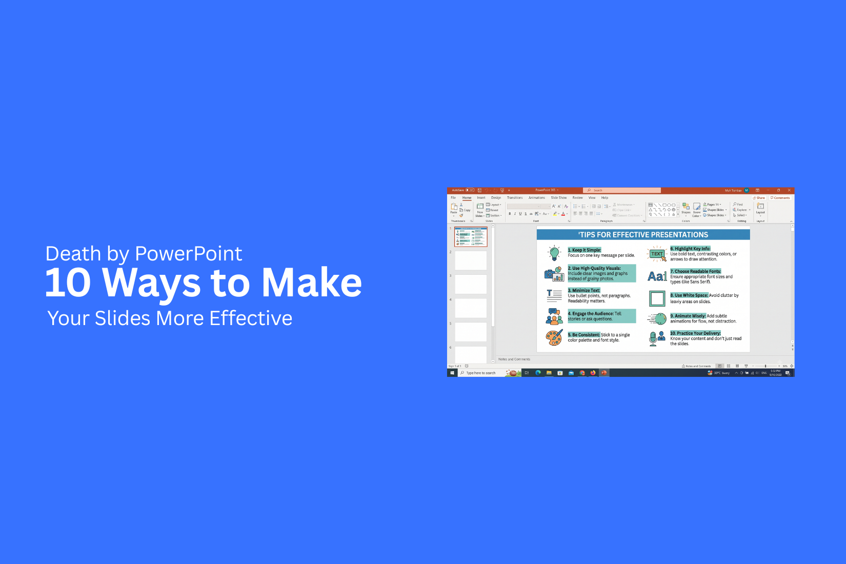
PowerPoint slides can lose an audience before the main message gets across. Too much text, crowded layouts, weak visuals, and complex charts can make a presentation hard to follow. This is often called “Death by PowerPoint.”
The problem gets worse as each slide adds more information without a clear purpose. People may stop paying attention, miss key points, or struggle to recall the message after the presentation. Even useful data can lose its value behind a poor slide design.
The good news is that small changes can make slides easier to read and follow. This guide covers 10 practical ways to make your slides more effective, from using less text to improving visual hierarchy and planning for your audience.
What Is Death by PowerPoint?
Death by PowerPoint is a term for a presentation that feels dull, crowded, or hard to follow. The slides often contain too much text, too many bullet points, or too many visual effects. The speaker may also read the slides word for word. The main problem is not PowerPoint itself. The problem is how the slides are designed and used.
A crowded slide can make it hard for people to find the main point. Long blocks of text can also pull attention away from the speaker. After several slides like this, the audience may stop paying attention. Good presentation slides should support the speaker, not replace the speaker. Each slide should have a clear purpose. Simple layouts, short points, useful visuals, and clear headings can make the message easier to follow. The goal is simple: help the audience understand the message without making them work too hard to read the slides.
The Psychology Behind Presentation Fatigue
Presentation fatigue happens when people struggle to keep their attention during a long or poorly designed slide deck. The problem is not always the topic. The way information appears on the screen also affects how people listen, read, and remember. A crowded slide can make the audience work too hard. A long presentation can make that effort feel even greater. Over time, attention drops and the main message becomes harder to follow.
Information Overload
People can only process a limited amount of information at one time. A slide filled with text, charts, icons, and images can create too much mental work. Large blocks of text make people read instead of listen. Too many details can also make it hard to spot the main point. The audience may spend time trying to understand the slide instead of following the speaker. A better slide gives each idea enough space. Use short phrases and clear headings. Show only the details that support the main message.
Memory Retention Issues
People may see every slide, yet still forget most of what they saw. Too much information makes it harder to store key points in memory. A slide with several facts can leave the audience unsure about what matters most. Clear structure helps solve this problem. Group related points and highlight the main idea. Simple visuals can also support memory. A chart can show a trend. A diagram can show how parts connect. A short example can help the audience link a new idea to something familiar.
Distractions Cause People to Switch Off
Small distractions can break attention. A busy layout, tiny text, random animations, or too many colors can pull attention away from the speaker. The audience may start reading the slide instead of listening. They may also stop following the presentation once the slides feel hard to use.
Good slide design keeps attention on the message. Use a clean layout and readable text. Keep visual effects tied to the content. Each slide should have a clear job. Part of the screen. The goal is to help the audience follow the story without extra mental effort.
What Causes Death by PowerPoint?
A presentation can lose the audience long before the last slide. The problem is often not the topic. It is how the information appears and how it is delivered. Too much text, weak design, flat delivery, and hard-to-read data can make slides tiring to follow.
Here are five common causes of Death by PowerPoint.
1. Text Overload
A slide packed with text gives the audience too much to read. They may start reading the slide instead of listening to the speaker. Long paragraphs also make key points hard to find. A better slide uses short phrases, clear headings, and only the details needed to support the speaker's message. Keep each slide focused on one main idea. Move extra details to speaker notes or a handout.
2. Cluttered Design
Too many elements can make a slide hard to scan. Large blocks of text, many colors, extra shapes, and too many images can compete for attention. A clean layout gives each element enough space. Use a simple visual order. Make the main point easy to spot. The goal is not to fill every part of the slide. Empty space can help separate ideas and make the content easier to read.
3. Monotonous Presentation Delivery
Good slides can still fail with a flat delivery. A speaker who reads every word from the screen gives the audience little reason to stay engaged. Use your slides as visual support. Speak to the audience instead of reading the screen. Change your pace and tone as the topic shifts. Short pauses can also help. They give people time to follow an important point without making the presentation feel slow.
4. Overcomplicated Charts and Data
Charts can help explain numbers, but a complex chart can create more work for the audience. Too many labels, data points, colors, or categories can hide the main message. Start with the point you want the audience to understand. Then show only the data that supports that point. Use clear labels and simple chart types. Highlight the key number or trend so the audience knows where to look.
5. Ignoring the Audience
A presentation should match the people in the room. A technical team may need more detail. A general audience may need simpler language and more context. Audience needs also affect slide length, examples, visuals, and the level of detail. A speaker who ignores these needs can lose attention even with good content. Ask what the audience needs to know, why they need it, and what they should do with the information. Build the slides around those answers.
The Cost of a Presentation Gone Wrong
A weak presentation can cost more than a few bored faces. It can make your message hard to follow and leave people unsure about what to do next.
Poor slides often create problems such as:
• Lost attention: Too much text or clutter can make people stop following the speaker.
• Weak message: A crowded slide can hide the main point.
• Poor memory: People may struggle to remember key facts after the presentation.
• Wasted time: Extra slides and long explanations can slow the meeting or lesson.
• Bad decisions: Unclear data can make it harder for people to understand the issue and choose the right action.
• Low trust: Slides with errors, poor layout, or unclear data can make the presenter look unprepared.
The cost also grows with the size of the audience. A poor 10-minute presentation affects one speaker and a few listeners. A weak presentation shared with a large team can waste much more time. That is why effective slides need more than a clean design. Each slide should help the audience follow the message, understand the key point, and stay focused on what matters.
10 Ways to Make Your Slides More Effective
Good slides do more than show information. They help people follow your message, stay focused, and remember key points. Small changes in slide design can make a big difference.
1. Build a Story, Not Just Slides
A strong presentation has a clear flow. Each slide should support the main message. Start with the problem, question, or topic. Then build your ideas step by step. End with a clear takeaway. Avoid adding slides just to fill time. Each slide should have a reason to be there. Ask yourself, “What should the audience understand after this slide?” Use the answer to guide your content.
2. Focus on One Idea Per Slide
Too many ideas can make a slide hard to follow. Give each slide one main point.
Use a short headline to state that point. Add only the text, image, chart, or example needed to support it.
This also makes your presentation easier to present. You know what each slide needs to communicate.
3. Use Less Text and More Visuals
Large blocks of text can make people stop listening. Slides should support your speech, not replace it.
Cut long sentences into short phrases. Remove words that do not add value. Use images, icons, diagrams, charts, and simple shapes to show key ideas. A useful visual can explain a point with less text.
Keep the most important words easy to spot. Your audience should understand the main point without reading a full paragraph.
4. Use Contrast and Visual Hierarchy
Every slide needs a clear order. The main point should stand out first. Use size, weight, spacing, and color to show what matters most. Make the title easy to see. Keep supporting text smaller. Strong contrast also improves readability. Dark text on a light background is easy to read. The same rule applies to other color choices. Avoid giving every element the same size or weight. That makes the slide feel flat and hard to scan.
5. Simplify Charts and Data
Charts can quickly become crowded. Too many labels, colors, numbers, or data points can hide the main message. Start with the one fact your audience needs to see. Remove details that do not support that point. Use a clear chart title. Label key numbers directly. Keep the number of colors low. A simple chart often works better than a complex one. Your audience should understand the main trend without needing a long explanation.
6. Keep Your Slide Design Consistent
A consistent design makes a presentation easier to follow. Use the same fonts, colors, spacing, and layout rules across your slides. Keep title positions similar. Use a small set of font sizes. Follow the same style for charts, icons, and images. This does not mean every slide must look the same. You can change layouts while keeping the main design rules in place.
7. Practice Delivery, Not Just Design
A well-designed deck cannot fix a weak delivery. Your words, pace, voice, and body language also shape the presentation. Practice speaking with your slides. Check how long each section takes. Look for places where you rush or spend too much time. Practice your opening and closing several times. Know the main point of every slide. This helps you speak with more control instead of reading from the screen.
8. Plan for Your Audience
Your slides should match the people in the room. A group of experts may need detailed data. A general audience may need more context and simple examples.
Use language your audience understands. Focus on the questions they may have. Remove details that do not help them understand the main point.
The goal is not to show everything you know. The goal is to give people the information they need.
9. Use Animations and Transitions With Purpose
Animations can help guide attention. They can also show movement, steps, or changes.
Use them to support your message. Avoid adding effects just because they look interesting.
Keep animation timing simple. Use similar effects across related slides. Skip effects that distract from your content.
A clean transition can help connect two ideas. Too many effects can make the presentation feel busy.
10. Edit and Test Every Slide
Your first version is rarely your best version. Review every slide before you present.
Check the text for errors. Remove extra words. Look for crowded areas. Check image quality and chart labels.
Test the deck on the screen you plan to use. Check font size, colors, spacing, videos, and animations.
Then review the full presentation from start to finish. Each slide should support the next one and move the audience toward your main message.
Examples: Bad vs. Effective Slides
A slide can contain the right information and still be hard to follow. The main problem is often the way the content is arranged. The examples below show how simple changes can make a slide clearer and easier to read.
1. Sales Strategy Slide
Bad slide: A sales strategy slide may list goals, target customers, sales channels, pricing, growth plans, and key actions in long blocks of text. The audience has to read the slide to understand the main point.
Effective slide: Use a clear headline that states the main strategy. Group the content into three or four short sections. Add simple icons or shapes to separate each idea. Keep each section focused on one message.
Better approach:
• Main sales goal
• Target customer
• Key sales channels
• Next action
The audience can scan the slide and understand the plan without reading a large block of text.
2. Performance Data Table
Bad slide: A large table may show sales, profit, growth, costs, and other figures across many months. Small text and too many numbers make the data hard to read.
Effective slide: Show only the numbers needed for the main point. Highlight the most useful figures. Use a simple chart for trends or comparisons.
For example, a sales slide can show:
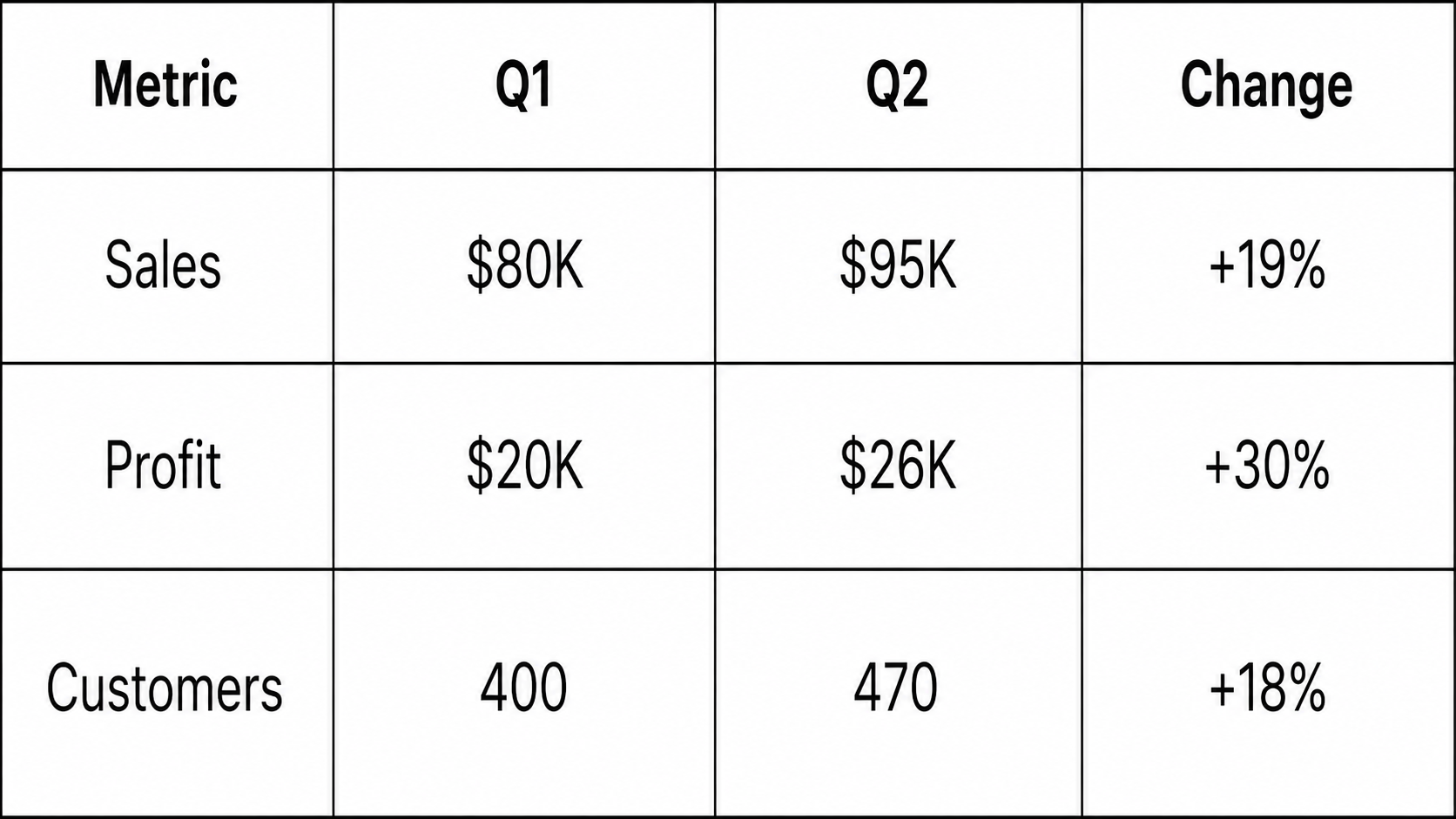
The slide gives the audience a clear view of what changed.
3. Process Diagram
Bad slide: A process slide may use many boxes, arrows, labels, and small details. The audience may not know where the process starts or what comes next.
Effective slide: Show the process as a simple path. Use four to six main steps. Give each step a short label and one brief detail.
Example:
Plan → Create → Review → Approve → Launch
This structure makes the order easy to follow. Extra details can go into speaker notes or a later slide.
4. Product Features Overview
Bad slide: A product slide may list every feature in long sentences. The result looks more like a product sheet than a presentation slide.
Effective slide: Group features into three or four main areas. Use short labels and one-line descriptions.
Example:
Easy Setup: Start using the product with fewer steps.
Team Tools: Share work and manage tasks in one place.
Reports: View key results in simple charts.
This format helps the audience understand the product without reading a wall of text.
5. Presentation Length and Slide Density
Slide density matters just as much as slide design. A short presentation with crowded slides can feel harder to follow than a longer presentation with clear slides.
Bad approach: A 10-minute presentation uses 5 slides, but each slide contains several paragraphs, charts, tables, and images.
Effective approach: Break large topics into smaller ideas. Give each slide one main message. Use more slides when the content needs more space.
For example:
Crowded slide: Sales results + customer data + market trends + next steps
Clear structure:
• Slide 1: Sales results
• Slide 2: Customer data
• Slide 3: Market trends
• Slide 4: Next steps
The goal is not to use fewer slides. The goal is to make each slide easy to understand. A clear slide gives the audience more time to listen instead of reading.
How to Fix a PowerPoint Slide That Is Not Working
A weak slide often tries to do too much at once. The message gets lost among text, images, charts, and other elements. A few simple changes can make the slide easier to follow.
Identify the Main Message
Start by asking one simple question: What should the audience remember from this slide? Write that idea in one short sentence. Use it as the main focus of the slide. Remove content that does not support this idea. Keep facts, examples, and visuals that help explain the main point. This gives the audience a clear path through the slide.
Remove Unnecessary Information
Too much content can make a slide hard to read. Long paragraphs, extra data, and repeated points can take attention away from the main message. Review every item on the slide. Ask if it helps explain the topic. Remove anything that does not add value. Use short phrases instead of full blocks of text. Keep only the details the audience needs during the presentation.
Improve the Slide Layout
A clean layout helps the audience know where to look first. Start with a clear title. Place related content close together. Leave enough empty space between different sections. Avoid placing too many items on one slide. A simple layout often works better than one packed with boxes, icons, and text. Keep key elements aligned. Use the same spacing and margins across the slide. This makes the content easier to scan.
Strengthen the Visual Hierarchy
Not every item on a slide needs the same level of attention. Use size, position, weight, and spacing to show what matters most. Make the main heading easy to spot. Give the key number or idea more visual weight. Keep supporting details smaller and less prominent. A clear visual order helps the audience follow the message without having to search the slide.
Make the Key Takeaway Clear
End the slide with a clear takeaway. The audience should know the main point after a quick look. Use a short statement, key number, or direct conclusion. Place it in a noticeable position on the slide. A strong takeaway also helps the presenter move into the next point. The slide does not need to explain everything. It needs to make the main idea easy to understand.
How to Prevent Death by PowerPoint During a Presentation
A good presentation needs more than clean slides. The speaker, message, and visuals must work together. A few simple changes can make the presentation easier to follow and more engaging.
Tell a Clear Story
Start with one clear message. Give the audience a reason to listen from the start. Build your points in a simple order. Each slide should support the main idea. Avoid adding facts that do not help the audience understand the topic. A clear story helps people follow your message without getting lost.
Keep the Audience Engaged
Give the audience a reason to stay focused. Ask a short question. Share a useful example. Add a quick activity when it fits the topic. You can also change the way you present information. Use a chart for data. Use an image for a visual idea. Use a short statement for a key point. Small changes can keep the presentation from feeling repetitive.
Match Slides With Your Delivery
Your slides should support what you say. They should not repeat your full speech. Use the slide to show the main point. Then explain the details in your own words. This gives the audience a reason to listen to you instead of reading the screen. Keep your speaking pace steady. Give people enough time to read key information before moving to the next slide.
Use Slides as Visual Support
Slides work best as visual aids. Use short text, images, charts, diagrams, and simple graphics to support your message. Avoid putting full paragraphs on the screen. Too much text can pull attention away from the speaker. Ask yourself one simple question for every slide: Does this visual help explain my point? Remove anything that does not add value.
Practice Before Presenting
Practice the full presentation before you present it to an audience. Read through your speaker notes. Check the timing. Practice moving from one slide to the next. Pay attention to slides that feel too crowded or hard to explain. Edit them before the presentation. Practice also helps you speak with more confidence. You can focus on the audience instead of trying to remember what comes next.
Death by PowerPoint Prevention Checklist
A simple checklist can help you spot slide problems before your presentation starts. Use these points during your final slide review.
• Keep one main idea per slide. Make the key point easy to spot.
• Cut extra text. Remove words that do not support the main message.
• Use short sentences. Keep each line brief and easy to read.
• Leave enough empty space. Give text, images, and charts room to breathe.
• Use readable font sizes. Make sure people at the back of the room can read the slide.
• Limit font styles. Stick to one or two fonts for a clean look.
• Use images with a purpose. Every image should support the topic.
• Simplify charts and graphs. Show only the data the audience needs.
• Keep colors consistent. Use the same color style across the deck.
• Check slide flow. Each slide should help the audience follow your main point.
• Remove repeated information. Do not show the same point on several slides.
• Read slides out loud. This helps you spot long or unclear text.
• Review every slide before presenting. Ask if the slide helps the audience or adds extra noise.
A strong slide does not need to say everything. Your voice should provide the detail. The slide should support your message and help the audience stay focused.
Final Notes
Death by PowerPoint often starts with simple slide problems. Too much text, crowded layouts, complex charts, and weak visual order can make a presentation hard to follow. Effective slides focus on one clear idea at a time. They use short text, useful visuals, readable layouts, and simple charts. Good slides also work with the speaker instead of repeating every word.
Before presenting, review each slide. Remove extra content. Check the layout, font size, colors, charts, and visual flow. Practice your delivery and make sure each slide supports the main message. The goal is not to create more slides or add more design elements. The goal is to help the audience understand, follow, and remember your message. A clear slide gives people more space to listen to the speaker and focus on the point that matters.
FAQs
What does Death by PowerPoint mean?
Death by PowerPoint describes a presentation with crowded slides, too much text, complex visuals, or poor delivery. These issues can make the presentation hard to follow.
What causes Death by PowerPoint?
Common causes include text overload, cluttered layouts, flat delivery, complex charts, and ignoring the audience. These problems can make people lose focus.
How can I avoid Death by PowerPoint?
Use one main idea per slide. Keep text short. Use useful visuals. Simplify charts and keep the slide design consistent. Practice your delivery before presenting.
How much text should I put on a PowerPoint slide?
Use only the text needed to support your main point. Replace long paragraphs with short phrases, headings, charts, images, or diagrams.
How can visuals make PowerPoint slides better?
Visuals can help explain ideas with less text. Use images, icons, charts, diagrams, and simple shapes that support the message on the slide.
Why is one idea per slide useful?
One main idea makes the slide easier to read and understand. It also helps the speaker stay focused on the key message.
How can I simplify a crowded PowerPoint slide?
Start by finding the main message. Remove extra text and data. Group related content. Improve spacing and make the key takeaway easy to spot.
How can I make PowerPoint charts easier to understand?
Show only the data needed for the main point. Remove extra labels and colors. Use clear titles and highlight key numbers or trends.
Do animations cause Death by PowerPoint?
Animations do not always cause a problem. They can help show steps, movement, or changes. Too many effects can distract from the message, so use them with a clear purpose.
How can I make my PowerPoint presentation more engaging?
Tell a clear story, use useful examples, ask short questions, vary your visuals, and match your slides with your delivery. Practice the presentation before presenting.
How do I know if a PowerPoint slide is not working?
A slide may need changes if it has too much text, too many elements, unclear data, or no clear main point. Ask what the audience should remember from the slide and remove anything that does not support that idea.
Why is slide design important in a presentation?
Good slide design helps the audience find the main point and follow the presentation. Clear layouts, readable text, simple visuals, and consistent design can make the message easier to understand.


You may also be interested in ...

Tips To Create A Great Infographic
Infographics Have been around for a while, but not many people know about them or are their preferred presentation choice. If...
08 Jun, 2024

3 Steps To Create The Best Presentation...
Presentations are something wonderful when well done, you can captivate an audience or be super interested in what another pe...
23 Jun, 2024

3 Tips For Your Next Presentation You MU...
PowerPoint presentations are perfect for explaining a topic and communicating your ideas with a visual aid. But most people s...
08 Jun, 2024