Customer Churn and Retention Analysis Presentation
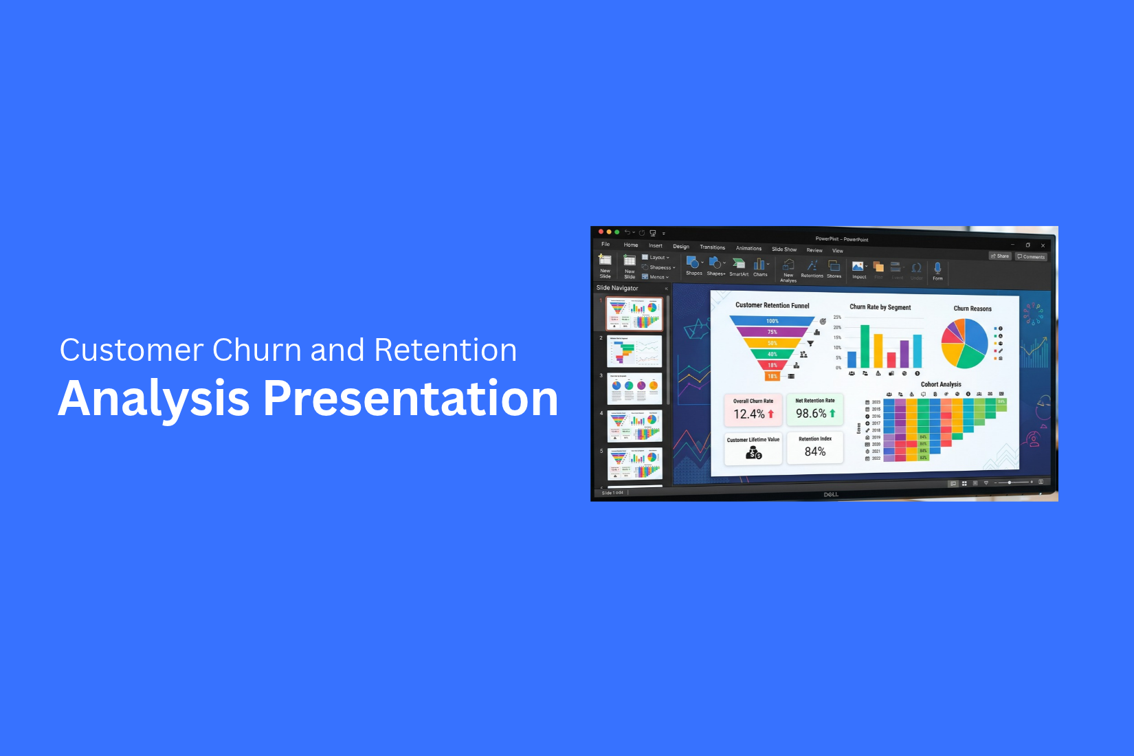
Customer churn can make it hard to see how well a business keeps its customers. A churn and retention analysis presentation brings this data into a clear format. It helps teams review customer loss, retention rates, and key trends.
The numbers alone may not tell the full story. A high churn rate can point to issues with a product, service, or customer experience. Customer segments may also show different churn patterns. A clear presentation helps teams spot these details and understand what they mean.
The right structure turns raw data into useful insights. This guide covers key churn and retention metrics, chart types, analysis methods, common mistakes, and action plans. You will also learn how to shape the presentation for different business teams.
What Is a Customer Churn and Retention Analysis Presentation?
A customer churn and retention analysis presentation explains how many customers leave a business and how many stay. It uses customer data to show changes in churn and retention over time. The presentation can also show key numbers, trends, and areas that need attention.
This type of presentation helps teams review customer behavior in a clear format. It can bring churn and retention data into one place. Charts, tables, and simple visuals can make the data easier to read.
Purpose of Churn and Retention Analysis
The main purpose is to understand customer loss and customer retention. Churn data shows the number or rate of customers who leave. Retention data shows how many customers remain.
A presentation can organize these numbers in a simple way. It can show changes over a set period. It can also help teams see which areas need a closer review.
Churn Rate vs. Retention Rate
Churn rate and retention rate measure two different sides of customer activity. Churn rate shows the share of customers who leave during a set period. A higher churn rate means more customers left during that period.
Retention rate shows the share of customers who stay during a set period. A higher retention rate means more customers remained. Using both rates gives a clearer view of customer movement. A presentation can place the two rates side by side for an easy comparison.
Why Customer Retention Matters
Customer retention shows how well a business keeps its existing customers. A strong retention rate means a larger share of customers continues to stay.
Retention data can also show changes in customer behavior over time. This makes it useful for team reviews and business discussions. A churn and retention presentation gives these numbers a clear structure. Teams can review the data, spot changes, and use the findings to guide their next steps.
Key Metrics for Churn and Retention Analysis
A churn and retention analysis needs clear numbers. These numbers show how many customers stay, how many leave, and how much value they bring over time. The right metrics also make your presentation easier to follow.
Customer Churn Rate
Customer churn rate shows the share of customers who stop using your product or service during a set period. A higher churn rate means more customers are leaving. This metric helps you track customer loss over time. You can also compare churn rates across different periods. This makes it easier to spot changes in customer behavior.
Customer Retention Rate
Customer retention rate shows the share of customers who stay with your business during a set period. It gives you a clear view of how well your business keeps its customers. A higher retention rate means more customers continue their relationship with your business. Add this metric to your presentation to show changes in customer loyalty over time.
Net Revenue Retention
Net Revenue Retention, or NRR, looks at revenue from existing customers over a set period. It accounts for customer upgrades, downgrades, and lost revenue. NRR gives a revenue-based view of customer retention. It can show changes that a basic customer count may miss.
Customer Lifetime Value
Customer Lifetime Value, or CLV, estimates the total revenue a customer may bring during the full customer relationship. This metric connects customer retention with revenue. A longer customer relationship can lead to more value from each customer. CLV can help show why keeping existing customers matters.
Cohort Retention
Cohort retention groups customers based on a shared starting point. This could be the month or quarter they first became customers. The analysis then tracks how many customers from each group remain over time. This makes it easier to compare customer groups and spot changes in retention patterns. A cohort view also adds more detail to your presentation. You can show how retention changes across customer groups instead of using one overall retention number.
How to Structure a Churn and Retention Presentation
A churn and retention presentation should tell a clear story. Start with the main findings. Then show the trends, customer groups, and key causes. End with clear action items. This order helps your audience follow the data and understand what needs attention.
Start With Key Findings
Open the presentation with the most important results. Keep this section short and clear. Show the current churn rate, retention rate, and any major change in customer behavior. Use a few key numbers instead of a large data table. Add short notes to explain what each number means. This gives your audience a clear view of the current situation before you share more details.
Present Churn and Retention Trends
Show how churn and retention have changed over time. A line chart can make these changes easy to see. Use a clear time range, such as monthly or quarterly data.
Point out major changes in the trend. A sudden rise in churn may need more attention. A steady drop in retention can also show a wider customer issue. Keep the focus on what the data shows.
Break Down Customer Segments
Churn may not affect every customer group in the same way. Break the data into useful segments. You can group customers by plan, age, location, signup date, or customer value.
Use simple charts to compare each group. This can show which segments have higher churn or stronger retention. It also helps your audience see where the main changes are taking place.
Highlight Key Causes
Show the main reasons customers leave. Use survey results, customer feedback, support data, or other information you have.
Group similar reasons together. For example, pricing, product issues, poor service, and low usage can each have their own section. Add a short note about the size or share of each cause. This keeps the focus on the issues linked to customer loss.
End With Action Items
Finish the presentation with clear next steps. Link each action to a finding from the data. For example, a high churn rate in one customer group may call for a targeted retention plan. A rise in churn after a price change may call for a review of pricing and customer feedback. Keep each action specific. Assign an owner and a target date where possible. This gives the presentation a clear path from data to action.
How to Analyze Customer Churn
Customer churn shows how many customers stop using a product or service. A churn analysis helps a team see where customer loss happens. It also helps connect churn with customer groups, products, and service types. A clear presentation should show the main patterns in a simple way.
Identify Churn Trends
Start by looking at churn over a set period. A monthly or quarterly view can show changes over time. Use a line chart to make the pattern easy to follow. Show the churn rate for each period. Add a short note for major changes. This gives the audience a clear view of customer loss over time.
Analyze Churn by Customer Segment
Customer groups may have different churn rates. Break the data into useful segments. These may include customer type, plan, location, or account size. Use a bar chart to compare each group. Highlight the groups with higher or lower churn. This helps the audience see which customer groups need more attention.
Compare Churn by Product or Service
Churn can also vary across products or services. Compare the churn rate for each product or service in your presentation. A simple chart can show the difference between them. Add key details about each product beside the chart. This makes it easier to connect customer loss with the product or service being used.
Review Voluntary and Involuntary Churn
Not all churn happens for the same reason. Separate voluntary churn from involuntary churn. Voluntary churn happens when customers choose to leave. Involuntary churn happens for reasons such as payment issues or account problems. Show both types in your presentation. This gives the audience a clearer view of why customers are leaving.
How to Analyze Customer Retention
Customer retention shows how well a business keeps its customers over time. A clear analysis can show changes in customer behavior and revenue. It also helps teams see which customer groups stay longer. A few key measures can make this analysis easier to present.
Track Retention Over Time
Start by reviewing retention across set time periods. Look at monthly, quarterly, or yearly results. This helps show changes in the customer base. A presentation can use a line chart to show these changes. Keep the chart simple and focus on the main trend. Add short notes to explain major changes.
Analyze Customer Cohorts
Group customers based on a shared starting point. A common approach is to group customers by the month they first joined. Then track how many customers from each group stay active over time. This gives a clear view of retention for each group. A cohort table or heatmap can make the results easier to read.
Measure Customer Lifetime Value
Customer lifetime value shows the value a customer brings during their time with a business. Use this measure to connect retention with customer value. Compare lifetime value across customer groups. This can show how longer customer relationships affect total value. Add the key figures to your presentation without filling each slide with too many numbers.
Identify High-Value Retained Customers
Look for customers who stay active and provide strong value over time. Group these customers by factors such as purchase level, account type, or length of the relationship. Review their retention patterns against other groups. This can show which customer segments have strong long-term value. Use a simple chart or table to highlight the main findings.
Visuals for Churn and Retention Presentations
Strong visuals make churn and retention data easier to read. Each chart should have a clear purpose. Keep the design simple. Show only the data that helps explain the main point.
Use Line Charts for Trends
Line charts work well for showing changes over time. Use them to show churn rates or retention rates across months or quarters. A line can make changes easy to spot.
Keep the time periods in order. Add clear labels for each point. Use separate lines for churn and retention if both metrics appear on the same chart. This helps the audience see how the numbers change over time.
Use Bar Charts for Segment Comparisons
Bar charts help compare customer groups. You can use them to compare churn rates across plans, regions, customer types, or other segments. Keep the number of groups small enough to read. Label each bar clearly. Put similar groups close together. This makes the differences easier to see.
Use Heat Maps for Cohort Analysis
Heat maps can show how customer groups perform over time. Each row can represent a customer cohort. Each column can show a month or another time period. Use different shades to show changes in retention. A clear scale helps the audience read the results. This format can reveal areas where retention drops across a cohort.
Use Tables for Detailed Metrics
Tables work well for exact numbers. Use them for metrics such as churn rate, retention rate, revenue retention, and customer lifetime value. Keep tables short and easy to scan. Show only the metrics needed for the presentation. Use clear column names and consistent number formats. This gives the audience a quick way to check the exact values.
Common Churn and Retention Analysis Mistakes
A churn and retention presentation should do more than show numbers. The way you present the data affects how well the audience understands the results. A few common mistakes can make the analysis less useful. Here are key issues to avoid.
Focusing on Churn Without Context
A high churn rate can draw attention right away. The number alone does not explain what caused the change. It also does not show which customers left or how the rate changed over time.
Add supporting data to give the churn rate more meaning. Show the related retention rate, customer groups, and reporting period. This gives the audience a clearer view of what the numbers mean.
Ignoring Customer Segments
Customers do not always behave in the same way. A single churn rate can hide key differences between customer groups.
Break the data into useful segments. You can group customers by plan, location, customer type, or other relevant groups. This makes it easier to see which groups have higher churn or stronger retention.
Using the Wrong Reporting Period
The reporting period affects how the data looks. A short period may show a sudden change. A longer period can show a broader pattern. Use a reporting period that matches the goal of the presentation. Keep the same period across related charts and metrics. This helps the audience make a clear comparison.
Showing Data Without Clear Actions
Data alone does not tell the audience what to do next. A presentation should connect each key finding to an action. Add action items after the main findings. Link each action to a specific issue shown in the data. This gives the team a clear path from analysis to the next step.
How to Turn Churn Data Into an Action Plan
Churn data shows where customers leave and which groups need more attention. The next step is to turn those findings into clear actions. A strong plan connects customer data with specific steps. It also gives teams clear goals to track progress.
Identify At-Risk Customers
Start by finding customer groups with a higher chance of leaving. Look at churn rates across plans, customer types, account age, or usage levels. This helps the team see which groups need attention.
Use simple charts to show these groups in your presentation. Add key numbers beside each chart. This makes the risk easier to understand and act on.
Address Common Churn Drivers
Next, review the main reasons customers leave. These may include poor service, pricing concerns, low product use, or support issues. Group similar reasons together.
Show the top churn drivers in a clear chart. Add a short note about each issue. This gives the team a clear view of what needs to change.
Create Retention Initiatives
Each churn driver needs a related action. A support issue may need faster help. Low product use may call for better customer education. Pricing concerns may need a review of plans or offers.
Keep each action tied to a customer group or churn reason. This makes the plan easier to manage. Assign an owner and a target date to each initiative.
Set Measurable Retention Goals
Clear goals help teams track progress. Set targets for churn rate, retention rate, or customer activity. Use a set time period for each goal.
Show the current result beside the target in your presentation. Add a simple progress chart for future updates. This gives the team a clear way to track results and adjust its actions.
Tailoring the Presentation for Different Audiences
A churn and retention presentation should match the needs of the people in the room. Each team may look at customer data from a different point of view. The same findings can support different questions and actions.
Presenting to Executives
Executives need a clear view of the business impact. Start with the main churn and retention results. Show key trends and major customer changes. Keep charts simple and easy to read.
Focus the presentation on the points that need attention. Add clear action items near the end. This helps executives understand the situation and the next steps without going through too much detail.
Presenting to Marketing and Sales Teams
Marketing and sales teams can use churn data to understand customer groups and buying patterns. Show which customer segments have higher churn rates. Point out changes across different groups.
The presentation can also connect churn trends with customer acquisition and sales efforts. Clear segment data can help these teams see where customer needs may differ.
Presenting to Customer Success Teams
Customer success teams work closely with existing customers. Give them a clear view of churn patterns across customer groups. Show which segments have higher retention or churn rates.
Include key causes linked to customer loss. This gives the team useful areas to review. Add action items that connect the findings with customer support and retention work.
Presenting to Product Teams
Product teams can use churn data to spot areas that may need review. Show which customer groups are leaving and how churn changes over time.
Highlight the main causes found in the analysis. Product teams can use these findings to review customer needs and product-related issues. Keep the data focused on clear patterns and customer behavior.
Final Notes
A churn and retention analysis presentation turns customer data into clear findings. It shows how many customers leave, how many stay, and which groups need more attention. Start with key metrics such as churn rate, retention rate, NRR, CLV, and cohort retention. Use charts to show trends and compare customer groups. Keep each slide focused on one main point.
The best presentations connect data with action. Show the main churn causes, identify customer groups at risk, and set clear retention goals. Add an owner and target date to each action where possible.
Keep the audience in mind as you build the presentation. Executives may need key business results. Marketing, sales, customer success, and product teams may need more detail about customer groups and churn causes. A clear structure helps your team move from customer data to useful next steps. Keep the numbers easy to read, explain the main findings, and end with actions the team can track.
FAQs
What is a customer churn and retention analysis presentation?
A customer churn and retention analysis presentation shows how many customers leave and how many stay. It uses metrics, charts, and customer data to show trends and areas that need attention.
What metrics should be included in a churn and retention presentation?
Key metrics include customer churn rate, customer retention rate, Net Revenue Retention, Customer Lifetime Value, and cohort retention. These metrics show customer loss, retention, and customer value.
How should churn and retention data be presented?
Start with key findings. Then show churn and retention trends, customer segments, and key causes. End with clear action items linked to the findings.
Which charts work well for churn and retention analysis?
Line charts work well for trends. Bar charts help compare customer segments. Heat maps can show cohort retention. Tables work well for exact metrics.
Why should customer segments be included in churn analysis?
Customer groups may have different churn rates. Segmenting customers by plan, location, customer type, or account size can show which groups have higher churn.
How can churn data be turned into an action plan?
Start by identifying customer groups with higher churn. Review the main churn causes. Create related retention actions. Set measurable goals and assign owners and target dates.
How should the presentation change for different teams?
Executives may need key business results and major trends. Marketing and sales teams may need customer segment data. Customer success teams may need churn causes and retention actions. Product teams may need product-related churn findings.


You may also be interested in ...

Tips To Create A Great Infographic
Infographics Have been around for a while, but not many people know about them or are their preferred presentation choice. If...
08 Jun, 2024

3 Steps To Create The Best Presentation...
Presentations are something wonderful when well done, you can captivate an audience or be super interested in what another pe...
23 Jun, 2024

3 Tips For Your Next Presentation You MU...
PowerPoint presentations are perfect for explaining a topic and communicating your ideas with a visual aid. But most people s...
08 Jun, 2024