How to Use Wardley Maps for Strategic Thinking
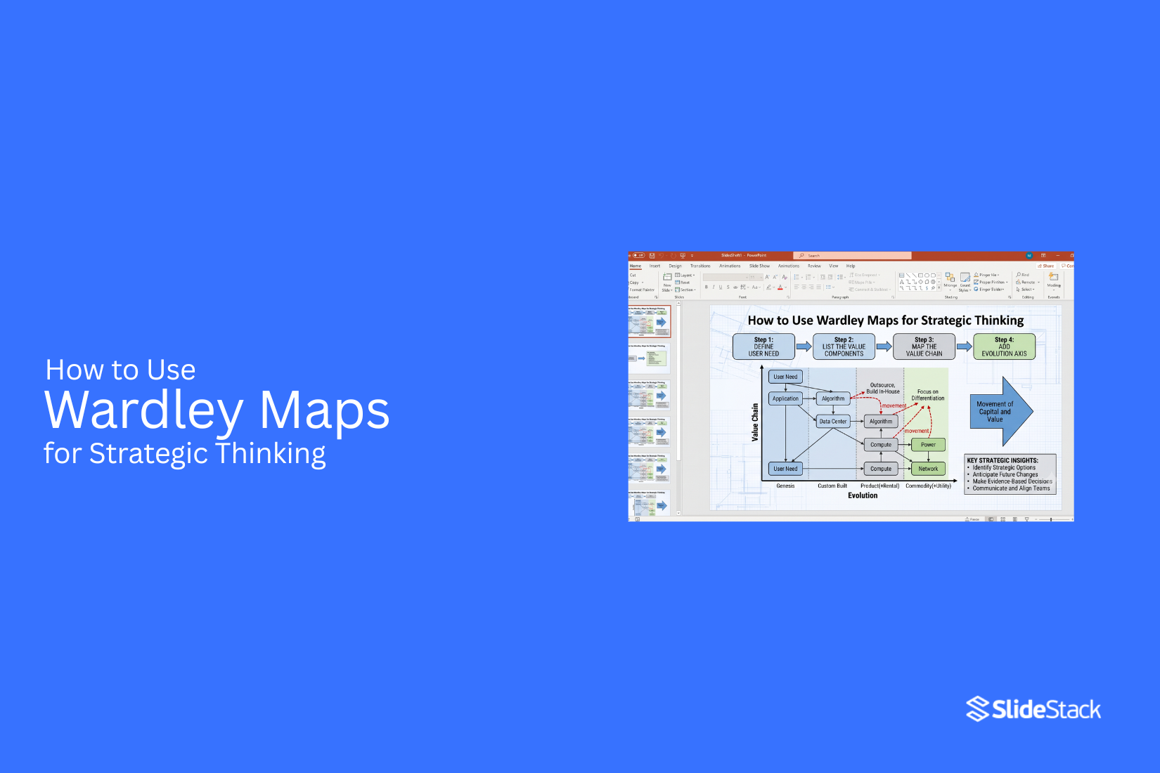
Many strategy presentations explain business decisions but do not show how those decisions were reached. Slides filled with charts, tables, and short points can present results. They often make it hard to see how different business parts connect or why one choice is better than another. This can make planning less clear and harder to review.
Wardley Maps help solve this problem. They provide a visual way to organize user needs, business components, and their place over time. Teams can use the map to study relationships, support planning, and compare different options. This article explains what a Wardley Map is, why it supports strategic thinking, its core elements, how to build and read one, common use cases, key benefits, common mistakes, best practices, and tools for creating Wardley Maps.
What Is a Wardley Map and Why Use It in Presentations
A Wardley Map is a visual tool that shows how different parts of a business connect. It also shows how each part changes over time. The map helps people see what a business needs to deliver a product or service. It also helps them see where each part stands in its life cycle. This type of map makes business ideas easier to understand. It gives a clear view of systems, processes, and dependencies. In a presentation, the map helps the audience follow the discussion from start to finish. It gives context before decisions are shared.
The Two Axes of Wardley Mapping
A Wardley Map uses two axes. Each axis has a different job. The vertical axis shows how visible a component is to the user. Items near the top have a direct effect on the user. Items lower on the map work behind the scenes. They still matter, but users may never see them. For example, an online store sits near the top because customers use it. A database that stores product details sits lower because it supports the store but stays hidden from customers.
The horizontal axis shows how mature each component is. Every component moves through a series of stages over time. The first stage is Genesis. This is where a new idea begins. It is still being tested. The next stage is Custom Built. The component is made for a specific need. It may change often as the business learns more.
The third stage is Product. The component becomes more stable. Other businesses may offer similar products. The last stage is Commodity. The component is common. Many businesses use it in the same way. It is easy to find and replace. Both axes work together to give a full picture. The vertical axis shows why a component matters. The horizontal axis shows how it has changed over time. This helps people understand both the business need and the current state of each component.
Wardley Map Slides in Workshops and Strategy Sessions
Wardley Map slides help teams keep business discussions clear. The map gives everyone the same view of the business. Team members can point to specific components instead of speaking in general terms. This makes discussions easier to follow. During workshops, teams use the map to review business activities. They can spot gaps, compare ideas, and discuss possible changes. The visual layout keeps the group focused on the same information.
In strategy sessions, the map supports decision-making. Teams can review which components need more work and which ones are already stable. They can also discuss how changes in one area may affect other parts of the business. A Wardley Map also helps presenters explain complex systems in a simple way. Each component has a clear place on the map. This makes presentations easier to follow for both technical and business audiences. The result is a shared view that supports better planning, clearer discussions, and more informed business decisions.
Why Use Wardley Maps for Strategic Thinking?
A Wardley map helps people see how a business works. It shows the link between customer needs and the parts that support those needs. It also shows how each part changes over time. This view makes it easier to plan, solve problems, and choose the next step. Teams can spend less time guessing and more time working with clear facts.
Improve Strategic Decision Making
Good decisions need a clear view of the current situation. A Wardley map lays out the key parts of a business in one place. It shows how those parts depend on each other. This makes it easier to spot weak areas, reduce risk, and choose actions that match business goals.
Understand Customer Value
Every business exists to meet customer needs. A Wardley map starts with those needs instead of starting with products or services. This keeps the focus on what matters most. Teams can check if each activity adds real value or if it takes time and money without helping customers.
Identify Competitive Advantages
Not every part of a business creates the same value. Some parts help a company stand out. Others are common across many businesses. A Wardley map helps separate these areas. This makes it easier to protect the work that gives a business an edge while using standard solutions for common tasks.
Support Innovation
New ideas work best with a clear purpose. A Wardley map helps teams see where change can make the biggest difference. It also shows which parts are stable and which parts have room for new ideas. This helps teams focus their effort on areas with the highest chance of creating value.
Prioritize Investments
Time, money, and people are limited. Every choice has a cost. A Wardley map helps teams decide where those resources should go first. It points to the areas that need attention and shows which parts can wait. This leads to better planning and helps avoid spending resources on work with little value.
Core Elements of a Wardley Map
A Wardley Map shows how a system works and why each part exists. It breaks down a business or strategy into clear building blocks. Each block plays a role in how value reaches a user.
User Needs
User needs sit at the top of the map. These are the reasons a system exists. They describe what the user wants to achieve or solve.
Every decision in the system connects back to this point. If a part of the map does not support a user need, it loses value in the strategy view.
Value Chain
The value chain shows how work flows from basic parts to user value. Each step supports the next one above it.
Simple parts combine to form larger services. Those services then support the user need at the top. This structure helps show how effort moves through the system.
Evolution Axis
The evolution axis shows how things change over time. Some parts start simple and become more stable. Others move toward standard forms used across many systems. This view helps explain why some parts need attention, and others can stay stable. It also shows where change is likely to happen next.
f(x)=x2−4x+3f(x) = x^2 - 4x + 3f(x)=x2−4x+3
Components and Dependencies
Components are the building blocks of the system. Each one has a role in delivering value. Dependencies show how these components rely on each other. A change in one part can affect others linked to it. Mapping these links helps reveal weak points and hidden risks in a system.
How to Map Components and Construct the Diagram
Building a Wardley Map starts with breaking a system into parts and placing each part in a structured layout. The goal is to show how value flows from user needs down to supporting elements. Each part of the system is treated as a component. These components are then arranged on a map using two axes. One axis shows visibility to the user. The other shows how each component exists and operates over time. The final diagram shows both structure and relationships. It helps reveal how each part supports another.
Identifying and Positioning Components
Building a Wardley map begins with listing every component that supports the user need at the top of the value chain. This step focuses on collecting everything involved in delivery, without judging importance or quality at first. Teams typically include services, applications, data layers, integrations, and infrastructure elements. The aim is to capture a full system view before any structure is applied. Once the list is complete, each component is placed using two positioning rules.
For the vertical axis, placement is based on how directly the component connects to the user experience. Items that users interact with directly sit at the top, such as interfaces, dashboards, or search functions. Components that support these visible elements sit lower, such as authentication systems, APIs, or data storage. Further down are foundational services like servers or cloud infrastructure. A simple check is to ask how quickly a user would notice failure. Immediate impact places a component higher, while invisible failure places it lower. For the horizontal axis, positioning follows four evaluation criteria.
The first is level of understanding. Some components are well documented and standardized, while others are still being explored or are poorly defined. The second is availability. Some components can be sourced from many suppliers, while others exist in limited forms or require internal creation. The third is predictability. Some behave consistently across environments, while others vary depending on context or implementation. The fourth is the level of custom work. Some components require heavy engineering effort, while others are mainly configured rather than built. Each component is placed along a continuum from early-stage forms on the left to mature, standardized forms on the right. Most real systems sit between custom-built and product stages.
Drawing Dependencies and Reading the Map
After positioning, connections are drawn between components to show dependency relationships. A link is created only when one component cannot function properly without another. The direction moves from higher-level user-facing components down to the supporting elements they rely on. These links represent real operational reliance, not organizational structure or informal associations. As connections are added, a clear structure appears. Multiple user-facing components often depend on shared lower-level services. These lower layers may also depend on deeper infrastructure, forming stacked chains of support.
Once complete, the map reveals strategic patterns. Components placed in the upper left show early-stage capabilities that are visible to users and still evolving. These areas often represent opportunities for differentiation. Components in the lower right sit in stable, standardized territory where custom effort adds little value. Concentration of effort in this area can indicate wasted engineering work on problems already solved by existing solutions. Over time, components tend to move from left to right as they mature. A component that starts as custom-built may shift toward product or commodity status. Tracking this movement helps show where future efficiency gains or investment changes may occur.
How to Create a Wardley Map
A Wardley Map shows how a system supports user needs through connected parts. It breaks a system into visible layers so relationships become easier to understand. Building one follows a clear sequence of steps. Each step adds structure and clarity to the final map. Different tools and formats support this process, from simple sketches to structured digital platforms.
Define Your Users
Wardley mapping starts with identifying the user or group the system serves. Each map focuses on a single user context to avoid confusion. The user sits at the top of the structure and anchors all other elements.
This step can be handled in different environments. Paper notes allow quick capture of ideas. Whiteboards support group discussion and shared input. Digital boards help organize multiple user groups if the system serves more than one audience. Each option supports clarity in different working situations. A clear user definition helps prevent scope drift later in the mapping process.
Identify User Needs
User needs describe what the user is trying to achieve. These are goals, tasks, or problems that must be supported by the system. Needs sit close to the user on the map because everything below exists to support them.
Workshops often begin by listing needs in simple language. Teams may group similar needs to reduce duplication. Digital templates help organize these needs into structured sections. Whiteboards allow live editing during discussion, which helps refine ideas in real time. Strong mapping depends on clear and specific needs. Vague needs lead to unclear system structure.
Map Business Components
Business components include systems, services, tools, and processes that support user needs. Each component must connect back to at least one need. This creates a direct link between user goals and system design. Diagram tools support structured placement of components. They allow clean layouts and easy editing. Whiteboards support brainstorming sessions where components are added and moved quickly. Paper sketches are useful in early stages where speed matters more than precision. At this stage, teams often discover missing components or unnecessary duplication. This helps refine system structure before deeper analysis begins.
Position Components on the Evolution Axis
The evolution axis shows how mature or standardized each component is. Some components are highly custom. Others are widely standardized and available as services. Placement on this axis changes how the system is understood. Custom-built parts usually sit closer to early stages. Mature services sit further along the axis. Digital tools with grid systems help maintain consistent placement. They reduce confusion when multiple components are involved. Whiteboards allow flexible adjustment during group sessions. Paper-based maps are useful for early thinking but can become harder to manage as complexity grows. This step helps highlight where effort is spent and where simplification may be possible.
Connect Dependencies
Dependencies show how components rely on each other. These are drawn as lines or arrows between elements. The connections explain how value flows from infrastructure to user needs. Diagram software provides clear linking tools that help keep relationships organized. Whiteboards support fast drawing of connections during planning sessions. Paper sketches can work for small systems but may become cluttered as relationships increase. Clear dependency mapping reduces hidden assumptions. It shows where changes in one part may affect other parts of the system.
Analyze the Completed Map
Once the map is complete, attention shifts to analysis. The goal is to understand structure, gaps, and areas of complexity. Teams review whether each user need is fully supported and whether components are placed correctly. Digital tools allow version tracking, which helps compare different map iterations. Whiteboards support group review sessions where ideas are adjusted live. Paper maps help early reflection but do not support structured updates. This step often reveals unnecessary complexity or missing support layers. It also highlights opportunities to simplify or improve system structure.
Tools and Approaches for Wardley Mapping
Wardley Maps can be created using several tools, each suited to different working styles and stages of development.
Paper sketching
• Useful for early thinking and rapid idea capture
• No setup or learning required
• Limited ability to edit or scale complex systems
Whiteboards
• Strong for group collaboration and live discussion
• Easy to adjust structure during sessions
• Difficult to store, version, or reuse long-term
General diagram tools
• Provide structured layout and clean visuals
• Support saving, sharing, and version control
• May require setup time and familiarity with the software
Specialized mapping platforms
• Designed specifically for Wardley mapping structure
• Support consistent formatting and complex systems
• Can reduce flexibility for freeform thinking in early stages
Each tool type supports a different phase of work. Early stages often need flexibility. Later stages benefit from structure and clarity.
Selecting a Suitable Approach
Tool selection depends on team size, collaboration needs, and level of system complexity. Smaller teams often prefer paper or whiteboards because they allow fast changes and direct discussion. Larger teams usually benefit from digital tools that support sharing and documentation. Systems with multiple layers or long-term planning often require platforms that support version history and structured layouts.
The most effective approach often combines more than one tool. Early ideas may start on a whiteboard and later move into a digital format for refinement and presentation.
Wardley Map Templates and Structure
Templates provide a ready-made structure for building maps. They include the user position, need layers, component zones, and evolution axis layout. This structure helps maintain consistency across different maps. Templates reduce setup time and allow teams to focus on content instead of layout decisions. They also help new team members understand the mapping format faster. Many teams adjust templates slightly based on project needs. However, the core structure usually stays the same. This consistency helps compare different maps across projects or time periods.
Multi-Slide Presentation Structure
Wardley Maps are often presented across multiple slides to reduce complexity. Each slide focuses on a specific part of the map. One slide introduces the user and their needs. Another slide shows the business components. A separate slide presents dependencies between elements. Final slides focus on analysis and interpretation. This structure supports clearer communication. Each layer is easier to understand when presented separately rather than all at once.
Examples and Progression
Basic maps often start with a small set of user needs and a limited number of components. These simple versions help teams understand the structure without overload. As the map develops, additional components and dependencies are added. The structure becomes more detailed and closer to real system complexity. This progression helps teams see how small parts connect into a larger system.
Over time, Wardley Maps can evolve from simple sketches into detailed strategic tools that support planning and decision making.
How to Read and Interpret a Wardley Map
A Wardley Map shows how value moves through a system. It helps you see how parts of a business connect. It also shows how those parts change over time.
Understanding the Value Chain
The value chain is the core of a Wardley Map. It shows what the user needs at the top. It also shows all the parts that support that need below it.
Each layer depends on the one above it. For example, a product may rely on software. The software may rely on servers. This helps you see how work is linked.
Reading the Evolution Stages
Each part of the map moves through stages over time. These stages show how mature or stable something is. Some parts are new and uncertain. Some are well known and stable. This helps you understand where change is likely to happen. You can see which parts are still developing. You can also see which parts are already standard.
Finding Strategic Opportunities
Wardley Maps help you spot gaps. These are places where needs are not fully met. You can also find areas where change can create value. This helps you decide where to invest effort. It shows where new ideas may work best. It also shows where improvement is possible.
Identifying Risks and Gaps
Some parts of the system may depend on weak areas. These weak areas can create risk. You can also see missing links in the value chain. These gaps can slow down progress. This helps you plan ahead. It also helps you avoid problems before they grow.
Common Use Cases for Wardley Maps
Wardley Maps can be used in many areas of work. They help teams think clearly and make better choices.
Business Strategy
Teams use Wardley Maps to plan direction. It helps them see what matters most. They can focus on real user needs. They can also avoid wasted effort.
Digital Transformation
Companies use these maps to update old systems. They can see what needs to change first. This makes large changes easier to manage. It also reduces confusion.
Product Development
Product teams use maps to guide features. They can see what users need and why. This helps them build useful products. It also reduces guesswork.
Technology Planning
Tech teams use Wardley Maps to plan systems. They can see what tools and services are needed. This helps them choose better technology paths. It also improves long-term planning.
Competitive Analysis
Wardley Maps help compare competitors. You can see how others solve the same problem. This shows where you are strong or weak. It helps you make better decisions about your position.
Benefits of Using Wardley Maps
Wardley Maps help teams see how everything connects to user needs and business goals. They turn complex systems into a simple visual structure. This makes planning clearer and reduces confusion across teams.
Better Strategic Alignment
Teams often pull in different directions. A Wardley Map brings shared direction. It links goals with the parts of the system that support them. People see how their work connects to outcomes. This reduces confusion across teams and departments.
Improved Decision-Making
Choices feel clearer with a map in front. Leaders can see what matters most and what can wait. Trade-offs become easier to compare. Work stops being based on guesswork. Decisions follow visible structure and context.
Greater Business Agility
Markets shift. User needs shift too. A Wardley Map shows which parts of the system are stable and which parts are still changing. This helps teams respond faster. It also helps avoid spending effort in the wrong place.
Clearer Communication
Technical teams and business teams often speak different languages. A map creates a shared view. It gives everyone one reference point. Discussions become easier to follow. Misunderstandings drop.
Common Mistakes to Avoid
Wardley Maps lose value when they are used without care. Small mistakes can change how people read the system. These errors often lead to weak planning and unclear direction.
Ignoring User Needs
Some maps start with systems, not people. That creates gaps. User needs sit at the top of the map for a reason. Leaving them out weakens the whole structure. Every part of the map should trace back to real needs.
Overcomplicating the Map
A map filled with too many details becomes hard to read. Clarity gets lost. Focus stays on the main components. Extra layers should only appear when they add real value.
Misplacing Components
Placement matters. A wrong position changes how people read the system. This leads to poor choices. Each element should reflect its true stage in the value chain.
Failing to Update the Map
A map that stays static loses value. Systems change over time. New tools appear. Old ones shift. Regular updates keep the map accurate and useful.
Best Practices for Effective Wardley Mapping
Strong maps come from clear thinking and shared input. The goal is not decoration but clarity. Good practice keeps the map useful over time.
Keep the Map Focused
A map works best with a clear scope. Too many elements spread attention thin. Focus on the key system or problem area. That keeps the structure readable and useful.
Collaborate with Stakeholders
Different views improve the map. Product, engineering, and business teams each bring useful input. Shared mapping sessions build alignment and reduce gaps in understanding.
Review Maps Regularly
A map is not a one-time task. Set points in time to revisit it. Check what has changed. Adjust structure based on new information.
Base Decisions on Evidence
Assumptions weaken planning. Real data strengthens it. Use facts from users, systems, and operations. Let evidence guide direction rather than opinion.
Wardley Maps vs Other Strategic Frameworks
Wardley Maps show how value moves through a system. They place parts of a business on a visual map based on how they are built and how they evolve. Other frameworks focus on different views of strategy. Each one helps in a different way.
Wardley Maps vs SWOT Analysis
SWOT Analysis breaks a situation into four parts: strengths, weaknesses, opportunities, and threats. It gives a clear list view of internal and external factors. Wardley Maps focus on structure and movement. They show how each part of a system connects and changes over time. SWOT does not show these links. Wardley Maps make those connections visible on a map.
Wardley Maps vs Business Model Canvas
Business Model Canvas lays out a business in blocks. It covers customers, value, channels, and costs in one place. It helps explain how a business works at a point in time. Wardley Maps go deeper into how each part of that business forms and shifts. Instead of static blocks, the map shows flow and change. The focus moves from structure to evolution.
Wardley Maps vs Value Stream Mapping
Value Stream Mapping tracks how work moves from start to finish. It highlights steps in a process and points of delay. It is often used in operations and production flow. Wardley Maps do not track steps in a process. They map components, their value, and how they evolve. The focus is on strategy rather than process timing.
Best Tools for Creating Wardley Maps
Different tools can support building Wardley Maps. Some focus on drawing, while others help teams work together or present ideas.
Online Wardley Mapping Tools
Online mapping tools give a simple space to place components on a map. They help users build and adjust maps without complex setup. These tools often support sharing through a browser link.
Diagramming Software
Diagramming software allows more control over layout and structure. Users can place nodes, connect lines, and adjust positions freely. This works well for detailed maps that need fine adjustments.
Presentation Software
Presentation tools can hold Wardley Maps as slides. They help show the map during meetings or discussions. Each slide can focus on one section of the map.
Collaborative Whiteboards
Collaborative whiteboards let multiple people work on a map at the same time. Teams can add ideas, move elements, and adjust structure together in real time. This supports group planning sessions.
Wardley Map Examples in Practice
Wardley mapping creates the most value when it is used in real business decisions. It helps teams move from abstract planning to clear structure. It shows how systems, users, and capabilities connect in one view. Consider a financial services company that is planning a migration of its core transaction processing system to cloud infrastructure. In a standard board discussion, the decision is often shown through cost tables, risk lists, and vendor comparisons. These tools separate information into different views, which can make trade-offs harder to see together.
When the same situation is placed on a Wardley Map, the structure becomes clearer. Core transaction processing sits in the Product or Custom Built stage. Cloud infrastructure appears as a Commodity because it is widely available and standardized. Fraud detection tools and advanced analytics may sit in earlier stages of evolution, where differentiation still matters. This layout makes it easier to see what should be protected, what can be outsourced, and where investment should shift. It also shows how competitors have already moved toward cloud adoption and redirected effort into higher value capabilities. The decision then includes not only cost and risk, but also the cost of delay in competitive positioning.
A second example appears in product roadmap planning. A software company preparing a new release maps user needs, features, and supporting systems before deciding what to build. Instead of debating features in isolation, teams see where each feature sits in the broader system. Some features are already common in the market and sit closer to Commodity. Others are new and sit in earlier stages of evolution where uncertainty is higher, but potential value is greater.
When product managers, engineers, and business leaders review the same Wardley Map, discussions shift from opinion-based arguments to shared context. Decisions about build versus buy and feature sequencing become more structured because everyone is working from the same visual model.
Organizations that reuse and update Wardley Maps across planning cycles build a record of how their understanding changes over time. This helps teams track shifts in assumptions, improve forecasting accuracy, and explain past decisions with clearer context. It also strengthens alignment between teams by keeping strategy discussions anchored to a shared view of the system landscape.
Final Notes
Wardley Maps help teams see how a system works in a clear way. They connect user needs with the parts that support them. This makes hidden structure visible. Many strategies fail because the reasoning behind decisions is unclear. Wardley Maps reduce that gap. They show both structure and movement over time. This helps teams see why something exists and where it may move next. The value of this method comes from shared understanding. When everyone sees the same map, discussions become more direct. Teams stop guessing. They start working from the same view of reality. A map is not static. Systems change. User needs shift. Tools evolve. A useful map reflects those changes. Regular updates keep it useful for planning and review. Good results come from focus. A map does not need every detail. It needs the right details. Clear scope leads to better decisions and easier communication. Wardley Maps work best when they are simple, honest, and kept up to date.
FAQs
What is a Wardley Map?
A Wardley Map is a diagram. It shows user needs and the parts that support them. It also shows how those parts change over time.
Why do teams use Wardley Maps?
Teams use them to see how a system works. The map helps with planning and decision-making. It also shows links between different parts of work.
What goes at the top of a Wardley Map?
User needs sit at the top. These are the reasons the system exists. All other parts connect back to these needs.
What does the value chain show?
The value chain shows how value moves through the system. Each part supports the next part above it. This builds a clear flow from support systems to user needs.
What does the evolution axis mean?
The evolution axis shows how mature a component is. Some parts are new. Some are stable and widely used. This shows how each part has changed over time.
Where are Wardley Maps used?
They are used in business planning, product work, and technology planning. Teams also use them in strategy sessions and workshops.
What makes a Wardley Map useful?
A clear map shows real connections between parts of a system. It helps teams make better choices and stay aligned on goals.


You may also be interested in ...

How To Create An Eye-Catching Portfolio
If you’re looking to create an eye-catching portfolio, this post will come in handy. In this article, you can find the easies...
23 Jun, 2024

How To Easily Create An Infographic
Infographics are the perfect way to make a presentation that will impact an audience, but their design and composition might...
08 Jun, 2024

PowerPoint Template Tips & Tricks You Ne...
PowerPoint seems to be an unknown world for many people, especially those who have been assigned to create a presentation out...
08 Jun, 2024