How to Use Editable Maps in PowerPoint
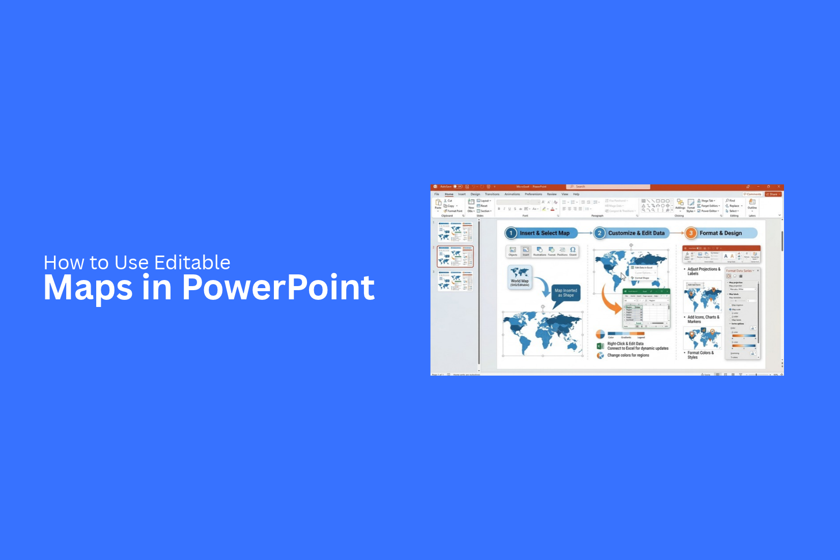
Maps can help explain locations, regions, and geographic data in a PowerPoint presentation. However, a map with fixed colors, labels, and shapes may not fit your needs. Editing it can also take extra time.
A map should do more than show places. It should help your audience understand the information on your slides. Crowded labels, unclear colors, and missing details can make your message harder to follow. These issues can also affect the look of your presentation.
Editable maps give you more control over your slides. You can change region colors, add labels, mark locations, and include data. This guide explains how to use editable maps in PowerPoint, customize them, and create clear map slides for your next presentation.
What Are Editable Maps in PowerPoint?
Editable maps in PowerPoint are maps that you can change to fit your presentation. You can adjust colors, add labels, highlight locations, and mark important areas. These maps help you show geographic information in a clear and simple way.
For example, a sales team can use a map to show sales across different states. A business can mark its office locations or show areas where it plans to grow. Teachers can also use maps to explain countries, regions, or travel routes.
Unlike a flat map image, an editable map gives you more control over its parts. You can change its look, add details, and match it to your slide design. This makes it easier to present location-based information in a way your audience can follow.
Why Use Editable Maps in PowerPoint Presentations?
Editable maps help you show locations, regions, and routes in a clear way. You can change map colors, highlight specific areas, and add labels to match your presentation needs. This makes it easier for your audience to understand location-based data.
You can use editable maps to show sales by region, office locations, market coverage, or business expansion plans. They also help you compare data across different areas. Instead of adding a static map image, you can adjust the map to fit your message.
Editable maps also save time. You can update colors, labels, and other details without creating a new map from scratch. This gives you more control over the design and helps keep your slides clear and consistent.
How to Use Editable Maps in PowerPoint
Editable maps help you show locations, regions, and geographic data in a clear way. You can use them to present sales areas, office locations, market coverage, or business growth across different regions. PowerPoint lets you add map templates and adjust their design to fit your topic. Follow these steps to create an editable map slide for your presentation.
Choose an Editable Map Template
Start by choosing a map template that fits your presentation. The right map depends on the information you want to share. A world map works well for global business data. A country map is a better choice for regional reports. Look for a template that lets you edit map colors, labels, shapes, and markers. Make sure the map is clear and easy to read. Avoid templates with too many details that do not support your message.
Insert the Map Into Your Presentation
After choosing a template, add it to your PowerPoint presentation. You can use a map slide from an existing presentation or copy the map elements into your current file. Place the map on a blank slide or a slide with a suitable layout. Adjust its size to fit the available space. Keep enough room for the title, labels, and any supporting data. Check the map after inserting it. Make sure its shapes and text remain clear. Also, confirm that the map elements can be edited in PowerPoint.
Customize Map Colors and Regions
Map colors help your audience tell regions apart. You can use different colors to show sales performance, market coverage, or business activity across locations. Select a region or map shape to change its fill color. Use a consistent color scheme throughout the slide. For example, you can use blue for active markets and gray for areas where your business does not operate.
Keep the number of colors low. Too many colors can make the map harder to read. Use strong contrast between the map regions and the background. This helps each area stand out without making the slide look crowded.
Edit Labels, Text, and Markers
Labels and markers help your audience understand what each location represents. Add city names, country names, office locations, or other useful details to the map. Select an existing text box to change its content. You can also add new text boxes for missing labels. Adjust the font size and placement so the text stays readable.
Markers can highlight key locations, such as company offices, stores, or project sites. Use simple shapes or symbols to mark these places. Keep markers consistent in size and style. Make sure they do not cover important map details.
Add Data and Other Visual Elements
A map becomes more useful when it connects to your presentation data. You can add sales figures, customer counts, market shares, or other details beside the relevant regions.
Use text boxes, charts, or small data labels to present this information. For example, a sales map can show the revenue for each region. A market coverage map can mark areas served by your company. Keep the data close to the locations it describes. Add a legend to explain the colors and markers. Check that the data labels do not overlap with map shapes or other text.
Save and Review Your Map Slide
Review the map slide before sharing your presentation. Check the labels, colors, markers, and data for errors. Make sure the text is easy to read at normal presentation size. Look at the slide in Slide Show mode. This helps you spot issues that may not be clear in the editing view. Check the map's position and spacing. Make sure every visual element supports the main message.
Save the PowerPoint file after making your final changes. Keep an editable copy so you can update the map later. This makes it easier to change regional data, update labels, or adjust colors for future presentations.
Types of Editable Maps You Can Use in PowerPoint
Editable maps come in different styles. Each type serves a different purpose in a presentation. Some show the whole world, while others focus on a single country, state, or city. You can also use maps to show sales areas or business locations. The right choice depends on your topic and the details your audience needs to see.
World Maps
World maps show all continents and major countries on one slide. They work well for presentations about global sales, international offices, or business growth across several countries. You can use different colors to mark active markets, target regions, or company locations.
For example, a global sales report can use blue to mark countries with active customers. Gray can show areas where the company has no sales yet. This makes the data easier to read.
Country and State Maps
Country and state maps focus on a single nation or its smaller divisions. They are useful for regional sales reports, market research, and business plans. You can highlight states based on sales, customer numbers, or store locations.
For example, a US sales presentation can use different colors to show revenue by state. A darker shade can mark states with higher sales. Lighter shades can mark states with lower sales. This helps your audience compare results across the country.
Regional and City Maps
Regional and city maps show smaller areas, such as provinces, districts, neighborhoods, or city zones. They are useful for local business reports, delivery plans, and site selection presentations.
A retail company can use a city map to mark its stores and nearby competitors. A delivery team can use it to show service areas. You can add labels, markers, and colored zones to help viewers understand each location.
Business Territory Maps
Business territory maps divide a market into areas assigned to sales teams, agents, or business units. They help managers show who handles each area and how teams cover the market.
For example, a sales manager can assign one color to each sales team. The map can show the states or districts covered by each team. You can also add office locations or territory names. This makes it easier to review team coverage and spot areas that need more support.
How to Customize an Editable Map in PowerPoint
An editable map gives you control over how locations appear in your presentation. You can change colors, mark key areas, add labels, and adjust the design to match your slides. These changes help your audience read the map and understand the main points.
Change the Colors of Map Regions
Different colors can help you show data or separate areas on a map. PowerPoint lets you change the fill color of editable map shapes.
- Select the map on your slide.
- Click the region you want to change. Some maps may need a second click to select a single region.
- Open the Shape Format tab.
- Select Shape Fill and choose a color.
- Repeat these steps for other regions.
Use a clear color scheme across the map. For example, you can use blue for one group of regions and green for another. Keep the number of colors low. Too many colors can make the map harder to read.
Highlight Specific Locations
A map can show many places, but your audience may only need to focus on a few. Highlighting key locations helps direct attention to the right areas. You can use a different fill color to mark a region. You can also add a circle or another shape over a location. To do this, open Insert > Shapes and select a shape. Place it over the area you want to highlight. Adjust its size and color to make the location stand out. Keep the markers easy to see. Use the same style for locations that serve the same purpose. Add a short label beside each marker to explain what it represents.
Add Pins, Lines, and Callouts
Pins, lines, and callouts help explain the details on a map. They can mark offices, show travel paths, or point out key locations.
PowerPoint has several tools for adding these elements:
- Pins: Use a small circle, map pin icon, or another shape to mark a location. Place it over the correct area.
- Lines: Go to Insert > Shapes and select a line or arrow. Draw it between locations to show a route or connection.
- Callouts: Add a text box or callout shape near a marker. Use it to display a place name, value, or short note.
Make sure each element has a clear purpose. Use arrows for routes or links between places. Keep labels short so they do not cover important parts of the map. Check the position of each marker against the map before presenting it.
Match the Map to Your Presentation Theme
A map should fit the rest of your presentation. Matching its colors, fonts, and labels to your slide theme creates a consistent look. Start by using colors from your presentation theme. You can apply them to map regions, markers, and lines. Keep the background simple so the map remains easy to read.
Use the same font style as the rest of your slides. Keep labels at a readable size. You can also remove extra borders or use thin outlines to give the map a cleaner look. Finally, check the map at full slide size. Make sure the text is readable, and the key locations are easy to spot. A well-formatted map helps your audience follow the information without distracting them from your main message.
Where to Use Editable Maps in PowerPoint Presentations
Editable maps can help explain location-based data in a clear way. You can change map colors, add labels, mark key areas, and highlight specific places. These features make maps useful for many types of presentations. Here are some common ways to use them.
Business and Sales Reports
Business teams can use editable maps to show sales data across different regions. You can mark areas with high sales, low sales, or new customers. Color-coded regions help viewers compare results quickly. You can also use maps to show branch locations, sales territories, and plans for market growth. This gives your audience a clear view of business activity across different areas.
Marketing and Market Research
Marketing teams can use maps to present customer data and market trends by location. You can highlight areas with more customers, show campaign results, or compare demand across regions. For example, a marketing report can use different colors to show how a campaign performed in each state. Labels and markers can point out areas that need more attention. This helps the team plan future campaigns based on location data.
Real Estate Presentations
Real estate agents can use editable maps to show property locations, nearby services, and local market areas. You can mark homes, offices, land plots, and commercial spaces on a map. Maps can also show nearby schools, hospitals, roads, and shopping centers. These details help buyers understand a property's location. Real estate teams can also use maps to compare property prices across different neighborhoods.
Education and Training
Teachers and trainers can use editable maps to explain places, regions, and geographic topics. A map can show countries, state borders, historical locations, or areas linked to a lesson. For example, a history presentation can mark the places where key events took place. A business training session can use a map to explain sales regions or office locations. You can change map colors and labels to match the lesson.
Travel and Route Planning
Travel planners can use editable maps to show destinations, stops, and travel routes. You can mark hotels, tourist spots, meeting points, and other places along the way. A route map can also show the order of stops during a trip. Use lines to connect each location and labels to name the places. This makes travel plans easier to follow during a presentation.
Common Problems With Editable Maps in PowerPoint
Editable maps can make your presentation easier to follow. However, some map elements may not work as expected. You may find that shapes cannot be changed, colors look different, or labels appear in the wrong places. These issues can affect how your map looks and how well your audience understands it.
Map Elements Cannot Be Edited
Some map templates contain a single image instead of separate shapes. You can resize the image, but you cannot change individual regions or move specific parts.
Check the map format before editing it. A map made with separate PowerPoint shapes gives you more control. You can select each region, change its color, and adjust its size. If the map is a flat image, you may need an editable version of the template.
Colors and Shapes Do Not Display Correctly
Map colors and shapes may look different after you open a file in PowerPoint. Some regions may lose their fill colors. Others may show unexpected borders or outlines.
Select the affected shape and check its fill and outline settings. Apply the correct colors to the regions you want to highlight. Keep the color style consistent across the map. This helps viewers understand what each color means.
Labels and Markers Are Misaligned
Labels and markers can shift out of place after you resize a map. A city name may cover a marker. A location symbol may also point to the wrong area.
Group related labels and markers with the correct map elements. This can help keep them together as you move or resize the map. Check their positions at the final slide size. Make sure each label is easy to read, and each marker points to the right location.
Map Details Look Too Crowded
A map can become hard to read if it contains too many labels, markers, colors, and lines. Small details may overlap, especially on a slide that shows a large area.
Remove details that do not support your main message. Keep the most useful locations and labels. Use a clear color scheme to separate key regions. You can also split the information across multiple slides. This gives each map more space and helps your audience follow the details.
Tips for Creating Effective Map Slides
A good map slide helps your audience understand locations and key details with ease. Keep the design simple and focus on the information that matters. Use clear labels, suitable colors, and a consistent layout. These tips can help you create map slides that are easy to read and present.
Keep the Map Easy to Read
A map slide should be easy to understand at a glance. Avoid adding too many shapes, labels, or details. Use a map size that fits the slide without making the text too small. Make sure roads, borders, and location markers are easy to see.
Keep enough space around the map. This helps your audience focus on the main details. Use a larger map for presentations that cover many locations.
Use Colors With a Clear Purpose
Colors help separate regions and highlight key locations. Give each color a clear role. For example, use blue for one region and green for another. Use a bright color to mark an important location.
Keep the color palette simple. Too many colors can make the map hard to read. Make sure text and labels stand out against the map background. Use the same colors for the same types of data across all slides.
Add Only Relevant Data
Every detail on a map slide should support your main point. Add only the locations, routes, or regions that your audience needs to see. Remove extra markers and labels that do not help explain the topic.
For example, a sales presentation may show store locations and sales regions. A travel presentation may focus on routes and key stops. Keep extra facts in a separate slide if they make the map too crowded.
Check Map Accuracy and Labels
Check the map before using it in your presentation. Make sure location names, borders, and markers are correct. Review spelling and check that each label points to the right place.
Use clear fonts and readable text sizes. Avoid placing labels too close together. Move them to open areas of the map if needed. Accurate details help your audience follow the information without confusion.
Maintain a Consistent Slide Design
Use the same design style across all map slides. Keep fonts, colors, label styles, and marker shapes consistent. This helps your audience follow the presentation from one slide to the next.
Place titles and supporting text in similar positions on each slide. Keep the map size and alignment consistent, too. In PowerPoint, you can use the same slide layout to save time and maintain a clean design.
Where to Find Editable Map Templates for PowerPoint
Editable map templates help you add maps to your PowerPoint slides without drawing each part by hand. You can use them to show countries, states, regions, or business locations. The right template also lets you change map colors, labels, and other details to match your slide design.
You can look for editable map templates in these places:
- PowerPoint templates: Check map templates that work with PowerPoint. Look for files that let you edit map shapes, colors, and labels.
- Presentation template websites: Some websites offer ready-made map slides for business reports, sales plans, and market research.
- PowerPoint shape tools: You can build a simple map with shapes and lines. This option gives you more control over the layout, but it may take more time.
- Editable map slide collections: Some template collections include maps of countries, continents, and regions. These can help you show location-based data in your presentation.
Before choosing a template, check its file format and editing options. Make sure you can change the parts you need in PowerPoint. A good template should fit your topic and let you adjust the map without rebuilding the whole slide.
Final Notes
Editable maps help you present locations, regions, and geographic data in PowerPoint. You can change map colors, add labels, mark key locations, and show data for different areas. These features make maps useful for business reports, sales plans, marketing research, education, real estate, and travel presentations.
Choose a map template that fits your topic. Keep the design simple and use colors with a clear purpose. Check all labels, markers, and data before presenting your slides. Most of all, make sure your map helps the audience understand your main message. With the right editable map, you can create clear and useful slides that fit your presentation needs.
Frequently Asked Questions
1. What are editable maps in PowerPoint?
Editable maps are maps that you can change in PowerPoint. You can edit colors, labels, shapes, and markers to fit your presentation needs.
2. How do I use an editable map in PowerPoint?
Choose an editable map template and add it to your slide. Then, change the colors, edit labels, add markers, and include relevant data. Review the slide before presenting it.
3. Can I change the colors of map regions in PowerPoint?
Yes. Select an editable map region, open the Shape Format tab, and choose a new color from Shape Fill. Repeat these steps for other regions as needed.
4. Can I add location markers to a PowerPoint map?
Yes. You can use shapes, icons, or circles to mark offices, stores, cities, and other key locations. Add short labels to explain each marker.
5. Why can't I edit some maps in PowerPoint?
Some maps are flat images. Their regions and labels are not separate objects. To edit individual parts, use a map template made with separate PowerPoint shapes.
6. Where can I find editable map templates for PowerPoint?
You can find them in PowerPoint template collections and presentation template websites. Check the file format and editing options before choosing a template.
7. How can I make an editable map easier to read?
Use a simple color scheme, clear labels, and consistent markers. Remove details that do not support your main message. Make sure the text is readable at full slide size.
8. What can I use editable maps for in presentations?
You can use editable maps for sales reports, market research, business territories, real estate, education, and travel planning. They help show locations, compare regions, and explain geographic data.




You may also be interested in ...

How To Create An Eye-Catching Portfolio
If you’re looking to create an eye-catching portfolio, this post will come in handy. In this article, you can find the easies...
23 Jun, 2024

How To Easily Create An Infographic
Infographics are the perfect way to make a presentation that will impact an audience, but their design and composition might...
08 Jun, 2024

PowerPoint Template Tips & Tricks You Ne...
PowerPoint seems to be an unknown world for many people, especially those who have been assigned to create a presentation out...
08 Jun, 2024