How to Use a Treemap Chart in Presentations – Essential Guide
Presenting complex data in a clear way can be a real challenge. Slides packed with numbers or multiple charts often leave audiences confused and overwhelmed. It becomes hard to show patterns, compare categories, or highlight key insights effectively.
That’s where treemap charts come in. These charts organize hierarchical data into colored rectangles, making it easy to see relationships and relative sizes at a glance. They fit large datasets into a limited slide space without losing clarity. In this guide, you will learn what treemap charts are, when to use them, and step-by-step methods to create and present them effectively.
What is a Treemap Chart?
A treemap chart is a way to show data using nested rectangles. Each rectangle represents a category or subcategory. The size of the rectangle reflects the value of that item. Larger values appear as bigger rectangles, while smaller values are smaller. This makes it easy to compare parts of a whole at a glance.
Treemaps organize data hierarchically. Main categories contain smaller subcategories inside them. This layout helps viewers see the structure of data quickly. It also makes it easier to spot patterns, trends, or outliers within large datasets.
Creating a treemap chart is straightforward in software like Excel. Start by arranging your data in a table with categories, subcategories, and their corresponding values. Then, select the data, go to the Insert tab, and choose the Treemap chart option. Excel will automatically generate the chart with nested rectangles sized by value.
In PowerPoint, you can copy a treemap chart from Excel or insert one using linked data. This keeps the chart editable while maintaining consistency with your presentation. Adjusting labels, borders, or layout can make the chart clearer for your audience.
Color is an important part of treemaps. Use contrasting colors for main categories and lighter shades for subcategories. This visual distinction helps the viewer separate groups and understand the hierarchy. Avoid using too many bright colors, as this can make the chart confusing.
Why Use a Treemap Chart in Presentations?
Treemap charts help you show data in a compact and organized way. They use nested rectangles to display hierarchical information. This makes it easier for audiences to see patterns and relationships that might be hidden in tables or other charts. Unlike pie charts or bar graphs, treemaps can handle many categories without crowding the slide.
Visualizing Hierarchical Data Clearly
Treemaps are ideal for showing how different pieces fit within a larger structure. For example, in a company presentation, you can use a treemap to display revenue by department and then break each department down by team. The size of each rectangle shows the relative value, making it simple to see which teams contribute most to overall revenue.
Comparing Multiple Data Categories
When you have many categories to compare, treemaps make differences obvious at a glance. Imagine comparing sales across product lines and regions. A treemap allows each product and region to have its own rectangle. The audience can quickly spot which combinations perform better or worse without reading rows of numbers.
Improving Data Comprehension for Audiences
Complex data can confuse viewers. Treemaps translate numbers into visual blocks. This makes it easier for audiences to understand proportions and relationships. For instance, in a financial report, showing expenses by category in a treemap helps executives grasp which areas cost the most without needing detailed spreadsheets.
Presenting Large Datasets in Limited Slide Space
Some presentations must fit a lot of data into small slides. Treemaps solve this problem. They pack information into a single view while keeping it readable. In risk assessment presentations, you can show potential risks and their impact in one slide. Each risk gets a rectangle sized by its probability or cost. This keeps slides clean and focused, while still sharing detailed insights.
Key Elements of a Treemap Chart
A treemap chart shows data as a set of nested rectangles. It helps you see both the overall structure and the details in one view. Each part of the chart has a purpose and works together to make the data clear.
Parent Categories: Parent categories are the main groups in the chart. They hold related items together. These categories give the chart structure and help viewers understand the overall organization.
Subcategories or Child Nodes: Subcategories, or child nodes, sit inside the parent categories. They show specific items or smaller data points. Their placement helps compare details within the same group.
Rectangle Size and Data Values: The size of each rectangle matches the value it represents. Bigger rectangles show higher values, smaller ones show lower values. This sizing makes it easy to see what matters most at a glance.
Color Coding and Data Segmentation: Colors separate different types of data. Each color can show a range, group, or trend. Using colors this way makes patterns and differences easy to spot quickly.
When to Use Treemap Charts in Presentations
Treemap charts work best when you need to show parts of a whole in a clear, visual way. They help the audience see differences at a glance and understand proportions without reading long tables.
Market Share Visualization: Treemaps make it simple to compare companies or brands in a market. Each block shows a company, and the size shows its share. This helps the audience see leaders and smaller players quickly.
Budget Distribution Analysis: Use treemaps to show how budgets are divided across projects or departments. Large blocks highlight bigger expenses, while smaller ones show minor costs. This makes financial data easy to digest.
Product Category Performance: Treemaps display which product categories perform best. Bigger blocks mean higher sales. Teams can quickly see which categories need attention and which are driving results.
Website Traffic Breakdown: Treemaps can break down website visitors by page, source, or region. Larger blocks show more traffic. This helps identify strong pages and channels at a glance.
Portfolio Composition: In finance, treemaps show investments across assets or sectors. Each block reflects a holding, and its size reflects value. This gives a clear picture of portfolio balance and concentration.
Step-by-Step Guide to Creating a Treemap Chart in Excel
A treemap chart helps show how different parts contribute to a whole. It works well when you want to compare categories and subcategories. Follow these steps to create a treemap chart in Excel.
Step 1 – Prepare Your Data
Before making the chart, organize your data.
- Place categories in one column.
- Place subcategories in the next column.
- Include values or amounts in a third column.
For example:
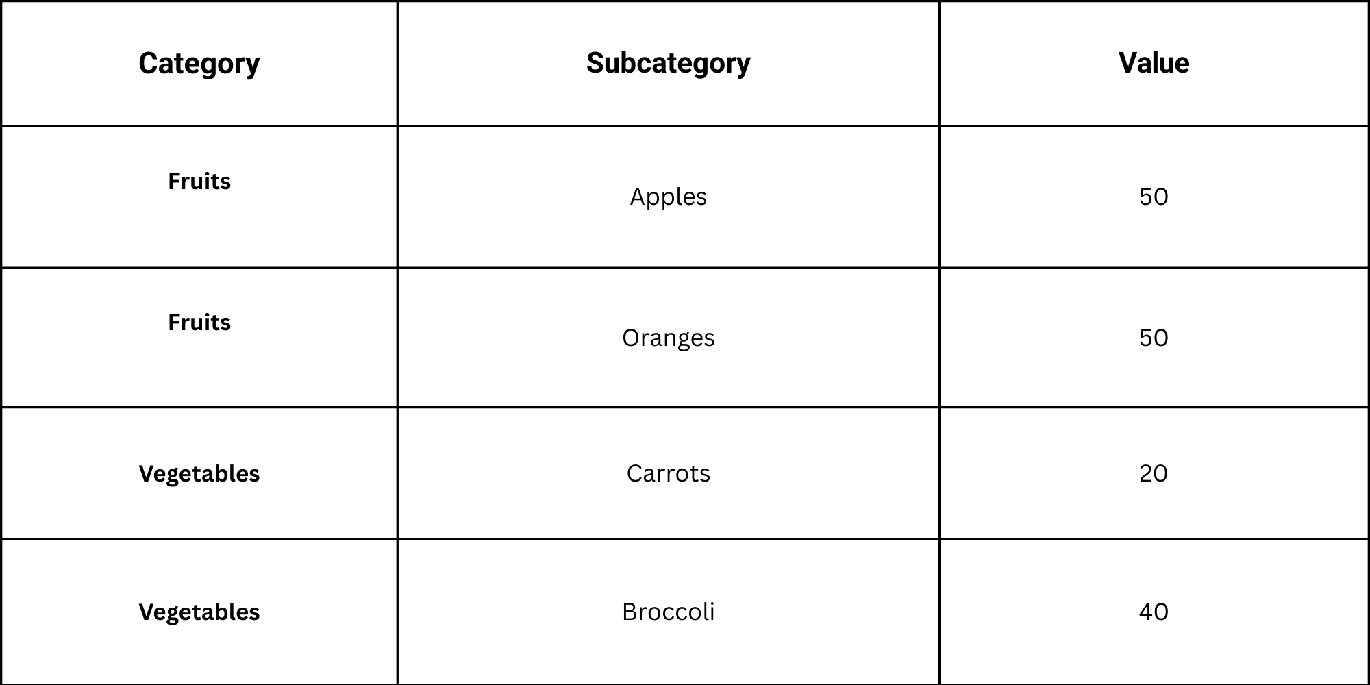
Make sure there are no blank rows. Each row must represent a single subcategory and its value.
Step 2 – Select the Data
Next, highlight the full range of your data, including headers.
• Go to the Insert tab in Excel.
• Find the Hierarchy Charts group.
• Click on Treemap.
Excel will automatically create a treemap chart using your selected data. Each rectangle shows a subcategory, and its size represents the value.
Step 3 – Customize the Layout
Now adjust the chart to improve readability.
• Click on the chart and use the Chart Design tab to change colors.
• Add data labels for easier comparison by selecting Add Chart Element > Data Labels.
• Adjust the layout in the Format tab to change borders or text style.
You can also experiment with different color schemes to make categories stand out. Choose contrasting colors for main categories and lighter shades for subcategories.
Best Practices for Using Treemap Charts
Treemap charts can show data in a clear way if used correctly. Following a few simple rules helps readers understand the information quickly.
Limit the Number of Categories: Too many categories make the chart hard to read. Focus on the most important ones. Keep it simple so patterns stand out.
Use Clear and Readable Labels: Labels must be easy to read at a glance. Avoid long words or abbreviations. Place them so they do not overlap other sections.
Apply Consistent Color Schemes: Colors should follow a clear pattern. Matching colors with similar groups helps the reader follow the chart. Avoid using random colors that confuse.
Emphasize Key Insights: Make the most important points stand out. Use size or color to draw attention. Show readers what matters first without extra explanation.
How to Import a Treemap Chart in PowerPoint
Adding a treemap chart from Excel into PowerPoint can make your presentation more visual and easier to understand. There are several ways to do this. Each method has its own advantages. Choosing the right one depends on how you plan to use the chart and whether you want to edit it later.
Method 1: Embed as an Object
Embedding the treemap keeps it linked to Excel. You can update data later without recreating the chart.
Steps:
- Open your PowerPoint slide.
- Click Insert > Object.
- Select Create from file.
- Browse and choose your Excel file.
- Check the link if you want changes in Excel to update in PowerPoint.
- Click OK.
Pros: You can update data directly from Excel.
Cons: File size may increase. Changes in Excel affect the chart in your slide.
Method 2: Copy as a Static Image
This method is simple and keeps the chart fixed. It won’t change even if the Excel file changes.
Steps:
- Open the Excel file with your treemap.
- Click the chart to select it.
- Press Ctrl + C (or right-click and select Copy).
- Go to PowerPoint. Click the slide where you want the chart.
- Press Ctrl + V (or right-click and select Paste).
Pros: Quick and easy. Keeps the PowerPoint file small.
Cons: You cannot edit chart data after pasting.
Method 3: Export as an Image
Exporting the chart as an image gives you flexibility for design purposes. You can resize or place it anywhere on your slide.
Steps:
- In Excel, click the treemap chart.
- Right-click and select Save as Picture.
- Choose a file format like PNG or JPEG.
- Open PowerPoint and insert the image using Insert > Pictures.
Pros: The chart is easy to move and format. File size stays manageable.
Cons: The chart is not editable. You will need to redo it if the data changes.
Choosing the Best Method
• Embed as an object is best if your data may change or you need to edit it later.
• Copying as a static image works for fast presentations with fixed data.
• Export as an image is ideal for slides where design flexibility matters more than data updates.
Selecting the right method depends on your priorities: editing ability, file size, or design control. Pick the approach that matches your presentation needs.
How to Customize a Treemap Chart in PowerPoint
Treemap charts display hierarchical data as nested rectangles. They help viewers see patterns and relationships clearly. Customizing them ensures your chart communicates effectively and looks polished.
Understanding Chart Types
PowerPoint lets you use two types of treemap charts: embedded and static.
• Embedded Charts: These are connected to Excel data. Editing the chart updates the data automatically.
• Static Charts: These are images or copied charts. You can adjust their appearance, but changes do not affect the underlying data.
Knowing the difference guides how you approach customization.
Editing Embedded Treemap Charts
For embedded charts, PowerPoint provides a variety of editing options. Follow these steps:
- Select the Chart: Click on the chart to activate editing tools.
- Open Chart Tools: Use the Design and Format tabs to adjust appearance.
- Modify Data: Click Edit Data to change numbers or categories in Excel.
- Adjust Layout: Rearrange categories or levels for clarity.
These steps keep your chart accurate while letting you refine its look.
Key Customization Recommendations
Focus on these elements to improve readability and visual impact:
• Color: Use contrasting shades to differentiate categories. Avoid excessive colors that distract from the data.
• Labels: Show labels clearly. Include category names and values if space allows.
• Borders: Add subtle borders to separate blocks. Strong lines can make the chart feel cluttered.
• Background: Keep it simple. A plain background highlights the chart without drawing attention away.
• Legend: Position the legend where it is easy to see. Avoid covering important data.
• Animation: Use simple entrance effects if needed. Avoid excessive motion that confuses viewers.
These choices help viewers understand the chart without unnecessary effort.
Working with Static Charts
Static treemaps need a slightly different approach:
• Adjust colors, labels, and borders directly in PowerPoint.
• Resize and crop elements to fit your slide layout.
• Ensure contrast remains clear, as static charts do not update automatically.
Even without live data, careful styling keeps your chart effective.
Testing for Readability
Always check your chart from the viewer’s perspective:
• Make sure text is legible.
• Confirm color differences are distinct for all categories.
• Step back from the screen or present in slideshow mode to assess clarity.
Testing ensures the chart communicates data efficiently and looks professional.
Working with Treemap PowerPoint Templates
Creating charts in PowerPoint can take a lot of time. Treemap templates help you save hours while keeping your slides clear and professional. These templates come ready-made with blocks that represent data. You only need to insert your numbers and labels.
For example, a company tracking market share can use a treemap template. Each block shows a brand, and its size matches the market share percentage. Larger blocks represent bigger shares; smaller blocks show less influence. This visual layout makes it easy to see which brands lead and which lag.
Using the treemap, businesses can spot patterns quickly. You can identify dominant players, highlight growth opportunities, or show trends over time. All insights appear in one clear view, making presentations easier to understand for clients or team members.
The best part is that templates are fully customizable in PowerPoint. You can change colors, labels, and numbers without starting from scratch. This keeps your data fresh while keeping your slides professional.
Treemap templates save time and make data easier to read. They turn complex information into clear visuals you can adjust in minutes.
Treemap Charts Compared with Other Charts
Treemap charts offer a clear way to show data with multiple layers. They display values as blocks, making it easy to see proportions at a glance. Other charts can show similar information, but treemaps save time and space while revealing patterns quickly. Using a template makes this process even faster. For example, a market share analysis can be completed in minutes by adjusting block sizes in PowerPoint instead of building charts from scratch in Excel. Each block’s size represents a value, giving an immediate sense of which items dominate the dataset.
Treemap vs Pie Charts
Pie charts show how a whole divides into parts, but they become hard to read when there are many categories. Treemaps handle large datasets better. You can fit dozens of categories in one slide, and the visual blocks make it easier to spot trends. For instance, a company tracking multiple product lines can see which line contributes the most revenue without switching between multiple pie charts.
Treemap vs Bar Charts
Bar charts are great for comparing a few values, but they take up more space as data grows. Treemaps compress information into a single view. You can compare dozens of items without overwhelming the slide. Adjusting block sizes directly in PowerPoint makes it simple to highlight key insights quickly. Teams can focus on performance patterns rather than spending time resizing and formatting bars.
Treemap vs Sunburst Charts
Sunburst charts also show hierarchical data, but they rely on circular layers. Treemaps use rectangles, which are easier to read and fit neatly on a slide. They make spotting dominant categories faster, especially in presentations with limited space. By customizing colors and labels in PowerPoint, you can guide the audience through complex datasets without extra effort.
Tips for Presenting Treemap Charts Effectively
A treemap can show a lot of data at once. Large blocks and color groups make patterns easy to spot. Yet a slide still needs clear direction. The audience should know where to look first and what each section means. A few simple steps help turn the chart into a clear message.
Highlight the Most Important Data First
Start with the largest or most important segment. Place focus on the area that carries the main message. A clear label helps the audience read the value without effort. A short note or callout can point to the key block. This step guides the eye and sets the story for the rest of the chart.
Use Animation to Reveal Insights
Animation can guide the viewer step by step. Show one section at a time instead of the whole chart at once. Each block appears as you speak about it. The audience stays focused on the point on screen. The slide feels easier to follow and less crowded.
Combine Charts with Clear Explanations
A treemap shows size and share, yet numbers alone may not tell the full story. Add short text next to the chart. Use simple words to explain what the viewer sees. A brief sentence can explain why one segment is larger than the rest. This link between the chart and message keeps the slide clear.
Focus Audience Attention on Key Segments
Not every block needs the same level of focus. Use color or a light highlight to draw attention to the parts that matter most. Other segments can stay in softer tones. The audience sees the main point right away. This small design choice keeps the slide easy to read.
Common Mistakes in Treemap Charts
Treemap charts help present large data sets in a compact view. Each block shows how a value compares with others. The layout works well for category data. Yet some charts become hard to read. Poor structure or design choices can hide the main message. A few common mistakes often cause this problem.
Misusing the Hierarchy Structure
A treemap relies on a clear hierarchy. The main category sits at the top. Subcategories sit inside it as smaller blocks. Problems appear once the hierarchy lacks clear levels.
Some charts mix unrelated items under the same group. Others skip levels or repeat categories. This structure confuses the reader. The chart loses its logic.
Keep the hierarchy simple. Place each item under the correct parent group. Maintain a clear order from the main category to the subcategory.
Adding Too Many Subcategories
Treemaps handle many values at once. Yet too many small blocks reduce clarity. Tiny rectangles become hard to compare. Labels also lose space.
Readers may struggle to find the key insight. The chart looks crowded.
Limit the number of subcategories. Group smaller items into a single category, such as “Other.” This step keeps the layout clean and easy to read.
Using Colors Without Clear Meaning
Color guides the viewer through the chart. Poor color choices weaken this guidance. Random colors break the visual link between related groups.
A chart may also use too many color tones. This choice makes the layout look messy. The reader cannot spot patterns or differences.
Apply a consistent color scheme. Use similar shades for related groups. Reserve stronger colors for the most important areas.
Overloading the Chart with Text Labels
Labels help explain each block. Yet too many labels crowd the chart. Small rectangles cannot hold long text.
The result looks cluttered. Readers may ignore the labels or miss key values.
Keep labels short. Show only the main category or value. Extra details can appear in the slide notes or nearby text. This approach protects readability while keeping the chart clear.
Final Words
Treemap charts show how parts relate to a whole. Each block stands for a category. The block size shows its value. Large blocks signal a larger share. Small blocks show a smaller share. This layout helps viewers scan the data at a glance. It works well for slides that show distribution across many groups.
Still, a treemap is not the right fit for every case. Very small blocks can be hard to read. Too many categories can crowd the slide. Labels may also become hard to place. Careful design keeps the chart clear and easy to follow. Limit the number of groups. Use clear labels and balanced colors.
At the same time, the chart works best for data that focuses on proportions. Market share is one example. Budget allocation is another. Product categories or site traffic can also fit well. In these cases, the block layout helps viewers spot patterns and size differences with ease.
A good presentation depends on the right visual choice. Treemap charts serve a clear role in that process. They help turn large sets of numbers into a clear visual structure. With careful setup and thoughtful design, they can support strong and clear data storytelling in presentation slides.
FAQs:
What types of data are best suited for treemaps?
Treemaps work best with hierarchical data. They show parts of a whole, like sales by product, market share, or budget categories. Each branch of the hierarchy can be divided into smaller sections.
Can treemap charts show changes over time?
Treemaps are not ideal for tracking changes over time. They show a snapshot of data at one moment. For trends, a line or bar chart is better.
Are treemaps suitable for live dashboards?
Yes, treemaps can be used in dashboards. They work well when you need to see proportions quickly. Interactive dashboards can allow users to drill down into details.
How many levels of hierarchy can a treemap handle?
Treemaps can handle multiple levels, but too many can make it hard to read. Usually, two to three levels are clear for viewers.
How do I make small values visible in a treemap?
You can increase the slide or chart size, use contrasting colors, or group small values under an “Other” category. This helps make tiny sections easier to see.
Can treemaps be animated in PowerPoint?
Yes, PowerPoint allows simple animations. You can fade in sections or highlight categories. Complex movements are limited.
What is the best way to organize data before creating a treemap chart?
Arrange data hierarchically in a table with categories and subcategories. Include numeric values for size. Clean, structured data ensures the treemap displays correctly.
Do treemap charts require hierarchical data to work properly?
Yes, hierarchies help show relationships between main categories and subcategories. Without them, the chart may lose clarity.
Can treemap charts handle large datasets in a single slide?
They can, but too many items may become crowded. Focus on key categories or group smaller items to keep it readable.
What tools or software can be used to create treemap charts?
Excel, Google Sheets, and PowerPoint can create treemaps. Data visualization tools like Tableau or Power BI also work well.
Should every rectangle in a treemap chart include a label?
Not always. Label only important or larger sections. Small sections can be left unlabeled or shown with a tooltip in interactive versions.
How can important categories be highlighted in a treemap chart?
Use contrasting colors, bold borders, or slightly larger blocks. This draws attention to the key areas without changing the data.
Can treemap charts be used in business or financial reports?
Yes, they are useful for visualizing sales, expenses, market share, or portfolio distribution. They make complex data easier to understand at a glance.


You may also be interested in ...

Tips To Create A Great Infographic
Infographics Have been around for a while, but not many people know about them or are their preferred presentation choice. If...
08 Jun, 2024

3 Steps To Create The Best Presentation...
Presentations are something wonderful when well done, you can captivate an audience or be super interested in what another pe...
23 Jun, 2024

3 Tips For Your Next Presentation You MU...
PowerPoint presentations are perfect for explaining a topic and communicating your ideas with a visual aid. But most people s...
08 Jun, 2024