How to Create an Academic Presentation: Step-by-Step Guide
Academic presentations often feel difficult because ideas need to be clear, structured, and easy to follow while still meeting academic standards. Many presenters struggle with organizing content, balancing detail, and keeping audience attention. A simple method helps bring order to this process.
A step-by-step approach makes preparation easier by breaking the work into clear stages, from understanding the purpose to building strong slides and refining delivery. This guide walks through each stage in a practical way so the message stays focused. By the end, you will know how to structure, design, and present academic content with clarity and confidence.
Understanding the Purpose of an Academic Presentation
An academic presentation shares research or study results. It helps explain ideas clearly to an audience. The goal is to show what was studied and what was found. It also helps organize thoughts in a clear order. Each slide or section carries one main idea. This makes complex topics easier to follow.
Teachers and classmates use presentations to learn from each other. It builds communication skills and confidence in speaking. A good presentation also shows evidence. Data, examples, or references support the main points. This makes the work more trustworthy.
Types of Academic Presentations
Academic presentations are a key part of higher education. They show how well a student can explain research and ideas in a clear way. Each type has its own format and purpose. The setting also changes the level of detail and performance needed. Some focus on spoken delivery. Others focus on visual communication or formal defense.
Research Presentations
Research presentations focus on sharing study work with an academic audience. They explain methods, findings, and meaning in a clear structure. The goal is to show understanding of a topic and the process behind it. At the undergraduate level, presentations stay basic in scope. Students present simple research questions. Slides often include an introduction, method, results, and a short discussion. Time limits are usually short, often around 5 to 10 minutes. Clarity matters more than depth. Visual aids support basic explanation.
At the master’s level, expectations increase. The research question becomes more focused. Data use is more detailed. Students must explain methods with stronger reasoning. Results need interpretation, not just description. Presentations often run 10 to 20 minutes. Academic language and structured flow are expected.
At the doctoral level, presentations reach the highest level of complexity. The work includes original research and deeper analysis. The speaker must defend choices in method and theory. Committee members expect strong justification for each part of the study. Time can extend beyond 30 minutes depending on the institution. Precision and depth shape evaluation. Each level builds stronger communication skills. Academic clarity becomes more important than presentation style. The focus stays on evidence and reasoning rather than decoration or performance.
Thesis and Dissertation Presentations
Thesis and dissertation presentations focus on the formal defense of academic work. They present completed research to a panel of reviewers. The goal is to show that the work meets academic standards and contributes to knowledge in the field.
A thesis presentation usually appears at the master’s level. It covers research goals, methods, findings, and final conclusions. The structure follows a strict academic flow. The speaker explains why the topic matters and how the study was carried out. Questions from the panel test understanding and depth of knowledge. A dissertation presentation is more advanced. It belongs to doctoral study. The work must show original contribution. The defense stage includes detailed questioning. Reviewers may challenge assumptions, methods, and interpretations. The speaker must respond with clear reasoning supported by evidence.
Common formats include slide-based presentations followed by oral defense sessions. Some institutions also include written summaries before the presentation. Visual slides stay simple. They support explanation rather than replacing it. Assessment focuses on three areas. These include research quality, clarity of explanation, and response to questioning. Strong preparation reduces gaps in explanation and builds confidence during defense. Clear structure supports performance in these presentations. Each section of the research must connect logically. Explanations stay direct and focused on evidence.
Poster Presentations
Poster presentations use visual layout instead of full spoken delivery. They appear in conferences and academic events. A single poster displays the main parts of a study. These include title, introduction, method, results, and conclusion. The format is compact. Standard sizes often include A0 or A1 dimensions. Content must fit within a limited space. Short text blocks and charts replace long explanations. Visual balance helps readers understand the work quickly. Interaction plays a key role. The presenter stands near the poster and explains the study to viewers. Conversations are brief and focused. Questions come directly from interested readers or reviewers.
Design principles guide poster quality. Text stays readable from a short distance. Sections are clearly separated. Charts and images support data explanation. Overcrowding reduces clarity and lowers impact. Behavior during poster sessions differs from slide presentations. The presenter adapts explanations based on audience questions. Flexibility in communication improves understanding. The goal is a clear transfer of key findings in a short interaction. Poster presentations train students to simplify complex research. They also strengthen the ability to explain ideas without long speeches.
10 Tips for Creating Better Academic Presentations
A strong academic presentation is not only about research quality. It is also about how clearly ideas are shown and how easily the audience can follow them. Many presentations lose impact because slides are crowded, timing is weak, or the message is unclear. The tips below focus on simple changes that improve clarity, structure, and delivery.
1. Start with a Visual Hook, Not a Text Slide
Your opening slide should not be a block of bullet points. Start with a strong image, a clear question, or a simple data visual that sets direction right away. The title slide sets the tone for everything that follows.
Why it works: People decide early if a presentation is worth attention. The first 30 seconds shape how the rest is received. A visual opening builds curiosity and pulls focus without effort.
2. Structure Your Presentation as a Story Arc
Arrange your content in a clear path. Start with the problem, move into what is missing in the current understanding, then lead into your findings or solution. Avoid dumping information without flow.
Why it works: The brain follows sequences more easily than scattered facts. A story structure helps the audience connect ideas and understand why your research matters.
3. Use Data Visualization Over Tables
Turn numbers into charts or graphs instead of long tables. Keep visuals simple and readable. Do not overload slides with rows of data.
Why it works: Visual patterns are processed faster than raw numbers. A chart shows trends instantly, while tables demand extra effort and slow attention.
4. Keep Slides Minimal — One Idea Per Slide
Each slide should carry one clear message. Do not mix multiple findings or concepts on one slide. Break content into smaller, focused parts.
Why it works: The mind handles single ideas more easily. One message per slide allows the audience to listen to you while still understanding the visual.
5. Practice Your Delivery Timing
Run through your full presentation multiple times. Match your speaking pace with slide changes. Avoid guessing timing on the day of delivery.
Why it works: Strong timing prevents rushed sections and awkward pauses. Practice builds control, improves confidence, and keeps attention steady.
6. Design for the Back Row
Use large fonts, clear spacing, and strong contrast. Avoid thin text or colors that fade under projection. Every slide should remain readable from a distance.
Why it works: If the audience cannot read the slide, attention drops. Clear visibility keeps the entire room connected to your message.
7. Include Interactive Elements
Add short questions or quick audience prompts during the presentation. Even simple engagement moments can reset attention.
Why it works: Attention fades during passive listening. Small interactions pull focus back and help the audience stay involved in the topic.
8. Build in Q&A Preparation
Prepare answers for likely questions in advance. Keep backup slides ready with extra details or supporting data.
Why it works: Q&A sessions test clarity and confidence. Preparation reduces hesitation and helps you respond with control under pressure.
9. Use Templates for Visual Consistency
Stick to one design system across all slides. Keep fonts, colors, and layouts consistent from start to finish.
Why it works: Consistency removes visual distraction. The audience spends less effort adjusting to design changes and more effort on understanding content.
10. Test on a Projector Before Presenting
Do a full run on a projector or similar display setup. Check font size, color visibility, and layout alignment.
Why it works: Screens and projectors display content differently. Testing prevents technical issues that can interrupt delivery and reduce clarity.
Academic Video Presentations
Academic video presentations refer to structured spoken academic content delivered through recorded video formats instead of live, in-person delivery. This format has become part of modern academic ecosystems, especially in distance learning programs, online degree structures, and digital conference environments. It extends traditional presentation practices into media-based communication, where assessment and knowledge sharing happen through recorded visual and audio outputs.
This format is widely used across different academic contexts. Students submit coursework presentations as recorded videos instead of presenting in front of a class. Lecturers record sessions for asynchronous access in online modules. Research dissemination also uses recorded presentations for virtual conferences. These uses shift presentation delivery away from fixed-time interaction and toward flexible access, where viewers engage with content independently.
A clear comparison emerges between live and recorded academic presentations. Live presentations rely on real-time delivery. They support direct audience interaction through questions and immediate feedback. Timing is fixed, which places pressure on pacing and spontaneous communication. Delivery quality depends heavily on performance in the moment.
Recorded presentations remove time pressure. Speakers can refine delivery through multiple takes. Editing allows correction of errors and a tighter structure. The audience experience becomes more controlled and consistent. At the same time, interaction is limited. Questions and discussions often occur separately through comments, forums, or follow-up sessions. Engagement depends more on clarity of structure and visual communication than on immediate response.
This contrast shapes expectations in academic evaluation. Live formats tend to value presence, adaptability, and verbal responsiveness. Recorded formats place greater weight on clarity, organization, and production quality. The absence of real-time interaction shifts emphasis toward how well ideas are structured and communicated through the recording itself.
Execution standards play a central role in academic video presentations. Audio clarity sits at the top of these requirements. Poor sound quality disrupts comprehension more than visual issues. Clear speech, stable volume, and minimal background noise form the baseline expectation. Visual presentation also carries weight. Screen resolution should support readable text and clean visuals. Slides must remain simple and structured, avoiding dense layouts that reduce readability on smaller screens. Background environments should remain neutral and free from distraction, especially in webcam-based recordings.
Production practices influence final quality. Short test recordings help identify issues before final submission. Consistent framing keeps attention on the speaker or content area. Stable pacing supports comprehension, especially when the audience cannot interrupt or ask questions in real time. Strong academic video presentations prioritize clarity over complex editing. Heavy post-production is not a substitute for clear structure and clean delivery. A well-prepared recording, supported by stable audio, readable visuals, and focused pacing, meets academic expectations more effectively than heavily edited but unclear content.
Core Structure of an Academic Presentation
A clear slide order helps make complex research easy to follow. Academic presentations work best when the slide flow matches the logic of the study. This helps the audience follow the research from start to end without confusion.
Recommended Slide Flow
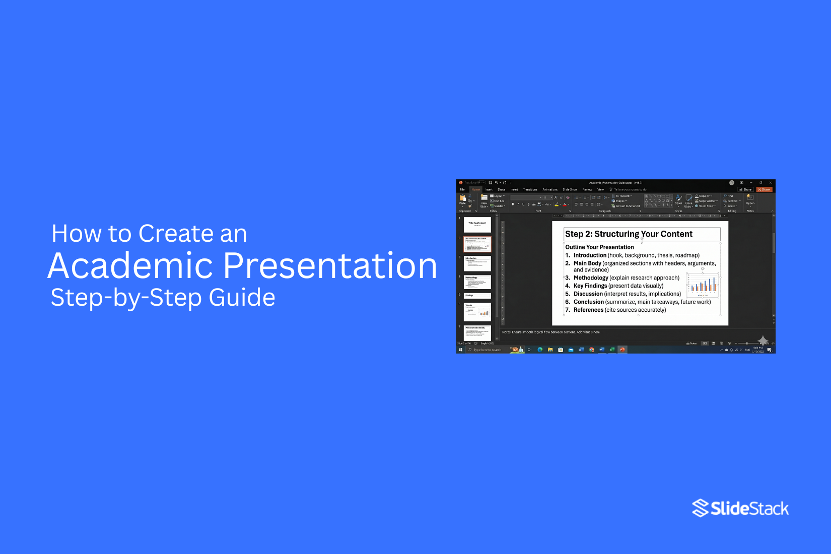
The opening slides introduce the research area. These slides give a basic background so the audience can understand the topic. The goal is to set context, not repeat full academic sources. Background slides help define the space where the research sits. The problem statement comes next. This slide explains the exact issue the study focuses on. The wording must stay direct and specific. A wide or unclear problem makes the research harder to understand during evaluation.
Research objectives follow the problem statement. These slides show what the study aims to achieve. Each objective links back to the problem. This link helps the audience track the direction of the work. The literature review section highlights existing knowledge. It does not need to show every study. It focuses on major ideas, shared findings, and gaps in past work. This section shows how the research fits into academic discussion.
The methodology section explains the approach used in the study. Slides here show the design, data source, and analysis method. Heavy procedural detail lowers clarity. A clear overview works better for an academic review. The results and findings slides show what the study discovered. These slides focus on the main outcomes. Raw data should stay limited. The audience should see meaning, not just numbers or charts.
The discussion section connects results back to the research problem and past studies. This section explains what the findings suggest. It also includes the limits of the study in a clear way without weakening the overall work.
The conclusion and future work slides close the presentation. These slides summarize what the study showed and what remains open for later research. The flow ends with a clear stopping point. References and acknowledgments appear at the end. These slides list sources and give credit to supporting work and institutions.
Best Practices for Slide Length by Academic Level
Slide count changes based on presentation type and time limit. A 15-minute conference talk usually uses 12 to 18 slides. A thesis proposal may use 25 to 30 slides. A dissertation defense may use 40 or more slides due to deeper detail and longer discussion. A simple guide is one to two slides per minute of speaking time. Some slides move faster, such as title or reference slides.
At the undergraduate level, presentations stay short and direct. Slides usually stay between 8 and 12 for a short talk. Content stays simple and clear. At the master’s level, more detail appears in methods and results. Slide count increases to support deeper explanation. At the doctoral level, evaluators review work closely. Slides carry more depth and a stronger explanation across all sections.
Developing Strong Academic Content
Converting academic writing into presentation content requires decisions that often feel restrictive for researchers. A thesis or journal article is built for reading depth, repetition, and cross-referencing. A presentation exists in real time. The audience processes it in sequence without pause or return. These are not the same format, and they should not be treated as if they are.
The most frequent issue appears when slides are treated like pages. Long paragraphs copied from written work reduce clarity. The audience reads instead of listening. The spoken explanation loses impact because it competes with dense text already on screen. This weakens both comprehension and evaluation of the argument.
The shift from written work to slides begins with extracting core claims. Most academic sections can be reduced to two to four central ideas. Each idea should sit on its own slide or across a small slide sequence. Supporting evidence, qualifications, and methodological detail belong in speech rather than slide text. Slide content should stay direct, with wording that prioritizes clarity over literary style.
Before building a slide deck, each section must pass a structural test. What role does this slide play in the argument? What comes before it and what follows after it. A slide that cannot justify its position in the sequence weakens the overall narrative and should be reworked or removed.
Visual structuring tools can support complex ideas when text becomes too heavy. Mind maps can represent theoretical frameworks or literature organization in a way that reduces cognitive load. They must remain simple enough to read clearly from a distance, without overcrowding or excessive branching.
Disciplinary expectations shape how content is presented. STEM fields often require strict logical sequencing and precise labeling. Humanities presentations may allow more narrative movement and interpretive framing. Social sciences often balance both approaches. The structure must align with the norms of the field and the expectations of the audience.
Presenting Data, Equations, and Technical Content
Technical material introduces specific constraints in academic presentations. Equations, datasets, and qualitative evidence must remain readable, accurate, and easy to interpret without repeated viewing. Equations require consistent formatting. Fields that use LaTeX should maintain that notation across written and presentation formats. Tools such as PowerPoint equation editors or Beamer support structured mathematical display. Readability is a core requirement. Small symbols, dense fractions, and compact expressions may function in print but fail in projection settings. Each slide should isolate one equation or one transformation step so the audience can follow the logic without distraction.
Data visualization depends on correct chart selection. Line charts show change across time. Bar charts compare categories. Scatter plots show relationships between variables. Each choice supports a different analytical purpose, and using the wrong one weakens interpretation. Every visual requires spoken interpretation. A chart alone does not communicate meaning in an academic setting. The presenter must explain what is being shown, what each axis represents, and what the pattern implies for the research question. Without this, the audience is left to infer meaning without guidance.
Tables are suited for precise comparisons across values. Their effectiveness decreases as size increases. Once a table moves beyond roughly six to eight rows, readability drops. A clear title should state the takeaway so attention is directed toward the most relevant values rather than the entire dataset. Qualitative data relies on selective representation. Excerpts, coded themes, and summarized narratives replace full datasets. The goal is not to display everything collected but to present evidence that supports the analytical structure. Transparency remains essential. The audience must understand how the data was interpreted and why selected examples reflect the broader findings.
Intermediate and Progress Presentations in Academic Programs
Graduate programs require multiple formal presentations before the final defense. Each stage serves a different purpose. Evaluators do not assess all presentations in the same way. They shift attention based on how far the research has developed. A strong presentation matches the stage instead of trying to cover everything at once.
Proposal Presentations
A proposal presentation introduces a research plan. The focus is approval of direction, not presentation of results. The structure centers on the research problem, the theoretical framework, the research questions, the proposed methodology, and the expected contribution. Each section supports the argument that the study is worth pursuing and can be completed within available constraints.
Committees look closely at how clearly the problem is defined. They also examine whether the methodology fits the question and whether the design is realistic. Literature awareness plays a key role in this judgment. Slides should prioritize reasoning behind choices. Early findings are not the focus because the study is not yet complete. The goal is to show that the plan is coherent and defensible.
Progress and Correction Sessions
Progress and correction sessions take place during the middle phase of research. These presentations sit between planning and final reporting. The focus shifts to completed work, current challenges, and adjustments made along the way. The student explains what has been achieved and how the original plan has changed based on real conditions.
Evaluators pay attention to intellectual independence. They look for evidence that the student can make decisions based on analysis rather than only following supervision. They also assess whether the project still fits within a realistic scope. Slides should show honest development. Challenges are expected. A smooth narrative without problems often reduces credibility. Clear reflection carries more weight than polished presentation style.
Committee Feedback and Internal Reviews
Internal reviews or committee meetings provide a structured critique before the final defense. These sessions focus on improving the research rather than grading completion. The presentation often follows the full thesis structure, including introduction, literature review, methodology, and early findings. Some sections may still be incomplete. Those parts are presented as works in progress with a clear indication of what remains unfinished. Committee members focus on gaps in logic, weak connections between sections, and areas that need stronger evidence. Questions tend to be direct and focused on improving clarity and structure. Students are expected to engage with feedback and respond clearly. These sessions are not only about presenting work but also about testing readiness for the final examination.
What Evaluators Expect at Each Stage
Across all stages, evaluators assess similar core abilities. These include understanding of literature, clarity of argument, methodological fit, and academic maturity. What changes is the emphasis. Early stages focus more on literature strength and methodological planning. Later stages place greater weight on results and interpretation. Question handling is also observed closely. Evaluators assess whether the student understands the intent behind questions and whether responses are precise and logically structured. This skill develops through repeated presentation experience.
How Structure Evolves from Proposal to Final Defense
Presentation structure changes as research progresses. Proposal presentations are forward-looking. They focus on what will be done and why it is justified. Progress presentations combine reflection and planning. They show what has been completed and what still needs attention. Final defense presentations are centered on evidence. They focus on completed findings, interpretation, and contribution to the field. Using a single slide structure across all stages creates a disconnect between research development and communication. Each stage requires a different emphasis. Adjusting structure shows awareness of how academic evaluation changes over time.
5 Common Mistakes to Avoid in Academic Presentations
Even experienced academics fall into these traps. These issues reduce clarity, weaken delivery, and affect how research is received. Here are five common mistakes and how to fix them.
1. Reading Directly from Your Slides
If your spoken words match the slide text, the audience stops listening and starts reading ahead. That shift breaks attention. It also makes the presenter look unprepared and overly dependent on the screen. The message loses impact quickly.
The fix: Slides should guide your talk, not replace it. Use short phrases, keywords, or visuals. Keep full explanations in speaker notes. Speak freely and use the slide as a reminder, not a script.
2. Overloading Slides with Text
Too much text forces the audience to read instead of listen. This creates a split focus. By the time they finish reading, the talk has already moved forward. Key points get missed.
The fix: Use the 6×6 rule. Keep lines short and words limited. One slide should carry one idea. Break dense content into multiple slides. Replace text blocks with visuals where possible.
3. Using Jargon Without Explanation
Specialized terms can block understanding. Not every listener shares the same background. Unexplained jargon creates confusion and distance from your message. It also reduces clarity in key arguments.
The fix: Introduce technical terms with short explanations. Expand acronyms on first use. Add a simple key terms slide if the topic includes heavy terminology. Keep language accessible without lowering accuracy.
4. Going Over Time
Exceeding the time limit disrupts the session flow. It reduces discussion time and can force organizers to cut speaking time. It also affects how the audience views your professionalism.
The fix: Practice with a timer before the presentation. Aim to finish slightly early during rehearsal. Separate slides into essential and optional sections. This allows quick adjustments during delivery.
5. Ignoring Slide Design Basics
Poor design makes content harder to follow. Low contrast, small fonts, and cluttered layouts reduce readability. Even strong research loses clarity when slides are visually weak.
The fix: Start with a clean academic template. Use a strong contrast between text and background. Stick to sans-serif fonts like Arial or Calibri. Keep font size at 24pt or higher. Test slides on actual presentation equipment before delivery.
Best PowerPoint Templates for Academic Presentations
Academic slides need a clear structure and clean visuals. Different academic settings need different slide styles. A single design does not fit every situation. Templates help match content to purpose. Some focus on data and research. Others focus on teaching or speaking. The right match makes ideas easier to follow.
For Conference Posters & Research Showcases
Conference posters and research showcases rely on clear data flow. The goal is quick understanding.
• Scientific Case Study Poster Template
• Built for structured research. It follows a clear research flow. Sections guide the reader through methods, results, and findings.
• Research Poster Google Slides Template
• Works well for broad academic topics. It balances text and visuals. It supports both data and explanation.
These layouts help research stand out in busy academic spaces. Clean spacing keeps attention on the content.
For Thesis Defenses & Capstone Projects
Thesis defense slides need structure and control. Each slide supports spoken explanation.
• Cool Animated Slideshow Template
• Uses smooth slide movement. Each point appears in a planned order. This helps control pacing during defense sessions.
Strong visuals support confidence during long presentations. Clear sections reduce confusion during questioning.
For Classroom Lectures & Student Engagement
Classroom settings benefit from interaction. Students stay engaged with active learning slides.
• Animated PowerPoint Quiz Template
• Includes question-based slides. Students respond during class. This keeps attention active.
• Family Feud PowerPoint Template
• Works for group learning. Students split into teams. The format supports review sessions in a game style.
These formats support participation instead of passive listening.
For Visual & Fieldwork Presentations
Fieldwork content depends on strong visual storytelling. Real-world data needs visual balance.
• Creative Collage Template
• Displays multiple images in one frame. Useful for design, art, and social research.
• Polaroid Template
• Gives a documentary feel. Good for ethnographic work and site documentation.
• Science Backgrounds for Google Slides
• Adds subject-based visual tone. Helps signal academic discipline at a glance.
These layouts support real-world context and visual evidence.
For Professional Introductions & Bios
Self-introduction slides need clarity and timing. Each detail should appear in order.
• Animated About Me Slide
• Builds profile step by step. Each slide reveals one part of the background.
This format supports conference introductions and academic networking events.
For Award Ceremonies & Recognition Events
Award settings need a formal structure and a clean presentation space.
• Achievement Awards Template
• Supports listing of winners and categories. Keeps attention on names and results.
• Certificate of Reward Template
• Designed for print and display. Works for academic recognition and honors.
These templates support formal academic celebrations with a clear presentation flow.
Final Notes
Academic presentations sit within long-term scholarly work. They are part of how research moves from written form into spoken delivery. This shift supports clear communication across different fields of study. A researcher shows understanding not only through writing but also through spoken explanation in front of others. Presentation conventions exist to support clear judgment of knowledge claims. A defined structure helps listeners follow the flow of ideas. Precise language reduces confusion in complex topics. The use of evidence shows the basis of claims. Stating limits of research adds honesty to the work. These elements serve a clear purpose in academic assessment. Surface-level use of these elements without understanding weakens the message and reduces clarity. Skill in this area develops through repeated practice and response from others. Feedback from an audience shapes how ideas are shaped and delivered. Awareness of listeners guides how content is explained. Regular rehearsal builds steadiness in delivery. This guide serves as a starting point for that process. Growth comes from continued engagement with both content and delivery over time.
FAQs
What is an academic presentation?
An academic presentation is a talk that shares research, findings, or ideas with an audience. It is often used in classes, conferences, thesis defenses, and job interviews. The goal is to explain information in a clear and organized way.
What is the difference between an academic presentation and a conference paper?
An academic presentation is spoken and supported by slides or visuals. A conference paper is a written document that explains the research in greater detail. Presentations focus on key points, while papers provide a full discussion of the work.
How long should an academic conference presentation be?
Most academic conference presentations last between 10 and 20 minutes. The exact length depends on the event and session rules. It is best to stay within the time limit and leave room for questions.
What is an academic poster presentation?
An academic poster presentation shares research through a large visual display. It combines text, images, charts, and key findings in one format. Researchers often discuss the poster with attendees during a conference session.
What size should an academic poster presentation be?
Poster sizes vary by conference. Common sizes include 36 x 48 inches and 42 x 56 inches. Always check the event guidelines before creating your poster.
What is an academic job talk presentation?
An academic job talk is a presentation given during a hiring process. It allows candidates to present their research and teaching interests. Faculty members use it to assess knowledge, communication skills, and future plans.
How is an academic job talk different from a conference presentation?
A conference presentation focuses on sharing research with peers. A job talk also highlights the candidate's ability to teach, conduct future research, and fit within a department. The audience often looks beyond the research itself.
What should be included in an academic CV under presentations?
List the title of the presentation, the event name, and the date. You can also include the location and your role as presenter. Keep the format clear and consistent throughout the CV.
What is the difference between an academic proposal presentation and a thesis defense?
A proposal presentation explains a research plan before the study is completed. A thesis defense presents the finished research and results. One focuses on what will be done, while the other explains what was done.
How many slides should an academic presentation have?
The number of slides depends on the presentation length and content. Many presenters use around one slide per minute as a rough guide. The focus should be on clarity rather than slide count.
How should I present data in an academic presentation?
Use charts, graphs, tables, or diagrams to make data easier to understand. Keep visuals simple and easy to read. Highlight the most important findings instead of showing every detail.
Is LaTeX or PowerPoint better for academic presentations?
Both tools can be effective. PowerPoint is easier for most users and offers many design options. LaTeX is often preferred for presentations that include complex equations and technical content.
What are common mistakes in academic conference presentations?
Common mistakes include reading directly from slides, using too much text, and going over time. Poor organization can also make a presentation hard to follow. Clear slides and practice can help avoid these issues.
What is an academic integrity presentation?
An academic integrity presentation explains the importance of honest academic work. Topics often include plagiarism, proper citation, and ethical research practices. The goal is to promote fairness and responsibility.
How should I prepare for questions after an academic presentation?
Review your research and be ready to explain your methods and findings. Practice answering likely questions before the presentation. During the discussion, listen carefully and respond clearly.
What is the role of an academic advisor in an interview presentation?
An academic advisor may help a candidate prepare for the presentation. They can provide feedback on content, structure, and delivery. Their guidance often helps improve confidence and clarity.
Can I use animations in academic presentations?
Yes, but they should be used sparingly. Simple animations can help guide attention and explain ideas. Too many effects can distract the audience from the content.
What is the best academic presentation template for conferences?
The best template is clear, professional, and easy to read. It should support the content without drawing attention away from it. Consistent fonts, colors, and layouts usually work well.
How do I make a poster for an academic conference?
Start with a clear title and organize the content into sections. Use visuals, charts, and short blocks of text to present the research. Make sure the poster is easy to read from a distance.
Should I memorize my academic presentation?
It is better to know the material well than to memorize every word. A natural delivery often sounds more confident and engaging. Practice enough to speak smoothly while staying flexible.


You may also be interested in ...

How To Create An Eye-Catching Portfolio
If you’re looking to create an eye-catching portfolio, this post will come in handy. In this article, you can find the easies...
23 Jun, 2024

How To Easily Create An Infographic
Infographics are the perfect way to make a presentation that will impact an audience, but their design and composition might...
08 Jun, 2024

PowerPoint Template Tips & Tricks You Ne...
PowerPoint seems to be an unknown world for many people, especially those who have been assigned to create a presentation out...
08 Jun, 2024