How the Opportunity Solution Tree Improves Presentations
Many presentations fail to present ideas in a clear order. Slides move from point to point without structure. The main message becomes hard to see. Ideas lose strength even when the content is strong. Audiences struggle to follow how decisions are formed and connected. This creates confusion during meetings. People spend more time explaining slides than discussing choices. Important points get missed or misunderstood. Discussions slow down because the reasoning behind each step is not easy to see. An Opportunity Solution Tree fixes this by linking outcomes, opportunities, and solutions in one structure. It shows the logic behind decisions in a simple map. Presenters can guide audiences through their thinking step by step, making complex ideas easier to follow.
What Is an Opportunity Solution Tree
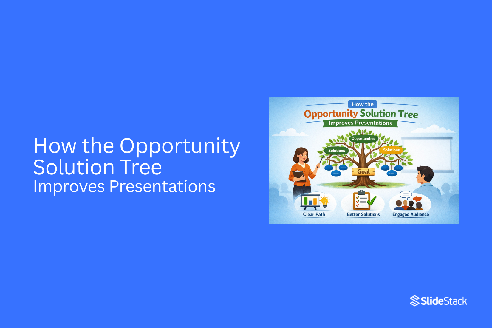
An Opportunity Solution Tree is a simple way to map a goal and the paths to reach it. It starts with a clear outcome at the top. Below that sit opportunities. These are problems or needs from users. Under each opportunity, there are possible solutions. The structure looks like a tree. One goal branches into many opportunities. Each opportunity branches into many solutions. This layout helps teams see the full picture in one place.
The goal stays fixed at the top. It guides every choice below. Teams do not jump straight to solutions. They first look at real user needs. That keeps the work focused and clear. Presentations often feel messy when ideas are scattered. This method brings order. It shows how ideas connect. It also shows which ideas matter most for reaching the goal. Different teams can use it to stay aligned. Product teams, design teams, and marketing teams can all follow the same path. Everyone works from the same map.
Structuring Ideas for Clarity and Impact
The main problem in many presentations is not missing information. The problem is a weak structure. Ideas appear without clear links. The audience sees pieces instead of one clear path. The Opportunity Solution Tree gives a simple structure that connects thinking from goal to action.
The process starts with the Outcome. This is the main result that matters most. It sets the direction for the entire discussion. A strong outcome is clear and measurable. A statement like “increase retention by 15%” gives focus. A vague goal like “improve engagement” creates confusion. Every other part of the structure depends on this point. It works as the anchor for all decisions.
Below the outcome are Opportunities. These show the real problems or needs that block progress. They are not random ideas or opinions. They come from evidence and clear observation. Each opportunity must connect directly back to the outcome. A clear link is required. Without that link, the point does not belong in the structure. This level helps sort important issues from noise. It also brings order to complex situations.
Next come Solutions. These are actions that respond to each opportunity. The focus here is direction, not detail. Presenting too many execution steps weakens clarity. The purpose is to show reasoning. Each solution should sit under a specific opportunity. This shows how thinking moves from problem to response. It also makes trade-offs easier to understand.
At the base are Experiments. These test whether a solution works in real use. They are small and focused steps. Each experiment produces feedback from real results. This feedback guides the next decision. The structure shows that decisions are not fixed. They stay open to learning from results. This layered approach builds a clear chain from goal to action. Each level supports the one above it. The full structure keeps thinking organized and easy to follow.
Applying the Opportunity Solution Tree in Presentations
The Opportunity Solution Tree helps shape ideas for presentations. It gives a clear path from goals to actions. It keeps the focus on real outcomes. It also helps teams stay organized. Ideas stop feeling scattered. Each part has a clear place.
Outcome-first framing
Start with the outcome. This is the result you want. State it in simple terms. Keep it short and direct. Every idea in the presentation links back to this outcome. This keeps the message steady. It also reduces confusion.
The outcome acts like a guide. It sets the direction for every slide that follows.
Mapping opportunities
Opportunities come next. These are the needs, problems, or gaps. List them one by one. Keep them clear and specific. Each opportunity shows a point where change is needed. Some may be small. Some may be larger. This step builds a full picture of the situation. It shows where attention should go.
Linking solutions
Solutions connect to each opportunity. Each solution answers a real need. No extra ideas stay in the mix. This link keeps ideas grounded. It stops random suggestions from entering the plan. One opportunity can have more than one solution. Each solution should stay direct and practical.
Structuring insights visually
Visual structure brings everything together. The tree layout shows links between outcomes, opportunities, and solutions. It makes the flow easy to follow. Each branch has a clear role. The eye moves from top to bottom with ease. This structure helps the audience see how decisions are made. It turns complex thinking into a simple map.
Benefits of Using the Framework
Ideas stay scattered during planning. The framework brings structure to that mess. Each part has a place. Objectives sit at the top. Solutions and insights sit under them. This setup makes the logic easy to follow. Presentations become easier to understand. The audience can see how each point connects. There is less guessing. The message feels steady from start to end.
Work also moves more quickly. A clear layout reduces time spent rearranging slides. Teams spend more time on content and less time fixing order. Alignment across teams becomes smoother. Everyone looks at the same structure. It is easier to agree on what matters and what comes next. Presenters also gain better control of the story. Each slide supports a clear path. The flow feels steady. The message stays on track without drifting.
Step-by-Step Integration into Slides
The Opportunity Solution Tree becomes useful in presentations when it is turned into a clear slide flow. Each part of the tree can guide what appears on the screen. This keeps ideas organized and easy to follow. It also helps the audience see how each choice connects back to the main goal.
Define outcome
Start with the goal of the presentation. Write the main message in one clear line. Keep it simple. The outcome shows what the audience should understand after the slides end. This gives direction to the entire tree.
Identify opportunities
List the areas where value can be created. Break the main goal into smaller problem areas. Each area should connect back to the main outcome. This helps turn a broad idea into clear parts that can be worked on.
Add solution branches
Place possible solutions under each opportunity. Keep each solution short and direct. Focus on options that can solve the problem in different ways. This builds structure and shows multiple paths forward inside the slide flow.
Prioritize options
Sort the solutions by impact and effort. Put stronger options near the top. Keep weaker ones lower in the list. This helps the viewer see what matters most without extra explanation. It also brings clarity to decision-making.
Convert into a slide structure
Turn each branch into a slide. One opportunity can become one section of slides. Each solution can become a separate slide point or visual block. Keep the flow clean so the audience can follow the logic from start to finish.
Using the OST in Different Presentation Contexts
The Opportunity Solution Tree helps organize ideas in a clear structure. It shows how goals connect to possible actions. The same model can support many types of professional presentations. Each setting uses it in a slightly different way based on purpose and audience.
Strategy Meetings
Strategy meetings focus on direction and priorities. Teams need a shared view of goals. OST is used to map objectives at the top level. Below that, teams list possible paths and solutions. This keeps discussions tied to outcomes, not scattered ideas. The structure helps leaders compare options. It also reduces confusion during planning.
Project Reviews
Project reviews focus on progress and results. Teams need to see what worked and what did not. OST shows the link between planned solutions and real outcomes. It helps teams track which ideas delivered value. This view supports clear reporting. It also helps spot gaps in execution without extra noise.
Consulting and Client Presentations
Client presentations need clear reasoning. Decisions must be easy to follow. OST presents the logic behind recommendations. It shows how each solution connects to a goal. Clients can see the path from problem to action. This builds clarity in discussions about next steps.
Education and Research
Education and research settings focus on learning and structure. Concepts must be easy to follow. OST breaks complex topics into smaller parts. It shows how ideas connect under one goal. This helps learners follow reasoning step by step. It also supports better retention of structured thinking.
Cross-functional Teams
Cross-functional teams include different roles and views. Misalignment often slows progress. OST brings all perspectives into one map. It links shared goals with team-level actions. This reduces overlap and confusion between departments. It also supports smoother coordination across workstreams.
Synthesis Rule
OST adapts based on context and audience needs. The structure stays the same. The level of detail changes with purpose. Clear alignment between goal and solution keeps presentations consistent and easy to follow.
Complementary Diagrams and Models for OST Presentations
Opportunity Solution Tree (OST) often needs visual support. Extra diagrams help show structure, flow, and results. Each model adds a clear layer to the story behind decisions.
Journey Maps
A Journey Map shows the steps a user takes over time. It breaks an experience into clear stages. It connects to OST by showing where opportunities appear in real use. Each step can reveal gaps or needs that link back to tree branches. In presentations, it helps the audience see the user flow. It makes the OST more grounded in real actions.
Problem-Solution Matrix
A Problem-Solution Matrix lists problems on one side and possible solutions on the other. It supports OST by aligning solution ideas with clear problem areas. Each part of the tree can match a direct entry in the matrix. In slides, it creates a quick comparison. It helps teams see the balance between issues and responses.
Impact-Effort Diagram
An Impact-Effort Diagram places ideas based on value and effort level. It links with OST by helping choose which solutions to test first. High-impact items often sit closer to key branches in the tree. In presentations, it supports decision-making. It shows where the focus should go first.
Cause-and-Effect (Fishbone) Diagram
A Fishbone Diagram breaks a problem into root causes. It connects to OST by feeding deeper reasons into opportunity areas. Each cause can point to a branch that needs attention. In slides, it helps explain why a problem exists. It gives structure to root thinking.
Roadmaps and Timelines
Roadmaps and Timelines show work across time in order. They support OST by turning chosen solutions into planned steps. Each OST branch can map to a time-based action. In presentations, they make plans clear. They show movement from ideas to execution.
KPI or Metric Dashboards
A KPI Dashboard shows key numbers and performance signals. It links to OST by tracking outcomes of selected solutions. Each branch can connect to a metric that shows progress. In slides, it keeps focus on results. It helps track what is working and what is not.
Feedback Loop Diagrams
Feedback Loop Diagrams show how results feed back into decisions. They support OST by closing the cycle between outcome and learning. Each loop can point back to earlier opportunity stages. In presentations, they show ongoing learning. They make the system feel continuous and active.
Example Presentation Structure
A clear presentation follows a simple flow. Each slide has one purpose. The message stays easy to follow. Start with the main goal. State the problem or objective in one short slide. Keep the focus direct. Next comes the Opportunity Solution Tree slide. This shows how the goal connects to different paths.
After that, list the main opportunities. Each opportunity sits on its own slide or section. Keep each one short and clear. Then move to solution ideas. Show options that connect to each opportunity. Each option stays separate. After that, highlight the selected solution. Show why it was chosen using direct points. End with expected impact. Show what change the solution is meant to bring in simple terms.
Common Presentation Mistakes with OSTs
OSTs often lose value through poor execution. The structure looks simple, but misuse breaks clarity. The framework stops guiding decisions and becomes decoration.
Treating OST as a Mind Map
Some presentations turn OST into a loose idea map. Ideas sit without clear order. The result feels scattered. The viewer cannot follow the direction or purpose. OST needs a structure tied to a clear objective. Each branch must connect to a defined goal and a real decision path.
Overloading with Text
Many OSTs are packed with long labels and full sentences. The slide becomes heavy. Reading slows down. Meaning gets buried. Clear OSTs use short labels. Each node carries one idea. Brevity keeps focus on relationships, not wording.
Weak Outcome Definition
Some OSTs start without a clear outcome. The tree grows, but the direction stays unclear. Teams lose focus on what success means. A strong OST begins with a specific outcome. Every branch must support that endpoint. Without it, structure loses purpose.
Disconnect Between Opportunity and Solution
Another common issue is a weak linkage between opportunity and solution. Ideas appear, but the connection is unclear. This breaks the logic flow. The audience cannot see how insights lead to action.
Each opportunity node must connect directly to a solution path that responds to it.
Visual Clutter
Too many colors, shapes, and lines reduce readability. The structure becomes harder to scan. Key relationships get lost. Simple design keeps attention on logic. Clean spacing and consistent formatting improve understanding.
Ignoring Flow During Delivery
Some OSTs work on paper but fail in presentation. The presenter jumps between branches without structure. The audience loses the sequence. The story becomes hard to follow.
A clear delivery path must guide movement across the tree in a steady order.
Using OST Without a Narrative Setup
OSTs sometimes appear without context. The audience sees structure but not the reason behind it. This weakens engagement. The tree feels technical instead of meaningful. A short setup should explain the purpose before showing the structure. Strong OST use depends on discipline. Each part must support clarity and direction. The framework only works when it stays tied to outcome, logic, and flow.
Final Notes:
The Opportunity Solution Tree gives structure to presentation thinking. It shows how goals, insights, and actions connect. This builds clear visibility in reasoning. Ideas become easier to trace from start to finish.
It is not a decorative slide element. It is a reasoning tool. Its purpose is to show how ideas form, not only what the final result looks like. Using it as decoration weakens its value and hides the thinking behind it.
Used in this way, communication becomes clearer and easier to follow. It keeps ideas aligned and reduces confusion for the audience. The message becomes tighter, and thinking stays clear from one point to the next.
FAQs
What is the primary purpose of using an Opportunity Solution Tree in a presentation?
It shows how a goal connects to user needs and actions. It organizes ideas into a clear structure. It helps audiences follow decision logic from start to finish.
Can I use an OST even if I don’t have quantitative data?
Yes. Qualitative input works well. User feedback and observations can fill each branch. The structure still shows clear decision flow without numbers.
How detailed should the tree be?
Each node stays simple and focused. Too much detail reduces clarity. The tree should show direction and reasoning, not full execution plans.
Should every opportunity lead to multiple solutions?
No. Some opportunities connect to one solution. Others connect to several. The structure depends on the problem and available options.
Can the OST replace a roadmap or strategy matrix?
No. It works as a support tool. Roadmaps show timing. Strategy matrices show prioritization. The OST shows decision logic.
What software is best for creating OST slides?
PowerPoint and Google Slides are common choices. Miro and FigJam also support visual tree layouts. Simple tools work best for clean structure.
How often should I update the OST?
Updates follow new insights or changes in direction. User feedback and test results often trigger revisions. The structure stays aligned with current goals.


You may also be interested in ...

How To Create An Eye-Catching Portfolio
If you’re looking to create an eye-catching portfolio, this post will come in handy. In this article, you can find the easies...
23 Jun, 2024

How To Easily Create An Infographic
Infographics are the perfect way to make a presentation that will impact an audience, but their design and composition might...
08 Jun, 2024

PowerPoint Template Tips & Tricks You Ne...
PowerPoint seems to be an unknown world for many people, especially those who have been assigned to create a presentation out...
08 Jun, 2024