How to Make a Creative Concept Map in PowerPoint
Many people struggle to organize ideas clearly in PowerPoint. Slides often end up looking like scattered notes that are hard to follow. That makes it difficult to show how ideas connect in a simple way. A concept map solves this problem. It turns complex information into a clear visual layout that is easy to understand. In this guide, you will learn how to make a creative concept map in PowerPoint.
Presentations often have limited time to hold attention, and unclear slides can make ideas harder to follow. This is where concept maps help. They show how different ideas link together in a simple structure. In basic terms, a concept map is a diagram that organizes information using connected nodes and branches.
What is a Concept Map?
A concept map is a visual tool used to show ideas and how they connect. It uses boxes or circles to hold words or short phrases. Lines link these parts together. Each line shows a relationship between ideas.
A concept map helps organize information in a clear way. It breaks large topics into smaller parts. It also shows how those parts relate to each other. This makes learning and planning easier to follow.
The idea of concept maps comes from educational research. It was developed to help students understand new topics better. Over time, teachers and professionals started using it in many fields. It became a simple way to structure knowledge and show connections.
Concept maps are used in many areas today.
• Education uses them to teach lessons and review topics
• Business teams use them to plan projects and strategies
• Science fields use them to explain systems and processes
• Writers use them to organize ideas before writing content
• Students use them to prepare for exams and summarize chapters
A concept map does more than list information. It shows how ideas connect in a structured way. This helps people see the full picture of a topic without confusion.
Why PowerPoint Is One of the Best Tools for Concept Mapping
PowerPoint is easy to use. Most people already know it. This makes it a good choice for concept maps. You can move shapes around with simple clicks. You can add text inside boxes. You can also connect ideas with lines. This helps show how topics link together.
PowerPoint also gives you control over layout. You can place ideas in a clear order. You can build from one main idea and branch out step by step. Colors and shapes are easy to change. This helps you group ideas. It also helps readers follow your map without confusion.
Types of Concept Maps You Can Create in PowerPoint
You can make different types of concept maps in PowerPoint. Each type helps show ideas in a clear way. You can choose the one that fits your topic.
Hub-and-Spoke Concept Map
This map has one main idea in the center. Other ideas connect around it. Each line links back to the center. This helps show one topic with many related points.
Tree-Structured Concept Map
This map looks like a tree. The main idea is at the top. Smaller ideas branch out below it. Each level shows more detail. It works well for breaking big topics into parts.
Flow-Based Concept Map
This map shows the steps in order. Each idea connects to the next one. It follows a clear path from start to end. It is useful for processes and sequences.
Circular Concept Map
This map is shaped like a circle. Ideas connect in a loop. Each point links to the next. It shows how ideas repeat or relate in a cycle.
Step-by-Step Guide to Creating a Concept Map in PowerPoint
PowerPoint allows you to build clear concept maps using shapes and connectors. It helps turn ideas into a simple visual layout. You can show relationships between topics in a structured way. The process stays flexible and easy to adjust.
Step 1: Define Your Central Idea Clearly
Start with the main topic. Place it in the center of your slide. This becomes the focus of your map. Keep the idea short and direct. One phrase or a single word works best.
Step 2: Identify Key Subtopics or Branches
Break the main idea into smaller parts. These become your branches. Each branch supports the central idea. Keep each one clear and separate. This helps avoid confusion later in the layout.
Step 3: Insert Shapes for Nodes (Smart Art or Manual Shapes)
Open PowerPoint shapes or SmartArt. Add boxes or circles for each idea. Place the central idea first. Add subtopics around it. Keep spacing even across the slide. Manual shapes give more control over layout. SmartArt gives a faster setup.
Step 4: Connect Ideas Using Lines and Arrows
Use connectors to link ideas. Draw lines from the center to each branch. Add arrows to show direction. Keep lines clean and straight. Avoid crossing lines as much as possible. This keeps the map easy to read.
Step 5: Organize Structure for Visual Balance
Adjust placement across the slide. Spread items evenly. Keep similar spacing between nodes. Align shapes for a clean look. Balance helps the map feel clear and simple to follow. A concept map can still grow in detail as ideas expand. More layers can be added using extra shapes or deeper branches. PowerPoint supports more complex layouts through careful arrangement and built-in design tools.
How to Design a Creative and Professional Concept Map
A concept map helps break down ideas into simple parts. It also shows how those ideas connect. PowerPoint gives you tools to build a clear and clean layout. Good design choices make the map easy to follow and pleasant to read.
Use Visual Hierarchy to Guide Attention
Start with the main idea in the center or top. Make it larger than the other text. Use smaller shapes for supporting points. This helps the viewer see what matters first. Lines can guide the eye from one idea to another without confusion. Keep the most important idea visually dominant.
Apply Color Grouping for Idea Clusters
Colors help separate ideas into groups. Use one color for each category. Keep shades soft so the content stays easy on the eyes. Avoid too many colors on one slide. Too many can make the map feel crowded. Grouping by color helps the viewer understand structure at a glance.
Choose the Right Fonts for Readability
Simple fonts work best. Sans-serif fonts keep text clean on screen. Use one font style for the whole map. Change size to show importance, not font type. Keep text short inside each node. Long text makes the map harder to read.
Use Icons and Visual Cues for Faster Understanding
Icons help explain ideas without extra words. A small symbol next to a node can add meaning quickly. Keep icon style consistent across the slide. Use them only where they add clarity. Too many icons can distract from the main structure.
Maintain Consistent Spacing and Alignment
Even spacing keeps the map balanced. Align shapes in a clear structure. Avoid random placement of elements. Use PowerPoint alignment tools to keep everything even. A clean layout helps the viewer follow connections without effort.
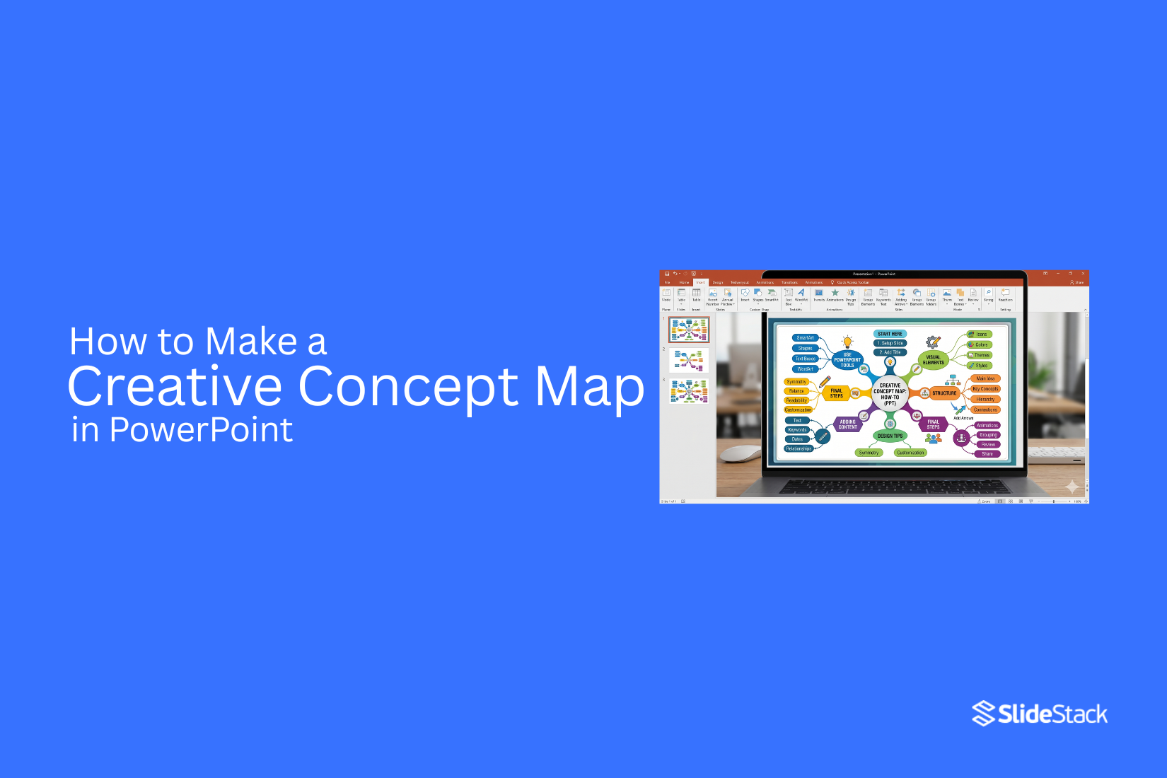
Example: Complete Concept Map Built in PowerPoint
A complete concept map in PowerPoint brings all ideas into one clear visual space where a central topic connects to related points in a structured way that helps viewers quickly understand how each idea links together without confusion.
Sample Topic Selection
A sample topic is chosen as the base of the concept map, and for this example, “Healthy Eating” sits at the center because it is broad enough to branch into several clear directions while still staying focused on one main idea that guides the full structure.
Structure Layout Explanation
The structure begins with a single central shape that holds the main topic, and from that center, lines extend outward to connect related ideas, while each main branch can further split into smaller sub-branches that add detail in a simple and organized flow across the slide.
Final Visual Arrangement Walkthrough
The final visual arrangement shows a balanced layout where the center topic stays in the middle of the slide, main branches spread evenly around it, and sub-branches sit close to their parent ideas, creating a clean and readable map that guides the viewer’s eye naturally across the full structure.
Advanced Tips to Make Your Concept Map Stand Out
A strong concept map is clear and easy to follow. It should guide the viewer from one idea to the next without confusion. These tips help improve structure and visual flow.
Use Storytelling Flow Instead of Random Branching
Build your map like a story. Start with one main idea. Then move step by step into related points. Each branch should connect to the next idea in a clear order. This makes the map easier to read and understand.
Keep Each Node Focused on One Idea Only
Do not mix multiple ideas in one box. Each node should hold a single point. This keeps the map clean. It also helps the viewer process information faster.
Limit Complexity to Improve Clarity
Do not add too many branches or layers. A crowded map becomes hard to read. Focus only on key ideas. Remove anything that does not support the main topic. Simple layouts work better for learning and recall.
Use Animation to Present Ideas Step-by-Step (Optional)
PowerPoint animations can help control flow. You can show one idea at a time. This keeps attention on the current point. Use simple effects. Avoid heavy or distracting motion.
Common Mistakes to Avoid When Creating Concept Maps in PowerPoint
Many concept maps look good at first, but fail in practice. Small design errors can make the slide hard to read. A clear structure helps people understand ideas faster. Below are common mistakes you should avoid.
Overcrowding the Slide with Too Many Nodes
Too many nodes make the slide hard to read. The main idea gets lost. Keep only the key points on the slide. Add more slides if needed.
Poor Alignment and Visual Chaos
Misaligned shapes make the map look messy. It becomes hard to follow the flow. Place each item in a clear position. Keep spacing even between all elements.
Weak Color Contrast Between Elements
Low contrast makes text hard to see. Some parts may blend into the background. Use clear color differences for text and shapes. This helps each idea stand out.
Lack of Logical Flow Between Ideas
A concept map needs a clear path. Without order, ideas feel random. Connect each point in a simple step-by-step way. This helps the reader follow the structure easily.
Best Practices for High-Impact Concept Map Presentations
A concept map works best when it feels easy to follow. Every part should guide the viewer step by step. The goal is clear understanding, not visual overload.
Keep the Design Minimal but Structured
A clean layout helps the mind stay focused. Too many shapes or lines can confuse the message. Stick to simple boxes and clear spacing. Place the main idea at the center. Let related ideas branch out in an organized way. Keep alignment consistent across the slide.
Prioritize Readability Over Decoration
Text should be easy to read at a glance. Use clear fonts with enough size. Avoid long sentences inside nodes. Short phrases work better. Strong contrast between text and background improves clarity. Fancy effects can reduce focus and should be avoided.
Use One Visual Theme Across the Slide
A single style keeps the map unified. Use matching colors, fonts, and shapes. Random design changes break the flow and distract the viewer. A steady theme helps each idea feel connected. It also makes the slide look organized without extra effort.
Focus on Communication, Not Just Design
A concept map is a tool for sharing ideas. Every element should support understanding. Remove anything that does not add meaning. Ask if each part helps explain the main topic. If it does not, it does not need to be there. Clear communication always matters more than decoration.
Final Notes
A concept map helps turn scattered ideas into a clear structure. PowerPoint makes this process simple with shapes, lines, and layout control. The goal stays the same from start to finish. Keep ideas easy to follow and visually organized. Each part of the map should serve a purpose. The central idea gives direction. Branches break it into smaller parts. Connections show how everything links together. This structure helps viewers understand information without effort.
Design choices matter, but clarity matters more. Clean spacing, short text, and clear alignment make a strong difference. Color and style should support reading, not distract from it. Strong concept maps avoid clutter. They stay focused on key points. They guide the viewer step by step through the topic. A simple layout often works better than a complex one. A well-built concept map in PowerPoint does more than display information. It helps people see relationships between ideas quickly and clearly.
FAQs
What is a concept map in PowerPoint?
A concept map is a diagram made of shapes and lines. It shows ideas and how they connect. Each shape holds a short word or phrase.
Why use a concept map in presentations?
It helps organize ideas in a clean structure. It also makes topics easier to follow on slides.
What tools in PowerPoint help make a concept map?
Shapes, lines, and SmartArt work well. These tools let you place ideas and connect them in different ways.
How many ideas should go on one concept map slide?
A small number of ideas works better. Too many points make the slide crowded and harder to read.
What layout works best for a concept map?
A hub-and-spoke layout is common. A central idea sits in the middle with related ideas around it.
How can a concept map stay easy to read?
Short text in each shape helps. Even spacing between elements also keeps the slide organized.
Can colors help in a concept map?
Colors can separate groups of ideas. A consistent color style keeps the slide organized and easy to follow.


You may also be interested in ...

How To Create An Eye-Catching Portfolio
If you’re looking to create an eye-catching portfolio, this post will come in handy. In this article, you can find the easies...
23 Jun, 2024

How To Easily Create An Infographic
Infographics are the perfect way to make a presentation that will impact an audience, but their design and composition might...
08 Jun, 2024

PowerPoint Template Tips & Tricks You Ne...
PowerPoint seems to be an unknown world for many people, especially those who have been assigned to create a presentation out...
08 Jun, 2024