How to Change Fonts in Canva for Better Designs
Fonts in Canva can change how a design looks and feels. Poor font choice can make text hard to read and weak. Good typography helps your message stand out and keeps viewers focused on your content in presentations and posts. Clear fonts improve design quality. Next, choosing the right style helps improve readability and gives better control over branding in Canva designs, leading to a more professional look. This guide shows simple steps to change fonts and improve results. Learning font changes in Canva helps create cleaner slides and stronger visual flow across all projects. Follow the steps below to adjust fonts and improve your Canva designs quickly and easily.
Why Fonts Matter in Canva Presentations
Fonts shape how text appears in Canva presentations and affect how people take in information. Clear fonts help readers understand words quickly without strain. Consistent font use across slides keeps the design steady and organized.
Different font sizes and styles guide attention toward titles, headings, and supporting details. Clean font choices also create a neat and polished look that supports the message. In Canva presentations, font selection supports school work, business reports, and marketing slides by helping each message match its purpose and audience.
Understanding Fonts in Canva
Fonts are the style of letters you use in your design. Each font has its own look. Some look clean. Some look bold. Some look soft and simple. Canva has many font choices. You can pick one that fits your message. A serious message often uses a clear font. A fun design may use a playful font.
Font style changes how people feel when they see your text. Thick letters can feel strong. Thin letters can feel light. Curved letters can feel friendly. Spacing between letters also changes how text looks. Wide spacing feels open. Tight spacing feels compact. Font size also matters. Big text stands out fast. Small text feels less loud. Each font choice shapes the design.
How to Change Font Style in Canva
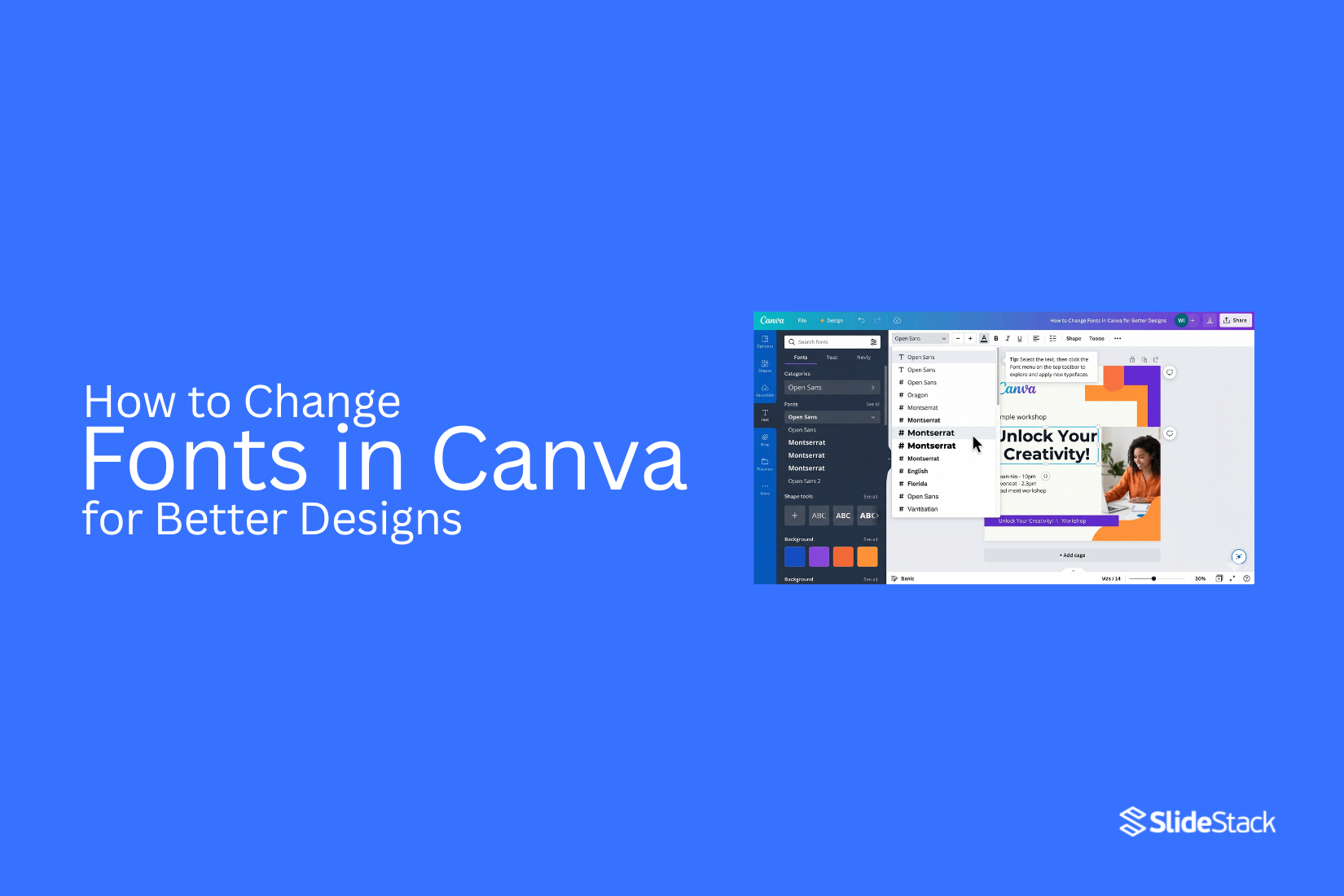
You can change fonts in Canva using the editing toolbar. You can edit text to improve clarity and adjust the look of your design. This helps you keep your slides consistent after importing files or building new ones in Canva.
Method 1: How to Change Text Font in Canva
This method is the main way to change fonts in Canva. It works well for headings, body text, and full text boxes. It helps you adjust design style quickly without rebuilding content.
Step 1: Open your Canva design and go to the page that has the text you want to edit.
Step 2: Click the text box. The editing toolbar will appear at the top of the screen.
Step 3: In the top toolbar, click the font dropdown menu.
Step 4: Scroll through the font list or type a font name in the search bar.
Step 5: Click the font you want. The text updates right away in the selected style.
Method 2: How to Change the Font of One Word in Canva
Sometimes you may want to highlight a single word inside a sentence. You may also want that word to stand out more than the rest of the text. A font change helps create that focus, such as making a word like “Agenda” more noticeable in a slide title.
Step 1: Click the text box twice. This opens the text for editing so you can work on individual words.
Step 2: Highlight the word you want to change. Drag your cursor only across that one word.
Step 3: Go to the font menu in the top toolbar. Pick a new font style for the selected word.
Tip: Use this carefully. Too many font styles in one design can make it look messy and harder to read.
Method 3: How to Change Font Color in Canva
Changing font color helps improve readability and keeps designs consistent with your brand. Canva makes this process simple through the Text Color tool in the top toolbar.
Step 1: Select the text box you want to edit. Click the Text Color icon (A with a color underline) in the top menu.
Step 2: Pick a color from the palette or enter a custom hex code for a precise brand color.
Tip: Use a strong contrast between text and background. Stick to a small set of brand colors. Avoid color combinations that reduce readability, especially on busy slides or images.
Method 4: Change Fonts Across Multiple Slides
Canva does not use a full theme-based font system like PowerPoint. Font changes often need to be applied more directly. Still, there are several ways to keep fonts consistent across a presentation.
Option 1 – Manual Update: Open each slide. Select the text box. Apply the new font from the font dropdown. This method gives full control but takes more time for large decks.
Option 2 – Use Text Styles Panel: Select a text element first. Open the font dropdown menu. Choose a text style combination if available. Apply the same style across matching text elements to keep consistency.
Option 3 – Replace Fonts: Select a text box and choose a new font from the font list. Then click Change All to apply the same font across all matching text in the design. This helps keep the presentation uniform without editing each slide one by one.
How to Upload Custom Fonts in Canva
Open Canva in your web browser and go to your main homepage, where all your designs are stored and managed in one place so you can start the process from a clean and simple screen. On the left side of the screen, look for the menu panel and click on Brand or Brand Kit, depending on your Canva plan, since some accounts show slightly different labels, but both lead to the same font settings area. Inside the Brand Kit section, scroll down until you see the Fonts area where Canva keeps all text styles organized, and then look for the option that allows you to upload a new font file from your device.
Click on Upload a Font, then choose a font file saved on your computer, usually in OTF or TTF format, and select it so Canva can start processing it for your account. A confirmation box will appear on the screen asking you to approve the upload, so confirm it to move forward and allow Canva to add the font to your brand settings. Wait a few moments while the system processes the file, and once it is complete, the new font will appear in your font list, ready to use in your designs.
Open any design file, click on a text box, then go to the font menu at the top and scroll through or search for the uploaded font so you can find it quickly. Click the font name, and it will apply instantly to your selected text, changing the style right away so you can see how it fits your design. If the font does not appear after uploading, refresh your browser page and repeat the steps from the Brand Kit section to make sure the upload is completed correctly.
Best Practices for Fonts in Canva Presentations
Font choice shapes how your message feels and how easily it is understood. Clear fonts help the audience focus on the idea, not the design itself. Good font use keeps slides clean and easy to follow. Strong choices also make your presentation feel more organized and intentional.
Good design starts with control. Fonts need structure, purpose, and balance across every slide.
Limit the Number of Fonts
Using too many fonts can make slides look messy. It creates visual noise. The message becomes harder to follow. Each font adds a different style. Too many styles compete with each other. This reduces clarity and weakens your design.
Keep your font choices small and focused. One font can work for headings. Another can support body text. That is often enough for a full presentation. A simple font system helps your audience move through content without distraction. It also makes your slides feel more professional and stable.
Establish a Clear Visual Hierarchy
Not all text carries the same weight. Some parts need more attention. Others support the main idea. Visual hierarchy helps guide the eye. Larger text often signals importance. Smaller text gives detail. Bold styles can highlight key points.
Each slide should show clear levels of importance. Headings should stand out first. Supporting text should stay secondary. Notes or details should stay subtle. This structure helps the audience understand what to read first. It also reduces confusion during fast viewing.
Prioritize Readability
Text must be easy to read at a glance. If reading takes effort, the message gets lost. Simple fonts often work best. Clean letter shapes improve clarity. Strong spacing between lines also helps. Avoid decorative styles for long text. They reduce speed and comfort when reading.
Font size matters as well. Small text can be missed. Large enough text supports better focus across different screen sizes. Readable slides help your audience stay engaged from start to finish.
Maintain Consistency Across Slides
Consistency builds trust in your design. It also makes your presentation feel structured and complete. Using the same fonts across all slides creates unity. Headings should look the same throughout. Body text should follow the same pattern.
Inconsistent fonts break the flow. They can make slides feel disconnected. The audience may lose track of the message. A consistent system keeps attention on your content. It also makes editing easier as your presentation grows.
Follow Your Brand Toolkit and Guidelines
Brand guidelines give your design direction. They define how your presentation should look and feel. Fonts are often part of that system. They support identity and recognition. Using approved fonts keeps your presentation aligned with your brand. This alignment builds familiarity. It also strengthens how your message is perceived.
Stay within the font choices provided by your brand toolkit. This keeps your design aligned across different materials and platforms. Strong brand alignment turns your presentation into part of a larger visual system, not just a standalone file.
Choosing Fonts for Different Canva Designs
Fonts change how a design feels. They set the mood before a single word is read. A business post needs clean fonts. Simple styles like sans serif, work well. They keep the message clear and easy to read. Too many details in the font can distract from the content. A school project or presentation needs balance. A mix of one bold font for titles and one simple font for body text keeps things organized. The title stands out. The main text stays readable.
Social media designs often need a strong impact. Thick, bold fonts can grab attention in a short time. Short text works best here. Each word should be easy to see on a small screen. Invitations or creative posts allow more style. Soft curves or handwritten fonts can add personality. Still, readability matters. If the words are hard to read, the message gets lost. Font pairing also matters. Two fonts should not fight for attention. One should lead. The other should support. This keeps the design clean and easy to follow.
Advanced Typography Features in Canva
Canva gives more control over text than many expect. Small changes in type can shift the whole feel of a design. Font pairing stands out as a strong tool. One font can hold attention for titles. Another font can support body text. The mix creates balance on the page. Letter spacing also changes the look of words. Wider spacing can feel clean and open. Tight spacing can feel bold and packed.
Line height controls how text sits in a block. More space between lines makes reading easier. Less space brings lines closer for a dense look. Text effects add more style choices. Shadow can lift words off the background. An outline can make text sharper. A curve can shape words into a circle or arc. Alignment also plays a big role. Center text feels formal. Left alignment feels natural and easy to read. Right alignment is less common but can stand out in design layouts. Text styles can be saved for later use. This keeps designs consistent across projects.
Common Font Mistakes in Canva
Many designs lose impact because of simple font choices. Small changes in text style can shift how a design feels and how people read it. One common mistake is using too many fonts in one design. This makes the layout look messy. It also pulls attention in different directions. A clean design usually sticks to one or two fonts.
Another issue is poor font pairing. Some fonts do not work well together. A bold font next to a very thin font can feel uneven. The text may look disconnected instead of balanced. Low contrast between text and background also causes problems. Light text on a light background becomes hard to read. The same happens with dark text on a dark background. Clear contrast helps the message stand out.
Font size is another area where mistakes happen. Small text can be hard to read on screens. Very large text can feel heavy and take up too much space. Balanced sizing keeps the design easy on the eyes. Spacing between letters and lines also matters. Tight spacing can make text feel crowded. Wide spacing can make it feel broken. A steady layout helps the reader move through the content with ease. Each of these issues can weaken a design. Small adjustments in font choice and layout often bring a cleaner and stronger result.
Tips for Better Typography in Canva
Good typography makes designs easy to read. It also makes them look clean and clear. Small changes can improve results a lot. Keep text simple. One design should not carry too many fonts. Two fonts work better than many. Match font style with the message. Bold text fits strong messages. Light text fits calm messages.
Use size differences. Headlines should be bigger. Body text should stay smaller. This helps readers see the order fast. Give space between lines. Tight lines feel crowded. Extra space makes text easier to read. Keep alignment steady. Left alignment often feels clean and easy to follow. Center alignment fits short text blocks.
Pick colors with care. Text should stand out from the background. Low contrast makes reading harder. Limit effects. Shadows and outlines should stay minimal. Too many effects make the text hard to read. Check spacing between letters. Wide spacing can help headings. Normal spacing works better for long text.
Popular Canva Fonts to Try
Fonts change how a design feels. Some look clean. Some feel bold. Some feel soft and simple.
Here are popular Canva fonts you can use:
Montserrat: Clean and modern. Works well for headings and strong text.
Poppins: Round and smooth. Good for simple and friendly designs.
Open Sans: Easy to read. Fits body text in many designs.
Lato: Balanced style. Looks neat in both headings and paragraphs.
Playfair Display: Has a classic style. Often used for elegant titles.
Roboto: Simple and clear. Works well in many layouts.
Bebas Neue: Tall and bold. Good for attention-grabbing headlines.
Oswald: Strong and narrow. Fits posters and bold statements.
Canva Font Alternatives Worth Exploring
Canva has many fonts, but some stand out more than others. The right font can change how a design feels right away. Some fonts look clean and modern. Others feel soft or bold. Picking the right one helps your message stand out. Try Montserrat for a clean and simple look. It works well for headings and body text. It feels clear and easy to read.
Lato is another solid choice. It has a balanced style. It fits well in business slides, posters, and social posts. For something with more style, Playfair Display adds a classic touch. It works well for titles. It brings a bit of elegance without making the design hard to read. Poppins gives a smooth and modern feel. It works well for both headings and paragraphs. Many designers use it for clean layouts.
If a softer look is needed, Raleway can help. It feels light and neat. It works well in simple designs that need space and balance. Each font changes the mood of a design. Testing a few options side by side helps you see what fits best.
Using Templates for Consistent Fonts
Templates help keep your design neat. They save time. They also keep fonts the same across pages. In Canva, a template already comes with set fonts. You do not need to pick each font from scratch. This helps your design stay steady from start to finish. Pick a template that matches your goal. A business design may use clean fonts. A playful design may use rounded fonts. The template already sets the tone.
You can still change fonts inside a template. Select the text. Then choose a new font from the font list. Try not to mix too many styles. Two fonts are often enough for a clean look. Stick with the same font for headings. Use another for body text. This keeps your design easy to read. It also helps the viewer focus on the message. Templates also help when working on multiple pages. Using the same font setup across pages makes everything look connected.
Final Notes
Fonts in Canva shape how a design feels and reads. Clear font choices make text easy to follow. They also help keep attention on the message. Poor font choices can make designs look unclear and hard to read. Simple fonts often work best for most projects. Clean styles help readers move through content without effort. Strong contrast between text and background improves clarity. Font size also matters. Titles need to stand out. Body text should stay easy to read at a normal size.
Using too many fonts can weaken a design. A small set of fonts keeps layouts steady. One font for headings and one for body text is often enough. This keeps the structure clear across all slides or pages. Consistency matters across every design. Fonts should stay the same from start to finish. This creates a clean and unified look. It also helps the audience focus on the message instead of style changes. Good typography supports better communication. It makes ideas easier to understand. It also improves the overall look of presentations, posts, and other Canva designs.
FAQs
1. How do I change fonts in Canva?
Click the text box. Open the font menu in the top toolbar. Pick a new font from the list. The text updates right away.
2. Can I change only one word in Canva?
Yes. Highlight the word inside the text box. Then choose a different font from the menu. The rest of the text stays the same.
3. How many fonts should I use in one design?
One or two fonts work best. More fonts can make the design look messy and harder to read.
4. Why does font choice matter in Canva?
Fonts affect how easy your text is to read. They also shape how your design feels. Good fonts help your message stand out.
5. Can I upload my own fonts to Canva?
Yes. Use the Brand Kit section. Upload a font file from your device. After that, it appears in your font list.
6. How do I keep fonts consistent across slides?
Use the same fonts for headings and body text on every slide. You can also copy text styles or use a template.
7. What fonts work best for Canva presentations?
Clean fonts like Open Sans, Lato, Montserrat, and Roboto work well. They are easy to read on screens.
8. How do I make text easier to read in Canva?
Use clear fonts, strong contrast, and proper spacing. Keep font size large enough for easy viewing.


You may also be interested in ...

How To Create An Eye-Catching Portfolio
If you’re looking to create an eye-catching portfolio, this post will come in handy. In this article, you can find the easies...
23 Jun, 2024

How To Easily Create An Infographic
Infographics are the perfect way to make a presentation that will impact an audience, but their design and composition might...
08 Jun, 2024

PowerPoint Template Tips & Tricks You Ne...
PowerPoint seems to be an unknown world for many people, especially those who have been assigned to create a presentation out...
08 Jun, 2024