How to Use Data Storytelling in Presentations: 5 Effective Frameworks
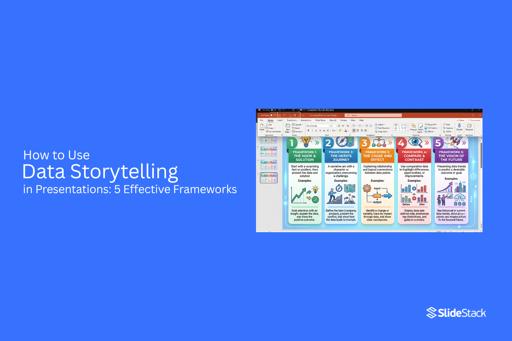
Many presentations include charts, graphs, and numbers. Yet the main message often gets lost. The audience sees the data but misses the meaning. That can make ideas harder to follow and reduce the impact of your presentation. Clear data alone does not always lead to clear understanding. Data storytelling helps connect facts with a simple narrative. It gives each number a purpose and helps people see why the information matters. In this article, you will learn what data storytelling is, why it matters, and five effective frameworks you can use to present data with more clarity, confidence, and impact.
What Is Data Storytelling in Presentations?
Data storytelling in presentations is the process of turning numbers, facts, and charts into a clear story. Instead of showing data on its own, you connect it to a message that people can follow and remember. A good data story has three main parts. The first part is the data. This gives proof and supports your message. The second part is the story. It explains what the data means and why it matters. The third part is the visuals. Charts, graphs, icons, and images help people understand the information more quickly.
Data alone can answer questions. A story explains why those answers matter. Visuals make the message easier to follow. Together, these parts help your audience stay focused from the first slide to the last. A presentation with data storytelling also has a clear flow. Each slide builds on the one before it. Every chart has a purpose. Every number supports the main point. This keeps the audience from feeling lost or overwhelmed. The goal is not to show every piece of data you have. The goal is to share the right data in the right order. That helps people understand the message and remember the key points after the presentation ends.
Why Data Storytelling Is Important
Numbers can show facts. A story gives those facts meaning. Put them together, and your audience can see what the data says and why it matters. This makes your presentation easier to follow from start to finish.
Makes Complex Data Easier to Understand
Large data sets can feel confusing. Long tables and crowded charts often make it hard to spot the main point. Data storytelling solves this by giving the audience a clear path through the information. Start with one key message. Next, use a simple chart or graph that supports it. Add a short explanation that connects the numbers to a real outcome. This keeps the focus on the point instead of every detail. Simple visuals and clear language help people understand the data without extra effort.
Increases Audience Engagement
People lose interest if they only see numbers on the screen. A story gives them a reason to pay attention. It creates a clear beginning, middle, and end that keeps the presentation moving. Real examples, simple visuals, and clear explanations help the audience stay involved. Each slide builds on the last one, so people stay focused instead of trying to figure out what the data means. A presentation that feels connected is easier to follow and more enjoyable to watch.
Improves Information Retention
People remember ideas better if they understand the message behind the numbers. A story links facts together in a way that makes sense. This helps the audience recall the key points after the presentation ends. Clear visuals also support memory. One strong chart with a simple explanation often leaves a bigger impact than several charts filled with extra details. A clear message on every slide gives people something they can remember and use later.
Supports Better Decision-Making
Data helps people make choices. A story helps them see which choice makes the most sense. Instead of showing numbers without context, data storytelling explains what the results mean and why they matter. Clear evidence builds confidence in the message. The audience can compare options, spot trends, and understand possible outcomes with less confusion. A well-told data story turns information into useful insights that support better decisions.
5 Effective Data Storytelling Frameworks
A clear framework helps you turn numbers into a story people can follow. Each one has a different purpose. Some work well for business updates. Others fit sales pitches or project reports. Pick the one that matches your message and your audience.
1. Situation, Complication, Resolution (SCR)
The SCR framework starts with the current situation. Next, it explains the problem. Last, it shows the solution. This order keeps the audience focused from start to finish.
How the SCR Framework Works
Start by explaining the current state with clear facts or data. Next, point out the challenge that needs attention. Use data to show why the problem matters. Finish with a solution that answers the problem. Support the final point with results or expected outcomes.
Best Use Cases
SCR works well for:
• Business reports
• Project updates
• Problem-solving presentations
• Executive meetings
• Performance reviews
Presentation Example
A sales team starts by showing that monthly sales stayed flat for three months. The next slide explains that customer response rates dropped during that period. The final slides present a new email strategy and show how it could improve response rates.
2. Before, After, Bridge (BAB)
The BAB framework compares the current state with a better future. Then it explains how to get there. This format helps people see the value of change.
How the BAB Framework Works
Begin with the current situation. Show the problems or limits using data. Next, describe the improved future after the problem is solved. Close with the steps, strategy, or solution that connects the two.
Best Use Cases
BAB works well for:
• Product launches
• Marketing proposals
• Change management
• Business pitches
Presentation Example
A marketing team shows that website traffic has stayed low. The next slides show higher traffic after a new content plan. The final section explains the actions needed to reach that goal.
3. Data, Insight, Action (DIA)
The DIA framework turns raw numbers into clear decisions. It helps the audience understand what the data means instead of only looking at charts.
How the DIA Framework Works
Start by presenting the data. Next, explain the key insight behind the numbers. Finish with the action that should follow. Each step builds on the one before it, making the message easy to follow.
Best Use Cases
DIA works well for:
• Data reports
• Business dashboards
• Team meetings
• Performance reviews
• Decision-making presentations
Presentation Example
A customer service team shows that support requests increased by 25%. The next slide explains that most requests came from one product feature. The final slide recommends updating that feature and adding better customer guides.
4. Hero's Journey
The Hero's Journey turns data into a story with progress and change. The hero can be a customer, a team, or even the company. Data supports each stage of that journey.
How the Hero's Journey Framework Works
Start by introducing the hero and the goal. Show the challenge with facts and data. Next, explain the steps taken to solve the problem. Finish by sharing the results and the lesson learned.
Best Use Cases
The Hero's Journey works well for:
• Customer success stories
• Brand presentations
• Conference talks
• Training sessions
• Fundraising presentations
Presentation Example
A nonprofit introduces a community facing low access to clean water. The next slides show survey data and project results. The story ends with improved access and better health outcomes after the project.
5. Pyramid Principle
The Pyramid Principle starts with the main message. The supporting points and data come after it. This structure helps busy audiences understand the key idea right away.
How the Pyramid Principle Works
Open with the main conclusion. Follow it with two or three supporting points. Use data, charts, or examples to support each point. End with a short recap of the recommendation.
Best Use Cases
The Pyramid Principle works well for:
• Executive presentations
• Board meetings
• Business proposals
• Strategy presentations
Financial reports
Presentation Example
A finance team starts by stating that operating costs should be reduced by 10%. The next slides show spending data across different departments. The presentation ends with clear recommendations for lowering costs while keeping business goals on track.
Tips for Using Data Storytelling Frameworks Effectively
A good framework gives your presentation a clear structure. Still, the way you use that framework matters just as much. Small choices can make your story easier to follow and your data easier to understand. These tips will help you turn numbers into a clear message that your audience can remember.
Focus on One Key Message Per Slide
Every slide should share one main idea. Trying to explain too many points at once can confuse your audience. A single message keeps the slide clear and helps people stay focused.
Use a short headline that tells readers what the data means. Then add only the chart, text, or image needed to support that idea. This approach keeps your presentation simple and easy to follow.
Choose the Right Charts and Graphs
The chart you pick should match the story you want to tell. A bar chart works well for comparing values. A line chart shows changes over time. Pie charts help show parts of a whole, while scatter plots display relationships between data points.
Avoid adding charts just to fill space. Pick the one that makes your message clear at a quick glance.
Add Context to Every Data Point
Numbers alone do not explain much. Your audience also needs to know why those numbers matter.
Add a short sentence that points out the main insight. You can also compare the data with a past result, a goal, or an industry average. This extra detail helps people understand the meaning behind the numbers instead of guessing.
Keep the Story Flow Logical
Your presentation should move from one idea to the next in a clear order. Start with the situation, show the data, explain what it means, and finish with the next step or result. Each slide should connect naturally with the one before it. That steady flow keeps your audience engaged and makes the story easier to follow from start to finish.
End With a Clear Takeaway
The last slide should leave your audience with one clear message. Summarize the main insight in a simple sentence instead of repeating every detail from earlier slides. Finish with the action you want your audience to take or the decision you want them to make. A clear ending gives your presentation a strong finish and helps people remember your main point.
Common Data Storytelling Mistakes to Avoid
A strong story can lose its impact because of a few common mistakes. Good data storytelling is not only about showing numbers. It is about helping people understand the message. Here are some mistakes that can make your presentation less effective.
Presenting Too Much Data
More data does not always mean more value. A slide filled with charts, tables, and numbers can confuse your audience. They may spend more time trying to read the data than listening to your point. Pick only the data that supports your message. Remove anything that does not help the story. A few strong facts often work better than a large collection of numbers.
Using the Wrong Visualizations
The wrong chart can hide your message. It can also make the data harder to read. For example, a pie chart with many small sections is difficult to follow. Match the chart to your data. Use bar charts to compare values, line charts to show changes over time, and pie charts only for simple parts of a whole. Clear visuals help your audience understand the story with less effort.
Ignoring the Audience
Every audience has different needs. A technical team may expect detailed data. Business leaders may want the main insight and the next step. Shape your story around the people in the room. Use words, examples, and details that fit their knowledge and goals. This keeps the presentation useful from start to finish.
Missing a Clear Narrative
Data without a story feels disconnected. Your audience may understand each chart but still miss the main point. Build a simple flow. Start with the problem. Show the data that explains it. End with the key insight and the action you want people to take. This structure keeps your presentation easy to follow.
Overloading Slides With Text
Slides filled with long paragraphs can pull attention away from the speaker. Most people will read the text instead of listening. Keep your slides clean. Use short headings, brief bullet points, and clear visuals. Let your spoken words provide the details while the slides support your message.
Final Thoughts
Data storytelling helps turn numbers into messages people can understand. A strong presentation does more than show charts and figures. It explains what the data means and why the audience should care. The right framework gives your slides a clear structure. SCR, BAB, DIA, Hero's Journey, and the Pyramid Principle each help organize information in a different way. Choose a format that fits your goal, audience, and message. Good data storytelling also depends on simple design choices. Use clear visuals, focus on one idea per slide, and remove details that do not support your main point. A clear story helps your audience follow the information and remember the key message after the presentation.
FAQs
What is data storytelling in presentations?
Data storytelling is the process of turning data into a clear message using facts, visuals, and a simple story. It helps the audience understand what the numbers mean and why they matter.
Why is data storytelling important for presentations?
Data storytelling helps people understand complex information more easily. It connects numbers with a clear message, keeps the audience focused, and helps them remember the main points.
What are the main parts of a data story?
A data story has three main parts: data, story, and visuals. Data provides facts, the story explains the meaning, and visuals help people understand the information.
Which data storytelling framework is best for business presentations?
The best framework depends on your goal. SCR works well for explaining problems and solutions. DIA helps present data and decisions. The Pyramid Principle works well for executive presentations that need a clear message at the start.
How many charts should I use in a data storytelling presentation?
Use only the charts that support your main message. Too many charts can make the presentation harder to follow. Choose visuals that help explain the key point.
How can I make data easier for my audience to understand?
Use simple charts, clear labels, and short explanations. Focus on the main insight instead of showing every piece of data you have.
What is the difference between data visualization and data storytelling?
Data visualization focuses on showing data through charts and graphs. Data storytelling adds context and explains the meaning behind those visuals.
Can data storytelling be used for any type of presentation?
Yes. Data storytelling can be used for business reports, sales presentations, project updates, training sessions, and other presentations that include data.




You may also be interested in ...

How To Create An Eye-Catching Portfolio
If you’re looking to create an eye-catching portfolio, this post will come in handy. In this article, you can find the easies...
23 Jun, 2024

How To Easily Create An Infographic
Infographics are the perfect way to make a presentation that will impact an audience, but their design and composition might...
08 Jun, 2024

PowerPoint Template Tips & Tricks You Ne...
PowerPoint seems to be an unknown world for many people, especially those who have been assigned to create a presentation out...
08 Jun, 2024